02_uniapp自定义上凸效果的底部TabBar
一.基础代码
前面已经实现了带凹槽的tabbar,在此基础上继续扩展上凸效果
javascript
export default {
  name:"x-custom-tab-bar",
  props: {
    // 浮动按钮的类型,notched:凹槽,raised: 上凸
    floatButtonType: {
      type: String,
      default: "notched"
    },
    // 浮动按钮相对tabBar内容区域高出多少像素
    raisedSize: {
      type: Number,
      default: 20
    },
    // 浮动按钮尺寸
    floatButtonSize: {
      type: Number,
      default: 44
    },
    // tabBar内容区域高度
    contentHeight: {
      type: Number,
      default: 50
    },
    // 浮动按钮与凹槽之间的间隙
    gap: {
      type: Number,
      default: 3
    },
    // 凹槽平滑过渡的圆角半径
    smoothRadius: {
      type: Number,
      default: 30
    },
    background: {
      type: String,
      default: "white"
    }
  },
  computed: {
    notchedHorizontalPadding() {
      const horizontalPadding = Math.max(this.radius - this.smoothOffsetX, 0) + 10;
      return horizontalPadding;
    },
    radius() {
      const floatButtonSize = this.floatButtonSize || 44;
      const gap = this.gap || 3;
      return floatButtonSize/2.0 + gap;
    },
    smoothOffsetX() {
      const smoothRadius = this.smoothRadius || 30;
      const radius = this.radius;
      const raisedSize = this.raisedSize || 20;

      return Math.sqrt(Math.pow(smoothRadius + radius, 2) - Math.pow(raisedSize + smoothRadius - radius, 2));
    },
    viewBoxWidth() {
      const horizontalPadding = this.notchedHorizontalPadding;
      const smoothOffsetX = this.smoothOffsetX;
      return smoothOffsetX * 2 + horizontalPadding * 2;
    },
    viewBoxHeight() {
      const raisedSize = this.raisedSize || 20;
      const contentHeight = this.contentHeight || 50;
      const safeAreaInsetBottom = (uni.getSystemInfoSync().safeAreaInsets || {}).bottom || 0;
      return raisedSize + contentHeight + safeAreaInsetBottom;
    },
    notchedShape() {
      const horizontalPadding = this.notchedHorizontalPadding;
      const raisedSize = this.raisedSize || 20;
      const radius = this.radius;
      const smoothRadius = this.smoothRadius || 30;

      const smoothOffsetX = this.smoothOffsetX;
      const clipOffsetY = (radius * (raisedSize + smoothRadius) + smoothRadius * radius) / (radius + smoothRadius);
      const clipLeftOffsetX = Math.sqrt(Math.pow(smoothRadius, 2) - Math.pow(clipOffsetY - (raisedSize + smoothRadius), 2)) + horizontalPadding;
      const clipRightOffsetX = 2 * smoothOffsetX - Math.sqrt(Math.pow(smoothRadius, 2) - Math.pow(raisedSize + smoothRadius - clipOffsetY, 2)) + horizontalPadding;

      const viewBoxWidth = this.viewBoxWidth;
      const viewBoxHeight = this.viewBoxHeight;

      const viewBox = `0 0 ${viewBoxWidth} ${viewBoxHeight}`;

      let largeArc = false;
      if(clipOffsetY < radius) {
        // 切点在中间圆的上半边,使用大圆弧
        largeArc = true
      }

      const notchedPath = [
        `M 0 ${raisedSize}`,
        `L ${horizontalPadding} ${raisedSize}`,
        `A ${smoothRadius} ${smoothRadius} 0 0 1 ${clipLeftOffsetX} ${clipOffsetY}`,
        `A ${radius} ${radius} 0 ${largeArc ? 1:0} 0 ${clipRightOffsetX} ${clipOffsetY}`,
        `A ${smoothRadius} ${smoothRadius} 0 0 1 ${smoothOffsetX * 2 + horizontalPadding} ${raisedSize}`,
        `L ${viewBoxWidth} ${raisedSize}`,
        `L ${viewBoxWidth} ${viewBoxHeight}`,
        `L 0 ${viewBoxHeight}`,
        `L 0 ${raisedSize} Z`
      ].join(" ");

      let notchedShape = `<svg viewBox="${viewBox}" width="100%" height="100%" preserveAspectRatio="none" xmlns="http://www.w3.org/2000/svg">`
      notchedShape += `<path stroke-width="0" shape-rendering="geometricPrecision" d="${notchedPath}"/>`
      notchedShape += `</svg>`;

      return notchedShape;
    },
    rectShape() {
      const raisedSize = this.raisedSize || 20;
      const rectPath = [
        `M 0 ${raisedSize}`,
        `L 100 ${raisedSize}`,
        `L 100 ${this.viewBoxHeight}`,
        `L 0 ${this.viewBoxHeight}`,
        `L 0 ${raisedSize} Z`
      ].join(" ");

      let rectShape = `<svg viewBox="0 0 100 ${this.viewBoxHeight}" width="100%" height="100%" preserveAspectRatio="none" xmlns="http://www.w3.org/2000/svg">`
      rectShape += `<path stroke-width="0" shape-rendering="geometricPrecision" d="${rectPath}"/>`
      rectShape += `</svg>`;

      return rectShape;
    },
    maskStyle() {
      const raisedSize = this.raisedSize || 20;
      const contentHeight = this.contentHeight || 50;
      const background = this.background || "white";

      const notchedLayer = `url("data:image/svg+xml;utf8,${encodeURIComponent(this.notchedShape)}") center top/${this.viewBoxWidth}px 100% no-repeat`;
      const leftLayer = `url("data:image/svg+xml;utf8,${encodeURIComponent(this.rectShape)}") left top/calc(50% - ${Math.max(this.smoothOffsetX, this.radius)}px) 100% no-repeat`
      const rightLayer = `url("data:image/svg+xml;utf8,${encodeURIComponent(this.rectShape)}") right top/calc(50% - ${Math.max(this.smoothOffsetX, this.radius)}px) 100% no-repeat`

      return {
        "height": `calc(const(safe-area-inset-bottom) + ${contentHeight}px + ${raisedSize}px)`,
        "height": `calc(env(safe-area-inset-bottom) + ${contentHeight}px + ${raisedSize}px)`,
        "background": background,
        "mask": [notchedLayer, leftLayer, rightLayer].join(","),
        "-webkit-mask": [notchedLayer, leftLayer, rightLayer].join(",")
      };
    },
    contentStyle() {
      const contentHeight = this.contentHeight || 50;
      return {
        "height": `${contentHeight}px`
      };
    },
    floatButtonStyle() {
      const raisedSize = this.raisedSize || 20;
      const contentHeight = this.contentHeight || 50;
      const floatButtonSize = this.floatButtonSize || 44;
      const gap = this.gap || 3;
      return {
        "width": `${floatButtonSize}px`,
        "height": `${floatButtonSize}px`,
        "border-radius": `${floatButtonSize/2}px`,
        "bottom": `calc(const(safe-area-inset-bottom) + ${raisedSize + contentHeight - (floatButtonSize + gap)}px)`,
        "bottom": `calc(env(safe-area-inset-bottom) + ${raisedSize + contentHeight - (floatButtonSize + gap)}px)`
      };
    }
  },
  data() {
    return {

    };
  }
}
解释下自定义属性:
-
floatButtonType: 浮动按钮的类型,notched:凹槽,raised: 上凸
-
raisedSize: 浮动按钮相对tabBar内容区域高出多少像素
-
floatButtonSize: 中间浮动按钮的大小
-
contentHeight: tabBar内容区域高度
-
gap: 浮动按钮的间隙
-
smoothRadius: 上凸平滑过渡的圆角半径
-
background: tabBar的背景色
二.上凸效果实现原理
通过css mask属性为tabBar指定一个遮罩,遮罩中的不透明像素,才会使用tabBar的背景渲染。
那么问题转换为如何绘制并为tabBar指定遮罩,本文通过svg来绘制遮罩。
三.上凸效果svg绘制过程
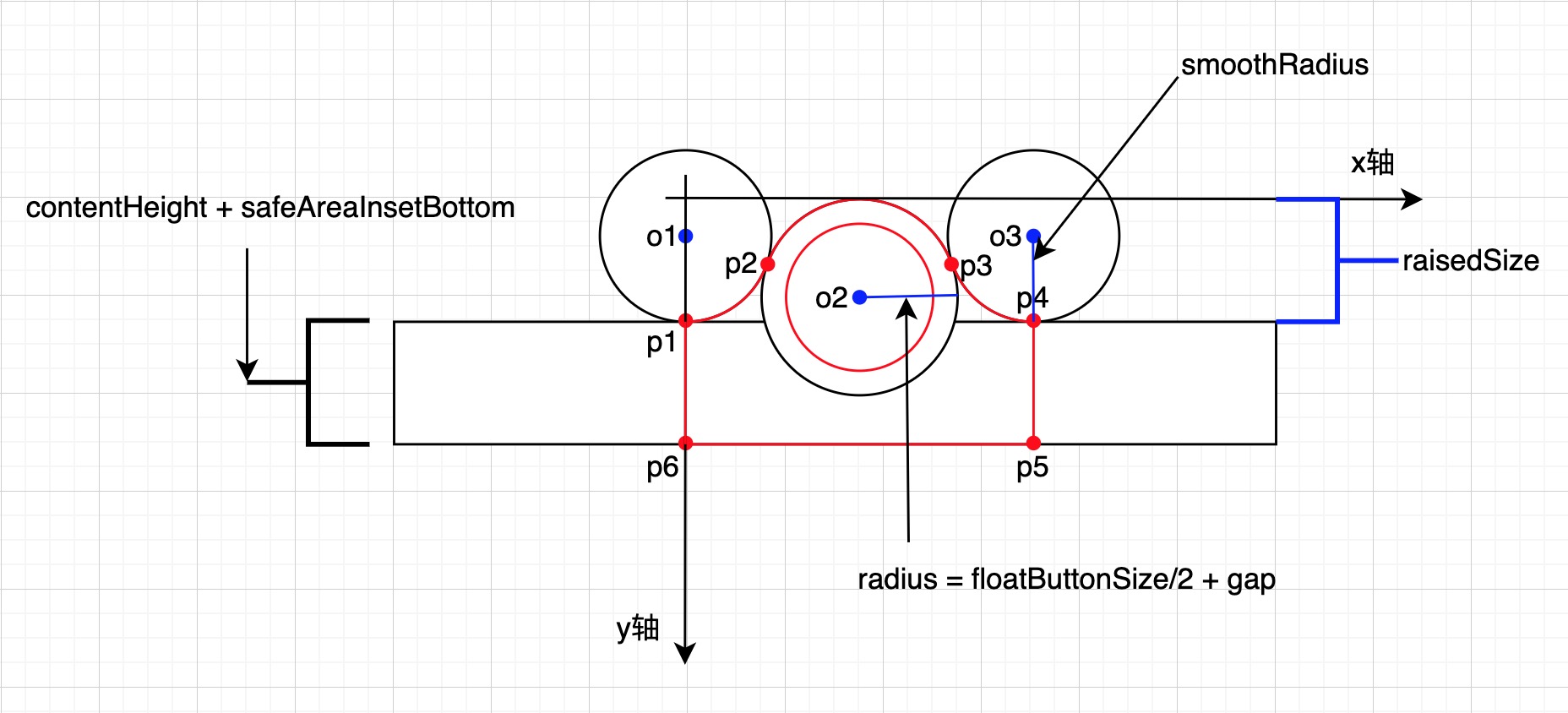
如图所示,只要确定了p1、p2、p3、p4、p5、p6的坐标,上凸效果的绘制路径也就确定了。
-
首先p1、p6的坐标很好确定
p1的坐标为(0, raisedSize)
P6的坐标为(0, raisedSize + contentHeight + safeAreaInsetBottom)
-
确定p4的坐标
p4的纵坐标很好确定,为raisedSize。
p1和p4与中间圆形按钮的圆心之间的水平距离是相等的,假设p1和中间圆形按钮的圆心之间的水平距离为smoothOffsetX,那么p4的横坐标为2 * smoothOffsetX:
smoothOffsetX = ?
问题转化为计算smoothOffsetX的值。
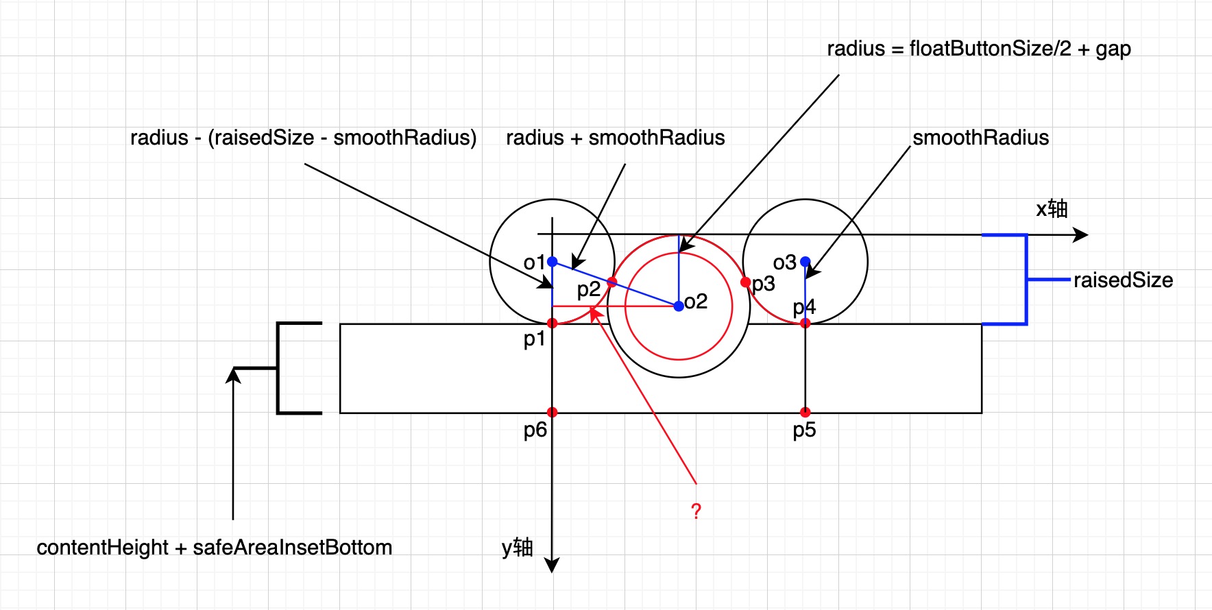
如图,使用勾股定理可算出smoothOffsetX的值。
所以,可以确定p4的坐标为:
smoothOffsetX = Math.sqrt(Math.pow(radius + smoothRadius, 2) - Math.pow(radius - (raisedSize - smoothRadius), 2))
P4的坐标为(2 * smoothOffsetX, raisedSize)
-
确定p5的坐标
P5的坐标为(2 * smoothOffsetX, raisedSize + contentHeight + safeAreaInsetBottom)
-
确定p2、p3的坐标
p2、p3的纵坐标相等,为中间圆形按钮对应的圆和平滑过渡圆外切时的切点纵坐标,问题转化为:已知两个圆的圆心纵坐标和半径,求外切时的切点纵坐标?
两圆外切时的切点纵坐标为: clipOffsetY = ?
左边平滑过渡圆的圆心纵坐标为: y1 = raisedSize - smoothRadius
左边平滑过渡圆的半径为:r1 = smoothRadius
中间圆形按钮的圆心纵坐标为: y2 = radius
中间圆形按钮的半径为: r2 = radius
clipOffsetY = (r2 * y1 + r1 * y2) / (r1 + r2) (不用问我这个公式怎么来的,我也是问ai的😄)
所以p2、p3的纵坐标为:
clipOffsetY = (radius * (raisedSize - smoothRadius) + smoothRadius * radius) / (radius + smoothRadius)
确定p2的横坐标
p2的横坐标为: clipLeftOffsetX = ?
p2的纵坐标为: clipOffsetY
o1的坐标为: (0, raisedSize - smoothRadius)
p2和o1的直线距离为平滑过渡圆的半径smoothRadius
所以,根据两点之间的距离公式可以计算p2的横坐标:
clipLeftOffsetX = Math.sqrt(Math.pow(smoothRadius, 2) - Math.pow(clipOffsetY - (raisedSize - smoothRadius), 2))
确定p3的横坐标
p3的横坐标为: clipRightOffsetX = ?
p3的纵坐标为: clipOffsetY
o3的坐标为: (2 * smoothOffsetX, raisedSize - smoothRadius)
p3和o3的直线距离为平滑过渡圆的半径smoothRadius
所以,根据两点之间的距离公式可以计算p3的横坐标:
clipRightOffsetX = 2 * smoothOffsetX - Math.sqrt(Math.pow(smoothRadius, 2) - Math.pow(raisedSize - smoothRadius - clipOffsetY, 2))
-
所有坐标都已确定,开始绘制
javascriptexport default { computed: { ..., smoothOffsetX() { const floatButtonType = this.floatButtonType || "notched"; const smoothRadius = this.smoothRadius || 30; const radius = this.radius; const raisedSize = this.raisedSize || 20; if(floatButtonType == "notched") { return Math.sqrt(Math.pow(smoothRadius + radius, 2) - Math.pow(raisedSize + smoothRadius - radius, 2)); } else { return Math.sqrt(Math.pow(radius + smoothRadius, 2) - Math.pow(radius - (raisedSize - smoothRadius), 2)); } }, viewBoxWidth() { const floatButtonType = this.floatButtonType || "notched"; const horizontalPadding = this.notchedHorizontalPadding; const smoothOffsetX = this.smoothOffsetX; if(floatButtonType == "notched") { return smoothOffsetX * 2 + horizontalPadding * 2; } else { return smoothOffsetX * 2; } }, raisedShape() { const raisedSize = this.raisedSize || 20; const radius = this.radius; const smoothRadius = this.smoothRadius || 30; const smoothOffsetX = this.smoothOffsetX; const clipOffsetY = (radius * (raisedSize - smoothRadius) + smoothRadius * radius) / (radius + smoothRadius); const clipLeftOffsetX = Math.sqrt(Math.pow(smoothRadius, 2) - Math.pow(clipOffsetY - (raisedSize - smoothRadius), 2)); const clipRightOffsetX = 2 * smoothOffsetX - Math.sqrt(Math.pow(smoothRadius, 2) - Math.pow(raisedSize - smoothRadius - clipOffsetY, 2)); const viewBoxWidth = this.viewBoxWidth; const viewBoxHeight = this.viewBoxHeight; const viewBox = `0 0 ${viewBoxWidth} ${viewBoxHeight}`; const raisedPath = [ `M 0 ${raisedSize}`, `A ${smoothRadius} ${smoothRadius} 0 0 0 ${clipLeftOffsetX} ${clipOffsetY}`, `A ${radius} ${radius} 0 0 1 ${clipRightOffsetX} ${clipOffsetY}`, `A ${smoothRadius} ${smoothRadius} 0 0 0 ${2 * smoothOffsetX} ${raisedSize}`, `L ${2 * smoothOffsetX} ${viewBoxHeight}`, `L 0 ${viewBoxHeight}`, `L 0 ${raisedSize} Z` ].join(" "); let raisedShape = `<svg viewBox="${viewBox}" width="100%" height="100%" preserveAspectRatio="none" xmlns="http://www.w3.org/2000/svg">`; raisedShape += `<path stroke-width="0" shape-rendering="geometricPrecision" d="${raisedPath}"/>` raisedShape += `</svg>`; return raisedShape; }, ... } }最后会生成如下的svg:
xml<svg viewBox="0 0 84.8528137423857 70" width="100%" height="100%" preserveAspectRatio="none" xmlns="http://www.w3.org/2000/svg"><path stroke-width="0" shape-rendering="geometricPrecision" d="M 0 20 A 30 30 0 0 0 23.1416764751961 9.090909090909092 A 25 25 0 0 1 61.711137267189606 9.090909090909092 A 30 30 0 0 0 84.8528137423857 20 L 84.8528137423857 70 L 0 70 L 0 20 Z"/></svg>将svg字符串转成dataUrl,并指定为mask,设置mask-position、mask-size、mask-repeat:
javascriptexport default { computed: { maskStyle() { const raisedSize = this.raisedSize || 20; const contentHeight = this.contentHeight || 50; const background = this.background || "white"; const floatButtonType = this.floatButtonType || "notched"; let layerList = []; if(floatButtonType == "notched") { const notchedLayer = `url("data:image/svg+xml;utf8,${encodeURIComponent(this.notchedShape)}") center top/${this.viewBoxWidth}px 100% no-repeat`; const leftLayer = `url("data:image/svg+xml;utf8,${encodeURIComponent(this.rectShape)}") left top/calc(50% - ${Math.max(this.smoothOffsetX, this.radius)}px) 100% no-repeat`; const rightLayer = `url("data:image/svg+xml;utf8,${encodeURIComponent(this.rectShape)}") right top/calc(50% - ${Math.max(this.smoothOffsetX, this.radius)}px) 100% no-repeat`; layerList.push(notchedLayer); layerList.push(leftLayer); layerList.push(rightLayer); } else { const raisedLayer = `url("data:image/svg+xml;utf8,${encodeURIComponent(this.raisedShape)}") center top/${this.viewBoxWidth}px 100% no-repeat`; layerList.push(raisedLayer); } return { "height": `calc(const(safe-area-inset-bottom) + ${contentHeight}px + ${raisedSize}px)`, "height": `calc(env(safe-area-inset-bottom) + ${contentHeight}px + ${raisedSize}px)`, "background": background, "mask": layerList.join(","), "-webkit-mask": layerList.join(",") }; }, } }效果如下:
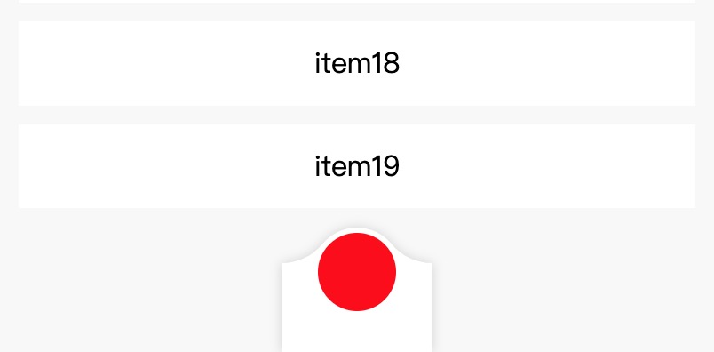
四.补齐左右两边的透明区域
比较简单,只需要使用svg绘制一个矩形,并设置mask-position、mask-size、mask-repeat让其铺满即可。
javascript
export default {
  computed: {
    maskStyle() {
				const raisedSize = this.raisedSize || 20;
				const contentHeight = this.contentHeight || 50;
				const background = this.background || "white";
				const floatButtonType = this.floatButtonType || "notched";

				let layerList = [];

				if(floatButtonType == "notched") {
					...
				} else {
					const raisedLayer = `url("data:image/svg+xml;utf8,${encodeURIComponent(this.raisedShape)}") center top/${this.viewBoxWidth}px 100% no-repeat`;
					const bottomLayer = `url("data:image/svg+xml;utf8,${encodeURIComponent(this.rectShape)}") left top/100% 100% no-repeat`;
					layerList.push(raisedLayer);
					layerList.push(bottomLayer);
				}

				return {
					"height": `calc(const(safe-area-inset-bottom) + ${contentHeight}px + ${raisedSize}px)`,
					"height": `calc(env(safe-area-inset-bottom) + ${contentHeight}px + ${raisedSize}px)`,
					"background": background,
					"mask": layerList.join(","),
					"-webkit-mask": layerList.join(",")
				};
    },
  }
}
效果如下:
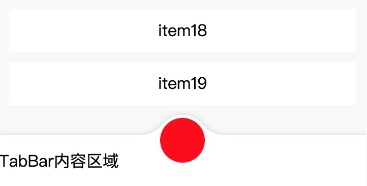
五.最后附上完整代码
-
组件代码
vue<template> <view class="x-custom-tab-bar__root"> <view class="x-custom-tab-bar__main" :style="maskStyle"> <view class="x-custom-tab-bar__content" :style="contentStyle">TabBar内容区域</view> <view class="x-custom-tab-bar__safe-area"></view> </view> <view class="x-custom-tab-bar__float-button" :style="floatButtonStyle"></view> </view> </template> <script> export default { name:"x-custom-tab-bar", props: { // 浮动按钮的样式,notched:凹槽,raised: 上凸 floatButtonType: { type: String, default: "notched" }, // 浮动按钮相对tabBar内容区域高出多少像素 raisedSize: { type: Number, default: 20 }, // 浮动按钮尺寸 floatButtonSize: { type: Number, default: 44 }, // tabBar内容区域高度 contentHeight: { type: Number, default: 50 }, // 浮动按钮与凹槽之间的间隙 gap: { type: Number, default: 3 }, // 凹槽平滑过渡的圆角半径 smoothRadius: { type: Number, default: 30 }, background: { type: String, default: "white" } }, computed: { notchedHorizontalPadding() { const horizontalPadding = Math.max(this.radius - this.smoothOffsetX, 0) + 10; return horizontalPadding; }, radius() { const floatButtonSize = this.floatButtonSize || 44; const gap = this.gap || 3; return floatButtonSize/2.0 + gap; }, smoothOffsetX() { const floatButtonType = this.floatButtonType || "notched"; const smoothRadius = this.smoothRadius || 30; const radius = this.radius; const raisedSize = this.raisedSize || 20; if(floatButtonType == "notched") { return Math.sqrt(Math.pow(smoothRadius + radius, 2) - Math.pow(raisedSize + smoothRadius - radius, 2)); } else { return Math.sqrt(Math.pow(radius + smoothRadius, 2) - Math.pow(radius - (raisedSize - smoothRadius), 2)); } }, viewBoxWidth() { const floatButtonType = this.floatButtonType || "notched"; const horizontalPadding = this.notchedHorizontalPadding; const smoothOffsetX = this.smoothOffsetX; if(floatButtonType == "notched") { return smoothOffsetX * 2 + horizontalPadding * 2; } else { return smoothOffsetX * 2; } }, viewBoxHeight() { const raisedSize = this.raisedSize || 20; const contentHeight = this.contentHeight || 50; const safeAreaInsetBottom = (uni.getSystemInfoSync().safeAreaInsets || {}).bottom || 0; return raisedSize + contentHeight + safeAreaInsetBottom; }, notchedShape() { const horizontalPadding = this.notchedHorizontalPadding; const raisedSize = this.raisedSize || 20; const radius = this.radius; const smoothRadius = this.smoothRadius || 30; const smoothOffsetX = this.smoothOffsetX; const clipOffsetY = (radius * (raisedSize + smoothRadius) + smoothRadius * radius) / (radius + smoothRadius); const clipLeftOffsetX = Math.sqrt(Math.pow(smoothRadius, 2) - Math.pow(clipOffsetY - (raisedSize + smoothRadius), 2)) + horizontalPadding; const clipRightOffsetX = 2 * smoothOffsetX - Math.sqrt(Math.pow(smoothRadius, 2) - Math.pow(raisedSize + smoothRadius - clipOffsetY, 2)) + horizontalPadding; const viewBoxWidth = this.viewBoxWidth; const viewBoxHeight = this.viewBoxHeight; const viewBox = `0 0 ${viewBoxWidth} ${viewBoxHeight}`; let largeArc = false; if(clipOffsetY < radius) { // 切点在中间圆的上半边,使用大圆弧 largeArc = true } const notchedPath = [ `M 0 ${raisedSize}`, `L ${horizontalPadding} ${raisedSize}`, `A ${smoothRadius} ${smoothRadius} 0 0 1 ${clipLeftOffsetX} ${clipOffsetY}`, `A ${radius} ${radius} 0 ${largeArc ? 1:0} 0 ${clipRightOffsetX} ${clipOffsetY}`, `A ${smoothRadius} ${smoothRadius} 0 0 1 ${smoothOffsetX * 2 + horizontalPadding} ${raisedSize}`, `L ${viewBoxWidth} ${raisedSize}`, `L ${viewBoxWidth} ${viewBoxHeight}`, `L 0 ${viewBoxHeight}`, `L 0 ${raisedSize} Z` ].join(" "); let notchedShape = `<svg viewBox="${viewBox}" width="100%" height="100%" preserveAspectRatio="none" xmlns="http://www.w3.org/2000/svg">` notchedShape += `<path stroke-width="0" shape-rendering="geometricPrecision" d="${notchedPath}"/>` notchedShape += `</svg>`; return notchedShape; }, raisedShape() { const raisedSize = this.raisedSize || 20; const radius = this.radius; const smoothRadius = this.smoothRadius || 30; const smoothOffsetX = this.smoothOffsetX; const clipOffsetY = (radius * (raisedSize - smoothRadius) + smoothRadius * radius) / (radius + smoothRadius); const clipLeftOffsetX = Math.sqrt(Math.pow(smoothRadius, 2) - Math.pow(clipOffsetY - (raisedSize - smoothRadius), 2)); const clipRightOffsetX = 2 * smoothOffsetX - Math.sqrt(Math.pow(smoothRadius, 2) - Math.pow(raisedSize - smoothRadius - clipOffsetY, 2)); const viewBoxWidth = this.viewBoxWidth; const viewBoxHeight = this.viewBoxHeight; const viewBox = `0 0 ${viewBoxWidth} ${viewBoxHeight}`; const raisedPath = [ `M 0 ${raisedSize}`, `A ${smoothRadius} ${smoothRadius} 0 0 0 ${clipLeftOffsetX} ${clipOffsetY}`, `A ${radius} ${radius} 0 0 1 ${clipRightOffsetX} ${clipOffsetY}`, `A ${smoothRadius} ${smoothRadius} 0 0 0 ${2 * smoothOffsetX} ${raisedSize}`, `L ${2 * smoothOffsetX} ${viewBoxHeight}`, `L 0 ${viewBoxHeight}`, `L 0 ${raisedSize} Z` ].join(" "); let raisedShape = `<svg viewBox="${viewBox}" width="100%" height="100%" preserveAspectRatio="none" xmlns="http://www.w3.org/2000/svg">`; raisedShape += `<path stroke-width="0" shape-rendering="geometricPrecision" d="${raisedPath}"/>` raisedShape += `</svg>`; return raisedShape; }, rectShape() { const raisedSize = this.raisedSize || 20; const rectPath = [ `M 0 ${raisedSize}`, `L 100 ${raisedSize}`, `L 100 ${this.viewBoxHeight}`, `L 0 ${this.viewBoxHeight}`, `L 0 ${raisedSize} Z` ].join(" "); let rectShape = `<svg viewBox="0 0 100 ${this.viewBoxHeight}" width="100%" height="100%" preserveAspectRatio="none" xmlns="http://www.w3.org/2000/svg">` rectShape += `<path stroke-width="0" shape-rendering="geometricPrecision" d="${rectPath}"/>` rectShape += `</svg>`; return rectShape; }, maskStyle() { const raisedSize = this.raisedSize || 20; const contentHeight = this.contentHeight || 50; const background = this.background || "white"; const floatButtonType = this.floatButtonType || "notched"; let layerList = []; if(floatButtonType == "notched") { const notchedLayer = `url("data:image/svg+xml;utf8,${encodeURIComponent(this.notchedShape)}") center top/${this.viewBoxWidth}px 100% no-repeat`; const leftLayer = `url("data:image/svg+xml;utf8,${encodeURIComponent(this.rectShape)}") left top/calc(50% - ${Math.max(this.smoothOffsetX, this.radius)}px) 100% no-repeat`; const rightLayer = `url("data:image/svg+xml;utf8,${encodeURIComponent(this.rectShape)}") right top/calc(50% - ${Math.max(this.smoothOffsetX, this.radius)}px) 100% no-repeat`; layerList.push(notchedLayer); layerList.push(leftLayer); layerList.push(rightLayer); } else { const raisedLayer = `url("data:image/svg+xml;utf8,${encodeURIComponent(this.raisedShape)}") center top/${this.viewBoxWidth}px 100% no-repeat`; const bottomLayer = `url("data:image/svg+xml;utf8,${encodeURIComponent(this.rectShape)}") left top/100% 100% no-repeat`; layerList.push(raisedLayer); layerList.push(bottomLayer); } return { "height": `calc(const(safe-area-inset-bottom) + ${contentHeight}px + ${raisedSize}px)`, "height": `calc(env(safe-area-inset-bottom) + ${contentHeight}px + ${raisedSize}px)`, "background": background, "mask": layerList.join(","), "-webkit-mask": layerList.join(",") }; }, contentStyle() { const contentHeight = this.contentHeight || 50; return { "height": `${contentHeight}px` }; }, floatButtonStyle() { const raisedSize = this.raisedSize || 20; const contentHeight = this.contentHeight || 50; const floatButtonSize = this.floatButtonSize || 44; const gap = this.gap || 3; return { "width": `${floatButtonSize}px`, "height": `${floatButtonSize}px`, "border-radius": `${floatButtonSize/2}px`, "bottom": `calc(const(safe-area-inset-bottom) + ${raisedSize + contentHeight - (floatButtonSize + gap)}px)`, "bottom": `calc(env(safe-area-inset-bottom) + ${raisedSize + contentHeight - (floatButtonSize + gap)}px)` }; } }, data() { return { }; } } </script> <style scoped> .x-custom-tab-bar__root { position: fixed; bottom: 0; left: 0; width: 100%; display: flex; flex-direction: column; align-items: stretch; filter: drop-shadow(0px 0px 3px rgba(0,0,0,0.15)); } .x-custom-tab-bar__main { display: flex; flex-direction: column; align-items: stretch; justify-content: flex-end; } .x-custom-tab-bar__content { flex-shrink: 0; display: flex; flex-direction: row; align-items: center; justify-content: flex-start; } .x-custom-tab-bar__safe-area { flex-shrink: 0; height: const(safe-area-inset-bottom); height: env(safe-area-inset-bottom); } .x-custom-tab-bar__float-button { position: fixed; left: 50%; box-sizing: border-box; transform: translateX(-50%); background: red; } </style> -
使用示例
vue<template> <view class="test-page__root"> <scroll-view scroll-y class="test-page__list-view"> <view class="test-page__scroll-content" :style="scrollContentStyle"> <template v-for="(item, index) in 20"> <view class="test-page__item" :style="{marginTop: `${index == 0 ? 20:0}rpx`}">item{{index}}</view> </template> </view> </scroll-view> <x-custom-tab-bar :raised-size="raisedSize" :float-button-size="floatButtonSize" :content-height="contentHeight" :gap="gap" :smooth-radius="smoothRadius" :background="background" :float-button-type="type"></x-custom-tab-bar> </view> </template> <script> export default { data() { return { type: "raised", raisedSize: 20, floatButtonSize: 44, contentHeight: 50, gap: 3, smoothRadius: 30, background: "white" }; }, computed: { scrollContentStyle() { const raisedSize = this.raisedSize || 20; const contentHeight = this.contentHeight || 50; return { "padding-bottom": `calc(const(safe-area-inset-bottom) + ${contentHeight}px + ${raisedSize}px)`, "padding-bottom": `calc(env(safe-area-inset-bottom) + ${contentHeight}px + ${raisedSize}px)` }; } } } </script> <style scoped> .test-page__root { display: flex; flex-direction: column; align-items: stretch; justify-content: flex-start; width: 100%; height: 100%; background: #f8f8f8; } .test-page__list-view { flex: 1; overflow: hidden; } .test-page__scroll-content { display: flex; flex-direction: column; align-items: stretch; justify-content: flex-start; box-sizing: border-box; } .test-page__item { height: 88rpx; line-height: 88rpx; text-align: center; margin: 0 20rpx 20rpx; background: white; } </style>