Bubble 消息操作区改造:复制、重新生成和反馈
前言
如果继续沿着"从简单到复杂"的路线往下走,新增 variant 之后,比较适合作为第三步的改造就是:
扩展 Bubble 的 header、footer 和 actions 区域。
普通聊天产品里,消息一般只需要展示文本内容。
但 Agent 产品不太一样。Agent 的回复通常更长,也更像一次任务执行结果。用户看完之后,往往还需要做一些操作,比如:
- 复制回答
- 重新生成
- 点赞
- 点踩
- 查看执行过程
- 展开详情
- 收起内容
所以在 Agent 场景里,Bubble 不应该只是一个"消息气泡",还应该具备一定的消息操作能力。
这篇文章主要梳理:如何基于 Bubble 的 header / footer 能力,设计一个更适合 Agent 产品的消息操作区。
为什么要改消息操作区
普通聊天消息一般是这样的:
txt
AI:你好,我可以帮你做什么?这种消息比较短,展示文本就够了。
但 Agent 产品里的消息可能是这样的:
txt
AI Assistant

我已经分析了 Bubble 组件的结构,主要结论如下:

1. Bubble.vue 负责单条消息渲染
2. interface.ts 定义组件 props
3. content.ts 负责 variant 和 shape 样式
4. hooks 负责 typing 等交互逻辑

[复制] [重新生成] [有帮助] [无帮助]
这时候操作区就很重要。
因为用户不只是"看消息",还会继续对这条消息做操作。
在真实 Agent 产品中,常见操作包括:
| 操作 | 作用 |
|---|---|
| 复制 | 复制 AI 回复内容 |
| 重新生成 | 对当前问题重新生成答案 |
| 点赞 | 标记回答有帮助 |
| 点踩 | 标记回答不满意 |
| 展开 | 展开较长内容或执行过程 |
| 查看过程 | 查看 Agent 思考链或工具调用 |
所以,消息操作区可以看作 Agent 对话体验里非常基础的一环。
Bubble 里已有 header 和 footer
先看 src/bubble/interface.ts。
BubbleProps 中已经有:
ts
header?: AvoidValidation<VNode | string | ((content: ContentType, info: SlotInfoType) => VNode | string)>;
footer?: AvoidValidation<VNode | string | ((content: ContentType, info: SlotInfoType) => VNode | string)>;也就是说,Bubble 本身已经支持:
headerfooter
这两个区域。
再看 src/bubble/Bubble.vue,里面会计算 _header 和 _footer:
tsx
const _header = slots.header
  ? slots.header({ content: typedContent.value as T, info: { key: _key } })
  : typeof header === 'function'
    ? header(typedContent.value as T, { key: _key })
    : header;

const _footer = slots.footer
  ? slots.footer({ content: typedContent.value as T, info: { key: _key } })
  : typeof footer === 'function'
    ? footer(typedContent.value as T, { key: _key })
    : footer;
这段逻辑说明:
- 如果外部传了
headerslot,就优先用 slot。 - 如果没有 slot,但传了
headerprop,就用 prop。 footer也是同样逻辑。
然后组件会把它们渲染出来:
tsx
<div class={`${prefixCls}-content-wrapper`}>
  {_header && (
    <div class={`${prefixCls}-header`}>
      {_header}
    </div>
  )}

  {_content}

  {_footer && (
    <div class={`${prefixCls}-footer`}>
      {_footer}
    </div>
  )}
</div>
所以当前 Bubble 其实已经具备扩展消息头部和底部的能力。
这对我们做 actions 改造很有帮助。
header、footer 和 actions 的区别
这三个概念容易混在一起。
可以先这样区分:
| 区域 | 主要作用 | 例子 |
|---|---|---|
header |
消息头部信息 | AI 名称、模型名、时间 |
content |
消息主体内容 | 文本、Markdown、代码块 |
footer |
消息底部区域 | 操作按钮、状态、反馈 |
actions |
footer 中的一组操作 | 复制、重新生成、点赞、点踩 |
也就是说:
txt
actions 通常是 footer 里面的一部分。当前 Bubble 已经有 footer,但没有专门的 actions prop。
所以我们有两种改造思路:
- 先用
footerslot 实现 actions。 - 后续如果需求稳定,再新增
actionsprop。
我更建议先走第一种。
因为它风险更低,不需要马上改组件 API。
第一种方案:通过 footer slot 实现 actions
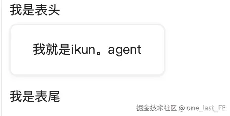
最简单的方式,是直接在使用 Bubble 时传入 footer。
示例:
vue
<Bubble
  variant="agent"
  placement="start"
  content="我已经分析完 Bubble 组件,下面是主要结论。"
>
  <template #header>
    <div class="bubble-demo-header">
      AI Assistant
    </div>
  </template>

  <template #footer>
    <div class="bubble-demo-actions">
      <button>复制</button>
      <button>重新生成</button>
      <button>有帮助</button>
      <button>无帮助</button>
    </div>
  </template>
</Bubble>
这种方式的优点是:
- 不用改
Bubble源码 - 能快速验证交互效果
- 适合在
play中做 demo - 不影响原有组件行为
缺点是:
- 每次使用都要自己写 footer
- actions 没有统一规范
- 不方便做统一的 hover、loading、disabled 逻辑
所以它适合第一阶段验证,不一定适合作为最终组件库 API。
第二种方案:新增 actions prop
如果公司内部确实需要统一的消息操作区,可以考虑给 Bubble 增加 actions。
比如在 interface.ts 中增加:
ts
export interface BubbleAction {
  key: string;
  label?: string;
  icon?: VNode;
  disabled?: boolean;
  onClick?: () => void;
}
然后在 BubbleProps 中增加:
ts
actions?: BubbleAction[];使用时可以这样:
vue
<Bubble
  variant="agent"
  placement="start"
  content="我已经分析完成。"
  :actions="[
    { key: 'copy', label: '复制' },
    { key: 'regenerate', label: '重新生成' },
    { key: 'like', label: '有帮助' },
    { key: 'dislike', label: '无帮助' },
  ]"
/>
这样业务侧就不用每次都自己写 footer。
组件内部可以统一处理:
- 操作按钮样式
- hover 展示
- loading 隐藏
- disabled 状态
- 图标样式
- 点击事件
但是这个方案会修改组件 API,所以要更谨慎。
它更适合在 footer slot 方案验证稳定之后再做。
第三种方案:footer 和 actions 共存
比较合理的最终方案是:
txt
footer 用来承载完全自定义内容
actions 用来承载标准操作按钮
也就是说:
- 如果用户传了
footerslot,就完全自定义底部。 - 如果用户传了
actions,组件自动渲染标准操作区。 - 如果两者都没有,就不显示底部。
大致优先级可以设计为:
txt
footer slot > footer prop > actions prop > 不显示 footer这样既保留了灵活性,也提供了标准化能力。
Agent 场景下 actions 应该怎么展示
我更建议 Agent 风格的 actions 采用"弱展示"。
原因是 AI 回复通常较长,如果操作按钮一直很醒目,会干扰阅读。
可以考虑:
| 状态 | 展示方式 |
|---|---|
| 默认 | 操作区弱展示或半透明 |
| hover 消息 | 显示完整操作按钮 |
| loading 中 | 隐藏重新生成和反馈 |
| typing 中 | 可以隐藏全部 actions |
| error | 显示重试或复制错误信息 |
| 用户消息 | 只显示复制 |
| AI 消息 | 显示复制、重新生成、反馈 |
比如:
txt
AI 消息完成后:
[复制] [重新生成] [有帮助] [无帮助]

AI 消息生成中:
不显示 actions,或者只显示停止生成

用户消息:
[复制]
这样会更符合真实 Agent 产品的体验。
loading 时为什么要隐藏 actions
Bubble 已经支持:
ts
loading?: boolean;
typing?: TypingOption | boolean;
当 AI 消息还在生成时,内容可能还不完整。
这时候如果显示:
txt
复制
重新生成
点赞
点踩
会有几个问题:
- 复制到的是不完整内容
- 重新生成时机不明确
- 用户还没看完,反馈没有意义
- 操作区会干扰 loading 状态
所以更合理的规则是:
txt
loading 或 typing 时,不显示常规 actions。等消息生成完成后,再显示操作区。
如果后续需要,也可以单独设计生成中的操作,比如:
txt
停止生成但这通常更适合放在 Sender 或全局运行状态里,不一定放在 Bubble 的 footer 中。
用户消息和 AI 消息的 actions 不一样
在对话产品里,用户消息和 AI 消息的操作通常不一样。
用户消息常见操作:
- 复制
- 编辑
- 重新发送
AI 消息常见操作:
- 复制
- 重新生成
- 点赞
- 点踩
- 查看过程
如果现在只做简单版本,可以先定规则:
txt
user 消息:只显示复制
assistant 消息:显示复制、重新生成、反馈
如果使用 BubbleList,可以通过 role 来控制不同角色的 footer。
比如:
ts
const roles = {
  assistant: {
    placement: 'start',
    variant: 'agent',
    footer: () => renderAssistantActions(),
  },
  user: {
    placement: 'end',
    variant: 'filled',
    footer: () => renderUserActions(),
  },
};
这样业务侧不用每条消息都重复配置。
建议的落地顺序
为了避免一开始就改太多,我建议按这个顺序做。
第一步,在 play 中用 footer slot 做静态 demo。
先不改源码,只验证:
- header 是否显示正常
- footer 是否显示正常
- actions 是否适合放在底部
- AI 消息和用户消息是否需要不同操作
第二步,补充 actions 样式。
可以先在 demo 里写局部样式,确认效果后再考虑沉淀到组件样式里。
第三步,增加 hover 交互。
比如默认不显示,hover Bubble 时显示:
css
.bubble-demo-actions {
  opacity: 0;
}

.ant-bubble:hover .bubble-demo-actions {
  opacity: 1;
}
第四步,处理 loading / typing。
当消息正在生成时,不显示常规 actions。
第五步,再考虑是否新增 actions prop。
如果 footer slot 已经能满足,就不一定马上改 API。
如果公司内部需要统一规范,再把它抽成 actions。
如果要改源码,可能涉及哪些文件
第一阶段只用 footer slot,可以只改:
txt
play/src/App.vue用于展示 demo。
如果要沉淀样式,可能涉及:
txt
src/bubble/style/index.ts
src/bubble/style/content.ts
如果要新增 actions API,可能涉及:
txt
src/bubble/interface.ts
src/bubble/Bubble.vue
src/bubble/style/index.ts
play/src/App.vue
各文件职责大致是:
| 文件 | 作用 |
|---|---|
interface.ts |
定义 actions 类型和 props |
Bubble.vue |
判断并渲染 actions |
style/index.ts |
增加 actions 基础样式 |
play/src/App.vue |
验证交互效果 |
不过当前阶段建议先不要急着新增 API。
先用现有 footer 能力做出来,会更稳。
总结
Bubble 不只是展示消息文本,它也可以承载消息相关操作。
在 Agent 产品中,消息操作区非常常见,尤其是 AI 回复完成后,用户通常需要复制、重新生成、反馈或查看执行过程。
当前 Bubble 已经支持 header 和 footer,所以第一阶段可以优先利用 footer slot 实现 actions,不需要马上修改组件 API。
比较推荐的路线是:
txt
先用 footer slot 做 demo
-> 验证 AI / 用户消息操作差异
-> 增加 hover 和 loading 交互
-> 再决定是否抽象 actions prop
这样既能快速看到效果,也不会一开始就破坏原有组件设计。