React Native 横竖屏响应式布局实战:一套组件,少量覆盖样式
移动端页面从竖屏切换到横屏时,真正需要处理的通常不是颜色、字体和圆角,而是空间分配方式:原来上下排列的内容可能要改成左右排列,单列卡片可能要变成双列,次要信息也可能需要隐藏。
如果为竖屏和横屏分别复制一套页面,短期看起来直观,长期却很容易出现逻辑不同步、修改遗漏和样式重复。更合适的方式是:保留一套组件和一套基础样式,仅为横屏增加少量布局覆盖。
本文通过一个 React Native 审批工作台案例,完整说明方向检测、样式组织、结构切换、原生配置、测试方法和常见问题。
最终效果与截图 Demo
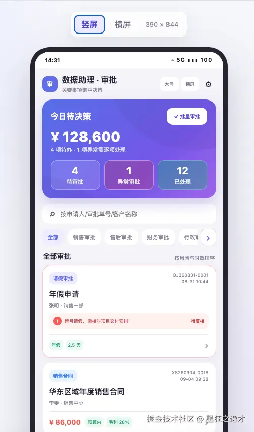
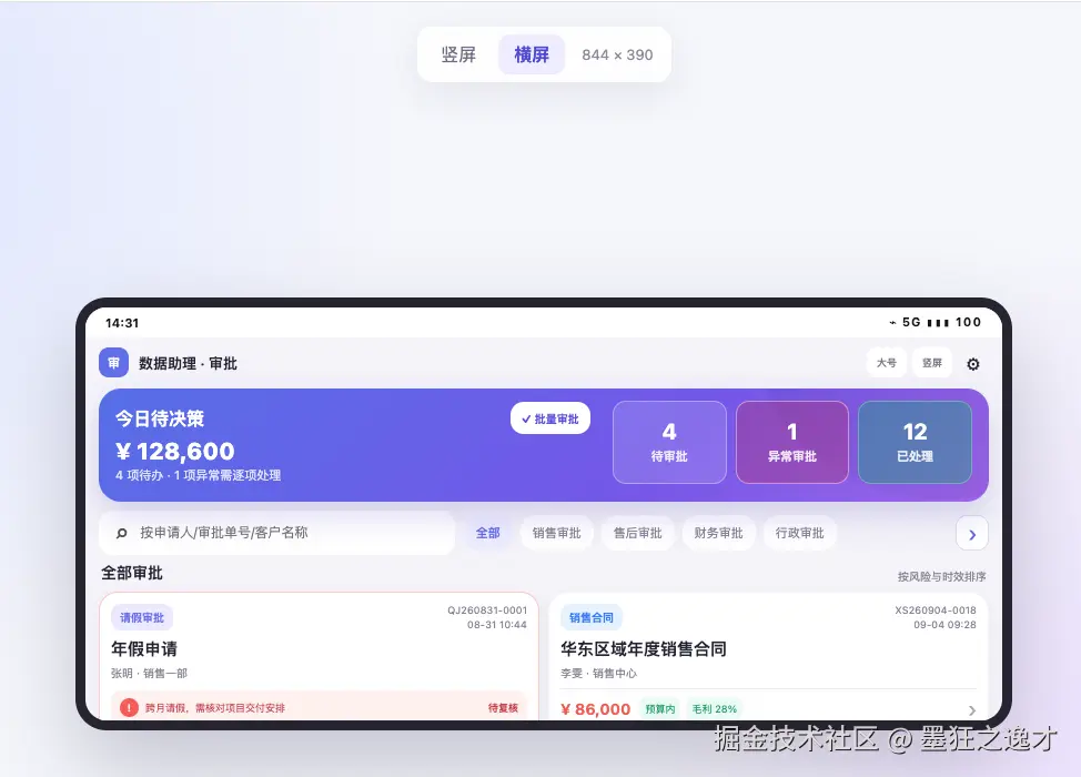
竖屏保持单列信息流,阅读顺序从上到下;横屏利用额外宽度,把摘要区改为左右布局,搜索与分类放到同一行,审批卡片变为双列。
可以直接打开下面的交互 Demo,通过顶部按钮切换横竖屏。这个 HTML 只负责博客视觉演示,真正可用于 React Native 项目的完整代码在本文第四节。
-
横竖屏响应式布局
一、先分析设计稿的"变化规则"
拿到横竖屏设计稿后,不要马上逐个抄尺寸。先把不变项和变化项分开。
| 页面区域 | 竖屏 | 横屏 | 实现方式 |
|---|---|---|---|
| 顶部栏 | 62px,显示副标题 | 46px,隐藏副标题 | 覆盖高度,条件渲染副标题 |
| 摘要卡 | 信息上下排列 | 左侧说明、右侧统计 | 修改 flexDirection 或局部结构 |
| 搜索与分类 | 上下两行 | 同一行 | 父容器改为横向 Flex |
| 审批列表 | 单列 | 双列 | flexWrap 与百分比宽度 |
| 卡片内部 | 常规间距 | 更紧凑 | 覆盖 padding、margin、gap |
| 颜色、圆角、阴影 | 不变 | 不变 | 只写在基础样式中 |
这个分析会直接决定代码结构。大多数变化只需要 Style;只有布局层级真正不同的区域,才需要切换少量 JSX。
二、用真实窗口尺寸判断方向
React Native 提供了 useWindowDimensions()。窗口尺寸变化时,它会自动让组件重新渲染,比模块外部调用一次 Dimensions.get() 更适合响应式页面。
jsx
import {useWindowDimensions} from 'react-native';

function ApprovalScreen() {
  const {width, height} = useWindowDimensions();
  const isLandscape = width > height;

  return null;
}
不要只在点击"横屏"按钮时手动切换一个布尔值:
jsx
// 不推荐:状态可能和设备真实方向不同步
const [isLandscape, setIsLandscape] = useState(false);
用户可能通过系统旋转、分屏、折叠屏展开或平板窗口缩放改变尺寸。布局应该始终以真实窗口宽高为准。
封装一个可复用 Hook
如果项目中有多个响应式页面,可以集中定义方向和断点:
jsx
import {useWindowDimensions} from 'react-native';

export function useResponsiveLayout() {
  const {width, height, scale, fontScale} = useWindowDimensions();
  const shortestSide = Math.min(width, height);

  return {
    width,
    height,
    scale,
    fontScale,
    isLandscape: width > height,
    isPhone: shortestSide < 600,
    isTablet: shortestSide >= 600,
    isCompactLandscape: width > height && width < 700,
  };
}
这里没有把"横屏"等同于"宽屏"。例如小尺寸手机横屏和 iPad 横屏的可用空间仍然不同,因此复杂页面还应该结合宽度断点。
三、使用"基础样式 + 横屏覆盖样式"
基础样式描述组件共同的视觉表现,横屏样式只描述差异:
jsx
<View style={[styles.header, isLandscape && styles.headerLandscape]} />
jsx
const styles = StyleSheet.create({
  header: {
    height: 62,
    paddingHorizontal: 14,
    flexDirection: 'row',
    alignItems: 'center',
  },

  headerLandscape: {
    height: 46,
    paddingHorizontal: 12,
  },
});
React Native 的样式数组会从左到右合并,后面的属性覆盖前面的同名属性。因此横屏不需要重新声明 flexDirection、alignItems 等未变化的属性。
可以把最终结果理解为:
text
横屏最终样式 = 基础样式 + 横屏差异样式四、完整案例:审批工作台页面
下面的代码可以作为一个独立页面放入 React Native 项目。案例包含方向检测、摘要区重排、搜索与分类同行、列表单双列切换。
jsx
import React, {useEffect} from 'react';
import {
  SafeAreaView,
  ScrollView,
  StyleSheet,
  Text,
  TextInput,
  TouchableOpacity,
  useWindowDimensions,
  View,
} from 'react-native';
import Orientation from 'react-native-orientation-locker';

const approvals = [
  {
    id: 'QJ260831-0001',
    type: '请假审批',
    title: '年假申请',
    applicant: '张明 · 销售一部',
    meta: '年假 · 2.5 天',
    risk: '跨月请假,需核对项目交付安排',
  },
  {
    id: 'XS260904-0018',
    type: '销售合同',
    title: '华东区域年度销售合同',
    applicant: '李雯 · 销售中心',
    meta: '¥ 86,000 · 毛利 28%',
  },
  {
    id: 'FY260904-0007',
    type: '费用报销',
    title: '客户拜访差旅报销',
    applicant: '周强 · 商务部',
    meta: '¥ 12,600 · 发票齐全',
  },
  {
    id: 'CG260904-0021',
    type: '采购审批',
    title: '办公设备集中采购',
    applicant: '王琳 · 行政部',
    meta: '¥ 30,000 · 三方询价',
  },
];

function Metric({value, label, tone}) {
  return (
    <View
      style={[
        styles.metric,
        tone === 'risk' && styles.metricRisk,
        tone === 'done' && styles.metricDone,
      ]}>
      <Text style={styles.metricValue}>{value}</Text>
      <Text style={styles.metricLabel}>{label}</Text>
    </View>
  );
}

function ApprovalCard({item, isLandscape}) {
  return (
    <TouchableOpacity
      activeOpacity={0.82}
      style={[
        styles.approvalCard,
        item.risk && styles.riskCard,
        isLandscape && styles.approvalCardLandscape,
      ]}>
      <View style={styles.cardTop}>
        <Text style={styles.typeTag}>{item.type}</Text>
        <Text style={styles.cardCode}>{item.id}</Text>
      </View>

      <Text style={styles.cardTitle}>{item.title}</Text>
      <Text style={styles.cardApplicant}>{item.applicant}</Text>

      {item.risk ? (
        <View style={styles.riskNote}>
          <Text style={styles.riskIcon}>!</Text>
          <Text style={styles.riskText}>{item.risk}</Text>
          <Text style={styles.riskState}>待复核</Text>
        </View>
      ) : null}

      <View style={styles.cardBottom}>
        <Text style={styles.cardMeta}>{item.meta}</Text>
        <Text style={styles.chevron}>›</Text>
      </View>
    </TouchableOpacity>
  );
}

export default function ResponsiveApprovalDemoScreen() {
  const {width, height} = useWindowDimensions();
  const isLandscape = width > height;
  const useTwoColumns = isLandscape && width >= 700;

  const toggleOrientation = () => {
    if (isLandscape) {
      Orientation.lockToPortrait();
    } else {
      Orientation.lockToLandscape();
    }
  };

  useEffect(() => {
    return () => Orientation.lockToPortrait();
  }, []);

  return (
    <SafeAreaView style={styles.safeArea}>
      <ScrollView
        style={styles.screen}
        contentContainerStyle={[styles.content, isLandscape && styles.contentLandscape]}>
        <View style={[styles.header, isLandscape && styles.headerLandscape]}>
          <Text style={styles.brand}>审</Text>
          <View style={styles.headerCopy}>
            <Text style={[styles.headerTitle, isLandscape && styles.headerTitleLandscape]}>
              数据助理 · 审批
            </Text>
            {!isLandscape ? <Text style={styles.subtitle}>关键事项集中决策</Text> : null}
          </View>
          <TouchableOpacity style={styles.headerButton} onPress={toggleOrientation}>
            <Text style={styles.headerButtonText}>{isLandscape ? '竖屏' : '横屏'}</Text>
          </TouchableOpacity>
        </View>

        <View style={[styles.hero, isLandscape && styles.heroLandscape]}>
          <View style={[styles.heroContent, isLandscape && styles.heroContentLandscape]}>
            <View style={styles.heroCopy}>
              <View style={styles.heroTop}>
                <Text style={styles.heroTitle}>今日待决策</Text>
                <TouchableOpacity style={styles.batchButton}>
                  <Text style={styles.batchButtonText}>✓ 批量审批</Text>
                </TouchableOpacity>
              </View>
              <Text style={styles.amount}>¥ 128,600</Text>
              <Text style={styles.heroDescription}>4 项待办 · 1 项异常需逐项处理</Text>
            </View>

            <View style={[styles.metrics, isLandscape && styles.metricsLandscape]}>
              <Metric value='4' label='待审批' />
              <Metric value='1' label='异常审批' tone='risk' />
              <Metric value='12' label='已处理' tone='done' />
            </View>
          </View>
        </View>

        <View style={[styles.filters, isLandscape && styles.filtersLandscape]}>
          <View style={[styles.search, isLandscape && styles.searchLandscape]}>
            <Text style={styles.searchIcon}>⌕</Text>
            <TextInput
              style={styles.searchInput}
              placeholder='按申请人/审批单号/客户名称'
              placeholderTextColor='#aaa7b4'
            />
          </View>

          <ScrollView
            horizontal
            showsHorizontalScrollIndicator={false}
            style={styles.categoryScroll}
            contentContainerStyle={styles.categories}>
            {['全部', '销售审批', '售后审批', '财务审批', '行政审批'].map((category, index) => (
              <TouchableOpacity
                key={category}
                style={[styles.category, index === 0 && styles.categoryActive]}>
                <Text style={[styles.categoryText, index === 0 && styles.categoryTextActive]}>
                  {category}
                </Text>
              </TouchableOpacity>
            ))}
          </ScrollView>
        </View>

        <View style={styles.sectionHeading}>
          <Text style={styles.sectionTitle}>全部审批</Text>
          <Text style={styles.sectionMeta}>按风险与时效排序</Text>
        </View>

        <View style={[styles.approvalList, useTwoColumns && styles.approvalListLandscape]}>
          {approvals.map(item => (
            <ApprovalCard key={item.id} item={item} isLandscape={useTwoColumns} />
          ))}
        </View>
      </ScrollView>
    </SafeAreaView>
  );
}

const styles = StyleSheet.create({
  safeArea: {flex: 1, backgroundColor: '#f4f3f8'},
  screen: {flex: 1, backgroundColor: '#f4f3f8'},
  content: {paddingBottom: 28},
  contentLandscape: {paddingBottom: 16},

  header: {
    height: 62,
    paddingHorizontal: 14,
    flexDirection: 'row',
    alignItems: 'center',
    gap: 9,
  },
  headerLandscape: {height: 46, paddingHorizontal: 12},
  brand: {
    width: 31,
    height: 31,
    borderRadius: 10,
    color: '#fff',
    backgroundColor: '#626ee9',
    textAlign: 'center',
    lineHeight: 31,
    fontWeight: '800',
  },
  headerCopy: {flex: 1},
  headerTitle: {fontSize: 16, fontWeight: '700', color: '#252334'},
  headerTitleLandscape: {fontSize: 13},
  subtitle: {marginTop: 2, fontSize: 10, color: '#858296'},
  headerButton: {
    height: 28,
    paddingHorizontal: 8,
    borderRadius: 8,
    backgroundColor: '#fff',
    justifyContent: 'center',
  },
  headerButtonText: {fontSize: 10, color: '#858296', fontWeight: '700'},

  hero: {
    minHeight: 190,
    marginHorizontal: 14,
    paddingHorizontal: 17,
    paddingVertical: 13,
    borderRadius: 20,
    backgroundColor: '#6b65e8',
  },
  heroLandscape: {
    minHeight: 102,
    marginHorizontal: 12,
    paddingHorizontal: 15,
    paddingVertical: 11,
  },
  heroContent: {flex: 1},
  heroContentLandscape: {flexDirection: 'row', gap: 20},
  heroCopy: {flex: 1, minWidth: 0},
  heroTop: {
    minHeight: 32,
    flexDirection: 'row',
    alignItems: 'center',
    justifyContent: 'space-between',
  },
  heroTitle: {fontSize: 16, color: '#fff', fontWeight: '600'},
  batchButton: {
    minHeight: 30,
    paddingHorizontal: 11,
    borderRadius: 10,
    backgroundColor: '#fff',
    justifyContent: 'center',
  },
  batchButtonText: {fontSize: 10, color: '#574ddc', fontWeight: '800'},
  amount: {marginTop: 3, fontSize: 25, color: '#fff', fontWeight: '800'},
  heroDescription: {marginTop: 2, fontSize: 11, color: 'rgba(255,255,255,.82)'},
  metrics: {flexDirection: 'row', gap: 8, marginTop: 13},
  metricsLandscape: {width: '42%', minWidth: 280, marginTop: 0},
  metric: {
    height: 58,
    flex: 1,
    borderWidth: 1,
    borderColor: 'rgba(255,255,255,.32)',
    borderRadius: 12,
    backgroundColor: 'rgba(255,255,255,.12)',
    alignItems: 'center',
    justifyContent: 'center',
  },
  metricRisk: {backgroundColor: 'rgba(185,35,58,.28)'},
  metricDone: {backgroundColor: 'rgba(25,169,109,.38)'},
  metricValue: {fontSize: 20, color: '#fff', fontWeight: '700'},
  metricLabel: {marginTop: 3, fontSize: 11, color: '#fff'},

  filters: {},
  filtersLandscape: {
    marginHorizontal: 12,
    flexDirection: 'row',
    alignItems: 'center',
    gap: 8,
  },
  search: {
    height: 40,
    marginHorizontal: 14,
    marginTop: 10,
    paddingHorizontal: 14,
    borderRadius: 13,
    backgroundColor: '#fff',
    flexDirection: 'row',
    alignItems: 'center',
  },
  searchLandscape: {width: '40%', marginHorizontal: 0},
  searchIcon: {marginRight: 8, fontSize: 22, color: '#515151'},
  searchInput: {height: 40, flex: 1, paddingVertical: 0, fontSize: 12, color: '#252334'},
  categoryScroll: {minWidth: 0},
  categories: {gap: 7, paddingHorizontal: 14, paddingVertical: 10},
  category: {
    height: 32,
    paddingHorizontal: 11,
    borderRadius: 14,
    backgroundColor: '#fff',
    justifyContent: 'center',
  },
  categoryActive: {backgroundColor: '#edeaff'},
  categoryText: {fontSize: 11, color: '#858296'},
  categoryTextActive: {color: '#626ee9', fontWeight: '700'},

  sectionHeading: {
    marginHorizontal: 16,
    marginBottom: 7,
    flexDirection: 'row',
    alignItems: 'flex-end',
    justifyContent: 'space-between',
  },
  sectionTitle: {fontSize: 14, color: '#252334', fontWeight: '700'},
  sectionMeta: {fontSize: 10, color: '#858296'},
  approvalList: {gap: 9},
  approvalListLandscape: {
    paddingHorizontal: 12,
    flexDirection: 'row',
    flexWrap: 'wrap',
    gap: 8,
  },
  approvalCard: {
    marginHorizontal: 14,
    padding: 13,
    borderWidth: 1,
    borderColor: '#f4f3f8',
    borderRadius: 17,
    backgroundColor: '#fff',
  },
  approvalCardLandscape: {
    width: '49.4%',
    marginHorizontal: 0,
    padding: 10,
  },
  riskCard: {borderColor: 'rgba(245,92,92,.34)'},
  cardTop: {flexDirection: 'row', alignItems: 'center', justifyContent: 'space-between'},
  typeTag: {
    paddingHorizontal: 8,
    paddingVertical: 5,
    borderRadius: 9,
    color: '#626ee9',
    backgroundColor: '#eeeaff',
    fontSize: 10,
  },
  cardCode: {fontSize: 9, color: '#858296'},
  cardTitle: {marginTop: 8, fontSize: 15, color: '#252334', fontWeight: '700'},
  cardApplicant: {marginTop: 4, fontSize: 10, color: '#858296'},
  riskNote: {
    marginTop: 9,
    padding: 8,
    borderRadius: 10,
    backgroundColor: '#fff0ee',
    flexDirection: 'row',
    alignItems: 'center',
    gap: 7,
  },
  riskIcon: {
    width: 17,
    height: 17,
    borderRadius: 9,
    color: '#fff',
    backgroundColor: '#f55c5c',
    textAlign: 'center',
    lineHeight: 17,
    fontWeight: '800',
  },
  riskText: {flex: 1, fontSize: 10, color: '#c44247'},
  riskState: {fontSize: 9, color: '#c44247', fontWeight: '700'},
  cardBottom: {
    marginTop: 10,
    paddingTop: 9,
    borderTopWidth: 1,
    borderTopColor: '#ebe9f0',
    flexDirection: 'row',
    alignItems: 'center',
  },
  cardMeta: {flex: 1, fontSize: 10, color: '#2ac265'},
  chevron: {fontSize: 20, color: '#aaa5b4'},
});
五、横屏按钮只负责旋转,布局仍然看真实尺寸
如果产品需要"横屏/竖屏"按钮,可以使用 react-native-orientation-locker:
jsx
import React, {useEffect} from 'react';
import {Pressable, Text, useWindowDimensions} from 'react-native';
import Orientation from 'react-native-orientation-locker';

function OrientationButton() {
  const {width, height} = useWindowDimensions();
  const isLandscape = width > height;

  const toggleOrientation = () => {
    if (isLandscape) {
      Orientation.lockToPortrait();
    } else {
      Orientation.lockToLandscape();
    }
  };

  useEffect(() => {
    return () => Orientation.lockToPortrait();
  }, []);

  return (
    <Pressable onPress={toggleOrientation}>
      <Text>{isLandscape ? '竖屏' : '横屏'}</Text>
    </Pressable>
  );
}
这里要区分两个职责:
Orientation.lockToLandscape():向系统请求旋转。useWindowDimensions():读取旋转完成后的真实窗口尺寸,决定页面布局。
不要在调用 lockToLandscape() 后直接把本地状态改成横屏。系统旋转可能失败、延迟,或者被设备策略限制。
六、Android 与 iOS 原生配置
只安装 JavaScript 依赖并不一定够,方向库通常还需要原生配置。
Android
在 AndroidManifest.xml 中确保主 Activity 声明尺寸和方向变化:
xml
<activity
    android:name=".MainActivity"
    android:configChanges="keyboard|keyboardHidden|orientation|screenSize|uiMode"
    android:windowSoftInputMode="adjustResize" />
在 MainActivity.java 转发方向变化:
java
@Override
public void onConfigurationChanged(Configuration newConfig) {
  super.onConfigurationChanged(newConfig);
  Intent intent = new Intent("onConfigurationChanged");
  intent.putExtra("newConfig", newConfig);
  sendBroadcast(intent);
}
在 MainApplication.java 注册生命周期监听:
java
@Override
public void onCreate() {
  super.onCreate();
  registerActivityLifecycleCallbacks(
      OrientationActivityLifecycle.getInstance()
  );
}
iOS
Info.plist 需要包含允许的方向:
xml
<key>UISupportedInterfaceOrientations</key>
<array>
  <string>UIInterfaceOrientationPortrait</string>
  <string>UIInterfaceOrientationLandscapeLeft</string>
  <string>UIInterfaceOrientationLandscapeRight</string>
</array>
AppDelegate.mm 根据方向库返回支持方向:
objc
#import "Orientation.h"

- (UIInterfaceOrientationMask)application:(UIApplication *)application
        supportedInterfaceOrientationsForWindow:(UIWindow *)window {
  return [Orientation getOrientation];
}
原生配置应以项目实际使用的库版本文档为准。
七、什么时候只切 Style,什么时候切 JSX?
只切 Style
下面这些变化通常不需要维护两套 JSX:
- 宽度、高度和内外边距变化。
- 单列变双列。
- 上下排列变左右排列。
- 文字对齐、按钮尺寸变化。
- 卡片内部变得更紧凑。
jsx
<View style={[styles.filters, isLandscape && styles.filtersLandscape]}>
  <Search />
  <Categories />
</View>
局部切 JSX
当内容顺序或层级关系真的发生改变时,可以局部切换结构:
jsx
{
  isLandscape ? (
    <View style={styles.heroRow}>
      <HeroCopy />
      <Metrics />
    </View>
  ) : (
    <>
      <HeroCopy />
      <Metrics />
    </>
  );
}
即使如此,也应该复用 HeroCopy 和 Metrics,不要把内容复制两遍。
八、把响应式尺寸集中成布局变量
页面复杂后,可以将高频尺寸集中计算:
jsx
function createLayout(isLandscape) {
  return {
    pagePadding: isLandscape ? 12 : 14,
    sectionGap: isLandscape ? 8 : 12,
    cardPadding: isLandscape ? 10 : 14,
    headerHeight: isLandscape ? 46 : 62,
    columnCount: isLandscape ? 2 : 1,
  };
}

function Screen() {
  const {width, height} = useWindowDimensions();
  const isLandscape = width > height;
  const layout = useMemo(() => createLayout(isLandscape), [isLandscape]);

  return <View style={{paddingHorizontal: layout.pagePadding}} />;
}
这样设计师要求"横屏整体再紧凑一点"时,只需要调整少数变量,不用在整个文件里寻找散落的数字。
不要为了几个简单数值过度使用 useMemo();只有布局对象较复杂,或者会作为 props 传给经过 memo 的子组件时才有明显意义。
九、安全区、大字号和键盘也要一起验证
横屏适配不能只看宽度。
安全区
刘海屏横屏后左右可能产生较大的安全区。业务页面推荐使用 react-native-safe-area-context:
jsx
import {useSafeAreaInsets} from 'react-native-safe-area-context';

function Screen() {
  const insets = useSafeAreaInsets();

  return (
    <View
      style={{
        paddingLeft: Math.max(insets.left, 12),
        paddingRight: Math.max(insets.right, 12),
      }}
    />
  );
}
大字号
不要通过固定卡片高度强行限制内容。优先使用 minHeight,并允许文字换行或内容滚动。
jsx
card: {
  minHeight: 120,
  // 避免 height: 120
}
键盘
横屏高度较小,输入框获得焦点后更容易被键盘遮挡。表单页面需要配合 KeyboardAvoidingView,并确认 Android 的 windowSoftInputMode 配置。
十、测试方向判断与关键样式
响应式布局最好至少覆盖竖屏和横屏两个渲染用例。
jsx
import React from 'react';
import renderer from 'react-test-renderer';
import * as ReactNative from 'react-native';
import ResponsiveApprovalDemoScreen from '../ResponsiveApprovalDemoScreen';

describe('ResponsiveApprovalDemoScreen', () => {
  afterEach(() => jest.restoreAllMocks());

  it('竖屏使用单列布局', () => {
    jest.spyOn(ReactNative, 'useWindowDimensions').mockReturnValue({
      width: 390,
      height: 844,
      scale: 3,
      fontScale: 1,
    });

    const tree = renderer.create(<ResponsiveApprovalDemoScreen />).toJSON();
    expect(tree).toBeTruthy();
  });

  it('宽屏横屏使用双列布局', () => {
    jest.spyOn(ReactNative, 'useWindowDimensions').mockReturnValue({
      width: 844,
      height: 390,
      scale: 3,
      fontScale: 1,
    });

    const tree = renderer.create(<ResponsiveApprovalDemoScreen />).toJSON();
    expect(tree).toBeTruthy();
  });
});
完整项目还可以给关键容器增加 testID,断言合并后的 Style 是否包含双列宽度、横向排列等关键属性。
十一、推荐的设计稿还原顺序
不要从字体和 1px 间距开始。更高效的顺序是:
- 确认页面安全区与可滚动区域。
- 调整 Header、摘要区等大模块高度。
- 确认大模块是上下还是左右排列。
- 确认列表列数和卡片宽度。
- 调整卡片内部的信息顺序与按钮位置。
- 最后处理字号、图标、阴影和细小间距。
外层布局还没稳定时,过早调整内部细节通常会返工。
十二、常见问题
1. 使用模块级 Dimensions.get()
jsx
// 不推荐:文件加载时只读取一次
const {width, height} = Dimensions.get('window');
旋转后变量不会自动更新。页面组件里优先使用 useWindowDimensions()。
2. 横屏后所有元素按比例放大
横屏增加的是宽度,不代表按钮、字号和卡片都要等比例放大。移动端横屏高度更紧张,通常应该提高信息密度。
3. 主体布局大量使用绝对定位
绝对定位适合背景装饰、角标和悬浮按钮,不适合页面主体。不同屏幕和大字号模式下很容易重叠。
4. 所有横屏都强制双列
小屏手机横屏的安全区和侧边手势区域可能占用大量空间。建议加入宽度判断:
jsx
const useTwoColumns = isLandscape && width >= 700;5. 为横竖屏复制整套页面
业务状态、点击事件和接口数据很容易逐渐不一致。优先共享组件和数据,只在布局真正不同的位置切换容器结构。
总结
React Native 横竖屏适配可以归纳为四层:
- 使用
useWindowDimensions()获取真实窗口状态。 - 使用基础样式保存共同视觉表现。
- 使用横屏覆盖样式调整位置、尺寸、间距和列数。
- 只在层级关系确实变化时局部切换 JSX。
核心目标不是让横屏页面简单地"变宽",而是让它重新分配空间,同时继续复用同一份业务逻辑和组件。