默认值
justify-items的默认值: stretch;
align-items的默认值: stretch;
表示项目会伸展占据网格单元内的可用空间。
justify-items:控制项目在网格单元内水平方向的对齐
justify-items: start(左边对齐) || center(中间对齐) || end(右边对齐)
align-items:控制项目在网格单元内垂直方向的对齐
align-items: start(顶部对齐) || center(中间对齐) || end(底部对齐)
css
.container{
    display: grid;
    border: 2px solid red;
    grid-template-columns: repeat(3, 150px);
    grid-template-rows: repeat(3, 300px);
    /* 表示行与行之间间距10px;列与列之间产生间距20px */
    /* 垂直方向上的间距和水平反向上的间距 */
    gap: 10px 20px;
    justify-items: stretch;
    align-items: stretch;
}
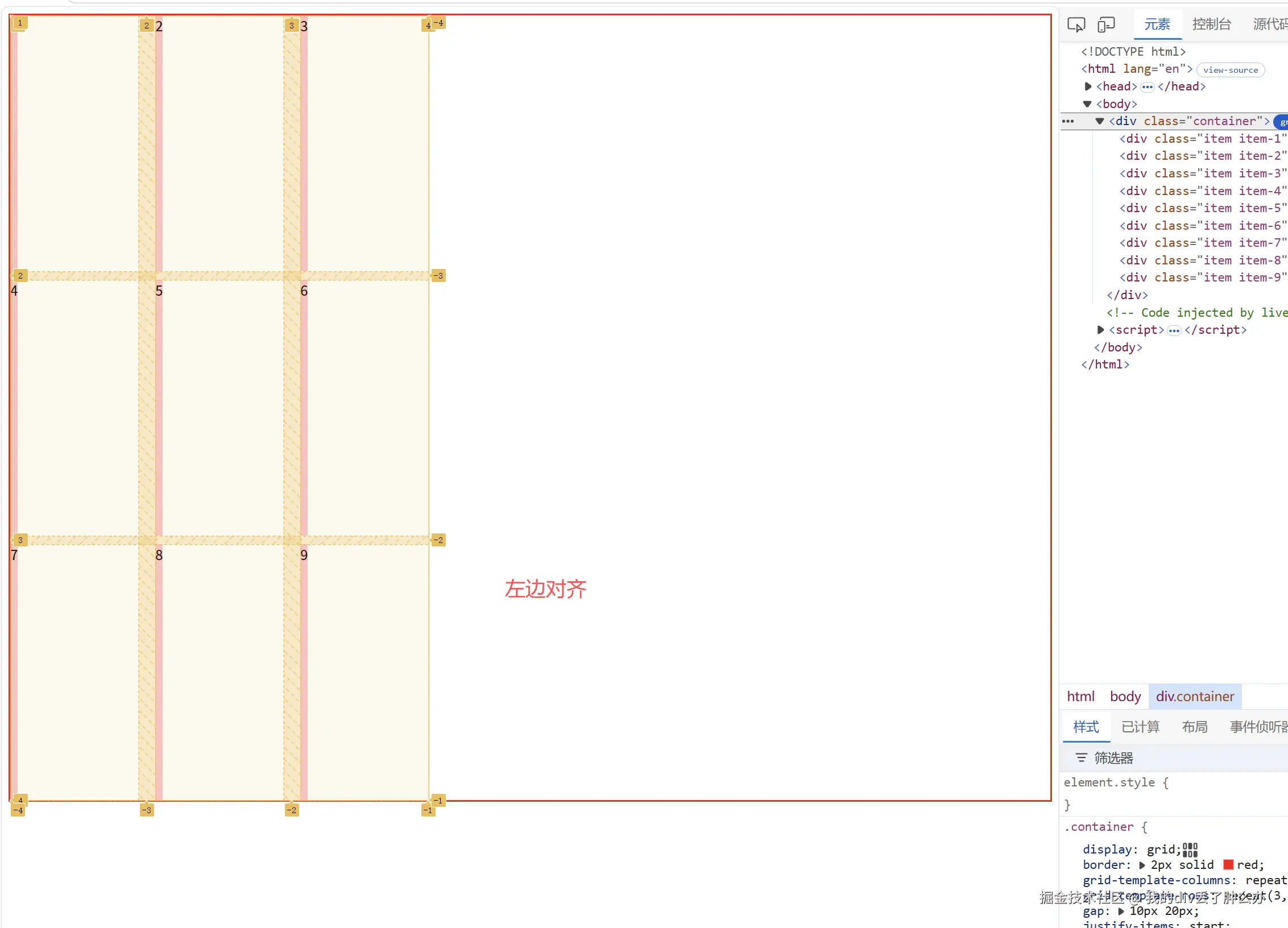
justify-items: start(左边对齐)
css
.container{
    display: grid;
    border: 2px solid red;
    grid-template-columns: repeat(3, 150px);
    grid-template-rows: repeat(3, 300px);
    /* 表示行与行之间间距10px;列与列之间产生间距20px */
    /* 垂直方向上的间距和水平反向上的间距 */
    gap: 10px 20px;
    // 水平方向左对齐
    justify-items: start;
}
.item{
    background: pink;
}
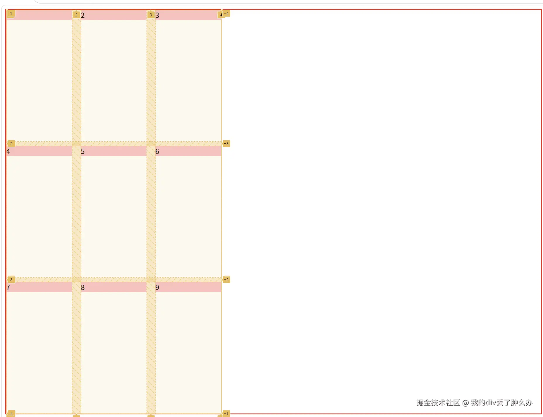
align-items:start(顶部对齐)
css
.container{
    display: grid;
    border: 2px solid red;
    grid-template-columns: repeat(3, 150px);
    grid-template-rows: repeat(3, 300px);
    /* 表示行与行之间间距10px;列与列之间产生间距20px */
    /* 垂直方向上的间距和水平反向上的间距 */
    gap: 10px 20px;
    align-items:  start;
}
.item{
    background: pink;
}
单独设置项目(子元素)的对齐方式
我可以在grid项目(子元素)上使用justify-self和align-self。
来覆盖容器中justify-items和align-items的值
设置第1个子元素水平垂直居中
css
 .container{
    display: grid;
    border: 2px solid red;
    grid-template-columns: repeat(3, 150px);
    grid-template-rows: repeat(3, 300px);
    /* 表示行与行之间间距10px;列与列之间产生间距20px */
    /* 垂直方向上的间距和水平反向上的间距 */
    gap: 10px 20px;
    align-items:  start;
}
.item{
    background: pink;
}
.item-1{
    justify-self: center;
    align-self: center;
}
justify-content 控制所有项目的水平对齐方式
justify-content控制所有项目在水平方向的对齐默认值是start
justify-content: start(左边对齐) || center(中间对齐) || end(右边对齐)
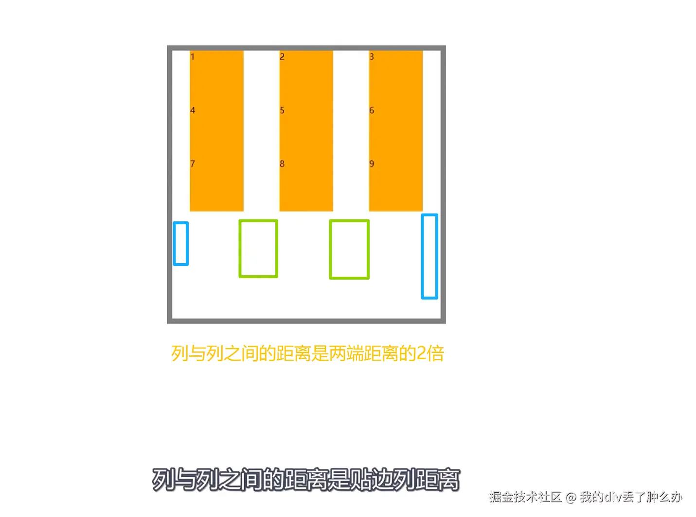
space-between(两端对齐)
space-between(两端对齐,列与列之间的距离是两端距离的两倍)
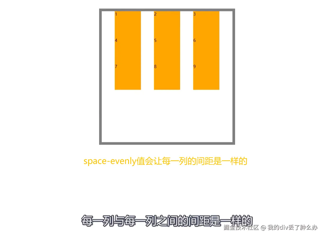
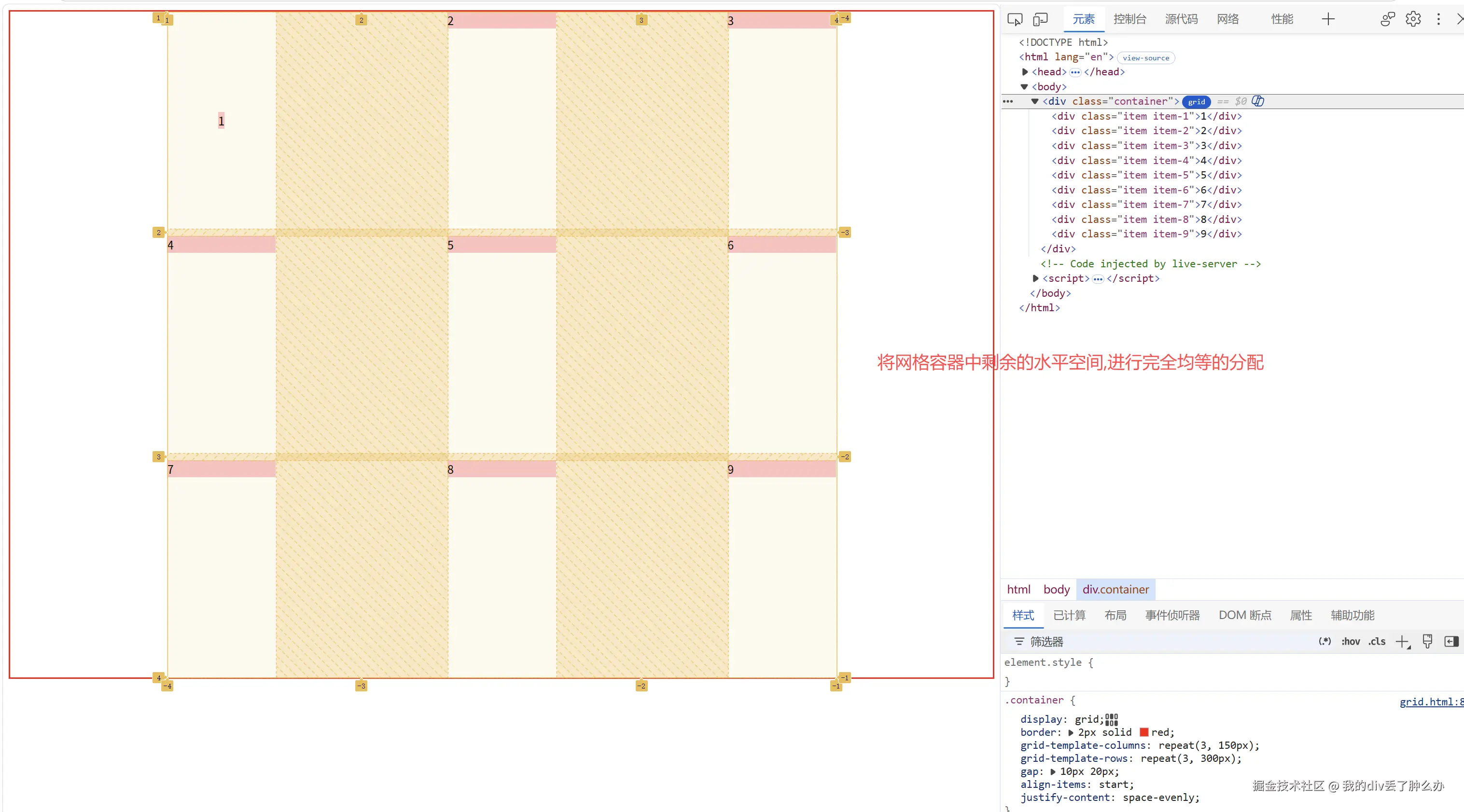
space-evenly(将网格容器中剩余的水平空间,进行完全均等的分配);
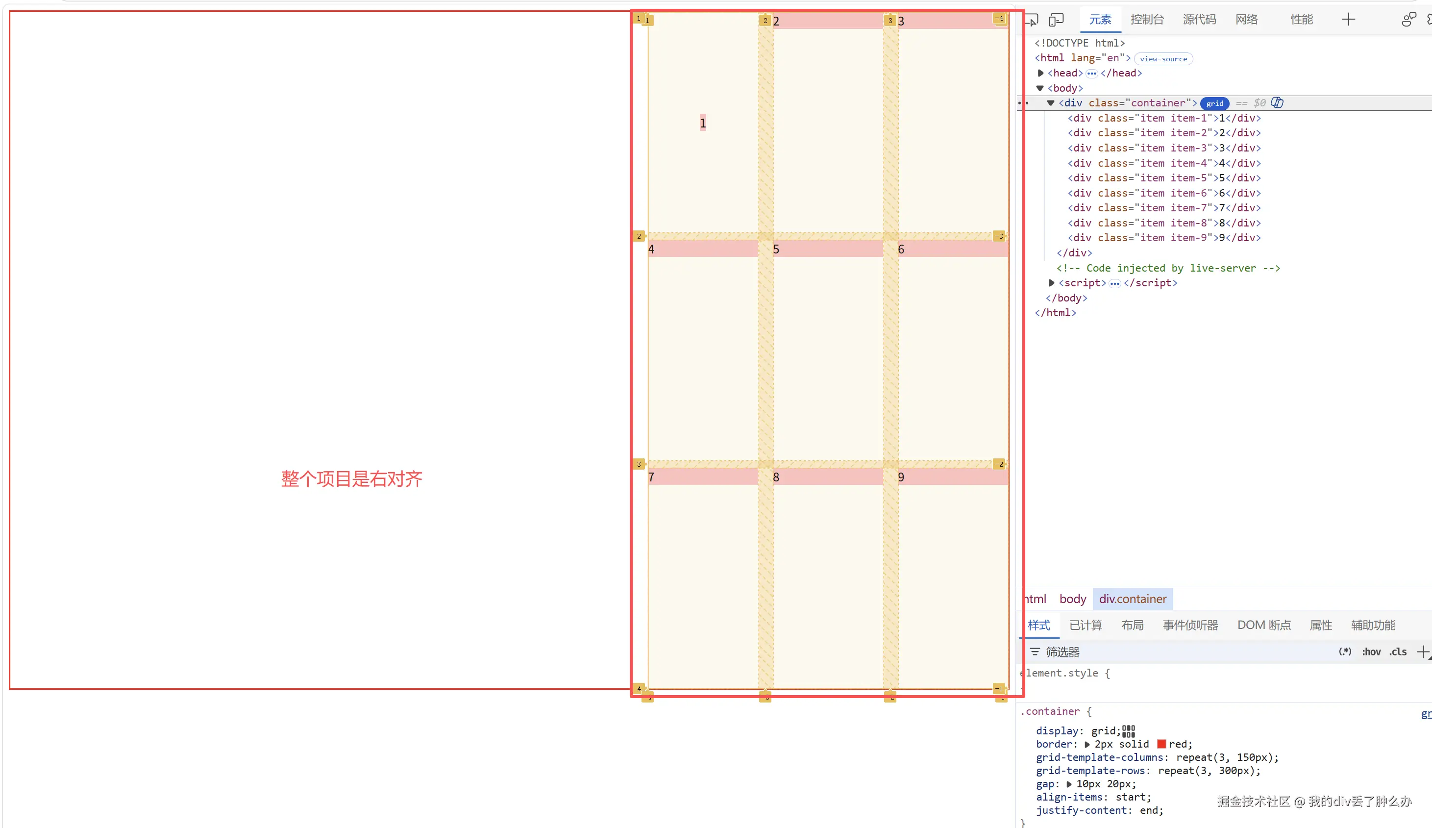
整个项目是右对齐的:justify-content: end;
css
.container{
    display: grid;
    border: 2px solid red;
    grid-template-columns: repeat(3, 150px);
    grid-template-rows: repeat(3, 300px);
    /* 表示行与行之间间距10px;列与列之间产生间距20px */
    /* 垂直方向上的间距和水平反向上的间距 */
    gap: 10px 20px;
    align-items:  start;
    /* 整个项目是右对齐的 */
    justify-content: end;
}
.item{
    background: pink;
}
.item-1{
    justify-self: center;
    align-self: center;
}
将网格容器中剩余的水平空间,进行完全均等的分配 :justify-content: space-evenly;
css
.container{
    display: grid;
    border: 2px solid red;
    grid-template-columns: repeat(3, 150px);
    grid-template-rows: repeat(3, 300px);
    /* 表示行与行之间间距10px;列与列之间产生间距20px */
    /* 垂直方向上的间距和水平反向上的间距 */
    gap: 10px 20px;
    align-items:  start;
    /* 整个项目是右对齐的 */
    justify-content: space-evenly;
}
.item{
    background: pink;
}
.item-1{
    justify-self: center;
}
align-content控制所有项目在垂直方向的对齐
align-content的值: start:靠上。
end:靠下。
center:居中。
stretch(默认):拉伸轨道填满容器。 space-between:上下边缘贴边,中间均分。
space-around:上下间距是中间的一半。
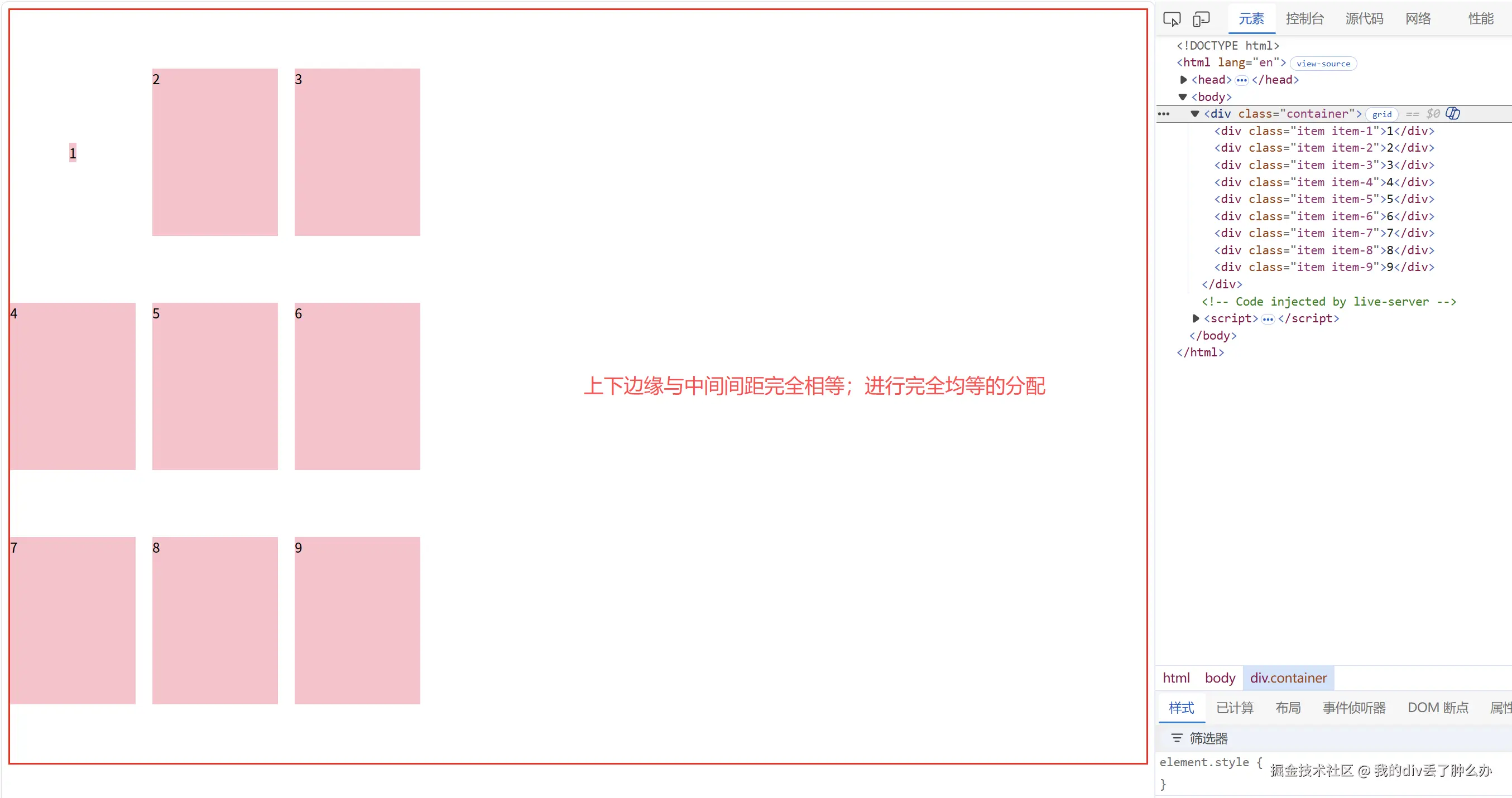
space-evenly:上下边缘与中间间距完全相等。
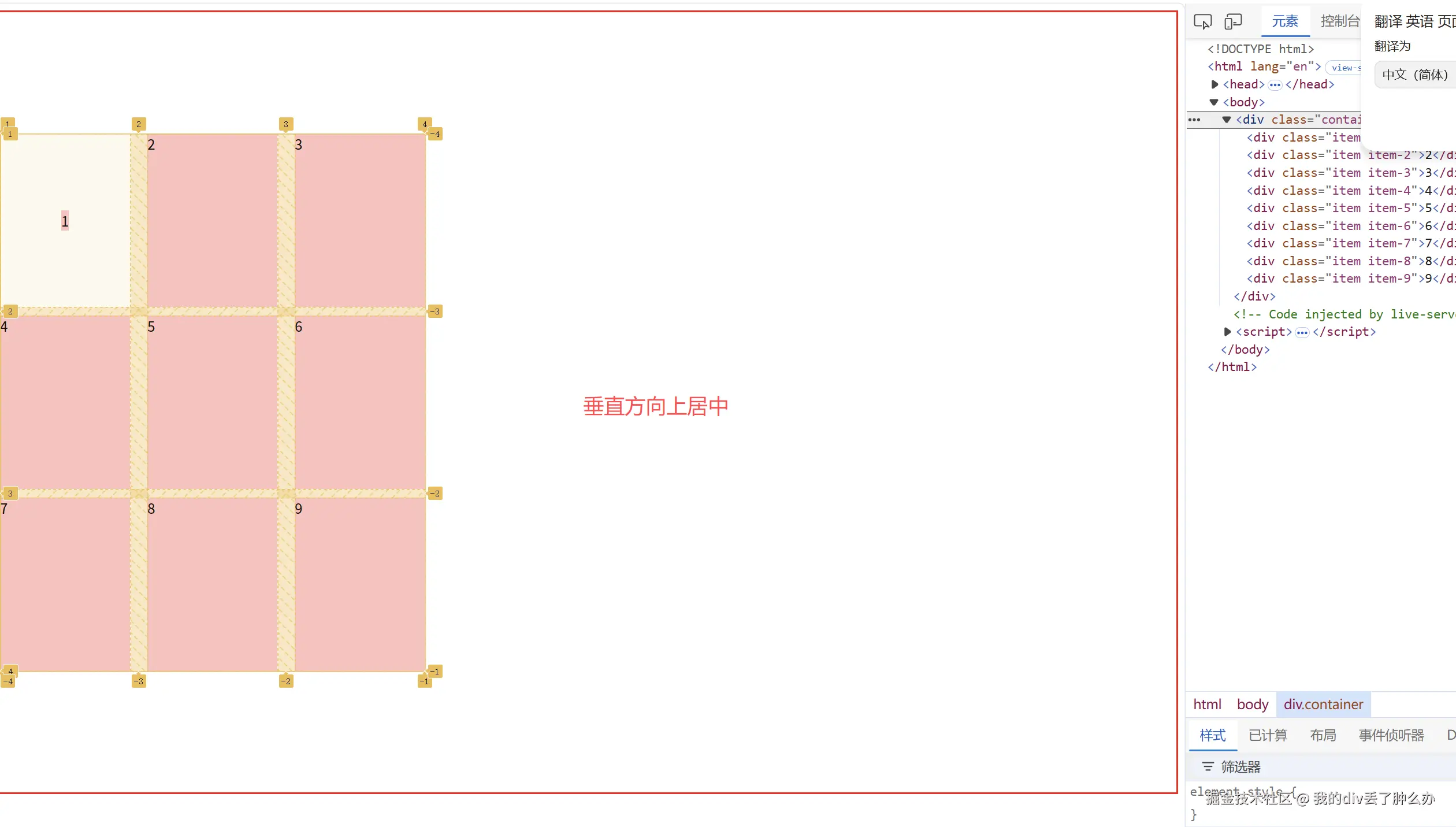
align-content:center 垂直居中
css
.container{
    display: grid;
    border: 2px solid red;
    grid-template-columns: repeat(3, 150px);
    grid-template-rows: repeat(3, 200px);
    /* 表示行与行之间间距10px;列与列之间产生间距20px */
    /* 垂直方向上的间距和水平反向上的间距 */
    gap: 10px 20px;
    /* 让容器高度大于所有内容 */
    height: 900px;
    /*  align-content:center 垂直居中 */
    align-content: center;
}
.item{
    background: pink;
}
.item-1{
    justify-self: center;
    align-self: center;
}
align-content: space-evenly;上下边缘与中间间距完全相等;
css
.container{
    display: grid;
    border: 2px solid red;
    grid-template-columns: repeat(3, 150px);
    grid-template-rows: repeat(3, 200px);
    /* 表示行与行之间间距10px;列与列之间产生间距20px */
    /* 垂直方向上的间距和水平反向上的间距 */
    gap: 10px 20px;
    /* 让容器高度大于所有内容 */
    height: 900px;
    /*  上下边缘与中间间距完全相等;进行完全均等的分配*/
    align-content: space-evenly;
}
.item{
    background: pink;
}
.item-1{
    justify-self: center;
    align-self: center;
}
place-item 是 align-items 和 justify-items的复合写法
place-item: 垂直方向上的对齐方式 水平方向上的对齐方式;
place-item: align-items的取值 justify-items的取值;
使用 place-item 设置垂直居中和水平居中
css
.container{
    display: grid;
    border: 2px solid red;
    grid-template-rows: 100px 100px 100px;
    grid-template-columns:100px 100px 100px ;
    grid-gap: 20px 30px;
    /* 元素纵向排列 */
    grid-auto-flow: column;
    place-items: center center;
}
place-content是 align-content 和 justify-content的复合写法
place-content: align-content的取值 justify-content的取值
-items 和 -content 的对齐区别
*-items:单个项目的对齐,调整网格项目在其自身单元格内部的位置。
align-items和justify-items就是调整项目在这个小盒子里的位置
*-content:整体网格的对齐,调整所有网格作为一个整体在容器中的位置。(当容器有剩余空间时生效)
-content决定的是所有网格轨道作为一个整体在容器中的对齐。
这只有在所有网格轨道的尺寸小于容器尺寸时才会生效(当容器有剩余空间时生效)