学会用 DelegateChooser 实现基础数据委托区分后,开发中会遇到两个高频问题:
- 单行列表的样式差异不止一个维度,多层样式区分该怎么实现?
- TableView 表格中,每一列需要渲染完全不同的控件,该如何适配?
本文通过两个可直接运行的实战 Demo,针对性解决以上问题:
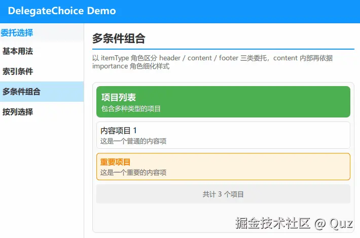
Demo1:实现混合布局列表,同一列表包含页眉、普通内容、重点内容、页脚四类行样式,完成多层级样式差异化渲染;

Demo2:适配 TableView 表格,让表格三列分别渲染文本、开关、进度条三种不同控件,实现表格列差异化自定义渲染。
多条件匹配核心规则
DelegateChooser 支持三种核心匹配条件:roleValue、index、column。
关键核心规则:同一个 DelegateChoice 中叠加多个条件,为「与」关系(全部满足才生效),不存在「或」关系。
基于这个规则,多条件差异化渲染只有两种实现方案,可根据场景灵活选择:
- 多分支拆分 :视觉差异极大、取值固定有限的场景,单独写多条
DelegateChoice,每条对应一种条件组合; - 粗分+精调组合 :先用
DelegateChooser做大的类别区分,细微的样式差异(颜色、字重、透明度等),直接在委托内部通过属性判断实现,代码更简洁、维护性更强。
新手排查报错小技巧
多条件编写后最常见问题:部分列表行/表格格子直接消失不显示。
核心原因:当前行/列没有匹配到任何一条 DelegateChoice 规则。常见诱因:角色名和数据模型不匹配、数据取值类型不一致、叠加条件过于严苛。
最佳优化习惯:复杂场景务必添加兜底 DelegateChoice,既能统一默认样式,又能快速规避空行、消失项的问题,是新手调试的第一道保障。
Demo 1 多条件组合
实现一个项目列表,混合四种行样式:绿色页眉行(展示标题副标题)、普通内容行、橙色高亮重点内容行、灰色页脚汇总行。
实现思路:通过 itemType 区分页眉、内容、页脚三大类行(粗分类);重点/普通内容的细微样式差异,在内容委托内部自行判断适配。
演示代码
qml
import QtQuick
import QtQuick.Controls
import QtQuick.Layouts
import Qt.labs.qmlmodels

FadeInAnimation {
    ColumnLayout {
        anchors.fill: parent
        anchors.margins: 16
        spacing: 12

        // ... 省略标题组件 TitleSeparator ...

        // 内容区:垂直方向填满剩余空间
        Rectangle {
            Layout.fillWidth: true
            Layout.fillHeight: true
            color: "#fafafa"
            radius: 8
            border.color: "#e0e0e0"
            border.width: 1

            ListView {
                anchors.fill: parent
                anchors.margins: 8
                spacing: 8
                clip: true
                ScrollBar.vertical: ScrollBar {}

                model: ListModel {
                    ListElement { itemType: "header"; title: "项目列表"; subtitle: "包含多种类型的项目" }
                    ListElement { itemType: "content"; title: "内容项目 1"; description: "这是一个普通的内容项"; importance: "normal" }
                    ListElement { itemType: "content"; title: "重要项目"; description: "这是一个重要的内容项"; importance: "high" }
                    ListElement { itemType: "footer"; summary: "共计 3 个项目" }
                }

                delegate: DelegateChooser {
                    role: "itemType"

                    DelegateChoice {
                        roleValue: "header"
                        delegate: Rectangle {
                            width: ListView.view.width
                            height: 62
                            color: "#4CAF50"
                            radius: 8

                            ColumnLayout {
                                anchors {
                                    fill: parent
                                    margins: 10
                                }
                                spacing: 3

                                Text {
                                    text: model.title
                                    color: "white"
                                    font {
                                        bold: true
                                        pixelSize: 17
                                    }
                                    Layout.fillWidth: true
                                }
                                Text {
                                    text: model.subtitle
                                    color: "white"
                                    font.pixelSize: 13
                                    Layout.fillWidth: true
                                }
                            }
                        }
                    }

                    DelegateChoice {
                        roleValue: "content"
                        delegate: Rectangle {
                            width: ListView.view.width
                            height: 54
                            radius: 6

                            property bool isHighImportance: model.importance === "high"

                            color: isHighImportance ? "#FFF3E0" : "white"
                            border {
                                color: isHighImportance ? "#FF9800" : "#e0e0e0"
                                width: 1
                            }

                            ColumnLayout {
                                anchors {
                                    fill: parent
                                    margins: 8
                                }
                                spacing: 3

                                Text {
                                    text: model.title
                                    font {
                                        bold: isHighImportance
                                        pixelSize: 15
                                    }
                                    color: isHighImportance ? "#F57C00" : "black"
                                    Layout.fillWidth: true
                                }
                                Text {
                                    text: model.description
                                    font.pixelSize: 13
                                    color: "#666666"
                                    Layout.fillWidth: true
                                }
                            }
                        }
                    }

                    DelegateChoice {
                        roleValue: "footer"
                        delegate: Rectangle {
                            width: ListView.view.width
                            height: 38
                            color: "#EEEEEE"
                            radius: 4

                            Text {
                                anchors.centerIn: parent
                                text: model.summary
                                font.pixelSize: 13
                                color: "#666666"
                            }
                        }
                    }
                }
            }
        }
    }
}
关键逻辑解析
这个列表案例的核心逻辑非常简单,整体采用「先粗分、后微调」的思路。首先根据数据里的 itemType 类型,把列表行统一分成页眉、内容、页脚三大类,用三条规则分别渲染对应的样式,实现整体结构区分。
针对内容行里「普通项目」和「重点项目」的细微样式区别,没有新增多余规则,而是直接在内容组件内部做一次简单判断,统一控制文字颜色、背景和边框样式,代码更简洁好维护。
只需要记住一个关键点:规则里的角色值,必须和数据里写的内容完全一致,不然样式会匹配失效。这个示例已经覆盖了所有数据类型,所以不用兜底样式,新手写复杂列表时,建议加上兜底样式,避免页面出现空白行。
Demo 2 按列选择委托
实现功能配置表格,表格共三列,每列渲染完全不同的控件:第一列展示纯文本功能名称、第二列展示可交互开关、第三列展示进度条。同时实现开关切换仅刷新当前单元格,避免全局闪烁。
演示代码
qml
import QtQuick
import QtQuick.Controls
import QtQuick.Layouts
import Qt.labs.qmlmodels

FadeInAnimation {
    id: root

    // 开关状态的数据源(仅作为 TableModel 的初始行数据)
    property var settingsData: [
        { name: "自动保存文档", enabled: true,  progress: 1.0 },
        { name: "拼写检查",     enabled: false, progress: 0.0 },
        { name: "云端同步",     enabled: true,  progress: 0.6 },
        { name: "同步书签",     enabled: true,  progress: 0.35 }
    ]

    function setEnabled(rowIndex, value) {
        // setData 只会触发第 1 列那一格的更新,整表其它列不重建,解决了第一列闪烁的问题
        tableModel.setData(tableModel.index(rowIndex, 1), value, "display")
    }

    ColumnLayout {
        anchors.fill: parent
        anchors.margins: 16
        spacing: 12

        // ... 省略标题组件 TitleSeparator ...

        // 内容区:垂直方向填满剩余空间
        Rectangle {
            id: card
            Layout.fillWidth: true
            Layout.fillHeight: true
            color: "#fafafa"
            radius: 8
            border.color: "#e0e0e0"
            border.width: 1

            readonly property var colWidths: [170, 90, 220]

            ColumnLayout {
                anchors.fill: parent
                anchors.margins: 10
                spacing: 6

                // 简易表头,宽度与下方各列保持一致
                RowLayout {
                    Layout.fillWidth: true
                    spacing: 0

                    Text {
                        Layout.preferredWidth: card.colWidths[0]
                        text: "功能"
                        font.pixelSize: 12
                        font.bold: true
                        color: "#1296FF"
                    }
                    Text {
                        Layout.preferredWidth: card.colWidths[1]
                        text: "启用"
                        font.pixelSize: 12
                        font.bold: true
                        color: "#1296FF"
                        horizontalAlignment: Text.AlignHCenter
                    }
                    Text {
                        Layout.preferredWidth: card.colWidths[2]
                        text: "进度"
                        font.pixelSize: 12
                        font.bold: true
                        color: "#1296FF"
                        horizontalAlignment: Text.AlignHCenter
                    }
                }

                Rectangle {
                    Layout.fillWidth: true
                    Layout.preferredHeight: 1
                    color: "#e0e0e0"
                }

                TableView {
                    Layout.fillWidth: true
                    Layout.fillHeight: true
                    clip: true
                    rowSpacing: 6
                    columnSpacing: 0
                    columnWidthProvider: function (column) { return card.colWidths[column] }
                    rowHeightProvider: function () { return 40 }
                    ScrollBar.vertical: ScrollBar { policy: ScrollBar.AsNeeded }

                    model: TableModel {
                        id: tableModel
                        TableModelColumn { display: "name" }
                        TableModelColumn { display: "enabled" }
                        TableModelColumn { display: "progress" }
                        rows: root.settingsData
                    }

                    delegate: DelegateChooser {
                        // 第 0 列:纯文本
                        DelegateChoice {
                            column: 0
                            delegate: Text {
                                required property var display
                                text: display
                                font.pixelSize: 14
                                color: "#333"
                                verticalAlignment: Text.AlignVCenter
                                elide: Text.ElideRight
                            }
                        }
                        // 第 1 列:可点击的开关,切换后写回数据源
                        DelegateChoice {
                            column: 1
                            delegate: Item {
                                required property var display
                                Switch {
                                    anchors.centerIn: parent
                                    checked: parent.display
                                    onToggled: root.setEnabled(row, checked)
                                }
                            }
                        }
                        // 第 2 列:进度条控件
                        DelegateChoice {
                            column: 2
                            delegate: ProgressBar {
                                required property var display
                                value: display
                                from: 0
                                to: 1
                            }
                        }
                    }
                }
            }
        }
    }
}
关键逻辑解析
表格案例的核心逻辑和列表刚好相反,不用复杂的角色匹配,直接通过列号区分不同单元格的渲染控件,第几列就对应展示什么内容,非常直观。
代码里的表格列顺序,和页面展示的数据是一一对应的,修改表格结构时不要乱改顺序,防止数据错乱。同时这个案例做了很好的性能优化,切换开关时只会刷新当前点击的格子,不会让整个表格闪烁,体验更流畅。
最后注意,开关的修改只是临时生效,只会改变当前页面的显示效果,不会改动原始数据,刷新页面就会恢复默认状态。
两个场景对比
| 维度 | 多条件组合 | 按列选择 |
|---|---|---|
| 用的条件 | roleValue(可写多条) |
column |
| 模型 | ListModel |
TableModel(配 TableView) |
| 差异来自 | 数据行的类型 | 列的位置 |
| 委托里怎么取数据 | model.角色名 |
required property var display 加 row / column |
| 典型场景 | 混排列表、时间线、带页眉页脚的列表 | 设置表格、参数面板、可编辑数据表 |
两者的选择依据其实是一句话:差异按行变,就用角色匹配;差异按列变,就用列匹配。行和列都要挑(比如表格里某一列还要按行类型换控件),把 roleValue 和 column 写在同一条 DelegateChoice 上就行,条件是叠加的。
已验证环境:
- Qt 版本:Qt 6.8.2 / Qt 6.11.1
- 操作系统:Windows 11
- GitHub:QML-Minimal-Demos/qml_delegatechoice