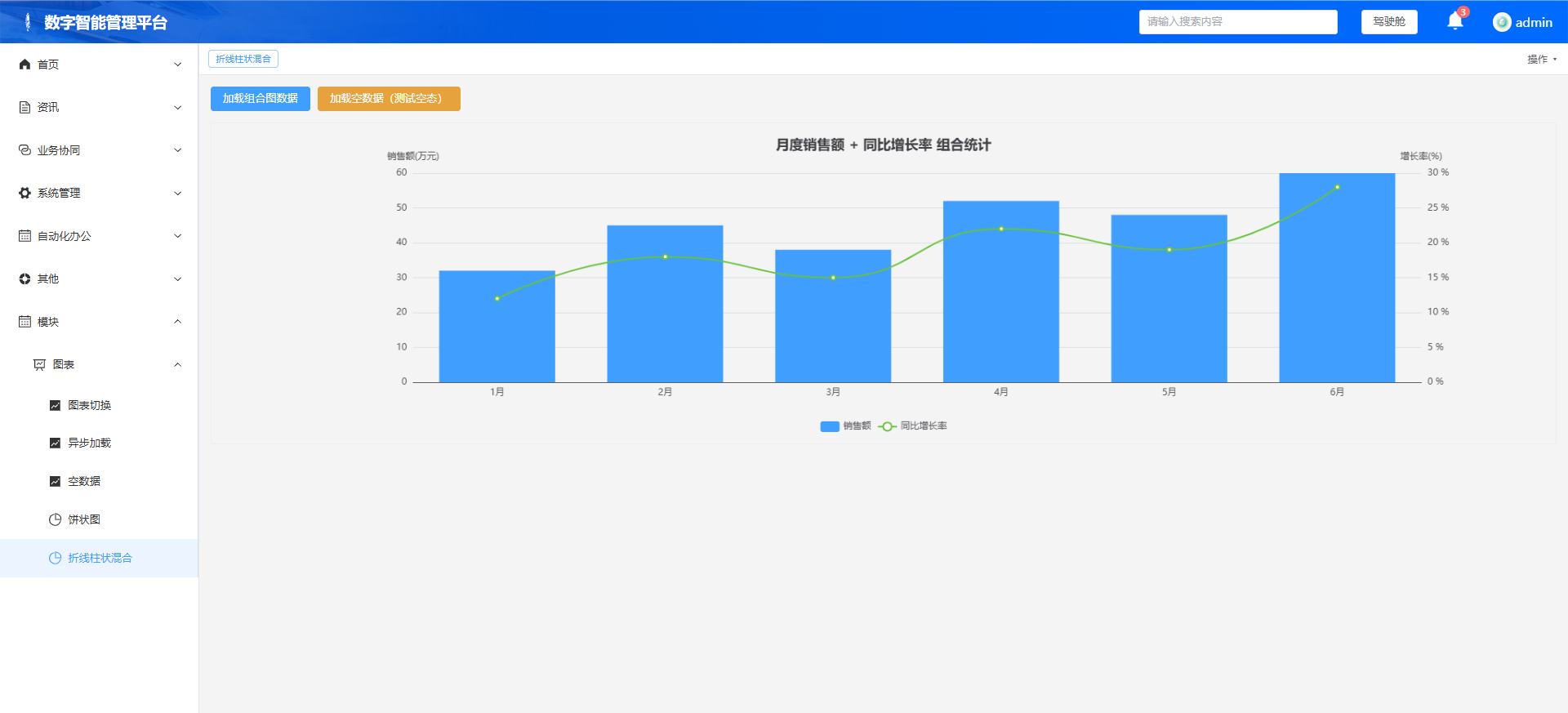
第 7 章:双 Y 轴组合图(柱状 + 折线,看板高频场景)
本章目标:实现业务最常用的组合看板图:左 Y 轴展示销售额(柱状),右 Y 轴展示同比增长率(折线),双轴独立刻度,复用我们封装好的
useEcharts。
完整 chartDemo.vue 代码
<template>
  <div class="chart-container">
    <el-button type="primary" @click="loadComboData">加载组合图数据</el-button>
    <el-button type="warning" @click="loadComboEmptyData" style="margin-left:10px;">加载空数据(测试空态)</el-button>
    <div
      ref="comboChartRef"
      v-loading="loading"
      style="
        width: 100%;
        height: 420px;
        border: 1px solid #eee;
        margin-top: 15px;
      "
    ></div>
  </div>
</template>

<script setup>
import { onMounted, ref } from 'vue'
import { useEcharts } from '@/composables/echartHelper'
import { ElMessage } from 'element-plus'

const { chartRef: comboChartRef, setChartOption: setComboOption } = useEcharts()
const loading = ref(false)

// 空数据配置(复用之前修复好的清空逻辑)
const getEmptyOption = () => ({
  title: { text: '' },
  tooltip: {},
  legend: { data: [] },
  series: [],
  graphic: [
    {
      type: 'text',
      left: 'center',
      top: 'middle',
      style: {
        text: '暂无数据',
        fill: '#999',
        fontSize: 14
      }
    }
  ]
})

// 构建组合图配置
const buildComboOption = (xData, saleData, rateData) => {
  return {
    title: {
      text: '月度销售额 + 同比增长率 组合统计',
      left: 'center'
    },
    tooltip: {
      trigger: 'axis',
      axisPointer: {
        type: 'cross' // 十字准星,组合图标配
      }
    },
    legend: {
      data: ['销售额', '同比增长率'],
      bottom: 10
    },
    xAxis: [
      {
        type: 'category',
        data: xData,
        axisPointer: {
          type: 'shadow'
        }
      }
    ],
    yAxis: [
      {
        type: 'value',
        name: '销售额(万元)',
        min: 0,
        position: 'left'
      },
      {
        type: 'value',
        name: '增长率(%)',
        position: 'right',
        axisLabel: {
          formatter: '{value} %'
        }
      }
    ],
    series: [
      {
        name: '销售额',
        type: 'bar', // 柱状图,对应左Y轴
        data: saleData,
        itemStyle: {
          color: '#409EFF'
        }
      },
      {
        name: '同比增长率',
        type: 'line', // 折线图,对应右Y轴
        yAxisIndex: 1, // 指定用第二个Y轴(右轴)
        smooth: true,
        data: rateData,
        itemStyle: {
          color: '#67C23A'
        }
      }
    ]
  }
}

// 加载正常组合图数据
const loadComboData = () => {
  const xData = ['1月','2月','3月','4月','5月','6月']
  const saleData = [32, 45, 38, 52, 48, 60]
  const rateData = [12, 18, 15, 22, 19, 28] // 同比增长率
  setComboOption(buildComboOption(xData, saleData, rateData), true)
  ElMessage.success('组合图数据加载完成')
}

// 加载空数据
const loadComboEmptyData = () => {
  const xData = []
  if (!xData.length) {
    setComboOption(getEmptyOption(), true)
    ElMessage.warning('暂无组合图数据')
    return
  }
  setComboOption(buildComboOption([], [], []), true)
}

onMounted(() => {
  loadComboData()
})
</script>
第 7 章测试清单
- 替换页面代码,保存刷新
- 逐项测试:
✅ 页面渲染组合图:蓝色柱子在左轴对应销售额,绿色折线在右轴对应增长率
✅ 鼠标悬浮十字准星,同时显示当月销售额和增长率
✅ 点击底部图例,可以单独隐藏柱子或折线
✅ 点击【加载空数据】,旧图表清空,显示 "暂无数据"
✅ 切回正常数据,无配置残留
✅ 窗口拉伸自适应,菜单切换无报错
核心知识点
- 双 Y 轴 :
yAxis配置两个对象,柱状图默认用yAxisIndex: 0(左轴),折线图手动指定yAxisIndex: 1(右轴),实现两套独立刻度 - 跨图类型 :
series数组里不同 item 指定不同type,就能同图混合柱状、折线、散点等多种图表 - 交叉提示 :
tooltip.axisPointer.type: 'cross'是双轴组合图标配,悬浮时十字线对齐,读数不混淆