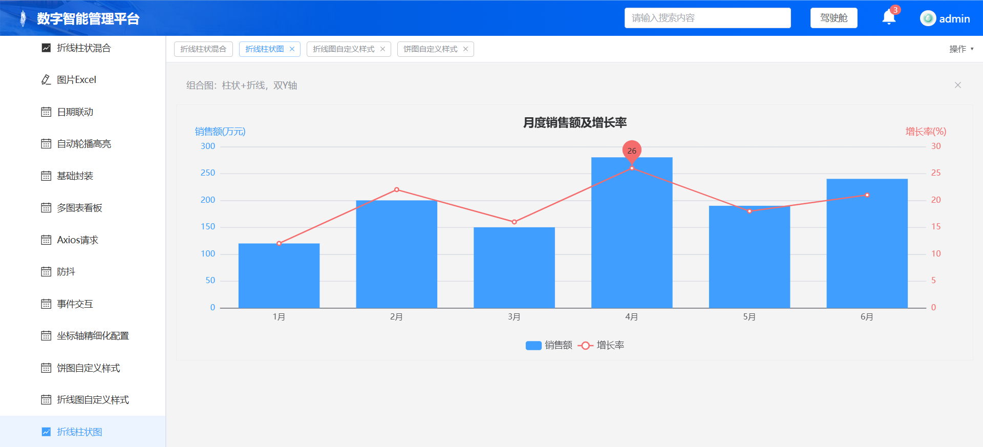
第19章:ECharts 组合图(折线 + 柱状混合图,双 Y 轴)
业务场景:一张图表同时展示两种不同量级的数据,例如:柱子展示销售额,折线展示增长率。双 Y 轴分别对应不同单位,是后台数据看板高频图表。继续复用我们封装好的
useEcharts,不需要修改echartHelper.js。
页面完整 Vue 代码
<template>
  <div class="chart-container">
    <el-alert title="组合图:柱状+折线,双Y轴" type="info" style="margin-bottom:10px"/>
    <div
      ref="chartRef"
      style="width:100%;height:400px;border:1px solid #eee"
    ></div>

    <el-dialog v-model="dialogVisible" title="图表点击详情">
      <p>月份:{{ clickData.name }}</p>
      <p>类型:{{ clickData.seriesName }}</p>
      <p>数值:{{ clickData.value }}</p>
    </el-dialog>
  </div>
</template>

<script setup>
import { ref } from 'vue'
import { useEcharts } from '@/composables/echartHelper'
const { chartRef, setChartOption, onChartEvent } = useEcharts()

const dialogVisible = ref(false)
const clickData = ref({ name:'', seriesName:'', value:0 })

const option = {
  title: {
    text: '月度销售额及增长率',
    left: 'center',
    textStyle: {
      fontSize:18,
      color:'#303133'
    }
  },
  tooltip: {
    trigger: 'axis',
    axisPointer: {
      type: 'cross'
    }
  },
  legend: {
    data: ['销售额','增长率'],
    bottom: 10,
    textStyle: { fontSize:14 }
  },
  grid: {
    left: '3%',
    right: '4%',
    bottom: '15%',
    containLabel: true
  },
  xAxis: {
    type: 'category',
    data: ['1月','2月','3月','4月','5月','6月'],
    axisLabel: { fontSize:13 }
  },
  yAxis: [
    {
      type: 'value',
      name: '销售额(万元)',
      min: 0,
      nameTextStyle: { fontSize:14, color:'#409EFF' },
      axisLabel: { fontSize:13, color:'#409EFF' }
    },
    {
      type: 'value',
      name: '增长率(%)',
      min: 0,
      max: 30,
      position: 'right', // 右侧Y轴
      nameTextStyle: { fontSize:14, color:'#F56C6C' },
      axisLabel: { fontSize:13, color:'#F56C6C' }
    }
  ],
  series: [
    {
      name: '销售额',
      type: 'bar',
      yAxisIndex: 0, // 使用左侧Y轴
      data: [120, 200, 150, 280, 190, 240],
      itemStyle: { color: '#409EFF' }
    },
    {
      name: '增长率',
      type: 'line',
      yAxisIndex: 1, // 使用右侧Y轴
      data: [12, 22, 16, 26, 18, 21],
      itemStyle: { color: '#F56C6C' },
      markPoint: {
        data: [{type:'max',name:'最高增长率'}]
      }
    }
  ]
}

setChartOption(option)

// 点击事件,同时支持柱子和折点点击
onChartEvent('click', (params)=>{
  console.log('点击参数', params)
  clickData.value = {
    name: params.name,
    seriesName: params.seriesName,
    value: params.value
  }
  dialogVisible.value = true
})
</script>
✅ 测试步骤
- 保存 vue 文件,刷新页面
- 图表渲染成功:蓝色柱子代表销售额(左 Y 轴),红色折线代表增长率(右 Y 轴)
- 鼠标悬浮,tooltip 同时展示当月销售额和增长率
- 点击柱子或者折线上的点,弹窗展示对应信息
- 缩放浏览器窗口,防抖 resize 自适应正常
- 切换路由,图表实例正常销毁,无内存泄漏
拓展知识点
yAxisIndex用来绑定当前系列使用哪一条 y 轴;多个系列可以自由混合 bar、line 等图表类型。