CSS 核心布局指南:盒模型、Flex 布局与 Position 定位(从入门到 React 实战)
学习目标:理解 CSS 布局的三个核心机制,能够看懂 React 项目中常见的页面布局代码,独立实现导航栏、筛选表单、任务列表、固定按钮等业务页面。
一、CSS 布局的核心思路
在前端开发中,HTML 负责描述页面结构,而 CSS 负责控制页面的样式和布局。
理解 CSS 布局,首先要回答三个问题:
| 核心问题 | CSS 知识点 | 作用 |
|---|---|---|
| 一个元素占多大空间? | Box Model | 控制宽高、内外边距、边框 |
| 多个元素如何排列? | Flex | 控制横向、纵向、居中、间距 |
| 元素如何放在指定位置? | Position | 控制相对、绝对、固定、粘性定位 |
可以简单理解为:
盒模型管尺寸,Flex 管排列,Position 管定位。
第一部分:CSS 盒模型(Box Model)
1. 什么是盒模型?
浏览器会将大部分 HTML 元素按照矩形盒子的形式进行布局。
例如:
ini
<div class="box">Hello CSS</div>
css
.box {
  width: 200px;
  height: 100px;
  padding: 20px;
  border: 5px solid blue;
  margin: 10px;
}
一个盒子由四部分组成:
- Content(内容区) :存放文字、图片等内容。
- Padding(内边距) :内容与边框之间的距离。
- Border(边框) :围绕内容和内边距的边框。
- Margin(外边距) :元素与其他元素之间的外部距离。
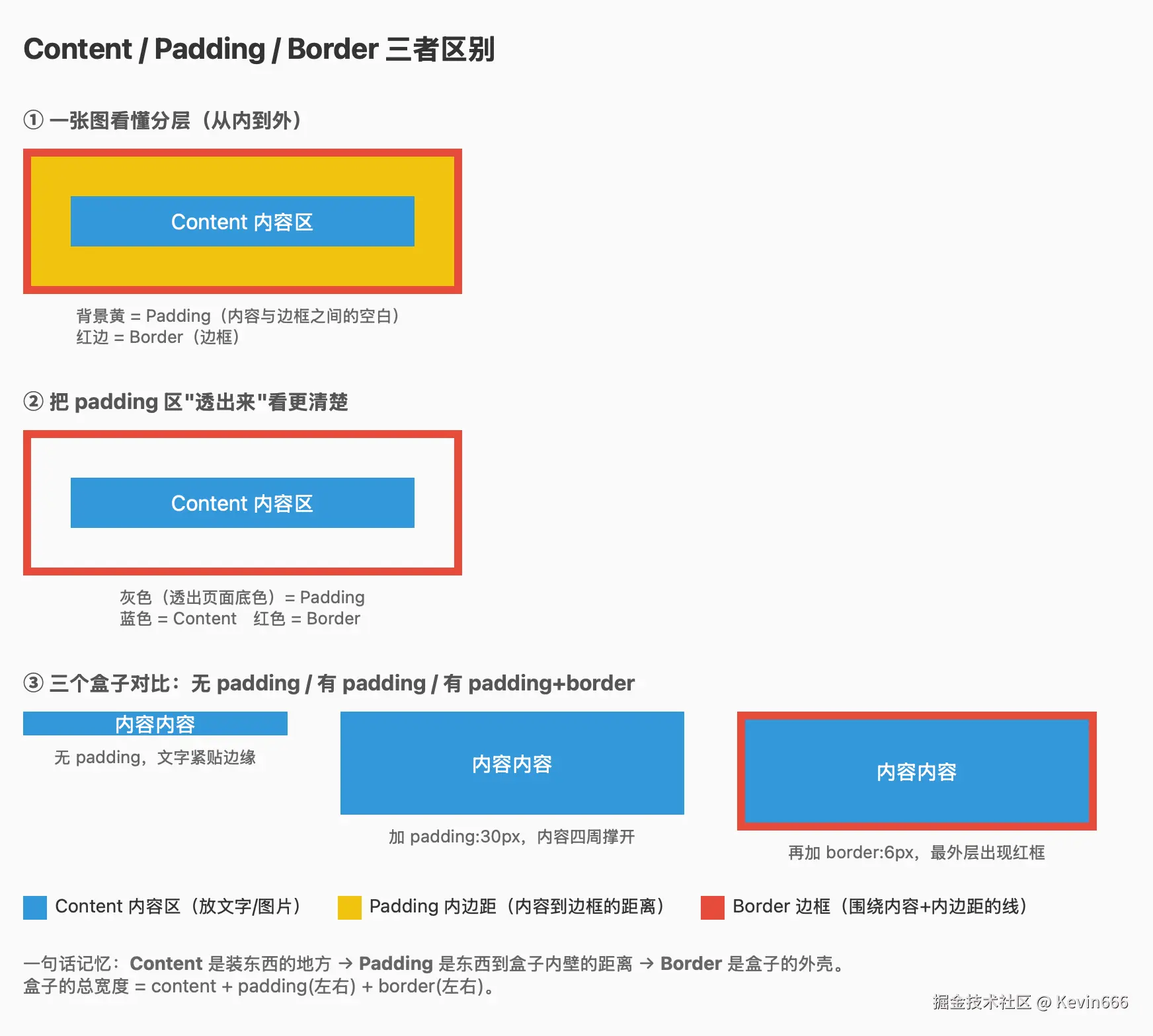 从内到外:
css
┌──────────────────────────────┐
│           Margin             │
│  ┌────────────────────────┐  │
│  │         Border         │  │
│  │  ┌──────────────────┐  │  │
│  │  │     Padding      │  │  │
│  │  │  ┌────────────┐  │  │  │
│  │  │  │  Content   │  │  │  │
│  │  │  └────────────┘  │  │  │
│  │  └──────────────────┘  │  │
│  └────────────────────────┘  │
└──────────────────────────────┘
四个属性的区别
css
.box {
  width: 200px;        /* 内容宽度 */
  padding: 20px;       /* 内边距 */
  border: 5px solid;   /* 边框 */
  margin: 10px;        /* 外边距 */
}
理解重点:
padding是盒子内部的间距。margin是盒子外部的间距。border是盒子的边界。width默认设置内容区的宽度。
2. 盒模型的宽度如何计算?
这是盒模型最值得掌握的知识点。
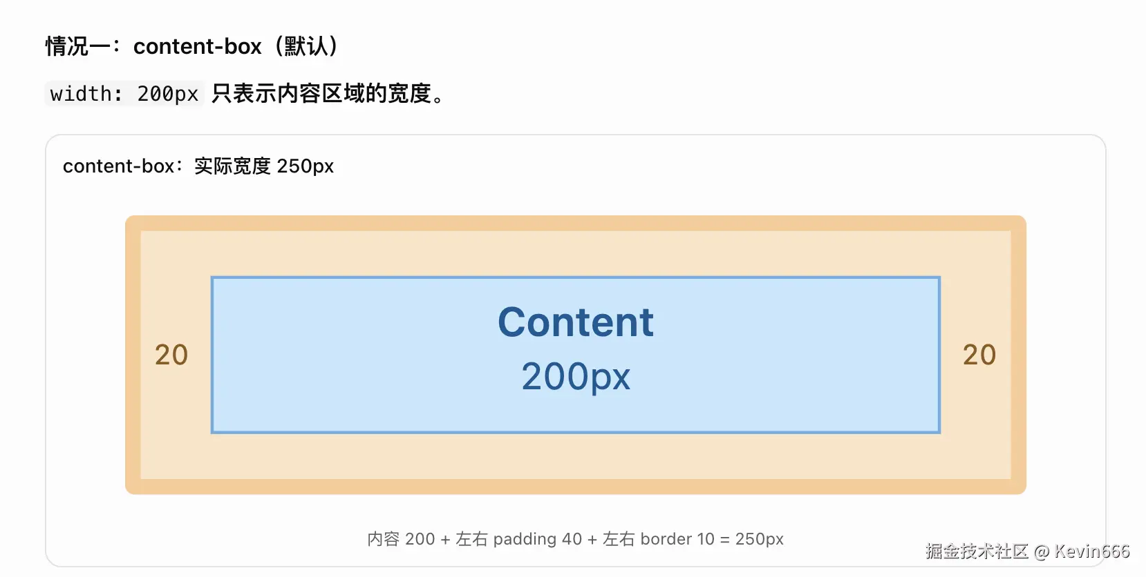
2.1 默认盒模型:content-box
css
.box {
  box-sizing: content-box;

  width: 200px;
  padding: 20px;
  border: 5px solid;
}
实际盒子宽度:
css
内容宽度:200px
左右 padding:20px × 2
左右 border:5px × 2

实际宽度 = 200 + 40 + 10
         = 250px
公式:
实际边框盒宽度 = width + 左右 padding + 左右 border
如果还要计算外边距占用的空间,则需要再考虑左右 margin。
2.2 推荐盒模型:border-box
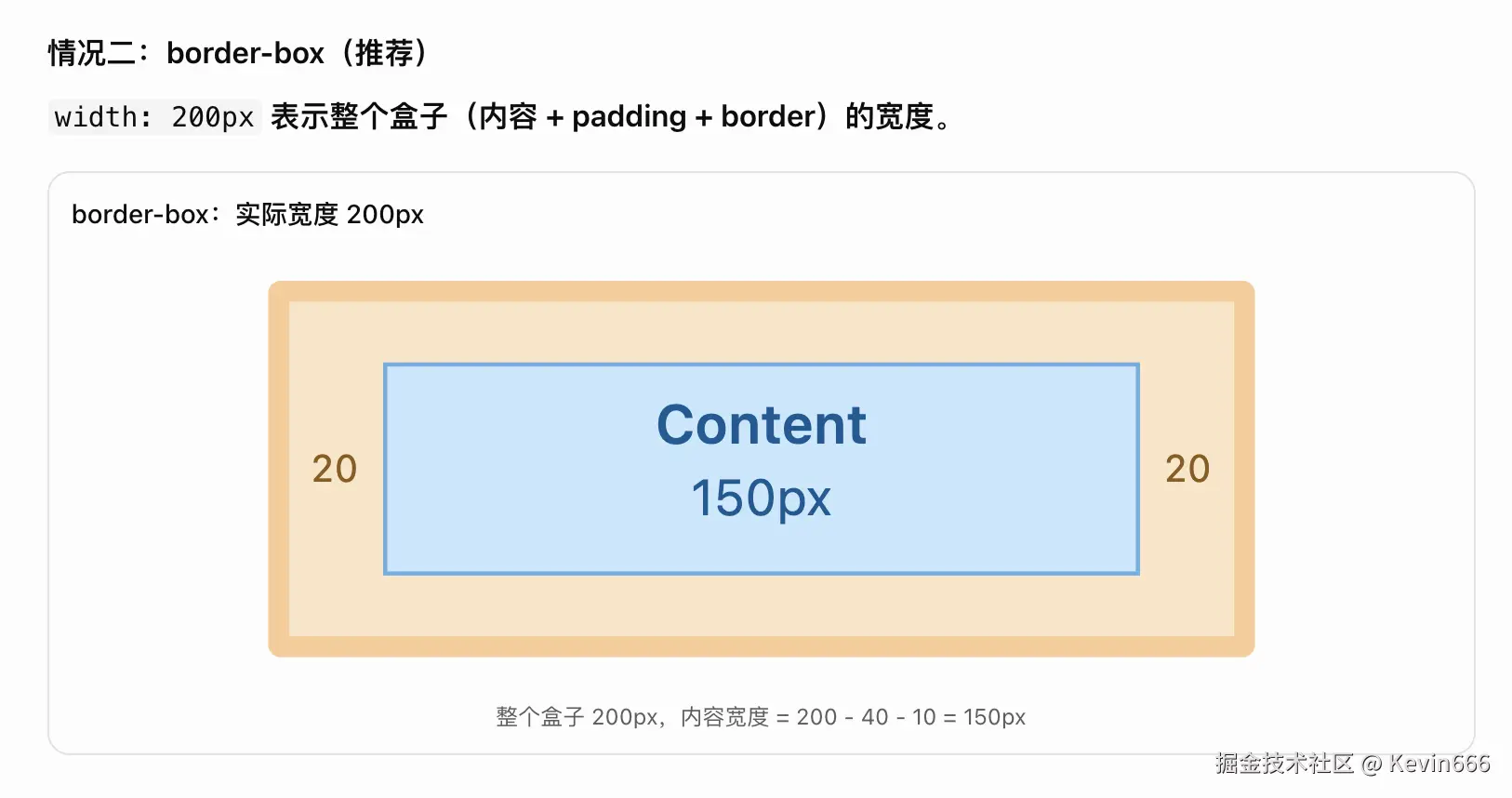
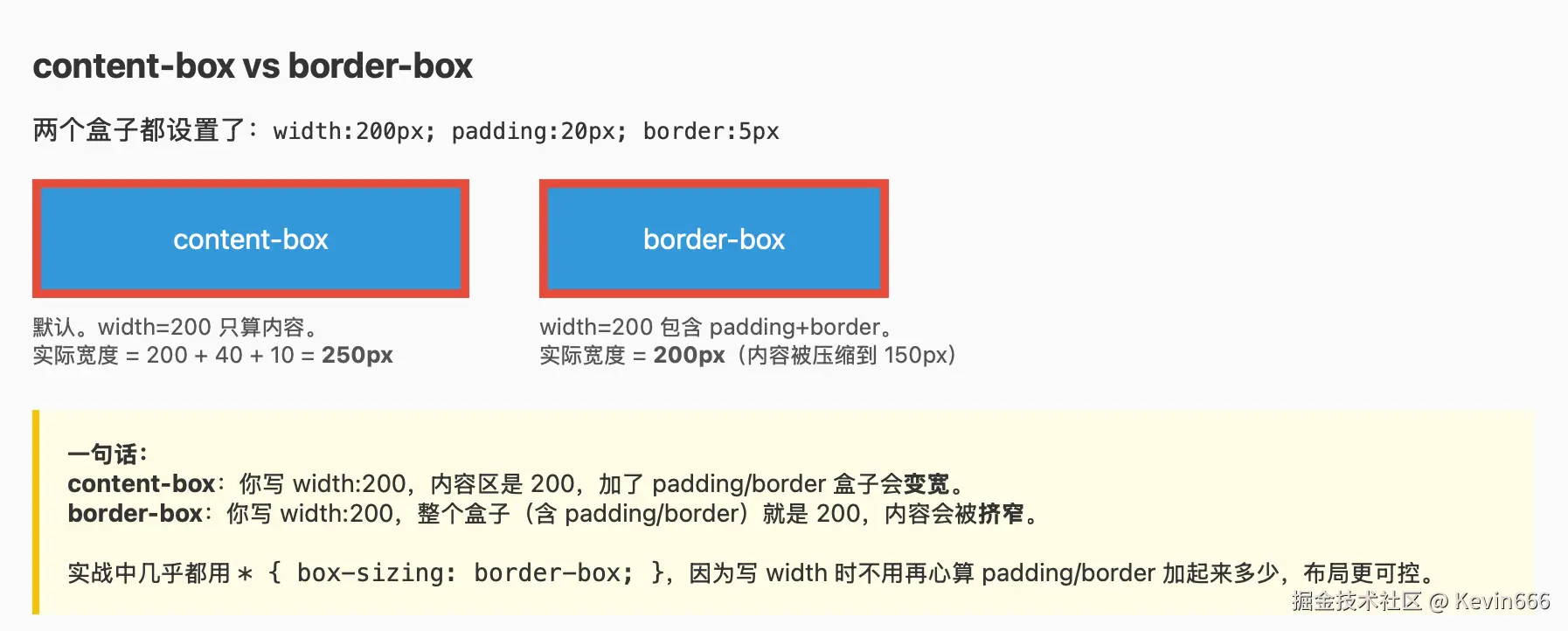 现代前端开发中,通常推荐:
css
* {
  box-sizing: border-box;
}
例如:
css
.box {
  box-sizing: border-box;

  width: 200px;
  padding: 20px;
  border: 5px solid;
}
此时实际边框盒宽度就是:
200px因为 width 已经包含了 padding 和 border。
两种盒模型对比:
| 属性 | content-box | border-box |
|---|---|---|
| width 包含内容 | 是 | 是 |
| width 包含 padding | 否 | 是 |
| width 包含 border | 否 | 是 |
| 推荐程度 | 了解即可 | 推荐使用 |
注意:border-box 也不包含 margin。
2.3 margin 与 padding 的区别
css
.card {
  margin: 20px;
  padding: 16px;
}
margin: 20px:卡片与外界保持距离。padding: 16px:卡片内容与卡片边缘保持距离。
在 React 中后台系统中,几乎每个卡片、弹窗、表单都会使用这两个属性。
2.4 四个方向的简写
css
.box {
  margin: 10px;                /* 四个方向 */
  margin: 10px 20px;           /* 上下、左右 */
  margin: 10px 20px 30px;      /* 上、左右、下 */
  margin: 10px 20px 30px 40px; /* 上、右、下、左 */
}
记忆顺序:
上 → 右 → 下 → 左(顺时针)
另外,margin: 0 auto 经常用于让指定宽度的块级元素水平居中。
2.5 注意 margin 合并
普通文档流中,相邻块级元素的上下 margin 在特定条件下可能发生折叠。
例如:
css
.first {
  margin-bottom: 20px;
}

.second {
  margin-top: 30px;
}
两个元素之间的距离可能是 30px,而不是 50px。
这种现象叫 Margin Collapsing(外边距折叠)。
在 Flex 和 Grid 布局中,Flex/Grid 子项之间不会发生这种外边距折叠,因此现代布局可以优先使用 gap 控制间距。
第二部分:Flex 布局(重点)
**这部分有点绕,给个比较好学习的方式,就是下面的这个网页动画,实操一下就能快速理解了!!! **
html
<!DOCTYPE html>
<html lang="zh-CN">
<head>
  <meta charset="UTF-8" />
  <meta name="viewport" content="width=device-width, initial-scale=1.0" />
  <title>Flex 布局交互演示</title>

  <style>
    * {
      box-sizing: border-box;
    }

    body {
      font-family: Arial, sans-serif;
      padding: 30px;
      background: #f5f6f8;
    }

    .panel {
      max-width: 650px;
      margin: 0 auto;
      padding: 24px;
      background: white;
      border-radius: 12px;
    }

    /* Flex 演示容器 */
    .container {
      display: flex;
      flex-direction: row;
      justify-content: flex-start;
      align-items: center;
      gap: 8px;

      height: 250px;
      padding: 12px;
      border: 2px dashed #aaa;
      border-radius: 8px;
    }

    /* 三个演示元素 */
    .item {
      padding: 12px 20px;
      background: #dceafe;
      border: 1px solid #81afe5;
      border-radius: 6px;
      color: #205e9a;
    }

    .control {
      margin-top: 20px;
    }

    label {
      display: block;
      margin-bottom: 8px;
      font-weight: bold;
    }

    select {
      width: 100%;
      padding: 10px;
      border: 1px solid #ccc;
      border-radius: 6px;
    }

    pre {
      padding: 16px;
      background: #f1f3f5;
      border-radius: 8px;
      white-space: pre-wrap;
    }
  </style>
</head>

<body>
<div class="panel">
  <h2>Flex 布局交互演示</h2>

  <!-- 1. 演示区域 -->
  <div class="container" id="flexDemo">
    <div class="item">新增</div>
    <div class="item">编辑</div>
    <div class="item">删除</div>
  </div>

  <!-- 2. 控制排列方向 -->
  <div class="control">
    <label for="direction">flex-direction</label>
    <select id="direction">
      <option value="row">row(横向)</option>
      <option value="column">column(纵向)</option>
    </select>
  </div>

  <!-- 3. 控制主轴对齐 -->
  <div class="control">
    <label for="justify">justify-content</label>
    <select id="justify">
      <option value="flex-start">flex-start(起点)</option>
      <option value="center">center(居中)</option>
      <option value="space-between">
        space-between(两端对齐)
      </option>
    </select>
  </div>

  <!-- 4. 控制交叉轴对齐 -->
  <div class="control">
    <label for="align">align-items</label>
    <select id="align">
      <option value="flex-start">flex-start(起点)</option>
      <option value="center" selected>center(居中)</option>
      <option value="flex-end">flex-end(终点)</option>
    </select>
  </div>

  <h3>当前 CSS</h3>
  <pre id="cssCode"></pre>
</div>

<script>
  // 1. 获取 DOM 元素
  const container = document.getElementById("flexDemo");

  const direction = document.getElementById("direction");
  const justify = document.getElementById("justify");
  const align = document.getElementById("align");

  const cssCode = document.getElementById("cssCode");

  // 2. 根据选项更新 Flex 布局
  function updateFlex() {
    const directionValue = direction.value;
    const justifyValue = justify.value;
    const alignValue = align.value;

    // 修改 DOM 元素的 CSS 样式
    container.style.flexDirection = directionValue;
    container.style.justifyContent = justifyValue;
    container.style.alignItems = alignValue;

    // 显示当前 CSS
    cssCode.textContent = `
.container {
  display: flex;
  flex-direction: ${directionValue};
  justify-content: ${justifyValue};
  align-items: ${alignValue};
  gap: 8px;
}`;
  }

  // 3. 监听下拉框变化
  direction.addEventListener("change", updateFlex);
  justify.addEventListener("change", updateFlex);
  align.addEventListener("change", updateFlex);

  // 4. 初始化
  updateFlex();
</script>
</body>
</html>| 属性 | row 横向排列时 |
column 纵向排列时 |
|---|---|---|
justify-content |
控制左右 | 控制上下 |
align-items |
控制上下 | 控制左右 |
核心:justify 控制主轴,align 控制交叉轴。 主轴方向由 flex-direction 决定。
1. 什么是 Flex?
Flex,全称 Flexible Box,叫弹性盒布局。
它主要解决一个问题:
如何让多个元素方便地横向排列、纵向排列、对齐、居中以及分配剩余空间?
例如三个按钮:
xml
<div class="container">
  <button>新增</button>
  <button>编辑</button>
  <button>删除</button>
</div>
css
.container {
  display: flex;
}
设置 display: flex 之后,三个按钮默认会沿水平方向排列。
这里需要理解两个角色:
- Flex Container :设置了
display: flex的父容器。 - Flex Item:Flex 容器的直接子元素。
注意:Flex 控制的是直接子元素的布局,而不是任意层级的所有后代元素。
2. Flex 的两条轴
Flex 最重要的概念是:
- 主轴(Main Axis)
- 交叉轴(Cross Axis)
默认情况下:
css
.container {
  display: flex;
  flex-direction: row;
}
主轴是水平方向,交叉轴是垂直方向。
如果改成:
css
.container {
  display: flex;
  flex-direction: column;
}
主轴变成垂直方向,交叉轴变成水平方向。
这一点非常重要,因为后面的 justify-content 和 align-items 都依赖主轴、交叉轴。
3. flex-direction:排列方向
决定子元素沿什么方向排列。
css
.container {
  display: flex;
  flex-direction: row;
}
四个常见取值:
| 属性值 | 含义 |
|---|---|
| row | 水平排列,默认值 |
| row-reverse | 水平反向排列 |
| column | 垂直排列 |
| column-reverse | 垂直反向排列 |
最常用的是:
css
flex-direction: row;
flex-direction: column;
4. justify-content:主轴对齐
控制元素在主轴方向的排列方式。
css
.container {
  display: flex;
  justify-content: center;
}
常见属性:
| 属性值 | 作用 |
|---|---|
| flex-start | 主轴起点对齐 |
| flex-end | 主轴终点对齐 |
| center | 主轴居中 |
| space-between | 首尾贴边,中间均匀分配剩余空间 |
| space-around | 每个元素两侧分配相等空间 |
| space-evenly | 所有相邻间隔及两端间隔相等 |
例如:
css
.header {
  display: flex;
  justify-content: space-between;
}
适用于:
┌──────────────────────────────┐
│ Logo                用户头像 │
└──────────────────────────────┘
这在后台管理系统的导航栏中非常常见。
5. align-items:交叉轴对齐
控制子元素沿交叉轴的对齐方式。
例如:
css
.container {
  display: flex;
  align-items: center;
}
常见取值:
| 属性值 | 含义 |
|---|---|
| stretch | 默认值,符合条件的子项沿交叉轴拉伸 |
| flex-start | 交叉轴起点对齐 |
| flex-end | 交叉轴终点对齐 |
| center | 交叉轴居中 |
| baseline | 文本基线对齐 |
需要注意:
当 flex-direction: row 时:
justify-content控制水平排列。align-items控制垂直对齐。
当 flex-direction: column 时:
justify-content控制垂直排列。align-items控制水平对齐。
不要死记 justify 是水平、align 是垂直。要记主轴和交叉轴。
6. 实现水平垂直居中
这是非常经典的 CSS 布局场景。
ini
<div class="container">
  <div class="box">Hello</div>
</div>
css
.container {
  display: flex;
  justify-content: center;
  align-items: center;

  height: 300px;
}
效果:
┌─────────────────────────────┐
│                             │
│                             │
│          ┌───────┐          │
│          │ Hello │          │
│          └───────┘          │
│                             │
│                             │
└─────────────────────────────┘
这三个属性值得直接记住:
css
display: flex;
justify-content: center;
align-items: center;
7. gap:控制元素之间的间距
例如:
css
.container {
  display: flex;
  gap: 16px;
}
三个元素之间会保持 16px 的间距。
相比给每个子元素设置 margin-right,使用 gap 通常更简单。
支持:
css
gap: 10px;

row-gap: 10px;

column-gap: 20px;
8. flex: 1:自动填充剩余空间
这是 React 开发中非常重要的属性。
例如:
ini
<div class="container">
  <div class="sidebar">侧边栏</div>
  <div class="content">主内容</div>
</div>
css
.container {
  display: flex;
}

.sidebar {
  width: 200px;
  flex-shrink: 0;
}

.content {
  flex: 1;
  min-width: 0;
}
效果:
┌─────────────┬────────────────────────┐
│             │                        │
│   侧边栏    │       主内容区域       │
│   200px     │       剩余宽度         │
│             │                        │
└─────────────┴────────────────────────┘
flex: 1 是一个简写,通常相当于:
css
flex: 1 1 0%;三个值分别对应:
flex-grow:有剩余空间时的扩展比例。flex-shrink:空间不足时的收缩比例。flex-basis:分配剩余空间之前的基础尺寸。
入门阶段可以先理解为:
flex: 1 让元素参与分配剩余空间,适合自适应布局。
9. flex-wrap:是否允许换行
默认情况下:
css
flex-wrap: nowrap;Flex 元素会尽量保持在同一行,必要时可能收缩或者溢出。
如果希望元素换行:
css
.container {
  display: flex;
  flex-wrap: wrap;
  gap: 10px;
}
常用于:
- 标签列表
- 筛选条件
- 按钮组
- 多个内容卡片
第三部分:CSS 定位(Position)
交互演示:切换 Position 看元素怎么移动
js
<!DOCTYPE html>
<html lang="zh-CN">
<head>
  <meta charset="UTF-8" />
  <meta name="viewport" content="width=device-width, initial-scale=1.0" />
  <title>CSS Position 定位交互演示</title>

  <style>
    * {
      box-sizing: border-box;
    }

    body {
      margin: 0;
      padding: 30px;
      font-family: Arial, sans-serif;
      background: #f5f6f8;
    }

    .panel {
      max-width: 720px;
      margin: 0 auto;
      padding: 24px;
      background: white;
      border-radius: 12px;
    }

    h2 {
      margin-top: 0;
    }

    /* 模拟浏览器视口 */
    .viewport {
      position: relative;
      border: 2px solid #9da5b4;
      border-radius: 8px;
      overflow: hidden;
    }

    .viewport-header {
      padding: 10px;
      background: #e8ebf0;
      font-size: 13px;
    }

    /* 可滚动区域 */
    .scroll-area {
      position: relative;
      height: 280px;
      overflow-y: auto;
      overflow-x: hidden;
    }

    .normal-box {
      padding: 12px;
      height: 45px;
      margin-bottom: 10px;
      background: #dceee7;
      border-radius: 5px;
    }

    /* 定位父容器 */
    .parent {
      position: relative;
      margin: 12px;
      padding: 12px;
      min-height: 300px;
      border: 2px dashed #83a3d4;
      border-radius: 8px;
      background: #f8faff;
    }

    /* 被观察的目标元素 */
    .target {
      position: static;
      top: 20px;
      left: 20px;

      width: 150px;
      height: 60px;
      padding: 12px;
      margin-bottom: 10px;

      background: #fce1db;
      border: 2px solid #e78f7e;
      border-radius: 6px;
      color: #9d342d;
      font-weight: bold;
      z-index: 2;
    }

    /* fixed 使用模拟视口实现,避免遮挡页面 */
    .fixed-target {
      display: none;
      position: absolute;
      z-index: 5;

      width: 150px;
      height: 60px;
      padding: 12px;

      background: #fce1db;
      border: 2px solid #e78f7e;
      border-radius: 6px;
      color: #9d342d;
      font-weight: bold;
    }

    .bottom-content {
      height: 220px;
      padding: 20px;
      background: #f1f4f8;
    }

    .control {
      margin-top: 20px;
    }

    label {
      display: block;
      margin-bottom: 8px;
      font-weight: bold;
    }

    select {
      width: 100%;
      padding: 10px;
      border: 1px solid #ccc;
      border-radius: 6px;
    }

    input[type="range"] {
      width: 100%;
    }

    .description {
      margin-top: 20px;
      padding: 14px;
      background: #f1f3f5;
      border-radius: 8px;
      line-height: 1.6;
    }

    pre {
      padding: 16px;
      background: #f1f3f5;
      border-radius: 8px;
      white-space: pre-wrap;
    }
  </style>
</head>

<body>
  <div class="panel">
    <h2>CSS Position 定位交互演示</h2>

    <p>
      切换定位类型,调整 top / left,
      并滚动演示区域观察变化。
    </p>

    <!-- 1. 演示区域 -->
    <div class="viewport">
      <div class="viewport-header">
        模拟浏览器视口(内部可滚动)
      </div>

      <div class="scroll-area" id="scrollArea">
        <div style="padding: 12px;">
          上方内容区域
        </div>

        <div class="parent">
          <p>父容器(position: relative)</p>

          <div class="normal-box">
            普通元素 A
          </div>

          <!-- 定位目标 -->
          <div class="target" id="target">
            目标元素 B
          </div>

          <div class="normal-box">
            普通元素 C
          </div>
        </div>

        <div class="bottom-content">
          下方内容区域,向下滚动观察变化
        </div>
      </div>

      <!-- fixed 模拟元素 -->
      <div class="fixed-target" id="fixedTarget">
        目标元素 B(fixed)
      </div>
    </div>

    <!-- 2. Position 选择 -->
    <div class="control">
      <label for="position">position 类型</label>

      <select id="position">
        <option value="static">static(默认定位)</option>
        <option value="relative">relative(相对定位)</option>
        <option value="absolute">absolute(绝对定位)</option>
        <option value="fixed">fixed(固定定位)</option>
        <option value="sticky">sticky(粘性定位)</option>
      </select>
    </div>

    <!-- 3. top 控制 -->
    <div class="control">
      <label for="top">
        top: <span id="topValue">20</span>px
      </label>

      <input
        type="range"
        id="top"
        min="0"
        max="80"
        step="10"
        value="20"
      />
    </div>

    <!-- 4. left 控制 -->
    <div class="control">
      <label for="left">
        left: <span id="leftValue">20</span>px
      </label>

      <input
        type="range"
        id="left"
        min="0"
        max="80"
        step="10"
        value="20"
      />
    </div>

    <!-- 5. 说明 -->
    <div class="description" id="description"></div>

    <h3>当前 CSS</h3>
    <pre id="cssCode"></pre>
  </div>

  <script>
    // 1. 获取 DOM 元素
    const target = document.getElementById("target");
    const fixedTarget = document.getElementById("fixedTarget");
    const scrollArea = document.getElementById("scrollArea");

    const position = document.getElementById("position");
    const topInput = document.getElementById("top");
    const leftInput = document.getElementById("left");

    const topValue = document.getElementById("topValue");
    const leftValue = document.getElementById("leftValue");

    const description = document.getElementById("description");
    const cssCode = document.getElementById("cssCode");

    // 2. 不同定位模式的说明
    const descriptions = {
      static:
        "static:默认定位,元素按正常文档流排列,top 和 left 不生效。",

      relative:
        "relative:相对自身原来的位置移动,但原位置仍被保留。",

      absolute:
        "absolute:脱离正常文档流,相对于定位父容器移动。其他元素会补上它原来的位置。",

      fixed:
        "fixed:通常相对于浏览器视口固定。这里通过模拟视口展示滚动时不移动的效果。",

      sticky:
        "sticky:滚动到指定位置后,在滚动容器内吸附。"
    };

    // 3. 更新定位方式
    function updatePosition() {
      const pos = position.value;
      const top = Number(topInput.value);
      const left = Number(leftInput.value);

      // 更新滑块数值
      topValue.textContent = top;
      leftValue.textContent = left;

      // fixed 模式使用模拟视口
      if (pos === "fixed") {
        target.style.display = "none";
        fixedTarget.style.display = "block";

        fixedTarget.style.top = (42 + top) + "px";
        fixedTarget.style.left = left + "px";
      } else {
        target.style.display = "block";
        fixedTarget.style.display = "none";

        // 直接修改 DOM 的 CSS
        target.style.position = pos;
        target.style.top = top + "px";
        target.style.left = left + "px";
      }

      // 显示当前模式说明
      description.textContent = descriptions[pos];

      // 显示对应 CSS
      cssCode.textContent = `
.target {
  position: ${pos};
  top: ${top}px;
  left: ${left}px;
}`;

      // sticky 切换时重置滚动位置
      if (pos === "sticky") {
        scrollArea.scrollTop = 0;
      }
    }

    // 4. 监听控件变化
    position.addEventListener("change", updatePosition);
    topInput.addEventListener("input", updatePosition);
    leftInput.addEventListener("input", updatePosition);

    // 5. 初始化
    updatePosition();
  </script>
</body>
</html>
1. 什么是 Position?
Flex 负责元素之间的排列,而 Position 负责元素在页面中的定位方式。
css
.box {
  position: relative;
}
CSS 中常见的五种定位方式:
| 属性 | 含义 | 是否脱离正常文档流 |
|---|---|---|
| static | 默认定位 | 否 |
| relative | 相对定位 | 否 |
| absolute | 绝对定位 | 是 |
| fixed | 固定定位 | 是 |
| sticky | 粘性定位 | 通常仍保留原有布局空间 |
2. static:默认定位
arduino
.box {
  position: static;
}
所有普通元素默认是 static。
元素按照正常文档流排列。
此时:
css
top: 20px;
left: 10px;
不会产生定位偏移效果。
日常开发一般不需要显式设置 position: static。
3. relative:相对定位
相对于元素自身原本的位置进行偏移。
css
.box {
  position: relative;
  top: 20px;
  left: 30px;
}
含义:
- 向下移动 20px。
- 向右移动 30px。
重要特点:
元素虽然发生了视觉位移,但它在原本布局中占据的空间仍然保留。
因此,周围元素不会因为它的位移而自动补上原来的位置。
另一个重要用途:为内部的绝对定位元素提供定位参考。
4. absolute:绝对定位
这是 Position 中的重点。
css
.child {
  position: absolute;
  top: 10px;
  right: 10px;
}
绝对定位元素会脱离正常文档流。
它通常相对于最近的、具有定位属性且建立定位参考的祖先元素进行定位;如果没有合适的祖先,则使用初始包含块。
最常见组合:父 relative,子 absolute
xml
<div class="card">
  <span class="badge">NEW</span>
  <h3>任务卡片</h3>
</div>
css
.card {
  position: relative;

  width: 300px;
  height: 200px;

  border: 1px solid #ddd;
}

.badge {
  position: absolute;

  top: 10px;
  right: 10px;
}
效果:
sql
┌──────────────────────────┐
│                     NEW  │
│                          │
│       任务卡片           │
│                          │
└──────────────────────────┘
最需要记住的组合:
css
.parent {
  position: relative;
}

.child {
  position: absolute;
  top: 0;
  right: 0;
}
在 React 开发中,这种写法非常常见,例如:
- 卡片右上角的状态标签。
- 输入框内部的搜索图标。
- 图片右上角的关闭按钮。
- 消息通知红点。
5. fixed:固定定位
fixed 通常相对于浏览器视口定位。
例如:
css
.back-to-top {
  position: fixed;

  right: 20px;
  bottom: 20px;
}
效果:
┌───────────────────────────────┐
│                               │
│          页面内容             │
│                               │
│                               │
│                        ┌────┐ │
│                        │ ↑  │ │
│                        └────┘ │
└───────────────────────────────┘
即使页面滚动,按钮通常也会停留在右下角。
常用于:
- 返回顶部按钮。
- 悬浮客服按钮。
- 固定导航栏。
- 全屏遮罩层。
注意:某些祖先元素具有 transform 等属性时,可能改变 fixed 元素的定位参考。
6. sticky:粘性定位
sticky 可以理解为一种结合正常布局与滚动约束的定位方式。
css
.header {
  position: sticky;
  top: 0;
}
元素正常情况下位于原有位置。
当页面滚动到指定位置时,会在其滚动容器的约束范围内保持粘性。
常用于:
- 表格固定表头。
- 页面顶部导航。
- 滚动时吸顶的筛选栏。
注意:sticky 可能受到父容器高度、滚动容器以及 overflow 属性的影响。
7. z-index:元素层级
当多个元素重叠时,需要控制显示顺序。
css
.modal {
  position: fixed;
  z-index: 1000;
}
通常可以理解为:
在同一个层叠上下文中,z-index 较大的元素更容易显示在上层。
但 z-index 不完全是全局数值比较,不同层叠上下文之间存在层级限制。
例如:
css
.overlay {
  position: fixed;
  z-index: 100;
}

.modal {
  position: fixed;
  z-index: 101;
}
适用于弹窗遮罩与弹窗内容的层级控制。
第四部分:React 业务实战
下面通过一个任务管理页面,将三个核心知识点串联起来。
1. 实现需求
页面包括:
- 顶部固定导航栏。
- 左侧固定宽度的侧边栏。
- 右侧自适应的主内容区。
- 任务卡片右上角显示状态标签。
- 页面右下角显示悬浮按钮。
2. React JSX
javascript
import "./App.css";

function App() {
  return (
    <div className="app">
      {/* 顶部导航 */}
      <header className="header">
        <span>任务管理平台</span>
        <span>用户中心</span>
      </header>

      {/* 主体布局 */}
      <div className="layout">
        <aside className="sidebar">
          <div>任务列表</div>
          <div>任务配置</div>
        </aside>

        <main className="content">
          <h2>任务列表</h2>

          <div className="task-card">
            <span className="status">
              运行中
            </span>

            <h3>回查任务 A</h3>
            <p>执行中...</p>
          </div>
        </main>
      </div>

      {/* 悬浮按钮 */}
      <button className="floating-btn">
        +
      </button>
    </div>
  );
}

export default App;
3. CSS 样式
css
/* 全局盒模型 */
* {
  box-sizing: border-box;
}

body {
  margin: 0;
}

/* 顶部导航 */
.header {
  position: sticky;
  top: 0;
  z-index: 10;

  height: 60px;
  padding: 0 24px;

  display: flex;
  justify-content: space-between;
  align-items: center;

  background: #1677ff;
  color: white;
}

/* 整体布局 */
.layout {
  display: flex;
  min-height: calc(100vh - 60px);
}

/* 侧边栏 */
.sidebar {
  width: 200px;
  flex-shrink: 0;
  padding: 20px;

  background: #f5f5f5;
}

/* 主内容 */
.content {
  flex: 1;
  min-width: 0;
  padding: 24px;
}

/* 任务卡片 */
.task-card {
  position: relative;

  width: 300px;
  max-width: 100%;
  padding: 20px;
  margin-top: 20px;

  border: 1px solid #ddd;
  border-radius: 8px;
}

/* 右上角状态 */
.status {
  position: absolute;
  top: 10px;
  right: 10px;

  color: green;
}

/* 悬浮按钮 */
.floating-btn {
  position: fixed;
  bottom: 20px;
  right: 20px;

  width: 48px;
  height: 48px;

  border: none;
  border-radius: 50%;

  background: #1677ff;
  color: white;
  cursor: pointer;
}
4. 核心知识点分析
| 代码 | 对应知识 |
|---|---|
box-sizing: border-box |
盒模型 |
padding: 20px |
内边距 |
margin-top: 20px |
外边距 |
display: flex |
Flex 布局 |
justify-content: space-between |
主轴排列 |
align-items: center |
交叉轴对齐 |
flex: 1 |
自适应剩余空间 |
position: relative |
相对定位 |
position: absolute |
绝对定位 |
position: fixed |
固定定位 |
position: sticky |
粘性定位 |
z-index: 10 |
元素层级 |
通过这个案例,你已经接触到了 React 中后台业务开发中大部分常用的 CSS 布局属性。
第五部分:常见问题与面试考点
Q1:padding 和 margin 有什么区别?
padding:元素内部间距,位于内容与边框之间。margin:元素外部间距,通常用于控制与其他元素的距离。
Q2:content-box 和 border-box 有什么区别?
content-box:width 不包含 padding、border。
border-box:width 包含 padding、border。
通常推荐全局设置:
css
* {
  box-sizing: border-box;
}
Q3:justify-content 和 align-items 的区别?
justify-content:控制主轴方向。align-items:控制交叉轴方向。
具体是水平还是垂直,由 flex-direction 决定。
Q4:flex: 1 是什么意思?
通常相当于:
css
flex: 1 1 0%;表示元素可以伸展和收缩,并以 0% 作为分配空间的基础尺寸。
实际开发中常用于分配父容器剩余空间。
Q5:relative 和 absolute 的区别?
| 对比 | relative | absolute |
|---|---|---|
| 是否脱离正常文档流 | 否 | 是 |
| 定位参考 | 自身原位置 | 定位包含块 |
| 原布局空间是否保留 | 是 | 否 |
| 常用场景 | 定位参考、微调 | 角标、图标、悬浮内容 |
Q6:fixed 和 sticky 的区别?
fixed:通常固定在视口指定位置,不随正常页面内容滚动。sticky:在滚动容器内,根据滚动位置和约束进行粘性定位。
Q7:Flex 和 Position 应该怎么选择?
一般原则:
- 多个元素排列:优先使用 Flex。
- 二维网格布局:优先使用 Grid。
- 元素内部角标:relative + absolute。
- 悬浮固定按钮:fixed。
- 滚动吸顶内容:sticky。
不要为了实现正常的页面排列而大量使用绝对定位。
六、知识点总结与学习优先级
| 知识点 | 优先级 | 掌握要求 |
|---|---|---|
| width、height | P0 | 熟练使用 |
| padding、margin | P0 | 熟练使用 |
| box-sizing | P0 | 理解两种盒模型 |
| display: flex | P0 | 熟练使用 |
| flex-direction | P0 | 熟练使用 |
| justify-content | P0 | 熟练使用 |
| align-items | P0 | 熟练使用 |
| gap | P0 | 熟练使用 |
| flex: 1 | P0 | 理解空间分配 |
| position: relative | P0 | 熟练使用 |
| position: absolute | P0 | 熟练使用 |
| position: fixed | P1 | 掌握常用场景 |
| position: sticky | P1 | 掌握吸顶场景 |
| z-index | P1 | 理解层叠上下文 |
| margin 折叠 | P2 | 理解现象即可 |
最后总结
CSS 布局最重要的三个模型:
- 盒模型(Box Model) :决定元素自身占据的尺寸和内外间距。
- Flex 布局:决定多个元素如何排列、对齐和分配空间。
- Position 定位:决定元素如何相对于参考位置进行布局和偏移。
对于 React 中后台开发,建议把主要精力投入 Flex 布局、盒模型和 relative + absolute 组合。
理解这些知识之后,再学习 CSS 选择器、响应式布局、Grid 和组件库样式覆盖,就能更高效地处理真实项目中的页面开发与样式问题。