一、实现思路
获取鼠标点击位置
通过鼠标点击位置设置高亮裁剪动画
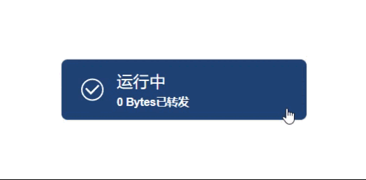
二、效果展示
三、按钮组件代码
html
<template>
  <button
    class="blueBut"
    @click="clickHandler"
    :style="{
      backgroundColor: clickBut ? 'rgb(31, 67, 117)' : 'rgb(128, 128, 128)',
    }"
  >
    <slot></slot>
    <!-- 光亮效果 -->
    <div
      class="lightBox"
      ref="lightBoxRef"
      :style="{
        background: 'rgba(209, 209, 209, 0.3)',
        backgroundSize: '200% 200%',
        '--clickX': `${clickPos.x}%`,
        '--clickY': `${clickPos.y}%`,
      }"
    ></div>
  </button>
</template>
<script setup lang="ts">
//获取鼠标在元素中点击位置,该函数见博客:https://blog.csdn.net/qq_45820271/article/details/139706893?spm=1001.2014.3001.5502
import { getClickPos } from "./getClickPos";
import { ref, reactive } from "vue";
const clickBut = defineModel<boolean>();
//获取光亮盒子元素,在H5中可以使用lightBoxRef = document.getElementById('lightbox')获取
const lightBoxRef = ref<HTMLElement | null>(null);
const clickPos = reactive({ x: 0, y: 0 });
const clickHandler = (e: MouseEvent) => {
  clickBut.value = !clickBut.value;
  const lightBox = lightBoxRef.value;
  if (!lightBox) return;
  const pos = getClickPos(e);
  let width = lightBox.getBoundingClientRect().width;
  let height = lightBox.getBoundingClientRect().height;
  //获取点击位置相对于元素的百分比
  clickPos.x = (pos.x / width) * 100;
  clickPos.y = (pos.y / height) * 100;
  //通过移除和添加让每次鼠标点击都触发动画
  lightBox.classList.remove("lightShow");
  setTimeout(() => {
    lightBox.classList.add("lightShow");
  }, 10);
};
</script>
<style scoped>
/* 自定义CSS属性解决无法过渡问题,方式见博客:https://blog.csdn.net/qq_45820271/article/details/139242637?spm=1001.2014.3001.5502 */
@property --time {
  syntax: "<time>";
  initial-value: 0.6s;
  inherits: false;
}
.blueBut {
  width: 200px;
  height: 50px;
  border-radius: 5px;
  border: none;
  color: #ffffff;
  box-shadow: 0 0 1px rgba(0, 0, 0, 0.4);
  cursor: pointer;
  position: relative;
  transition: all var(--time) linear;
}
.lightBox {
  width: 100%;
  height: 100%;
  pointer-events: none;
  transition: all var(--time) ease;
  position: absolute;
  top: 0;
  left: 0;
  filter: blur(3px);
}
.lightShow {
  animation: changeImg var(--time) linear forwards;
}
@keyframes changeImg {
  0% {
    opacity: 0;
    clip-path: circle(0% at var(--clickX) var(--clickY));
  }
  50% {
    opacity: 1;
  }
  100% {
    opacity: 0;
    clip-path: circle(200% at var(--clickX) var(--clickY));
  }
}
</style>
四、组件使用
html
<template>
  <div class="page">
    <blueBut v-model="clickBut">
      <div class="ButInfos">
        <div class="icon">
          <svg
            t="1718506308447"
            class="icon"
            viewBox="0 0 1024 1024"
            version="1.1"
            xmlns="http://www.w3.org/2000/svg"
            p-id="2403"
            width="20"
            height="20"
          >
            <path :d="path" fill="#ffffff" p-id="2404"></path>
          </svg>
        </div>

        <div class="texts">
          {{ runText }}<br /><span style="font-size: 9px; font-weight: 600">{{
            numText
          }}</span>
        </div>
      </div>
    </blueBut>
  </div>
</template>

<script setup lang="ts">
import { ref, computed } from "vue";
import blueBut from "../components/blueBut.vue";
const clickBut = ref(false);
const path = computed(() => {
  return clickBut.value
    ? "M512 42.666667A469.333333 469.333333 0 0 0 42.666667 512 469.333333 469.333333 0 1 0 512 42.666667z m0 878.506666A409.173333 409.173333 0 0 1 102.826667 512a409.173333 409.173333 0 0 1 818.346666 0A409.173333 409.173333 0 0 1 512 921.173333zM810.666667 354.133333L756.906667 298.666667l-307.2 315.733333L267.093333 426.666667 213.333333 482.133333l236.373334 243.2 51.626666-53.333333z"
    : "M939.52 331.38A465.39 465.39 0 1 0 976 512a462.4 462.4 0 0 0-36.48-180.62zM512 896c-211.74 0-384-172.26-384-384a382.29 382.29 0 0 1 90.31-247.12l540.81 540.81A382.29 382.29 0 0 1 512 896z m302.65-147.92L275.92 209.35A382.1 382.1 0 0 1 512 128c211.74 0 384 172.26 384 384a382.1 382.1 0 0 1-81.35 236.08z";
});
const runText = computed(() => {
  return clickBut.value ? "运行中" : "已停止";
});
const byteNum = ref(0);
const numText = computed(() => {
  return clickBut.value ? `${byteNum.value} Bytes已转发` : "点此启动";
});
</script>
<style scoped>
.page {
  width: 100%;
  height: 100vh;
  display: flex;
  justify-content: center;
  align-items: center;
}
.ButInfos {
  display: flex;
  align-items: center;
  padding-left: 5px;
  text-align: left;
}
.icon {
  width: 40px;
  display: flex;
  justify-content: center;
  align-items: center;
}
</style>