echarts 数据大屏
数据大屏适配方案
html
<div class="container">
  <div class="box"></div>
</div>
css
<style>
  .box {
    position: fixed;
    left: 50%;
    top: 50%;
    width: 1920px;
    height: 1080px;
    background-color: red;
    /* 缩放是以盒子的中心点为基点进行缩放的 需要把基点调整到设备的正中间*/
    transform-origin: left top;
  }
</style>
javascript
<script>
  // 控制数据大屏的放大和缩小
  let box = document.querySelector(".box");
  box.style.transform = `scale(${getScale()}) translate(-50%,-50%)`;

  function getScale(w = 1920, h = 1080) {
    // 放大的比例 屏幕的宽度 / 原型稿的宽度
    const ww = window.innerWidth / w;
    const wh = window.innerHeight / h;
    return ww < wh ? ww : wh;
  }

  // 当视口发生变化的时候触发
  window.onresize = () => {
    box.style.transform = `scale(${getScale()}) translate(-50%,-50%)`;
  };
</script>
展示当前时间
shell
pnpm i moment
vue
<template>
	<span class="time">当前时间{{ time }}</span>
</template>

<script setup lang="ts">
	import moment from 'moment';

    const time = ref(moment().format('YYYY年MM月DD日 HH:mm:ss'))
    const timer = ref()

    // 每一秒执行一次
    onMounted(() => {
        timer.value = setInterval(() => {
            time.value = moment().format('YYYY年MM月DD日 HH:mm:ss')
        }, 1000);
    })

    // 页面销毁之前清空定时器
    onBeforeUnmount(() => {
        clearInterval(timer.value)
    })
</script>
引入 echarts
shell
# echarts的引入
pnpm i echarts

# 水球图的引入
pnpm i echarts-liquidfill
初始化 echarts
vue
<template>
    <div class="container">
        <div class="charts" ref="charts"></div>
    </div>
</template>
vue
<script setup lang="ts">
import { ref, onMounted } from 'vue';
import * as echarts from 'echarts';

const charts = ref()

onMounted(() => {
    const myCharts = echarts.init(charts.value)
    myCharts.setOption({})
})
</script>
vue
<style scoped lang="scss">
.container {
    .charts {
        width: 500px;
        height: 500px;
    }
}
</style>
水球图的基本使用
引入相关依赖
shell
import 'echarts-liquidfill';
javascript
// 设置 series 的 type 为 liquidFill

series: { type: 'liquidFill'}
配置项
data\[\]:数据数组
每个数据项位于 0 到 1 之间,每一个数据项也可以是单个对象。
javascript
// 一个占 60% 的波纹图形
series: { type: 'liquidFill', data: [0.6] }
java
// 第一个波纹占 60% 第二个波纹占 40% 且波纹颜色为红色
series: { type: 'liquidFill', data: [0.6, { value: 0.5, itemStyle: { color: 'red' } }] }
color\[\]:波纹颜色
java
// 设置波纹颜色为红色 波纹颜色数组的顺序和数据数组的顺序一致
series: { type: 'liquidFill', data: [0.6], color: ['red'] }
shape:水球图的形状
| 值 | 形状 |
|---|---|
| circle | 圆 |
| rect | 矩形 |
| roundRect | 四个角带弧度的矩形 |
| triangle | 三角形 |
| diamond | 菱形 |
| pin | 图钉:类似花瓣 |
| arrow | 箭头 |
| path:// 开头的路径 | SVG 图片 |
javascript
series: { type: 'liquidFill', data: [0.6], shape: 'arrow' }radius: 图表的半径
一般用于控制图表的大小 可以是百分比(80%) 或者是 绝对值(100px)
javascript
series: { type: 'liquidFill', data: [0.6], radius: '80%' }amplitude:振幅
可以将amplitude设置为 0 以产生静止波,即没有波纹。
waveLength:波长
用于控制波纹的缓急程度
javascript
series: { type: 'liquidFill', data: [0.6], amplitude: '5%', waveLength: '60%' }direction:波纹移动的方向
可选值:left、right
javascript
series: { type: 'liquidFill', data: [0.6], direction: 'left' }waveAnimation:是否开启波纹
可选值:true、false
animationEasing:初始动画的缓动方法
当波浪开始时从底部升起
animationDuration:初始动画持续时间
animationEasingUpdate:其他动画的缓动方法
当数据值更改和波形位置更改时
animationDurationUpdate:其他动画持续时间
javascript
// 静态波纹
series: { type: 'liquidFill', data: [0.6], waveAnimation: false, animationDuration: 0, animationDurationUpdate: 0 }
outline:外围轮廓
show:是否显示
javascript
series: { type: 'liquidFill', data: [0.6], outline: { show: false } }borderDistance:边界和内圆之间的距离
itemStyle.borderColor:边框颜色
itemStyle.borderWidth:边框宽度
itemStyle.shadowBlur:轮廓阴影模糊大小
itemStyle.shadowColor:轮廓阴影颜色
javascript
series: {
    type: 'liquidFill', data: [0.6],
    outline: {
        itemStyle: { borderColor: '#94A3B8', shadowBlur: 10, shadowColor: 'rgba(148, 163, 184, 0.5)', opacity: 0.8 }
    }
}
backgroundStyle:背景样式
color:背景填充颜色
borderWidth:背景描边线条宽度
borderColor:背景描边线条宽度
shadowBlur:背景阴影模糊大小
shadowColor:背景阴影颜色
opacity:背景不透明度
javascript
series: {
    type: 'liquidFill', data: [0.6],
    backgroundStyle: {
        color: 'red', borderWidth: 20, borderColor: 'black', shadowBlur: 10, shadowColor: 'rgba(0, 0, 0, 0.1)'
    }
}
itemStyle:波纹样式
opacity:波纹不透明度
shadowBlur:波纹阴影宽度
shadowColor:波纹阴影颜色
javascript
series: {
    type: 'liquidFill', data: [0.6],
    itemStyle: {
        opacity: 0.8,
        color: 'red',
        shadowBlur: 10,
        shadowColor: 'black'
    },
}
emphasis.itemStyle:鼠标悬停时样式
javascript
series: {
    type: 'liquidFill', data: [0.6],
    emphasis: {
        itemStyle: {
            opacity: 0.8,
            color: 'red',
            shadowBlur: 10,
            shadowColor: 'black'
        }
    }
}
label:标签样式
show:是否显示标签文本
color:在背景上显示时的文本颜色
insideColor:在波纹上显示时的文本颜色
fontSize:标签字体大小
fontWeight:标签字体粗细
align:文本对齐
可选值: left、center、right
baseline:文本垂直对齐
可选值:top、middle、bottom
javascript
series: {
    type: 'liquidFill', data: [0.6],
    label: {
        show: true,
        color: 'red',
        insideColor: 'black',
        fontSize: 50,
        fontWeight: 'bold',
        align: 'left',
        baseline: 'bottom'
    }
}
案例
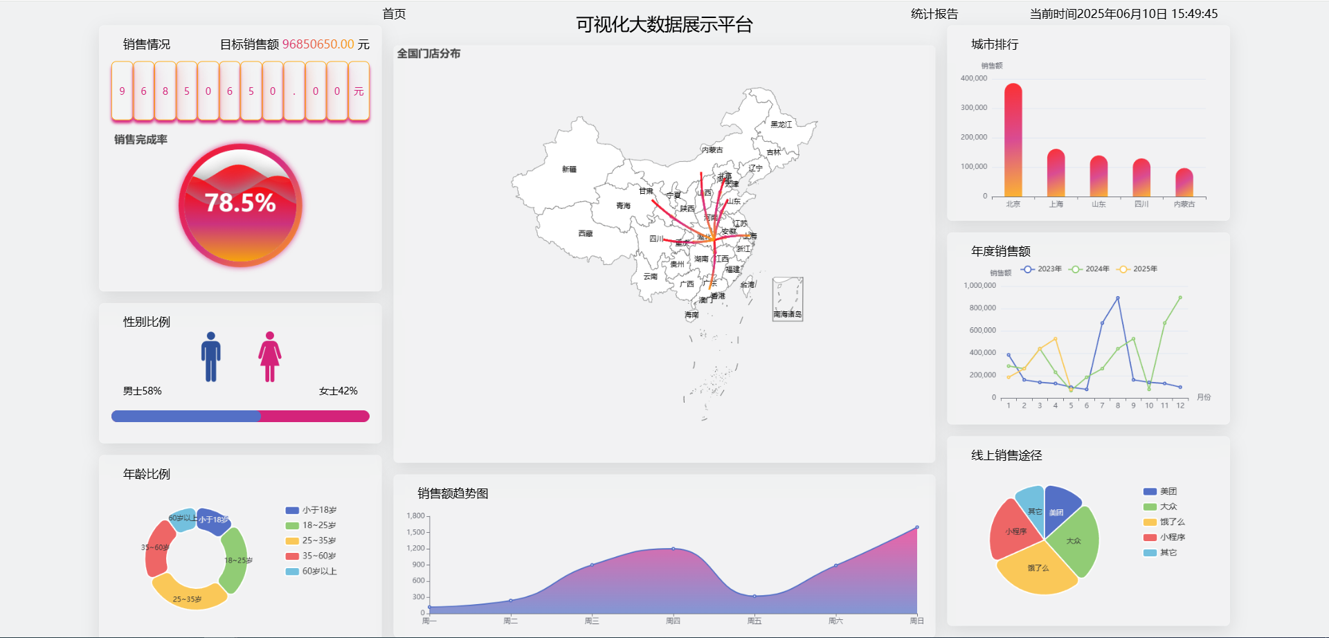
主体区域
编写数据大屏适配内容 并将大屏做组件划分
vue
<template>
    <div class="container">
        <!-- 数据大屏展示内容区域 -->
        <div class="screen" ref="screen">
            <div class="top">
                <Top></Top>
            </div>
            <div class="bottom">
                <div class="left">
                    <Left></Left>
                </div>
                <div class="center">
                    <Center></Center>
                </div>
                <div class="right">
                    <Right></Right>
                </div>
            </div>
        </div>
    </div>
</template>

<script setup lang="ts" name="Screen">
import { ref, onMounted } from 'vue';
import Top from './components/top/index.vue'
import Left from './components/left/index.vue'
import Center from './components/center/index.vue'
import Right from './components/right/index.vue'

const screen = ref()

onMounted(() => {
    screen.value.style.transform = `scale(${getScale()}) translate(-50%,-50%)`;
})

function getScale(w = 1920, h = 1080) {
    const ww = window.innerWidth / w;
    const wh = window.innerHeight / h;
    return ww < wh ? ww : wh;
}

window.onresize = () => {
    screen.value.style.transform = `scale(${getScale()}) translate(-50%,-50%)`;
};
</script>

<style scoped lang="scss">
.container {
    width: 100vw;
    height: 100vh;
    background-color: #F0F1F2;

    .screen {
        position: fixed;
        left: 50%;
        top: 50%;
        width: 1920px;
        height: 1080px;
        transform-origin: left top;

        .top {
            width: 100%;
            height: 40px;
        }

        .bottom {
            display: flex;

            .left {
                flex: 1;
            }

            .center {
                flex: 2;
            }

            .right {
                flex: 1;
            }
        }
    }
}
</style>
顶部
展示标题和时间并可以跳转到首页
vue
<template>
    <div class="top">
        <div class="left">
            <span class="home" @click="goHome">首页</span>
        </div>
        <div class="center">
            <div class="title">可视化大数据展示平台</div>
        </div>
        <div class="right">
            <span class="report">统计报告</span>
            <span class="time">当前时间{{ time }}</span>
        </div>
    </div>
</template>

<script setup lang="ts" name="Top">
import { ref, onMounted, onBeforeUnmount } from 'vue';
import { useRouter } from 'vue-router';
import moment from 'moment';

const router = useRouter()
const goHome = () => {
    router.push('/home')
}

const time = ref(moment().format('YYYY年MM月DD日 HH:mm:ss'))

const timer = ref()
onMounted(() => {
    timer.value = setInterval(() => {
        time.value = moment().format('YYYY年MM月DD日 HH:mm:ss')
    }, 1000);
})

onBeforeUnmount(() => {
    clearInterval(timer.value)
})
</script>

<style scoped lang="scss">
.top {
    width: 100%;
    height: 40px;
    display: flex;

    .left {
        flex: 1.5;
        display: flex;
        justify-content: flex-end;

        .home {
            width: 150px;
            height: 40px;
            font-size: 20px;
            text-align: center;
            line-height: 40px;
            cursor: pointer;
        }
    }

    .center {
        flex: 2;

        .title {
            width: 100%;
            height: 74px;
            text-align: center;
            line-height: 74px;
            font-size: 30px;
        }
    }

    .right {
        flex: 1.5;
        display: flex;
        justify-content: space-between;
        align-items: center;


        .report {
            width: 150px;
            height: 40px;
            font-size: 20px;
            text-align: center;
            line-height: 40px;
            cursor: pointer;
        }

        .time {
            margin-right: 20px;
            font-size: 20px;
        }
    }
}
</style>
左侧区域
左侧区域分为上、中、下三个部分。顶部展示销售额占比,中间展示性别比例,底部展示年龄比例。
vue
<template>
    <div class="left-container">
        <LeftTop class="left-top box"></LeftTop>
        <LeftCenter class="left-center box"></LeftCenter>
        <LeftBottom class="left-bottom box"></LeftBottom>
    </div>
</template>

<script setup lang="ts" name="index">
import LeftTop from './components/LeftTop.vue';
import LeftCenter from './components/LeftCenter.vue';
import LeftBottom from './components/LeftBottom.vue';


</script>

<style scoped lang="scss">
.left-container {
    height: 1040px;
    display: flex;
    flex-direction: column;

    .left-top {
        flex: 1;
        padding: 20px;
    }

    .left-center {
        flex: 1.5;
        padding: 20px;
    }

    .left-bottom {
        flex: 1;
        padding: 20px;
    }

    .box {
        background: rgba(255, 255, 255, 0.1);
        backdrop-filter: blur(20px);
        border: 1px solid rgba(255, 255, 255, 0.2);
        box-shadow: 0 10px 30px rgba(0, 0, 0, 0.1);
        border-radius: 8px;
        transition: all 0.3s ease;
        margin-bottom: 20px;
    }
}
</style>
左侧顶部
利用水球图完成目前销售情况和销售额的占比
vue
<template>
    <div class="container">
        <div class="title">
            <p class="left">销售情况</p>
            <p class="right">目标销售额<span> 96850650.00 </span>元</p>
        </div>
        <div class="number">
            <span v-for="(item, index) in pople" :key="index">{{ item }}</span>
        </div>
        <div class="charts" ref="charts"></div>
    </div>
</template>

<script setup lang="ts" name="LeftTop">
import { ref, onMounted } from 'vue';
import * as echarts from 'echarts';
import 'echarts-liquidfill';

const pople = ref('96850650.00元')
const charts = ref()

onMounted(() => {
    const myCharts = echarts.init(charts.value)
    myCharts.setOption({
        title: { text: '销售完成率' },
        series: {
            type: 'liquidFill', radius: '80%', data: [0.785, 0.685, 0.585],
            // 背景颜色
            backgroundStyle: { color: 'white' },
            // 外围轮廓
            outline: {
                borderDistance: 0,
                itemStyle: {
                    borderColor: {
                        type: 'linear',
                        x: 0, y: 0, x2: 1, y2: 1,
                        colorStops: [{ offset: 0, color: 'red' }, { offset: 0.5, color: '#D4237A' }, { offset: 1, color: 'orange' }]
                    },
                    borderWidth: 10, shadowBlur: 10, shadowColor: '#D4237A', opacity: 0.85
                }
            },
            // 波纹样式
            itemStyle: {
                color: {
                    type: 'linear',
                    x: 0, y: 0, x2: 0, y2: 1,
                    colorStops: [{ offset: 0, color: 'red' }, { offset: 0.5, color: '#D4237A' }, { offset: 1, color: 'orange' }]
                },
                shadowBlur: 30, shadowColor: '#999', opacity: 0.85
            },
            // 标签文本
            label: {
                fontSize: 40,
                color: 'black',
                formatter: function (param: { value: number; }) {
                    return (param.value * 100).toFixed(1) + '%';
                }
            }
        }
    })
})
</script>

<style scoped lang="scss">
.title {
    display: flex;
    justify-content: space-between;

    .left {
        font-size: 20px;
        margin-left: 20px;
    }

    .right {
        font-size: 20px;

        span {
            background: linear-gradient(to right, #D4237A, orange);
            -webkit-background-clip: text;
            background-clip: text;
            color: transparent;
        }
    }
}

.number {
    display: flex;
    margin-top: 20px;

    span {
        flex: 1;
        color: #D4237A;
        height: 100px;
        text-align: center;
        line-height: 100px;
        backdrop-filter: blur(10px);
        border: 1px solid orange;
        box-shadow: 0 5px 5px #D7237B;
        border-radius: 8px;
        transition: all 0.3s ease;
    }
}

.charts {
    margin-top: 20px;
    width: 100%;
    height: 250px;
}
</style>
左侧中部
利用柱状图展示消费群体的性别比例情况
vue
<template>
    <div class="container">
        <p class="title">性别比例</p>
        <div class="sex">
            <div class="man">
                <img src="../../../../../assets/image/man.png" alt="">
            </div>
            <div class="woman">
                <img src="../../../../../assets/image/woman.png" alt="">
            </div>
        </div>
        <div class="rate">
            <p>男士58%</p>
            <p>女士42%</p>
        </div>
        <div class="charts" ref="charts"></div>
    </div>
</template>

<script setup lang="ts" name="LeftCenter">
import { ref, onMounted } from 'vue';
import * as echarts from 'echarts';

const charts = ref()
onMounted(() => {
    const myCharts = echarts.init(charts.value)
    myCharts.setOption({
        xAxis: { show: false, min: 0, max: 100 },
        yAxis: { type: 'category', show: false },
        series: [
            { type: 'bar', data: [58], barWidth: 20, z: 100, itemStyle: { borderRadius: 20 } },
            { type: 'bar', data: [100], barWidth: 20, barGap: '-100%', itemStyle: { color: '#D4237A', borderRadius: 20 } }
        ],
        grid: { left: 0, right: 0, bottom: 0, top: 0 }
    })
})
</script>

<style scoped lang="scss">
.container {
    .title {
        font-size: 20px;
        margin-left: 20px;
    }

    .sex {
        display: flex;
        justify-content: center;

        .man {
            width: 100px;
            height: 100px;

            img {
                width: 100%;
                height: 100%;
            }
        }

        .woman {
            width: 100px;
            height: 100px;

            img {
                width: 100%;
                height: 100%;
            }
        }
    }

    .rate {
        display: flex;
        justify-content: space-between;
        padding: 0 20px;
    }

    .charts {
        margin-top: 10px;
        height: 50px;
    }
}
</style>
左侧底部
利用饼状图展示消费群体的年龄比例情况
vue
<template>
    <div class="container">
        <p class="title">年龄比例</p>
        <div class="charts" ref="charts"></div>
    </div>
</template>

<script setup lang="ts" name="LeftBottom">
import { ref, onMounted } from 'vue';
import * as echarts from 'echarts';

const charts = ref()
onMounted(() => {
    const myCharts = echarts.init(charts.value)
    myCharts.setOption({
        tooltip: { trigger: 'item' },
        legend: { orient: 'vertical', right: 50, top: 30, textStyle: { fontSize: 14 } },
        series: [
            {
                type: 'pie',
                left: -150,
                radius: ['40%', '70%'],
                avoidLabelOverlap: false,
                itemStyle: { borderRadius: 10, borderColor: '#fff', borderWidth: 2 },
                label: { show: true, position: 'inside', },
                data: [
                    { value: 800, name: '小于18岁' },
                    { value: 1500, name: '18~25岁' },
                    { value: 1800, name: '25~35岁' },
                    { value: 1300, name: '35~60岁' },
                    { value: 600, name: '60岁以上' }
                ]
            }
        ],
        grid: { left: 0, right: 0, bottom: 0, top: 0 }
    })
})
</script>

<style scoped lang="scss">
.container {
    .title {
        font-size: 20px;
        margin-left: 20px;
    }

    .charts {
        margin-top: 10px;
        height: 250px;
    }
}
</style>
中间区域
中间区域分为地图和底部两个区域,地图展示全国门店情况,底部展示近七天全国销售额。
vue
<template>
    <div class="center-container">
        <CenterTop class="center-top box"></CenterTop>
        <CenterBottom class="center-bottom box"></CenterBottom>
    </div>
</template>

<script setup lang="ts" name="Center">
import CenterTop from './components/CenterTop.vue';
import CenterBottom from './components/CenterBottom.vue';


</script>

<style scoped lang="scss">
.center-container {
    display: flex;
    height: 1006px;
    margin-top: 34px;
    flex-direction: column;
    padding: 0 20px 0 20px;

    .center-top {
        flex: 3;
        margin-bottom: 20px;
    }

    .center-bottom {
        flex: 1;
    }

    .box {
        background: rgba(255, 255, 255, 0.1);
        backdrop-filter: blur(20px);
        border: 1px solid rgba(255, 255, 255, 0.2);
        box-shadow: 0 10px 30px rgba(0, 0, 0, 0.1);
        border-radius: 8px;
        transition: all 0.3s ease;
    }
}
</style>
地图
china.json 来源:https://geo.datav.aliyun.com/areas_v3/bound/100000_full.json
geo:用于展示地图数据
series.lines:用于展示点到点的线性数据
vue
<template>
    <div class="container" ref="charts">地图</div>
</template>

<script setup lang="ts" name="CenterTop">
import { ref, onMounted } from 'vue';
import * as echarts from 'echarts';
import chinaJson from './china.json';

const charts = ref()
echarts.registerMap('china', chinaJson as any)
onMounted(() => {
    const myCharts = echarts.init(charts.value)
    myCharts.setOption({
        title: {
            text: '全国门店分布'
        },
        geo: {
            map: 'china', label: { show: true },
            itemStyle: { areaColor: "white" },
        },
        series: {
            type: 'lines',
            effect: { show: true, symbol: 'arrow', symbolSize: 5, constantSpeed: 30 },
            lineStyle: {
                color: {
                    type: 'linear',
                    x: 0, y: 0, x2: 1, y2: 1,
                    colorStops: [{ offset: 0, color: 'red' }, { offset: 0.5, color: '#D4237A' }, { offset: 1, color: 'orange' }]
                }
            },
            data: [
                {
                    coords: [[114.298572, 30.584355], [116.405285, 39.904989]],
                    lineStyle: { width: 3, curveness: 0.1 }
                },
                {
                    coords: [[114.298572, 30.584355], [121.472644, 31.231706]],
                    lineStyle: { width: 3, curveness: 0.1 }
                }, {
                    coords: [[114.298572, 30.584355], [113.280637, 23.125178]],
                    lineStyle: { width: 3, curveness: 0.1 }
                }, {
                    coords: [[114.298572, 30.584355], [117.000923, 36.675807]],
                    lineStyle: { width: 3, curveness: 0.1 }
                }, {
                    coords: [[114.298572, 30.584355], [104.065735, 30.659462]],
                    lineStyle: { width: 3, curveness: 0.1 }
                }, {
                    coords: [[114.298572, 30.584355], [101.778916, 36.623178]],
                    lineStyle: { width: 3, curveness: 0.1 }
                }, {
                    coords: [[114.298572, 30.584355], [111.670801, 40.818311]],
                    lineStyle: { width: 3, curveness: 0.1 }
                },
            ]
        }
    })
})
</script>

<style scoped lang="scss"></style>
底部
折线图展示销售额趋势。
vue
<template>
    <div class="container">
        <p class="title">销售额趋势图</p>
        <div class="charts" ref="charts">地图</div>
    </div>
</template>

<script setup lang="ts" name="CenterBottom">
import { ref, onMounted } from 'vue';
import * as echarts from 'echarts';

const charts = ref()
onMounted(() => {
    const myCharts = echarts.init(charts.value)
    myCharts.setOption({
        xAxis: { type: 'category', splitLine: { show: false }, boundaryGap: false, data: ['周一', '周二', '周三', '周四', '周五', '周六', '周日'] },
        yAxis: { splitLine: { show: false }, axisLine: { show: true }, axisTick: { show: true } },
        series: {
            type: 'line', data: [120, 240, 900, 1200, 321, 890, 1600], smooth: true, areaStyle: {
                color: {
                    type: 'linear',
                    x: 0, y: 0, x2: 0, y2: 1,
                    colorStops: [{ offset: 0, color: '#E92686' }, { offset: 1, color: '#5470C6' }],
                }
            },
        },
        grid: { left: 40, right: 10, bottom: 20, top: 10 }
    })
})
</script>

<style scoped lang="scss">
.container {
    padding: 20px;

    .title {
        font-size: 20px;
        margin-left: 20px;
    }

    .charts {
        margin-top: 20px;
        height: calc(100% - 40px);
    }
}
</style>
右侧区域
左侧区域分为上、中、下三个部分。顶部展示销售额的城市排行,中间展示近三年销售额情况,底部展示线上销售途径占比情况。
vue
<template>
    <div class="right-container">
        <RightTop class="right-top box"></RightTop>
        <RightCenter class="right-center box"></RightCenter>
        <RightBottom class="right-bottom box"></RightBottom>
    </div>
</template>

<script setup lang="ts" name="index">
import RightTop from './components/RightTop.vue';
import RightCenter from './components/RightCenter.vue';
import RightBottom from './components/RightBottom.vue';


</script>

<style scoped lang="scss">
.right-container {
    height: 1040px;
    display: flex;
    flex-direction: column;

    .right-top {
        flex: 1;
        padding: 20px;
    }

    .right-center {
        flex: 1.5;
        padding: 20px;
    }

    .right-bottom {
        flex: 1;
        padding: 20px;
    }

    .box {
        background: rgba(255, 255, 255, 0.1);
        backdrop-filter: blur(20px);
        border: 1px solid rgba(255, 255, 255, 0.2);
        box-shadow: 0 10px 30px rgba(0, 0, 0, 0.1);
        border-radius: 8px;
        transition: all 0.3s ease;
        margin-bottom: 20px;
    }
}
</style>
右侧顶部
vue
<template>
    <div class="container">
        <p class="title">城市排行 </p>
        <div class="charts" ref="charts"></div>
    </div>
</template>

<script setup lang="ts" name="RightTop">
import { ref, onMounted } from 'vue';
import * as echarts from 'echarts';

const charts = ref()

onMounted(() => {
    const myCharts = echarts.init(charts.value)
    myCharts.setOption({
        xAxis: { data: ['北京', '上海', '山东', '四川', '内蒙古'] },
        yAxis: { name: '销售额' },
        series: {
            type: 'bar',
            data: [385550.32, 162220.85, 140000.66, 130000.31, 97000.00],
            labelLine: false,
            itemStyle: {
                color: {
                    type: 'linear',
                    x: 0, y: 0, x2: 1, y2: 1,
                    colorStops: [{ offset: 0, color: 'red' }, { offset: 0.5, color: '#D4237A' }, { offset: 1, color: 'orange' }]
                },
                borderRadius: [50, 50, 0, 0], opacity: 0.8
            },
            barWidth: 30
        },
        grid: { left: 55, right: 20, bottom: 20, top: 30 }
    })
})
</script>

<style scoped lang="scss">
.container {
    .title {
        font-size: 20px;
        margin-left: 20px;
    }

    .charts {
        margin-top: 20px;
        width: 100%;
        height: 250px;
    }
}
</style>
右侧中间
vue
<template>
    <div class="container">
        <p class="title">年度销售额</p>
        <div class="charts" ref="charts"></div>
    </div>
</template>

<script setup lang="ts" name="RightCenter">
import { ref, onMounted } from 'vue';
import * as echarts from 'echarts';

const charts = ref()
onMounted(() => {
    const myCharts = echarts.init(charts.value)
    myCharts.setOption({
        xAxis: { name: '月份', data: [1, 2, 3, 4, 5, 6, 7, 8, 9, 10, 11, 12] },
        yAxis: { name: '销售额' },
        series: [
            { type: 'line', name: '2023年', data: [385550.32, 162220.85, 140000.66, 130000.31, 97000.00, 77000.00, 669990.66, 895466.30, 162220.85, 140000.66, 130000.31, 97000.00] },
            { type: 'line', name: '2024年', data: [285550.32, 262220.85, 440000.66, 230000.31, 67000.00, 185550.32, 262220.85, 440000.66, 530000.31, 77000.00, 669990.66, 898566.30] },
            { type: 'line', name: '2025年', data: [185550.32, 262220.85, 440000.66, 530000.31, 77000.00] },
        ],
        legend: { show: true },
        grid: { left: 70, right: 50, bottom: 20, top: 40 }
    })
})
</script>

<style scoped lang="scss">
.container {
    .title {
        font-size: 20px;
        margin-left: 20px;
    }

    .charts {
        margin-top: 10px;
        height: 250px;
    }
}
</style>
右侧底部
vue
<template>
    <div class="container">
        <p class="title">线上销售途径</p>
        <div class="charts" ref="charts"></div>
    </div>
</template>

<script setup lang="ts" name="RightBottom">
import { ref, onMounted } from 'vue';
import * as echarts from 'echarts';

const charts = ref()
onMounted(() => {
    const myCharts = echarts.init(charts.value)
    myCharts.setOption({
        tooltip: { trigger: 'item' },
        legend: { orient: 'vertical', right: 50, top: 30, textStyle: { fontSize: 14 } },
        series: [
            {
                type: 'pie',
                left: -150,
                avoidLabelOverlap: false,
                itemStyle: { borderRadius: 10, borderColor: '#fff', borderWidth: 2 },
                label: { show: true, position: 'inside', },
                data: [
                    { value: 800, name: '美团' },
                    { value: 1500, name: '大众' },
                    { value: 1800, name: '饿了么' },
                    { value: 1300, name: '小程序' },
                    { value: 600, name: '其它' }
                ]
            }
        ],
        grid: { left: 0, right: 0, bottom: 0, top: 0 }
    })
})
</script>

<style scoped lang="scss">
.container {
    .title {
        font-size: 20px;
        margin-left: 20px;
    }

    .charts {
        margin-top: 10px;
        height: 250px;
    }
}
</style>