一、代码部分
1.html
a
<!DOCTYPE html>
<html lang="en">
<head>
    <meta charset="UTF-8">
    <meta name="viewport" content="width=device-width, initial-scale=1.0">
    <link rel="stylesheet" href="style.css">
    <title>Document</title>
</head>
<body>
    <div class="circle1"></div>
    <div class="circle2"></div>
</body>
</html>
2.css
A
.circle1{
width: 180px;
margin-top: 20px;
background-color: green;
height: 180px;
border-radius: 50%;
animation: test 4.0s ease-in-out infinite alternate;
text-align: center;
}
@keyframes test {
0%{transform: translate(100px,100px);}
20%{transform: translate(200px,200px);}
50%{transform: translate(300px,300px);}
80%{transform: translate(400px,200px);}
100%{transform: translate(500px,100px);}
}
.circle2{
margin: 50px;
width: 180px;
height: 180px;
background: blue;
animation: sample 2s ease-in-out infinite alternate;
}
@keyframes sample {
0%{background: pink; transform:scale(1) rotate(0deg); }
20%{
background-color: red;
transform: scale(1.2) rotate(90deg);
}
40%{
background-color: green;
transform: scale(1.2) rotate(135deg);
}
60%{
background-color: blue;
transform: scale(1.2) rotate(180deg);
}
80%{
background-color: saddlebrown;
transform: scale(1.2) rotate(225deg);
}
100%{background: red; transform:scale(1.2) rotate(270deg);}
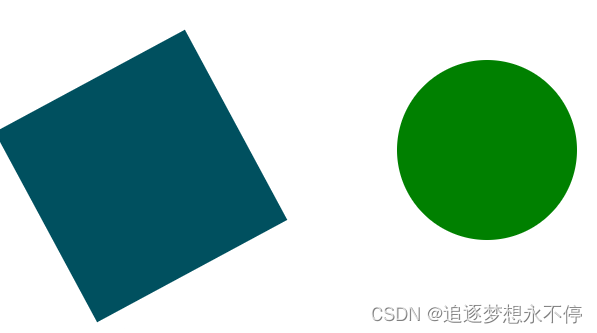
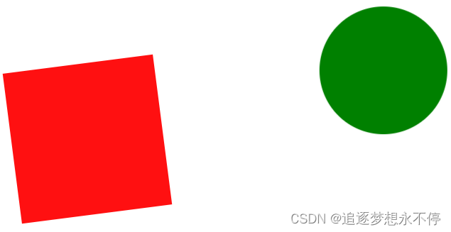
}二、网页效果
三、说明
以上代码实现了一个简单的移动的圆形,一个旋转变色的矩形。
后续可以用录屏软件,录屏后转为gif动图。