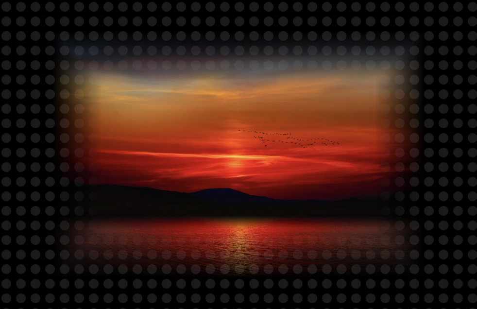
使用场景
在生产环境中,遇到一个需求,需要在一个深色风格的大屏页面中,嵌入 Google Maps。为了减少违和感,希望地图四边能够淡出过渡。
这里的"淡出过渡",关键是淡出,而非降低透明度。
基于 Google Maps 的深色示例中,附加上述需求,效果如下:
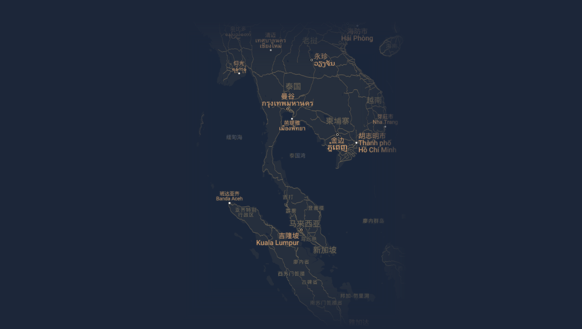
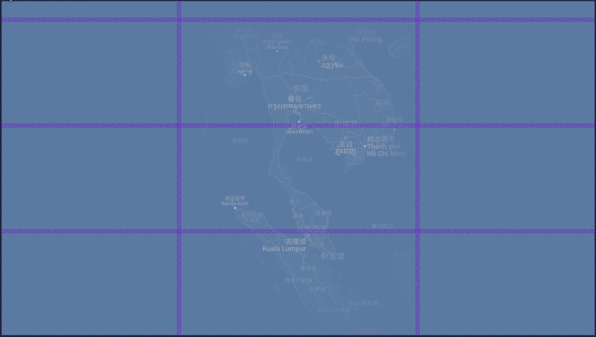
简单的说,就是中间放地图,四周放标题和其它展板内容。
CSS mask-image + SVG
简化一下,把地图换成图片,实现一个示例。
示例中,注释掉"mask"标记的内容,恢复"svg test"标记的内容,可以查看 svg 。
准备工作,定义一个"容器"和"目标"层:
html
<div id="container">
  <img id="target" src="https://cdn.pixabay.com/photo/2024/07/28/09/04/mountain-8927018_1280.jpg">

  <!-- svg test -->
  <!-- <div id="target" style="width:1920px;height:1080px;"></div> -->
</div>
基础样式:
css
body {
  margin: 0;
  background-color: black;
}

#container {
  position: absolute;
  width: 100%;
  height: 100%;
  background-repeat: repeat;
  display: flex;
  align-items: center;
  justify-content: center;
}

#target {
  max-width: 80%;
  max-height: 80%;

  /* mask */
  -webkit-mask-mode: alpha;
  mask-mode: alpha;
  mask-repeat: no-repeat;
  mask-size: 100% 100%;

  /* svg test */
  /* background-repeat: no-repeat;
  background-size: 100% 100%; */
}
给"容器"添加一个波点背景,为了验证淡出过渡区域可以透视背景,这里直接用 svg 实现:
javascript
(function() {
  const container = document.querySelector('#container');
  const containerBg = `<svg xmlns="http://www.w3.org/2000/svg" width="30" height="30"><circle fill="rgba(255,255,255,0.1)" cx="15" cy="15" r="10" /></svg>`;
  container.style.backgroundImage = `url('data:image/svg+xml;utf8,${encodeURIComponent(containerBg)}')`;
  // 略
})();
接着给"目标"准备一个处理方法,如果目标是一个图片,为了获得图片大小,将在图片的 onload 中执行:
javascript
(function() {
  // 略
  const target = document.querySelector('#target');

  function setTargetBg() {
    // 略
  }

  target.onload = setTargetBg

  setTargetBg()
})();
为了实现淡出过渡效果,需要准备一个 svg:
分为 4+1 块,上下左右 4 个梯形 path,中间 1 个矩形 rect。
4 个梯形分别设置了 4 个方向的 linearGradient 渐变。
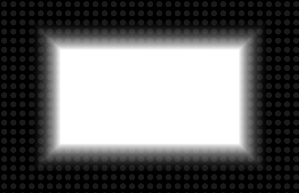
这里用代码绘制上面的 svg:
svg 的宽高是基于"目标"的宽高,淡入过渡区域大小 padding 基于"目标"短边的 20%。
特别地,patch 和 rect 中的加减"1",目的是为了消除 path 之间的缝隙。
javascript
  function setTargetBg() {
    const svgWidth = target.offsetWidth,
      svgHeight = target.offsetHeight,
      padding = Math.floor(Math.min(target.offsetWidth, target.offsetHeight) * 0.2),
      fill = 'white',
      patch = 0.2;

    const targetMask = `
  <svg xmlns="http://www.w3.org/2000/svg"
    xmlns:xlink="http://www.w3.org/1999/xlink" version="1.1"
    width="${svgWidth}"
    height="${svgHeight}" viewBox="0 0 ${svgWidth} ${svgHeight}">
    <defs>
      <linearGradient id="mask-bottom-to-top" x1="0" x2="0" y1="0" y2="1">
        <stop offset="0%" stop-color="transparent" />
        <stop offset="100%" stop-color="${fill}" />
      </linearGradient>
      <linearGradient id="mask-top-to-bottom" x1="0" x2="0" y1="0" y2="1">
        <stop offset="0%" stop-color="${fill}" />
        <stop offset="100%" stop-color="transparent" />
      </linearGradient>
      <linearGradient id="mask-rigth-to-left" x1="0" x2="1" y1="0" y2="0">
        <stop offset="0%" stop-color="transparent" />
        <stop offset="100%" stop-color="${fill}" />
      </linearGradient>
      <linearGradient id="mask-left-to-right" x1="0" x2="1" y1="0" y2="0">
        <stop offset="0%" stop-color="${fill}" />
        <stop offset="100%" stop-color="transparent" />
      </linearGradient>
    </defs>
    <path fill="url(#mask-bottom-to-top)" d="M0,0 L${svgWidth},0 L${svgWidth - padding + patch},${padding + patch} L${padding - patch},${padding + patch} Z"></path>
    <path fill="url(#mask-top-to-bottom)" d="M0,${svgHeight} L${padding - patch},${svgHeight - padding - patch} L${svgWidth - padding + patch},${svgHeight - padding - patch} L${svgWidth},${svgHeight} Z"></path>
    <path fill="url(#mask-rigth-to-left)" d="M0,0 L${padding + patch},${padding} L${padding + patch},${svgHeight - padding} L0,${svgHeight} Z"></path>
    <path fill="url(#mask-left-to-right)" d="M${svgWidth},0 L${svgWidth - padding - patch},${padding} L${svgWidth - padding - patch},${svgHeight - padding} L${svgWidth},${svgHeight} Z"></path>
    <rect x="${padding - 1}" y="${padding - 1}" width="${svgWidth - padding * 2 + 1 * 2}" height="${svgHeight - padding * 2 + 1 * 2}" fill="${fill}"></rect>
  </svg>
`;

	// mask
    target.style.maskImage = `url('data:image/svg+xml;utf8,${encodeURIComponent(targetMask.replace(/\n/g, ''))}')`;

    // svg test
    // target.style.backgroundImage = `url('data:image/svg+xml;utf8,${encodeURIComponent(targetMask.replace(/\n/g, ''))}')`;
  }
最终效果: