demo 地址: https://github.com/iotjin/JhHarmonyDemo
代码不定时更新,请前往github查看最新代码
在demo中这些组件和工具类都通过module实现了,具体可以参考HarmonyOS NEXT - 通过 module 模块化引用公共组件和utils
官方介绍
Navigation是路由容器组件,一般作为首页的根容器,包括单栏(Stack)、分栏(Split)和自适应(Auto)三种显示模式。Navigation组件适用于模块内和跨模块的路由切换,一次开发,多端部署场景。通过组件级路由能力实现更加自然流畅的转场体验,并提供多种标题栏样式来呈现更好的标题和内容联动效果。在不同尺寸的设备上,Navigation组件能够自适应显示大小,自动切换分栏展示效果。
Navigation组件主要包含导航页(NavBar)和子页(NavDestination)。导航页由标题栏(Titlebar,包含菜单栏menu)、内容区(Navigation子组件)和工具栏(Toolbar)组成,其中导航页可以通过hideNavBar属性进行隐藏,导航页不存在页面栈中,导航页和子页,以及子页之间可以通过路由操作进行切换。
在API Version 9上,需要配合NavRouter组件实现页面路由,从API Version 10开始,推荐使用NavPathStack实现页面路由。
这里里封装的只是组件,路由跳转通过 Router切换Navigation 或者 @ohos.route 跳转
demo中都是通过@ohos.router实现的跳转,因为Router需要Navigation 包着页面的内容,多一层嵌套
页面路由 (@ohos.router)(不推荐)
Router切换Navigation
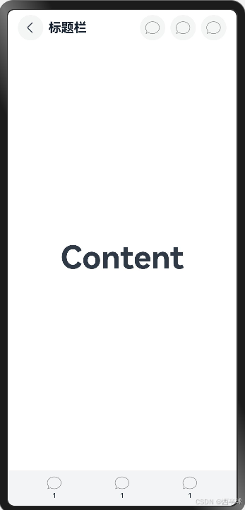
Navigation官方效果图
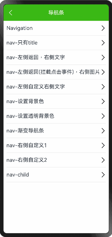
BaseNavigation效果图
Navigation使用
js
@Entry
@Component
struct TestNav {
  // menus(value: Array<NavigationMenuItem> | CustomBuilder): NavigationAttribute

  aboutToAppear() {
    console.log('CustomComponent: aboutToAppear called. Component is about to appear.')
    // 在这里执行初始化数据的操作
  }

  build() {
    Column() {
      this.NavigationTest()
    }
  }

  TooTmp: NavigationMenuItem = {
    'value': "1",
    'action': () => {
    },
    'icon': "resources/rawfile/tab/nav_tab_1.png",
  }
  TooBar: ToolbarItem[] = [this.TooTmp, this.TooTmp, this.TooTmp]

  @Builder
  NavigationTest() {
    Navigation() {
      RelativeContainer() {
        Text('Content')
          .fontSize(50)
          .fontWeight(FontWeight.Bold)
          .alignRules({
            center: { anchor: '__container__', align: VerticalAlign.Center },
            middle: { anchor: '__container__', align: HorizontalAlign.Center }
          })
      }
      .height('100%')
      .width('100%')
    }
    .titleMode(NavigationTitleMode.Mini)
    .title("标题栏") // 设置title,此时不支持修改文字大小,颜色等样式
    .hideBackButton(false)
    .menus([this.TooTmp, this.TooTmp, this.TooTmp])
    .toolbarConfiguration(this.TooBar)

    // .size({ width: '100%', height: '100%' })
    // .backgroundColor(Color.Orange)
    // .toolbarConfiguration(this.TooBar)
  }
}
BaseNavigation使用
demo里的弹框在这里 HarmonyOS NEXT - Toast和Loading使用
- 左侧返回,右侧文字
js
BaseNavigation({
   title: '标题标题标题标题标题标题标题标题标题标题',
   rightText: '设置',
   rightItemCallBack: () => {
     console.log("点击了设置")
     JhProgressHUD.showText("点击了设置")
   }
})- 左侧返回(拦截点击事件),右侧图片
js
  BaseNavigation({
    title: '标题标题标题标题标题标题标题标题标题标题标题标题标题标题标题标题标题标题标题标题',
    titleTextAlign: TextAlign.Start,
    // rightImgPath: 'resources/rawfile/images/ic_more_white.png',
    rightImgPath: $rawfile("images/ic_nav_add.png"),
    rightItemCallBack: () => {
      JhProgressHUD.showText("点击了右侧图标")
    },
    leftItemCallBack: () => {
      JhProgressHUD.showText("点击左侧")
    }
})- 左侧自定义右侧文字
js
  BaseNavigation({
    title: '标题',
    titleTextAlign: TextAlign.Start,
    leftItem: {
      text: '设置1',
      icon: $rawfile("images/ic_nav_add.png"),
      itemCallBack: () => {
        JhProgressHUD.showText("点击了左侧")
      }
    },
    rightText: '发布',
    rightItemCallBack: () => {
      console.log("点击了设置")
      JhProgressHUD.showText("点击了发布")
    }
})- 渐变导航条
js
BaseNavigation({
   isGradient: true,
   title: '标题',
   // rightImgPath: 'resources/rawfile/images/ic_more_white.png',
   rightImgPath: $rawfile("images/ic_nav_add.png"),
   rightItemCallBack: () => {
     JhProgressHUD.showText("点击了右侧图标")
   }
})-
右侧自定义1
BaseNavigation({ title: '标题标题标题标题标题标题标题标题标题标题标题标题标题标题标题标题标题标题标题标题', titleTextAlign: TextAlign.Start, rightItems: [ { text: '设置1', itemCallBack: () => { JhProgressHUD.showText("点击了设置1") } }, { text: '设置2', itemCallBack: () => { JhProgressHUD.showText("点击了设置2") } } ] }) -
内部包裹child内容
js
 BaseNavigation({
    title: '自定义child',
    child: () => {
      this.childBuilder()
    }
  })

  @Builder
  childBuilder() {
    Scroll() {
      Column() {
        Text('111111111')
          .width('100%')
          .height(600)
          .backgroundColor(Color.Orange)
        Text('222222222')
          .width('100%')
          .height(500)
          .backgroundColor(Color.Yellow)
      }
    }
  }
JhProgressHud.ets 完整代码
js
///  BaseNavigation.ets
///
///  Created by iotjin on 2024/08/01.
///  description: 导航条

import { router } from '@kit.ArkUI';
import { KColors } from '../configs/Colors';

type imageType = string | Resource | PixelMap

interface ItemType {
  icon?: imageType // icon优先级高于text
  text?: string
  itemCallBack?: () => void
}

const _titleFontSize = 18.0
const _textFontSize = 16.0
const _itemSpace = 15.0 // 右侧item内间距
const _imgWH = 22.0 // 右侧图片宽高
const _rate = 16 // 左右item占比

const _bgColor: ResourceColor = KColors.kThemeColor
const _bgDarkColor: ResourceColor = KColors.kNavBgDarkColor
const _titleColor: ResourceColor = KColors.kNavTitleColor

const _appbarStartColor = KColors.kGradientStartColor // 默认appBar 渐变开始色
const _appbarEndColor = KColors.kGradientEndColor // 默认appBar 渐变结束色

@Preview
@Component
export struct BaseNavigation {
  @Prop public title: string = '' // 标题文字
  private isCenterTitle: boolean = true
  @Prop public titleFontSize: number = _titleFontSize
  @Prop public titleTextAlign: TextAlign = this.isCenterTitle ? TextAlign.Center : TextAlign.Start
  @Prop public bgColor: ResourceColor = _bgColor
  @Prop public leftItem?: ItemType | null = null // 左侧Widget,为空显示返回按钮
  public leftItemCallBack?: () => void
  @Prop public rightText: string = '' // 右侧按钮文字
  @Prop public rightImgPath: imageType = '' // 右侧按钮图片路径,优先级高于text ,eg: $rawfile("images/ic_nav_add.png") | 'resources/rawfile/images/ic_nav_add.png'
  public rightItemCallBack?: () => void
  @Prop public rightItems: [] | [ItemType] | [ItemType, ItemType] = [] // 优先级高于rightText和rightImgPath
  @Prop public isGradient: boolean = false // 是否渐变背景色
  @Prop public navHeight: number = 56 // 传入child为100%,否则为navHeight
  @BuilderParam child?: () => void // 子组件
  //
  private backImage: imageType = $rawfile("common/ic_nav_back_white.png")
  private titleAndIconColor: ResourceColor = _titleColor

  aboutToAppear() {
    // 如果背景透明或者是白色,设置字体和图标、状态栏字体为黑色
    let isTransparent = this.bgColor == Color.Transparent || this.bgColor == Color.White || this.bgColor == KColors.kNavWhiteBgColor
    if (isTransparent) {
      this.titleAndIconColor = Color.Black
      this.backImage = $rawfile("common/ic_nav_back_black.png")
    }
  }

  build() {
    Navigation() {
      if (this.child) {
        this.child()
      }
    }
    .titleMode(NavigationTitleMode.Mini)
    .title(this.NavigationTitle())
    .hideBackButton(true)
    .height(this.child ? '100%' : this.navHeight)
  }

  @Builder
  NavigationTitle() {
    Row() {
      this.navBuilder()
    }
    .width('100%')
    .height('100%')
    .backgroundColor(this.bgColor)
    .linearGradient(this.isGradient ? {
      direction: GradientDirection.Right, // 从左向右
      colors: [[_appbarStartColor, 0.0], [_appbarEndColor, 1.0]]
    } : null)
  }

  @Builder
  navBuilder() {
    Row() {
      if (this.leftItem) {
        Row() {
          this.itemBuilder({ icon: this.leftItem.icon, text: this.leftItem.text })
        }.onClick(this.leftItem.itemCallBack)
      } else {
        this.backBuilder()
      }
    }
    .layoutWeight(_rate)
    .width('100%')

    Row() {
      this.titleBuilder()
    }
    .layoutWeight(this.rightItems.length ? (100 - _rate - this.rightItems.length * _rate) : (100 - _rate * 2))
    .width('100%')

    if (this.rightItems.length) {
      Row() {
        ForEach(this.rightItems, (item: ItemType) => {
          Row() {
            this.itemBuilder({ icon: item.icon, text: item.text })
          }.onClick(item.itemCallBack)
          .layoutWeight(1)
          .width('100%')
        })
      }
      .margin({ left: this.rightItems.length == 2 ? 15 : 0, right: this.rightItems.length == 2 ? 5 : 0 })
      .layoutWeight(_rate * this.rightItems.length)
      .width('100%')
    } else {
      Row() {
        this.itemBuilder({ icon: this.rightImgPath, text: this.rightText })
      }
      .onClick(this.rightItemCallBack)
      .layoutWeight(_rate)
      .width('100%')
    }
  }

  @Builder
  backBuilder() {
    Row() {
      Image(this.backImage)
        .width(18)
        .height(18)
        .margin({ left: 15 })
    }
    .size({ width: '100%', height: '100%' })
    .onClick(() => {
      if (this.leftItemCallBack) {
        this.leftItemCallBack()
      } else {
        this.goBack()
      }
    })
  }

  @Builder
  titleBuilder() {
    Row() {
      Text(this.title)
        .padding({
          left: 10,
          top: 5,
          right: 10,
          bottom: 5
        })
        .fontSize(this.titleFontSize)
        .fontColor(this.titleAndIconColor)
        .textAlign(this.titleTextAlign)
        .maxLines(2)
        .textOverflow({ overflow: TextOverflow.Ellipsis })// 文本超长显示省略号
        .wordBreak(WordBreak.BREAK_WORD)
    }
    .justifyContent(FlexAlign.Center)
    .alignItems(VerticalAlign.Center)
    .size({ width: '100%', height: '100%' })
  }

  @Builder
  itemBuilder(item: ItemType) {
    Row() {
      if (item.icon) {
        Image(item.icon)
          .width(_imgWH)
          .height(_imgWH)
          .margin({ left: _itemSpace, right: _itemSpace })
      } else if (item.text) {
        Text(item.text)
          .fontSize(_textFontSize)
          .fontColor(this.titleAndIconColor)
      }
    }
    .size({ width: '100%', height: '100%' })
    .justifyContent(FlexAlign.Center)
    .alignItems(VerticalAlign.Center)
  }

  goBack() {
    router.back()
  }
}
里面用到的颜色
js
export class KColors {
  // 主题色(导航条背景、提交按钮背景、弹框确认文字、表单图标录入光标)
  // 暗黑模式高亮显示颜色按kThemeColor设置,如tabBar选中文字图标、提交按钮背景色、指示器选中下划线、光标等
  static readonly kThemeColor: ResourceColor = '#3BB815'
  static readonly kThemeDarkColor: ResourceColor = '#0A0A0A' // (10, 10, 10)
  static readonly kThemeBlueColor: ResourceColor = '#4688FA'
  static readonly kThemePurpleColor: ResourceColor = '#9C27B0'
  // 渐变色(appBar和按钮)
  static readonly kGradientStartColor: ResourceColor = '#2683BE' // 渐变开始色
  static readonly kGradientEndColor: ResourceColor = '#34CABE' // 渐变结束色
  static readonly kNavTitleColor: Color = Color.White
}