开发中经常会遇到一个场景,使用 CSS 实现一个子元素靠右,其余子元素靠左。
这里总结一下常见的实现方式。
1. flex 布局
flexbox 是一种常用且灵活的布局方式,适合完成这种需求。**将父容器设置为 display: flex,然后使用 margin-left: auto 将特定的子元素推到右边,**左边也是同样的。
举个 🌰
html
<!DOCTYPE html>
<html lang="en">
<head>
<meta charset="UTF-8" />
<meta name="viewport" content="width=device-width, initial-scale=1.0" />
<title>Document</title>
<style>
.container {
width: 500px;
padding: 10px;
background-color: #ffe2bd;
border-radius: 8px;
/* 主要代码 */
display: flex;
}
.item {
width: 100px;
height: 100px;
text-align: center;
background-color: #ffc75f;
border-radius: 8px;
}
.left {
margin-right: 10px;
}
.right {
margin-left: auto; /* 将这个子元素推到右边 */
}
</style>
</head>
<body>
<div class="container">
<div class="item left">左边元素1</div>
<div class="item left">左边元素2</div>
<div class="item right">右边元素</div>
</div>
</body>
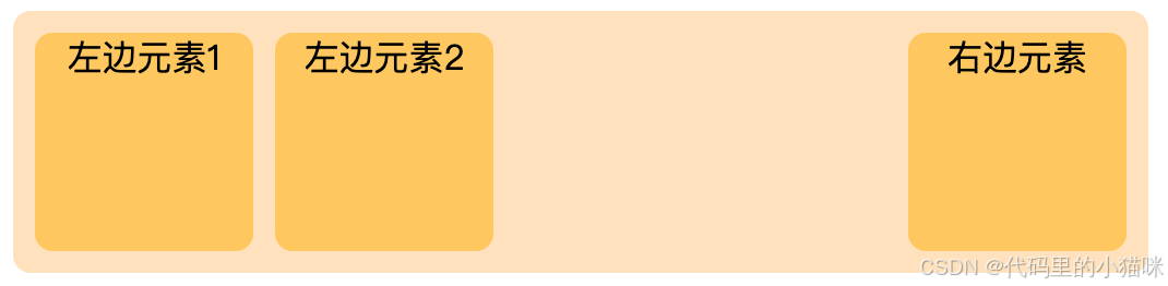
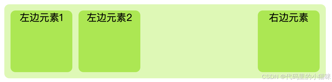
</html>展示为:
同理:如果想让某一个子元素靠左排列,那父容器设置display: flex ,该元素设置 margin-right: auto。
原理:
1、display: flex 将父容器变为弹性盒模型容器,子元素变为弹性盒项目(flex items),弹性盒模型自动处理子元素的排列,使它们默认水平排列。
2、使用 margin-left: auto 可以将某个子元素推到容器的最右边,原因是 auto 会自动填充元素左侧的剩余空间,这会将该子元素向右移动到容器的右边界。
3、margin-right: auto 同理,将某个子元素推到容器的最左边。
2. grid 布局
CSS grid 也是一种强大的布局工具,可以指定某个子元素在网格布局的某个区域中显示。父容器设置:display: grid; grid-template-columns: auto auto 1fr; 靠右元素设置:justify-self: end; 即可。
举个 🌰
html
<!DOCTYPE html>
<html lang="en">
<head>
<meta charset="UTF-8" />
<meta name="viewport" content="width=device-width, initial-scale=1.0" />
<title>Document</title>
<style>
.container {
width: 500px;
padding: 10px;
background-color: #fdcedd;
border-radius: 8px;
/* 主要代码 */
display: grid;
grid-template-columns: auto auto 1fr; /* 左边两个元素自动宽度,右边占据剩余空间 */
}
.item {
width: 100px;
height: 100px;
background-color: #ff889c;
text-align: center;
border-radius: 8px;
}
.left {
margin-right: 10px;
}
.right {
justify-self: end; /* 将这个子元素推到右边 */
}
</style>
</head>
<body>
<div class="container">
<div class="item left">左边元素1</div>
<div class="item left">左边元素2</div>
<div class="item right">右边元素</div>
</div>
</body>
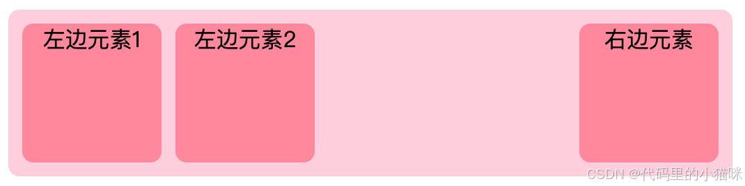
</html>展示为:
同理,实现某一个元素靠左排列,父容器设置:display: grid; grid-template-columns: 1fr auto auto; 靠左元素设置:justify-self: start; 即可。
原理:
1、display: grid 将父容器转换为网格容器(grid container),grid-template-columns 定义了网格的列数及其宽度。在该 🌰 中,前两列的宽度是自动的(根据内容的大小调整),第三列占据容器剩余的空间(通过 1fr 实现,它表示剩余空间的1倍份额)。
2、justify-self: end 指将指定的子元素在单元格内水平向右对齐。
3、justify-self: start; 指将指定的子元素在单元格内水平向左对齐。
3. 使用 float
float 是较早期的一种布局方式,尽管现在使用的比较少,但有时仍然有效。只需要在靠左元素上添加 float: left,靠右元素上添加:float: right 即可实现。
举个 🌰
html
<!DOCTYPE html>
<html lang="en">
<head>
<meta charset="UTF-8" />
<meta name="viewport" content="width=device-width, initial-scale=1.0" />
<title>Document</title>
<style>
.container {
width: 500px;
background-color: #def8b7;
border-radius: 8px;
padding: 10px;
}
/* 注意:清除浮动 */
.container::after {
content: '';
display: block;
clear: both;
}
.item {
width: 100px;
height: 100px;
background-color: #ace753;
text-align: center;
border-radius: 8px;
}
.left {
float: left;
margin-right: 10px;
}
.right {
float: right;
}
</style>
</head>
<body>
<div class="container">
<div class="item left">左边元素1</div>
<div class="item left">左边元素2</div>
<div class="item right">右边元素</div>
</div>
</body>
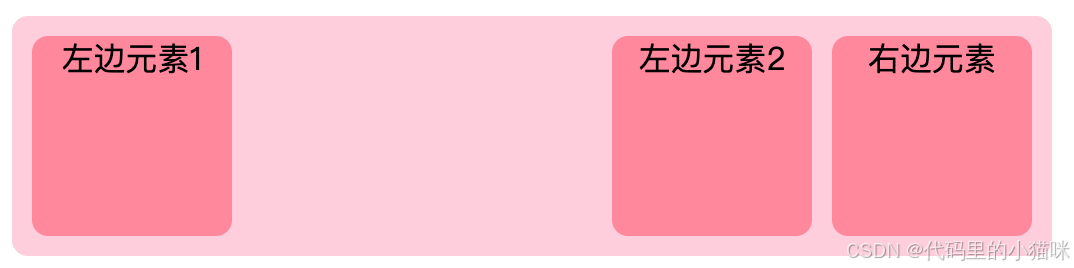
</html>展示为:
float 是一种较早的布局方式,它最初用于图文混排,但后来被用于实现左右分布的布局。
原理:
1、float: left 会使元素向容器的左边浮动,并让后续的元素绕过它。如果多个元素都设置了 float: left,它们会依次排列在容器的左边。float: right 将元素向右浮动,与左边元素相对。
2、使用 clear 可以防止浮动元素影响后续的非浮动元素。通常,这种布局方式需要考虑清除浮动以避免布局崩溃。
注意📢:float 不太适合这种布局,维护起来不如 flex 和 grid 简单。
4. 使用 position: absolute
当父元素为 relative,可以将右边的子元素设置为 absolute 定位。
举个 🌰
html
<!DOCTYPE html>
<html lang="en">
<head>
<meta charset="UTF-8" />
<meta name="viewport" content="width=device-width, initial-scale=1.0" />
<title>Document</title>
<style>
.container {
width: 500px;
padding: 10px;
background-color: #9af5ff;
border-radius: 8px;
/* 主要代码 */
position: relative; /* 定义父容器为相对定位 */
/* height: 100px; */
}
.item {
width: 100px;
height: 100px;
text-align: center;
background-color: #23e9ff;
border-radius: 8px;
}
.left1 {
position: absolute;
left: 10px;
top: 10px;
}
.left2 {
position: absolute;
top: 10px;
left: 120px;
}
.right {
position: absolute;
right: 10px; /* 将右边元素推到右边 */
top: 10px;
}
</style>
</head>
<body>
<div class="container">
<div class="item left1">左边元素1</div>
<div class="item left2">左边元素2</div>
<div class="item right">右边元素</div>
</div>
</body>
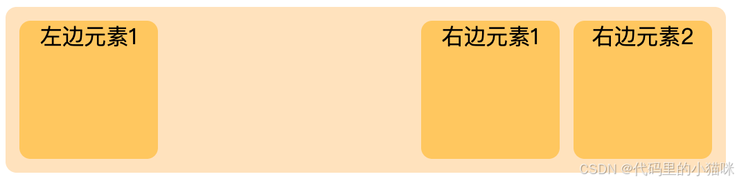
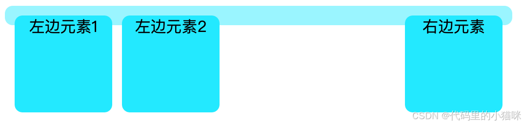
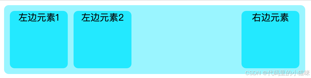
</html>该方法需要给每一个元素设置位置,并且父元素的高度需要处理,比较麻烦。
不设置高度展示为:
设置高度展示为:
position 属性允许我们对元素进行更精确的定位,absolute 定位相对于离它最近的 reactive 定位的父元素或文档流进行偏移。
原理:
1、父元素使用 position: relative, 它成为 absolute 子元素的定位参考。position: absolute 的子元素完全脱离文档流,不会影响其他元素的排列。
2、设置 right 可以将该子元素定位到父容器的右边界。因为该元素是 absolute 定位的,所以它在布局上不会与其他子元素产生冲突。
注意📢:使用 position: absolute 需要小心,因为它会将元素从正常的文档流中移除,可能会对页面的响应性和布局结构产生影响。
5. 总结
1、Flex(推荐):适合处理单行或单列的布局,具有自动对齐和分布功能,适合响应式设计。
2、Grid:适合处理复杂的二维布局,提供了行和列的控制,非常灵活。
3、Float:早期的布局方法,现在主要用于图文混排和较简单的布局,已经逐渐被其他方法取代。
4、Absolute:适用于需要精确定位的场景,但需要避免影响其他元素的布局。