文章目录
- 二维可视化方案
- 平面等高线
-
- plotly.express
- Plotly的另一个模块
- [代码4 Plotly生成的](#代码4 Plotly生成的)
- 热图
- 三维可视化方案
- 三维散点图
-
- 代码8
- [代码9 plotly绘制](#代码9 plotly绘制)
- 三维线图
- 用Matplotlib和Plotly可视化三维网格面
- 三维等高线图
- 箭头图
思维导图

函数使用
二维可视化方案
平面散点图

使用scatter函数
matplotlib.pyplot.scatter()
seaborn. Scatterplot()
可交互的散点图
plotly.express.scatter()
plotly.graph_objects.Scatter()
散点图的示例
python
import matplotlib.pyplot as plt
import numpy as np

plt.style.use('_mpl-gallery')

# make the data
np.random.seed(3)
x = 4 + np.random.normal(0, 2, 24)
y = 4 + np.random.normal(0, 2, len(x))
# size and color:
sizes = np.random.uniform(15, 80, len(x))
colors = np.random.uniform(15, 80, len(x))

# plot
fig, ax = plt.subplots()

ax.scatter(x, y, s=sizes, c=colors, vmin=0, vmax=100)

ax.set(xlim=(0, 8), xticks=np.arange(1, 8),
       ylim=(0, 8), yticks=np.arange(1, 8))

plt.show()代码1:绘制鸢尾花的散点图
python
# 导入包
import matplotlib.pyplot as plt
from sklearn.datasets import load_iris
import numpy as np

# 加载鸢尾花数据集
iris = load_iris()
#(*, return_X_y=False, as_frame=False)
#返回(数据、目标)
#返回dataframe对象
#默认的是数组,
iris = load_iris(as_frame=True)

# 提取花萼长度和花萼宽度作为变量
sepal_length = iris.data[:, 0]
sepal_width = iris.data[:, 1]
target = iris.target

fig, ax = plt.subplots()

# 创建散点图
plt.scatter(sepal_length, sepal_width, c=target, cmap='rainbow')

# 添加标题和轴标签
#使用轴对象的写法
plt.title('Iris sepal length vs width')# ax.set_title()
plt.xlabel('Sepal length (cm)')
plt.ylabel('Sepal width (cm)')

# 设置横纵轴刻度
ax.set_xticks(np.arange(4, 8 + 1, step=1))
ax.set_yticks(np.arange(1, 5 + 1, step=1))

# 设定横纵轴尺度1:1
ax.axis('scaled')

# 增加刻度网格,颜色为浅灰
ax.grid(linestyle='--', linewidth=0.25, color=[0.7,0.7,0.7])

# 设置横纵轴范围
ax.set_xbound(lower = 4, upper = 8)
ax.set_ybound(lower = 1, upper = 5)

# 显示图形
plt.show()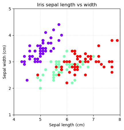
代码2Plotly绘制散点图
可交互
无颜色区分的
python
# 导入包
import numpy as np
import plotly.express as px

# 从Ploly中导入鸢尾花样本数据
iris_df = px.data.iris()

# 绘制散点图,不渲染marker
#dataframe,之后两行指定列
fig = px.scatter(iris_df, x="sepal_length", y="sepal_width",
                 width = 600, height = 600,
                 labels={"sepal_length": "Sepal length (cm)",
                         "sepal_width":  "Sepal width (cm)"})
# 修饰图像
fig.update_layout(xaxis_range=[4, 8], yaxis_range=[1, 5])
xticks = np.arange(4,8+1)
yticks = np.arange(1,5+1)

fig.update_layout(xaxis = dict(tickmode = 'array',
                               tickvals = xticks))
fig.update_layout(yaxis = dict(tickmode = 'array',
                               tickvals = yticks))
fig.show()
有颜色区分
python
# 绘制散点图,渲染marker展示鸢尾花分类
fig = px.scatter(iris_df, x="sepal_length", y="sepal_width",
                 color="species",
                 width = 600, height = 600,
                 labels={"sepal_length": "Sepal length (cm)",
                         "sepal_width": "Sepal width (cm)"})
# 修饰图像
fig.update_layout(xaxis_range=[4, 8], yaxis_range=[1, 5])
fig.update_layout(xaxis = dict(tickmode = 'array',
                               tickvals = xticks))
fig.update_layout(yaxis = dict(tickmode = 'array',
                               tickvals = yticks))

fig.update_layout(legend=dict(yanchor="top", y=0.99,
                              xanchor="left",x=0.01))
fig.show()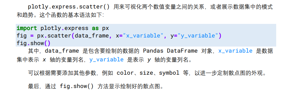
数据类型和绘图工具的对应
导入鸢尾花数据的三个途径。
大家可能发现,我们经常从不同的 Python 第三方库导入鸢尾花数据。本例用sklearn.datasets.load_iris(),这是因为 sklearn 中的鸢尾花数据将特征数据和标签数据分别保存,而且数据类型都是 NumPy Array,方便用 matplotlib 绘制散点图。
此外,NumPy Array 数据类型还方便调用 NumPy 中的线性代数函数。
我们也用 seaborn.load_dataset("iris") 导入鸢尾花数据集,数据类型为 Pandas DataFrame。
数据帧列标为
sepal_length'、'sepal_width'、'petal_length'、'petal_width'、'species',
其中,标签中的独特值为三个字符串'setosa'、'versicolor'、'virginica'。
Pandas DataFrame 获取某列独特值的函数为 pandas.unique()。这种数据类型方便利用Seaborn 进行统计可视化。此外,Pandas DataFrame 也特别方便利用 Pandas 的各种数据帧工具。
下一章会专门介绍利用 Seaborn 绘制散点图和其他常用统计可视化方案。
在利用 Plotly 可视化鸢尾花数据时,我们会直接从 Plotly 中用
plotly.express.data.iris() 导入鸢尾花数据,数据类型也是 Pandas DataFrame。
这个数据帧的列标签为'sepal_length'、'sepal_width'、'petal_length'、
'petal_width', 'species'、'species_id'。前五列和 Seaborn 中鸢尾花数据帧相同,不同的是'species_id'这一列的标签为整数 0、1、2。
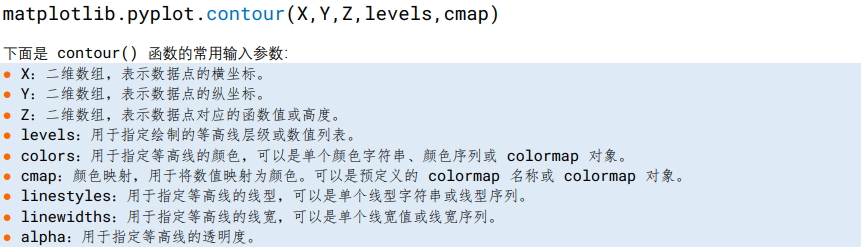
平面等高线
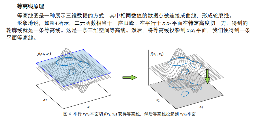
二元函数

代码3生成等高线
python
# 导入包
import numpy as np
import matplotlib.pyplot as plt

# 生成数据
# 坐标轴
x1_array = np.linspace(-3,3,121)
x2_array = np.linspace(-3,3,121)
#网格
xx1, xx2 = np.meshgrid(x1_array, x2_array)
#xx1和xx2 (121, 121)
#最后生成的值也是(121, 121)
ff = xx1 * np.exp(- xx1**2 - xx2 **2)

# 等高线
fig, ax = plt.subplots()

CS = ax.contour(xx1, xx2, ff, levels = 20,
                cmap = 'RdYlBu_r', linewidths = 1)

fig.colorbar(CS)
ax.set_xlabel(r'$\it{x_1}$'); ax.set_ylabel(r'$\it{x_2}$')
ax.set_xticks([]); ax.set_yticks([])
ax.set_xlim(xx1.min(), xx1.max())
ax.set_ylim(xx2.min(), xx2.max())r
ax.grid(False)
ax.set_aspect('equal', adjustable='box')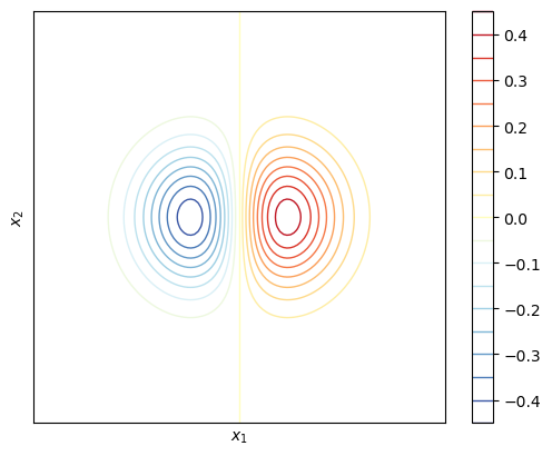
python
# 填充等高线
fig, ax = plt.subplots()

CS = ax.contourf(xx1, xx2, ff, levels = 20,
                 cmap = 'RdYlBu_r')

fig.colorbar(CS)
ax.set_xlabel(r'$\it{x_1}$'); ax.set_ylabel(r'$\it{x_2}$')
ax.set_xticks([]); ax.set_yticks([])
ax.set_xlim(xx1.min(), xx1.max())
ax.set_ylim(xx2.min(), xx2.max())
#去掉了网格
ax. Grid(False)
ax.set_aspect('equal', adjustable='box')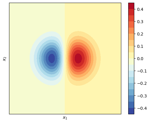
上面两个的区别在于
- ax.contourf 填充曲线
- ax.contourr 曲线
网格数据
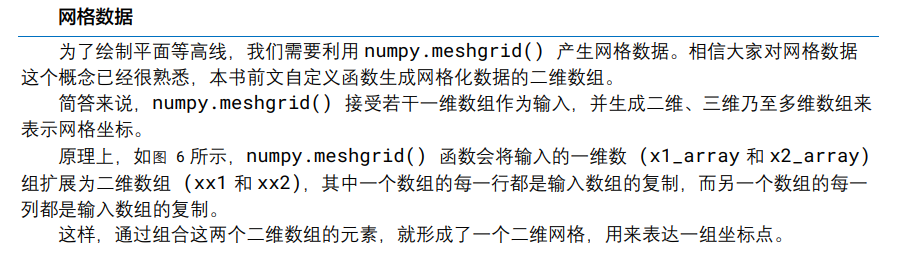
实际的存储格式
xx1横轴
xx2纵轴

plotly.express
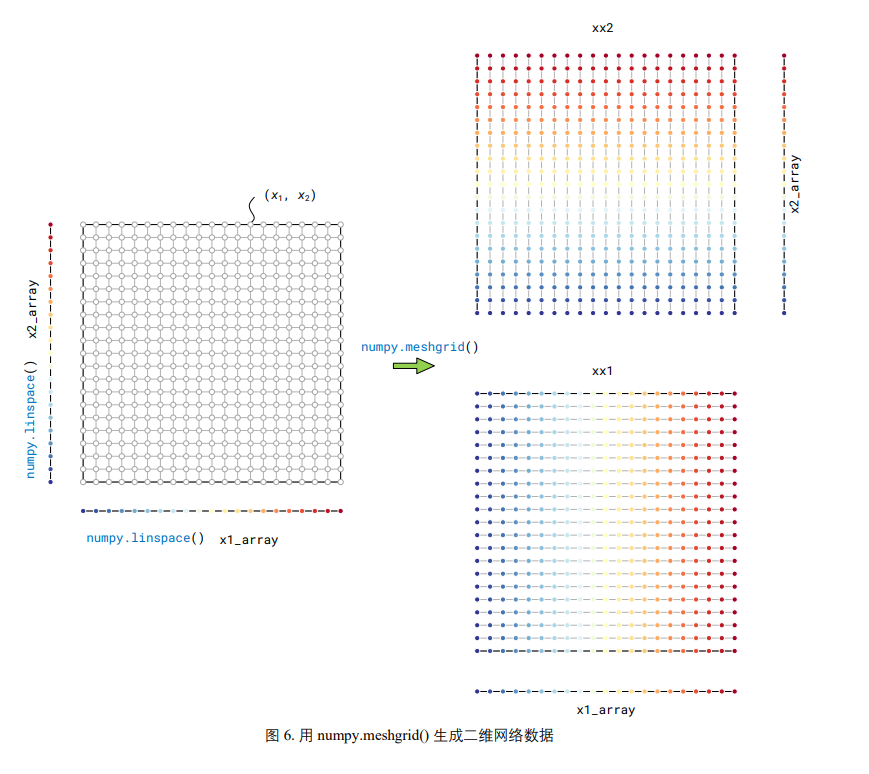
python
import plotly.express as px
df = px.data.gapminder()

fig = px.scatter(df.query("year==2007"),
 x="gdpPercap",
  y="lifeExp",
   size="pop",
   color="continent",
 hover_name="country",#鼠标停留触发
 log_x=True, size_max=55)
fig.show()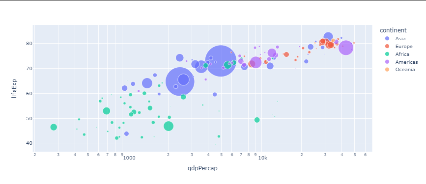
不指定年份,
python
fig = px.scatter(df, x="gdpPercap", y="lifeExp",
                 animation_frame="year",
                  size="pop", color="continent",
                 hover_name="country",
                 log_x=True, size_max=55)
                 # fig.update_layout(xaxis_range=[0,10])
fig.update_layout(yaxis_range=[30,90])
fig.show()
是否可以在热图中使用这个,来查看相关性和其他属性。
关键的绘图函数
Plotly的另一个模块
plotly.graph_objects 复杂度是高于plotly.express的
代码4 Plotly生成的
python
# 导入包
import numpy as np
import matplotlib.pyplot as plt
import plotly.graph_objects as go
python
# 生成数据
x1_array = np.linspace(-3,3,121)
x2_array = np.linspace(-3,3,121)

xx1, xx2 = np.meshgrid(x1_array, x2_array)
ff = xx1 * np.exp(- xx1**2 - xx2 **2)
python
# 等高线设置
#levels的字典
levels = dict(start=-0.5,end=0.5,size=0.05)
data = go.Contour(x=x1_array,y=x2_array,z=ff,
        contours_coloring='lines',
        line_width=2,
        colorscale = 'RdYlBu_r',
        contours=levels)
python
# 创建布局
layout = go.Layout(
    width=600,   # 设置图形宽度
    height=600,  # 设置图形高度
    xaxis=dict(title=r'$x_1$'),
    yaxis=dict(title=r'$x_2$'))
python
# 创建图形对象
fig = go.Figure(data=data, layout=layout)

fig.show()
matplotlib 绘制各种二维的函数
peak function
z = 3 ( 1 − x ) 2 e − x 2 − ( y + 1 ) 2 − 10 ( x 5 − x 3 − y 5 ) e − x 2 − y 2 − 1 3 e − ( x + 1 ) 2 − y 2 . z=3(1-x)^{2}e^{-x^{2}-(y+1)^{2}}-10\biggl(\frac{x}{5}-x^{3}-y^{5}\biggr)e^{-x^{2}-y^{2}}-\frac{1}{3}e^{-(x+1)^{2}-y^{2}}. z=3(1−x)2e−x2−(y+1)2−10(5x−x3−y5)e−x2−y2−31e−(x+1)2−y2.
绘制一下上面的函数
python
import numpy as np
import matplotlib.pyplot as plt
from mpl_toolkits.mplot3d import Axes3D
# 创建 x, y 的网格
x = np.linspace(-3, 3, 300)
y = np.linspace(-3, 3, 300)
x, y = np.meshgrid(x, y)

# 计算 z 的值
z = z_func(x, y)

# 绘制图形
fig = plt.figure(figsize=(10, 8))
ax = fig.add_subplot(111, projection='3d')

# 绘制曲面图
surf = ax.plot_surface(x, y, z, cmap='viridis')

# 添加颜色条
fig.colorbar(surf)

# 设置图形标签
ax.set_xlabel('X')
ax.set_ylabel('Y')
ax.set_zlabel('Z')

plt.show()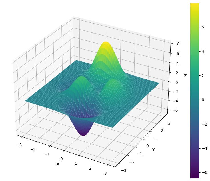
怎么绘制等高线
python
import numpy as np
import matplotlib.pyplot as plt
# 定义函数
def z_func(x, y):
    term1 = 3 * (1 - x) ** 2 * np.exp(-x ** 2 - (y + 1) ** 2)
    term2 = -10 * ((x / 5) - x ** 3 - y ** 5) * np.exp(-x ** 2 - y ** 2)
    term3 = -(1 / 3) * np.exp(-(x + 1) ** 2 - y ** 2)
    return term1 + term2 + term3

# 创建 x, y 的网格
x = np.linspace(-3, 3, 300)
y = np.linspace(-3, 3, 300)
x, y = np.meshgrid(x, y)

# 计算 z 的值
z = z_func(x, y)
fig, ax = plt.subplots()
#说明level可以指定数量,也可以是数组,指定绘制等高线的位置[-0.4,-0.2,0,0.2,0.4]
CS = ax.contourf(x, y, z, levels = 20,
                 cmap = 'RdYlBu_r',linewidths=1.0)

fig.colorbar(CS)
ax.set_xlabel(r'$\it{x_1}$'); ax.set_yla bel(r'$\it{x_2}$')
ax.set_xticks([]); ax.set_yticks([])
ax.set_xlim(x.min(), x.max())
ax.set_ylim(y.min(), y.max())
ax.grid(True)
ax.set_aspect('equal', adjustable='box')

热图
不是矢量图,不推荐。

尝试使用seaborn和Plotly


代码5:鸢尾花热力图
python
# 导入包
import matplotlib.pyplot as plt
import seaborn as sns
iris_sns = sns.load_dataset("iris")
# 绘制热图
fig, ax = plt.subplots()

#选择绘制的是所有的列,对dataframe使用序号进行切片,序号为零到-1列,不取物种
#热图映射的最小值和最大值

sns.heatmap(data=iris_sns.iloc[:,0:-1],
            vmin = 0, vmax = 8,
            ax = ax,#在那个轴上绘制
            yticklabels = False,#不设置y轴
            xticklabels = ['Sepal length', 'Sepal width',
                           'Petal length', 'Petal width'],
            cmap = 'RdYlBu_r')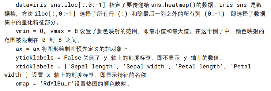
代码6使用plotly绘制
python
# 导入包
import matplotlib.pyplot as plt
import plotly.express as px

# 从Plotly中导入鸢尾花样本数据
df = px.data.iris()
# 创建Plotly热图
fig = px.imshow(df.iloc[:,0:-2], text_auto=False,
                width = 600, height = 600,
                x = None, zmin=0, zmax=8,
                color_continuous_scale = 'viridis')

# 隐藏 y 轴刻度标签
fig.update_layout(yaxis=dict(tickmode='array',tickvals=[]))

# 修改 x 轴刻度标签
x_labels = ['Sepal length', 'Sepal width',
            'Petal length', 'Petal width']
x_ticks  = list(range(len(x_labels)))
fig.update_xaxes(tickmode='array',tickvals=x_ticks,
                 ticktext=x_labels)
fig.show()

三维可视化方案
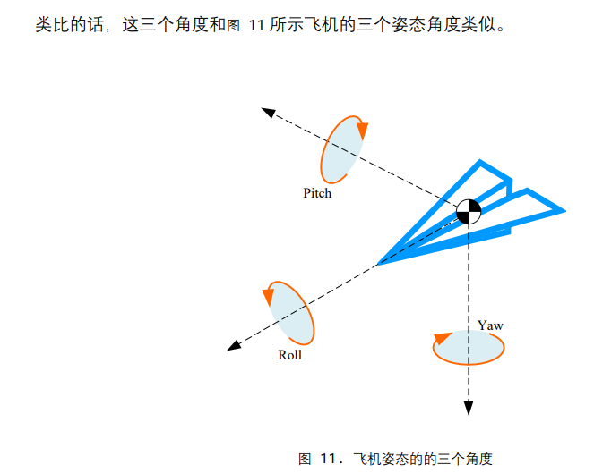
在绘制图像时,我们首要考虑视角的问题


Matplotlib设置视角和相机角度


代码7:设置角度
python
import matplotlib.pyplot as plt
# 导入Matplotlib的绘图模块
fig = plt.figure()
# 创建一个新的图形窗口

ax = fig.add_subplot(projection='3d')
# 在图形窗口中添加一个3D坐标轴子图

ax.set_xlabel('x')
ax.set_ylabel('y')
ax.set_zlabel('z')
# 设置坐标轴的标签

ax.set_proj_type('ortho')
# 设置投影类型为正交投影 (orthographic projection)

ax.view_init(elev=30, azim=30)
# 设置观察者的仰角为30度,方位角为30度,即改变三维图形的视角

ax.set_box_aspect([1,1,1])
# 设置三个坐标轴的比例一致,使得图形在三个方向上等比例显示

plt.show()
# 显示图形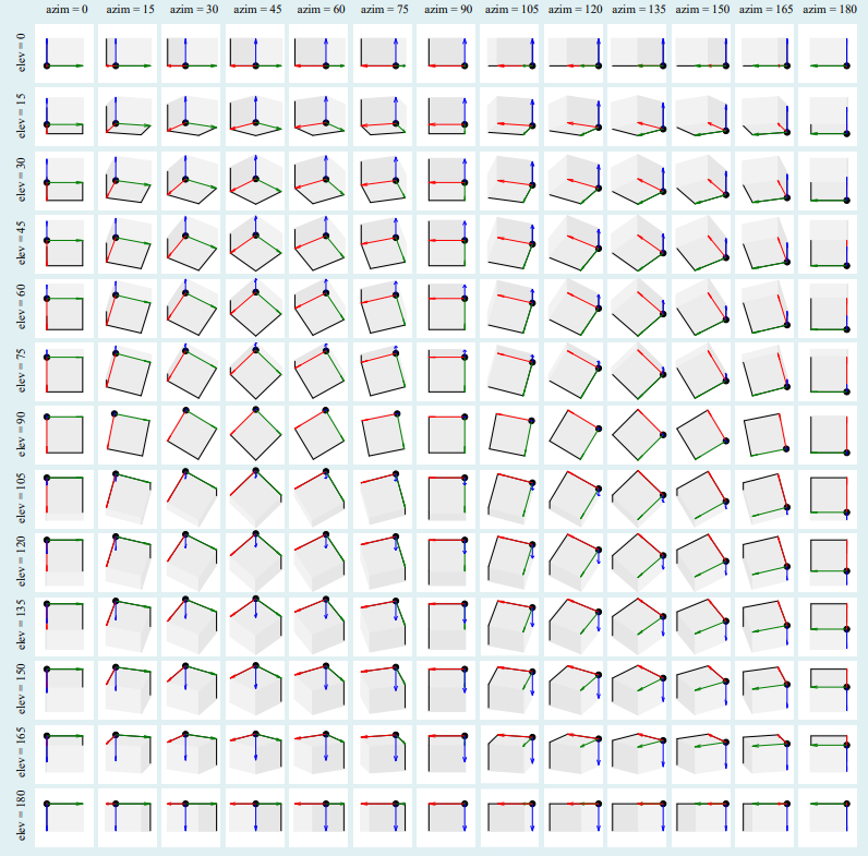
设置的elev(仰角)和azim(方位角)的坐标布局
投影的两种方式
上面给出的六种方式是正交投影

透视效果符合人眼,但是会造成误判。
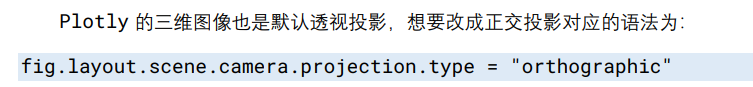
python
fig.layout.scene.camera.projection.type = "orthographic"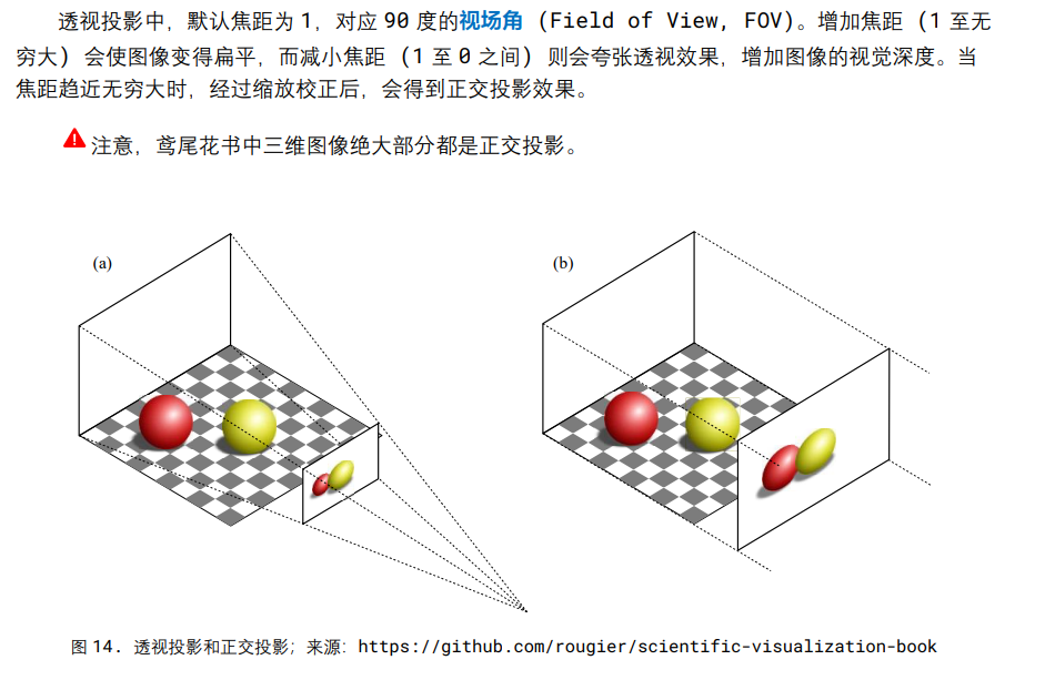
此外透视投影还会有焦距参数,对显示的图像造成影响。

三维散点图
代码8
python
# 导入包
import matplotlib.pyplot as plt
import numpy as np
from sklearn import datasets

# 加载鸢尾花数据集
iris = datasets.load_iris()
# 取出前三个特征作为横纵坐标和高度
X = iris.data[:, :3]
y = iris.target

# 创建3D图像对象
fig = plt.figure()
#设置3d
ax = fig.add_subplot(111, projection='3d')

# 绘制散点图
ax.scatter(X[:, 0], X[:, 1], X[:, 2], c=y)

# 设置坐标轴标签
ax.set_xlabel('Sepal length')
ax.set_ylabel('Sepal width')
ax.set_zlabel('Petal length')
# 设置坐标轴取值范围
ax.set_xlim(4,8); ax.set_ylim(1,5); ax.set_zlim(0,8)
# 设置正交投影
ax.set_proj_type('ortho')
# 显示图像
plt.show()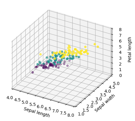
代码9 plotly绘制
python
import plotly.express as px
# 导入鸢尾花数据
df = px.data.iris()
fig = px.scatter_3d(df,
                    x='sepal_length',
                    y='sepal_width',
                    z='petal_length',
                    size = 'petal_width',
                    color='species')

fig.update_layout(autosize=False,width=500,height=500)
fig.layout.scene.camera.projection.type = "orthographic"
fig.show()
可旋转

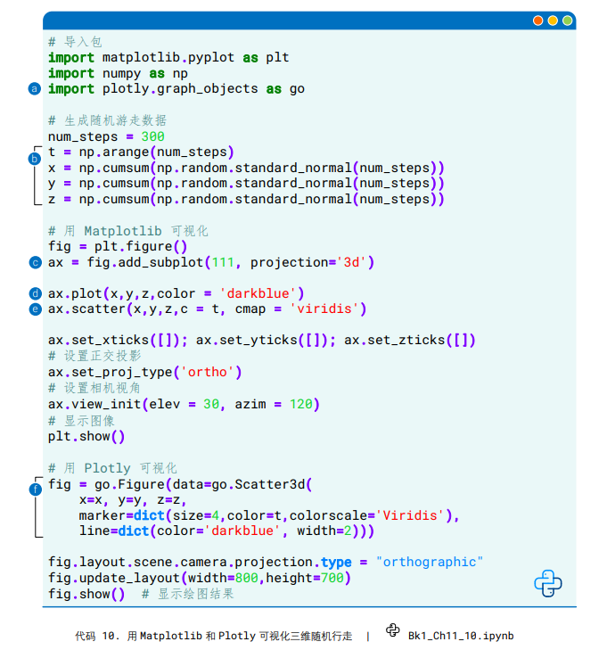
三维线图

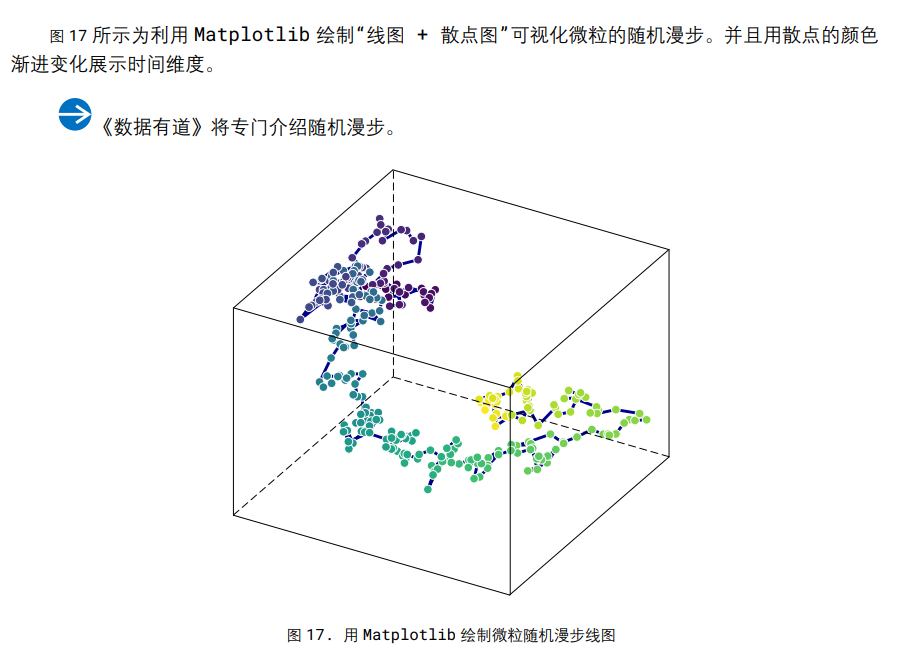
python
# 导入包
import matplotlib.pyplot as plt
import numpy as np
import plotly.graph_objects as go

# 生成随机游走数据
num_steps = 300
t = np.arange(num_steps)
#正态分布
#累加的结果是同形状的累加和
x = np.cumsum(np.random.standard_normal(num_steps))
y = np.cumsum(np.random.standard_normal(num_steps))
z = np.cumsum(np.random.standard_normal(num_steps))

# 用 Matplotlib 可视化
fig = plt.figure()
ax = fig.add_subplot(111, projection='3d')
#绘制线
ax.plot(x,y,z,color = 'darkblue')
#绘制点
ax.scatter(x,y,z,c = t, cmap = 'viridis')

ax.set_xticks([]); ax.set_yticks([]); ax.set_zticks([])
# 设置正交投影
ax.set_proj_type('ortho')
# 设置相机视角
ax.view_init(elev = 30, azim = 120)
# 显示图像
plt.show()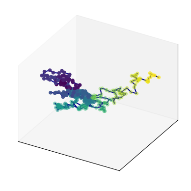
python
# 用 Plotly 可视化
fig = go.Figure(data=go.Scatter3d(
    x=x, y=y, z=z,
    marker=dict(size=4,color=t,colorscale='Viridis'),
    line=dict(color='darkblue', width=2)))

fig.layout.scene.camera.projection.type = "orthographic"
fig.update_layout(width=800,height=700)
fig.show()  # 显示绘图结果

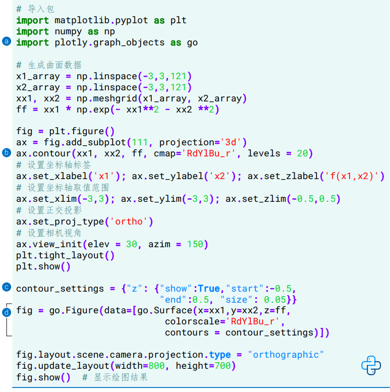
用Matplotlib和Plotly可视化三维网格面
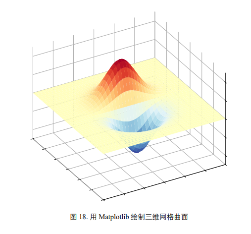
和平面等高线类似
python
import matplotlib.pyplot as plt
import numpy as np
import plotly.graph_objects as go

# 生成曲面数据
x1_array = np.linspace(-3,3,121)
x2_array = np.linspace(-3,3,121)

xx1, xx2 = np.meshgrid(x1_array, x2_array)
ff = xx1 * np.exp(- xx1**2 - xx2 **2)

# 用 Matplotlib 可视化三维曲面
fig = plt.figure()
ax = fig.add_subplot(111, projection='3d')

ax.plot_surface(xx1, xx2, ff, cmap='RdYlBu_r')

# 设置坐标轴标签
ax.set_xlabel('x1'); ax.set_ylabel('x2'); ax.set_zlabel('f(x1,x2)')
# 设置坐标轴取值范围
ax.set_xlim(-3,3); ax.set_ylim(-3,3); ax.set_zlim(-0.5,0.5)
# 设置正交投影
ax.set_proj_type('ortho')
# 设置相机视角
ax.view_init(elev = 30, azim = 150)
plt.tight_layout()
plt.show()
python
# 用 Plotly 可视化三维曲面
fig = go.Figure(data=[go.Surface(z=ff, x=xx1, y=xx2,
                                 colorscale='RdYlBu_r')])
fig.layout.scene.camera.projection.type = "orthographic"
fig.update_layout(width=800,height=700)
fig.show()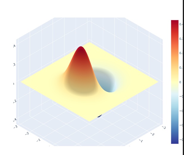
三维等高线图
箭头图
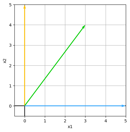
python
# 定义二维列表
A = [[0,5],
     [3,4],
     [5,0]]
# 自定义可视化函数
def draw_vector(vector,RBG):
    plt.quiver(0, 0, vector[0], vector[1],angles='xy',
               scale_units='xy',scale=1,color = RBG,
               zorder = 1e5)

fig, ax = plt.subplots()
v1 = A[0] # 第一行向量
draw_vector(v1,'#FFC000')
v2 = A[1] # 第二行向量
draw_vector(v2,'#00CC00')
v3 = A[2] # 第三行向量
draw_vector(v3,'#33A8FF')

ax.axvline(x = 0, c = 'k')
ax.axhline(y = 0, c = 'k')
ax.set_xlabel('x1')
ax.set_ylabel('x2')
ax.grid()
ax.set_aspect('equal', adjustable='box')
ax.set_xbound(lower = -0.5, upper = 5)
ax.set_ybound(lower = -0.5, upper = 5)
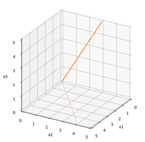
python
# 自定义可视化函数
def draw_vector_3D(vector,RBG):
    plt.quiver(0, 0, 0, vector[0], vector[1], vector[2],
               arrow_length_ratio=0, color = RBG,
               zorder = 1e5)
python
fig = plt.figure(figsize = (6,6))
ax = fig.add_subplot(111, projection='3d', proj_type = 'ortho')
# 第一列向量
v_1 = [row[0] for row in A]
draw_vector_3D(v_1,'#FF6600')
# 第二列向量
v_2 = [row[1] for row in A]
draw_vector_3D(v_2,'#FFBBFF')

ax.set_xlim(0,5)
ax.set_ylim(0,5)
ax.set_zlim(0,5)
ax.set_xlabel('x1')
ax.set_ylabel('x2')
ax.set_zlabel('x3')
ax.view_init(azim = 30, elev = 25)
ax.set_box_aspect([1,1,1])