flutter
161·`·由于官方的汉化文档感觉还是有很多没有汉化的地方 ,所以自己打一遍的同时写下了以下笔记
社区生态
官方文档 所有的控件:Widget 目录 | Flutter 中文文档 - Flutter 中文开发者网站 - Flutter
官方论坛的教程 Flutter Widget框架概述 - Flutter中文网 (flutterchina.club)
全球开发者写的flutter插件查找网站 Easy Flutter Pubs - Finding Flutter packages more easier (pubdev.top)
基本上各个开发者开发的查找凭借就可以凭借一款不错的app了
由于flutter是使用dart语言,所以需要熟悉dart (很简单 80%的java 和20%js的感觉)
目录结构:
my_flutter_app/
├── android/
├── build/
├── ios/
├── lib/
│ ├── main.dart
│ ├── pages/
│ │ ├── home_page.dart
│ │ ├── settings_page.dart
│ │ └──...
│ ├── models/
│ │ ├── user.dart
│ │ └──...
│ ├── services/
│ │ ├── api_service.dart
│ │ └──...
│ ├── utils/
│ │ ├── constants.dart
│ │ ├── helpers.dart
│ │ └──...
│ └── widgets/
│ ├── custom_button.dart
│ └──...
├── test/
├──.gitignore
├──.metadata
├── pubspec.yaml
├── README.md
└── analysis_options.yaml
pubspec.yaml :管理第三方依赖
还有一个lock 当运行编译产生文件
目录结构
而 ios 和 android 文件夹中的代码是用于集成 Flutter 应用到 iOS 和 Android 平台的原生部分。
所有的adrt代码写到lib目录 编译运行时候
快速入门
android studo 下载flutter插件后 进入lib目录进行启动
main是入口 app.run 是将widget(控件)渲染到屏幕上 flutter应用中的所有显示效果都是采用控件的形式
比如改成 显示一个文本
dart
  /**
   * widget 组件
    // * runapp 渲染组件到屏幕上
    // * 渲染构造眼熟时候就要求静态化
    // */
  runApp(const Text("你好 我是显示文本的组件",
      textDirection:TextDirection.ltr,
      style: TextStyle(
        shadows:[],
        fontSize: 30,
        color: Colors.pink,
      )
  ));
值得注意的是需要表明 标明控件的方向, 否则会进行报错
布局应用app(脚手架)
dart
void main() {

  /**
   * aterialApp 是 Flutter 框架中的一个顶级组件,用于构建一个基于 Material Design 风格的应用程序。Material Design 是 Google 推出的设计规范,强调简洁、响应式、多平台的一致用户体验,Flutter 提供了 MaterialApp 这个类来帮助开发者快速构建符合 Material Design 的应用。

      MaterialApp 作用
      MaterialApp 是 Flutter 应用的入口,负责管理应用的路由、主题、导航、以及一些全局的设置。它类似于 Android 中的 Application 类或是 iOS 中的 AppDelegate。
      为app 开发提供了模板 在其中写的组件 除开防线组件不需要写模板
   */

//1. 定义 TextTheme
  TextTheme textTheme = const TextTheme(
    bodyLarge:  TextStyle(fontSize: 18, color: Colors.red),
    // 可以定义更多的文本样式...
  );

    runApp(MaterialApp(
      theme: ThemeData(
        primarySwatch: Colors.blue,
//      2.  全局使用
        textTheme:textTheme),

      //为 Material Design 微件创建可视化基架。
      home: Scaffold(
        appBar: AppBar(
          //左边的图标
          leading: const Icon(Icons.access_alarms),
          // 中间区域 title
          title: const Center(child:   Text("测试app主页",
                style: TextStyle(
                  shadows:[],
                  color: Colors.cyan,
                )),
          ),
//          右边区域
          actions:[
            //3.  全局使用
            Text("详细查看", style: textTheme.bodyLarge, ),
            const Icon(Icons.ac_unit_sharp),
          ],
        ),

        // 内容部分   垂直布局  采用容器列进行布局

          body: Column(
            children: [
              Expanded(
                flex: 40, // 表示占据的比例
                child: Container(
                  color: Colors.red,
                  child: Center(
                    child: Column(  // 使用 Column 允许在同一区域放置多个控件
                      mainAxisAlignment: MainAxisAlignment.center,  // 垂直居中对齐
                      children: [
                        Container(
                          width: 100,
                          height: 100,
                          color: Colors.amberAccent,
                          child: TextButton(
                            onPressed: () => print("用户点击了按钮"),
                            onLongPress: () => print("长按触发事件"),
                            child: const Text("点击即可"),
                          ),
                        ),
                        const SizedBox(height: 20),  // 增加一个空隙


                        Container(
                          width: 100,
                          height: 100,
                          color: Colors.lightBlue,
                          child: TextButton(
                            onPressed: () => print("用户点击了另一个按钮"),
                            child: const Text("另一个按钮"),
                          ),
                        ),
                      ],
                    ),
                  ),
                ),
              ),
//              占位分割符
             const Spacer(),

              Expanded(
                flex: 20,
                //直接监听区域事件
                child: GestureDetector(
                  // 单击
                  onTap: () {
                    print("监听点击了按钮");
                  },

                  child: Container(
                    color: Colors.amber,
                    child: Container(
                      color: Colors.blue,
                      child:const Center(child: Text("蓝色容器")),
                    ),
                  ),
                ),
              ),
             const Spacer(),
              Expanded(
                flex: 20,
                child: Container(
                  color: Colors.green,
                  child: Center(child: Text("绿色容器")),
                ),
              ),
            ],
          ),


          //浮动按钮 可以点击 点击时触发事件 容器预一营好的布局 改按钮是在容器中 右下角
        floatingActionButton: FloatingActionButton(

          child:  Icon(Icons.account_balance_wallet_sharp),
        onPressed: () {
          print("点击了按钮");
        },
        tooltip: "长按触发事件",
        ),

        //底部的导航栏 有items 属性 当前位置 索引 点击时时间等
        bottomNavigationBar: buildBtoomnNavigationBar()
      ),
    ));
}

Widget buildBtoomnNavigationBar() {
  return BottomNavigationBar(
    items: const <BottomNavigationBarItem>[
      BottomNavigationBarItem(
        icon: Icon(Icons.home),
        label: '首页',
      ),
      BottomNavigationBarItem(
        icon: Icon(Icons.search),
        label: '搜索',
      ),
      BottomNavigationBarItem(
        icon: Icon(Icons.person),
        label: '个人中心',
      ),
    ],
    // 初始索引位置
    currentIndex: 0, // 选中的索引
    onTap: (index) {
      // 处理点击事件
      // 例如,切换页面

      print('点击了第$index 个按钮');
    },
  );
}
MaterialApp 就是一个快入搭建material风格的app脚手架 其中可以有各种空间
Scaffold 是 Flutter 中的一个基本结构组件,提供了一个应用程序的框架。它包含一个 AppBar(应用栏)、一个主内容区域(body)和一个底部导航栏(bottomNavigationBar)。
它让你更方便地构建具有 Material Design 风格的界面
Scaffold 的主要组成部分
Scaffold 提供了以下几个主要部分:
appBar:位于屏幕顶部的应用栏(AppBar)。
body:屏幕的主要内容区域。
bottomNavigationBar:位于屏幕底部的导航栏(BottomNavigationBar)。
floatingActionButton:浮动操作按钮(FloatingActionButton)。
drawer:侧边抽屉(Drawer)。
endDrawer:右侧边抽屉(EndDrawer)。
backgroundColor:背景颜色。
resizeToAvoidBottomInset:是否调整大小以避免底部内边距。
resizeToAvoidBottomPadding:是否调整大小以避免底部填充。
primary:是否是主要的屏幕。
extendBody:是否扩展到屏幕边缘。
extendBodyBehindAppBar:是否在 AppBar 后面扩展内容。
persistentFooterButtons:底部固定的按钮。
navigationMode:导航模式。
bottomSheet:底部表单(BottomSheet)。
这样看的话 flutter 就像是把各个ui控件拼接到各个布局组成app
并且跟web前端很相似
由于每一个布局的位置的参数都是控件 可以进行拆分成方法
所以这个给文档主要就是说各个控件以及相关api
布局控件
再任何布局前,官方推荐根布局嵌套一个safearea(安全区),自适应,不会被状态栏给挡住的内容区域
dart
body:SafeArea(
        child: ListView(......)
)
在body部分 ,这部分的控件主要是手机的主要显示区域 ,往往是一个列包裹多个行 (手机是竖屏显示)
contaier
body 部分确实经常使用像 Container 这样的组件来布局页面,但与前端开发中的 div 不完全相同。Flutter 提供了许多灵活的布局控件,开发者在实际开发中会根据需求来组合使用这些控件,而不仅仅依赖 Container。
Flutter 和前端布局的对比
- 前端
div:在前端开发中,div是一种非常基础的布局标签,几乎什么都可以包裹。开发者通常使用 CSS 来为div设置布局属性,比如flex、grid、padding、margin等。 - Flutter
Container:Container是 Flutter 中类似div的通用容器控件。它可以包裹其他控件,并允许设置padding、margin、border、color、width、height等属性。除此之外,Flutter 提供了更多的布局控件,如Row、Column、Stack、Expanded等,专门用于实现不同的布局。
实际开发中的 body 布局
在实际开发中,body 部分通常使用多个 Flutter 的布局控件进行嵌套组合,而不仅仅是使用 Container。这使得布局更加灵活和响应式。下面是一些常见的布局控件及其用法:
1. Column 和 Row
Column 和 Row 是最常见的布局控件,用于垂直或水平排列子组件。它们可以像前端的 flex 布局一样使用(不可以直接设置宽度高度 需要根据子容器来)
dart
body: Column(
  children: [
    Container(
      width: double.infinity,
      height: 200,
      color: Colors.red,
      child: Center(child: Text("顶部区域")),
    ),
    Row(
      children: [
        Expanded(child: Container(color: Colors.blue, height: 100)),
        Expanded(child: Container(color: Colors.green, height: 100)),
      ],
    ),
    Container(
      width: double.infinity,
      height: 200,
      color: Colors.yellow,
      child: Center(child: Text("底部区域")),
    ),
  ],
)
并且row和col 都有俩个相同的api
主轴和副轴的对称方式
dar
  		 mainAxisAlignment: MainAxisAlignment.spaceBetween, // 主轴对齐方式
          crossAxisAlignment: CrossAxisAlignment.center, // 副轴对齐方式
比如当布局时row 时候,主轴就是行,副轴就是列
当然这种包裹的子组件是children 如果类似多个控件数组,有多种方式批量生成
list.generate
dart
   List<String> items = ['Apple', 'Banana', 'Cherry'];
   List<Widget> widgetList = List.generate(items.length, (index) {
     return Text(items[index]);
   });
map (类似java stream 流)
dart
   List<String> items = ['Apple', 'Banana', 'Cherry'];
   List<Widget> widgetList = items.map((item) => Text(item)).toList();
builder
dart
   ListView.builder(
     itemCount: items.length,
     itemBuilder: (BuildContext context, int index) {
       return Text(items[index]);
     },
   );
最简单的for 构建控件数组
dart
   List<Widget> widgetList = [];
   for (var item in items) {
     widgetList.add(Text(item));
   }
2. Stack
Stack 类似于 HTML/CSS 中的 position: absolute,允许在同一个布局中叠加多个组件。
dart
body: Stack(
  children: [
    Container(
      width: double.infinity,
      height: 300,
      color: Colors.blue,
    ),
    //搭配这个属性可以实现类似z-index:999的效果
    Positioned(
      top: 100,
      left: 50,
      child: Container(
        width: 100,
        height: 100,
        color: Colors.red,
      ),
    ),
  ],
)
3. ListView
对于需要滚动的内容,ListView 是一个非常常用的控件,类似于 HTML 中的 ul 或者 ol。
dart复制代码body: ListView(
  children: [
    Container(
      height: 100,
      color: Colors.red,
      child: Center(child: Text("第一个Item")),
    ),
    Container(
      height: 100,
      color: Colors.blue,
      child: Center(child: Text("第二个Item")),
    ),
    // 更多的Item
  ],
)
4. Expanded 和 Flexible
当你想要让某些子组件根据父组件的剩余空间自动调整大小时,Expanded 和 Flexible 是非常有用的。
dart复制代码body: Row(
  children: [
    Container(width: 100, height: 100, color: Colors.red),
    Expanded(
      child: Container(
        height: 100,
        color: Colors.blue,
        child: Text("我会填满剩下的空间"),
      ),
    ),
  ],
)
注意
往往使用这个expanded来进行达到flex布局的效果时候 (只看内容部分 ) ,如果是Row的属性 flex 比列就是行宽占比 ,Colum 就是列
dart
void main() {

  /**
   * aterialApp 是 Flutter 框架中的一个顶级组件,用于构建一个基于 Material Design 风格的应用程序。Material Design 是 Google 推出的设计规范,强调简洁、响应式、多平台的一致用户体验,Flutter 提供了 MaterialApp 这个类来帮助开发者快速构建符合 Material Design 的应用。

      MaterialApp 作用
      MaterialApp 是 Flutter 应用的入口,负责管理应用的路由、主题、导航、以及一些全局的设置。它类似于 Android 中的 Application 类或是 iOS 中的 AppDelegate。
      为app 开发提供了模板 在其中写的组件 除开防线组件不需要写模板
   */

//1. 定义 TextTheme
  TextTheme textTheme = const TextTheme(
    bodyLarge:  TextStyle(fontSize: 18, color: Colors.red),
    // 可以定义更多的文本样式...
  );

    runApp(MaterialApp(
      theme: ThemeData(
        primarySwatch: Colors.blue,
//      2.  全局使用
        textTheme:textTheme),

      //为 Material Design 微件创建可视化基架。
      home: Scaffold(
        appBar: AppBar(
          //左边的图标
          leading: const Icon(Icons.access_alarms),
          // 中间区域 title
          title: const Center(child:   Text("测试app主页",
                style: TextStyle(
                  shadows:[],
                  color: Colors.cyan,
                )),
          ),
//          右边区域
          actions:[
            //3.  全局使用
            Text("详细查看", style: textTheme.bodyLarge, ),
            const Icon(Icons.ac_unit_sharp),
          ],
        ),

        // 内容部分

          body: Column(
            children: [
              // 使用 Expanded 来占据屏幕宽度的剩余空间
              Expanded(
                flex: 2, // 表示占据的比例,值越大占据的空间越多
                child: Container(
                  color: Colors.red,
                  child: Center(child: Text("红色容器")),
                ),
              ),
              Expanded(
                flex: 1, // 这里的比例是1:1:1

                child: Container(
                  color: Colors.blue,
                  child: Center(child: Text("蓝色容器")),
                ),
              ),
              Expanded(
                flex: 1, // 这里的比例是1:1:1
                child: Container(
                  color: Colors.green,
                  child: Center(child: Text("绿色容器")),
                ),
              ),
            ],
          ),


          //浮动按钮 可以点击 点击时触发事件 容器预一营好的布局 改按钮是在容器中 右下角
        floatingActionButton: FloatingActionButton(
          child: const Icon(Icons.add),
        onPressed: () {
          print("点击了按钮");
        },
        tooltip: "长按触发事件",
        ),

        //底部的导航栏 有items 属性 当前位置 索引 点击时时间等
        bottomNavigationBar: buildBtoomnNavigationBar()
      ),
    ));
}
示例:实际应用中的 body 布局
dart
body: Column(
  children: [
    Container(
      height: 200,
      color: Colors.blue,
      child: Center(child: Text("顶部区域")),
    ),
    Expanded(
      child: ListView(
        children: [
          Container(
            height: 100,
            color: Colors.red,
            child: Center(child: Text("第一个Item")),
          ),
          Container(
            height: 100,
            color: Colors.green,
            child: Center(child: Text("第二个Item")),
          ),
        ],
      ),
    ),
    Container(
      height: 100,
      color: Colors.yellow,
      child: Center(child: Text("底部区域")),
    ),
  ],
)-
Container在 Flutter 中确实类似于 HTML 的div,但在实际开发中,你通常会根据需求使用更多其他布局控件。 -
在
body部分,开发者常常会使用Row、Column、Stack等布局控件,而不仅仅依赖Container,这样可以更灵活地管理布局。 -
mainAxisAlignment是 Flutter 中用于控制 主轴方向上 子控件的排列方式的属性。它主要用于Row(水平布局) 和Column(垂直布局)等多子控件的布局容器。1. 主轴和副轴的概念
-
主轴(Main Axis):是控件排列的主要方向。例如:
- 在
Row中,主轴是 水平方向,子控件从左到右排列。 - 在
Column中,主轴是 垂直方向,子控件从上到下排列。
- 在
-
副轴(Cross Axis):与主轴垂直的方向。例如:
- 在
Row中,副轴是 垂直方向。 - 在
Column中,副轴是 水平方向。
- 在
2.
mainAxisAlignment的作用mainAxisAlignment控制的是子控件在主轴方向上的对齐方式。例如,决定控件是靠左、居中还是分散排列。它有几个可选值,具体如下:3.
MainAxisAlignment的可选值-
MainAxisAlignment.start:子控件从主轴的 开始 对齐。- 对于
Row,就是从 左侧 开始对齐。 - 对于
Column,就是从 顶部 开始对齐。
dartmainAxisAlignment: MainAxisAlignment.start, - 对于
-
MainAxisAlignment.end:子控件从主轴的 末端 对齐。- 对于
Row,就是从 右侧 对齐。 - 对于
Column,就是从 底部 对齐。
dartmainAxisAlignment: MainAxisAlignment.end, - 对于
-
MainAxisAlignment.center:子控件在主轴上 居中 对齐。dartmainAxisAlignment: MainAxisAlignment.center, -
MainAxisAlignment.spaceBetween:子控件在主轴上 两端对齐 ,而且子控件之间的间距是 均匀分布的。dartmainAxisAlignment: MainAxisAlignment.spaceBetween, -
MainAxisAlignment.spaceAround:子控件之间的间距是均匀分布的,并且 两端的间距是控件之间间距的一半。dartmainAxisAlignment: MainAxisAlignment.spaceAround, -
MainAxisAlignment.spaceEvenly:子控件之间的间距是 完全均匀分布 的,包括控件和容器的两端。dartmainAxisAlignment: MainAxisAlignment.spaceEvenly,
4. 实例说明
dartimport 'package:flutter/material.dart'; void main() { runApp(MaterialApp( home: Scaffold( appBar: AppBar( title: Text('MainAxisAlignment 演示'), ), body: Row( mainAxisAlignment: MainAxisAlignment.spaceAround, children: [ Container(color: Colors.red, width: 50, height: 50), Container(color: Colors.green, width: 50, height: 50), Container(color: Colors.blue, width: 50, height: 50), ], ), ), )); }在这个例子中,
Row使用了MainAxisAlignment.spaceAround,所以三个颜色的方块会在水平方向上均匀排列,左右两端的间距是控件之间间距的一半。 -
动态布局
在 Flutter 中,Expanded 是一种非常常用的控件,它允许子控件在父容器中根据可用空间进行扩展,以实现响应式布局。但并不是只有 Expanded 可以实现响应式布局,Flutter 提供了多种方式实现响应式布局,取决于具体的需求和场景。下面是几种实现响应式布局的常见方法:
Expanded 和 Flexible
-
Expanded:可以让子控件在父容器中占据剩余的可用空间。所有使用Expanded的子控件都会均匀分配可用空间。示例:
dartRow( children: [ Expanded( child: Container(color: Colors.red), ), Expanded( child: Container(color: Colors.green), ), ], )在这个例子中,两个
Container会各自占据一半的可用空间。 -
Flexible:与Expanded类似,但Flexible可以让子控件在父容器中根据比例分配空间,且子控件不会强制填满空间。示例:
dartRow( children: [ Flexible( flex: 2, child: Container(color: Colors.red), ), Flexible( flex: 1, child: Container(color: Colors.green), ), ], )这里,
Container会按照2:1的比例来分配剩余空间。
MediaQuery
MediaQuery 是 Flutter 中用于获取屏幕尺寸和设备信息的工具。你可以使用它来根据屏幕的大小调整布局,从而实现响应式设计。
示例:
dart
double screenWidth = MediaQuery.of(context).size.width;

Container(
  width: screenWidth * 0.5,  // 设置容器宽度为屏幕宽度的50%
  height: 100,
  color: Colors.blue,
)
在这个例子中,我们根据屏幕的宽度调整了 Container 的大小,从而实现了响应式布局。
LayoutBuilder
LayoutBuilder 允许你根据父容器的尺寸来动态调整子控件的布局。它特别适合处理不同尺寸的布局需求。
示例:
dart
LayoutBuilder(
  builder: (context, constraints) {
    if (constraints.maxWidth > 600) {
      return Text("大屏布局");
    } else {
      return Text("小屏布局");
    }
  }
)在这个例子中,根据父容器的宽度,Text 的内容会发生变化。
AspectRatio
AspectRatio 控件可以帮助你控制子控件的宽高比,确保其响应式调整大小。
示例:
dart
AspectRatio(
  aspectRatio: 16/9,
  child: Container(color: Colors.red),
)
这个 AspectRatio 控件会确保 Container 以 16:9 的比例进行缩放,无论父容器的大小如何。
FittedBox
FittedBox 用于调整子控件的大小以适应父容器,并保持子控件内容的比例。
示例:
dart
FittedBox(
  child: Text('这是一个长文本'),
)
FittedBox 会自动缩放 Text,以确保它能够适应可用的空间。
Wrap
Wrap 是一种类似 Row 和 Column 的布局方式,但它允许子控件在空间不足时换行,因此在处理动态数量的子控件时非常有用。
示例:
dart
Wrap(
  children: [
    Container(width: 100, height: 100, color: Colors.red),
    Container(width: 100, height: 100, color: Colors.green),
    Container(width: 100, height: 100, color: Colors.blue),
    Container(width: 100, height: 100, color: Colors.yellow),
  ],
)在这个例子中,Wrap 会在一行容不下所有 Container 时自动换行,从而实现响应式布局。
分割符
dart
Spacer(),用来做容器中的内容分割,点击源码 发现默认是一个一个占比的 所有整个 容器的占比 就至少根据这个情况来
dart
  const Spacer({super.key, this.flex = 1})
    : assert(flex > 0);
比如
dart
          body: Column(
            children: [
              Expanded(
                flex: 20, // 表示占据的比例
                child: Container(
                  color: Colors.red,
                  child: Center(
                    child: Column(  // 使用 Column 允许在同一区域放置多个控件
                      mainAxisAlignment: MainAxisAlignment.center,  // 垂直居中对齐
                      children: [
                        Container(
                          width: 100,
                          height: 100,
                          color: Colors.amberAccent,
                          child: TextButton(
                            onPressed: () => print("用户点击了按钮"),
                            onLongPress: () => print("长按触发事件"),
                            child: const Text("点击即可"),
                          ),
                        ),
                        const SizedBox(height: 20),  // 增加一个空隙
                        Container(
                          width: 100,
                          height: 100,
                          color: Colors.lightBlue,
                          child: TextButton(
                            onPressed: () => print("用户点击了另一个按钮"),
                            child: const Text("另一个按钮"),
                          ),
                        ),
                      ],
                    ),
                  ),
                ),
              ),
//              占位分割符
              Spacer(),
              Expanded(
                flex: 10,
                child: Container(
                  color: Colors.blue,
                  child: Center(child: Text("蓝色容器")),
                ),
              ),
              Spacer(),
              Expanded(
                flex: 10,
                child: Container(
                  color: Colors.green,
                  child: Center(child: Text("绿色容器")),
                ),
              ),
            ],
          ),
用户交互:手势检测
手势控件(如
GestureDetector、InkWell等)主要是用于捕捉和处理用户的手势操作,它们通常应用于需要处理交互的局部区域,而不是全局应用。因此,它们不需要放在全局的MaterialApp中,而是用于包裹具体的 UI 组件(如按钮、图片、容器等),以检测用户在这些组件上的手势操作。
js
   Expanded(
                flex: 20,
                child: GestureDetector(
                  // 单击
                  onTap: () {
                    print("监听点击了按钮");
                  },
                  // 双击
                  onDoubleTap: () {
                    print("监听该区域双击了按钮");
                  },
                  // 长按
                  onLongPress: () {
                    print("监听长按触发事件");
                  },
                  // 长按抬起
                  onLongPressUp: () {
                    print("监听长按后松手");
                  },
                  // 按下
                  onTapDown: (details) {
                    print("监听手指按下");
                  },
                  // 点击抬起
                  onTapUp: (details) {
                    print("监听手指松开");
                  },
                  // 点击取消
                  onTapCancel: () {
                    print("监听点击取消");
                  },
                  onPanStart: (details) {
                    print("监听任意方向拖动开始");
                  },
                  onPanUpdate: (details) {
                    print("监听任意方向拖动更新");
                  },
                  onPanEnd: (details) {
                    print("监听任意方向拖动结束");
                  },


                  // 垂直拖动更新
                  // onVerticalDragUpdate: (details) {
                  //   print("监听垂直拖动更新");
                  // },
                  // 垂直拖动结束
                  // onVerticalDragEnd: (details) {
                  //   print("监听垂直拖动结束");
                  // },
                  // 缩放开始
                  // onScaleStart: (details) {
                  //   print("监听缩放开始");
                  // },
                  // 缩放更新
                  // onScaleUpdate: (details) {
                  //   print("监听缩放更新");
                  // },
                  // 缩放结束
                  // onScaleEnd: (details) {
                  //   print("监听缩放结束");
                  // },
                      	//监听的区域
                  child: Container(
                    color: Colors.amber,
                    child: Container(
                      color: Colors.blue,
                      child:const Center(child: Text("蓝色容器")),
                    ),
                  ),
                ),
              ),
注意:
同时设置了水平拖动 (
onHorizontalDrag)、垂直拖动 (onVerticalDrag) 和缩放手势 (onScale)。这三种手势在一起时会冲突,因为它们都涉及拖动,导致缩放手势被忽略。
其他交互相关: 交互性 | Flutter 中文文档 - Flutter 中文开发者网站 - Flutter
页面响应式--有状态控件
和react 和vue 一样,可以根据携带状态的改变刷新页面,对应react的usestatte,vue的响应式ref,也可以全局状态管理pinia等状态管理工具
- 有状态的控件指的是在 Flutter 中可以通过修改其内部状态来响应用户交互或其他事件的控件。
这些控件可以是按钮、文本框、复选框、单选按钮等, - 它们在内部都有自己的状态,例如按钮的选中状态、文本框的输入内容等。
之前使用的class Text extends StatelessWidget 基本都是继承无状态控件
有状态控件 可以把无状态控制包裹起来实现动态渲染
使用步骤
1.自定义控件继承 StatefulWidget ,重写起创建方法createState.(调用构造函数时候默认调用)
2.自定义状态包含初始状态,并且继承State<自定义控件> 重写起build 方法(一个返回控件的初始化方法)
3.此时自定义内的数据(状态是收到监听的,当使用setState方法的时候 ,重新渲染控件build 方法)从而实现更新
dart
/**
 * 有状态的控件指的是在 Flutter 中可以通过修改其内部状态来响应用户交互或其他事件的控件。
 这些控件可以是按钮、文本框、复选框、单选按钮等,
 * 它们在内部都有自己的状态,例如按钮的选中状态、文本框的输入内容等。
 */

import 'package:flutter/material.dart';

/**
 * 1.继承自 StatefulWidget 的有状态控件通常需要实现一个 State 类来管理其内部状态。
 */
class CounterWidget extends StatefulWidget {
  @override
  State<StatefulWidget> createState() {
    // TODO: implement createState

    return CountState();
  }

}

// 在使用有状态控件时,通常需要在 State 类中定义一些方法来处理用户交互或其他事件,例如点击按钮时增加计数器的值。
class CountState extends State<CounterWidget> {
  int _counter = 0;//state
 // 2.重写build方法 每次页面刷新 时候都会执行一下 build方法
  @override
  Widget build(BuildContext context) {
    print("页面刷新"+DateTime.now().toString());

    return Scaffold(
      appBar: AppBar(title: Text('有状态控件示例')),
      body: Center(
        child: Column(
          mainAxisAlignment: MainAxisAlignment.center,
          children: <Widget>[
            Text('按钮被按下了这么多次:'),
            Text(
              '$_counter',
              style: Theme.of(context).textTheme.headlineMedium,
            ),
          ],
        ),
      ),
      // 浮动按钮
      floatingActionButton: FloatingActionButton(
        onPressed: _incrementCounter,//调用自增action 改变了state 后 state数据改变,会重新执行build 方法进行渲染更新新数据到视图上,
        tooltip: '自增按钮',
        child: Icon(Icons.add),
      ),
    );
  }
    //action
  // 更新状态
  void _incrementCounter() {
      //调用setState方法后 页面会重新执行build方法进行渲染
    setState(() {
      _counter++;
    });
  }
  // 清理资源
  @override
  void dispose() {
    print('控件被销毁');
    super.dispose();
  }


}

void main() {
    //使用构造函数返回携带状态的视图
  runApp(MaterialApp(home: CounterWidget()));
}
/**

}

**/
setState方法是状态控件的父类方法
android studio快捷健 stful
全局状态
Provider 是 Flutter 中的一种状态管理方式,它基于 InheritedWidget,但比直接使用 InheritedWidget 更简洁和强大。Provider 通常用于全局管理状态、共享数据,以及在不同的组件之间进行数据传递。并且由于flutter是嵌套组件进行构建app,如果子孙组件,因为父类选择的item,需要刷新,但是父级组件状态改变,然后嵌套深的无关子孙组件也要跟着重新渲染,这样就造成了性能损失,所以下面我将详细解释 Provider 的使用。
1. 引入 Provider
在开始使用 Provider 之前,需要将它添加到项目的 pubspec.yaml 文件中:
yaml
dependencies:
   provider: ^6.1.2
然后在 Dart 文件中引入 provider 包:
dart
import 'package:provider/provider.dart';2. 基本概念
ChangeNotifier:这是一个可监听的类,用于保存状态。通过调用notifyListeners()方法,可以通知所有监听者更新数据。ChangeNotifierProvider:这是Provider提供的一种具体实现,它与ChangeNotifier搭配使用,能够提供状态和监听变化。Consumer:它是用来读取Provider中的状态并构建 UI 的小部件。它能够订阅某个状态,并在状态发生变化时自动重建 UI。
3. ChangeNotifier 和 ChangeNotifierProvider
ChangeNotifier 是一个简化的状态管理类。可以创建一个 ChangeNotifier 类来管理应用的状态:
示例:计数器的状态管理
- 创建
ChangeNotifier类:
dart
//类似dart 对多集成的实现
class Counter with ChangeNotifier {
  int _count = 0;

  int get count => _count;

  void increment() {
    _count++;
    notifyListeners(); // 通知所有监听这个状态的Widget
  }
}- 在应用中提供
ChangeNotifierProvider:
在根组件(或任意父组件)中使用 ChangeNotifierProvider 来提供 Counter 状态:
dart
void main() {
  runApp(
    ChangeNotifierProvider(
      create: (context) => Counter(), // 创建并提供Counter实例
      child: MyApp(),
    ),
  );
}- 在子组件中使用
Consumer或Provider.of获取状态:
可以通过 Consumer 或 Provider.of 来监听状态,并在状态发生变化时更新 UI。
- 使用
Consumer:
dart
class CounterScreen extends StatelessWidget {
  @override
  Widget build(BuildContext context) {
    return Scaffold(
      appBar: AppBar(
        title: Text('Counter App'),
      ),
      body: Center(
          //局部渲染的组件 使用conumer 包裹
        child: Consumer<Counter>(
          builder: (context, counter, child) {
            return Text(
              'Count: ${counter.count}', // 获取计数状态
              style: TextStyle(fontSize: 40),
            );
          },
        ),
      ),
      floatingActionButton: FloatingActionButton(
        onPressed: () {
            //由于在顶级组件树注入的状态,所以偶可以使用上下文read来进行读取
          context.read<Counter>().increment(); // 修改计数状态
        },
        child: Icon(Icons.add),
      ),
    );
  }
}- 使用
Provider.of:
dart
class CounterScreen extends StatelessWidget {
  @override
  Widget build(BuildContext context) {
    final counter = Provider.of<Counter>(context);
    return Scaffold(
      appBar: AppBar(
        title: Text('Counter App'),
      ),
      body: Center(
        child: Text(
          'Count: ${counter.count}', // 获取计数状态
          style: TextStyle(fontSize: 40),
        ),
      ),
      floatingActionButton: FloatingActionButton(
        onPressed: () {
          counter.increment(); // 修改计数状态
        },
        child: Icon(Icons.add),
      ),
    );
  }
}
4. 多个 Provider 的使用
有时应用需要管理多个状态。可以通过 MultiProvider 来提供多个 Provider。
示例:多个状态管理
- 创建多个
ChangeNotifier类:
dart
class Counter with ChangeNotifier {
  int _count = 0;

  int get count => _count;

  void increment() {
    _count++;
    notifyListeners();
  }
}

class Message with ChangeNotifier {
  String _message = "Hello";

  String get message => _message;

  void changeMessage(String newMessage) {
    _message = newMessage;
    notifyListeners();
  }
}- 使用
MultiProvider:
dart
void main() {
  runApp(
    MultiProvider(
      providers: [
        ChangeNotifierProvider(create: (context) => Counter()),
        ChangeNotifierProvider(create: (context) => Message()),
      ],
      child: MyApp(),
    ),
  );
}- 在子组件中获取不同的状态:
dart
class MultipleStateScreen extends StatelessWidget {
  @override
  Widget build(BuildContext context) {
    final counter = Provider.of<Counter>(context);
    final message = Provider.of<Message>(context);

    return Scaffold(
      appBar: AppBar(
        title: Text('Multi Provider Example'),
      ),
      body: Column(
        mainAxisAlignment: MainAxisAlignment.center,
        children: <Widget>[
          Text(
            'Count: ${counter.count}',
            style: TextStyle(fontSize: 40),
          ),
          Text(
            'Message: ${message.message}',
            style: TextStyle(fontSize: 20),
          ),
        ],
      ),
      floatingActionButton: FloatingActionButton(
        onPressed: () {
          counter.increment();
          message.changeMessage("New Message");
        },
        child: Icon(Icons.add),
      ),
    );
  }
}
5. Provider.of、Consumer 和 Selector 的区别
Provider.of:立即获取Provider中的值。如果listen为true(默认值),则当值发生变化时,组件会重建。Consumer:专门用于监听Provider中的数据变化,并且只会更新Consumer里面的部分组件,这可以避免不必要的组件重建。Selector:可以选择监听Provider中的某个部分数据变化,避免整个对象变化时导致不必要的重建。
使用 Selector
dart
class CounterScreen extends StatelessWidget {
  @override
  Widget build(BuildContext context) {
    return Scaffold(
      appBar: AppBar(
        title: Text('Selector Example'),
      ),
      body: Center(
        child: Selector<Counter, int>(
          selector: (context, counter) => counter.count, // 只监听 count 的变化
          builder: (context, count, child) {
            return Text(
              'Count: $count',
              style: TextStyle(fontSize: 40),
            );
          },
        ),
      ),
      floatingActionButton: FloatingActionButton(
        onPressed: () {
          context.read<Counter>().increment();
        },
        child: Icon(Icons.add),
      ),
    );
  }
}
6. 总结
Provider 是一种简便且高效的状态管理方式,和react 一样将全局状态在顶级组件树木注入,让子组件上下文可以直接使用读取,并且可以使用conmuer包裹监听渲染特定部分,状态改变时候,之刷新comsumer 包裹部分
尤其适用于较小的 Flutter 应用或状态较简单的情况。通过使用 ChangeNotifier 和 ChangeNotifierProvider,可以轻松实现状态的全局管理。同时,通过 Consumer、Selector 等机制,能够精准控制组件的重建,从而提升应用性能。
无状态控件
快捷健stless
dart
main(){
  runApp(MaterialApp(home: myState()));
}
class myState extends StatelessWidget {
  const myState({super.key});

  @override
  Widget build(BuildContext context) {
    int i = 100;
    print("自定义无状态组件初始化");
    return Placeholder(child: Column(
        children: <Widget>[
          ElevatedButton(onPressed: ()=>{
            i++,
            print("$i"),
          }, child: Text("点击输出当前控件的数值")),
        ],
      ),
    );
  }
}
点击屏幕 发现控件内的数据i虽然变化了,但是页面不会渲染也就是所谓的无状态,不会随着状态改变
生命周期
只有有状态控件才会有生命周期,并且flutter的生命周期感觉和react还有一些相似
都是挂载组件/控件树
在Flutter中,生命周期的管理类似于React,尤其是在组件的创建、更新和销毁过程中,都会触发不同的生命周期方法。在你的Flutter代码中,你定义了一个StatefulWidget,因为只有有状态的组件才有生命周期方法。接下来我会详细介绍这些生命周期方法并补充完整。
Flutter 生命周期方法解析:
-
createState():- 在
MyHome这个StatefulWidget中,createState()方法是首先被调用的,用于创建与该组件关联的状态对象_MyHomeState。 - 打印输出:"1.初始化控件 执行了createState方法"
- 在
-
initState():initState()是State类的第一个生命周期方法,它在状态对象被创建时调用。通常用于组件的初始化操作,比如获取数据、订阅事件等。- 你在
initState()中进行了网络图片的初始化加载,这种做法类似于React中的componentDidMount()。 - 打印输出:"2.执行了state的initState方法"
- 注意 :必须调用
super.initState(),以确保父类的初始化逻辑也被执行。
-
build():build()方法在组件每次需要更新UI时被调用。这就类似于React中的render()方法。Flutter会根据你在setState()中触发的状态变更,调用build()重新渲染UI。- 每次点击按钮后调用
setState(),Flutter会再次调用build()方法。 - 打印输出:"3.执行了build方法 渲染控件"
-
didUpdateWidget()(可选):- 当
StatefulWidget的配置发生变化时,didUpdateWidget()会被调用。可以通过这个方法来处理父组件传递给子组件的新数据。类似于React的componentDidUpdate()。 - 如果你修改父组件的数据传递给子组件,比如你在外部改变了
MyHome的某些参数,Flutter会调用这个方法。
示例:
dart@override void didUpdateWidget(covariant MyHome oldWidget) { super.didUpdateWidget(oldWidget); print("4.执行了didUpdateWidget方法"); } - 当
-
dispose():- 当组件不再需要时,
dispose()会被调用,用来释放资源,比如取消网络请求、监听器、动画等。 - 你在代码中正确地使用了
dispose()来释放组件。 - 打印输出:"释放资源控件销毁"
- 当组件不再需要时,
-
deactivate()(可选):deactivate()方法在组件从树中被移除时调用,通常用于从父组件或其他依赖的地方解除绑定。这和dispose()不同,dispose()是在彻底销毁前调用,而deactivate()在组件可能还会重新插入树中时调用。
示例:
dart@override void deactivate() { super.deactivate(); print("5.执行了deactivate方法"); } -
reassemble()(可选):- 该方法主要用于热重载(hot reload)期间,开发时重新编译代码后,
reassemble()会被调用。正常情况下应用不会用到这个方法。
示例:
dart@override void reassemble() { super.reassemble(); print("执行了reassemble方法"); } - 该方法主要用于热重载(hot reload)期间,开发时重新编译代码后,
完整的生命周期顺序:
createState()initState()build()didUpdateWidget()(在组件重新构建时,如果父组件传入新参数)deactivate()(组件从树中被移除)dispose()(释放资源,销毁组件)
生命周期优化:
Flutter与React相似,使用setState()来更新UI,触发build()的重新渲染。为了避免不必要的重绘,通常需要谨慎使用setState(),确保它只在需要更新的地方调用,类似于React中的shouldComponentUpdate。可以使用全局状态插件provider
dart
void main() {
  runApp(MaterialApp(
      home: Scaffold(
          appBar: AppBar(
            title: Text('演示控件的生命周期'),
          ),
          body: MyHome())));
}

class MyHome extends StatefulWidget {
  int a = 10;
  MyHome({super.key});

  @override
  State<MyHome> createState() {
    print("1.初始化控件 执行了createState方法");
    return _MyHomeState();
  }
}

class _MyHomeState extends State<MyHome> {
  List<String> images = [];
  int index = 0;

  // 2. initState: 初始化状态
  @override
  void initState() {
    print("2.执行了state的initState方法");
    images.addAll([
      'https://img.zcool.cn/community/017f51563447666ac7259e0f1522ea.jpg@1280w_1l_2o_100sh.jpg',
      "https://img.zcool.cn/community/01129957723f4b0000018c1b6692bb.jpg@2o.jpg",
      "https://n.sinaimg.cn/sinacn10113/332/w1024h1708/20190806/3afd-iatixpm8624881.jpg",
      "http://image.yjcf360.com/u/cms/www/201905/25084330vx4w.jpg"
    ]);
    super.initState();
  }

  // 3. didChangeDependencies: 当依赖的对象发生变化时调用(比如 InheritedWidget)
  @override
  void didChangeDependencies() {
    super.didChangeDependencies();
    print("3.执行了didChangeDependencies方法");
  }

  // 4. build: 构建UI界面
  @override
  Widget build(BuildContext context) {
    print("4.执行了build方法 渲染控件");
    return Column(
      children: [
        Expanded(
          flex: 80,

          child: Image.network(
            // 宽度充满父容器 高度自适应 这个参数标识无穷大
            width: double.infinity,
            // 加载网络图片
            images[index],
            fit: BoxFit.cover,
          ),
        ),
        Expanded(
          flex: 20,
          child: Center(
              child: ElevatedButton(
                  style: ButtonStyle(
                    side: MaterialStateProperty.all<BorderSide>(BorderSide(
                      color: Colors.black,
                      width: 2.0,
                    )),
                  ),
                  onPressed: () => {
                    setState(() {
                      index = (index + 1) % images.length;
                    })
                  },
                  child: Text("点击切换图片"))),
        )
      ],
    );
  }

  // 5. didUpdateWidget: 当组件状态改变时(比如父组件传递新的数据),调用此方法
  @override
  void didUpdateWidget(covariant MyHome oldWidget) {
    super.didUpdateWidget(oldWidget);
    print("5.执行了didUpdateWidget方法");
  }

  // 6. reassemble: 热重载时会调用(开发调试用)
  @override
  void reassemble() {
    super.reassemble();
    print("6.执行了reassemble方法(热重载时调用)");
  }

  // 7. deactivate: 当组件从树中移除时调用(还没被销毁)
  @override
  void deactivate() {
    super.deactivate();
    print("7.执行了deactivate方法");
  }

  // 8. dispose: 销毁组件时调用,释放资源
  @override
  void dispose() {
    print("8.释放资源 执行了dispose方法");
    super.dispose();
  }
}
滑动布局
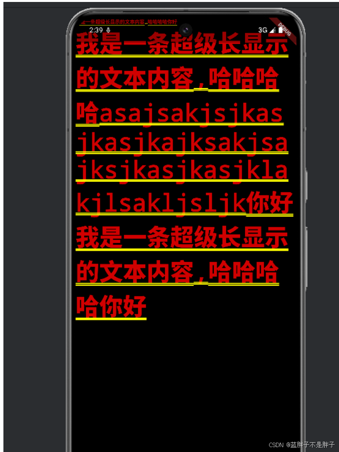
当行列布局如果超出容器后 会出现话花屏的感觉 比如 我某个区间容器是row 布局 但是·是多个文本 ,当数据过长时候 发现竟然不会自动换行 而是渲染花屏
dart
main(){
  runApp(MaterialApp(
    home: MyrowLogout(),
  ));
}
class MyrowLogout  extends StatefulWidget {
  const MyrowLogout ({super.key});

  @override
  State<MyrowLogout > createState() => _MyrowLogoutState();
}

class _MyrowLogoutState extends State<MyrowLogout > {
  @override
  Widget build(BuildContext context) {
    return Row(
      children: [
        //此时  文本内容  超出屏幕后 右边会显示花屏
        Text("我是一条超级长显示的文本内容,哈哈哈哈你好")
      ],
    );
  }
}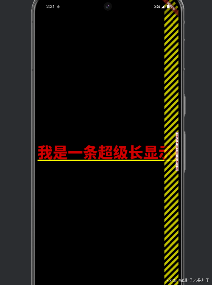
当你的文本内容超出一行的宽度时,Row 布局不会自动换行,这也是为什么你会看到渲染失败的黄屏。Row 是一个水平布局控件,默认情况下,它会尝试将所有的子控件在同一行上显示,如果内容超出可用宽度,就会出现布局溢出问题。
要解决这个问题,可以考虑以下几种方法:
**使用 Expanded 或 Flexible**等动态布局
你可以使用 Expanded 或 Flexible 控件包裹row布局的子控件 Text,让文本根据屏幕的宽度自动换行并避免超出布局。它们会自动占用 Row 的可用空间,并将文本换行。
dart
main(){
runApp(MaterialApp(
home: MyrowLogout(),
));
}
class MyrowLogout extends StatefulWidget {
const MyrowLogout({super.key});
@override
State<MyrowLogout> createState() => _MyrowLogoutState();
}
class _MyrowLogoutState extends State<MyrowLogout> {
@override
Widget build(BuildContext context) {
return Row(
mainAxisAlignment: MainAxisAlignment.center,
children: [
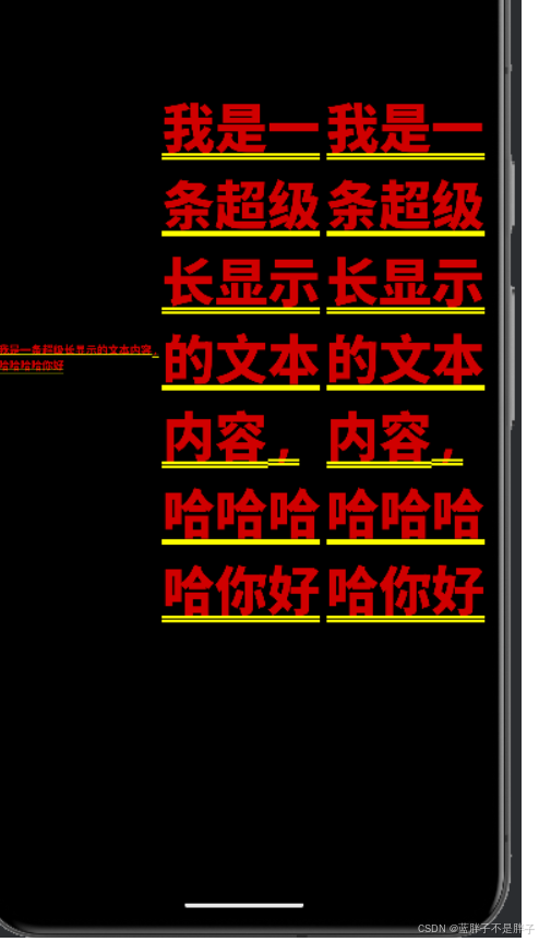
Expanded( // 使用 Expanded 包裹 Text 控件
child: Text(
"我是一条超级长显示的文本内容,哈哈哈哈你好",
style: TextStyle(fontSize: 10),
),
),
Expanded(
child: Text("我是一条超级长显示的文本内容,哈哈哈哈你好"),
),
Expanded(
child: Text("我是一条超级长显示的文本内容,哈哈哈哈你好"),
),
],
);
}
}布局依旧是row 对于布局的每个子容器 如果出现无法装载的情况 就会换行
使用 Wrap 控件
Wrap 是一个专门用于自动换行的控件,它会自动将子控件换到下一行或下一列,以避免布局溢出。对于这种情况,使用 Wrap 来代替 Row 可以很好地解决问题。
dart
main(){
  runApp(MaterialApp(
    home: MyrowLogout(),
  ));
}

class MyrowLogout extends StatefulWidget {
  const MyrowLogout({super.key});

  @override
  State<MyrowLogout> createState() => _MyrowLogoutState();
}

class _MyrowLogoutState extends State<MyrowLogout> {
  @override
  Widget build(BuildContext context) {
    return Wrap(
      // Wrap 会自动换行,当内容超出时
      children: [
        Text(
          "我是一条超级长显示的文本内容,哈哈哈哈你好",
          style: TextStyle(fontSize: 10),
        ),
        Text("我是一条超级长显示的文本内容,哈哈哈哈你好"),
        Text("我是一条超级长显示的文本内容,哈哈哈哈你好"),
      ],
    );
  }
}
这种效果类似col布局了
使用 SingleChildScrollView 控件
如果你希望保留 Row 布局,并让超出部分可以水平滚动,而不是换行,可以使用 SingleChildScrollView 来包裹 Row,实现水平滚动。
dart
main(){
  runApp(MaterialApp(
    home: MyrowLogout(),
  ));
}

class MyrowLogout extends StatefulWidget {
  const MyrowLogout({super.key});

  @override
  State<MyrowLogout> createState() => _MyrowLogoutState();
}

class _MyrowLogoutState extends State<MyrowLogout> {
  @override
  Widget build(BuildContext context) {
    return SingleChildScrollView(
      scrollDirection: Axis.horizontal, // 水平滚动
      child: Row(
        mainAxisAlignment: MainAxisAlignment.center,
        children: [
          Text(
            "我是一条超级长显示的文本内容,哈哈哈哈你好",
            style: TextStyle(fontSize: 10),
          ),
          Text("我是一条超级长显示的文本内容,哈哈哈哈你好"),
          Text("我是一条超级长显示的文本内容,哈哈哈哈你好"),
        ],
      ),
    );
  }
}Expanded或Flexible:让文本根据可用空间自动换行,适合你希望内容按比例分配空间的情况。Wrap:适合需要自动换行的场景,不再局限于一行显示。SingleChildScrollView:适合需要水平滚动的场景。
根据你的需求选择合适的布局控件即可避免渲染失败的黄屏问题。
在 Flutter 中,实现滑动区域的内容时,有多种可滑动的视图组件,每个组件在不同的场景下适用,尤其是像你提到的图文应用(如小红书)中,涉及到图片、文本内容的滑动。以下是一些常用的可滑动视图组件及它们的区别:
SingleChildScrollView 适用于内容较少的情况,允许在一个方向上(水平或垂直)滚动其子元素。
-
适用场景:
- 需要将所有内容包裹在一个滚动区域里。
- 内容较小,可以一次性加载完成,不需要懒加载或分页加载。
-
缺点:
- 不能在需要大量数据滚动时使用,因为它不会在视图外部丢弃不可见的子元素,可能会导致性能问题。
ListView(动态页面推荐)
ListView 是最常用的滚动组件之一,适合垂直方向上大量的可滚动内容,通常用于显示列表数据。
-
适用场景:
- 适用于垂直方向的长列表内容,比如新闻列表、图片集等。
- 支持懒加载,即只渲染当前视口内的元素,不会加载所有内容,性能表现优越。
- 支持无限滚动和分段加载。
-
种类:
ListView.builder():适用于大量数据,动态创建视图。ListView.separated():用于在列表项之间添加分割线。ListView.custom():高度自定义列表的行为。
-
示例:
静态
darListView( padding: const EdgeInsets.all(8), children: <Widget>[ Container( height: 50, color: Colors.amber[600], child: const Center(child: Text('Entry A')), ), Container( height: 50, color: Colors.amber[500], child: const Center(child: Text('Entry B')), ), Container( height: 50, color: Colors.amber[100], child: const Center(child: Text('Entry C')), ), ], )动态(懒加载数据 视图到哪里才加载哪里)
dartListView.builder( itemCount: 1000, // 列表项的数量 itemBuilder: (context, index) { return Container( height: 50, color: Colors.amber[500], child: Center(child: Text(' 区域 ')), ); }, )
GridView
GridView 适用于以网格形式显示内容,比如图片墙、商品展示等。
-
适用场景:
- 适合在横向和纵向上都需要滑动的网格布局场景,如图片展示、商品卡片。
- 支持懒加载,仅渲染当前视图内的元素。
-
种类:
GridView.builder():动态构建网格项,适合大量数据。GridView.count():预设固定数量的列。GridView.custom():自定义网格行为。
-
示例:
dartGridView.builder( gridDelegate: SliverGridDelegateWithFixedCrossAxisCount( crossAxisCount: 2, // 每行两列 ), itemCount: 20, itemBuilder: (context, index) { return Card( child: Column( children: [ Image.network('https://example.com/image.jpg'), Text('商品 $index'), ], ), ); }, )
PageView (实现轮播图)
PageView 用于水平或垂直方向的分页滑动视图,比如显示类似于轮播图、教程页面的效果。
-
适用场景:
- 用于展示分屏效果,比如分页显示内容、图片轮播。
- 可以自定义滑动动画、页面指示器。
-
示例:
dartPageView( children: [ Image.network('https://example.com/image1.jpg'), Image.network('https://example.com/image2.jpg'), Image.network('https://example.com/image3.jpg'), ], )
**CustomScrollView + Slivers ** (推荐)
CustomScrollView 是 Flutter 中非常灵活的可滚动区域,用于构建复杂的滚动效果。Sliver 是构建这种滚动区域的基础,它允许创建灵活的自定义布局,比如带有吸顶效果的 SliverAppBar 或自定义的滚动动画。
-
适用场景:
- 适用于复杂的滚动效果,比如头部吸附、分段显示列表、网格与列表组合等。
- 可以组合不同类型的
Sliver,如SliverList、SliverGrid和SliverAppBar。 - 适用于构建如小红书这样复杂的 UI 布局。
-
示例:
dartCustomScrollView( slivers: [ SliverAppBar( expandedHeight: 200.0, flexibleSpace: FlexibleSpaceBar( title: Text('小红书风格页面'), background: Image.network('https://example.com/banner.jpg', fit: BoxFit.cover), ), ), SliverList( delegate: SliverChildBuilderDelegate( (BuildContext context, int index) { return ListTile( title: Text('Item $index'), ); }, childCount: 50, ), ), ], )
NestedScrollView
NestedScrollView 允许在一个页面中同时包含两个滚动视图,通常用于顶部有 SliverAppBar 并且页面内部还有可以滚动的内容,比如一个列表或网格。
-
适用场景:
- 适用于需要同时滚动头部(如
AppBar)和内容(如列表或网格)的场景。 - 实现类似于下拉刷新的效果,或头部滑动隐藏与显示效果。
- 适用于需要同时滚动头部(如
-
示例:
dartNestedScrollView( headerSliverBuilder: (BuildContext context, bool innerBoxIsScrolled) { return <Widget>[ SliverAppBar( expandedHeight: 200.0, floating: false, pinned: true, flexibleSpace: FlexibleSpaceBar( title: Text("NestedScrollView Demo"), ), ), ]; }, body: ListView.builder( itemCount: 50, itemBuilder: (BuildContext context, int index) { return ListTile( title: Text('Item $index'), ); }, ), )
Scrollable
Scrollable 是最基础的滚动组件,几乎所有其他滚动组件(如 ListView 和 GridView)都基于它构建。一般情况下,开发者不会直接使用 Scrollable,而是使用封装好的组件。
-
适用场景:
- 在需要高度自定义滚动行为时使用。
-
示例:
dartScrollable( axisDirection: AxisDirection.down, viewportBuilder: (context, position) { return Viewport( offset: position, slivers: [ SliverToBoxAdapter( child: Text('这是一个自定义滚动视图'), ), ], ); }, )
结论
- 单一页面滑动 :如果页面内容较少或需要垂直滚动,
SingleChildScrollView是一个简单的选择,但当内容量大时,建议使用ListView或GridView。 - 分页滑动 :
PageView适合实现类似轮播图或教程分屏的效果。 - 复杂布局 :如果你需要构建类似于小红书的复杂页面布局,可以考虑使用
CustomScrollView,结合SliverList、SliverGrid等构建高度灵活的滑动内容。 - 头部和内容同时滚动 :
NestedScrollView适合在页面中既有滚动头部,又有内容滚动的情况。
根据你的需求,选择最合适的组件可以提升开发效率和用户体验。
路由跳转
Navigator 类
Navigator 是一个全局访问点,用于推送和弹出路由。它是 Flutter 中管理页面导航的中央对象。
和vue,react一样,flutter的路由也是路由栈,一个页面一个页面的往上叠
-
Navigator.push():这个方法会将一个新的路由添加到路由栈的顶部,并触发页面转换动画。它返回一个
Future,该Future在新页面通过Navigator.pop被弹出时完成。dartNavigator.push( context, MaterialPageRoute(builder: (context) => NewScreen()), ).then((value) { // 新页面通过 Navigator.pop 返回的结果 }); -
Navigator.pop():这个方法用于从路由栈中移除当前路由,并返回到前一个路由。如果提供了参数,它将作为结果返回给前一个页面。
dartNavigator.pop(context, result); -
Navigator.popUntil():这个方法弹出当前路由,直到遇到符合给定条件的路由。这允许你一次性弹出多个路由。
dartNavigator.popUntil(context, (route) { return route.settings.name == 'target_route_name'; }); -
Navigator.canPop():这个方法返回一个布尔值,指示当前路由是否可以被弹出。
dartfinal canPop = Navigator.canPop(context);
Route 类
Route 是表示导航路径的基类。它定义了路由的基本接口,包括 buildContent(), popped(), willShow(), didShow() 等方法。
-
PageRoute:
PageRoute是Route的具体实现,它表示一个全屏页面,并提供了页面转换动画。PageRoute需要被实现以创建自定义的路由。dartclass MyCustomRoute extends PageRoute { @override Widget buildContent(BuildContext context) { return NewScreen(); } @override Widget buildTransitions(BuildContext context, Animation<double> animation, Animation<double> secondaryAnimation, Widget child) { // 自定义过渡动画 return FadeTransition(opacity: animation, child: child); } } -
MaterialPageRoute:
MaterialPageRoute是PageRoute的具体实现,它提供了 Material Design 风格的过渡动画。dartMaterialPageRoute( builder: (context) => NewScreen(), settings: RouteSettings(name: 'new_screen_route'), )
PageRouteBuilder 类
PageRouteBuilder 允许你以编程方式构建路由,而不是在 MaterialApp 的 routes 字典中静态定义。
dart
Navigator.push(
  context,
  PageRouteBuilder(
    pageBuilder: (context, animation, secondaryAnimation) => NewScreen(),
    transitionsBuilder: (context, animation, secondaryAnimation, child) {
      return FadeTransition(
        opacity: animation,
        child: child,
      );
    },
  ),
);
Navigator.restorablePush() 方法
这个方法类似于 Navigator.push(),但它允许你保存和恢复路由状态。
dart
Navigator.restorablePush(
  context,
  MaterialPageRoute(builder: (context) => NewScreen()),
);
ModalRoute 类
ModalRoute 是 PageRoute 的子类,表示一个模态路由。它提供了当前路由的状态和信息,如 isCurrent, isFirst, isLast 等。
dart
final route = ModalRoute.of(context);
if (route.isCurrent) {
  // 当前路由是显示的路由
}
Navigator.onGenerateRoute() 方法
在 MaterialApp 或 CupertinoApp 中,你可以使用 onGenerateRoute 回调来动态生成路由。
dart
MaterialApp(
  onGenerateRoute: (settings) {
    if (settings.name == '/path') {
      return MaterialPageRoute(builder: (context) => NewScreen());
    }
    return null;
  },
);
Navigator.obscureBehavior 属性
这个属性定义了当新路由出现时,如何模糊或隐藏当前的路由。它接受一个 ObscureBehavior 值,可以是 ObscureBehavior.none, ObscureBehavior.fade, ObscureBehavior.blur 等。
dart
Navigator(
  obscureBehavior: ObscureBehavior.fadeIn,
  pages: [MaterialPage(child: HomeScreen())],
);
路由传递参数
你可以通过 RouteSettings 来传递参数给下一个路由。
dart
Navigator.push(
  context,
  MaterialPageRoute(
    builder: (context) => NewScreen(),
    settings: RouteSettings(arguments: 'some arguments'),
  ),
).then((value) {
  // 处理返回值
});

// 在新页面中获取参数
final args = ModalRoute.of(context)!.settings.arguments;
路由结果
你可以在弹出路由时返回一个结果给前一个路由。
dart
// 在新页面中
Navigator.pop(context, 'result');

// 在前一个页面中
Navigator.push(
  context,
  MaterialPageRoute(
    builder: (context) => NewScreen(),
  ),
).then((value) {
  if (value == 'result') {
    // 处理结果
  }
});
封装一个路由管理类
现在的路由跳转时api 编程式跳转,并且便于进行权限校验
dart
        Padding(
                padding: const EdgeInsets.all(10.0),
                child: SizedBox(
                  height: 300,
                  child: ListView(
                    scrollDirection: Axis.horizontal,
                    children: cards.map((card) {
                      return CardAnimationHover(
                        card: card,
                        width: 200,
                        showAnimation: false,
                        onTap: () {
                          Navigator.push(
                            context,
                            MaterialPageRoute(
                              builder: (context) => DetailsPage(
                                title: card['header'].toString(),
                                coverUrl: card['image'].toString(),
                              ),
                            ),
                          );
                        },
                      );
                    }).toList(),
                  ),
                ),
              ),
跳转具体页面
dart
/// 详情页面
class DetailsPage extends StatefulWidget {
// 确保 title 在构造函数中被初始化
   String title;
//   封面url
   String coverUrl;
   DetailsPage({super.key, required this.title, required this.coverUrl}  );
  @override
  State<DetailsPage> createState() => _DetailsPageState();
}

class _DetailsPageState extends State<DetailsPage> with SingleTickerProviderStateMixin {
  late AnimationController _controller;

  @override
  void initState() {
    super.initState();
    _controller = AnimationController(vsync: this);
  }

  @override
  void dispose() {
    _controller.dispose();
    super.dispose();
  }

  @override
  Widget build(BuildContext context) {
     return Scaffold(
        appBar: AppBar(
          leading: const BackButton(),
          actions: [
            IconButton(
              icon: const Icon(Icons.search),
              tooltip: '查找',
              onPressed: () {
                ScaffoldMessenger.of(context).showSnackBar(
                    const SnackBar(content: Text('This is a snackbar')));
              },
            ),
            IconButton(onPressed: (){

              Navigator.pop(context);
            }, icon: const Icon(Icons.more_vert))
          ],
          title: Text(widget.title),
        ),
        body: SafeArea(child: Column(
          children: [
            // 封面
            Container(
              height: 200,
              width: double.infinity,
              decoration: BoxDecoration(
                borderRadius: BorderRadius.circular(16.0), // 设置圆角半径
              ),
              child: Image.network(widget.coverUrl,fit: BoxFit.fill),
            ),
            Expanded(child: Text("这是详细页面"))
          ],
        ))
    );
  }
}
除开构造器获取路由传递的数值还可以生命周期获取
dart
import 'package:flutter/material.dart';

class DetailsPage extends StatefulWidget {
  @override
  _DetailsPageState createState() => _DetailsPageState();
}

class _DetailsPageState extends State<DetailsPage> {
  String? title;
  String? coverUrl;

  @override
  void initState() {
    super.initState();
    // 在初始化时获取传递的参数
    WidgetsBinding.instance.addPostFrameCallback((_) {
      final args = ModalRoute.of(context)?.settings.arguments as DetailPageArgs?;
      if (args != null) {
        setState(() {
          title = args.title;
          coverUrl = args.coverUrl;
        });
      }
    });
  }

  @override
  Widget build(BuildContext context) {
    return Scaffold(
      appBar: AppBar(title: Text(title ?? 'Details')),
      body: Center(
        child: coverUrl != null
            ? Image.network(coverUrl!)
            : const Text('No cover image available'),
      ),
    );
  }
}
但是一般开发会封装一个专门的路由跳转的类 (鉴权,错误页面处理等)
基于navigator api封装的路由管理类
dart
import 'package:flutter/material.dart';

class AppRouter {
  // 跳转到指定路由并传递参数
  static Future<T?> navigateTo<T>(
      BuildContext context, String routeName, {Object? arguments}) {
    return Navigator.pushNamed<T>(context, routeName, arguments: arguments);
  }

  // 跳转到指定路由并清除之前所有的路由(通常用于登录页面)
  static Future<T?> navigateAndReplaceAll<T>(
      BuildContext context, String routeName, {Object? arguments}) {
    return Navigator.pushNamedAndRemoveUntil<T>(
        context, routeName, (route) => false, arguments: arguments);
  }

  // 跳转到指定路由并替换当前路由
  static Future<T?> navigateAndReplace<T>(
      BuildContext context, String routeName, {Object? arguments}) {
    return Navigator.pushReplacementNamed<T, dynamic>(context, routeName,
        arguments: arguments);
  }

  // 返回上一页并传递数据
  static void goBack<T>(BuildContext context, [T? result]) {
    Navigator.pop<T>(context, result);
  }

  // 判断是否可以返回
  static bool canGoBack(BuildContext context) {
    return Navigator.canPop(context);
  }
}
路由类
根据不同路由返回不同的组件
dart
// 路由生成器类
class RouteGenerator {
  static Route<dynamic> generateRoute(RouteSettings settings) {
    // 获取传递的参数
    final args = settings.arguments;

    switch (settings.name) {
      case '/':
      // 验证参数类型并传递
        if (args != null) {
          return _errorRoute();

        }
        // 参数不正确,跳转错误页面
        return MaterialPageRoute(builder: (_) => const Myhome());
      case '/details':
      // 期待传入一个带多个属性的对象(比如一个 Map 或自定义类)
        if (args is DetailPageArgs) {
          return MaterialPageRoute(
              builder: (_) => DetailsPage(
                title: args.title,
                coverUrl: args.coverUrl,
              ));
        }
        return _errorRoute();

      // case '/login':
      //   return MaterialPageRoute(builder: (_) => LoginScreen());

      default:
        return _errorRoute();
    }
  }

  // 错误路由页面
  static Route<dynamic> _errorRoute() {
    return MaterialPageRoute(
      builder: (_) => Scaffold(
        appBar: AppBar(title: const Text('出错啦')),
        body: const Center(child: Text('Page not found!',style: TextStyle(
          fontSize: 30
        ),)),
      ),
    );
  }
}
项目入口main中进行配置
dart
void main() {
  runApp( MyApp());
}

class MyApp extends StatelessWidget {
  @override
  Widget build(BuildContext context) {
    return const MaterialApp(
      title: '一乐动漫',
      initialRoute: '/',
      onGenerateRoute: RouteGenerator.generateRoute, // 使用路由管理器
    );
  }
}
具体使用
dart
   onTap: () {
       AppRouter.navigateTo(context, '/details', arguments:
       DetailPageArgs(title: card['header'].toString(), coverUrl: card['image'].toString()));
                        },
页面返回时携带数据
dart
// 跳转时传递参数
AppRouter.navigateTo(context, '/details', arguments: 'Some data').then((result) {
  // 接收返回的结果
  if (result != null) {
    print('返回结果: $result');
  }
});

//跳转的具体页面 点击返回的
Navigator.pop(context, 'This is the result');
抽屉
Flutter 提供了一个专门用于实现这种侧边菜单抽屉的控件,叫做 Drawer。它可以和 Scaffold 结合使用,提供左侧或右侧的抽屉菜单(类似于移动应用中常见的滑动菜单)。
典型的 Drawer 使用示例
以下是一个在 Flutter 中使用 Drawer 的基本示例。点击左上角的菜单图标(hamburger icon)可以打开从左侧滑出的抽屉菜单。
dart
import 'package:flutter/material.dart';

void main() {
  runApp(MyApp());
}

class MyApp extends StatelessWidget {
  @override
  Widget build(BuildContext context) {
    return MaterialApp(
      title: 'Drawer Demo',
      theme: ThemeData(
        primarySwatch: Colors.blue,
      ),
      home: HomePage(),
    );
  }
}

class HomePage extends StatelessWidget {
  @override
  Widget build(BuildContext context) {
    return Scaffold(
      appBar: AppBar(
        title: Text('Drawer Demo'),
      ),
      // 左侧抽屉菜单
      drawer: Drawer(
        child: ListView(
          padding: EdgeInsets.zero,
          children: <Widget>[
            DrawerHeader(
              decoration: BoxDecoration(
                color: Colors.blue,
              ),
              child: Text(
                'Menu',
                style: TextStyle(
                  color: Colors.white,
                  fontSize: 24,
                ),
              ),
            ),
            ListTile(
              leading: Icon(Icons.home),
              title: Text('Home'),
              onTap: () {
                // 点击菜单后关闭抽屉
                Navigator.pop(context);
              },
            ),
            ListTile(
              leading: Icon(Icons.settings),
              title: Text('Settings'),
              onTap: () {
                Navigator.pop(context);
              },
            ),
            ListTile(
              leading: Icon(Icons.logout),
              title: Text('Logout'),
              onTap: () {
                Navigator.pop(context);
              },
            ),
          ],
        ),
      ),
      body: Center(
        child: Text('Swipe from left or click the menu icon to open drawer'),
      ),
    );
  }
}
关键点解析:
-
Scaffold: Flutter 提供的基本页面布局结构,Scaffold可以帮助你快速搭建包含 AppBar、Drawer、BottomNavigationBar 等常见 UI 组件的页面。 -
drawer:Scaffold的drawer属性允许你定义从左侧滑出的抽屉。可以在Drawer中放置任何 widget,常见的是使用ListView结合ListTile来创建菜单项。 -
DrawerHeader: 用于在抽屉顶部显示自定义内容(如头像、用户名等)。 -
关闭抽屉 : 使用
Navigator.pop(context)关闭抽屉菜单。
从右侧弹出的抽屉
如果你想要从右侧滑出菜单,可以使用 Scaffold 的 endDrawer 属性。它的用法与 drawer 类似,但菜单会从右侧弹出。
dart
Scaffold(
  appBar: AppBar(
    title: Text('End Drawer Demo'),
  ),
  // 右侧抽屉
  endDrawer: Drawer(
    child: ListView(
      padding: EdgeInsets.zero,
      children: <Widget>[
        DrawerHeader(
          decoration: BoxDecoration(
            color: Colors.blue,
          ),
          child: Text(
            'Right Menu',
            style: TextStyle(
              color: Colors.white,
              fontSize: 24,
            ),
          ),
        ),
        ListTile(
          leading: Icon(Icons.home),
          title: Text('Home'),
          onTap: () {
            Navigator.pop(context);
          },
        ),
        ListTile(
          leading: Icon(Icons.settings),
          title: Text('Settings'),
          onTap: () {
            Navigator.pop(context);
          },
        ),
      ],
    ),
  ),
  body: Center(
    child: Text('Swipe from right or click the menu icon to open end drawer'),
  ),
)
网络请求和json解析
在 Flutter 中,网络请求和 JSON 数据处理是非常常见的需求。通过使用 http 包进行网络请求,以及结合 Dart 自带的 dart:convert 库处理 JSON 数据,可以非常方便地实现与服务端的交互。下面我将详细介绍网络请求和 JSON 处理的具体步骤。
1. 导入依赖
在 Flutter 中使用 http 库来发起网络请求。在 pubspec.yaml 中添加依赖:
yaml
dependencies:
  http: ^0.13.3
然后在代码中导入 http 和 dart:convert:
dart
import 'package:http/http.dart' as http;
import 'dart:convert';
2. 发起网络请求
(1) GET 请求
GET 请求用于从服务器获取数据。以下是一个简单的 GET 请求示例:
dart
Future<void> fetchData() async {
  final response = await http.get(Uri.parse('https://jsonplaceholder.typicode.com/posts/1'));

  if (response.statusCode == 200) {
    // 请求成功,将响应体解析为 JSON
    var jsonResponse = jsonDecode(response.body);
    print('Title: ${jsonResponse['title']}');
  } else {
    // 请求失败,抛出异常
    throw Exception('Failed to load data');
  }
}
http.get 方法返回一个 Future<http.Response> 对象,异步等待请求完成。我们可以通过 jsonDecode 函数将返回的 JSON 数据转为 Dart 的 Map 或 List。
(2) POST 请求
POST 请求用于向服务器发送数据,例如提交表单。以下是一个简单的 POST 请求示例:
dart
Future<void> postData() async {
  final response = await http.post(
    Uri.parse('https://jsonplaceholder.typicode.com/posts'),
    headers: {'Content-Type': 'application/json; charset=UTF-8'},
    body: jsonEncode(<String, String>{
      'title': 'Flutter',
      'body': 'Network request example',
      'userId': '1',
    }),
  );

  if (response.statusCode == 201) {
    // 请求成功,解析响应
    var jsonResponse = jsonDecode(response.body);
    print('Post created: ${jsonResponse['id']}');
  } else {
    // 请求失败,抛出异常
    throw Exception('Failed to create post');
  }
}
在 POST 请求中,body 是通过 jsonEncode 将 Dart 对象转为 JSON 字符串,然后发送给服务器。响应的处理与 GET 请求类似。
3. JSON 处理
(1) 解析 JSON 字符串
dart:convert 库中的 jsonDecode 函数可以将 JSON 字符串转换为 Dart 对象。
dart
String jsonString = '{"name": "John", "age": 30}';
Map<String, dynamic> user = jsonDecode(jsonString);

print('Name: ${user['name']}');
print('Age: ${user['age']}');在上面的例子中,jsonDecode 会将 JSON 字符串解析为 Map<String, dynamic> 对象。
(2) 将 Dart 对象转换为 JSON 字符串
jsonEncode 函数可以将 Dart 对象转换为 JSON 字符串,通常用于发送 POST 请求时。
dart
Map<String, dynamic> user = {
  'name': 'John',
  'age': 30,
};

String jsonString = jsonEncode(user);
print(jsonString); // 输出 {"name":"John","age":30}
4. 结合模型类处理 JSON
为了简化代码,并确保 JSON 解析和序列化的正确性,建议将 JSON 转换为模型类对象。以下是一个简单的例子。
(1) 创建模型类
dart
class Post {
  final int id;
  final String title;
  final String body;

  Post({required this.id, required this.title, required this.body});

  // 工厂方法:从 JSON 构造 Post 对象
  factory Post.fromJson(Map<String, dynamic> json) {
    return Post(
      id: json['id'],
      title: json['title'],
      body: json['body'],
    );
  }

  // 将 Post 对象转换为 JSON
  Map<String, dynamic> toJson() {
    return {
      'id': id,
      'title': title,
      'body': body,
    };
  }
}
(2) 使用模型类解析 JSON
dart
Future<void> fetchPost() async {
  final response = await http.get(Uri.parse('https://jsonplaceholder.typicode.com/posts/1'));

  if (response.statusCode == 200) {
    // 解析 JSON 并创建 Post 对象
    var jsonResponse = jsonDecode(response.body);
    Post post = Post.fromJson(jsonResponse);
    print('Post title: ${post.title}');
  } else {
    throw Exception('Failed to load post');
  }
}
(3) 将对象转换为 JSON
dart
Post post = Post(id: 1, title: 'Flutter', body: 'Network request example');
String jsonPost = jsonEncode(post.toJson());
print(jsonPost);
通过将 JSON 数据映射到模型类,可以使代码更加清晰、易于维护。
5. 异常处理
在进行网络请求时,可能会出现各种错误,例如网络不可用、请求超时等。可以通过 try-catch 进行异常捕获。
dart
Future<void> fetchData() async {
  try {
    final response = await http.get(Uri.parse('https://example.com/data'));
    if (response.statusCode == 200) {
      var jsonResponse = jsonDecode(response.body);
      print(jsonResponse);
    } else {
      print('Server error: ${response.statusCode}');
    }
  } catch (error) {
    print('Error: $error');
  }
}
没错!在 Flutter 中,尽管 http 模块是内置的网络请求解决方案,但很多开发者更倾向于使用功能更丰富的第三方库,比如 Dio。Dio 是一个强大且易用的网络请求库,提供了丰富的功能,如拦截器、全局配置、文件上传和下载、取消请求等。
http 插件dio
为什么使用 Dio?
- 更强的功能:Dio 支持网络请求的拦截器、全局配置、文件上传/下载、表单数据提交等。
- 错误处理更灵活:Dio 提供了更全面的错误处理机制,方便管理和追踪各种类型的错误。
- 更好的性能 :Dio 在某些场景下比
http更加优化,并且支持配置请求超时时间和请求重试等功能。 - 容易集成拦截器:可以轻松添加拦截器以处理请求、响应、错误等,便于实现例如日志记录、权限校验等功能。
1. 在 pubspec.yaml 中添加 Dio 依赖
yaml
dependencies:
  dio: ^5.3.1
然后在代码中导入 Dio:
dart
import 'package:dio/dio.dart';2. 基本使用
(1) 发起 GET 请求
dart
Future<void> fetchData() async {
  Dio dio = Dio();
  try {
    Response response = await dio.get('https://jsonplaceholder.typicode.com/posts/1');
    print('Response data: ${response.data}');
  } catch (e) {
    print('Error occurred: $e');
  }
}
dio.get() 返回一个 Response 对象,其中 response.data 可以直接访问返回的数据,Dio 会自动处理 JSON 解码。
dart
void main() {
  test('测试dio网络请求', () async {
    Dio dio = Dio();
    try {
      Response response = await dio.get('http://localhost:8080/api/users');
      /**
       * 响应数据: {t: {name: 测试对象, age: 666}, msg: success, code: 0}
       */
      print('响应数据: ${response.data}');

      // 直接使用 response.data
      var data = response.data;
      print(data);

      // 如果可以直接读取dio解析的json对象,但是这样的话 不易阅读
      if (data['code'] == 0) {
        var t = data['t'];
        print('名称: ${t['name']}, 年龄: ${t['age']}');
      } else {
        print('请求失败: ${data['msg']}');
      }
    } catch (e) {
      print('错误异常: $e');
    }
  });
  test('测试dio网络请求json和dart对象互转', () async {
    Dio dio = Dio();
    try {
      Response response = await dio.get('http://localhost:8080/api/users');
      /**
       * 响应数据: {t: {name: 测试对象, age: 666}, msg: success, code: 0}
       */
      print('响应数据: ${response.data}');

      // 使用模型类解析数据
      var apiResponse = ApiResponse.fromJson(response.data);
      print(apiResponse);

      // 如果需要进一步处理数据
      if (apiResponse.code == 0) {
        print('名称: ${apiResponse.t.name}, 年龄: ${apiResponse.t.age}');
      } else {
        print('请求失败: ${apiResponse.msg}');
      }
    } catch (e) {
      print('错误异常: $e');
    }
  });
}
class ApiResponse {
  final int code;
  final String msg;
  final User t;

  ApiResponse({required this.code, required this.msg, required this.t});

  factory ApiResponse.fromJson(Map<String, dynamic> json) {
    return ApiResponse(
      code: json['code'],
      msg: json['msg'],
      t: User.fromJson(json['t']),
    );
  }
}

class User {
  final String name;
  final int age;

  User({required this.name, required this.age});

  factory User.fromJson(Map<String, dynamic> json) {
    return User(
      name: json['name'],
      age: json['age'],
    );
  }
}
(2) 发起 POST 请求
dart
Future<void> postData() async {
  Dio dio = Dio();
  try {
    Response response = await dio.post(
      'https://jsonplaceholder.typicode.com/posts',
      data: {
        'title': 'Flutter Dio',
        'body': 'This is a Dio post request example',
        'userId': 1,
      },
    );
    print('Response data: ${response.data}');
  } catch (e) {
    print('Error occurred: $e');
  }
}
在 POST 请求中,数据可以通过 data 参数发送,并且支持自动将 Dart 的 Map 对象转为 JSON。
3. 使用拦截器
Dio 提供了拦截器来在请求发出前或响应返回时执行自定义逻辑,这对于处理 token、全局错误处理等非常有用。
添加请求拦截器和响应拦截器
dart
Dio dio = Dio();

dio.interceptors.add(InterceptorsWrapper(
  onRequest: (options, handler) {
    print('Request: ${options.method} ${options.path}');
    return handler.next(options); // 继续执行请求
  },
  onResponse: (response, handler) {
    print('Response: ${response.statusCode}');
    return handler.next(response); // 继续执行响应
  },
  onError: (DioError e, handler) {
    print('Error: ${e.message}');
    return handler.next(e); // 继续处理错误
  },
));
通过拦截器,您可以在网络请求的各个阶段执行自定义逻辑,例如在每个请求前自动添加身份验证 token,或者在响应中统一处理错误。
4. 全局配置
Dio 可以为所有请求设置全局的配置,例如超时时间、请求头等:
dart
Dio dio = Dio(BaseOptions(
  baseUrl: 'https://jsonplaceholder.typicode.com',
  connectTimeout: Duration(seconds: 5),
  receiveTimeout: Duration(seconds: 5),
  headers: {
    'Content-Type': 'application/json; charset=UTF-8',
  },
));

Future<void> fetchData() async {
  try {
    Response response = await dio.get('/posts/1');
    print('Response data: ${response.data}');
  } catch (e) {
    print('Error occurred: $e');
  }
}
在这里,我们通过 BaseOptions 为 Dio 实例设置了基础配置,后续的每个请求都将继承这些配置。
5. 文件上传和下载
(1) 文件上传
Dio 支持表单数据提交,非常适合用于上传文件:
dart
Future<void> uploadFile(String filePath) async {
  Dio dio = Dio();

  FormData formData = FormData.fromMap({
    'file': await MultipartFile.fromFile(filePath, filename: 'upload.png'),
  });

  try {
    Response response = await dio.post(
      'https://example.com/upload',
      data: formData,
    );
    print('File uploaded: ${response.data}');
  } catch (e) {
    print('Upload error: $e');
  }
}
FormData 可以处理多种类型的数据,包括文件上传。MultipartFile.fromFile() 方法会将本地文件转换为上传的表单文件。
(2) 文件下载
dart
Future<void> downloadFile() async {
  Dio dio = Dio();
  try {
    await dio.download(
      'https://example.com/file.zip',
      '/path/to/save/file.zip',
      onReceiveProgress: (received, total) {
        if (total != -1) {
          print('Downloading: ${(received / total * 100).toStringAsFixed(0)}%');
        }
      },
    );
  } catch (e) {
    print('Download error: $e');
  }
}
Dio 提供了 download 方法用于文件下载,并且可以通过 onReceiveProgress 回调函数实时获取下载进度。
6. 取消请求
Dio 提供了取消请求的功能,非常适合处理用户发起多个重复请求或长时间等待的操作。可以通过 CancelToken 来控制请求的取消。
dart
CancelToken cancelToken = CancelToken();

Future<void> fetchData() async {
  Dio dio = Dio();

  try {
    Response response = await dio.get(
      'https://jsonplaceholder.typicode.com/posts/1',
      cancelToken: cancelToken,
    );
    print('Response data: ${response.data}');
  } catch (e) {
    if (CancelToken.isCancel(e)) {
      print('Request cancelled');
    } else {
      print('Error: $e');
    }
  }
}

// 在需要的时候取消请求
cancelToken.cancel('Request cancelled by user');
封装
和axios一样可以封装实列使用
dart
import 'package:dio/dio.dart';

class DioClient {
  static DioClient? _instance;
  late Dio _dio;

  // 私有构造函数
  DioClient._internal() {
    _dio = Dio(BaseOptions(
      baseUrl: "https://your-api.com", // 设置基础URL
      connectTimeout: const Duration(seconds: 10),
      receiveTimeout: const Duration(seconds: 10),
      headers: {
        'Content-Type': 'application/json',
      },
    ));

    // 添加拦截器
    _dio.interceptors.add(InterceptorsWrapper(
      onRequest: (options, handler) {
        // 在请求发送前做一些处理,如添加公共token
        options.headers['Authorization'] = 'Bearer your_token';
        print('REQUEST[${options.method}] => PATH: ${options.path}');
        handler.next(options); // 继续下一个拦截器
      },
      onResponse: (response, handler) {
        // 处理响应
        print('RESPONSE[${response.statusCode}] => PATH: ${response.requestOptions.path}');
        handler.next(response);
      },
      onError: (DioError e, handler) {
        // 处理错误
        print('ERROR[${e.response?.statusCode}] => PATH: ${e.requestOptions.path}');
        handler.next(e); // 继续下一个拦截器
      },
    ));

    // 可选:日志拦截器,用于在开发时打印请求和响应
    _dio.interceptors.add(LogInterceptor(
      request: true,
      requestHeader: true,
      requestBody: true,
      responseHeader: true,
      responseBody: true,
      error: true,
    ));
  }

  // 单例模式
  static DioClient getInstance() {
    _instance ??= DioClient._internal();
    return _instance!;
  }

  // GET 请求
  Future<Response> get(String path, {Map<String, dynamic>? queryParams}) async {
    try {
      Response response = await _dio.get(path, queryParameters: queryParams);
      return response;
    } catch (e) {
      return Future.error(_handleError(e));
    }
  }

  // POST 请求
  Future<Response> post(String path, {Map<String, dynamic>? data}) async {
    try {
      Response response = await _dio.post(path, data: data);
      return response;
    } catch (e) {
      return Future.error(_handleError(e));
    }
  }

  // PUT 请求
  Future<Response> put(String path, {Map<String, dynamic>? data}) async {
    try {
      Response response = await _dio.put(path, data: data);
      return response;
    } catch (e) {
      return Future.error(_handleError(e));
    }
  }

  // DELETE 请求
  Future<Response> delete(String path, {Map<String, dynamic>? data}) async {
    try {
      Response response = await _dio.delete(path, data: data);
      return response;
    } catch (e) {
      return Future.error(_handleError(e));
    }
  }

  // Token 自动刷新逻辑(可根据具体情况修改)
  Future<void> _refreshToken() async {
    // 刷新 token 的逻辑
    // 如果 token 刷新成功,更新请求头中的 token
    _dio.options.headers['Authorization'] = 'Bearer new_token';
  }

  // 处理错误
  String _handleError(dynamic error) {
    if (error is DioError) {
      switch (error.type) {
        case DioErrorType.connectTimeout:
          return "Connection Timeout!";
        case DioErrorType.sendTimeout:
          return "Send Timeout!";
        case DioErrorType.receiveTimeout:
          return "Receive Timeout!";
        case DioErrorType.response:
          return "Received invalid status code: ${error.response?.statusCode}";
        case DioErrorType.cancel:
          return "Request to API server was cancelled";
        case DioErrorType.other:
          return "Connection to API server failed due to internet connection";
        default:
          return "Unexpected error occured";
      }
    } else {
      return "Unexpected error occured";
    }
  }
}
实列化
DioClient dioClient = DioClient.getInstance();
发送请求
var response = await dioClient.get('/api/v1/resource');
总结
相比 http 库,Dio 提供了更丰富的功能,尤其是在处理拦截器、全局配置、文件上传和下载、取消请求等方面。通过使用 Dio,你可以更方便地管理复杂的网络请求逻辑,并保持代码简洁和易维护。
你可以根据项目需求选择适合的网络请求库,但如果你的项目复杂度较高且需要更多的控制,Dio 会是一个非常合适的选择。
样式
flutter的每个控件的样式类都不一样,很容易记混,所以进行总结
在 Flutter 中,控件样式的定义是非常灵活的,有些控件有类似的样式属性,但不同类型的控件又可能有特定的样式定义。为了方便你记忆,我将根据控件的类型对常用的样式属性进行归纳总结。
1. 通用样式属性
以下属性是 Flutter 中大部分控件共享的样式属性,尤其是涉及到 Container、Text、Button 等常见控件:
通用样式属性在 Flutter 中适用于许多控件,尤其是像 Container、Text、Button 等控件,几乎所有的 UI 组件都可以设置一些通用的样式属性。为了帮助你更详细地理解通用样式属性,我将对每个属性进行详细解释,并提供相应的代码示例。
color
color 是设置控件的背景颜色的属性。它常见于 Container、Text、Button、Scaffold 等控件。
用法:
dart
Container(
  color: Colors.blue,  // 设置背景颜色为蓝色
  child: Text('This is a Container'),
)
注意:
- 有些控件需要通过
decoration来设置背景颜色,例如Container中,当decoration设置时,不能直接使用color属性。 Text控件的颜色需要通过TextStyle的color属性来设置。
padding
padding 是设置控件内部内容的边距(内边距)。通过 EdgeInsets 来定义四个方向的距离。
用法:
dart
Container(
  padding: EdgeInsets.all(16.0),  // 设置四周内边距为16像素
  color: Colors.grey,
  child: Text('This is a padded Container'),
)
常见的 EdgeInsets 构造函数:
EdgeInsets.all(double value):四个方向的边距相同。EdgeInsets.symmetric({double vertical, double horizontal}):设置水平或垂直方向的对称内边距。EdgeInsets.only({double left, double top, double right, double bottom}):分别设置某个方向的边距。
margin
margin 是设置控件外部与其他控件之间的间距(外边距)。与 padding 类似,也使用 EdgeInsets 进行定义。
用法:
dart
Container(
  margin: EdgeInsets.all(20.0),  // 设置四周外边距为20像素
  color: Colors.green,
  child: Text('This Container has a margin'),
)
注意:
margin是容器之外的空间,而padding是容器内部的空间。
alignment
alignment 用于控制容器内子控件的对齐方式。常用于 Container、Align 等控件。
用法:
dart
Container(
  alignment: Alignment.center,  // 将子控件居中对齐
  color: Colors.yellow,
  child: Text('Centered text'),
)
常见的 Alignment 常量:
Alignment.center:子控件居中。Alignment.topLeft:子控件左上角对齐。Alignment.bottomRight:子控件右下角对齐。
细节:
Alignment 是一个 2D 平面的坐标系,中心为 (0,0),向左为负数,向右为正数,向上为负数,向下为正数。你也可以通过 Alignment(x, y) 自定义位置。
. decoration
decoration 属性通过 BoxDecoration 来设置更加丰富的样式,适用于 Container 等控件。它可以设置背景颜色、背景图像、圆角、阴影、边框等。
用法:
dart
Container(
  decoration: BoxDecoration(
    color: Colors.red,  // 设置背景颜色
    borderRadius: BorderRadius.circular(10),  // 设置圆角
    boxShadow: [
      BoxShadow(
        color: Colors.black.withOpacity(0.5),  // 阴影颜色
        offset: Offset(2, 4),  // 阴影偏移
        blurRadius: 5,  // 阴影模糊半径
      ),
    ],
  ),
  child: Text('Decorated Container'),
)
其他属性:
border:设置边框样式。gradient:设置渐变背景。image:设置背景图片,使用DecorationImage。
注意:
如果 Container 同时设置了 color 和 decoration,color 会被忽略。
width 和 height
width 和 height 用于设置控件的宽度和高度,通常用于容器控件如 Container、SizedBox。
用法:
dart
Container(
  width: 200.0,  // 宽度 200 像素
  height: 100.0, // 高度 100 像素
  color: Colors.blue,
  child: Center(child: Text('Fixed size container')),
)
如果标识沾满 ,无限大使用double.infinity, 源码是1.0/0.0
注意:
- 如果
Container的子控件有固定大小,那么width和height可能会受到子控件的影响。
constraints
constraints 属性通过 BoxConstraints 设置控件的尺寸约束,如最小宽度、最大高度等。
用法:
dart
Container(
  constraints: BoxConstraints(
    minWidth: 100,  // 最小宽度
    maxWidth: 200,  // 最大宽度
    minHeight: 50,  // 最小高度
    maxHeight: 150, // 最大高度
  ),
  color: Colors.orange,
  child: Text('Constrained Container'),
)
常用的 BoxConstraints:
BoxConstraints.tight(Size size):强制控件固定尺寸。BoxConstraints.loose(Size size):允许控件小于指定尺寸。BoxConstraints.expand():扩展控件以占据所有可用空间。
transform
transform 用于在控件绘制时进行几何变换,包括旋转、缩放、平移等。它接收一个 Matrix4 对象来定义变换方式。
用法:
dart
Container(
  color: Colors.purple,
  transform: Matrix4.rotationZ(0.1),  // 绕 Z 轴旋转
  child: Text('Rotated Container'),
)
常见变换类型:
Matrix4.translationValues(double x, double y, double z):平移。Matrix4.rotationZ(double radians):绕 Z 轴旋转。Matrix4.diagonal3Values(double x, double y, double z):缩放。
注意:
transform 影响控件的渲染位置,但不会改变它实际的布局空间。
child
child 是几乎所有容器类控件中都有的属性,表示容器内部的子控件。大多数情况下,容器类控件只能包含一个子控件,如果需要包含多个子控件,可以使用布局控件如 Column、Row 等。
用法:
dart
Container(
  color: Colors.teal,
  child: Text('This is a child widget'),
)
decoration 和 foregroundDecoration
decoration:用于设置控件背景的装饰样式,如背景颜色、边框、阴影等。foregroundDecoration:和decoration类似,但应用在内容的前景(覆盖在child之上)。
用法:
dart
Container(
  decoration: BoxDecoration(
    color: Colors.yellow,
    border: Border.all(color: Colors.red, width: 2),
  ),
  foregroundDecoration: BoxDecoration(
    color: Colors.black.withOpacity(0.5), // 在前景添加半透明黑色覆盖层
  ),
  child: Text('Container with foreground decoration'),
)
2. 文本样式 (TextStyle)
文本控件 (Text) 的样式属性,定义了字体、大小、颜色等。
-
fontSize:字体大小。dartfontSize: 16.0 -
fontWeight:字体粗细,可使用FontWeight.bold或FontWeight.w400。dartfontWeight: FontWeight.bold -
color:文本颜色。dartcolor: Colors.black -
fontFamily:指定字体族。dartfontFamily: 'Roboto' -
letterSpacing:字母间距。dartletterSpacing: 2.0 -
decoration:文本装饰,如下划线、删除线等。dartdecoration: TextDecoration.underline -
height:行高,通常是字体大小的倍数。dartheight: 1.5
3. 按钮样式
Flutter 的按钮控件(如 ElevatedButton、TextButton、OutlinedButton)有统一的样式系统,通过 ButtonStyle 来定义。常用的按钮样式属性有:
-
backgroundColor:按钮背景颜色。dartbackgroundColor: MaterialStateProperty.all(Colors.blue) -
foregroundColor:按钮上的文本或图标的颜色。dartforegroundColor: MaterialStateProperty.all(Colors.white) -
shape:按钮的形状,如圆角按钮。dartshape: MaterialStateProperty.all( RoundedRectangleBorder( borderRadius: BorderRadius.circular(18.0), ), ) -
side:边框样式,适用于OutlinedButton。dartside: MaterialStateProperty.all( BorderSide(color: Colors.blue, width: 2.0), ) -
padding:按钮内的填充空间。dartpadding: MaterialStateProperty.all(EdgeInsets.all(16.0)) -
elevation:按钮的阴影效果,适用于ElevatedButton。dartelevation: MaterialStateProperty.all(5.0)
4. 容器样式 (Container)
Container 是一个灵活的控件,几乎可以包含所有样式属性。除了上面提到的通用样式,Container 还支持:
-
width和height:容器的宽度和高度。dartwidth: 100, height: 50, -
constraints:设置容器的尺寸约束。dartconstraints: BoxConstraints( minWidth: 100, minHeight: 50, maxWidth: 200, maxHeight: 100, ) -
transform:用于在绘制时应用旋转、缩放、平移等变换。darttransform: Matrix4.rotationZ(0.1), -
decoration:用于设置容器的背景颜色、渐变、阴影、边框等样式。dartdecoration: BoxDecoration( color: Colors.blue, borderRadius: BorderRadius.circular(10), boxShadow: [ BoxShadow( color: Colors.grey.withOpacity(0.5), spreadRadius: 5, blurRadius: 7, offset: Offset(0, 3), ), ], )
5. 图片样式 (Image)
图片控件(Image)也有一些特定的样式属性:
-
fit:图片的适应模式,用于控制图片如何填充容器,比如BoxFit.cover。dartfit: BoxFit.cover -
width和height:图片的宽度和高度。dartwidth: 100, height: 100, -
alignment:图片的对齐方式。dartalignment: Alignment.center -
color和colorBlendMode:应用颜色和混合模式到图片上。dartcolor: Colors.red, colorBlendMode: BlendMode.colorBurn,
6. 列表样式
在 ListView 或 GridView 中,每个项的样式往往与容器类似,可以通过 padding、margin、decoration 来控制样式。此外,列表特有的样式包括:
-
scrollDirection:滚动方向,水平或垂直。dartscrollDirection: Axis.horizontal -
shrinkWrap:是否根据内容收缩,适用于在嵌套列表中防止无限滚动。dartshrinkWrap: true, -
physics:控制滚动行为,如BouncingScrollPhysics(滚动回弹效果)或NeverScrollableScrollPhysics(禁止滚动)。dartphysics: BouncingScrollPhysics()
7. 布局样式
布局控件(如 Row、Column、Stack 等)有一些特定的样式属性:
-
mainAxisAlignment:主轴对齐方式,如MainAxisAlignment.center。dartmainAxisAlignment: MainAxisAlignment.center, -
crossAxisAlignment:交叉轴对齐方式,如CrossAxisAlignment.start。dartcrossAxisAlignment: CrossAxisAlignment.start, -
spacing:在Wrap布局中,用于控制子控件之间的间距。dartspacing: 10.0, -
overflow:在Stack中控制子控件溢出时的处理方式,如Overflow.visible。dartoverflow: Overflow.visible,
总结
- 通用样式:颜色、对齐方式、边距、内边距等可广泛应用于大多数控件。
- 文本样式 :通过
TextStyle定制字体、大小、颜色、间距等。 - 按钮样式 :按钮具有
ButtonStyle来控制背景、边框、阴影等。 - 容器样式 :
Container拥有灵活的尺寸、装饰、变换等属性。 - 图片样式:控制图片的适应模式、尺寸、颜色滤镜等。
- 列表和布局样式:控制滚动方向、对齐方式、间距等布局特性。
由于控件特别多 篇幅原因根本写不完,下面给一个大概目录介绍,实际用法可以使用gpt 进行了解(gpt 都比文档解释明白)
超详细的 Flutter 控件大全
目录
- 基础控件
- 布局控件
- 输入控件
- 按钮控件
- 导航控件
- 动画与过渡控件
- 样式与主题控件
- 异步与状态管理控件
- 滚动控件
- 绘制与效果控件
- 交互模型
- Material 组件
- Cupertino(iOS 风格)控件
基础控件
Text
描述:用于显示一行简单格式的文本。
用法:
dart
Text(
'Hello, Flutter!',
style: TextStyle(
fontSize: 24,
color: Colors.blue,
fontWeight: FontWeight.bold,
fontStyle: FontStyle.italic,
letterSpacing: 2.0,
wordSpacing: 5.0,
decoration: TextDecoration.underline,
decorationColor: Colors.red,
decorationStyle: TextDecorationStyle.dashed,
),
textAlign: TextAlign.center,
overflow: TextOverflow.ellipsis,
maxLines: 2,
)主要属性:
data:要显示的文本。style:文本样式,使用TextStyle。textAlign:文本对齐方式,如TextAlign.center。overflow:文本溢出处理方式,如TextOverflow.ellipsis(省略号)。maxLines:最大显示行数。softWrap:是否自动换行。
RichText
描述:显示多种样式的富文本,可以对文本的不同部分应用不同的样式。
用法:
dart
RichText(
text: TextSpan(
text: 'Hello ',
style: TextStyle(fontSize: 18, color: Colors.black),
children: <TextSpan>[
TextSpan(
text: 'Flutter',
style: TextStyle(fontWeight: FontWeight.bold, color: Colors.blue),
),
TextSpan(text: '!'),
],
),
)主要属性:
text:要显示的文本,使用TextSpan组合。textAlign:文本对齐方式。textDirection:文本方向。softWrap:是否自动换行。overflow:文本溢出处理方式。
Image
描述:用于显示图片,可以从多种来源加载图片。
用法:
dart
Image.network(
'https://example.com/image.png',
width: 100,
height: 100,
fit: BoxFit.cover,
color: Colors.red,
colorBlendMode: BlendMode.colorBurn,
)主要属性:
image:要显示的图片,使用ImageProvider。width、height:图片的宽高。fit:图片的适应方式,如BoxFit.cover。alignment:图片的对齐方式。repeat:图片的重复方式。color、colorBlendMode:颜色和混合模式。
示例:
dart
Image.asset(
  'assets/images/flutter_logo.png',
  width: 200,
  height: 200,
)
Icon
描述:用于显示图标,图标来自于字体库,如 Material Icons。
用法:
dart
Icon(
  Icons.favorite,
  color: Colors.pink,
  size: 24.0,
  semanticLabel: 'Favorite',
)主要属性:
icon:要显示的图标,使用IconData。size:图标大小。color:图标颜色。semanticLabel:语义标签。
Placeholder
描述:一个占位控件,用于在布局时占据空间,表示将来会添加其他控件。
用法:
dart
Placeholder(
  color: Colors.grey,
  strokeWidth: 2.0,
  fallbackWidth: 100.0,
  fallbackHeight: 100.0,
)主要属性:
color:占位符的颜色。strokeWidth:线条宽度。fallbackWidth、fallbackHeight:当约束无效时的默认宽高。
布局控件
Container
描述:一个方便的容器控件,结合了绘制、定位和尺寸调整的常见操作。
用法:
dart
Container(
  width: 200,
  height: 200,
  padding: EdgeInsets.all(16.0),
  margin: EdgeInsets.symmetric(horizontal: 20.0),
  alignment: Alignment.center,
  decoration: BoxDecoration(
    color: Colors.blue,
    borderRadius: BorderRadius.circular(10.0),
    border: Border.all(color: Colors.black, width: 2.0),
    boxShadow: [
      BoxShadow(
        color: Colors.grey.withOpacity(0.5),
        offset: Offset(0, 3),
        blurRadius: 7,
        spreadRadius: 5,
      ),
    ],
  ),
  child: Text('Container 示例', style: TextStyle(color: Colors.white)),
)主要属性:
alignment:子控件的对齐方式。padding:内边距。color:背景颜色。decoration:背景装饰,如颜色、渐变、边框等。width、height:容器的宽高。constraints:添加额外的约束条件。margin:外边距。transform:在绘制时应用的变换。
Padding
描述:一个小部件,用于在其子部件周围插入给定的填充。
用法:
dart
Padding(
  padding: EdgeInsets.fromLTRB(10, 20, 10, 20),
  child: Text('Padding 示例'),
)主要属性:
padding:填充的值,使用EdgeInsets。child:子控件。
Center
描述:将其子控件居中显示。
用法:
dart
Center(
  child: Text('居中文本'),
)主要属性:
widthFactor、heightFactor:可选参数,用于控制 Center 的尺寸。child:子控件。
Align
描述:根据 Alignment 对齐其子控件,并可根据子控件的大小调整自身大小。
用法:
dart
Align(
  alignment: Alignment.bottomRight,
  child: Text('右下角对齐'),
)主要属性:
alignment:对齐方式,使用Alignment。widthFactor、heightFactor:可选参数,用于控制 Align 的尺寸。child:子控件。
SizedBox
描述:具有特定尺寸的盒子,可用于给子控件指定固定的宽高。
用法:
dart
SizedBox(
  width: 100,
  height: 100,
  child: ElevatedButton(
    onPressed: () {},
    child: Text('固定尺寸按钮'),
  ),
)主要属性:
width、height:宽度和高度。child:子控件。
Expanded
描述 :用于扩展 Row、Column 或 Flex 中的子控件,以填充可用空间。
用法:
dart
Row(
  children: <Widget>[
    Expanded(
      flex: 1,
      child: Container(color: Colors.red),
    ),
    Expanded(
      flex: 2,
      child: Container(color: Colors.green),
    ),
  ],
)主要属性:
flex:占用空间的比例。child:子控件。
Flexible
描述 :一个控件,可以控制 Row、Column 或 Flex 子控件的弹性行为。
用法:
dart
Row(
  children: <Widget>[
    Flexible(
      flex: 1,
      fit: FlexFit.tight,
      child: Container(color: Colors.blue),
    ),
    Flexible(
      flex: 2,
      fit: FlexFit.loose,
      child: Container(color: Colors.orange),
    ),
  ],
)主要属性:
flex:占用空间的比例。fit:弹性系数,FlexFit.tight或FlexFit.loose。child:子控件。
Row
描述:沿水平方向排列子控件的布局。
用法:
dart
Row(
  mainAxisAlignment: MainAxisAlignment.spaceAround,
  crossAxisAlignment: CrossAxisAlignment.center,
  children: <Widget>[
    Icon(Icons.home),
    Icon(Icons.star),
    Icon(Icons.person),
  ],
)主要属性:
children:子控件列表。mainAxisAlignment:主轴(水平)方向的对齐方式。crossAxisAlignment:交叉轴(垂直)方向的对齐方式。mainAxisSize:主轴尺寸,MainAxisSize.max或MainAxisSize.min。
Column
描述:沿垂直方向排列子控件的布局。
用法:
dart
Column(
  mainAxisAlignment: MainAxisAlignment.spaceEvenly,
  crossAxisAlignment: CrossAxisAlignment.start,
  children: <Widget>[
    Text('第一行'),
    Text('第二行'),
    Text('第三行'),
  ],
)主要属性:
- 与
Row类似,只是方向为垂直方向。
Stack
描述:可以将子控件堆叠在一起,后添加的控件会覆盖在之前的控件之上。
用法:
dart
Stack(
  alignment: Alignment.center,
  children: <Widget>[
    Container(width: 200, height: 200, color: Colors.red),
    Container(width: 150, height: 150, color: Colors.green),
    Positioned(
      bottom: 10,
      right: 10,
      child: Text('定位文本'),
    ),
  ],
)主要属性:
alignment:未定位子控件的对齐方式。fit:未定位子控件如何适应 Stack 的大小。overflow:溢出处理方式(已废弃,使用clipBehavior)。
Wrap
描述:当空间不足时,自动换行排列子控件,类似于网页的自动换行布局。
用法:
dart
Wrap(
  spacing: 8.0,
  runSpacing: 4.0,
  alignment: WrapAlignment.center,
  children: <Widget>[
    Chip(label: Text('标签1')),
    Chip(label: Text('标签2')),
    Chip(label: Text('标签3')),
    Chip(label: Text('标签4')),
    Chip(label: Text('标签5')),
  ],
)主要属性:
direction:布局方向,水平或垂直。alignment:主轴对齐方式。spacing:主轴方向子控件之间的间距。runSpacing:交叉轴方向子控件之间的间距。children:子控件列表。
Flow
描述:一个高效的控件,可以自定义子控件的位置,适用于需要高度自定义布局的场景。
用法:
dart
Flow(
  delegate: MyFlowDelegate(),
  children: <Widget>[
    Container(width: 80, height: 80, color: Colors.red),
    Container(width: 80, height: 80, color: Colors.green),
    Container(width: 80, height: 80, color: Colors.blue),
  ],
)主要属性:
delegate:控制子控件布局的委托类,需要继承FlowDelegate。children:子控件列表。
Table
描述:创建一个表格布局,按行和列排列子控件。
用法:
dart
Table(
  border: TableBorder.all(color: Colors.black),
  children: [
    TableRow(children: [
      Text('单元格1'),
      Text('单元格2'),
      Text('单元格3'),
    ]),
    TableRow(children: [
      Text('单元格4'),
      Text('单元格5'),
      Text('单元格6'),
    ]),
  ],
)主要属性:
children:TableRow的列表,每个TableRow包含一行的子控件。border:表格边框。defaultColumnWidth:默认列宽。
GridView
描述:可滚动的网格列表,用于以网格形式显示数据。
用法:
dart
GridView.count(
  crossAxisCount: 2,
  crossAxisSpacing: 10.0,
  mainAxisSpacing: 10.0,
  children: <Widget>[
    Container(color: Colors.red),
    Container(color: Colors.green),
    Container(color: Colors.blue),
    Container(color: Colors.yellow),
  ],
)主要属性:
crossAxisCount:列数。mainAxisSpacing:主轴(垂直)方向间距。crossAxisSpacing:交叉轴(水平)方向间距。childAspectRatio:子控件的宽高比。children:子控件列表。
ListView
描述:可滚动的列表,用于按顺序显示子控件。
用法:
dart
ListView.builder(
  itemCount: 100,
  itemBuilder: (context, index) {
    return ListTile(
      leading: Icon(Icons.person),
      title: Text('用户 $index'),
      subtitle: Text('用户详情'),
      trailing: Icon(Icons.arrow_forward),
    );
  },
)主要属性:
children:子控件列表。itemCount:列表项数量(用于builder模式)。itemBuilder:列表项构建器函数。
输入控件
TextField
描述:用于文本输入的控件,支持单行和多行输入。
用法:
dart
TextField(
  decoration: InputDecoration(
    labelText: '用户名',
    hintText: '请输入用户名',
    prefixIcon: Icon(Icons.person),
  ),
  onChanged: (value) {
    print('输入的内容:$value');
  },
)主要属性:
decoration:输入框装饰,使用InputDecoration。onChanged:内容改变时的回调。controller:控制器,用于获取和设置文本。keyboardType:键盘类型,如TextInputType.emailAddress。obscureText:是否隐藏输入的内容(如密码)。maxLength:最大输入长度。
Checkbox
描述:复选框,可用于选择或取消选择某个选项。
用法:
dart
Checkbox(
  value: _isChecked,
  onChanged: (bool? newValue) {
    setState(() {
      _isChecked = newValue!;
    });
  },
)主要属性:
value:当前选中状态。onChanged:状态改变时的回调。activeColor:选中时的颜色。
Radio
描述:单选按钮,用于从多个选项中选择一个。
用法:
dart
Radio<int>(
  value: 1,
  groupValue: _selectedValue,
  onChanged: (int? newValue) {
    setState(() {
      _selectedValue = newValue!;
    });
  },
)主要属性:
value:当前单选按钮的值。groupValue:当前组中被选中的值。onChanged:选中状态改变时的回调。
Switch
描述:开关控件,用于在开和关之间切换。
用法:
dart
Switch(
  value: _isSwitched,
  onChanged: (bool newValue) {
    setState(() {
      _isSwitched = newValue;
    });
  },
  activeColor: Colors.green,
)主要属性:
value:当前状态。onChanged:状态改变时的回调。activeColor:打开时的颜色。
Slider
描述:滑块控件,用于在给定范围内选择一个值。
用法:
dart
Slider(
  value: _sliderValue,
  min: 0.0,
  max: 100.0,
  divisions: 10,
  label: '${_sliderValue.round()}',
  onChanged: (double newValue) {
    setState(() {
      _sliderValue = newValue;
    });
  },
)主要属性:
value:当前值。min、max:最小值和最大值。divisions:将滑块分成的等份数。label:显示在滑块上的标签。onChanged:值改变时的回调。
Form
描述:表单,用于对多个输入控件进行统一管理和验证。
用法:
dart
final _formKey = GlobalKey<FormState>();

Form(
  key: _formKey,
  child: Column(
    children: <Widget>[
      TextFormField(
        decoration: InputDecoration(labelText: '邮箱'),
        validator: (value) {
          if (value == null || value.isEmpty) {
            return '请输入邮箱';
          }
          return null;
        },
      ),
      ElevatedButton(
        onPressed: () {
          if (_formKey.currentState!.validate()) {
            // 表单验证通过
          }
        },
        child: Text('提交'),
      ),
    ],
  ),
)主要属性:
key:用于标识表单的全局键。child:表单的子控件。autovalidateMode:自动验证模式。
DropdownButton
描述:下拉按钮,可以从多个选项中选择一个。
用法:
dart
String _selectedItem = '选项1';

DropdownButton<String>(
  value: _selectedItem,
  items: <String>['选项1', '选项2', '选项3']
      .map<DropdownMenuItem<String>>((String value) {
    return DropdownMenuItem<String>(
      value: value,
      child: Text(value),
    );
  }).toList(),
  onChanged: (String? newValue) {
    setState(() {
      _selectedItem = newValue!;
    });
  },
)主要属性:
value:当前选中的值。items:可供选择的菜单项列表。onChanged:选项改变时的回调。
按钮控件 (Button Widgets)
ElevatedButton
-
概述: ElevatedButton 是一个带有凸起效果的按钮,用户点击时会有立体感。
-
常见属性:
onPressed: 按钮点击事件的回调函数,若为null则按钮不可用。child: 按钮中的内容,通常为Text或Icon。style: 自定义按钮的样式,如背景颜色、阴影、边框等。
示例:
dartElevatedButton( onPressed: () {}, child: Text('Elevated Button'), )
TextButton
-
概述: TextButton 是一个没有边框和背景的文本按钮,适合用于轻量级的按钮需求。
-
常见属性:
onPressed: 点击时触发的回调。child: 按钮的内容,通常为文本。style: 可定制字体颜色、内边距等。
示例:
dartTextButton( onPressed: () {}, child: Text('Text Button'), )
OutlinedButton
-
概述: OutlinedButton 是一个带边框但没有背景的按钮,适合用于较轻的交互需求。
-
常见属性:
onPressed: 点击事件的回调。child: 按钮内容。style: 自定义边框颜色、形状等。
示例:
dartOutlinedButton( onPressed: () {}, child: Text('Outlined Button'), )
IconButton
-
概述: IconButton 是一个点击响应的图标按钮,可以用来触发特定的功能,如导航、删除等。
-
常见属性:
icon: 显示的图标。onPressed: 点击时触发的回调。tooltip: 长按按钮时显示的提示文字。
示例:
dartIconButton( icon: Icon(Icons.add), onPressed: () {}, )
FloatingActionButton
-
概述: FloatingActionButton 是一个悬浮的圆形按钮,通常用于页面的主要交互操作。
-
常见属性:
onPressed: 按钮点击的回调函数。child: 按钮中的图标或文本。backgroundColor: 背景颜色。
示例:
dartFloatingActionButton( onPressed: () {}, child: Icon(Icons.add), )
PopupMenuButton
-
概述: PopupMenuButton 是一个点击后弹出菜单项的按钮,适合用于选项选择或菜单操作。
-
常见属性:
onSelected: 选择某个菜单项后的回调。itemBuilder: 构建弹出的菜单项列表。
示例:
dartPopupMenuButton<String>( onSelected: (value) { // Handle selection }, itemBuilder: (BuildContext context) { return ['Option 1', 'Option 2'].map((String choice) { return PopupMenuItem<String>( value: choice, child: Text(choice), ); }).toList(); }, )
导航控件 (Navigation Widgets)
AppBar
-
概述: AppBar 是一个放置在 Scaffold 顶部的导航栏控件,通常包含标题、导航图标、操作按钮等。
-
常见属性:
title: 导航栏的标题。actions: 导航栏右侧的操作按钮,如搜索、分享等。leading: 导航栏左侧的控件,通常为返回按钮或菜单按钮。
示例:
dartAppBar( title: Text('App Bar'), actions: [ IconButton( icon: Icon(Icons.search), onPressed: () {}, ), ], )
BottomNavigationBar
-
概述: BottomNavigationBar 是页面底部的导航栏,通常用于在多个页面之间切换。
-
常见属性:
items: 导航栏中的菜单项,通常为BottomNavigationBarItem的列表。currentIndex: 当前选中的菜单项索引。onTap: 点击某个菜单项时触发的回调。
示例:
dartBottomNavigationBar( currentIndex: 0, onTap: (index) { // Handle tab change }, items: [ BottomNavigationBarItem(icon: Icon(Icons.home), label: 'Home'), BottomNavigationBarItem(icon: Icon(Icons.person), label: 'Profile'), ], )
Drawer
-
概述: Drawer 是一个从屏幕边缘滑出的侧边栏,通常用于显示导航选项或设置菜单。
-
常见属性:
child: 侧边栏中的内容,通常为导航列表。
示例:
dartDrawer( child: ListView( children: [ DrawerHeader(child: Text('Header')), ListTile( title: Text('Item 1'), onTap: () {}, ), ], ), )
TabBar
-
概述 : TabBar 是用于页面标签切换的控件,通常与
TabBarView一起使用。 -
常见属性:
tabs: Tab 标签项的列表。controller: 控制 Tab 页的切换。
示例:
dartTabBar( tabs: [ Tab(text: 'Tab 1'), Tab(text: 'Tab 2'), ], )
TabBarView
-
概述: TabBarView 是与 TabBar 配合使用的内容视图,当标签切换时显示不同的内容。
-
常见属性:
children: 每个 Tab 对应的内容视图。controller: 控制切换的控制器。
示例:
dartTabBarView( children: [ Center(child: Text('Tab 1 Content')), Center(child: Text('Tab 2 Content')), ], )
Navigator
-
概述: Navigator 是 Flutter 中管理路由的控件,提供页面间导航的能力。
-
常见方法:
push: 推入一个新页面。pop: 返回上一个页面。
示例:
dartNavigator.push( context, MaterialPageRoute(builder: (context) => NewPage()), );
PageView
-
概述: PageView 是一个可以水平或垂直滑动的多页面视图控件,常用于图片轮播或页面翻阅。
-
常见属性:
children: 子页面列表。controller: 控制滑动的控制器。
示例:
dartPageView( children: [ Container(color: Colors.red), Container(color: Colors.blue), ], )
动画与过渡控件 (Animation and Transition Widgets)
AnimatedContainer
-
概述: AnimatedContainer 是一个带有动画效果的容器,属性的变化会触发过渡动画。
-
常见属性:
duration: 动画持续时间。curve: 动画曲线。
示例:
dartAnimatedContainer( duration: Duration(seconds: 1), color: Colors.blue, height: 100.0, width: 100.0, )
AnimatedOpacity
-
概述: AnimatedOpacity 用于对不透明度的变化进行动画处理,适合用于渐隐渐现效果。
-
常见属性:
opacity: 不透明度值。duration: 动画持续时间。
示例:
dartAnimatedOpacity( opacity: 0.5, duration: Duration(seconds: 2), child: Container(color: Colors.red), )
Hero
-
概述: Hero 用于两个页面之间的元素过渡动画,创建视觉连贯的动画效果。
-
常见属性:
tag: 唯一标识符,用于在两个页面间匹配相同的控件。
示例:
dartHero( tag: 'heroTag', child: Image.asset('path_to_image'), )
Transform
-
概述: Transform 控件用于应用几何变换,如平移、旋转、缩放等。
-
常见属性:
transform: 变换矩阵,如Matrix4用于平移、旋转等。
示例:
dart
Transform.rotate(
angle: 0.5,
child: Container(color: Colors.blue),
)
### **AnimationController**

- **概述**: AnimationController 是动画的核心控制器,用于控制动画的进度、启动、停止等。

- **常见属性与方法**:

- `vsync`: 提高动画性能。
- `duration`: 动画的持续时间。
- `forward`, `reverse`, `stop`: 启动、反转、停止动画。

**示例**:

```dart
AnimationController(
  vsync: this,
  duration: Duration(seconds: 2),
)
FadeTransition
-
概述: FadeTransition 用于实现渐隐渐现的动画效果。
-
常见属性:
opacity: 动画的不透明度控制,通常使用 Animation。
示例:
dartFadeTransition( opacity: animation, child: Text('Fade Transition'), )
ScaleTransition
-
概述: ScaleTransition 用于实现缩放动画。
-
常见属性:
scale: 动画的缩放值,通常使用 Animation。
示例:
dartScaleTransition( scale: animation, child: Icon(Icons.star), )
SizeTransition
-
概述: SizeTransition 根据动画的值对子控件进行尺寸缩放,适用于线性变化。
-
常见属性:
sizeFactor: 尺寸因子,决定动画的变化。
示例:
dartSizeTransition( sizeFactor: animation, child: Container(color: Colors.blue), )
PositionedTransition
-
概述 : PositionedTransition 是基于
Positioned控件实现的动画,用于动态改变子控件的top、left等定位属性。 -
常见属性:
rect: 定位属性的动画值。
示例:
dartPositionedTransition( rect: animation, child: Text('Positioned Transition'), )
SlideTransition
-
概述: SlideTransition 实现平移动画,通常用于滑动视图的过渡效果。
-
常见属性:
position: 动画控制的滑动位置,通常为 Animation。
示例:
dartSlideTransition( position: animation, child: Text('Slide Transition'), )
1. 样式与主题控件
Theme
-
概述 :
Theme控件用于设置应用的全局样式和主题。 -
常见属性:
data: 定义ThemeData对象,包括颜色、字体等。child: 需要应用主题的子控件。
示例:
dartTheme( data: ThemeData(primarySwatch: Colors.blue), child: MyApp(), )
MediaQuery
-
概述 :
MediaQuery控件用于获取设备的屏幕尺寸、方向和其他媒体信息。 -
常见属性:
data: 提供MediaQueryData对象,包括屏幕宽度、高度、设备像素比等。child: 需要响应媒体查询的子控件。
示例:
dartMediaQuery.of(context).size.width;
DefaultTextStyle
-
概述 :
DefaultTextStyle设置子控件的默认文本样式。 -
常见属性:
style:TextStyle对象,指定文本颜色、字体等。child: 应用样式的子控件。
示例:
dartDefaultTextStyle( style: TextStyle(fontSize: 20, color: Colors.red), child: Text('Styled Text'), )
IconTheme
-
概述 :
IconTheme用于设置图标的默认样式。 -
常见属性:
data:IconThemeData对象,定义图标的大小、颜色等。child: 应用图标样式的子控件。
示例:
dartIconTheme( data: IconThemeData(color: Colors.green), child: Icon(Icons.star), )
Builder
-
概述 :
Builder用于在其子控件中构建上下文环境,以便访问BuildContext。 -
常见属性:
builder: 返回需要的Widget的构建器函数。
示例:
dartBuilder( builder: (context) { return Text('Width: ${MediaQuery.of(context).size.width}'); }, )
2. 异步与状态管理控件
StatefulWidget
-
概述 :
StatefulWidget是一个状态变化的控件,每次状态变化都会重新构建。 -
常见属性:
createState: 创建控件的状态对象。
示例:
dartclass MyStatefulWidget extends StatefulWidget { @override _MyStatefulWidgetState createState() => _MyStatefulWidgetState(); } class _MyStatefulWidgetState extends State<MyStatefulWidget> { @override Widget build(BuildContext context) { return Container(); } }
StatelessWidget
-
概述 :
StatelessWidget是一个无状态控件,构建时不依赖状态。 -
常见属性:
build: 构建控件的方法。
示例:
dartclass MyStatelessWidget extends StatelessWidget { @override Widget build(BuildContext context) { return Text('I am stateless'); } }
FutureBuilder
-
概述 :
FutureBuilder根据异步Future的状态动态构建 UI。 -
常见属性:
future: 需要等待的异步操作。builder: 返回根据AsyncSnapshot构建的Widget。
示例:
dartFutureBuilder<String>( future: fetchData(), builder: (context, snapshot) { if (snapshot.connectionState == ConnectionState.done) { return Text(snapshot.data ?? 'Error'); } else { return CircularProgressIndicator(); } }, )
StreamBuilder
-
概述 :
StreamBuilder根据数据流Stream的状态动态构建 UI。 -
常见属性:
stream: 需要监听的数据流。builder: 返回根据AsyncSnapshot构建的Widget。
示例:
dartStreamBuilder<int>( stream: myStream, builder: (context, snapshot) { return Text('Stream Value: ${snapshot.data}'); }, )
滚动控件
SingleChildScrollView
-
概述 :
SingleChildScrollView允许一个子控件在可滚动的视图中显示。 -
常见属性:
child: 需要滚动显示的子控件。scrollDirection: 滚动方向,默认为垂直方向。
示例:
dartSingleChildScrollView( child: Column( children: List.generate(100, (index) => Text('Item $index')), ), )
Scrollbar
-
概述 :
Scrollbar控件用于显示滚动条。 -
常见属性:
child: 可滚动的子控件。
示例:
dartScrollbar( child: ListView.builder( itemCount: 100, itemBuilder: (context, index) => ListTile(title: Text('Item $index')), ), )
CustomScrollView
-
概述 :
CustomScrollView是一个支持自定义滚动效果的控件。 -
常见属性:
slivers: 需要滚动的子控件,通常是Sliver类型。
示例:
dartCustomScrollView( slivers: [ SliverList( delegate: SliverChildBuilderDelegate( (context, index) => ListTile(title: Text('Item $index')), childCount: 100, ), ), ], )
NotificationListener
-
概述 :
NotificationListener用于监听子控件中的滚动事件。 -
常见属性:
onNotification: 处理通知事件的回调。
示例:
dartNotificationListener<ScrollNotification>( onNotification: (notification) { print(notification.metrics.pixels); return true; }, child: ListView.builder( itemCount: 100, itemBuilder: (context, index) => ListTile(title: Text('Item $index')), ), )
绘制与效果控件
Opacity
-
概述 :
Opacity控件用于设置子控件的不透明度。 -
常见属性:
opacity: 控件的透明度,范围为 0.0 - 1.0。
示例:
dartOpacity( opacity: 0.5, child: Text('Semi-transparent text'), )
ClipRect
-
概述 :
ClipRect用于裁剪矩形区域中的子控件。 -
常见属性:
child: 需要裁剪的子控件。
示例:
dartClipRect( child: Align( alignment: Alignment.topLeft, widthFactor: 0.5, heightFactor: 0.5, child: Container(color: Colors.red), ), )
ClipRRect
-
概述 :
ClipRRect用于裁剪圆角矩形区域中的子控件。 -
常见属性:
borderRadius: 圆角半径。child: 需要裁剪的子控件。
示例:
dartClipRRect( borderRadius: BorderRadius.circular(16.0), child: Container(color: Colors.blue, width: 100, height: 100), )
ClipOval
-
概述 :
ClipOval用于裁剪椭圆形区域中的子控件。 -
常见属性:
child: 需要裁剪的子控件。
示例:
dartClipOval( child: Image.network('https://via.placeholder.com/150'), )
ClipPath
-
概述 :
ClipPath使用自定义路径裁剪子控件。 -
常见属性:
clipper: 自定义路径裁剪器。
示例:
dartClipPath( clipper: MyCustomClipper(), child: Container(color: Colors.green), )
CustomPaint
- 概述 :
CustomPaint用于自定义绘制内容。 - 常见属性 :
painter: 自定义绘制
器。
示例:
dart
CustomPaint(
painter: MyPainter(),
child: Container(),
)
1. 交互模型
GestureDetector
-
概述 :
GestureDetector是一个无形的控件,能够检测用户的手势(如点击、拖动、滑动等)。 -
常见属性:
onTap: 点击时调用的回调。onDoubleTap: 双击时调用的回调。onLongPress: 长按时调用的回调。onPanUpdate: 拖动时调用的回调。
示例:
dartGestureDetector( onTap: () { print('Tapped!'); }, onLongPress: () { print('Long pressed!'); }, child: Container( color: Colors.blue, width: 100, height: 100, child: Center(child: Text('Tap Me')), ), )
Dismissible
-
概述 :
Dismissible控件用于实现滑动删除的功能,适合用于列表项。 -
常见属性:
key: 唯一标识符,通常是Key类型。background: 当控件被滑动时显示的背景。child: 需要滑动的子控件。onDismissed: 控件被滑动并删除时的回调。
示例:
dartDismissible( key: Key('item'), background: Container(color: Colors.red), child: ListTile(title: Text('Swipe to delete')), onDismissed: (direction) { print('Item dismissed'); }, )
Draggable
-
概述 :
Draggable控件用于创建可拖动的控件。 -
常见属性:
child: 拖动时显示的子控件。feedback: 拖动时的反馈控件。childWhenDragging: 拖动时原控件显示的内容。
示例:
dartDraggable( data: 'data', child: Container(color: Colors.blue, width: 100, height: 100), feedback: Material( child: Container(color: Colors.red, width: 100, height: 100), ), childWhenDragging: Container(color: Colors.grey, width: 100, height: 100), )
LongPressDraggable
-
概述 :
LongPressDraggable是一种专门用于长按拖动的控件。 -
常见属性:
- 与
Draggable类似,增加了对长按的支持。
示例:
dartLongPressDraggable( data: 'data', child: Container(color: Colors.blue, width: 100, height: 100), feedback: Material( child: Container(color: Colors.red, width: 100, height: 100), ), ) - 与
DragTarget
-
概述 :
DragTarget用于接收拖动控件的数据。 -
常见属性:
builder: 构建拖放目标的函数,接收当前拖动状态。onAccept: 当接受到拖动数据时调用的回调。
示例:
dartDragTarget<String>( builder: (context, candidateData, rejectedData) { return Container(color: Colors.green, width: 100, height: 100); }, onAccept: (data) { print('Accepted: $data'); }, )
2. Material 组件
Scaffold
-
概述 :
Scaffold是一个 Material 设计的基本布局结构,包含应用程序的主要视觉界面元素。 -
常见属性:
appBar: 顶部的应用栏。body: 主要的内容区域。floatingActionButton: 浮动操作按钮。bottomNavigationBar: 底部导航栏。
示例:
dartScaffold( appBar: AppBar(title: Text('Scaffold Example')), body: Center(child: Text('Hello World')), floatingActionButton: FloatingActionButton(onPressed: () {}), )
MaterialApp
-
概述 :
MaterialApp是一个封装了多个 Material 设计相关的配置的控件,通常作为应用程序的根控件。 -
常见属性:
home: 应用的主界面。theme: 应用的主题设置。
示例:
dartMaterialApp( home: Scaffold( appBar: AppBar(title: Text('MaterialApp Example')), body: Center(child: Text('Hello World')), ), )
Material
-
概述 :
Material是一个简单的控件,用于将子控件渲染为 Material 设计风格。 -
常见属性:
child: 需要应用 Material 风格的子控件。
示例:
dartMaterial( child: Container(color: Colors.red), )
Card
-
概述 :
Card是一个 Material 风格的容器,通常用于显示内容。 -
常见属性:
child: 显示在卡片上的内容。elevation: 卡片的阴影深度。
示例:
dartCard( elevation: 4, child: Padding( padding: const EdgeInsets.all(16.0), child: Text('This is a Card'), ), )
Chip
-
概述 :
Chip是一个 Material 风格的小块,通常用于展示信息或选项。 -
常见属性:
label: 显示的文本。avatar: 显示的头像。
示例:
dartChip( label: Text('Chip Label'), avatar: CircleAvatar(child: Text('A')), )
SnackBar
-
概述 :
SnackBar是一个短暂显示的消息提示框,通常用于显示反馈信息。 -
常见属性:
content: 显示的内容。action: 额外的操作按钮。
示例:
dartScaffoldMessenger.of(context).showSnackBar( SnackBar( content: Text('This is a SnackBar'), action: SnackBarAction(label: 'Undo', onPressed: () {}), ), )
Dialog
-
概述 :
Dialog是一个弹出窗口,通常用于显示信息或请求用户操作。 -
常见属性:
child: 显示在对话框中的内容。
示例:
dartshowDialog( context: context, builder: (context) => AlertDialog( title: Text('Dialog Title'), content: Text('This is a dialog'), actions: [TextButton(onPressed: () => Navigator.of(context).pop(), child: Text('OK'))], ), );
AlertDialog
-
概述 :
AlertDialog是一种特殊类型的对话框,用于提示用户重要信息或请求确认。 -
常见属性:
title: 对话框的标题。content: 对话框的内容。
示例:
dartshowDialog( context: context, builder: (context) => AlertDialog( title: Text('Alert Title'), content: Text('This is an alert dialog.'), actions: [ TextButton( onPressed: () => Navigator.of(context).pop(), child: Text('Cancel'), ), TextButton( onPressed: () => Navigator.of(context).pop(), child: Text('OK'), ), ], ), );
SimpleDialog
-
概述 :
SimpleDialog是一个简单的对话框,通常用于提供多个选项供用户选择。 -
常见属性:
title: 对话框的标题。children: 显示在对话框中的子控件。
示例:
dartshowDialog( context: context, builder: (context) => SimpleDialog( title: Text('Choose an option'), children: [ SimpleDialogOption(child: Text('Option 1'), onPressed: () {}), SimpleDialogOption(child: Text('Option 2'), onPressed: () {}), ], ), );
BottomSheet
-
概述 :
BottomSheet是从屏幕底部滑出的面板,可以用于显示额外内容。 -
常见属性:
builder: 返回底部面板的构建器函数。
示例:
dartshowModalBottomSheet( context: context, builder: (context) => Container( height:
200,
child: Center(child: Text('This is a BottomSheet')),
),
);
#### **ExpansionPanel**
- **概述**: `ExpansionPanel` 是一种可展开的面板,适合用于显示可折叠的信息。
- **常见属性**:
- `headerBuilder`: 用于构建面板头部的函数。
- `body`: 显示在面板展开时的内容。

**示例**:
```dart
ExpansionPanelList(
  expandedHeaderAlignment: ExpansionPanelHeaderAlignment.center,
  elevation: 1,
  expandedPanel: true,
  children: [
    ExpansionPanel(
      headerBuilder: (context, isExpanded) => ListTile(title: Text('Panel Header')),
      body: ListTile(title: Text('This is the body')),
      isExpanded: true,
    ),
  ],
)
3. Cupertino(iOS 风格)控件
CupertinoApp
-
概述 :
CupertinoApp是一个应用程序的根控件,具有 iOS 风格的外观和行为。 -
常见属性:
home: 应用的主界面。
示例:
dartCupertinoApp( home: CupertinoPageScaffold( navigationBar: CupertinoNavigationBar( middle: Text('Cupertino App'), ), child: Center(child: Text('Hello World')), ), );
CupertinoButton
-
概述 :
CupertinoButton是一个 iOS 风格的按钮。 -
常见属性:
onPressed: 按钮被点击时的回调。child: 按钮内部显示的内容。
示例:
dartCupertinoButton( onPressed: () { print('Button pressed'); }, child: Text('Click Me'), )
CupertinoNavigationBar
-
概述 :
CupertinoNavigationBar是一个 iOS 风格的导航栏,通常放在页面顶部。 -
常见属性:
middle: 中间显示的标题。leading: 导航栏左侧的控件。
示例:
dartCupertinoNavigationBar( middle: Text('Navigation Bar'), leading: CupertinoButton( padding: EdgeInsets.zero, child: Icon(CupertinoIcons.back), onPressed: () {}, ), )
CupertinoTabScaffold
-
概述 :
CupertinoTabScaffold是一个 iOS 风格的标签式页面结构。 -
常见属性:
tabBar: 显示在底部的标签栏。tabBuilder: 用于构建每个标签对应的页面。
示例:
dartCupertinoTabScaffold( tabBar: CupertinoTabBar( items: [ BottomNavigationBarItem(icon: Icon(CupertinoIcons.home), label: 'Home'), BottomNavigationBarItem(icon: Icon(CupertinoIcons.settings), label: 'Settings'), ], ), tabBuilder: (context, index) { return Center(child: Text('Tab $index')); }, )
CupertinoAlertDialog
-
概述 :
CupertinoAlertDialog是一种 iOS 风格的警告对话框。 -
常见属性:
title: 对话框的标题。content: 对话框的内容。actions: 显示在对话框底部的操作按钮。
示例:
dartshowCupertinoDialog( context: context, builder: (context) => CupertinoAlertDialog( title: Text('Alert'), content: Text('This is an alert dialog'), actions: [ CupertinoDialogAction( onPressed: () => Navigator.of(context).pop(), child: Text('OK'), ), ], ), );
这份详细的控件描述涵盖了 Flutter 中的一些主要控件及其用法,帮助你更好地理解和使用 Flutter 进行应用开发!