User interfaces are built not only for displaying information but also for user interaction. The ElevatedButton widget in Flutter serves as a core component for creating interactive buttons that users can tap or click. These buttons are often used to trigger actions, navigate to other screens, or submit forms.
用户界面不仅用于显示信息,而且用于用户交互。Flutter中的"ElevatedButton"小部件是创建用户可以点击或单击的交互式按钮的核心组件。这些按钮通常用于触发操作、导航到其他屏幕或提交表单。
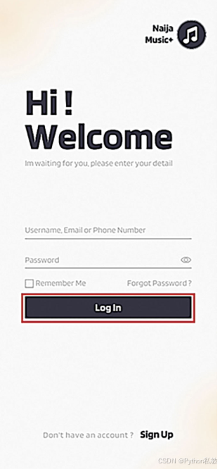
See Figure 3.6: Login button using ElevatedButton widget
参见图3.6:使用ElevatedButton小部件的登录按钮
Basic Usage:
The ElevatedButton widget is straightforward to use. You define its child widget, which is typically a Text widget, to display the label of the button. When the user taps or clicks the button, it triggers an action that you specify through its onPressed property.
"ElevatedButton"小部件使用起来很简单。您定义它的子小部件(通常是一个"Text"小部件)来显示按钮的标签。当用户点击按钮时,它会触发一个你通过它的' onPressed '属性指定的动作。
Styling:
Just like the Text widget, you can customize the appearance of the ElevatedButton using the style property. You can adjust properties like text style, background color, padding, and more to match your app's design.
就像"文本"小部件一样,您可以使用"style"属性自定义"ElevatedButton"的外观。你可以调整文本样式、背景色、填充等属性来匹配应用的设计。
Elevation:
The name "ElevatedButton" implies a sense of depth, and that's exactly what the elevation property controls. You can adjust how much the button stands out from its surroundings by setting the elevation value.
名称"ElevatedButton"暗示了一种深度感,而这正是elevation属性所控制的。您可以通过设置标高值来调整按钮与周围环境的突出程度。
Focus and Accessibility:
Interactive elements should provide a good user experience for all users, including those who navigate with a keyboard or assistive technologies. The ElevatedButton automatically handles focus, making it easier for keyboard users to interact with your app. To enhance accessibility, consider providing a label or description for the button using the Semantics widget.
交互元素应该为所有用户提供良好的用户体验,包括那些使用键盘或辅助技术进行导航的用户。"ElevatedButton"自动处理焦点,使键盘用户更容易与应用程序交互。为了增强可访问性,请考虑使用"Semantics"小部件为按钮提供标签或描述。
Disabled State:
Buttons might need to be disabled in certain scenarios, such as when the user hasn't provided the required input. The ElevatedButton supports a disabled state that visually indicates to users that the button cannot be interacted with.
在某些情况下,例如当用户没有提供所需的输入时,可能需要禁用按钮。' ElevatedButton '支持' disabled '状态,直观地向用户指示按钮不能与之交互。
Customization:
While the default styling of ElevatedButton is suitable for many scenarios, you can also create highly customized buttons by wrapping the ElevatedButton with other widgets like Container, Ink, or ClipRRect.
虽然' ElevatedButton '的默认样式适用于许多场景,但您也可以通过使用' Container ', ' Ink '或' ClipRRect '等其他小部件包装' ElevatedButton '来创建高度自定义的按钮。
Tap Feedback:
When the user taps an ElevatedButton, it provides visual feedback by changing its appearance temporarily. This visual feedback helps users understand that their interaction was registered.
当用户点击"ElevatedButton"时,它会通过暂时改变其外观来提供视觉反馈。这种视觉反馈可以帮助用户了解他们的交互是注册的。
As you progress through this chapter, you'll have the opportunity to see the ElevatedButton in action and explore how it can enhance your app's interactivity.
随着你在本章的学习,你将有机会看到"ElevatedButton"的作用,并探索它如何增强你的应用程序的交互性。