两栏布局和三栏布局
两栏布局
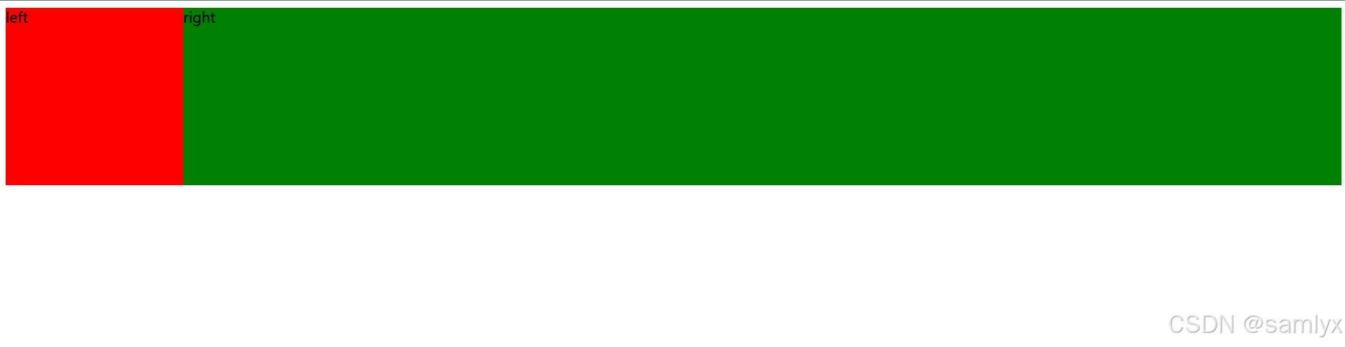
两栏布局:一侧的宽度固定,另一侧自适应;
这是HTML的基础结构,后续的代码都以此为基础;
html
<div class="container">
  <div class="left">left</div>
  <div class="right">right</div>
</div>- 利用浮动 将左侧的盒子向左浮动,右侧的盒子宽度设置
100%或者auto,让其撑起整个父元素;
css
.left {
    float: left;
    width: 200px;
    height: 200px;
    background-color: red;
  }
  .right {
    width: auto;
    height: 200px;
    background-color: green;
}- 利用浮动 左侧元素设置固定大小,并左浮动,右侧元素设置
overflow: hidden; 这样右边就触发了BFC ,BFC 的区域不会与浮动元素发生重叠,所以两侧就不会发生重叠。
想了解BFC请点击这里
css
.left {
    float: left;
    width: 200px;
    height: 200px;
    background-color: red;
  }
  .right {
    height: 200px;
    background-color: green;
    overflow: hidden;
}flex布局 父元素设置flex布局,将右边的元素设置为flex:1,或者给父元素添加justify-content: space-between;,右侧元素宽度设置100%;
css
.container {
    display: flex;
    /* justify-content: space-between; */
  }

  .left {
    width: 200px;
    height: 200px;
    background-color: red;
  }

  .right {
    flex: 1; /*如果那两行注释取消,需要将该行注释,并且加上width:100%;*/
    /* width: 100%; */
    height: 200px;
    background-color: green;

}- 利用定位方法 将父级元素设置为相对定位。固定的一侧元素设置为
absolute定位,另一侧宽度100%,但是要给右侧盒子添加margin-left;
css
.container {
    position: relative;
  }
  .left {
    position: absolute;
    width: 200px;
    height: 200px;
    background-color: red;
  }
  .right {
    width: 100%;
    height: 200px;
    background-color: green;
    margin-left: 200px;
  }
三栏布局
三栏布局就是圣杯布局/双飞翼布局;左右两侧的宽度是固定的,中间部分是自适应的;
这是HTML基础结构,后续代码也使用该结构;
html
<div class="container">
  <div class="left">left</div>
  <div class="center">center</div>
  <div class="right">right</div>
</div>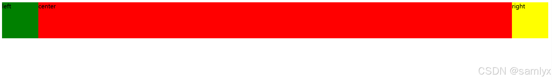
- 利用浮动 左边设置向左浮动,右边设置向右浮动,中间一栏设置左右两个方向的
margin值,注意这种方式,中间一栏div必须放到最后;
css
.left {
    float: left;
    width: 100px;
    height: 100px;
    background: green;
  }
  .right {
    float: right;
    width: 100px;
    height: 100px;
    background: yellow;
  }
  .center {
    background-color: red;
    margin-left: 100px;
    margin-right: 100px;
    height: 100px;
}- 利用定位 左右两栏设置绝对定位,中间设置对应方向大小的
margin的值
css
.container {
    position: relative;
  }
  .left {
    position: absolute;
    width: 100px;
    height: 100px;
    background: green;
  }
  .right {
    position: absolute;
    width: 100px;
    height: 100px;
    right: 0;
    top: 0;
    background: yellow;
  }
  .center {
    background-color: red;
    margin-left: 100px;
    margin-right: 100px;
    height: 100px;
}- flex布局,左右两栏设置固定大小,给父元素添加
display:flex,给中间盒子添加flex:1
css
.container {
    display: flex;
  }
  .left {
    width: 100px;
    height: 100px;
    background: green;
  }
  .right {
    width: 100px;
    height: 100px;
    background: yellow;
  }
  .center {
    flex: 1;
    background-color: red;
    height: 100px;
  }
圣杯布局
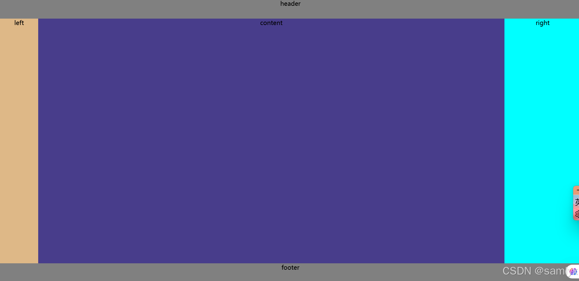
这是HTML基础布局;
html
<div class="header">header</div>
  <div class="outer">
    <div class="center">center</div>
    <div class="left">left</div>
    <div class="right">right</div>
  </div>
  <div class="footer">footer</div>
圣杯布局思路:
- 将
center盒子写在最前面,保证center盒子最先渲染; - 给
outer盒子指定padding-left和padding-right值,留出left和right的位置; - 三个盒子都设置
float:left,这时left和right就会被挤到下一行; - left设置
margin-left:-100%;相对定位+left:-left的宽度;right设置margin-left=-right的宽度;相对定位+right:-right的宽度, 即可将两个盒子归位。
css
 * {
    padding: 0;
    margin: 0;
    text-align: center;
  }
  html {
    height: 100%;
  }
  body {
    display: flex;
    flex-direction: column;
    height: 100%;
    ;
  }
  .header {
    width: 100%;
    height: 50px;
    background-color: dimgray;
  }
  .footer {
    width: 100%;
    height: 50px;
    background-color: dimgray;
  }
  .outer {
    flex: 1;
    padding-left: 100px;
    padding-right: 200px;
  }
  .center {
    float: left;
    background-color: darkslateblue;
    height: 100%;
    width: 100%;
  }
  .left {
    float: left;
    width: 100px;
    margin-left: -100%;
    background-color: burlywood;
    height: 100%;
    position: relative;
    left: -100px;
  }
  .right {
    float: left;
    width: 200px;
    margin-left: -200px;
    height: 100%;
    position: relative;
    right: -200px;
    background-color: cyan;
  }
双飞翼布局
这是HTML结构
html
<div class="header">header</div>
  <div class="outer">
    <div class="center">
      <div class="content">content</div>
    </div>
    <div class="left">left</div>
    <div class="right">right</div>
  </div>
  <div class="footer">footer</div>
双飞翼布局思路:
- 给三个盒子都设置为左浮动;
center的宽度设为100%;left设置margin-left:-100%;right设置margin-left=-right的宽度即可将两个盒子归位,但是将center的两端挡住了;- 在
center盒子中再写一个content盒子,设置margin-left和margin-right为两侧的宽度,content盒子作为内容。
css
* {
    padding: 0;
    margin: 0;
  }
  html {
    width: 100%;
    height: 100%;
    text-align: center;
  }
  body {
    display: flex;
    width: 100%;
    height: 100%;
    flex-direction: column;
  }
  .header {
    background-color: grey;
    height: 50px;
  }
  .footer {
    background-color: grey;
    height: 50px;
  }
  .outer {
    flex: 1;
  }
  .center {
    float: left;
    width: 100%;
    background-color: darkslateblue;
    height: 100%;
  }
  .left {
    float: left;
    margin-left: -100%;
    width: 100px;
    background-color: burlywood;
    height: 100%;
  }
  .right {
    float: left;
    width: 200px;
    background-color: cyan;
    margin-left: -200px;
    height: 100%;
  }
  .content {
    margin-left: 100px;
    margin-right: 200px;
    height: 100%;
  }
圣杯布局和双飞翼布局的区别
圣杯布局是利用padding将中间部分留出,再利用定位、margin的方式将左右盒子归位,因此不需要外层div;
双飞翼布局是先设置中间盒子的宽度为100%,再用margin移动左右盒子覆盖了中间盒子的两侧,再将中间加入一个盒子,留出两侧的margin值,达到三栏布局的效果。
两种布局都需要把center盒子写在left和right前面,为了最先渲染。