语义化更易读,seo;搜索引擎优化
块级元素:独占一行,不管内容长度
内联元素:紧跟着排列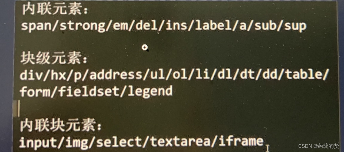
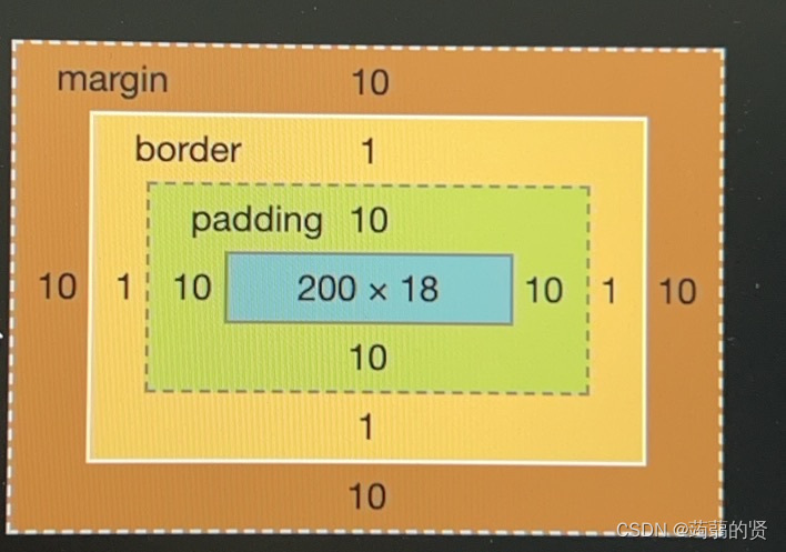
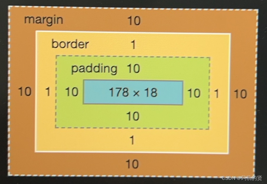
盒模型:
标准盒模型,内容即为长宽,内外边距,框都不算。
怪异盒模型,内边距+内容+框=宽
标准盒模型写width:200px
得到的box-sizing大于200,
加上一句box-sizing:border-box。就缩到200了
不加的话就是默认content-box(内容占据全部的width)
margin合并
当两个div有低外边距和顶外边距时,会造成盒子塌陷。
html
<body>
    <div>第一个盒子</div>
    <div>第二个盒子</div>
</body>

<style>
    div {
        font-size: 16px;
        line-height: 1;
        margin-top: 10px;
        margin-bottom: 50px;
        border: 1px solid #fcfcfc;
    }
</style>
在两个div之间插入空div,也会合并。
margin负值

BFC:Block formatting context(块级格式化上下文)
形成独立的渲染区域,内部原元素的渲染不会影响外界,用于清除浮动

正常div先写img,加上float:left,再写<p>,文字正常,但是整个div高度很小,造成图片浮动

加上
.bfc {
overflow: hidden;
}

还是有问题:p占满了整个页面

解决方案:p也加上bfc

圣杯布局


html
<!DOCTYPE html>
<html lang="en">

<head>
    <meta charset="UTF-8">
    <meta name="viewport" content="width=device-width, initial-scale=1.0">
    <title>Document</title>
</head>

<body>
    <div>
        <div id="header">header</div>
        <div id="content">
            <div id="center" class="column">center</div>
            <div id="left" class="column">left</div>
            <div id="right" class="column">right</div>
        </div>
        <div id="footer">footer </div>
    </div>
</body>

<style>
    div {
        text-align: center;
    }

    #header {
        background-color: #f1f1f1;
    }

    #content {
        padding-left: 300px;
        padding-right: 200px;
    }

    #content #center {
        background-color: #ddd;
        width: 100%;
    }

    #content #left {
        background-color: yellow;
        width: 300px;
        margin-left: -100%;
        /* 拖到上面 */
        position: relative;
        right: 300px;
        /* 继续左拖300px */
    }

    #content #right {
        background-color: green;
        width: 200px;
        margin-right: -200px;
    }

    #content .column {
        float: left;
    }

    #footer {
        background-color: #f1f1f1;
        clear: both;
        /* 清除浮动 */
    }
</style>

</html>
flex骰子布局
html
<!DOCTYPE html>
<html lang="en">

<head>
    <meta charset="UTF-8">
    <meta name="viewport" content="width=device-width, initial-scale=1.0">
    <title>Document</title>
</head>

<body>
    <div class="continer">
        <div class="point"></div>
        <div class="point"></div>
        <div class="point"></div>
    </div>
</body>

<style>
    .continer {
        background-color: #fff;
        border: 1px solid #000;
        display: flex;
        flex-direction: row;
        width: 100px;
        height: 100px;
    }

    .point {
        background-color: black;
        border-radius: 50%;
        width: 20px;
        height: 20px;
        margin: 7px;
    }

    .point:nth-child(2) {
        align-self: center;
    }

    .point:nth-child(3) {
        align-self: flex-end;
    }
</style>

</html>
row-reserve是从右往左排列

space-between是左右靠边分布
space-around是等距离分布

baseline:不是靠近最底下。是靠近基线,而交叉轴和主轴的基线从左上角开始。
示例:
html
<!DOCTYPE html>
<html lang="en">

<head>
    <meta charset="UTF-8">
    <meta name="viewport" content="width=device-width, initial-scale=1.0">
    <title>Document</title>
</head>

<body>
    <div class="continer">
        <div class="point"></div>
        <div class="point"></div>
        <div class="point"></div>
        <div class="point"></div>
        <div class="point"></div>
        <div class="point"></div>
        <div class="point"></div>
        <div class="point"></div>
        <div class="point"></div>
        <div class="point"></div>
        <div class="point"></div>
        <div class="point"></div>
        <div class="point"></div>
        <div class="point"></div>
        <div class="point"></div>
        <div class="point"></div>
        <div class="point"></div>
        <div class="point"></div>
        <div class="point"></div>
        <div class="point"></div>
        <div class="point"></div>
        <div class="point"></div>
        <div class="point"></div>
        <div class="point"></div>
        <div class="point"></div>
        <div class="point"></div>
        <div class="point"></div>
    </div>
</body>

<style>
    .continer {
        background-color: #fff;
        border: 1px solid #000;
        display: flex;
        flex-direction: row;
        width: 100px;
        height: 100px;
        justify-content: flex-start;
        align-items: flex-start;
        flex-wrap: wrap;
    }

    .point {
        background-color: black;
        border-radius: 50%;
        width: 20px;
        height: 20px;
        margin: 0;
    }

    /* .point:nth-child(2) {
        align-self: center;
    }

    .point:nth-child(3) {
        align-self: flex-end;
    } */
</style>

</html>
relative和absolte定位

relative相对于自身,absolute相对于上一个父元素
在CSS中,relative和absolute是用于定位元素的两种方式
relative(相对定位)是相对于元素自身原来的位置进行定位。当你对一个元素使用position: relative后,可以通过top、bottom、left、right属性来移动这个元素。元素原来占据的空间仍然会保留,其他元素不会占据它原来的位置。例如,设置一个元素position: relative和top: 10px,这个元素会相对于它原来的位置向下移动10像素。
absolute(绝对定位)是相对于最近的已定位祖先元素(position属性值为relative、absolute或者fixed)来定位。如果没有已定位的祖先元素,那么它会相对于文档根元素(<html>)进行定位。当一个元素使用position: absolute时,它会脱离文档流,原来占据的空间不会被保留,其他元素会填补它原来的位置。比如,在一个相对定位的容器中有一个绝对定位的元素,这个绝对定位元素会以容器的左上角为参照点(如果没有其他偏移量设置)进行定位。
水平居中

html
<!DOCTYPE html>
<html lang="en">

<head>
    <meta charset="UTF-8">
    <meta name="viewport" content="width=device-width, initial-scale=1.0">
    <title>Document</title>
</head>

<body>

    <div class="item1">hello world</div>


    <div class="continer">
        <div class="item2">hello world</div>

    </div>
    <div class="continer">
        <div class="item3">hello world</div>
    </div>
</body>

<style>
    .continer {
        width: 400px;
        height: 200px;
        background-color: gray;
        border: 1px solid black;
    }


    .item1 {
        text-align: center;
        background-color: gray;
    }

    .continer .item2 {
        margin: 0 auto;
        background-color: pink;
        width: 100px;
        height: 100px;
    }

    .item3 {
        position: absolute;
        background-color: yellow;
        top: 250px;
        left: 50px;
        left: 50%;
        margin-left: -150px;
    }
</style>

</html>
垂直居中


line-heigh继承

当1情况,直接继承50px,
当2情况,继承1.5*自身行高
当3情况,继承2*父元素行高。
rem?

