开篇
今天的小作品是突然脑子灵光一闪写出来的,代码不多,就不过多赘述了。
代码实现
html
<template>
  <div class="clock-container">
    <!-- 八卦图 -->
    <!-- <div class="bagua">
      <div
        v-for="(trigram, index) in trigrams"
        :key="index"
        class="trigram"
        :style="{ transform: `rotate(${index * 45}deg)` }"
        :data-name="trigram.name"
      >
        <div class="trigram-lines">
          <div
            v-for="(line, lineIndex) in trigram.lines"
            :key="lineIndex"
            :class="['line', line ? 'yang' : 'yin']"
          ></div>
        </div>
      </div>
    </div> -->

    <!-- 太极图 -->
    <div class="taiji">
      <div class="taiji-inner">
        <div class="yang">
          <div class="dot"></div>
        </div>
        <div class="yin">
          <div class="dot"></div>
        </div>
      </div>
    </div>

    <!-- 时钟 -->
    <div class="clock">
      <div class="hand hour" :style="hourRotation"></div>
      <div class="hand minute" :style="minuteRotation"></div>
      <div class="hand second" :style="secondRotation"></div>
      <div
        v-for="n in 12"
        :key="n"
        class="number"
        :style="{ transform: `rotate(${n * 30}deg)` }"
      >
        <span :style="{ transform: `rotate(-${n * 30}deg)` }">{{ n }}</span>
      </div>
    </div>
  </div>
</template>

<script setup>
import { ref, computed, onMounted, onUnmounted } from 'vue';

const time = ref(new Date());
let timer;

const updateTime = () => {
  time.value = new Date();
};

onMounted(() => {
  timer = setInterval(updateTime, 1000);
});

onUnmounted(() => {
  clearInterval(timer);
});

const hourRotation = computed(() => ({
  transform: `rotate(${(time.value.getHours() % 12 + time.value.getMinutes() / 60) * 30}deg)`,
}));

const minuteRotation = computed(() => ({
  transform: `rotate(${time.value.getMinutes() * 6}deg)`,
}));

const secondRotation = computed(() => ({
  transform: `rotate(${time.value.getSeconds() * 6}deg)`,
}));

// 八卦数据:每个卦象由三条爻组成,true表示阳爻,false表示阴爻
// const trigrams = [
//   { name: '乾', lines: [true, true, true] },    // ☰
//   { name: '兑', lines: [true, true, false] },   // ☱
//   { name: '离', lines: [true, false, true] },   // ☲
//   { name: '震', lines: [false, false, true] },  // ☳
//   { name: '巽', lines: [true, false, false] },  // ☴
//   { name: '坎', lines: [false, true, false] },  // ☵
//   { name: '艮', lines: [false, true, true] },   // ☶
//   { name: '坤', lines: [false, false, false] }  // ☷
// ];
</script>

<style scoped>
.clock-container {
  position: relative;
  width: 600px;
  height: 600px;
}

.bagua {
  position: absolute;
  width: 100%;
  height: 100%;
  animation: rotate 60s linear infinite;
  pointer-events: none;
}

.trigram {
  position: absolute;
  width: 80px;
  height: 160px;
  top: 0;
  left: 50%;
  transform-origin: 50% 300px;
  margin-left: -40px;
  display: flex;
  justify-content: center;
  align-items: flex-start;
}

.trigram-lines {
  display: flex;
  flex-direction: column;
  align-items: center;
  gap: 12px;
  padding: 10px;
  background: rgba(255, 255, 255, 0.8);
  border-radius: 8px;
  box-shadow: 0 2px 10px rgba(0, 0, 0, 0.1);
}

.line {
  width: 60px;
  height: 8px;
  background: #000;
  border-radius: 4px;
}

.line.yang {
  background: #000;
  border-radius: 2px;
}

.line.yin {
  background: transparent;
  display: flex;
  justify-content: space-between;
}

.line.yin::before,
.line.yin::after {
  content: '';
  width: 25px;
  height: 8px;
  background: #000;
  border-radius: 4px;
}

.line.yin::before {
  left: 0;
}

.line.yin::after {
  right: 0;
}

.trigram::after {
  content: attr(data-name);
  position: absolute;
  top: -30px;
  left: 50%;
  transform: translateX(-50%);
  font-size: 16px;
  font-weight: bold;
  color: #000;
  background: rgba(255, 255, 255, 0.9);
  padding: 4px 10px;
  border-radius: 4px;
  white-space: nowrap;
}

.taiji {
  position: absolute;
  width: 500px;
  height: 500px;
  top: 50px;
  left: 50px;
  border-radius: 50%;
  background: linear-gradient(90deg, #000 50%, #fff 50%);
  animation: rotate 30s linear infinite;
}

.taiji-inner {
  position: relative;
  width: 100%;
  height: 100%;
}

.yang,
.yin {
  position: absolute;
  width: 50%;
  height: 50%;
  border-radius: 50%;
}

.yang {
  background: #000;
  top: 0;
  left: 25%;
}

.yin {
  background: #fff;
  bottom: 0;
  left: 25%;
}

.dot {
  position: absolute;
  width: 50%;
  height: 50%;
  border-radius: 50%;
  top: 25%;
  left: 25%;
}

.yang .dot {
  background: #fff;
}

.yin .dot {
  background: #000;
}

.clock {
  position: absolute;
  width: 300px;
  height: 300px;
  top: 150px;
  left: 150px;
  border-radius: 50%;
  background: rgba(255, 255, 255, 0.9);
  box-shadow: 0 0 20px rgba(0, 0, 0, 0.1);
}

.hand {
  position: absolute;
  bottom: 50%;
  left: 50%;
  transform-origin: bottom;
  background: #333;
}

.hour {
  width: 4px;
  height: 60px;
  margin-left: -2px;
}

.minute {
  width: 3px;
  height: 80px;
  margin-left: -1.5px;
  background: #666;
}

.second {
  width: 2px;
  height: 90px;
  margin-left: -1px;
  background: #f00;
}

.number {
  position: absolute;
  width: 100%;
  height: 100%;
  text-align: center;
  transform-origin: center;
}

.number span {
  display: inline-block;
  font-size: 20px;
  font-weight: bold;
  color: #333;
}

@keyframes rotate {
  from {
    transform: rotate(0deg);
  }
  to {
    transform: rotate(360deg);
  }
}
</style>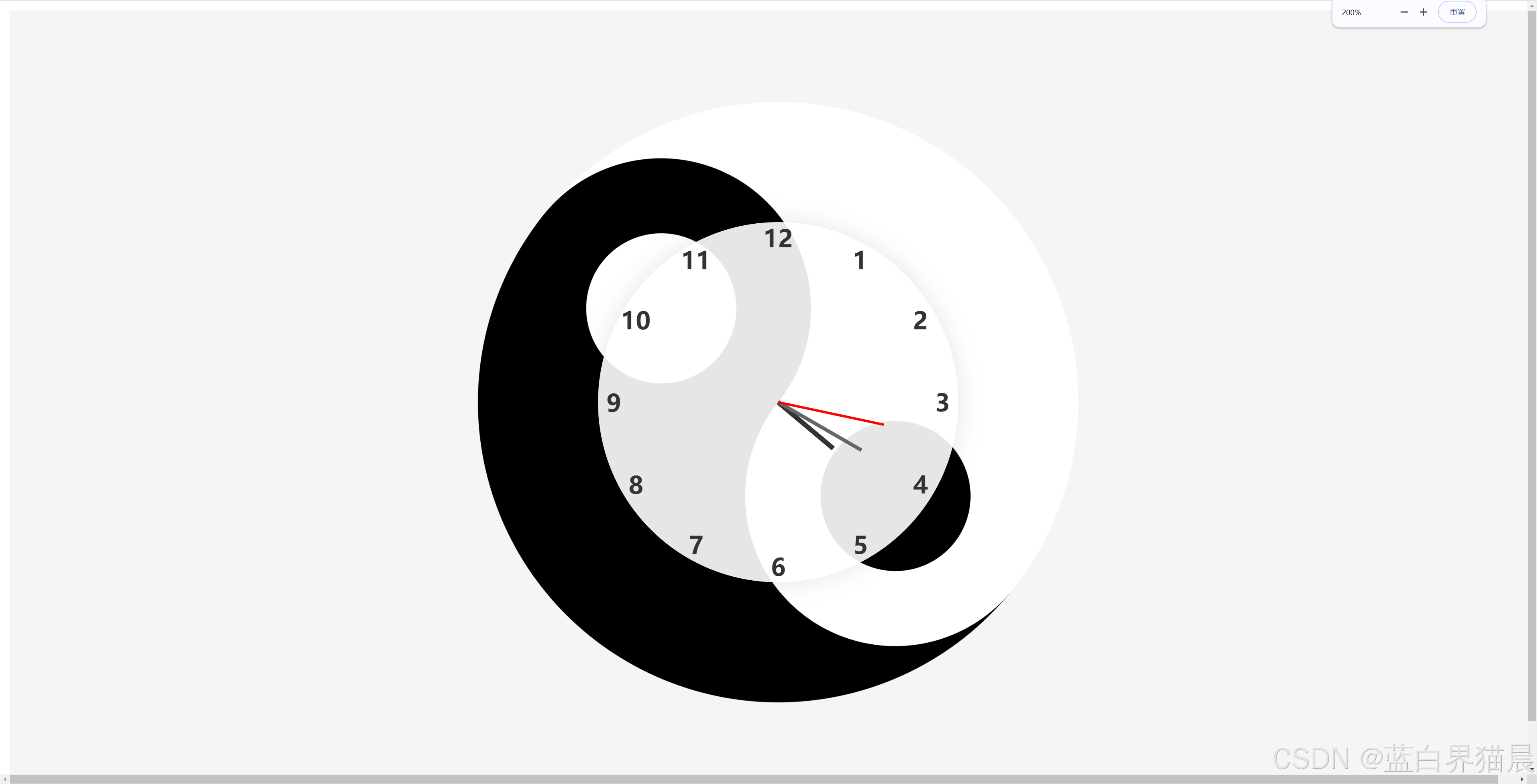
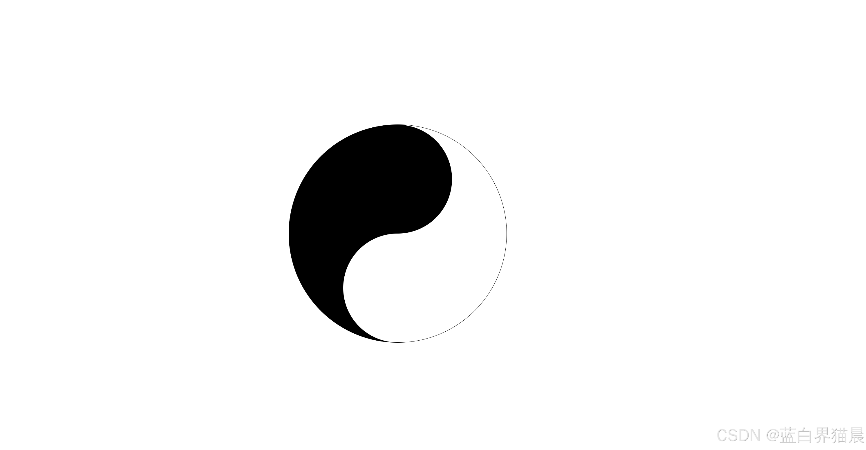
注
这里看起来代码量比较大,是因为我在尝试在阴阳图外面加一个八卦图,但是失败了,这里只能等待后续有时间了再完善了。其实单纯阴阳图的代码量还是很少的,我在下面把阴阳图的实现样式代码抽离出来。
阴阳图代码
xml
<!DOCTYPE html>
<html lang="en">
  <head>
    <meta charset="UTF-8" />
    <meta name="viewport" content="width=device-width, initial-scale=1.0" />
    <title>Document</title>
    <style>
      body {
        height: 100vh;
        width: 100vw;
      }
      .taiji {
        width: 500px;
        height: 500px;
        position: absolute;
        top: 50%;
        left: 50%;
        transform: translate(-50%, -50%);
        border-radius: 50%;
        background: linear-gradient(90deg, #000 50%, #fff 50%);
        animation: rotate 10s linear infinite;
        border: 1px solid #000;
      }

      .taiji-inner {
        position: relative;
        width: 100%;
        height: 100%;
      }

      .yang,
      .yin {
        position: absolute;
        width: 50%;
        height: 50%;
        border-radius: 50%;
      }

      .yang {
        background: #000;
        top: 0;
        left: 25%;
      }

      .yin {
        background: #fff;
        bottom: 0;
        left: 25%;
      }
    </style>
  </head>
  <body>
    <div class="taiji">
      <div class="taiji-inner">
        <div class="yang">
          <div class="dot"></div>
        </div>
        <div class="yin">
          <div class="dot"></div>
        </div>
      </div>
    </div>
  </body>
</html>