前言
aria-hidden 属性可用于隐藏非交互内容,使其在无障碍 API 中不可见。即当aria-hidden="true" 添加到一个元素会将该元素及其所有子元素从无障碍树中移除,这可以通过隐藏来改善辅助技术用户的体验:
- 纯装饰性内容,如图标或图片
- 重复的内容,如重复的文本
- 屏幕外或折叠的内容,如菜单
tips: 不要在可以获得焦点的元素上使用 aria-hidden="true"。因 元素的隐藏状态基于其是否被渲染通常由 CSS 控制。
css
[aria-hidden="true"] {
display: none;
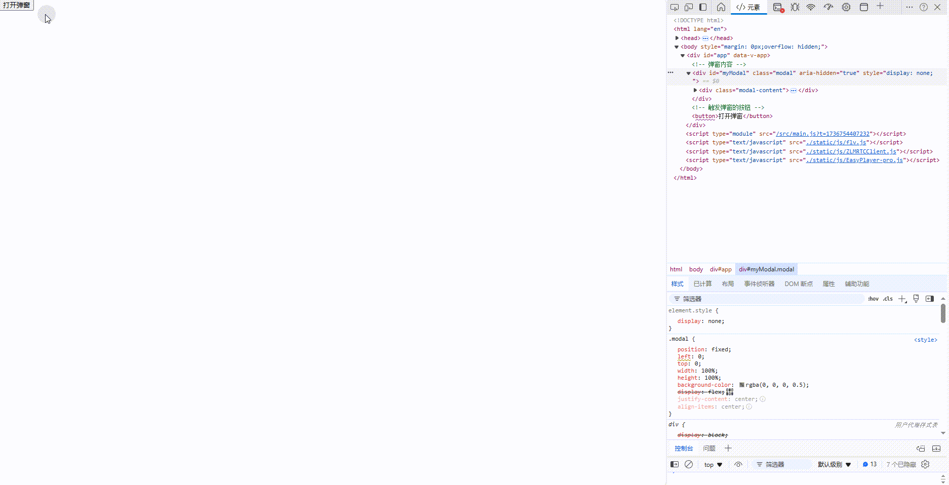
}弹窗显隐demo
javascript
<template>
<!-- 弹窗内容 -->
<div id="myModal" class="modal" aria-hidden="true" style="display: none;">
<div class="modal-content">
<span class="close-button" @click="closeModal">×</span>
<p>这是一个弹窗内容。</p>
</div>
</div>
<!-- 触发弹窗的按钮 -->
<button @click="openModal">打开弹窗</button>
</template>
<script setup>
const openModal = () => {
var modal = document.getElementById('myModal');
modal.style.display = 'flex'; // 显示弹窗
modal.setAttribute('aria-hidden', 'false'); // 使弹窗对辅助技术可见
}
const closeModal = () => {
var modal = document.getElementById('myModal');
modal.style.display = 'none'; // 显示弹窗
modal.setAttribute('aria-hidden', 'true'); // 使弹窗对辅助技术可见
}
</script>
<style lang="scss">
.modal {
position: fixed;
left: 0;
top: 0;
width: 100%;
height: 100%;
background-color: rgba(0, 0, 0, 0.5);
display: flex;
justify-content: center;
align-items: center;
}
.modal-content {
background-color: #fff;
padding: 20px;
border-radius: 5px;
position: relative;
}
.close-button {
position: absolute;
top: 10px;
right: 10px;
cursor: pointer;
font-size: 20px;
}
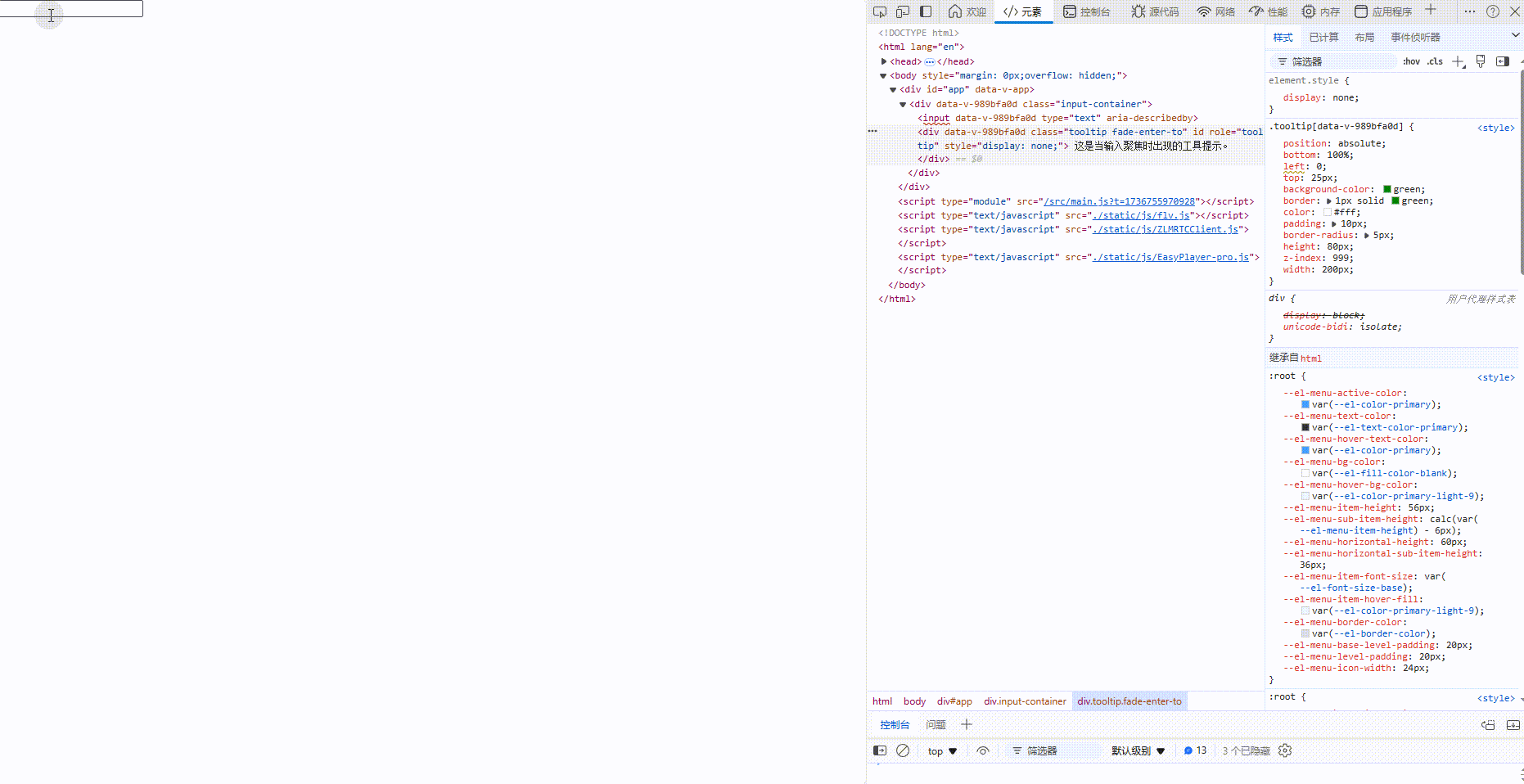
</style>input获取焦点提示demo
javascript
<template>
<div class="input-container">
<input type="text" v-model="inputValue" :aria-describedby="tooltipId" @focus="showTooltip = true"
@blur="showTooltip = false" />
<transition name="fade">
<div v-show="showTooltip" class="tooltip" :id="tooltipId" ref="tooltip" role="tooltip">
这是当输入聚焦时出现的工具提示。
</div>
</transition>
</div>
</template>
<script>
import { ref, computed } from 'vue';
export default {
setup () {
const inputValue = ref('');
const showTooltip = ref(false);
const tooltip = ref(null);
const tooltipId = computed(() => showTooltip.value ? 'tooltip' : '');
return {
inputValue,
showTooltip,
tooltip,
tooltipId
};
}
};
</script>
<style scoped>
.input-container {
position: relative;
display: inline-block;
}
.tooltip {
position: absolute;
bottom: 100%;
left: 0;
top: 25px;
background-color: green;
border: 1px solid green;
color: #fff;
padding: 10px;
border-radius: 5px;
height: 80px;
z-index: 999;
width: 200px;
}
.fade-enter-active,
.fade-leave-active {
transition: opacity 0.1s ease-in-out;
}
.fade-enter-from,
.fade-leave-to {
opacity: 0;
}
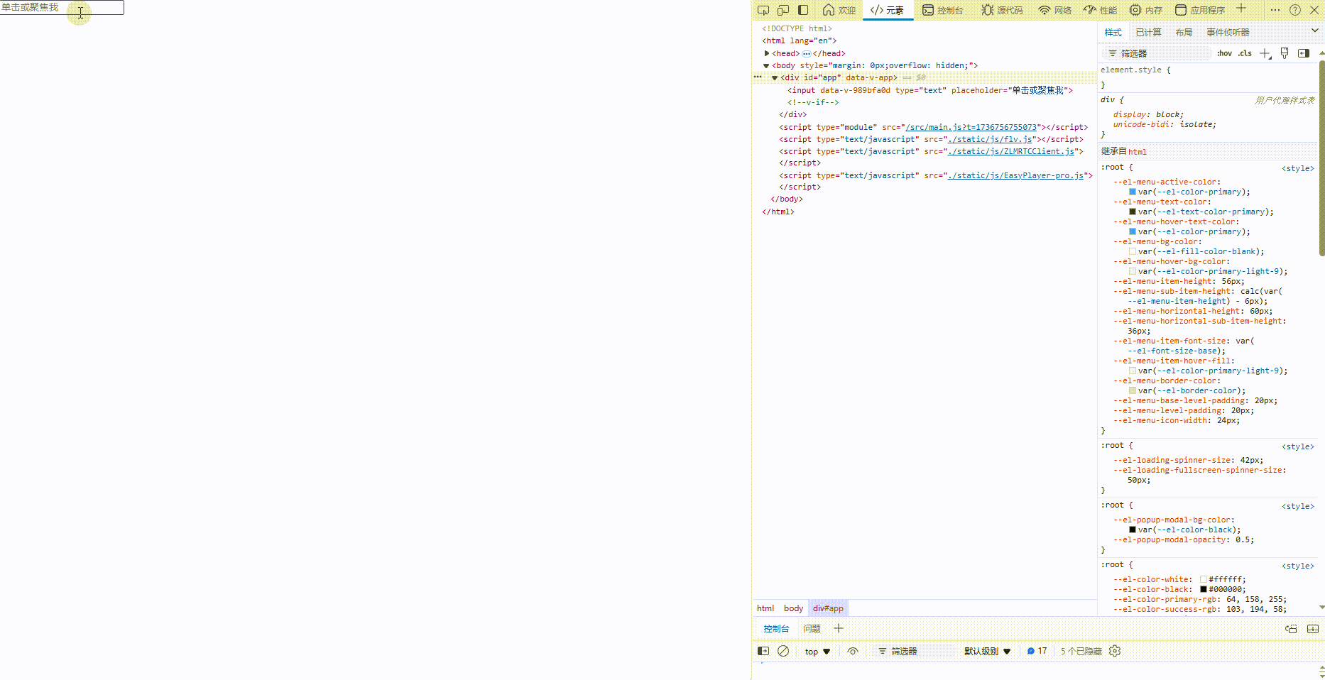
</style>追更
javascript
<template>
  <input type="text" v-model="inputValue" @focus="showTooltip" @blur="hideTooltip" placeholder="单击或聚焦我" ref="inputRef">
  <transition name="fade">
    <div v-if="isTooltipVisible" class="tooltip" :style="tooltipStyle">这是一个工具提示!</div>
  </transition>
</template>

<script setup>
import { ref, onMounted, reactive } from 'vue';

const inputValue = ref('');
const isTooltipVisible = ref(false);
const inputRef = ref(null);

const tooltipStyle = reactive({
  left: '0px',
  top: '0px'
});

const showTooltip = () => {
  isTooltipVisible.value = true;
  positionTooltip();
};

const hideTooltip = () => {
  isTooltipVisible.value = false;
};

const positionTooltip = () => {
  if (inputRef.value) {
    const inputRect = inputRef.value.getBoundingClientRect();
    tooltipStyle.left = `${inputRect.left + window.scrollX}px`;
    tooltipStyle.top = `${inputRect.bottom + window.scrollY + 10}px`; // 10px的间距
  }
};

onMounted(() => {
  // 可以在这里做一些额外的初始化工作,比如监听窗口滚动事件来重新定位tooltip等
  // 但在这个简单示例中,我们不需要这样做
});
</script>

<style scoped>
.tooltip {
  position: absolute;
  background-color: #333;
  color: #fff;
  text-align: center;
  border-radius: 5px;
  padding: 5px;
  z-index: 1000;
  white-space: nowrap;
  /* 防止文本换行 */
}

.fade-enter-active,
.fade-leave-active {
  transition: opacity 0.3s;
}

.fade-enter,
.fade-leave-to

/* .fade-leave-active in <2.1.8 */
  {
  opacity: 0;
}
</style>