前言
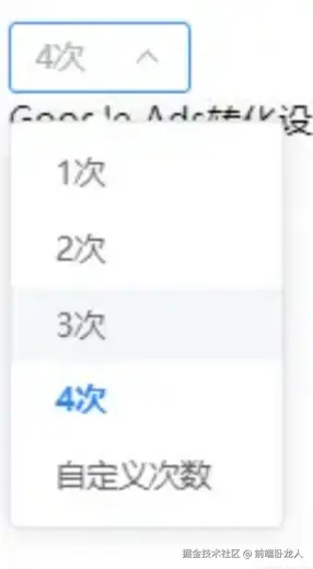
最近公司产品要求要一个自定义输入的下拉框组件,如下图,项目使用 Element Plus+vue3,可以对其element进行二次封装
以下是如何基于 Element Plus 的 el-select 组件实现一个带有自定义输入功能的下拉框组件的详细步骤。
一、组件功能需求
- 基本下拉选择 :
- 提供一个下拉框,用户可以从预定义的选项中选择值。
- 自定义输入 :
- 当用户选择"自定义"选项时,显示一个输入框,允许用户输入自定义值。
- 输入完成后,用户可以通过点击"确认"按钮将自定义值添加到下拉框的选项中。
- 动态宽度调整 :
- 根据当前选中的值(包括自定义值)动态调整下拉框的宽度,确保显示效果良好。
- 数据回显 :
- 当用户从下拉框中选择或输入自定义值后,能够正确回显到界面上。
二、实现思路
(一)组件结构
- 使用
el-select和el-option构建基础的下拉框。 - 在下拉框中添加一个"自定义"选项,其值设为
0。 - 当用户选择"自定义"选项时,通过
v-if控制显示一个输入框和"确认"按钮。
(二)逻辑实现
- 输入框的显示与隐藏 :
- 使用
v-if控制输入框的显示状态。 - 在下拉框的
change事件中判断用户是否选择了"自定义"选项,如果是,则显示输入框并聚焦。
- 使用
- 动态宽度调整 :
- 使用 CSS 和 JavaScript 动态计算下拉框的宽度,确保在不同状态下(如显示自定义输入框时)宽度合适。
- 数据回显 :
- 使用计算属性或方法将自定义输入的值添加到下拉框的选项中。
- 监听
el-select的v-model值变化,动态调整下拉框的选项列表。
(三)代码实现
1. 模板部分
vue
<template>
  <div>
    <el-select
      v-model="value"
      placeholder="请选择"
      class="relative"
      :style="{ width: selectWidth }"
      @change="handleSelectChange"
      @visible-change="visibleChange"
    >
      <el-option
        v-for="item in options"
        :key="item.value"
        :label="item.label"
        :value="item.value"
      />
      <el-option
        key="custom"
        label="自定义"
        :value="0"
      />
    </el-select>
    <div v-if="showInput" class="input-container absolute">
      <el-input
        ref="inputRef"
        v-model="customValue"
        placeholder="请输入自定义值"
        style="width: 80px; margin-right: 16px;"
      />
      <el-button type="text" @click="addCustomOption">
        确认
      </el-button>
    </div>
  </div>
</template>
2. js部分
vue
<script>
import { ref, watch, nextTick } from 'vue';

export default {
  setup() {
    const value = ref(null);
    const options = ref([
      { value: 1, label: '选项1' },
      { value: 2, label: '选项2' },
      { value: 3, label: '选项3' },
    ]);
    const showInput = ref(false);
    const customValue = ref(null);
    const inputRef = ref(null);
    const selectWidth = ref('120px');

    // 处理下拉框选择变化
    function handleSelectChange(val) {
      if (val === 0) {
        showInput.value = true;
        customValue.value = null;
        adjustSelectWidth(val);
        nextTick(() => {
          inputRef.value.focus();
        });
      } else {
        showInput.value = false;
        adjustSelectWidth(val);
      }
    }

    // 添加自定义选项
    function addCustomOption() {
      if (customValue.value !== null) {
        const customLabel = `自定义(${customValue.value})`;
        options.value.push({ value: customValue.value, label: customLabel });
        value.value = customValue.value;
        showInput.value = false;
      }
    }

    // 动态调整下拉框宽度
    function adjustSelectWidth(val) {
      const tempDiv = document.createElement('div');
      tempDiv.style.position = 'absolute';
      tempDiv.style.visibility = 'hidden';
      tempDiv.style.width = 'auto';
      tempDiv.style.fontSize = '14px';
      document.body.appendChild(tempDiv);
      tempDiv.innerHTML = getLabel(val);
      selectWidth.value = val ? `${tempDiv.clientWidth + 60}px` : '120px';
      document.body.removeChild(tempDiv);
    }

    // 获取标签文本
    function getLabel(val) {
      const option = options.value.find(option => option.value === val);
      return option ? option.label : '';
    }

    // 监听下拉框显示状态
    function visibleChange(val) {
      if (val) {
        showInput.value = false;
      }
    }

    // 确保动态值在选项中存在
    function ensureValueInOptions(val) {
      if (!options.value.some(option => option.value === val)) {
        val && options.value.push({
          value: val,
          label: getLabel(val),
        });
      }
    }

    watch(
      () => value.value,
      (newVal) => {
        ensureValueInOptions(newVal);
        adjustSelectWidth(newVal);
      },
      { immediate: true },
    );

    return {
      value,
      options,
      showInput,
      customValue,
      inputRef,
      selectWidth,
      handleSelectChange,
      addCustomOption,
      adjustSelectWidth,
      visibleChange,
    };
  },
};
</script>
3. 样式部分
vue
<style scoped>
.input-container {
  display: flex;
  align-items: center;
  border-radius: 8px;
  background: #fff;
  box-shadow: 0px 4px 4px 0px rgba(0, 0, 0, 0.12);
  padding: 15px;
  z-index: 9999;
}
// 样式穿透
::v-deep(.el-input__wrapper) {
  box-shadow: none;
}
</style>
三、总结
通过上述实现,我们成功构建了一个带有自定义输入功能的下拉框组件。它不仅支持从预定义选项中选择值,还允许用户输入自定义值,并动态调整下拉框的宽度以适应不同场景。
这种组件在实际开发中非常实用,能够满足复杂的用户交互需求,后续其他地方进行复用也是非常不错的。