概要
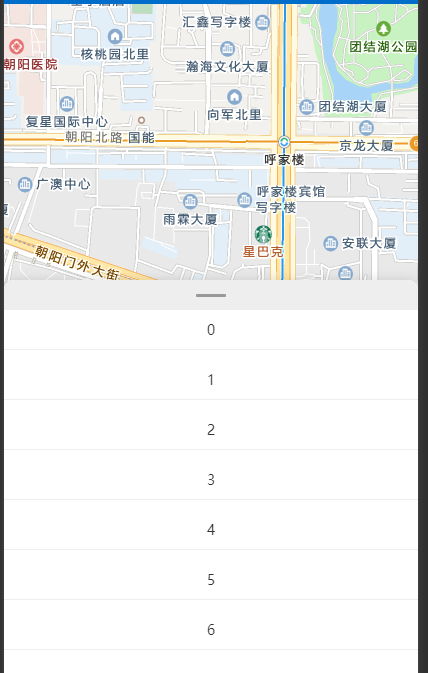
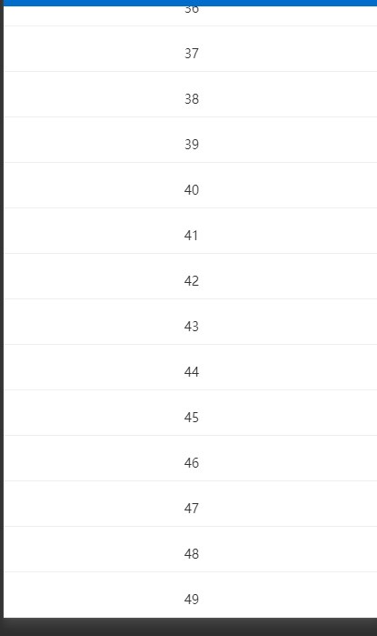
使用百度地图、各种单车APP时,对地图上的滑动面板很感兴趣,于是根据自己的理解实现了一下
之前用的js实现,滑动的时候没有原生好
这一次用的css实现
代码
javascript
<template>
  <view class="container">
    <map
      style="
        position: fixed;
        height: 100%;
        width: 100%;
        top: 0;
        left: 0;
        z-index: 0;
      "
      :enable-scroll="!isPanelTouched"
    ></map>
    <view
      style="
        height: 500rpx;
        width: 100%;
        background-color: rgba(255, 255, 255, 0.8);
        z-index: -1;
      "
    ></view>
    <view
      class="panel"
      @touchstart="onPanelTouchStart"
      @touchend="onPanelTouchEnd"
    >
      <view class="handle"></view>
      <view class="item" v-for="item in 50" :key="item">
        {{ item }}
      </view>
    </view>
    <view
      v-if="isPanelTouched"
      class="mask"
      @touchstart.stop.prevent
      @touchmove.stop.prevent
      @touchend.stop.prevent
    ></view>
  </view>
</template>

<script>
export default {
  data() {
    return {
      isPanelTouched: false
    }
  },
  methods: {
    onPanelTouchStart() {
      this.isPanelTouched = true
    },
    onPanelTouchEnd() {
      this.isPanelTouched = false
    }
  }
}
</script>

<style scoped lang="scss">
.panel {
  position: relative;
  background-color: #fff;
  border-top-left-radius: 10px;
  border-top-right-radius: 10px;
  box-shadow: 0 -2px 10px rgba(0, 0, 0, 0.1);
  z-index: 2;
  .handle {
    height: 30px;
    background-color: #eee;
    border-top-left-radius: 10px;
    border-top-right-radius: 10px;
    cursor: pointer;
    display: flex;
    justify-content: center;
    align-items: center;

    &::after {
      content: '';
      width: 30px;
      height: 3px;
      background-color: #999;
      border-radius: 3px;
    }
  }
  .content {
    height: calc(100% - 30px);
    overflow-y: auto;
  }
  .item {
    text-align: center;
    font-size: 14px;
    color: #333;
    margin-bottom: 10px;
    padding: 10px;
    border-bottom: 1px solid #eee;
  }
}

.mask {
  position: fixed;
  top: 0;
  left: 0;
  width: 100%;
  height: 100%;
  z-index: 1;
  background-color: rgba(0, 0, 0, 0);
}
</style>
效果图
在这里插入图片描述