- [1. QML中容器控件全解:构建灵活界面的基石](#1. QML中容器控件全解:构建灵活界面的基石)
- [1.1. Item(万物容器)](#1.1. Item(万物容器))
- [1.2. Rectangle(视觉容器)](#1.2. Rectangle(视觉容器))
- [1.3. ListView(动态列表容器)](#1.3. ListView(动态列表容器))
- [1.4. Frame(表单容器)](#1.4. Frame(表单容器))
- [1.5. SwipeView(页面容器)](#1.5. SwipeView(页面容器))
- [1.6. TabBar(导航容器)](#1.6. TabBar(导航容器))
- [1.7. SwipeView 和 TabBar 的区别](#1.7. SwipeView 和 TabBar 的区别)
- [1.7.1. 功能和交互方式](#1.7.1. 功能和交互方式)
- [1.7.2. 交互方式](#1.7.2. 交互方式)
- [1.7.3. 视觉表现](#1.7.3. 视觉表现)
- [1.7.4. 适用场景](#1.7.4. 适用场景)
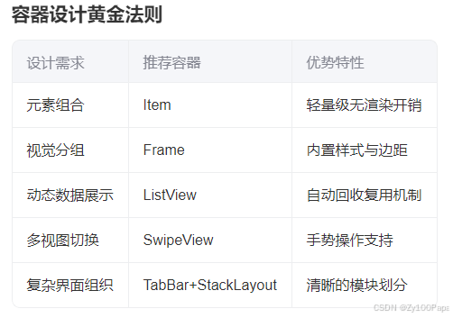
- [2. 容器设计黄金法则](#2. 容器设计黄金法则)
1. QML中容器控件全解:构建灵活界面的基石
在智能设备井喷的时代,QML容器控件如同"数字乐高",通过巧妙的组合艺术,将简单元素转化为功能强大的交互界面。
本篇将揭秘工业HMI、车载中控等专业场景中最核心的容器控件,带您掌握界面架构设计的精髓。
1.1. Item(万物容器)
设计哲学:
作为QML世界的"原子单位",Item是其他所有控件的基类,承担着界面元素组织者的角色。
html
Item {

    id: sensorGroup
    width: 300; height: 200

    // 组合多个传感器显示模块
    TemperatureDisplay { anchors.left: parent.left }
    PressureIndicator { anchors.right: parent.right }
    StatusLed {
        anchors.horizontalCenter: parent.horizontalCenter
        anchors.bottom: parent.bottom
    }

    // 统一控制可见性
    visible: systemStatus === "normal"
}实战技巧:
通过visible属性实现整体显隐控制
使用anchors进行相对定位
作为自定义组件的基容器
1.2. Rectangle(视觉容器)
工业场景:
在设备状态看板中,用于创建带背景色的信息区块,提升界面层次感。
qml
Rectangle {

    radius: 8
    border.color: "#2196F3"
    color: "#E3F2FD"

    Column {
        spacing: 10
        anchors.fill: parent
        padding: 15

        Text { text: "电机状态监控"; font.bold: true }
        ProgressBar { value: motorStatus.speed }
        Row {
            spacing: 5
            CheckBox { text: "过热保护" }
            CheckBox { text: "震动报警" }
        }
    }
}设计规范:
使用radius实现圆角现代化设计
通过嵌套布局构建复合组件
用颜色区分不同功能区域
1.3. ListView(动态列表容器)
车载系统应用:
用于音乐列表、导航历史等需要动态加载的滚动列表。
qml
ListView {

    width: 240
    height: 300
    model: musicListModel
    spacing: 2
    clip: true

    delegate: Rectangle {
        width: ListView.view.width
        height: 40
        color: index%2 ? "#FAFAFA" : "white"

        Text {
            text: model.title
            anchors.verticalCenter: parent.verticalCenter
            color: model.isPlaying ? "#2196F3" : "black"
        }

        MouseArea {
            anchors.fill: parent
            onClicked: musicPlayer.selectTrack(model.id)
        }
    }

    ScrollBar.vertical: ScrollBar { policy: ScrollBar.AlwaysOn }
}性能优化:
使用clip:true防止渲染溢出
通过delegate复用机制提升性能
集成自定义滚动条
1.4. Frame(表单容器)
医疗设备应用:
用于参数设置面板等需要明确视觉边界的表单组合。
qml
Frame {

    background: Rectangle {
        color: "#FFF3E0"
        border.color: "#FFA726"
        radius: 4
    }

    ColumnLayout {
        spacing: 12

        TextField {
            placeholderText: "患者ID"
            Layout.fillWidth: true
        }

        Slider {
            id: pressureSlider
            from: 0
            to: 100
            Layout.fillWidth: true
        }

        Button {
            text: "保存预设"
            Layout.alignment: Qt.AlignRight
        }
    }
}交互设计:
自定义边框颜色增强辨识度
内置padding保持内容间距
配合Layout控件实现自适应
1.5. SwipeView(页面容器)
工业平板应用:
实现多页面滑动切换,适用于设备监控的多视图场景。
qml
SwipeView {

    id: view
    anchors.fill: parent
    currentIndex: 0

    // 页面1:实时监控
    RealTimeMonitor { }

    // 页面2:历史数据
    HistoryChart { }

    // 页面3:报警记录
    AlarmList { }
}


PageIndicator {

    count: view.count
    currentIndex: view.currentIndex
    anchors.bottom: view.bottom
}进阶用法:
结合PageIndicator显示进度
通过currentIndex控制页面跳转
支持手势滑动操作
1.6. TabBar(导航容器)
智能家居中控应用:
实现多标签页导航,管理不同功能模块。
qml
Column {

    anchors.fill: parent

    TabBar {
        id: bar
        width: parent.width

        TabButton { text: "环境监测" }
        TabButton { text: "设备控制" }
        TabButton { text: "能耗统计" }
    }

    StackLayout {
        width: parent.width
        height: parent.height - bar.height
        currentIndex: bar.currentIndex

        EnvironmentPanel { }
        DeviceController { }
        EnergyDashboard { }
    }
}
1.7. SwipeView 和 TabBar 的区别
1.7.1. 功能和交互方式
-
SwipeView :
SwipeView 是一个基于滑动的导航控件,用户可以通过水平滑动手势在不同页面之间切换。它适合需要通过滑动手势快速切换页面的场景,比如轮播图、选项卡、向导等。
-
TabBar :
TabBar 是一个标签栏控件,用户通过点击标签按钮切换页面。它适合需要通过标签明确指示当前页面的场景,比如多页面应用的导航栏。
1.7.2. 交互方式
-
SwipeView :
主要通过滑动手势进行页面切换,支持触摸屏设备的自然交互。
-
TabBar :
主要通过点击标签按钮进行页面切换,适合需要明确的页面导航和选择的场景。
1.7.3. 视觉表现
-
SwipeView :
SwipeView 本身是不可见的,通常需要与页面指示器(如 PageIndicator)结合使用,以显示当前页面的位置。
-
TabBar :
TabBar 是一个可视化的标签栏,通常显示在页面顶部或底部,提供明确的导航指示。
1.7.4. 适用场景
-
SwipeView :
适合需要滑动切换页面的场景,比如设置页面、欢迎引导页面等。
-
TabBar :
适合需要通过标签导航的场景,比如多页面应用的底部导航栏。
2. 容器设计黄金法则
掌握这些容器控件,您将能像搭积木一样构建出专业级工业界面。立即用这些代码片段开启您的下一个项目吧!