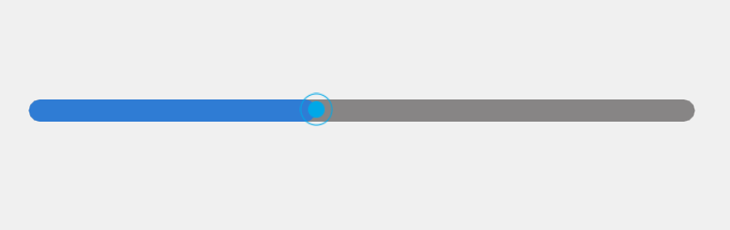
在许多应用程序中,进度条控件用于显示任务的完成进度或实时更新的数据。通常,进度条控件带有滑块,用户可以通过拖动滑块来手动调整进度。
为什么选择自定义滑动条?
在许多应用程序中,我们可以使用系统或框架提供的原生控件来构建进度条,但原生控件在某些情况下可能并不完美。例如:
-
滑块无法精准控制:原生滑动条控件通常不能很好地应对步长控制问题,用户拖动滑块时可能会遇到进度更新不精确的情况,或者滑块位置无法精准控制。
-
选中操作复杂:某些原生控件可能存在滑块选中操作的问题,尤其是在不同平台或分辨率下,滑块的可选中状态可能不一致,导致用户体验不流畅。
-
进度条样式限制:使用原生控件时,进度条的样式可能受到框架限制,无法完全符合项目的设计需求。若需要多个不同风格的进度条,原生控件的定制能力可能不足。
因此,封装自定义滑动条控件,能够灵活地控制进度条和滑块的表现,避免原生控件在一些特定场景下的局限性,还可以根据项目需求方便地切换多种不同风格的进度条。
进度条控件的基本功能
此控件具有以下几个基本功能:
- 进度条拖动:用户通过滑动滑块来改变进度,进度条和滑块的宽度都会实时更新。
- 步长控制 :设置一个步长(
stepSize),确保进度在每次更新时只按预定的步幅变化,避免细微的变化影响用户体验。 - 进度值更新信号 :每次进度更新时,控件会触发
currentValueChanged信号,通知外部获取当前的进度值。 - 滑块位置限制:滑块不会超出进度条的左右边界。
- 支持外部设置进度值 :控件提供了一个
setProgressValue(value)方法,让外部代码能够直接设置进度条的值。
源码下载链接
qml
通过网盘分享的文件:Slider.7z
链接: https://pan.baidu.com/s/1qpWrfX7P8pz1e3a26mczUg?pwd=jkcf 提取码: jkcf
核心代码讲解
下面是优化后的 QML 代码,我们通过该代码实现了一个进度条滑动控件,支持步长和滑动拖动控制。
qml
import QtQuick 2.15
import QtQuick.Controls 2.15

Item {
    id: progressBar
    width: 140
    height: 20

    // 信号:每次进度更新时触发,返回当前进度
    signal currentValueChanged(real progress)

    // 步长单位
    property real stepSize: 0.05  // 假设步长为 0.05

    property real currValue : 0 // 当前进度值

    property string sliderImageSource: "file:btn_nan@2x.png"  // 使用你的图片路径

    // 最小值和最大值
    property real minValue: 0    // 最小值
    property real maxValue: 10    // 最大值

    property real handleSize: 15   // 滑块大小

    // 标志位,防止死循环
    property bool isDragging: false

    // 背景进度条
    Rectangle {
        id: backgroundBar
        width: progressBar.width
        height: 10
        color: "#878585"  // 进度条背景色
        anchors.verticalCenter: parent.verticalCenter
        radius: 5
    }

    // 当前进度条
    Rectangle {
        id: currentProgress
        width: 0  // 初始宽度为 0
        height: 10
        color: "#a60078ff"  // 当前进度条颜色
        anchors.verticalCenter: parent.verticalCenter
        radius: 5
    }

    // 设置滑块图像作为 handle
    Item {
        width: handleSize
        height: handleSize
        anchors.verticalCenter: parent.verticalCenter

        Image {
            id: sliderImage
            width: parent.width
            height: parent.height
            source: sliderImageSource
            anchors.left: parent.left
        }

        MouseArea {
            id: handleArea
            anchors.fill: parent
            drag.target: parent

            // 按下后开始监控鼠标的移动
            onPressed: {
                isDragging = true
                updateProgress()
                progressBar.dragging()
            }

            // 鼠标移动时更新滑块位置并更新进度条
            onPositionChanged: {
                // 限制 handle 的位置,使其不超出进度条的范围
                if (parent.x < 0) {
                    parent.x = 0;  // 保证滑块不会超出左边界
                } else if (parent.x > progressBar.width - parent.width) {
                    parent.x = progressBar.width - parent.width;  // 保证滑块不会超出右边界
                }

                // 更新进度条的当前进度
                updateProgress()
            }

            // 松开鼠标时更新进度
            onReleased: {
                isDragging = false;
                updateProgress()
                progressBar.dragging()
            }

            // 更新进度条的当前进度
            function updateProgress() {
                // 计算滑块的中心位置
                let sliderCenter = parent.x + parent.width / 2;

                // 计算当前进度条宽度:进度条的右边界以滑块的中心为分界
                let progress = sliderCenter / progressBar.width;

                // 将进度限制在 minValue 和 maxValue 之间
                progress = Math.min(Math.max(progress, 0), 1);  // 限制在 [0, 1] 范围内

                // 根据进度计算当前值,并根据 minValue 和 maxValue 映射到相应范围
                let currentValue = minValue + (progress * (maxValue - minValue));

                // 检查进度是否超过步长单位
                if (Math.abs(currentValue - previousValue) >= stepSize) {
                    // 四舍五入 currentValue 到与 stepSize 相同的小数位数
                    let decimalPlaces = getDecimalPlaces(stepSize);
                    let roundedValue = roundToDecimal(currentValue, decimalPlaces);

                    // 更新进度条宽度
                    currentProgress.width = progress * progressBar.width;  // 更新当前进度条宽度

                    // 发射当前值更新信号
                    currentValueChanged(roundedValue);

                    currValue = roundedValue;

                    // 更新上次的值
                    previousValue = roundedValue;

                    // 打印当前值
                    console.log("当前值:" + roundedValue);
                }
            }

            // 上次进度值,用于比较是否超过步长
            property real previousValue: minValue  // 默认时保持与步长一样的长度

            // 获取 stepSize 的小数位数
            function getDecimalPlaces(value) {
                let stringValue = value.toString();
                if (stringValue.indexOf('.') === -1) return 0;
                return stringValue.split('.')[1].length;
            }

            // 四舍五入到指定的小数位
            function roundToDecimal(value, decimalPlaces) {
                let multiplier = Math.pow(10, decimalPlaces);
                return Math.round(value * multiplier) / multiplier;
            }
        }
    }

    // 新增接口:设置进度值
    function setProgressValue(value) {
        // 确保 value 在 minValue 和 maxValue 之间
        value = Math.min(Math.max(value, minValue), maxValue);

        // 根据传入的进度值更新进度
        let progress = (value - minValue) / (maxValue - minValue);

        // 计算滑块的新位置
        let newPosition = progress * progressBar.width;

        // 更新滑块位置
        sliderImage.parent.x = newPosition - sliderImage.width / 2;

        // 更新进度条宽度
        currentProgress.width = newPosition;

        // 发射进度更新信号
        currentValueChanged(value);

        // 更新当前值
        currValue = value;
    }
}
优化说明
- 滑块位置限制 :通过检查滑块的
x坐标,确保滑块不会超出进度条的左右边界,避免出现不可选择的滑块位置。 - 步长控制 :通过
stepSize属性设置步长,确保进度变化不会太细微,提供更精确的控制。 - 拖动过程平滑:拖动过程中通过实时更新滑块位置来确保用户体验流畅。
- 进度更新信号 :每次进度更新时,都会触发
currentValueChanged信号,方便外部代码进行监听和处理。
使用实例
qml
import QtQuick 2.15
import QtQuick.Controls 2.15
import "path/to/your/custom/progressbar.qml" as ProgressBar

ApplicationWindow {
    visible: true
    width: 600
    height: 400

    MySlider{
        id: myProgressBar
        width: 300
        height: 40
        minValue: 0
        maxValue: 100
        stepSize: 0.1
        scale: 2
        anchors.centerIn: parent
        onCurrentValueChanged: {
            console.log("进度更新为:" + progress);
        }
    }
}