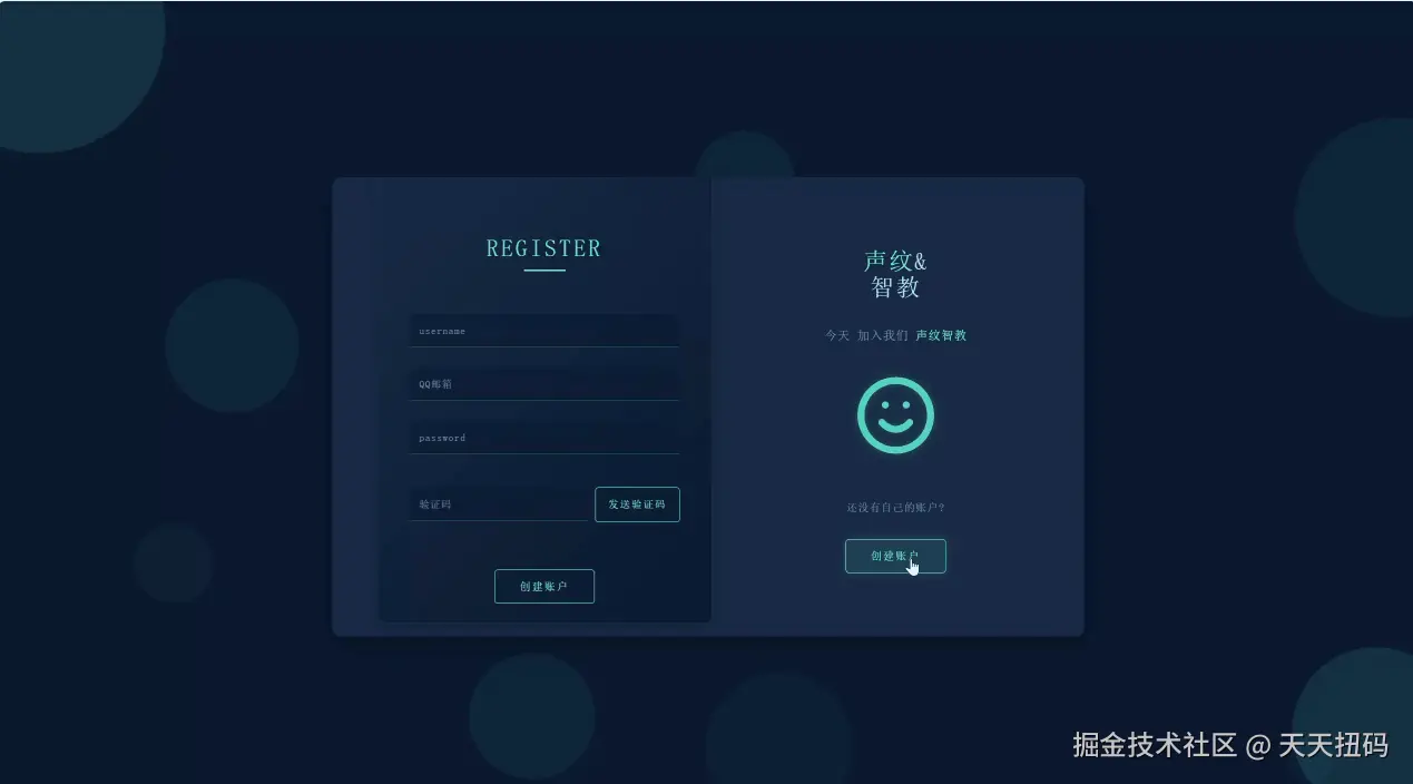
一、直接展示页面效果
二、源码展示(可一键复制)
html
<!DOCTYPE html>
<html lang="en">
<head>
<meta charset="UTF-8">
<meta name="viewport" content="width=device-width, initial-scale=1.0">
<title>TechAuth - 科技风登录注册</title>
<script src="https://code.jquery.com/jquery-3.6.0.min.js"></script>
<style>
:root {
--dark-blue: #0a192f;
--medium-blue: #172a45;
--light-blue: #64ffda;
--text-primary: #ccd6f6;
--text-secondary: #8892b0;
--transition: all 0.25s cubic-bezier(0.645, 0.045, 0.355, 1);
}
@import url('https://fonts.googleapis.com/css2?family=Roboto+Mono:wght@300;400;500&display=swap');
body {
background: var(--dark-blue);
font-family: 'Roboto Mono', monospace;
color: var(--text-primary);
margin: 0;
padding: 0;
display: flex;
justify-content: center;
align-items: center;
min-height: 100vh;
overflow: hidden;
}
/* 背景动画元素 */
.bg-circle {
position: absolute;
border-radius: 50%;
background: rgba(100, 255, 218, 0.1);
z-index: -1;
animation: float 2.9s infinite linear;
}
@keyframes float {
0% { transform: translateY(0) rotate(0deg); }
50% { transform: translateY(-20px) rotate(180deg); }
100% { transform: translateY(0) rotate(360deg); }
}
/* 主容器 */
.container {
margin: auto;
width: 900px;
height: 650px;
position: relative;
perspective: 1000px;
}
.welcome {
background: var(--medium-blue);
width: 100%;
height: 550px;
position: absolute;
top: 10%;
border-radius: 10px;
box-shadow: 0 10px 30px rgba(0, 0, 0, 0.3);
overflow: hidden;
transition: var(--transition);
}
/* 蓝色盒子 */
.bluebox {
position: absolute;
top: -5%;
left: 5%;
background: linear-gradient(135deg, var(--medium-blue), var(--dark-blue));
width: 400px;
height: 560px;
border-radius: 10px;
box-shadow: 0 5px 15px rgba(0, 0, 0, 0.2);
transition: all 0.5s cubic-bezier(0.645, 0.045, 0.355, 1);
z-index: 2;
border: 1px solid rgba(100, 255, 218, 0.1);
overflow: hidden;
}
.bluebox::before {
content: '';
position: absolute;
top: -50%;
left: -50%;
width: 200%;
height: 200%;
background: linear-gradient(
to bottom right,
transparent 0%,
transparent 50%,
rgba(100, 255, 218, 0.1) 50%,
rgba(100, 255, 218, 0.1) 100%
);
transform: rotate(30deg);
animation: shine 3s infinite;
}
@keyframes shine {
0% { transform: rotate(30deg) translate(-30%, -30%); }
100% { transform: rotate(30deg) translate(30%, 30%); }
}
.nodisplay {
display: none;
transition: all 0.5s ease;
}
.leftbox, .rightbox {
position: absolute;
width: 50%;
transition: 1s all ease;
height: 100%;
display: flex;
flex-direction: column;
justify-content: center;
align-items: center;
text-align: center;
}
.leftbox {
left: 0;
}
.rightbox {
right: 0;
}
/* 字体和按钮样式 */
h1 {
font-family: 'Roboto Mono', monospace;
text-align: center;
margin-top: 95px;
text-transform: uppercase;
color: var(--light-blue);
font-size: 1.8em;
letter-spacing: 3px;
font-weight: 500;
position: relative;
}
h1::after {
content: '';
display: block;
width: 50px;
height: 2px;
background: var(--light-blue);
margin: 10px auto;
}
.title {
font-family: 'Roboto Mono', monospace;
color: var(--text-primary);
font-size: 1.8em;
line-height: 1.1em;
letter-spacing: 2px;
text-align: center;
font-weight: 500;
margin-bottom: 20px;
}
.desc {
margin-top: 10px;
font-size: 0.9em;
color: var(--text-secondary);
}
.account {
margin-top: 30px;
font-size: 0.8em;
color: var(--text-secondary);
}
p {
font-family: 'Roboto Mono', monospace;
font-size: 0.9em;
letter-spacing: 1px;
color: var(--text-secondary);
text-align: center;
line-height: 1.6;
}
span {
color: var(--light-blue);
}
.tech-icon {
width: 100px;
height: 100px;
margin: 20px 0;
opacity: 0.8;
filter: drop-shadow(0 0 5px rgba(100, 255, 218, 0.3));
}
.smaller {
width: 80px;
height: 80px;
}
/* 按钮样式 */
button {
padding: 12px 30px;
font-family: 'Roboto Mono', monospace;
text-transform: uppercase;
letter-spacing: 2px;
font-size: 0.8em;
border-radius: 4px;
margin: 15px auto;
outline: none;
display: block;
cursor: pointer;
transition: var(--transition);
position: relative;
overflow: hidden;
border: 1px solid var(--light-blue);
background: transparent;
color: var(--light-blue);
}
button::before {
content: '';
position: absolute;
top: 0;
left: -100%;
width: 100%;
height: 100%;
background: linear-gradient(90deg, transparent, rgba(100, 255, 218, 0.1), transparent);
transition: 0.5s;
}
button:hover {
background: rgba(100, 255, 218, 0.1);
box-shadow: 0 0 10px rgba(100, 255, 218, 0.2);
}
button:hover::before {
left: 100%;
}
/* 表单样式 */
form {
display: flex;
align-items: center;
flex-direction: column;
padding-top: 20px;
width: 100%;
}
.more-padding {
padding-top: 35px;
}
.more-padding input {
padding: 12px;
}
.more-padding .submit {
margin-top: 45px;
}
.submit {
margin-top: 30px;
padding: 12px 30px;
background: transparent;
color: var(--light-blue);
border: 1px solid var(--light-blue);
transition: var(--transition);
}
.submit:hover {
background: rgba(100, 255, 218, 0.1);
transform: translateY(-3px);
box-shadow: 0 5px 15px rgba(100, 255, 218, 0.2);
}
input {
z-index: 9999;
background: rgba(10, 25, 47, 0.5);
width: 75%;
color: var(--text-primary);
border: none;
border-bottom: 1px solid rgba(100, 255, 218, 0.3);
padding: 12px;
margin: 12px 0;
font-family: 'Roboto Mono', monospace;
transition: var(--transition);
}
input::placeholder {
color: var(--text-secondary);
letter-spacing: 1px;
font-size: 0.9em;
font-weight: 300;
}
input:focus {
color: var(--text-primary);
outline: none;
border-bottom: 1px solid var(--light-blue);
background: rgba(10, 25, 47, 0.8);
box-shadow: 0 5px 15px rgba(100, 255, 218, 0.1);
}
input:focus::placeholder {
opacity: 0.5;
}
label {
font-family: 'Roboto Mono', monospace;
color: var(--text-secondary);
font-size: 0.8em;
letter-spacing: 1px;
cursor: pointer;
}
.checkbox {
display: flex;
align-items: center;
margin: 10px 0;
width: 70%;
}
input[type=checkbox] {
width: auto;
margin-right: 10px;
accent-color: var(--light-blue);
}
.checkbox input[type="checkbox"]:checked + label {
color: var(--light-blue);
transition: var(--transition);
}
/* 验证码相关样式 */
.verification-group {
display: flex;
width: 81%;
margin: 12px 0;
align-items: center;
}
.verification-input {
flex: 1;
margin-right: 10px;
}
.verification-btn {
padding: 12px 15px;
font-size: 0.7em;
white-space: nowrap;
height: 42px;
box-sizing: border-box;
}
.verification-btn:disabled {
opacity: 0.6;
cursor: not-allowed;
}
.captcha-group {
display: flex;
width: 81%;
margin: 12px 0;
align-items: center;
}
.captcha-input {
flex: 1;
margin-right: 10px;
}
.captcha-img {
height: 42px;
width: 100px;
background: rgba(10, 25, 47, 0.8);
border: 1px solid rgba(100, 255, 218, 0.3);
border-radius: 4px;
display: flex;
align-items: center;
justify-content: center;
cursor: pointer;
user-select: none;
font-family: 'Roboto Mono', monospace;
font-weight: bold;
letter-spacing: 2px;
color: var(--light-blue);
}
/* 响应式设计 */
@media (max-width: 950px) {
.container {
width: 90%;
height: auto;
}
.welcome {
height: auto;
position: relative;
top: 0;
margin: 20px 0;
}
.bluebox {
position: relative;
top: 0;
left: 0;
width: 100%;
height: auto;
margin-bottom: 20px;
}
.leftbox, .rightbox {
position: relative;
width: 100%;
padding: 30px;
}
.leftbox {
margin-bottom: 20px;
}
}
</style>
</head>
<body>
<!-- 背景动画元素 -->
<div class="bg-circle" style="width: 300px; height: 300px; top: -100px; left: -100px;"></div>
<div class="bg-circle" style="width: 200px; height: 200px; bottom: -50px; right: -50px;"></div>
<div class="container">
<div class="welcome">
<div class="bluebox">
<div class="signup nodisplay">
<h1>register</h1>
<form autocomplete="off">
<input type="text" placeholder="username" required>
<input type="email" id="reg-email" placeholder="QQ邮箱" required>
<input type="password" placeholder="password" required>
<div class="verification-group">
<input type="text" class="verification-input" id="verification-code" placeholder="验证码" required>
<button type="button" class="button verification-btn" id="send-code">发送验证码</button>
</div>
<button class="button submit">创建账户</button>
</form>
</div>
<div class="signin">
<h1>sign in</h1>
<form class="more-padding" autocomplete="off">
<input type="text" placeholder="username" required>
<input type="password" placeholder="password" required>
<div class="captcha-group">
<input type="text" class="captcha-input" id="captcha" placeholder="图形验证码" required>
<div class="captcha-img" id="captcha-img">A7B9</div>
</div>
<button class="button submit">登录</button>
</form>
</div>
</div>
<div class="leftbox">
<h2 class="title"><span>声纹</span>&<br>智教</h2>
<p class="desc">进入教学& <span>AI 的时代</span></p>
<svg class="tech-icon smaller" xmlns="http://www.w3.org/2000/svg" viewBox="0 0 24 24" fill="none" stroke="#64ffda" stroke-width="2" stroke-linecap="round" stroke-linejoin="round">
<path d="M12 2L2 7l10 5 10-5-10-5zM2 17l10 5 10-5M2 12l10 5 10-5"></path>
</svg>
<p class="account">有自己的账户?</p>
<button class="button" id="signin">登录</button>
</div>
<div class="rightbox">
<h2 class="title"><span>声纹</span>&<br>智教</h2>
<p class="desc">今天 加入我们 <span>声纹智教</span></p>
<svg class="tech-icon" xmlns="http://www.w3.org/2000/svg" viewBox="0 0 24 24" fill="none" stroke="#64ffda" stroke-width="2" stroke-linecap="round" stroke-linejoin="round">
<circle cx="12" cy="12" r="10"></circle>
<path d="M8 14s1.5 2 4 2 4-2 4-2"></path>
<line x1="9" y1="9" x2="9.01" y2="9"></line>
<line x1="15" y1="9" x2="15.01" y2="9"></line>
</svg>
<p class="account">还没有自己的账户?</p>
<button class="button" id="signup">创建账户</button>
</div>
</div>
</div>
<script>
// 创建随机背景元素
function createBgElements() {
const colors = ['rgba(100, 255, 218, 0.05)', 'rgba(100, 255, 218, 0.03)', 'rgba(100, 255, 218, 0.07)'];
const body = document.body;
for (let i = 0; i < 8; i++) {
const circle = document.createElement('div');
circle.classList.add('bg-circle');
const size = Math.random() * 200 + 50;
const posX = Math.random() * 100;
const posY = Math.random() * 100;
const color = colors[Math.floor(Math.random() * colors.length)];
const animationDuration = Math.random() * 20 + 10;
const animationDelay = Math.random() * 5;
circle.style.width = `${size}px`;
circle.style.height = `${size}px`;
circle.style.left = `${posX}%`;
circle.style.top = `${posY}%`;
circle.style.background = color;
circle.style.animationDuration = `${animationDuration}s`;
circle.style.animationDelay = `${animationDelay}s`;
body.appendChild(circle);
}
}
// 生成随机验证码
function generateCaptcha() {
const chars = '0123456789ABCDEFGHIJKLMNOPQRSTUVWXYZ';
let captcha = '';
for (let i = 0; i < 4; i++) {
captcha += chars.charAt(Math.floor(Math.random() * chars.length));
}
return captcha;
}
// 初始化背景元素
createBgElements();
// 切换登录注册表单
$(document).ready(function() {
// 生成初始图形验证码
let currentCaptcha = generateCaptcha();
$('#captcha-img').text(currentCaptcha);
// 点击刷新图形验证码
$('#captcha-img').click(function() {
currentCaptcha = generateCaptcha();
$(this).text(currentCaptcha);
});
// 发送验证码功能
$('#send-code').click(function() {
const email = $('#reg-email').val();
const emailRegex = /^[a-zA-Z0-9._-]+@(qq|QQ)\.com$/;
if (!emailRegex.test(email)) {
alert('请输入有效的QQ邮箱地址');
return;
}
// 禁用按钮并开始倒计时
const $btn = $(this);
$btn.prop('disabled', true);
let countdown = 60;
$btn.text(`${countdown}s后重新发送`);
const timer = setInterval(() => {
countdown--;
$btn.text(`${countdown}s后重新发送`);
if (countdown <= 0) {
clearInterval(timer);
$btn.prop('disabled', false);
$btn.text('发送验证码');
}
}, 1000);
// 这里应该发送AJAX请求到后端发送验证码
console.log(`验证码已发送至: ${email}`);
alert(`验证码已发送至: ${email} (演示用)`);
});
// 登录表单验证
$('.signin form').submit(function(e) {
e.preventDefault();
const inputCaptcha = $('#captcha').val().toUpperCase();
if (inputCaptcha !== currentCaptcha) {
alert('图形验证码错误,请重新输入');
currentCaptcha = generateCaptcha();
$('#captcha-img').text(currentCaptcha);
$('#captcha').val('');
return;
}
// 验证通过,可以提交表单
alert('登录验证通过 (演示用)');
// this.submit(); // 实际使用时取消注释
});
// 注册表单验证
$('.signup form').submit(function(e) {
e.preventDefault();
const password = $('.signup input[type="password"]').eq(0).val();
const confirmPassword = $('.signup input[type="password"]').eq(1).val();
if (password !== confirmPassword) {
alert('两次输入的密码不一致');
return;
}
// 验证通过,可以提交表单
alert('注册验证通过 (演示用)');
// this.submit(); // 实际使用时取消注释
});
$('#signup').click(function() {
$('.bluebox').css('transform', 'translateX(95%)');
$('.signin').addClass('nodisplay');
$('.signup').removeClass('nodisplay');
});
$('#signin').click(function() {
$('.bluebox').css('transform', 'translateX(0%)');
$('.signup').addClass('nodisplay');
$('.signin').removeClass('nodisplay');
});
// 输入框动画效果
$('input').on('focus', function() {
$(this).parent().find('label').css('color', '#64ffda');
});
$('input').on('blur', function() {
if (!$(this).val()) {
$(this).parent().find('label').css('color', '#8892b0');
}
});
});
</script>
</body>
</html>三、页面由来
本人前几天一直在做一个名为"声纹智教"的项目,一直为前端的登录页面发愁,总想做一个让人眼前一亮的登录注册页面,于是我去网上找了很多基本样式,找到了一个让人眼前一亮的登录注册样式(链接在文章末尾),我在这个样式的基础上进行了修改产生了这个页面
四、页面的其他版本
我这里也有该登陆注册页面的Vue组件版本,因为组件拆分的原因这里不再展示,有想要的可以留言,我给他整出来,如果该页面有什么问题也欢迎斧正。