css3响应式布局
响应式设计是现代网页开发的重要组成部分,它确保网页在不同的屏幕尺寸上都有良好的显示效果。
在CSS中,实现响应式布局是一种常用的技术,旨在使网页能够根据用户的设备和屏幕尺寸自动调整其布局和样式。这种技术对于确保网站在不同设备上(如手机、平板、桌面电脑等)都能良好显示非常重要。下面是一些实现响应式布局的关键技术和概念:
媒体查询(Media Queries)
媒体查询是CSS中用于根据不同的屏幕或媒体类型应用不同样式规则的功能。它允许你根据屏幕的宽度、高度或其他特性来改变网页的布局和样式。例如:
@media (max-width: 600px) {
.container {
width: 100%;
}
}
一、媒体类型
| 值 | 含义 |
|---|---|
| all | 检测所有设备 |
| screen | 检测电子屏幕,包括:电脑屏幕、平板屏幕、手机屏幕等。 |
| 检测打印机 | |
| ++aural++ | ++已废弃,用于语音和声音合成器。++ |
| ++braille++ | ++已废弃,应用于盲文触摸式反馈设备。++ |
| ++embossed++ | ++已废弃, 用于打印的盲人印刷设备。++ |
| ++handheld++ | ++已废弃, 用于掌上设备或更小的装置,如PDA和小型电话。++ |
| ++projection++ | ++已废弃, 用于投影设备++ |
| ++tty++ | ++已废弃, 用于固定的字符网格,如电报、终端设备和对字符有限制的便携设备。++ |
| ++tv++ | ++已废弃, 用于电视和网络电视。++ |
代码
markdown
<title>01.媒体查询_媒体类型</title>
<style>
h1 {
width: 600px;
height: 400px;
background-image: linear-gradient(60deg,red,yellow,green);
font-size: 40px;
color: white;
text-shadow: 0 0 20px black;
text-align: center;
line-height: 400px;
margin: 0 auto;
}
/* 打印机设备 */
@media print {
h1 {
background-color: transparent;
}
}
/* 在屏幕上面应用的样式 */
@media screen {
h1 {
font-family:'Trebuchet MS';
}
}
/* 一直应用的样式 */
@media all {
h1 {
color: pink;
}
}
</style>
</head>
<body>
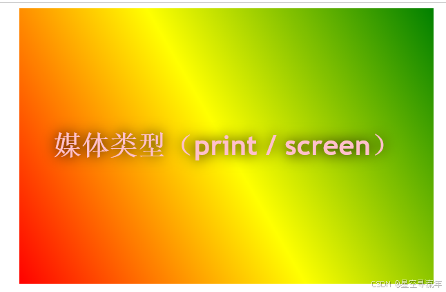
<h1>媒体类型(print / screen)</h1>
</body>效果
说明
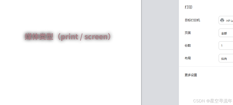
我们设置了一个媒体为打印机(print),当我们按ctrl + p 的时候,会调出打印机模式,这个时候我们将背景给出掉了,只是显示一个字的样式;
二、媒体特性
每个媒体都有一个自己的宽高,当我们检测到这些宽高进入到我们需要的范围内时候,可以做一些设置工作,如设置背景颜色,或者字体大小等
| 媒体值 | 含义 |
|---|---|
| width | 检测视口宽度。 |
| max-width | 检测视口最大宽度。 |
| min-width | 检测视口最小宽度 |
| height | 检测视口高度 |
| max-height | 检测视口最小高度。 |
| device-width | 检测设备屏幕的宽度。 |
| max-device-width | 检测设备屏幕的最大宽度。 |
| min-device-width | 检测设备屏幕的最小宽度 |
| orientation | 检测视口的旋转方向(是否横屏)。 1. portrait :视口处于纵向,即高度大于等于宽度。 2. landscape :视口处于横向,即宽度大于高度。 |
完整列表请参考:https://developer.mozilla.org/zh-CN/docs/Web/CSS/@media
代码
markdown
<title>02.媒体查询_媒体特性</title>
<style>
h1 {
background-color: blue;
font-size: 40px;
color: white;
text-align: center;
height: 400px;
line-height: 400px;
}
/* 当检测到视口为 800px 时候变为黄色 */
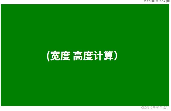
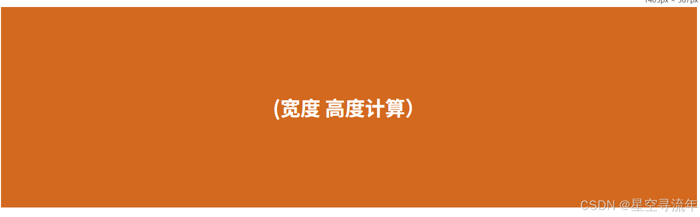
@media (width:800px) {
h1 {
background-color: yellow;
}
}
/* 最大宽度为700px,那么也就是小于 700px的时候所产生的效果 */
@media (max-width:700px) {
h1 {
background-color: green;
}
}
/* 最小宽度为900px 那么代表的意思就是屏幕超过 900px 产生的效果 */
@media (min-width:900px) {
h1 {
background: chocolate;
}
}
/* 视口高度 小于300px时候 */
@media (max-height:300px) {
h1 {
background: goldenrod;
}
}
/* device 设置前缀 */
/* @media (device-width:1920px) {
h1 {
background-color: aquamarine;
}
} */
</style>
</head>
<body>
<h1>(宽度 高度计算)</h1>
</body>效果
常用参数
我们一般直接设置 width 和height 比较少,因为这是一个固定的值,很难把握,一般我们会这是 min-width和max-width 这种可以设置区间,再 加上 height 设置的也比较少,一般就是默认高度,超长了就会有滚动条出来不影响结果的展示;
max-width
最大宽度为xx,那么也就是小于 xx 的时候所产生的效果
最大宽度为700px,那么也就是小于 700px的时候所产生的效果
@media (max-width:700px) {
h1 {
background-color: green;
}
}
min-width
最小宽度 ,那么代表的意思就是屏幕超过xx 产生的效果
@media (min-width:900px) {
h1 {
background: chocolate;
}
}
max-height
视口高度 小于xx 时候呈现的效果,用的很少
@media (max-height:300px) {
h1 {
background: goldenrod;
}
}
三、运算符
我们可以对max-width及 min-width 设置区间,我们就需要用到逻辑运算,xx区间到xx区间呈现的是一个什么的效果。
| 逻辑值 | 含义 |
|---|---|
| and | 并且 |
| , 或 or | 或 |
| not | 否定 |
| only | 肯定 |
代码
markdown
<title>03.媒体查询_运算符</title>
<style>
h1 {
background-color: rgba(236, 230, 219,.7);
font-size: 40px;
color: white;
text-align: center;
height: 300px;
line-height: 300px;
}
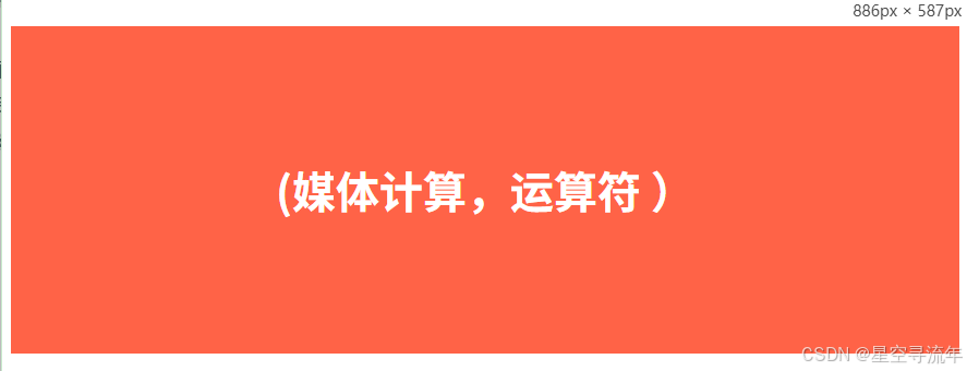
/* and 运算 并且 大于 700px ~ 900px */
/* @media (min-width:700px) and (max-width:900px) {
h1 {
background-color: tomato;
}
} */
/* 方式2 兼容ie写法 and 运算 */
/* @media screen and (min-width:700px) and (max-width:900px) {
h1 {
background-color: tomato;
}
} */
/* or 或 , */
/* @media (max-width:700px) or (min-width:900px) {
h1 {
background-color: gold;
}
} */
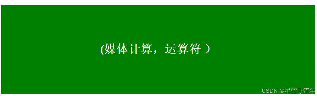
@media screen and (max-width:700px) , (min-width:900px) {
h1 {
background-color: green;
}
}
/* not 否定 */
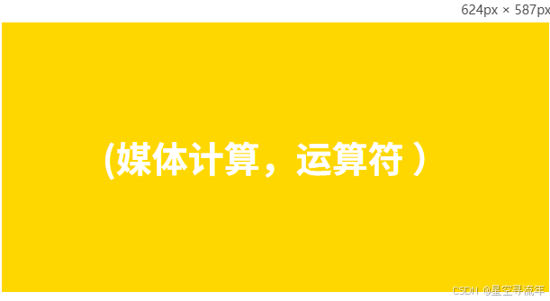
@media not screen {
h1 {
background-color: yellow;
}
}
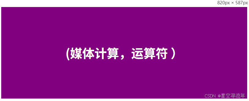
/* only 肯定 当屏幕在800px时候生效 */
@media only screen and (width:820px){
h1 {
background-color: purple;
}
}
</style>
</head>
<body>
<h1>(媒体计算,运算符 )</h1>
</body>效果
and 逻辑且
and 运算 并且 大于 700px ~ 900px
@media (min-width:700px) and (max-width:900px) {
h1 {
background-color: tomato;
}
}
/* 方式2 兼容ie写法 and 运算 */
@media screen and (min-width:700px) and (max-width:900px) {
h1 {
background-color: tomato;
}
}
or 或 ,
@media (max-width:700px) or (min-width:900px) {
h1 {
background-color: gold;
}
}
/* @media screen and (max-width:700px) , (min-width:900px) {
h1 {
background-color: green;
}
} */
not 否定
@media not screen {
h1 {
background-color: yellow;
}
}
only 肯定
/* only 肯定 当屏幕在820px时候生效 */
@media only screen and (width:820px){
h1 {
background-color: purple;
}
}
四、常用阀值
在实际开发中,会将屏幕划分成几个区间,例如
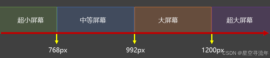
- 我们利用计算将屏幕划分为多个区间
代码
markdown
<title>04.媒体查询_常用阀值</title>
<style>
div {
background-color: rgba(212, 159, 61, 0.7);
font-size: 20px;
color: white;
text-align: center;
height: 100px;
line-height: 100px;
display: none;
}
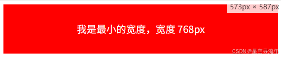
/* 超小屏幕 */
@media screen and (max-width:768px) {
.small_width {
display:block;
background-color: red;
}
}
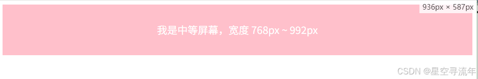
/* 中等屏幕 */
@media screen and (min-width:768px) and (max-width:992px){
.middle_width {
display:block;
background-color: pink;
}
}
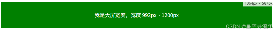
/* 大屏幕 */
@media screen and (min-width:992px) and (max-width:1200px) {
.large_width {
display:block;
background-color: green;
}
}
/* 超大屏幕 */
@media screen and (min-width:1200px) {
.huge_width {
display:block;
background-color: skyblue;
}
}
</style>
</head>
<body>
<div class="small_width">我是最小的宽度,宽度 768px</div>
<div class="middle_width">我是中等屏幕,宽度 768px ~ 992px </div>
<div class="large_width">我是大屏宽度,宽度 992px ~ 1200px</div>
<div class="huge_width">我是超大宽度,宽度 1200px 以上</div>
</body>效果

代码引入其他方式
我们可以直接写到index.html文件中,也可以通过外部文档引入方式。都写道一个有些乱
方式1
markdown
 <meta charset="UTF-8">
 <meta name="viewport" content="width=device-width, initial-scale=1.0">
 <title>05.媒体查询_常用阀值(外部引入方式1)</title>
 <link rel="stylesheet" href="./css/index.css">
 <link rel="stylesheet" href="./css/small.css">
 <link rel="stylesheet" href="./css/middle.css">
 <link rel="stylesheet" href="./css/large.css">
 <link rel="stylesheet" href="./css/huge.css">

</head>
<body>
   <div class="small_width">我是最小的宽度,宽度 768px</div>
   <div class="middle_width">我是中等屏幕,宽度 768px ~ 992px </div>
   <div class="large_width">我是大屏宽度,宽度 992px ~ 1200px</div>
   <div class="huge_width">我是超大宽度,宽度 1200px 以上</div>
</body>
方式2
markdown
  <meta charset="UTF-8">
  <meta name="viewport" content="width=device-width, initial-scale=1.0">
  <title>05.媒体查询_常用阀值(外部引入方式1)</title>
  <link rel="stylesheet" href="./css/index.css">
  <link rel="stylesheet" media="screen and (max-width:768px)" href="./css/small.css">
  <link rel="stylesheet" media="screen and (min-width:768px) and (max-width:992px)" href="./css/middle.css">
  <link rel="stylesheet" media="screen and (min-width:992px) and (max-width:1200px)" href="./css/large.css">
  <link rel="stylesheet" media="screen and (min-width:1200px)" href="./css/huge.css">

</head>
<body>
    <div class="small_width">我是最小的宽度,宽度 768px</div>
    <div class="middle_width">我是中等屏幕,宽度 768px ~ 992px </div>
    <div class="large_width">我是大屏宽度,宽度 992px ~ 1200px</div>
    <div class="huge_width">我是超大宽度,宽度 1200px 以上</div>
</body>