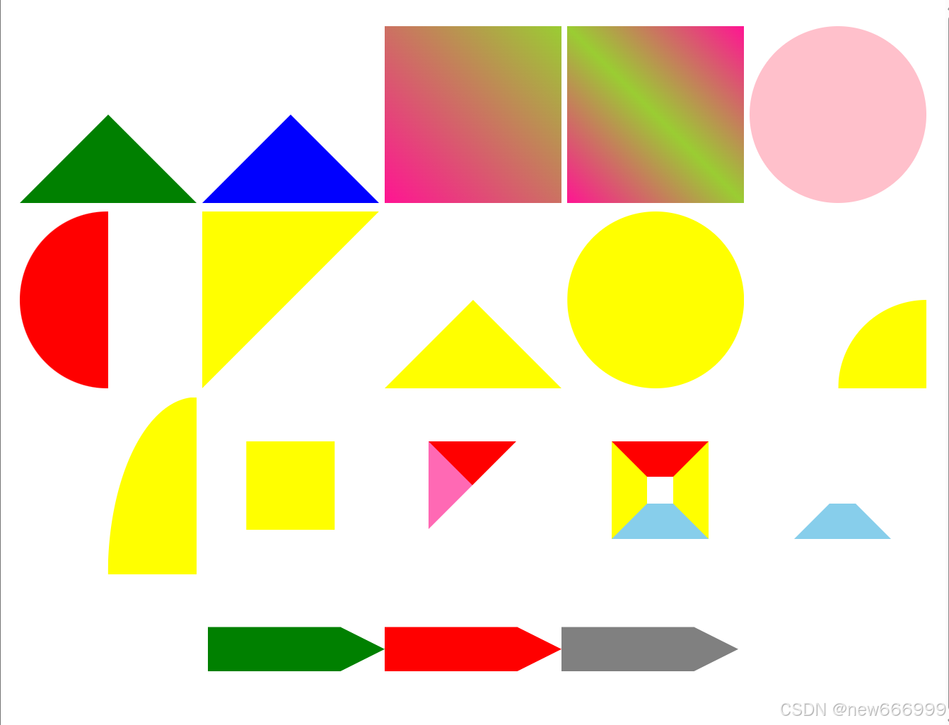
一、效果
二、代码
html
<!DOCTYPE html>
<html lang="en">
<head>
    <meta charset="UTF-8">
    <title>实现</title>
    <style lang="scss" scoped>
        .box {
            display: flex;
            padding: 10px;
            justify-content: space-around;
            flex-wrap: wrap;
        }

        div {
            margin-top: 10px;
        }

        .div1 {
            width: 0px;
            height: 0px;
            border-top: 100px solid transparent;
            border-left: 100px solid transparent;
            border-right: 100px solid transparent;
            border-bottom: 100px solid green;
        }

        .div2 {
            width: 0px;
            height: 0px;
            border: 100px solid;
            border-color: transparent transparent blue transparent;
        }

        .div3 {
            width: 200px;
            height: 200px;
            background: linear-gradient(45deg, deeppink, yellowgreen);
        }

        .div4 {
            width: 200px;
            height: 200px;
            background: linear-gradient(45deg, deeppink, yellowgreen 50%, yellowgreen 50%, deeppink 100%);
        }

        .div5 {
            width: 200px;
            height: 200px;
            border-radius: 50%;
            background-color: pink;
        }

        .div6 {
            width: 100px;
            height: 200px;
            border-radius: 100%;
            border-left: 100px solid red;
        }

        .div7 {
            width: 200px;
            height: 200px;
            background-color: yellow;
            clip-path: polygon(0% 0%, 100% 0%, 0% 100%);
        }

        .div8 {
            width: 200px;
            height: 200px;
            background-color: yellow;
            clip-path: polygon(50% 50%, 0% 100%, 100% 100%);
        }

        .div9 {
            width: 200px;
            height: 200px;
            background-color: yellow;
            clip-path: circle(50%);
        }

        .div10 {
            width: 200px;
            height: 200px;
            background-color: yellow;
            clip-path: circle(50% at 100% 100%);
        }

        .div11 {
            width: 200px;
            height: 200px;
            background-color: yellow;
            clip-path: ellipse(50% 100% at 100% 100%);
        }

        .div12 {
            width: 200px;
            height: 200px;
            background-color: yellow;
            clip-path: path('M 50 50 L 150 50 L 150 150 L 50 150 z');
        }

        .div13 {
            width: 200px;
            height: 200px;
        }

        .star13 {
            margin-top: 50px;
            margin-left: 50px;
            width: 0px;
            height: 0px;
            border-style: solid;
            border-color: red transparent transparent hotpink;
            border-width: 50px;
        }

        .div14 {
            width: 200px;
            height: 200px;
        }

        .star14 {
            margin-top: 50px;
            margin-left: 50px;
            width: 30px;
            height: 30px;
            border-style: solid;
            border-color: red yellow skyblue yellow;
            border-width: 40px;
        }

        .div15 {
            width: 200px;
            height: 200px;
        }

        .star15 {
            margin-top: 50px;
            margin-left: 50px;
            width: 30px;
            height: 30px;
            border-style: solid;
            border-color: transparent transparent skyblue transparent;
            border-width: 40px;
        }

        .div16 {
            width: 600px;
            height: 150px;
            display: flex;
        }
    </style>
</head>
<body>
<div class="box">

    <div class="div1"></div>
    <div class="div2"></div>
    <div class="div3"></div>
    <div class="div4"></div>
    <div class="div5"></div>
    <div class="div6"></div>
    <div class="div7"></div>
    <div class="div8"></div>
    <div class="div9"></div>
    <div class="div10"></div>
    <div class="div11"></div>
    <div class="div12"></div>
    <div class="div13">
        <div class="star13"></div>
    </div>
    <div class="div14">
        <div class="star14"></div>
    </div>
    <div class="div15">
        <div class="star15"></div>
    </div>
    <div class="div16">
        <svg>
            <path d="M 0 50 L 150 50 L 200 75 L 150 100 L 0 100 z" fill="green"></path>
        </svg>
        <svg>
            <path d="M 0 50 L 150 50 L 200 75 L 150 100 L 0 100 z" fill="red"></path>
        </svg>
        <svg>
            <path d="M 0 50 L 150 50 L 200 75 L 150 100 L 0 100 z" fill="gray"></path>
        </svg>
    </div>
</div>
</body>
</html>