本系列可作为前端学习系列的笔记,代码的运行环境是在HBuilder中,小编会将代码复制下来,大家复制下来就可以练习了,方便大家学习。
HTML系列文章 已经收录在前端专栏,有需要的宝宝们可以点击前端专栏查看!点赞关注不迷路!您的点赞、关注和收藏是对小编最大的支持和鼓励!
系列文章目录
CSS- 2.1 实战之图文混排、表格、表单、学校官网一级导航栏
CSS- 3.1 盒子模型-块级元素、行内元素、行内块级元素和display属性
CSS- 4.2 相对定位(position: relative)
CSS- 4.3 绝对定位(position: absolute)&学校官网导航栏实例
CSS- 4.4 固定定位(fixed)& 咖啡售卖官网实例
目录
[1. 相对于视口定位](#1. 相对于视口定位)
[2. 脱离文档流](#2. 脱离文档流)
[3. 定位属性](#3. 定位属性)
[1. 固定导航栏](#1. 固定导航栏)
[2. 返回顶部按钮](#2. 返回顶部按钮)
[3. 浮动广告或通知](#3. 浮动广告或通知)
[4. 视频播放器控件](#4. 视频播放器控件)
[1. 层叠上下文](#1. 层叠上下文)
[2. 移动设备上的行为](#2. 移动设备上的行为)
[3. 键盘弹出影响](#3. 键盘弹出影响)
[4. 内容重叠问题](#4. 内容重叠问题)
[5. 打印样式](#5. 打印样式)
[2.咖啡售卖官网 代码实例如下:](#2.咖啡售卖官网 代码实例如下:)
前言
小编作为新晋码农一枚,会定期整理一些写的比较好的代码,作为自己的学习笔记,会试着做一下批注和补充,如转载或者参考他人文献会标明出处,非商用,如有侵权会删改!欢迎大家斧正和讨论!
一、固定定位(fixed)详解
1、固定定位(fixed)的基本概念
固定定位(position: fixed)是CSS中一种特殊的定位方式,它使元素**相对于浏览器视口(viewport)**进行定位,即使页面滚动,元素也会保持在视口的固定位置。固定定位元素会脱离正常的文档流,不占据原始文档空间。
2、固定定位的核心特性
1. 相对于视口定位
- 固定定位元素的位置始终相对于浏览器窗口,而不是文档或任何父元素
- 即使页面滚动,元素也会保持在屏幕上的相同位置
2. 脱离文档流
- 与绝对定位类似,固定定位元素不占据文档中的空间
- 其他元素会忽略它的存在,就好像它从文档中"消失"了一样
3. 定位属性
- 使用
top、right、bottom、left属性来精确控制位置 - 示例:
css
html
.fixed-element {
  position: fixed;
  top: 20px;
  right: 20px;
  width: 150px;
  background: rgba(0,0,0,0.7);
  color: white;
  padding: 10px;
  text-align: center;
}
3、固定定位的常见应用场景
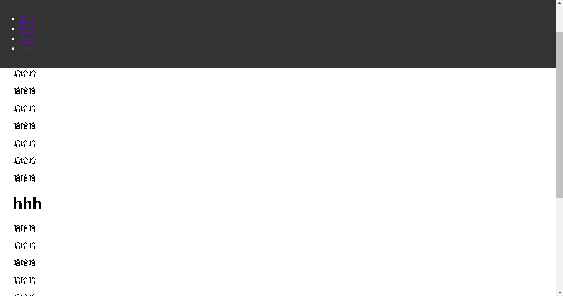
1. 固定导航栏
html
html
<!DOCTYPE html>
<html>
	<head>
		<meta charset="utf-8">
		<title></title>
		<style type="text/css">
			.fixed-nav {
			  position: fixed;
			  top: 0;
			  left: 0;
			  width: 100%;
			  background: #333;
			  color: white;
			  padding: 15px 0;
			  z-index: 1000;
			}
			.content {
			  margin-top: 60px; /* 为固定导航栏留出空间 */
			  padding: 20px;
			}
		</style>
	</head>
	<body>
		<nav class="fixed-nav">
		  <ul>
		    <li><a href="#">首页</a></li>
		    <li><a href="#">产品</a></li>
		    <li><a href="#">关于</a></li>
		    <li><a href="#">联系</a></li>
		  </ul>
		</nav>
		<div class="content">
			<p>哈哈哈</p>
			<p>哈哈哈</p>
			<p>哈哈哈</p>
			<p>哈哈哈</p>
			<p>哈哈哈</p>
			<p>哈哈哈</p>
			<p>哈哈哈</p>
			<p>哈哈哈</p>
			<p>哈哈哈</p>
			<p>哈哈哈</p>
			<p>哈哈哈</p>
			<h1>hhh </h1>
			<p>哈哈哈</p>
			<p>哈哈哈</p>
			<p>哈哈哈</p>
			<p>哈哈哈</p>
			<p>哈哈哈</p>
			<p>哈哈哈</p>
			<p>哈哈哈</p>
			<p>哈哈哈</p>
			<p>哈哈哈</p>
			<p>哈哈哈</p>
			<p>哈哈哈</p>
			<h1>hhh </h1>
		  <!-- 大量内容... -->
		</div>
	</body>
</html>
css
html
.fixed-nav {
  position: fixed;
  top: 0;
  left: 0;
  width: 100%;
  background: #333;
  color: white;
  padding: 15px 0;
  z-index: 1000;
}
.content {
  margin-top: 60px; /* 为固定导航栏留出空间 */
  padding: 20px;
}
代码运行:导航栏固定在上方
2. 返回顶部按钮
html
html
<button class="back-to-top">↑ 返回顶部</button>css
html
.back-to-top {
  position: fixed;
  bottom: 30px;
  right: 30px;
  padding: 10px 15px;
  background: #333;
  color: white;
  border: none;
  border-radius: 50%;
  cursor: pointer;
  opacity: 0;
  transition: opacity 0.3s;
}
.back-to-top.visible {
  opacity: 1;
}
(通常配合JavaScript在滚动一定距离后显示)
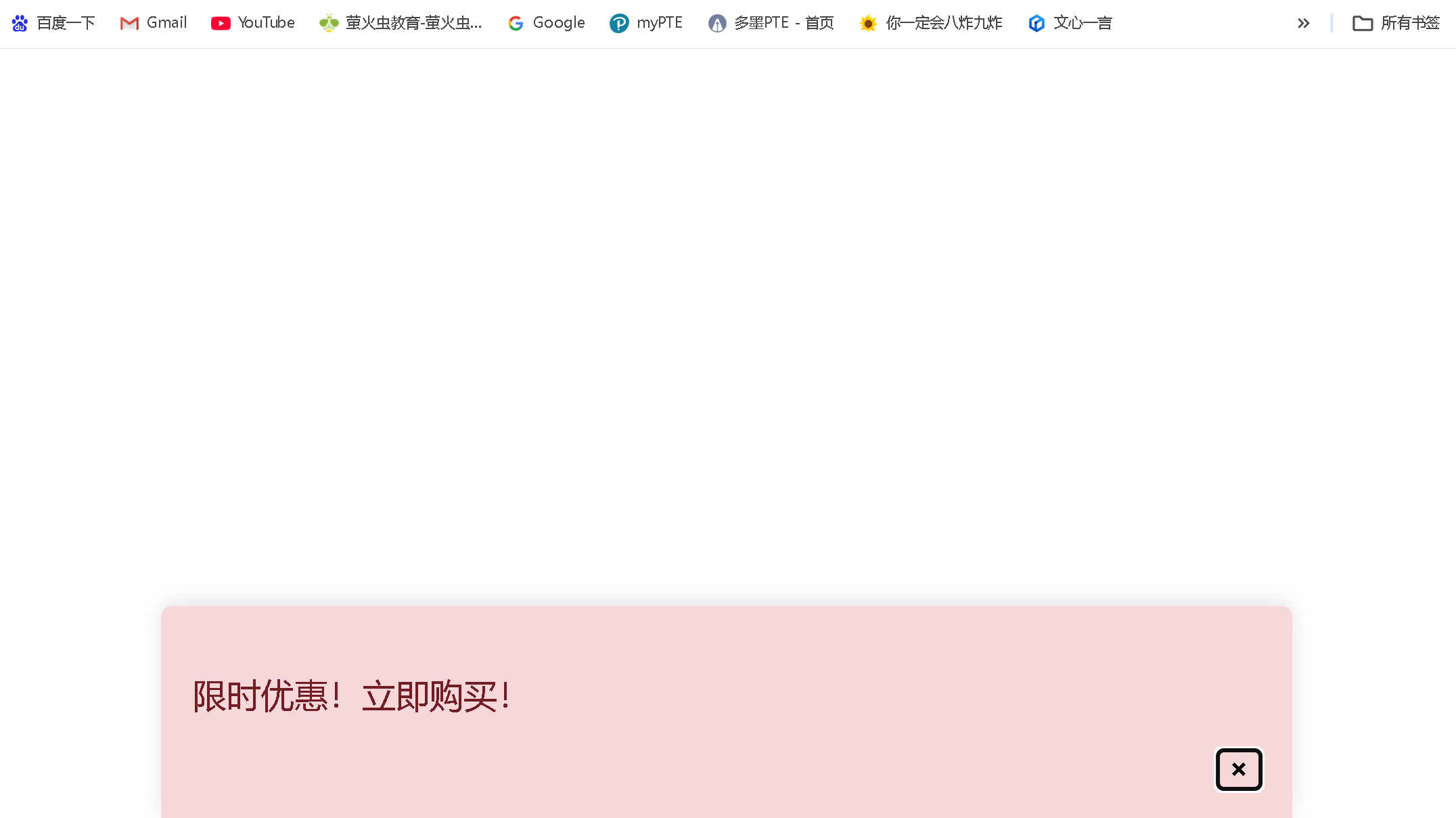
3. 浮动广告或通知
html
html
<div class="floating-ad">
  <p>限时优惠!立即购买!</p>
  <button class="close-ad">×</button>
</div>
css
html
.floating-ad {
  position: fixed;
  bottom: 0;
  left: 50%;
  transform: translateX(-50%);
  width: 90%;
  max-width: 500px;
  background: #f8d7da;
  color: #721c24;
  padding: 15px;
  border-radius: 5px 5px 0 0;
  box-shadow: 0 -2px 10px rgba(0,0,0,0.1);
}
.close-ad {
  float: right;
  background: none;
  border: none;
  font-weight: bold;
  cursor: pointer;
}
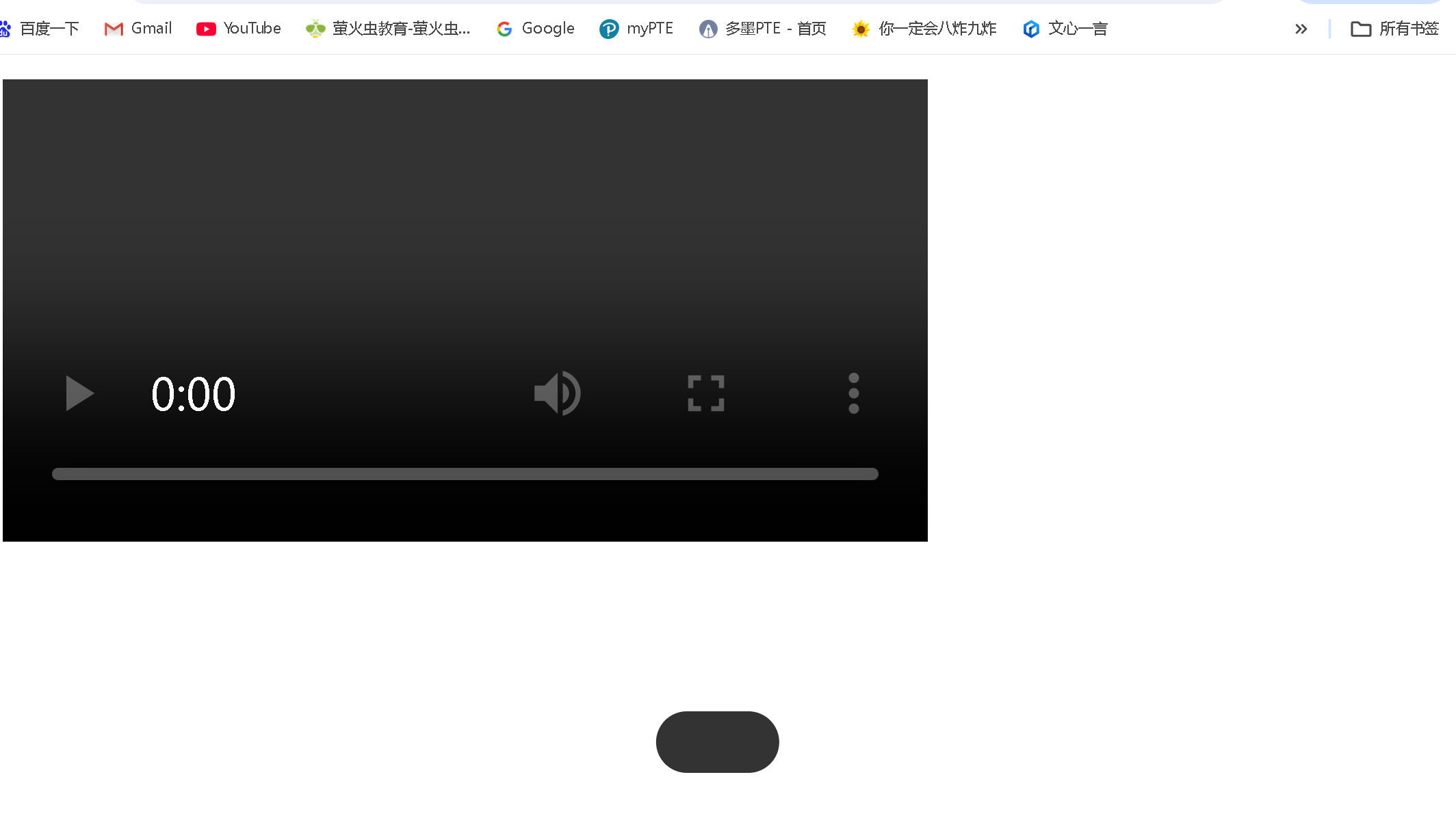
4. 视频播放器控件
html
html
<div class="video-container">
  <video src="video.mp4" controls></video>
  <div class="video-controls">
    <!-- 播放/暂停按钮、进度条等 -->
  </div>
</div>
css
html
.video-controls {
  position: fixed;
  bottom: 20px;
  left: 50%;
  transform: translateX(-50%);
  background: rgba(0,0,0,0.8);
  padding: 10px 20px;
  border-radius: 30px;
  display: flex;
  align-items: center;
  gap: 15px;
}
4、固定定位的注意事项
1. 层叠上下文
- 固定定位元素会创建新的层叠上下文(当设置了
z-index值时) - 示例:
css
html
.fixed-header {
  position: fixed;
  top: 0;
  left: 0;
  width: 100%;
  z-index: 100; /* 确保在大多数内容之上 */
  background: white;
}
2. 移动设备上的行为
- 在iOS等移动设备上,固定定位元素在滚动时可能会有轻微抖动
- 某些移动浏览器可能会忽略
fixed定位或表现不一致
3. 键盘弹出影响
- 在移动设备上,当键盘弹出时,固定定位元素的位置可能会受到影响
4. 内容重叠问题
- 固定定位元素可能会遮挡页面内容,需要为下方内容留出空间
- 示例:
css
html
body {
  padding-top: 60px; /* 为固定导航栏留出空间 */
}
5. 打印样式
- 固定定位元素在打印时可能不会按预期显示,需要特殊处理
5、固定定位与其他定位方式的比较
| 定位方式 | 是否脱离文档流 | 定位基准点 | 滚动行为 | 适用场景 |
|---|---|---|---|---|
| static (默认) | 否 | 正常文档流 | 随文档滚动 | 默认布局 |
| relative | 否 | 相对于自身原始位置 | 随文档滚动 | 微调元素位置 |
| absolute | 是 | 相对于最近的已定位祖先元素 | 随文档滚动 | 创建浮动元素、工具提示等 |
| fixed | 是 | 相对于视口 | 不随文档滚动 | 固定导航栏、返回顶部按钮 |
| sticky | 否(滚动时是) | 相对于最近的滚动祖先和视口 | 滚动到阈值后固定 | 粘性头部、侧边栏 |
6、最佳实践建议
-
考虑移动设备兼容性:在移动设备上测试固定定位元素的行为,特别是滚动和键盘弹出时
-
为下方内容留出空间 :使用
margin-top或padding-top为固定定位元素下方的页面内容留出空间,防止内容被遮挡 -
合理使用z-index:确保固定定位元素在正确的层叠顺序中,避免被其他元素遮挡
-
响应式设计:在小屏幕上可能需要调整固定定位元素的位置或完全隐藏它们
-
性能考虑:避免在固定定位元素上使用复杂的动画或效果,这可能会影响滚动性能
-
可访问性:确保固定定位元素不会干扰键盘导航或屏幕阅读器的使用
固定定位是创建现代网页布局中非常有用的工具,特别适合需要始终可见的元素。然而,由于其特殊的行为,使用时需要特别注意其对页面布局和用户体验的影响。
二、代码实例
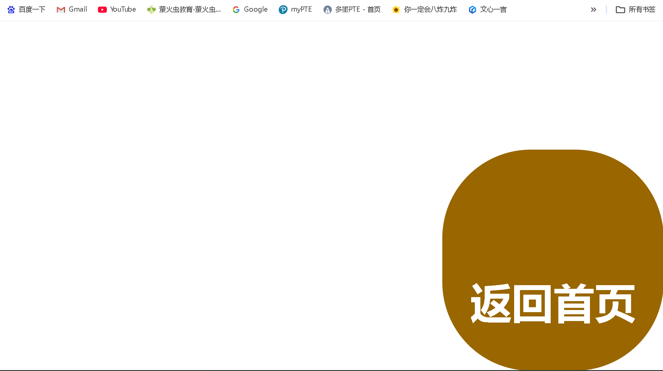
1.练习代码实例如下:
html
<!DOCTYPE html>
<html>
	<head>
		<meta charset="utf-8">
		<title>定位-固定定位</title>
		<style type="text/css">
			.fix {
				width: 100px;
				height: 100px;
				background-color: #996600;
				border-radius: 40px 40px;
				position: fixed;
				bottom: 0px;
				right: 0px;
			}
			.fix a:link,a:visited {
				color: white;
				text-decoration: none;
				display: block;
				width: 100px;
				height: 100px;
				text-align: center;
				line-height: 100px;
			}
		</style>
	</head>
	<body>

		<div class="fix">
			<a href="../个人主题网站/index.html"><h3 align="center">返回首页</h3></a>
		</div>
	</body>
</html>
代码运行:有一个固定的图标在页面右下角
2.咖啡售卖官网 代码实例如下:
html
html
<!DOCTYPE html>
<html>
<head>
<meta charset="utf-8">
<title>子绝父相</title>
<link rel="stylesheet" type="text/css" href="../css/cs4-6.css" />
<style type="text/css">
.fix {
width: 100px;
height: 100px;
background-color: #996600;
border-radius: 40px 40px;
position: fixed;
bottom: 0px;
right: 0px;
}
.fix a:link,a:visited {
color: white;
text-decoration: none;
display: block;
width: 100px;
height: 100px;
text-align: center;
line-height: 100px;
}
.header {
width: 900px;
height: 220px;
margin: 10px auto;
}
.showpic {
width: 1100px;
height: 230px;
margin: 10px auto;
}
.container {
width: 170px;
height: 230px;
/* border: 1px solid black; */
position: relative;
float: left;
margin-right: 50px;
}
.container .coffee:link,
.coffee:visited {
text-decoration: none;
color: #996600;
}
.container .tag {
position: absolute;
bottom: 1px;
left: 40px;
/* display: block;
width: 170px;
height: 35px;
text-align: center; */
}
.container a:hover {
opacity: 0.7;
}
</style>
</head>
<body>
<div class="header">
<img src="../img/coffee.jpg">
</div>
<div class="nvg">
<ul>
<li><a href="#">人才培养</a>
<ul>
<li><a href="#">咖啡简介</a></li>
<li><a href="#">历史沿革</a></li>
<li><a href="#">季节限定</a></li>
<li><a href="#">产地漫游</a></li>
</ul>
</li>
<li><a href="#">菜单一览</a>
<ul>
<li><a href="#">咖啡简介</a></li>
<li><a href="#">历史沿革</a></li>
<li><a href="#">季节限定</a></li>
<li><a href="#">产地漫游</a></li>
</ul>
</li>
<li><a href="#">体系设置</a>
<ul>
<li><a href="#">咖啡简介</a></li>
<li><a href="#">历史沿革</a></li>
<li><a href="#">季节限定</a></li>
<li><a href="#">产地漫游</a></li>
</ul>
</li>
<li><a href="#">品牌特色</a>
<ul>
<li><a href="#">咖啡简介</a></li>
<li><a href="#">历史沿革</a></li>
<li><a href="#">季节限定</a></li>
<li><a href="#">产地漫游</a></li>
</ul>
</li>
<li><a href="#">招聘启事</a>
<ul>
<li><a href="#">咖啡简介</a></li>
<li><a href="#">历史沿革</a></li>
<li><a href="#">季节限定</a></li>
<li><a href="#">产地漫游</a></li>
</ul>
</li>
<li><a href="#">咖啡资源</a>
<ul>
<li><a href="#">咖啡简介</a></li>
<li><a href="#">历史沿革</a></li>
<li><a href="#">季节限定</a></li>
<li><a href="#">产地漫游</a></li>
</ul>
</li>
<li><a href="#">科学成分</a>
<ul>
<li><a href="#">咖啡简介</a></li>
<li><a href="#">历史沿革</a></li>
<li><a href="#">季节限定</a></li>
<li><a href="#">产地漫游</a></li>
</ul>
</li>
<li><a href="#">咖啡分布</a>
<ul>
<li><a href="#">咖啡简介</a></li>
<li><a href="#">历史沿革</a></li>
<li><a href="#">季节限定</a></li>
<li><a href="#">产地漫游</a></li>
</ul>
</li>
</ul>
</div>
<div class="showpic">
<div class="container">
<a href="#" class="coffee">
<img src="../img/kbjn.jpg">
<span class="tag">阿拉比卡</span>
</a>
</div>
<div class="container">
<a href="#" class="coffee">
<img src="../img/kbjn.jpg">
<span class="tag">罗布斯塔</span>
</a>
</div>
<div class="container">
<a href="#" class="coffee">
<img src="../img/kbjn.jpg">
<span class="tag">利比里卡</span>
</a>
</div>
<div class="container">
<a href="#" class="coffee">
<img src="../img/kbjn.jpg">
<span class="tag">埃克塞尔莎</span>
</a>
</div>
<div class="container">
<a href="#" class="coffee">
<img src="../img/kbjn.jpg">
<span class="tag">蓝山</span>
</a>
</div>
</div>
<div class="showpic">
<div class="container">
<a href="#" class="coffee">
<img src="../img/kbjn.jpg">
<span class="tag">格拉纳达</span>
</a>
</div>
<div class="container">
<a href="#" class="coffee">
<img src="../img/kbjn.jpg">
<span class="tag">铁皮卡</span>
</a>
</div>
<div class="container">
<a href="#" class="coffee">
<img src="../img/kbjn.jpg">
<span class="tag">波旁</span>
</a>
</div>
<div class="container" class="coffee">
<a href="#" class="coffee">
<img src="../img/kbjn.jpg">
<span class="tag">瑰夏</span>
</a>
</div>
<div class="container">
<a href="#" class="coffee">
<img src="../img/kbjn.jpg">
<span class="tag">耶加雪菲</span>
</a>
</div>
</div>
<div class="fix">
</div>
</body>
</html>css
html
/* 导航栏的父盒子 */
* {
	padding: 0px;
}
.nvg {
	width: 1376px;
	height: 42px;
	/* border: 1px solid black; */
	margin: 10px auto;
}
/* 一级二级导航栏框架 */
.nvg ul {
	list-style-type: none;
}
/* 一级导航栏 */
/* .nvg>ul>li {
	list-style-type: none;
} */
.nvg>ul>li:hover ul{
	display: block;
}
/* 二级导航栏 */
.nvg>ul>li>ul {
	display: none;
	position: absolute;
	top: 42px;
	z-index: 999;
}
/* 每一个li */
.nvg ul li {
	width: 170px;
	height: 40px;
	background-color: #996600;
	border: 1px solid #CCCCCC;
	position: relative;
	float: left;
}
.nvg a:link,a:visited {
	text-decoration: none;
	font: 20px "times new roman";
	color: white;
	display: block;
	width: 170px;
	height: 40px;
	text-align: center;
	line-height: 40px;
}
.nvg a:hover {
	background-color: #492002;
}
代码运行如下:
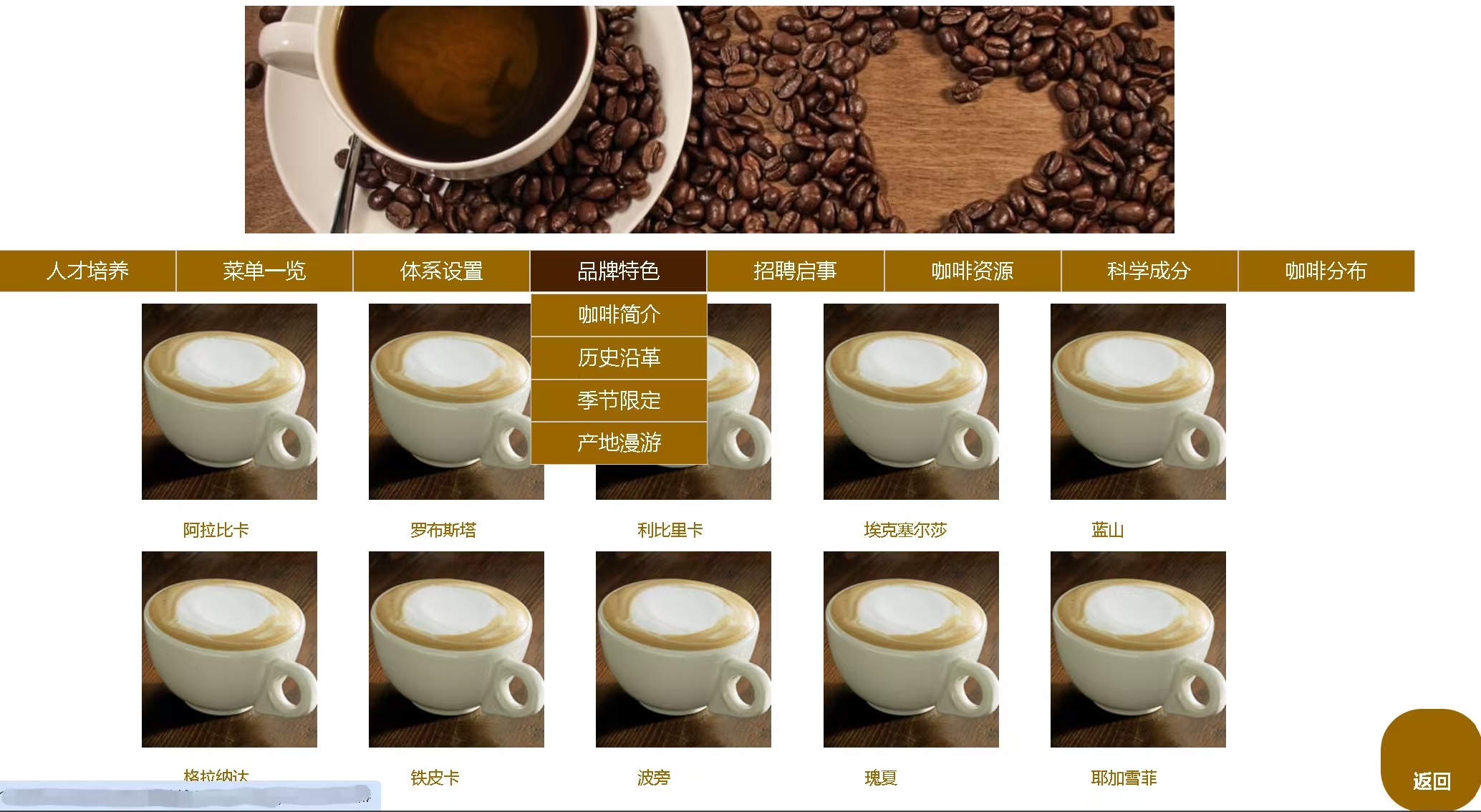 当鼠标悬停在图片上时,清晰度变化:
- 正常状态:链接保持完全不透明(opacity: 1)
- 悬停状态:当鼠标移动到链接上时,不透明度变为0.7,产生淡出效果
- 鼠标移出:当鼠标移开时,不透明度恢复为1
html
.container a:hover {
  opacity: 0.7;
}
总结
以上就是今天要讲的内容,本文简单记录了固定定位(fixed)以及咖啡售卖官网,仅作为一份简单的笔记使用,大家根据注释理解