vw/vh
目标: 能够使用vw单位设置网页元素的尺寸
- 相对单位
- 相对视口的尺寸计算结果.
- vw全称viewport width;
- 1vw=1/100视口宽度
- vh全称viewport height;
- 1vh=1/100视口高度
体验vw和vh单位
<!DOCTYPE html>
<html lang="en">
<head>
    <meta charset="UTF-8">
    <meta http-equiv="X-UA-Compatible" content="IE=edge">
    <meta name="viewport" content="width=device-width, initial-scale=1.0">
    <title>体验vw和vh</title>
    <style>
        * {
            margin: 0;
            padding: 0;
        }

        /* 1. vw = 1/100视口宽度 */
        /* 375 / 100 * 50 = 187.5 */
        /* 375 / 100 * 30 = 112.5 */
        .box {
            width: 50vw;
            height: 30vw;
            background-color: pink;
        }

        /* 2. vh = 1/100视口高度 */
        /* 667 / 100 * 50 = 333.5 */
        /* 667 / 100 * 30 = 200.1 */
        .box {
            width: 50vh;
            height: 30vh;
            background-color: pink;
        }
    </style>
</head>
<body>
    <div class="box"></div>
</body>
</html>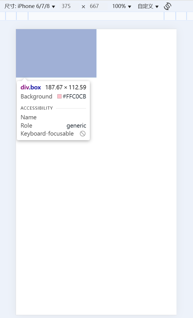
- vw/vh方案的优势就是不再依赖媒体查询
- 这里盒子的尺寸和计算值有误差是因我的屏幕分辨率是2k, 逻辑分辨率不同
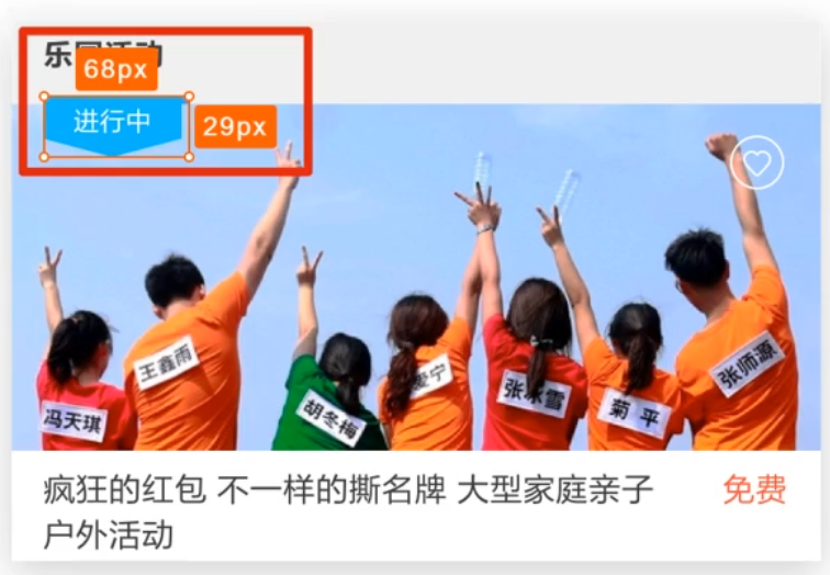
vw单位换算: 设计稿中的单位一定是px单位, 写代码要写vw单位, 怎么换算呢?
- 确定设计稿对应的vw尺寸(1/100视口宽度)
- 查看设计稿宽度 → 确定参考设备宽度 (视口宽度) → 确定ww尺寸 (1/100)视口宽度
- vw单位的尺寸 = px单位数值 / (1/100 视口宽度)
- vh单位的尺寸 = px单位数值 / (1/100 视口高度)
- 设计稿如下图, 设计稿宽度是375px, 完成尺寸换算
<!DOCTYPE html>
<html lang="en">
<head>
    <meta charset="UTF-8">
    <meta http-equiv="X-UA-Compatible" content="IE=edge">
    <meta name="viewport" content="width=device-width, initial-scale=1.0">
    <title>vw适配</title>
    <link rel="stylesheet" href="./demo.css">
</head>
<body>
    <div class="box"></div>

    <div class="box2"></div>
</body>
</html>

// out: ./
* {
    margin: 0;
    padding: 0;
}

// vw单位的尺寸 = px单位数值 / (1/100 视口宽度)
.box {
   // vw
    width: (68 / 3.75vw);
    height: (29 / 3.75vw);
    background-color: pink;
}

// vh单位的尺寸 = px单位数值 / (1/100 视口高度)
.box2 {
    // vh
    width: (68 / 6.67vh);
    height: (29 / 6.67vh);
    background-color: green;
}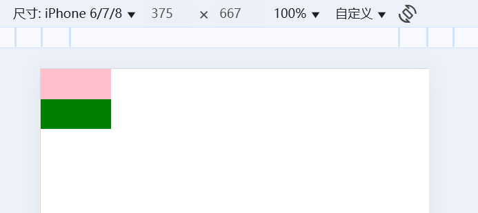
- 使用vw和vh两种单位设置盒子尺寸, 最终盒子的大小是一致的
- 所以开发中使用vw和vh都行
- 全面屏手机的高度变大, 所以vw和vh单位不能混用, 元素会变形
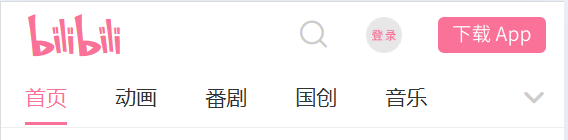
仿b站首页
准备工作
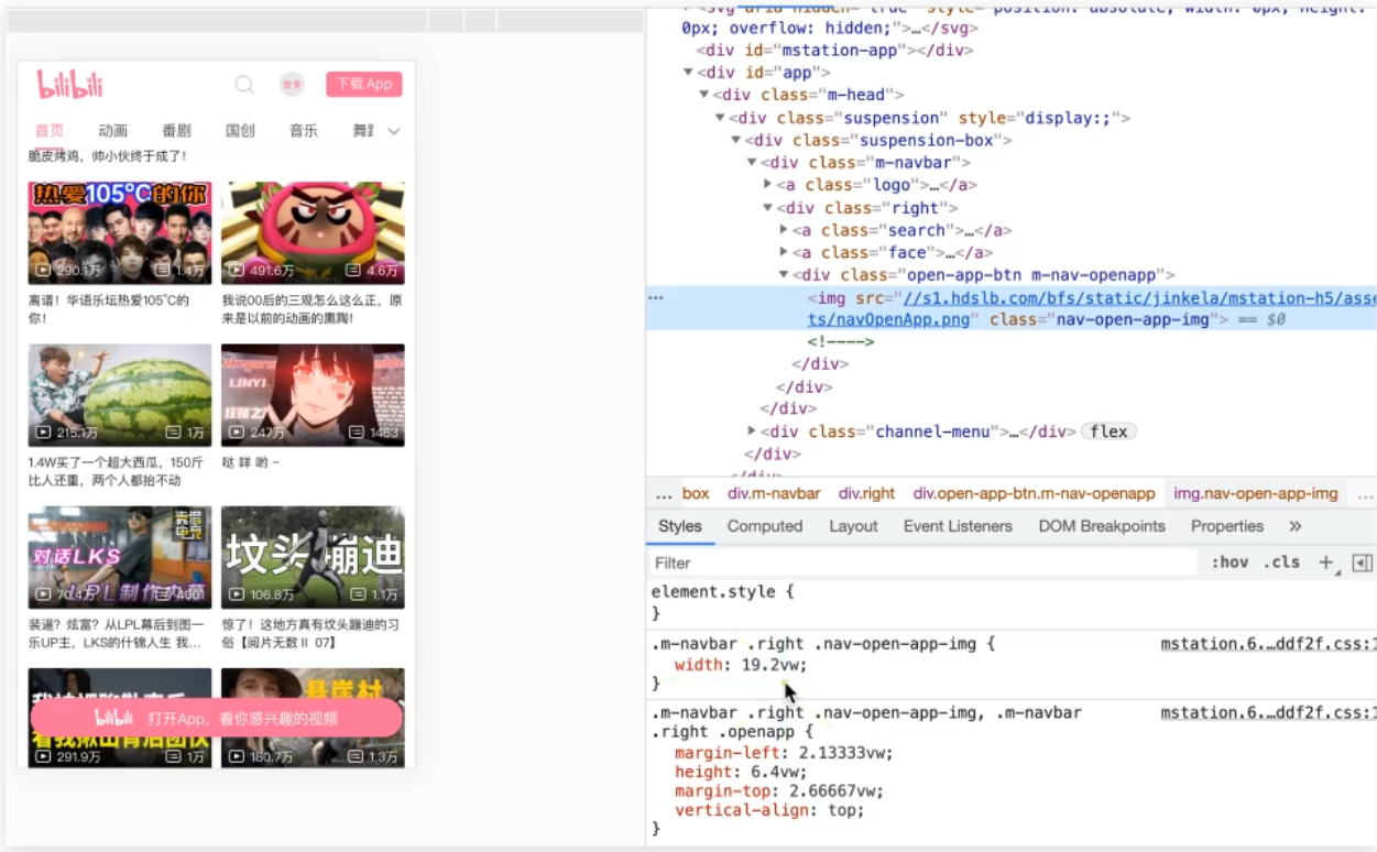
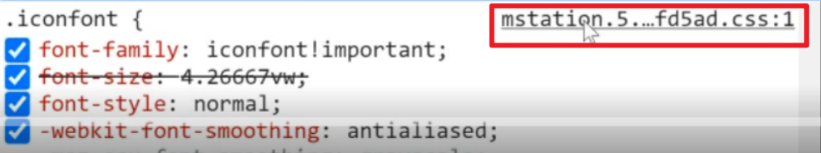
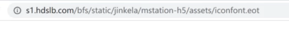
素材获取: 图片直接右键另存为, 字体图标的下载如下
- 检查元素, 找到iconfont类名, 点击iconfont样式表
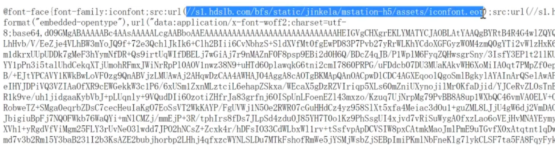
- 复制字体URL到浏览器地址栏, 回车就能下载字体文件
- 新建iconfont.css文件, 把样式表的代码复制下来
- 在原站中复制图标类名使用就行了
新建index.html文件, 新建index.less文件
<!DOCTYPE html>
<html lang="en">
<head>
    <meta charset="UTF-8">
    <meta http-equiv="X-UA-Compatible" content="IE=edge">
    <meta name="viewport" content="width=device-width, initial-scale=1.0">
    <title>B站</title>
    <link rel="stylesheet" href="./fonts/iconfont.css">
    <link rel="stylesheet" href="./css/index.css">
</head>
<body>
</body>
</html>

@import 'base';
头部区域
<!DOCTYPE html>
<html lang="en">
<head>
    <meta charset="UTF-8">
    <meta http-equiv="X-UA-Compatible" content="IE=edge">
    <meta name="viewport" content="width=device-width, initial-scale=1.0">
    <title>B站</title>
    <link rel="stylesheet" href="./fonts/iconfont.css">
    <link rel="stylesheet" href="./css/index.css">
</head>
<body>
    <!-- 1. 头部固定 -->
    <header>
        <div class="top">
            <div class="left">
                <a href="#">
                    <i class="iconfont Navbar_logo"></i>
                </a>
            </div>
            <div class="right">
                <a href="#">
                    <i class="iconfont ic_search_tab"></i>
                </a>
                <a href="#" class="login"><img src="./images/login.png" alt=""></a>
                <a href="#" class="download"><img src="./images/download.png" alt=""></a>
            </div>
        </div>
        <div class="bottom">
            <div class="tab">
                <ul>
                    <li><a href="#" class="current">首页</a></li>
                    <li><a href="#">动画</a></li>
                    <li><a href="#">番剧</a></li>
                    <li><a href="#">国创</a></li>
                    <li><a href="#">音乐</a></li>
                </ul>
            </div>
            <div class="more">
                <a href="#">
                    <i class="iconfont general_pulldown_s"></i>
                </a>
            </div>
        </div>
    </header>

    <!-- 2. 视频区域 -->


    <!-- 3. 按钮固定 -->
</body>
</html>

@import 'base';

@vw: 3.75vw;
@color: #fb7299;

// 头部 固定
header {
    position: fixed;
    left: 0;
    top: 0;
    z-index: 1;

    width: 100%;
    // width: 100vw;
    height: (84 / @vw);
    background-color: #fff;

    // top
    .top {
        display: flex;
        justify-content: space-between;
        align-items: center;

        height: (44 / @vw);
        padding-left: (18 / @vw);
        padding-right: (12 / @vw);

        .left {
            .iconfont {
                font-size: (28 / @vw);
                color: @color;
            }
        }

        .right {
            display: flex;
            .iconfont {
                font-size: (22 / @vw);
                color: #ccc;
            }

            .login {
                width: (24 / @vw);
                height: (24 / @vw);
                margin-left: (24 / @vw);
            }

            .download {
                width: (72 / @vw);
                height: (24 / @vw);
                margin-left: (24 / @vw);
            }

        }
    }

    // bottom
    .bottom {
        display: flex;
        justify-content: space-between;

        height: (40 / @vw);
        border-bottom: 1px solid #eee;
        .more {
            a {
                display: block;
                width: (40 / @vw);
                height: (40 / @vw);
                // background-color: pink;
                text-align: center;
                line-height: (40 / @vw);
                // font-size: (22 / @vw);
                color: #ccc;
                .iconfont {
                    font-size: (22 / @vw);
                }
            }
        }

        .tab {
            ul {
                display: flex;
                li {
                    padding: 0 (16 / @vw);
                    a {
                        display: block;
                        height: (38 / @vw);
                        line-height: (38 / @vw);
                        font-size: (14 / @vw);
                        &.current {
                            color: @color;
                            border-bottom: 2px solid @color;
                        }
                    }
                }
            }
        }
    }
}
视频区域
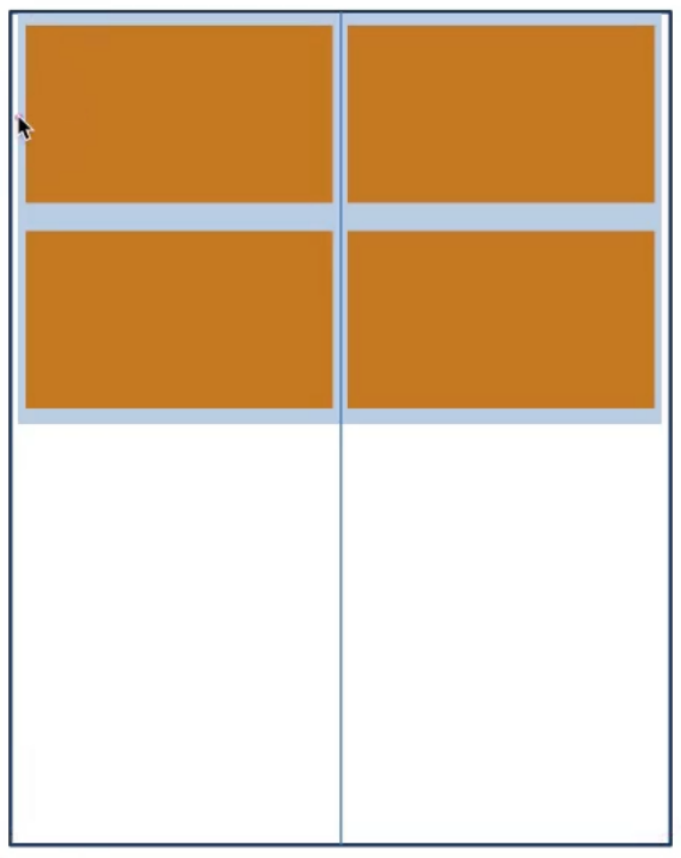
视频区域布局分析:
- 父级设置左右padding
- 每个视频盒子宽度为50%左右padding(拉开内容的距离)
- 完成两列盒子三距等宽的视觉效果
<!DOCTYPE html>
<html lang="en">
<head>
<meta charset="UTF-8">
<meta http-equiv="X-UA-Compatible" content="IE=edge">
<meta name="viewport" content="width=device-width, initial-scale=1.0">
<title>B站</title>
<link rel="stylesheet" href="./fonts/iconfont.css">
<link rel="stylesheet" href="./css/index.css">
</head>
<body>
<!-- 1. 头部固定 -->
<!-- 2. 视频 -->
<!-- 视频区域布局 -->
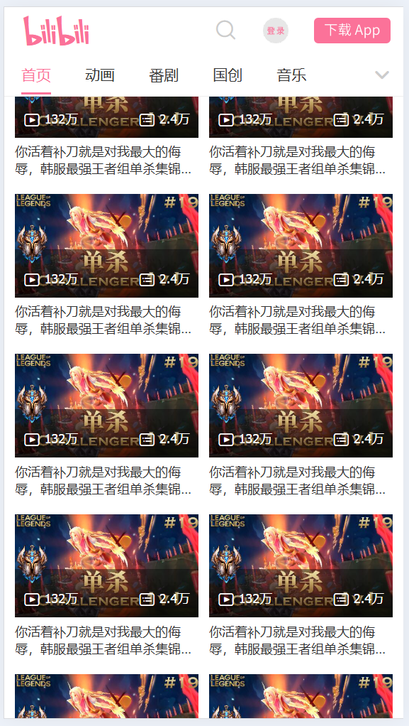
<section class="video_content">
<!-- 一份视频, 共计有5个菜单, 应该有5份视频的div -->
<div class="video_list">
<a href="#">
<div class="pic">
<img src="./images/1.jpg" alt="">
<div class="count">
<p>
<i class="iconfont icon_shipin_bofangshu"></i>
<span>132</span>万
</p>
<p>
<i class="iconfont icon_shipin_danmushu"></i>
<span>2.4</span>万
</p>
</div>
</div>
<div class="txt ellipsis-2">你活着补刀就是对我最大的侮辱,韩服最强王者组单杀集锦#19</div>
</a>
</div>
</section>
<!-- 3. 按钮固定 -->
</body>
</html>
@import 'base';
@vw: 3.75vw;
@color: #fb7299;
// 视频
.video_content {
padding: (84 / @vw) (5 / @vw) 0;
.video_list {
display: flex;
// 弹性盒子换行
flex-wrap: wrap;
a {
width: 50%;
padding: (8 / @vw) (5 / @vw);
// background-color: pink;
font-size: (12 / @vw);
.txt {
margin-top: (5 / @vw);
}
.pic {
position: relative;
.count {
position: absolute;
left: 0;
bottom: 0;
display: flex;
justify-content: space-between;
width: 100%;
padding: (8 / @vw);
background-image: linear-gradient(to top, rgba(0, 0, 0, 0.6), rgba(0, 0, 0, 0));
color: #fff;
i {
vertical-align: middle;
}
}
}
}
}
}