Flex布局
Flex布局也叫做:伸缩布局,当子盒子的总和溢出父盒子时默认进行压缩显示
线性布局的原理是基于Flex来设计的。
Flex布局默认主轴是:水平向右的,交叉轴垂:直向下
单行或者单列的情况下,优先使用线性布局
线性布局的性能由于Flex布局
FLex布局我们可以根据 direction 来调整主轴的方向
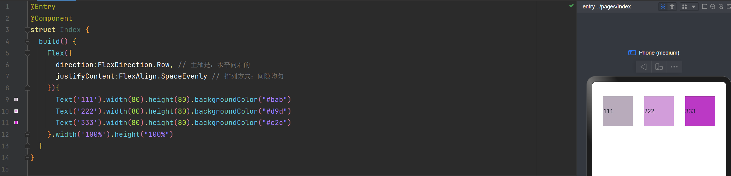
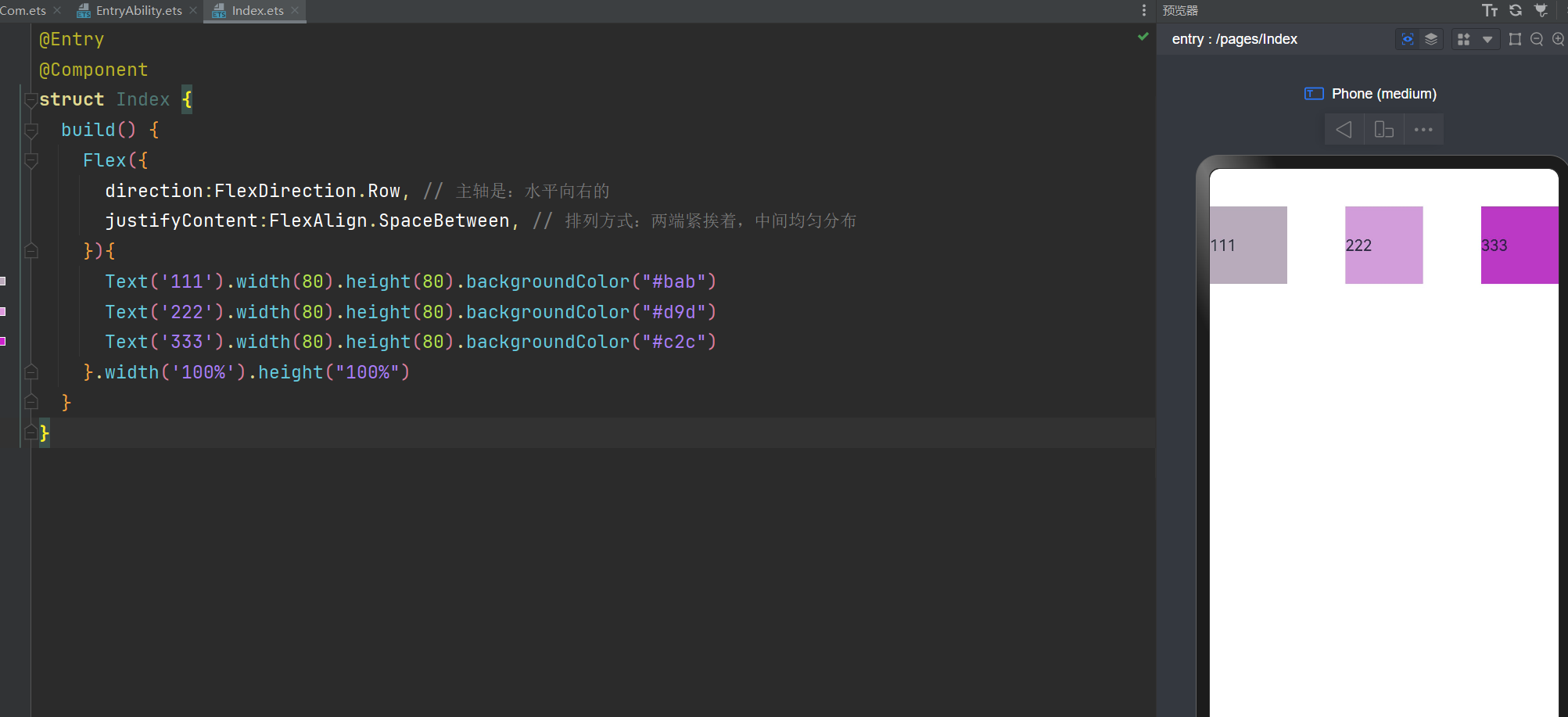
direction:FlexDirection.Row 主轴水平向右的
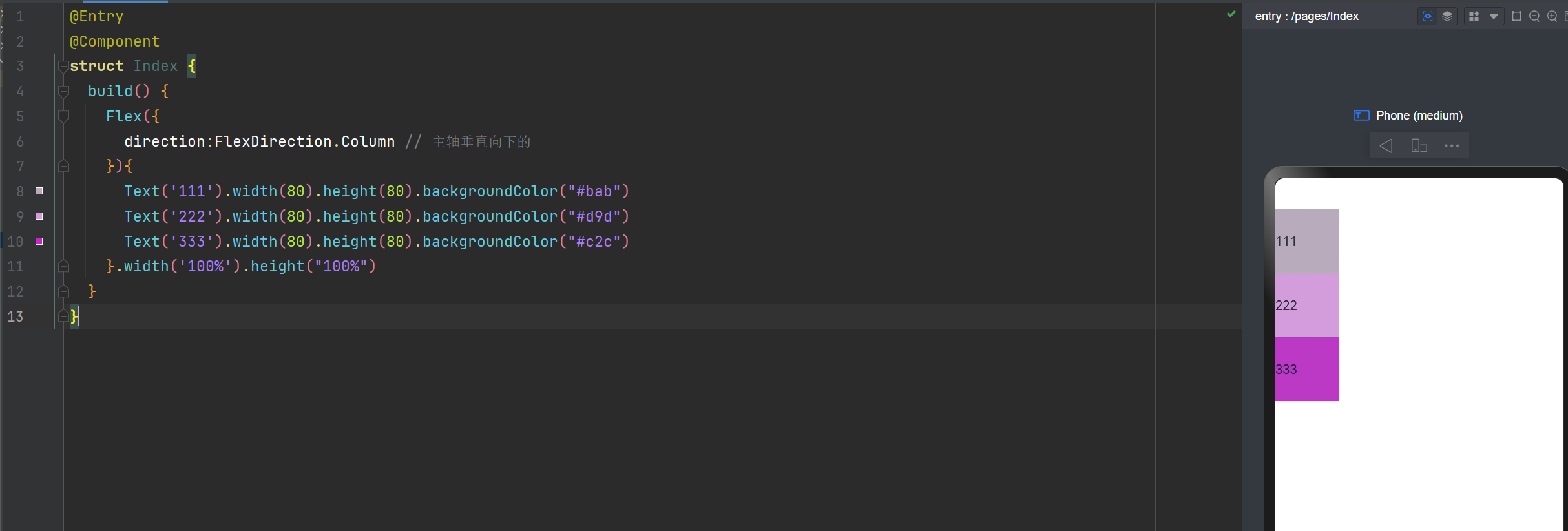
direction:FlexDirection.Column 主轴垂直向下的
direction:FlexDirection.RowReverse 主轴水平向左,与Row
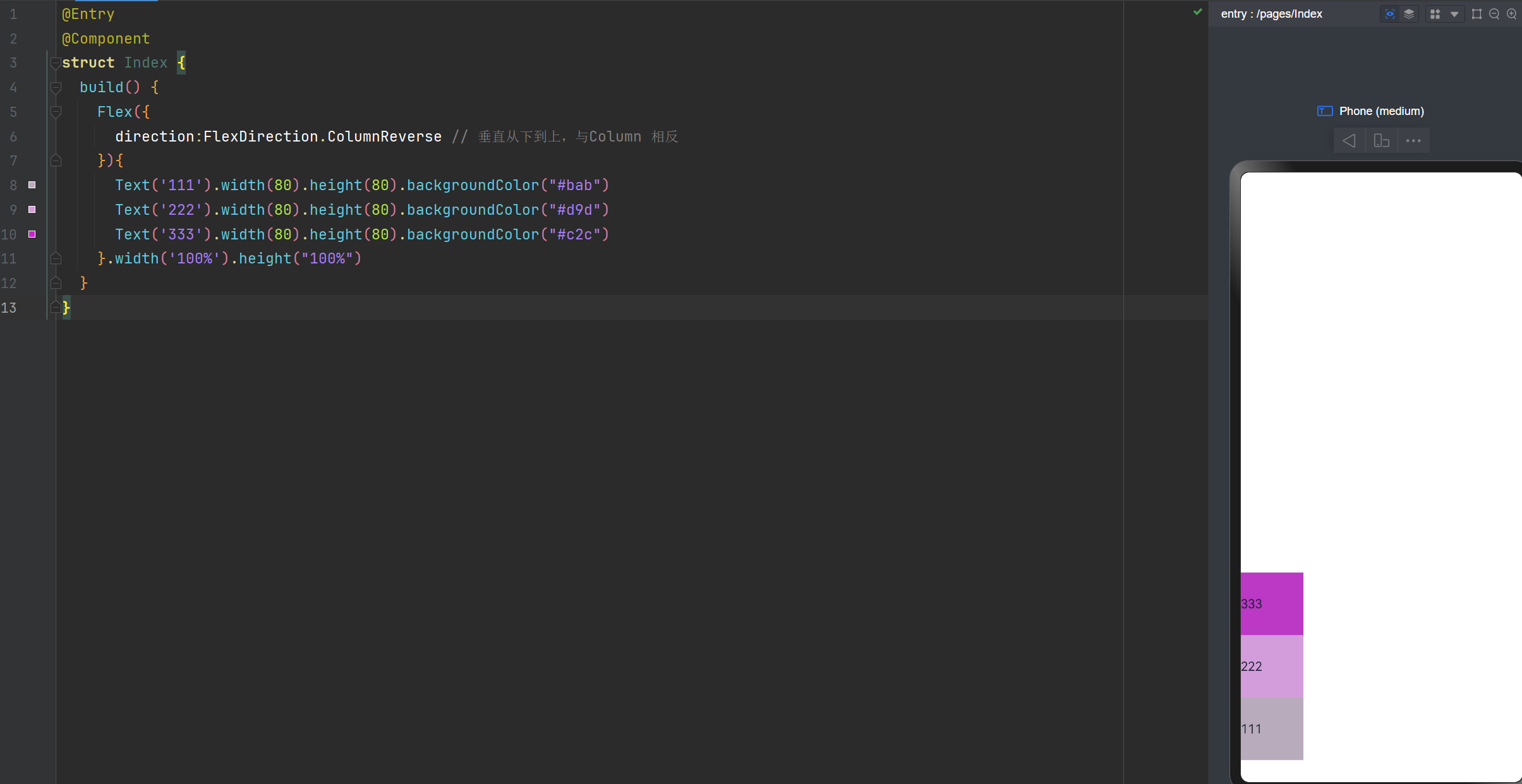
direction:FlexDirection.ColumnReverse 垂直从下到上,与Column 相反
Flex布局主轴垂直向下
@Entry
@Component
struct Index {
  build() {
    Flex({
      direction:FlexDirection.Column // 主轴垂直向下的
    }){
      Text('111').width(80).height(80).backgroundColor("#bab")
      Text('222').width(80).height(80).backgroundColor("#d9d")
      Text('333').width(80).height(80).backgroundColor("#c2c")
    }.width('100%').height("100%")
  }
}
Flex布局主轴:垂直从下到上
@Entry
@Component
struct Index {
  build() {
    Flex({
      direction:FlexDirection.ColumnReverse // 垂直从下到上,与Column 相反
    }){
      Text('111').width(80).height(80).backgroundColor("#bab")
      Text('222').width(80).height(80).backgroundColor("#d9d")
      Text('333').width(80).height(80).backgroundColor("#c2c")
    }.width('100%').height("100%")
  }
}
主轴的对齐方式,与之前学习的线性布局方式是一样的哈
justifyContent:FlexAlign.Start在最起始位置;
justifyContent:FlexAlign.Center在中间;
justifyContent:FlexAlign.End 在最末端;
justifyContent:FlexAlign.SpaceBetween 两端紧挨着,中间均匀分布。与css3的一样。
justifyContent:FlexAlign.SpaceAround 两端有一点间距(0.5),中间间距(1)均匀分布。与css3的一样。
justifyContent:FlexAlign.SpaceEvenly 间隙是均匀的。
主轴水平向右,排列方式间隙均匀
@Entry
@Component
struct Index {
  build() {
    Flex({
      direction:FlexDirection.Row, // 主轴是:水平向右的
      justifyContent:FlexAlign.SpaceEvenly // 排列方式:间隙均匀
    }){
      Text('111').width(80).height(80).backgroundColor("#bab")
      Text('222').width(80).height(80).backgroundColor("#d9d")
      Text('333').width(80).height(80).backgroundColor("#c2c")
    }.width('100%').height("100%")
  }
}
主轴水平向右,排列方式:两端紧挨着,中间均匀分布
@Entry
@Component
struct Index {
  build() {
    Flex({
      direction:FlexDirection.Row, // 主轴是:水平向右的
      justifyContent:FlexAlign.SpaceBetween, // 排列方式:两端紧挨着,中间均匀分布
    }){
      Text('111').width(80).height(80).backgroundColor("#bab")
      Text('222').width(80).height(80).backgroundColor("#d9d")
      Text('333').width(80).height(80).backgroundColor("#c2c")
    }.width('100%').height("100%")
  }
}
交叉轴的对齐方式
alignItems: ItemAlign.Start 顶部
alignItems: ItemAlign.Center 居中
alignItems: ItemAlign.End 底部
alignItems: ItemAlign.Stretch 拉伸,占满整个空间
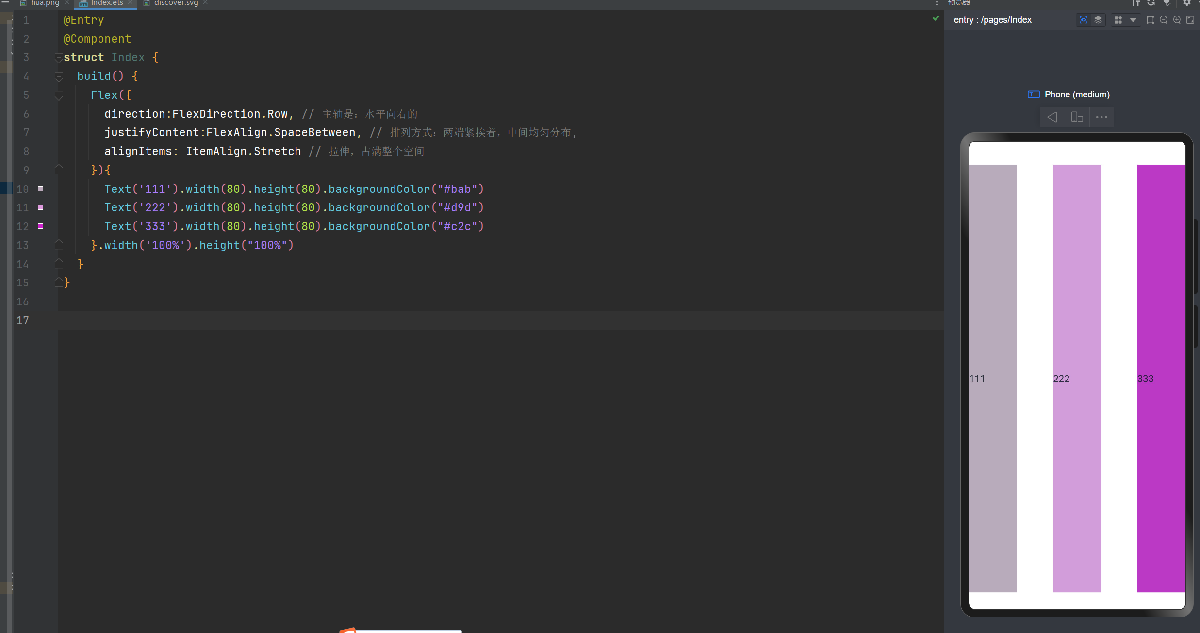
交叉轴的对齐方式: 垂直方向拉伸,占满整个空间
@Entry
@Component
struct Index {
  build() {
    Flex({
      direction:FlexDirection.Row, // 主轴是:水平向右的
      justifyContent:FlexAlign.SpaceBetween, // 排列方式:两端紧挨着,中间均匀分布,
      alignItems: ItemAlign.Stretch // 交叉轴的对齐方式:  垂直方向拉伸,占满整个空间
    }){
      Text('111').width(80).height(80).backgroundColor("#bab")
      Text('222').width(80).height(80).backgroundColor("#d9d")
      Text('333').width(80).height(80).backgroundColor("#c2c")
    }.width('100%').height("100%")
  }
}
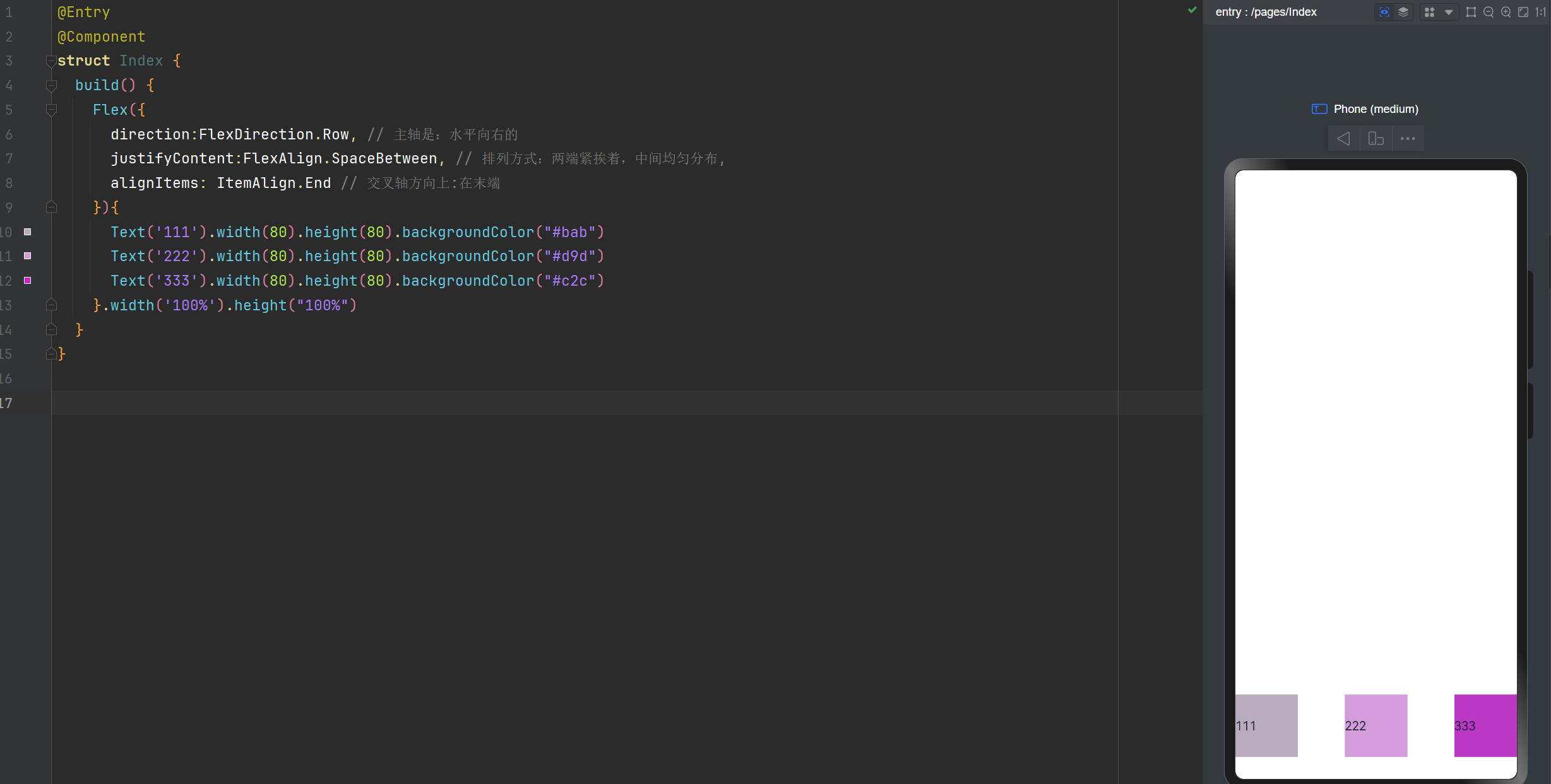
交叉轴对齐方式:在末端
@Entry
@Component
struct Index {
  build() {
    Flex({
      direction:FlexDirection.Row, // 主轴是:水平向右的
      justifyContent:FlexAlign.SpaceBetween, // 排列方式:两端紧挨着,中间均匀分布,
      alignItems: ItemAlign.End // 交叉轴方向上:在末端
    }){
      Text('111').width(80).height(80).backgroundColor("#bab")
      Text('222').width(80).height(80).backgroundColor("#d9d")
      Text('333').width(80).height(80).backgroundColor("#c2c")
    }.width('100%').height("100%")
  }
}
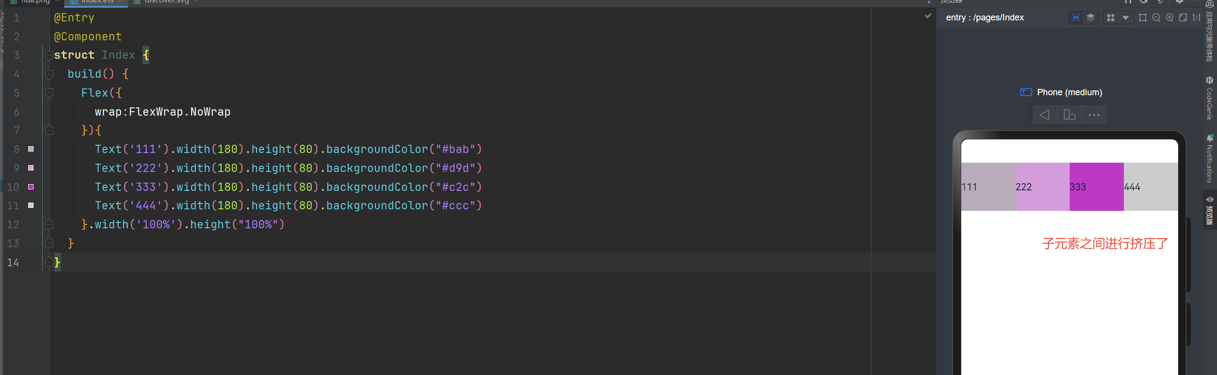
是否换行
wrap: FlexWrap.Wrap 换行
wrap: FlexWrap.NoWrap 不换行。在使用Flex布局时,如果不进行换行,子元素的宽度大于父元素。会进行挤压
wrap: FlexWrap.WrapReverse 换行翻转
不换行
在使用Flex布局时,如果不进行换行,子元素的宽度大于父元素。会进行挤压
@Entry
@Component
struct Index {
  build() {
    Flex({
      wrap:FlexWrap.NoWrap
    }){
      Text('111').width(180).height(80).backgroundColor("#bab")
      Text('222').width(180).height(80).backgroundColor("#d9d")
      Text('333').width(180).height(80).backgroundColor("#c2c")
      Text('444').width(180).height(80).backgroundColor("#ccc")
    }.width('100%').height("100%")
  }
}
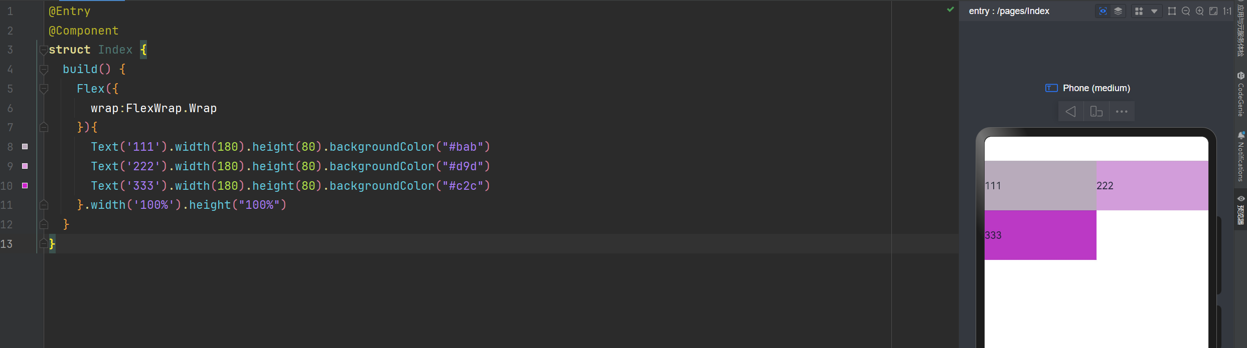
换行显示
@Entry
@Component
struct Index {
  build() {
    Flex({
      wrap:FlexWrap.Wrap
    }){
      Text('111').width(180).height(80).backgroundColor("#bab")
      Text('222').width(180).height(80).backgroundColor("#d9d")
      Text('333').width(180).height(80).backgroundColor("#c2c")
    }.width('100%').height("100%")
  }
}
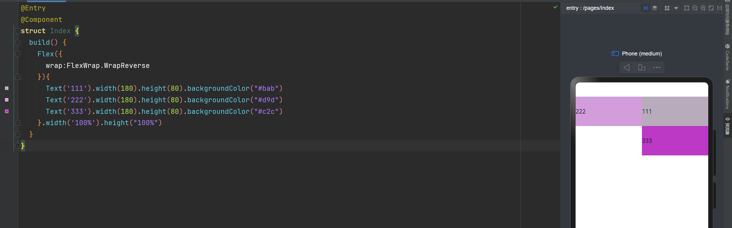
换行翻转
@Entry
@Component
struct Index {
  build() {
    Flex({
      wrap:FlexWrap.WrapReverse
    }){
      Text('111').width(180).height(80).backgroundColor("#bab")
      Text('222').width(180).height(80).backgroundColor("#d9d")
      Text('333').width(180).height(80).backgroundColor("#c2c")
    }.width('100%').height("100%")
  }
}
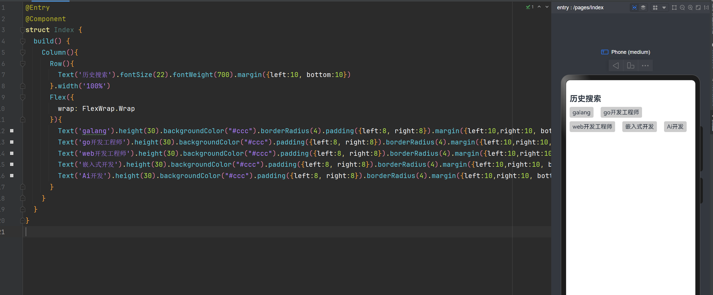
实现XX直聘搜索历史记录
@Entry
@Component
struct Index {
  build() {
    Column(){
      Row(){
        Text('历史搜索').fontSize(22).fontWeight(700).margin({left:10, bottom:10})
      }.width('100%')
      Flex({
        wrap: FlexWrap.Wrap
      }){
        Text('galang').height(30).backgroundColor("#ccc").borderRadius(4).padding({left:8, right:8}).margin({left:10,right:10, bottom:10})
        Text('go开发工程师').height(30).backgroundColor("#ccc").padding({left:8, right:8}).borderRadius(4).margin({left:10,right:10, bottom:10})
        Text('web开发工程师').height(30).backgroundColor("#ccc").padding({left:8, right:8}).borderRadius(4).margin({left:10,right:10, bottom:10})
        Text('嵌入式开发').height(30).backgroundColor("#ccc").padding({left:8, right:8}).borderRadius(4).margin({left:10,right:10, bottom:10})
        Text('Ai开发').height(30).backgroundColor("#ccc").padding({left:8, right:8}).borderRadius(4).margin({left:10,right:10, bottom:10})
      }
    }
  }
}
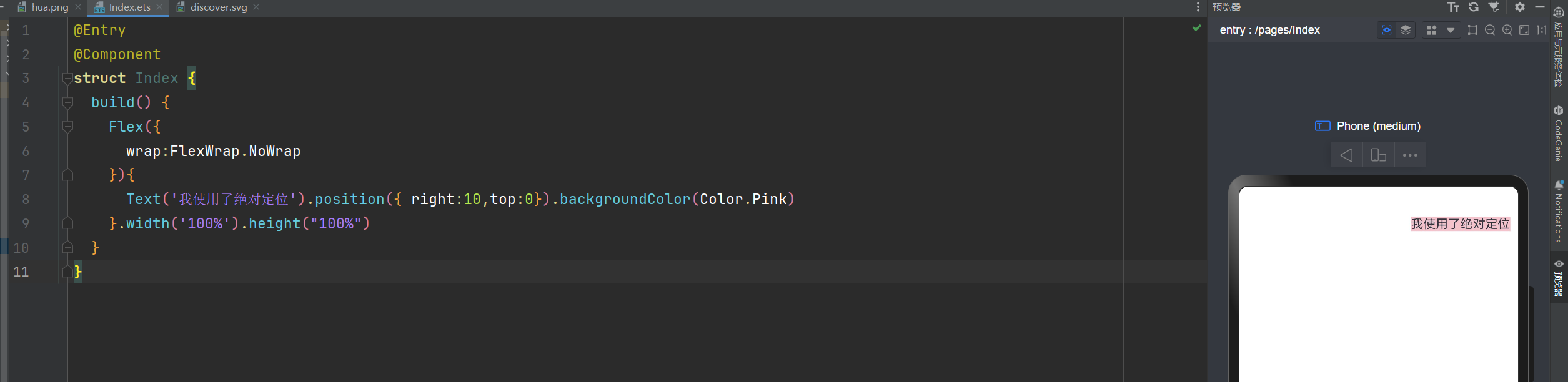
绝对定位
绝对定位后的组件不再占用自身原有位置,可以实现层叠效果,原本的位置就不进行占用了。
默认情况下,绝对定位的堆叠层级与组件的加载顺序有关,在最后的组件往往在最上面。
如果使用了ZIndex,就与ZIndex的值大小有关,谁值越大,谁就在最上面。
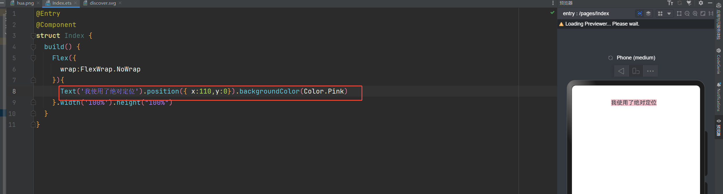
语法:组件.position({x:数值,y:数值}) 或者 组件.position({right:数值,top:数值})
你也可以这样写:Text('使用定位').position({ right:10,top:0}).backgroundColor(Color.Pink)
@Entry
@Component
struct Index {
  build() {
    Flex({
      wrap:FlexWrap.NoWrap
    }){
      Text('我使用了绝对定位').position({ right:10,top:0}).backgroundColor(Color.Pink)
    }.width('100%').height("100%")
  }
}
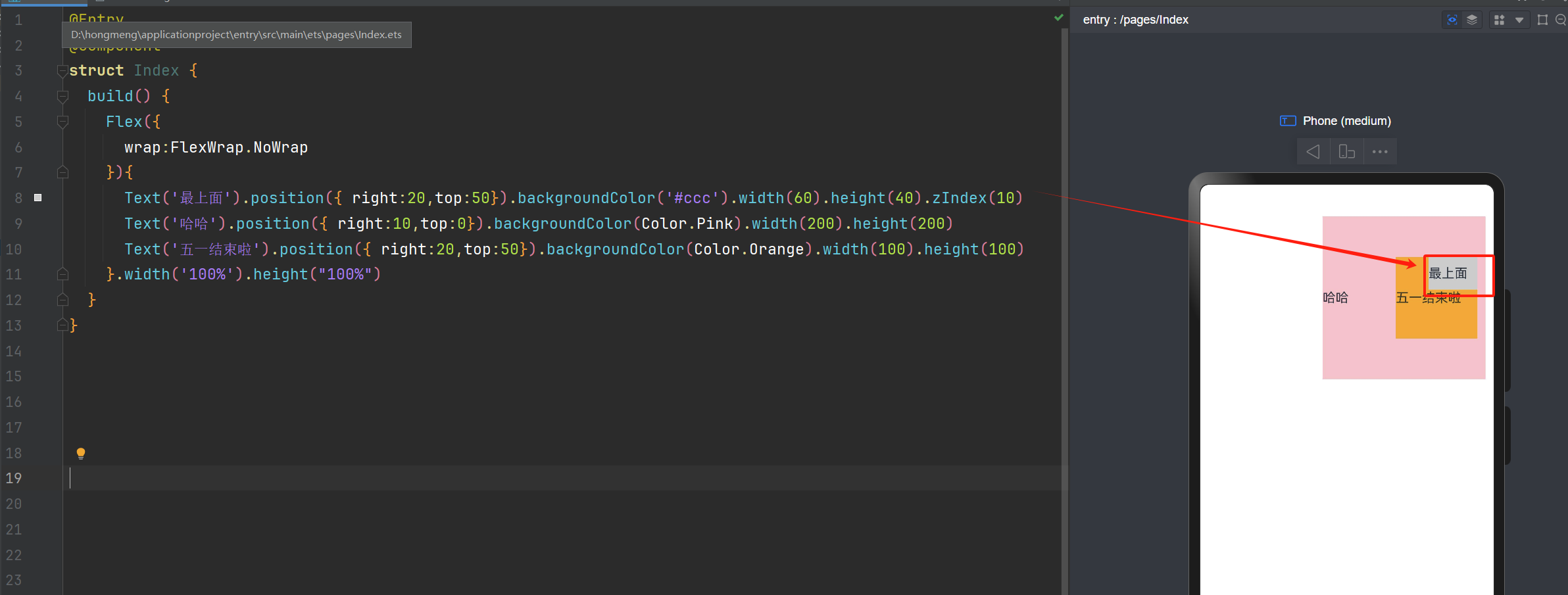
ZIndex的使用
@Entry
@Component
struct Index {
  build() {
    Flex({
      wrap:FlexWrap.NoWrap
    }){
      Text('最上面').position({ right:20,top:50}).backgroundColor('#ccc').width(60).height(40).zIndex(10)
      Text('哈哈').position({ right:10,top:0}).backgroundColor(Color.Pink).width(200).height(200)
      Text('五一结束啦').position({ right:20,top:50}).backgroundColor(Color.Orange).width(100).height(100)
    }.width('100%').height("100%")
  }
}
层叠布局
层叠布局:堆叠容器,子组件按照顺序依次入栈,后一个子组件覆盖前一个子组件。
层叠布局具有较强的组件层叠能力。
场景:卡片层叠效果等,如购物车等
特点:层叠操作更简洁,编码效率高。(绝对定位的优势是更灵活)
我们可以通过alignContent来控制显示的位置
语法:Stack({alignContent:Alignment.Start}){ })
alignContent的属性值通过有下面这9个属性值
| 值 | 说明 |
|---|---|
| Alignment.TopStart | 子组件对齐到容器的左上角(Top-Left) |
| Alignment.Top | 子组件水平居中,并紧贴容器的顶部 |
| Alignment.TopEnd | 子组件对齐到容器的右上角(Top-Right) |
| Alignment.Start | 子组件垂直居中,并紧贴容器的左侧(Left) |
| Alignment.Center | 子组件在容器的中心位置(水平和垂直居中) |
| Alignment.End | 子组件垂直居中,并紧贴容器的右侧(Right) |
| Alignment.BottomStart | 子组件对齐到容器的左下角(Bottom-Left) |
| Alignment.Bottom | 子组件水平居中,并紧贴容器的底部 |
| Alignment.BottomEnd | 子组件对齐到容器的右下角(Bottom-Right) |
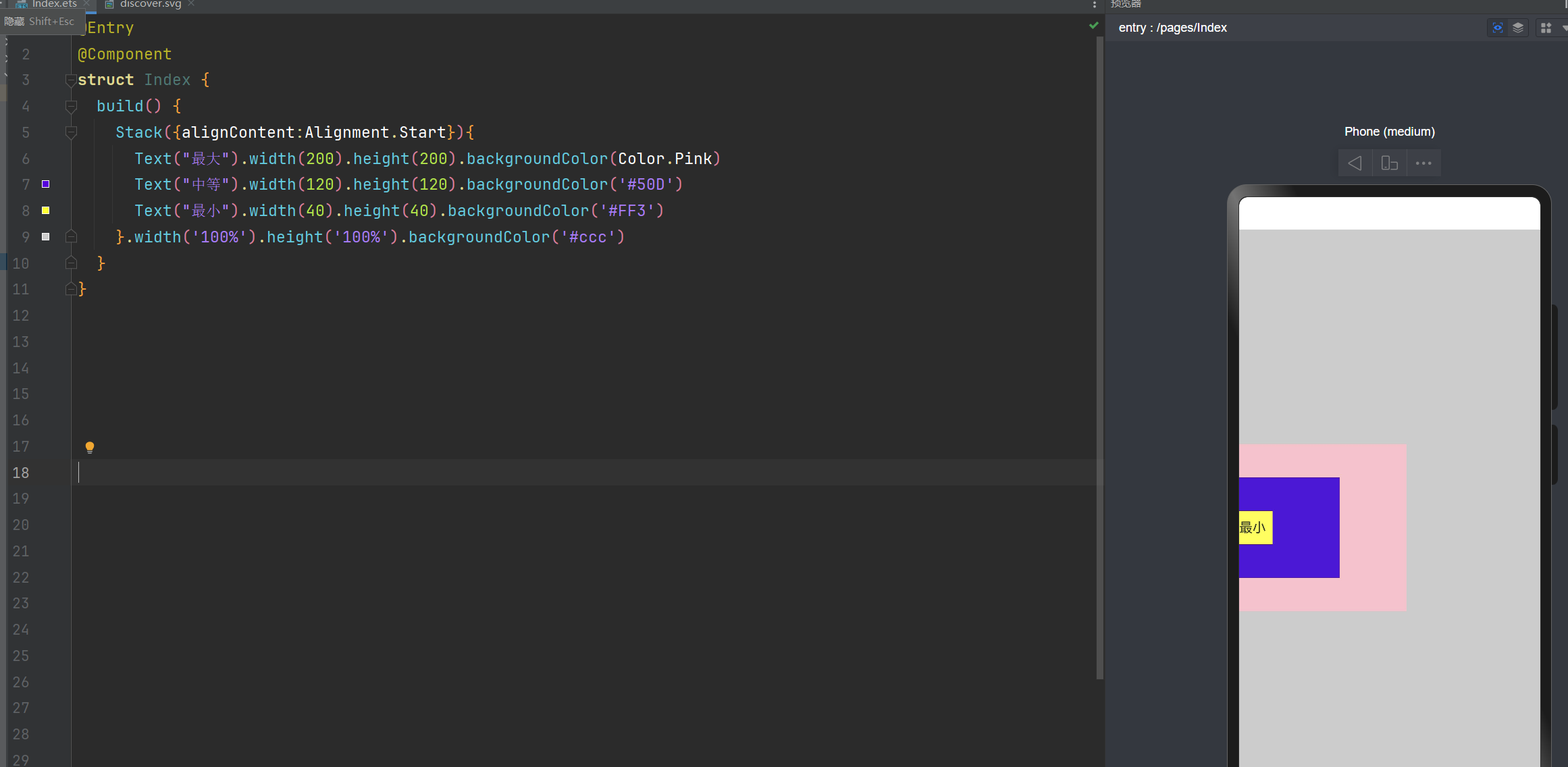
层叠布局: alignContent:Alignment.Start 子组件垂直居中,并紧贴容器的左侧
@Entry
@Component
struct Index {
  build() {
    Stack({alignContent:Alignment.Start}){
      Text("最大").width(200).height(200).backgroundColor(Color.Pink)
      Text("中等").width(120).height(120).backgroundColor('#50D')
      Text("最小").width(40).height(40).backgroundColor('#FF3')
    }.width('100%').height('100%').backgroundColor('#ccc')
  }
}
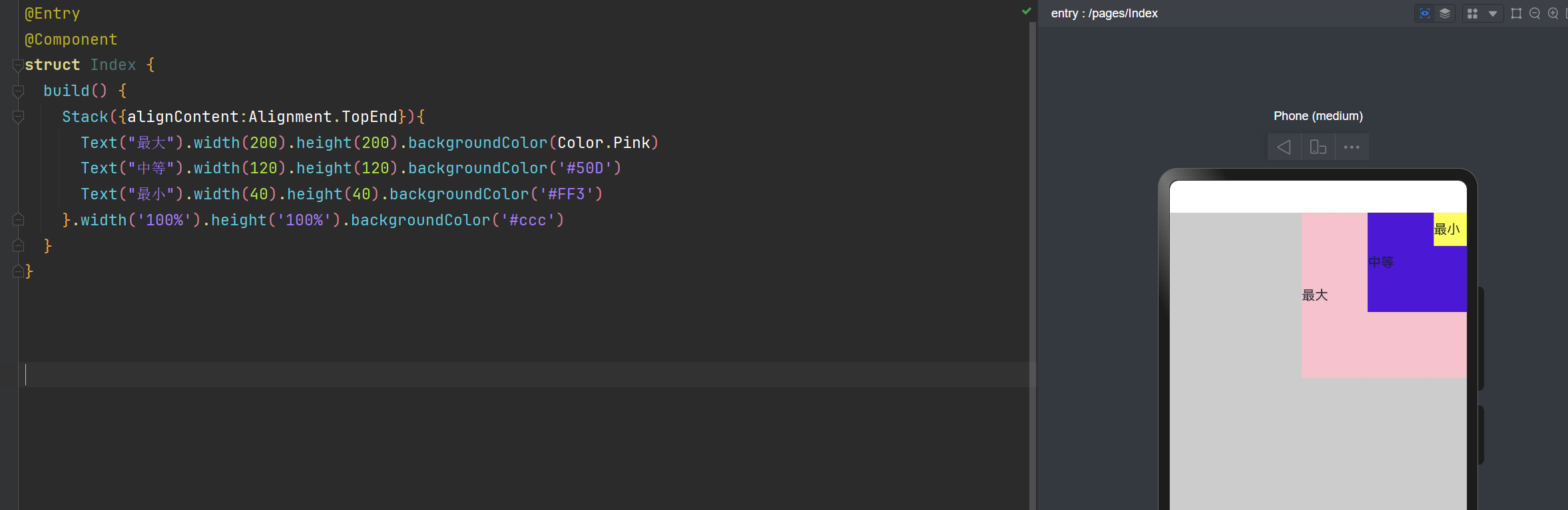
层叠布局: alignContent:Alignment.TopEnd 右上角
@Entry
@Component
struct Index {
  build() {
    Stack({alignContent:Alignment.TopEnd}){
      Text("最大").width(200).height(200).backgroundColor(Color.Pink)
      Text("中等").width(120).height(120).backgroundColor('#50D')
      Text("最小").width(40).height(40).backgroundColor('#FF3')
    }.width('100%').height('100%').backgroundColor('#ccc')
  }
}
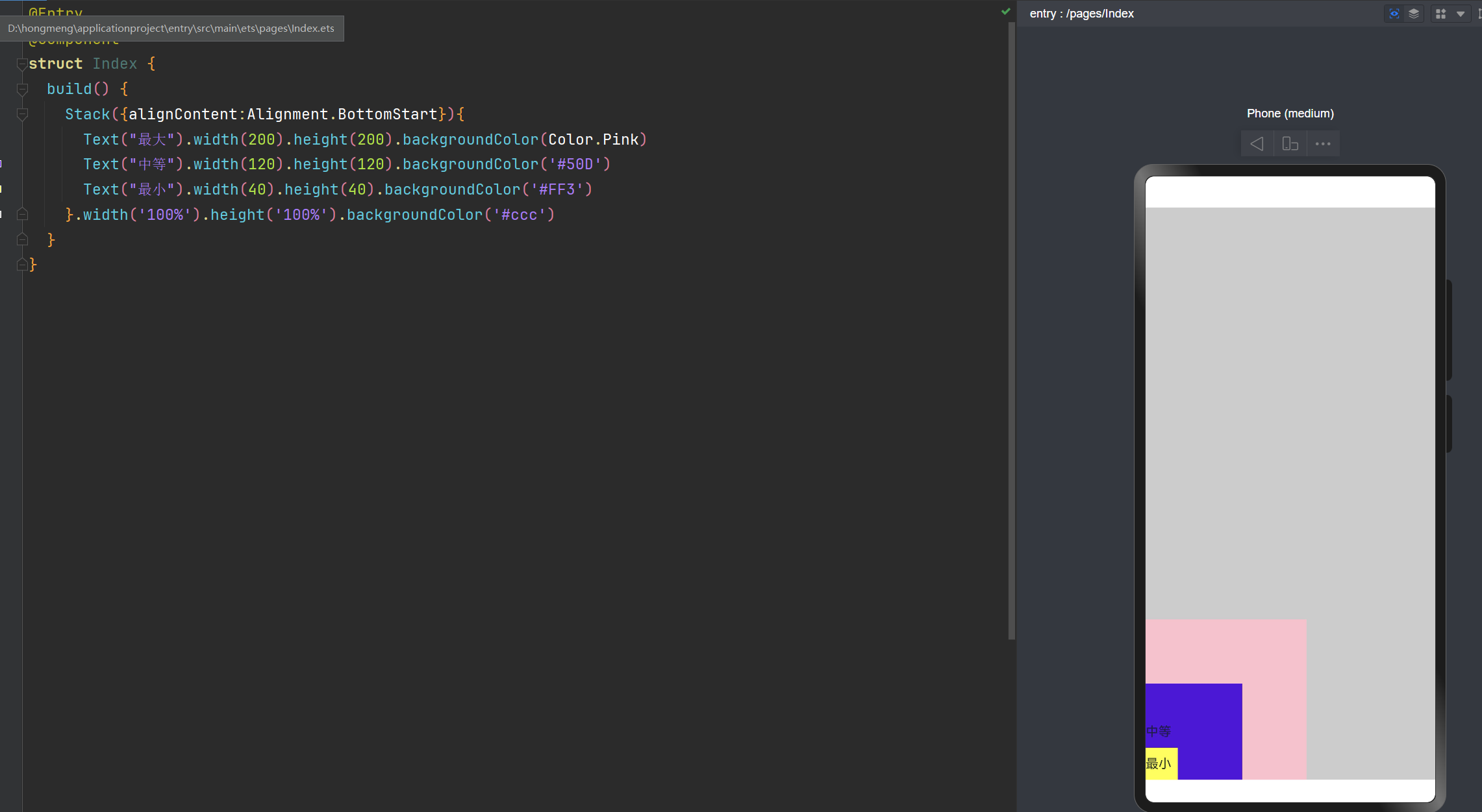
层叠布局: alignContent:Alignment.BottomStart 左边底部
@Entry
@Component
struct Index {
  build() {
    Stack({alignContent:Alignment.BottomStart}){
      Text("最大").width(200).height(200).backgroundColor(Color.Pink)
      Text("中等").width(120).height(120).backgroundColor('#50D')
      Text("最小").width(40).height(40).backgroundColor('#FF3')
    }.width('100%').height('100%').backgroundColor('#ccc')
  }
}
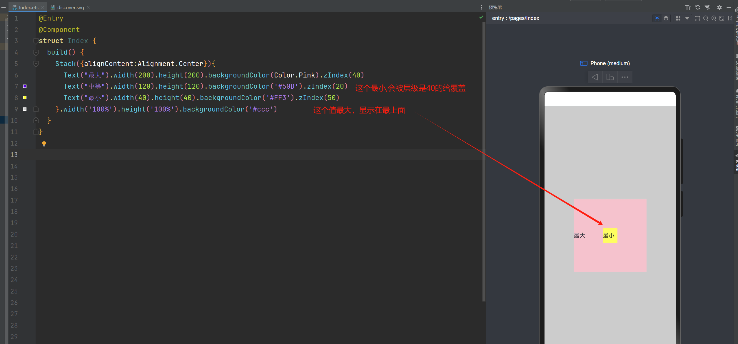
通过ZIndex来控制层级关系
@Entry
@Component
struct Index {
  build() {
    Stack({alignContent:Alignment.Center}){
      Text("最大").width(200).height(200).backgroundColor(Color.Pink).zIndex(40)
      Text("中等").width(120).height(120).backgroundColor('#50D').zIndex(20)
      Text("最小").width(40).height(40).backgroundColor('#FF3').zIndex(50)
    }.width('100%').height('100%').backgroundColor('#ccc')
  }
}
层叠布局和绝对定位的区别
层叠布局(Stack):通过对齐属性快速实现组件堆叠,适合简单叠加场景。
绝对定位:通过精确坐标自由控制位置,适合复杂或动态布局需求。
也就是说:绝对定位更加控制位置更加的自由。
能够使用层叠布局实现的,一定可以使用绝对定位来实现。
在我们实现需求时,优先使用:层叠布局,如果不好实现的话,在考虑绝对定位