背景
在日常开发过程中,产品经理经常会提出一些看似简单但实现起来颇具挑战的需求。为了更高效地满足这些业务场景,我们通常需要对现有的 UI 组件进行二次封装。例如,基于 ElementUI 或 ElementPlus 提供的组件进行功能扩展与定制,使其更贴合具体业务需求。
本文将以对 ElementPlus 的 <el-input> 组件进行二次封装为例,创建一个自定义组件 <my-input>,并通过该示例展示如何进行合理、规范的组件封装。
解决思路
本次封装的目标是确保自定义组件具备高度的兼容性和可复用性,具体实现思路如下:
- 属性透传 :保留并支持
<el-input>的所有原生attributes,确保原有配置能力不受影响。 - 插槽透传 :支持
<el-input>的所有插槽slots,保持原有结构扩展能力。 - 事件透传 :支持
<el-input>所有对外抛出的事件,确保行为一致性与交互完整性。
属性透传
使用$attrs可以实现左右属性透传,特定组件自定义的参数依旧可以使用,毫不冲突
vue
// my-input.vue
<template>
<section class="my-input-wrap">
<section class="input__label">
{{ label }}
</section>
<el-input v-bind="$attrs" />
<section class="input__desc">
{{ desc }}
</section>
</section>
</template>
<script setup lang="ts">
defineProps({
label: {
type: String,
default: '',
},
desc: {
type: String,
default: '',
},
});
</script>
<style lang="scss" scoped>
.my-input-wrap {
padding: 16px;
border: 1px solid #ececec;
border-radius: 8px;
.input__label {
position: relative;
display: flex;
align-items: center;
height: 36px;
padding-left: 8px;
font-size: 14px;
font-weight: 600;
color: #111;
&::before {
position: absolute;
top: 50%;
left: 0;
width: 2px;
height: 10px;
margin-top: -5px;
content: '';
background-color: #007af5;
border-radius: 4px;
}
}
.input__desc {
margin-top: 8px;
color: #999;
}
}
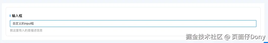
</style>在父组件中使用
vue
<MyInput
    v-model="inputValue"
    label="输入框"
    placeholder="请输入内容"
    desc="我这里传入的是描述信息"
/>
效果展示
插槽透传
<el-input>组件可以支持很多插槽,我们二次封装之后,应该如何处理插槽呢?聪明的你应该想到使用 slots,然后我们动态便利父组件传入的slots来实现保持<el-input>组件原有结构扩展能力。具体代码实现如下:
vue
// my-input.vue 核心代码
<template>
<section class="my-input-wrap">
<section class="input__label">
{{ label }}
</section>
<el-input v-bind="$attrs">
<template
v-for="(_, name) in slots"
:key="name"
#[name]="slotData"
>
<slot
:name="name"
v-bind="slotData || {}"
/>
</template>
</el-input>
<section class="input__desc">
{{ desc }}
</section>
</section>
</template>
<script setup lang="ts">
import { useSlots } from 'vue';
defineProps({
label: {
type: String,
default: '',
},
desc: {
type: String,
default: '',
},
});
const slots = useSlots();
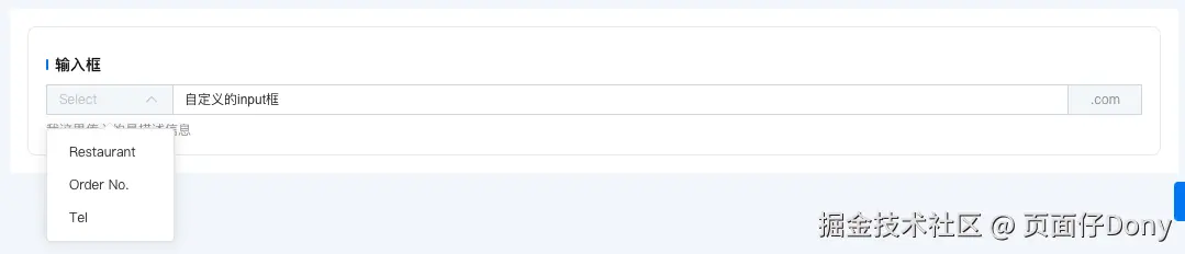
</script>在父组件中使用
vue
<MyInput
  v-model="inputValue"
  label="输入框"
  placeholder="请输入内容"
  desc="我这里传入的是描述信息"
>
  <template #prepend>
    <el-select
      placeholder="Select"
      style="width: 115px;"
    >
      <el-option
        label="Restaurant"
        value="1"
      />
      <el-option
        label="Order No."
        value="2"
      />
      <el-option
        label="Tel"
        value="3"
      />
    </el-select>
  </template>
  <template #append>
    .com
  </template>
</MyInput>
效果展示
事件透传
在 Vue 中,我们都知道可以通过 ref 在父组件中访问子组件通过 expose 暴露出来的方法和属性。然而,直接将 ref 透传到更深层的子组件是无法直接实现的。不过我们可以这样思考:既然在中间子组件中通过 ref 能够获取到其内部子组件暴露的方法和属性,那么我们将这些内容再次通过 expose 暴露出去,不就实现了 ref 的透传了吗?
vue
// my-input.vue核心代码
<template>
<section class="my-input-wrap">
<section class="input__label">
{{ label }}
</section>
<el-input
v-bind="$attrs"
ref="myCustomInputRef"
>
<template
v-for="(_, name) in slots"
:key="name"
#[name]="slotData"
>
<slot
:name="name"
v-bind="slotData || {}"
/>
</template>
</el-input>
<section class="input__desc">
{{ desc }}
</section>
</section>
</template>
<script setup lang="ts">
import { onMounted, useSlots, ref } from 'vue';
defineProps({
label: {
type: String,
default: '',
},
desc: {
type: String,
default: '',
},
});
const slots = useSlots();
const myCustomInputRef = ref();
const exposedInfo = {} as Record<string, any>;
const getExposedInfo = () => {
const myInstance = myCustomInputRef.value;
if (myInstance) {
// 显式列出需要暴露的方法
const methodNames: string[] = [
'blur',
'clear',
'focus',
'input',
'ref',
'resizeTextarea',
'select',
'textarea',
'textareaStyle',
'isComposing',
];
methodNames.forEach((key) => {
const method = myInstance[key];
if (typeof method === 'function') {
exposedInfo[key] = (...args: any[]) =>
method?.apply(myInstance, args);
} else {
exposedInfo[key] = method;
}
});
}
};
onMounted(() => {
getExposedInfo();
});
defineExpose(exposedInfo);
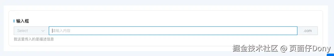
</script>父组件中使用
ts
...

<MyInput
  ref="myInputRef"
  v-model="inputValue"
  label="输入框"
  placeholder="请输入内容"
  desc="我这里传入的是描述信息"
/>

...

const myInputRef = ref();

onMounted(() => {
  myInputRef.value?.focus();
});

...
效果展示
总结
主要是为了展示如何实现下面三点的内容,如果需要实现其他需求,大侠你自己举一反三吧🤗🤗!哈哈...
- 属性透传 :保留并支持
<el-input>的所有原生attributes。 - 插槽透传 :支持
<el-input>的所有插槽slots。 - 事件透传 :支持
<el-input>所有对外抛出的事件。