约束布局基础
现在,我们创建的布局默认就是约束布局。你可以把它看作是一个升级版的相对布局。它不仅能实现 RelativeLayout 的所有功能,还能帮我们轻松实现一些之前需要复杂嵌套才能完成的场景,比如让 View 根据角度定位。
现在,我们就开始约束布局的学习。
定位控件:从约束开始
先打开一个新的布局,添加一个 TextView 控件到布局中:
xml
<?xml version="1.0" encoding="utf-8"?>
<androidx.constraintlayout.widget.ConstraintLayout xmlns:android="http://schemas.android.com/apk/res/android"
    xmlns:app="http://schemas.android.com/apk/res-auto"
    android:layout_width="match_parent"
    android:layout_height="match_parent">

    <TextView
        android:layout_width="150dp"
        android:layout_height="150dp"
        android:background="?attr/colorPrimary" />

</androidx.constraintlayout.widget.ConstraintLayout>我们并没有添加任何约束,此时文字控件会被默认放在布局的左上角。如图:
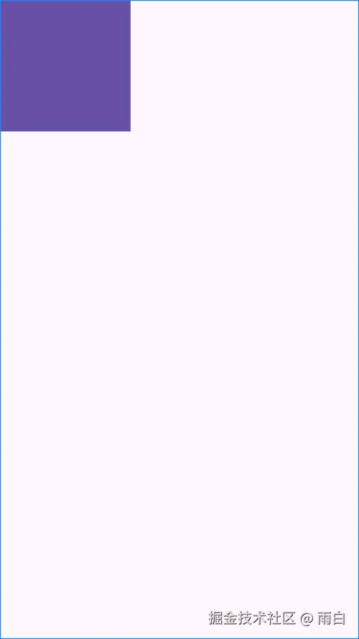
并且你会在 TextView 上看到警告:This view is not constrained. It only has designtime positions, so it will jump to (0,0) at runtime unless you add the constraints。
(这个视图没有约束。它只有设计时的位置,所以除非你添加约束,否则在运行时会跳转到(0,0))
我们尝试给 TextView 控件添加顶部的外边距:
xml
<TextView
    android:layout_width="150dp"
    android:layout_height="150dp"
    android:layout_marginTop="16dp"
    android:background="?attr/colorPrimary" />
但你运行程序会发现此时 android:layout_marginTop 属性并没有生效,这是因为当前控件没有确定垂直方向的位置。在约束布局中,要定位一个控件,通常需要给它添加至少两个约束:一个水平方向的,一个垂直方向的。
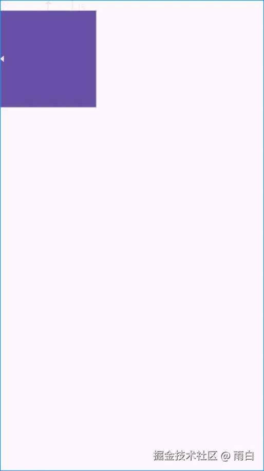
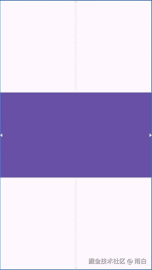
我们来使用约束条件:将 TextView 控件的左侧约束到父容器的左侧,顶部约束到父容器的上侧。
xml
<TextView
    android:id="@+id/text_view_1"
    android:layout_width="150dp"
    android:layout_height="150dp"
    android:layout_marginTop="16dp"
    android:background="?attr/colorPrimary"
    app:layout_constraintStart_toStartOf="parent"
    app:layout_constraintTop_toTopOf="parent" />
这样,控件的位置被确定下来后,外边距就能生效了,TextView 的警告也消失了。可以看到,layout_constraint*_to*of(约束)就像一根根绳子,将一个控件的边"绑"到了另一个控件的边或父容器上,这就是约束的本质。如图:
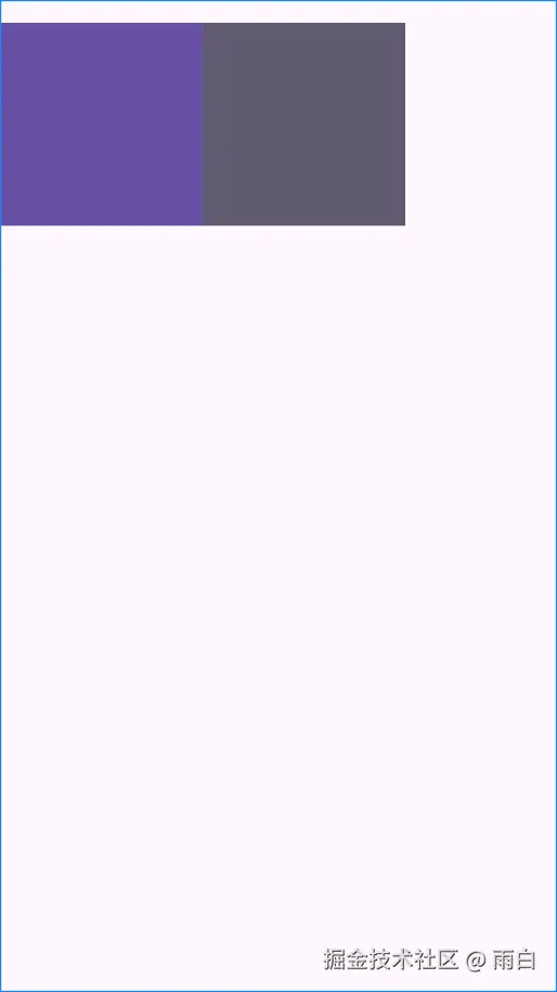
约束条件除了能和父容器 parent 建立外,控件之间也能建立约束。我们往布局中再添加一个 TextView 控件,让它的左侧和顶部约束到第一个 TextView 上,实现水平排列的效果。
xml
<TextView
    android:id="@+id/text_view_1"
    ... />

<TextView
    android:id="@+id/text_view_2"
    android:layout_width="150dp"
    android:layout_height="150dp"
    android:background="?attr/colorAccent"
    app:layout_constraintStart_toEndOf="@id/text_view_1"
    app:layout_constraintTop_toTopOf="@id/text_view_1" />
效果如图:
这样,我们就实现了类似线性布局的水平排列效果。
貌似我们可以使用约束布局替代线性布局?其实没必要,因为对于简单的列表式布局,使用线性布局更直接、性能更好(测量开销小)。而对于复杂的布局,需要嵌套 多层线性布局时,我们就可以通过使用约束布局来提升性能(通过其扁平化的结构,减少测量和布局的传递次数)。
实战:用约束布局替换相对布局
在
ConstraintLayout出现之前,安卓原生有五大布局:分别是线性布局(LinearLayout)、相对布局(RelativeLayout)、帧布局(FrameLayout)、表格布局(TableLayout)和绝对布局(AbsoluteLayout)。其中,表格布局很少会被使用,而绝对布局已经被废弃了。在简单场景下,线性布局和帧布局仍被推荐使用。
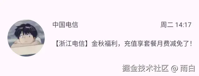
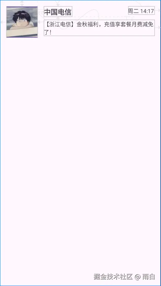
RelativeLayout 相对布局虽然灵活,但使用起来比较复杂,且在复杂场景下性能不如约束布局,已不被 Google 推荐使用。现在,我们就来使用 ConstraintLayout 来实现一个常见的图文混排效果。
代码如下:
xml
<?xml version="1.0" encoding="utf-8"?>
<androidx.constraintlayout.widget.ConstraintLayout xmlns:android="http://schemas.android.com/apk/res/android"
    xmlns:app="http://schemas.android.com/apk/res-auto"
    xmlns:tools="http://schemas.android.com/tools"
    android:layout_width="match_parent"
    android:layout_height="match_parent"
    android:padding="16dp">

    <ImageView
        android:id="@+id/image_avatar"
        android:layout_width="80dp"
        android:layout_height="80dp"
        android:background="?attr/colorPrimary"
        android:src="@drawable/avatar"
        app:layout_constraintStart_toStartOf="parent"
        app:layout_constraintTop_toTopOf="parent" />

    <TextView
        android:id="@+id/text_title"
        android:layout_width="wrap_content"
        android:layout_height="wrap_content"
        android:layout_marginStart="16dp"
        android:text="中国电信"
        android:textSize="18sp"
        android:textStyle="bold"
        app:layout_constraintStart_toEndOf="@id/image_avatar"
        app:layout_constraintTop_toTopOf="@id/image_avatar" />

    <TextView
        android:id="@+id/text_content"
        android:layout_width="0dp"
        android:layout_height="wrap_content"
        android:layout_marginTop="8dp"
        android:text="【浙江电信】金秋福利,充值享套餐月费减免了!"
        app:layout_constraintEnd_toEndOf="parent"
        app:layout_constraintStart_toStartOf="@+id/text_title"
        app:layout_constraintTop_toBottomOf="@+id/text_title" />

    <TextView
        android:id="@+id/text_time"
        android:layout_width="wrap_content"
        android:layout_height="wrap_content"
        android:text="周二 14:17"
        app:layout_constraintEnd_toEndOf="parent"
        app:layout_constraintTop_toTopOf="@+id/text_title" />

</androidx.constraintlayout.widget.ConstraintLayout>
为什么不使用 Left 和 Right,而是要使用 Start 和 End?
这是为了更好地支持 RTL(从右到左)布局。因为有些语言中的文字是从右往左书写的。使用 Start 和 End,系统会自动处理方向,我们就可以不用针对不同语言做布局方向的适配了。
效果如图:
核心优势:减少布局嵌套
轻松实现居中
在约束布局中实现居中特别简单。只需同时给控件在某个方向上(水平/垂直)的两侧都添加约束,该控件就会在该方向上居中。
xml
<?xml version="1.0" encoding="utf-8"?>
<androidx.constraintlayout.widget.ConstraintLayout xmlns:android="http://schemas.android.com/apk/res/android"
    xmlns:app="http://schemas.android.com/apk/res-auto"
    android:layout_width="match_parent"
    android:layout_height="match_parent">

    <ImageView
        android:layout_width="80dp"
        android:layout_height="80dp"
        android:src="?attr/colorPrimary"
        app:layout_constraintBottom_toBottomOf="parent"
        app:layout_constraintEnd_toEndOf="parent"
        app:layout_constraintStart_toStartOf="parent"
        app:layout_constraintTop_toTopOf="parent" />

</androidx.constraintlayout.widget.ConstraintLayout>
你可能会说在 RelativeLayout 中一个 center_in_parent 属性就能实现居中效果,为什么说约束布局优于相对布局呢?
请你接着往下看。
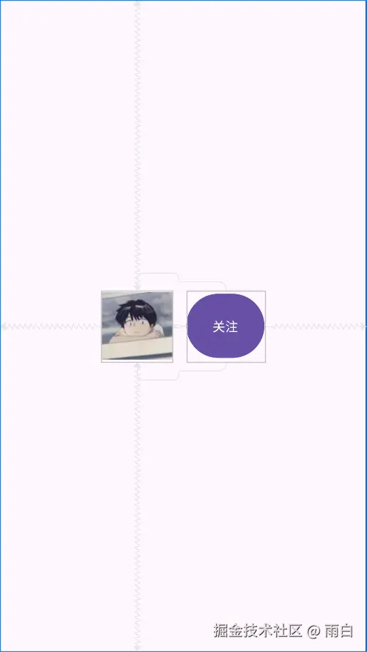
相对控件居中
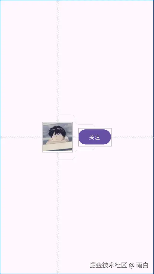
比如,我们要实现"关注"按钮垂直居中于"头像"右侧的效果:
如果使用相对布局,我们可能需要在外部再套上一个布局容器,但这也就多了一层布局嵌套。使用约束布局的话,实现起来非常简单,还不会产生额外的布局嵌套:
xml
<?xml version="1.0" encoding="utf-8"?>
<androidx.constraintlayout.widget.ConstraintLayout xmlns:android="http://schemas.android.com/apk/res/android"
    xmlns:app="http://schemas.android.com/apk/res-auto"
    android:layout_width="match_parent"
    android:layout_height="match_parent"
    android:padding="16dp">

    <ImageView
        android:id="@+id/image_avatar"
        android:layout_width="80dp"
        android:layout_height="80dp"
        android:src="@drawable/avatar"
        app:layout_constraintBottom_toBottomOf="parent"
        app:layout_constraintEnd_toStartOf="@+id/button_follow"
        app:layout_constraintHorizontal_chainStyle="packed"
        app:layout_constraintStart_toStartOf="parent"
        app:layout_constraintTop_toTopOf="parent" />

    <Button
        android:id="@+id/button_follow"
        android:layout_width="wrap_content"
        android:layout_height="wrap_content"
        android:layout_marginStart="16dp"
        android:text="关注"
        app:layout_constraintBottom_toBottomOf="@id/image_avatar"
        app:layout_constraintEnd_toEndOf="parent"
        app:layout_constraintStart_toEndOf="@id/image_avatar"
        app:layout_constraintTop_toTopOf="@id/image_avatar" />

</androidx.constraintlayout.widget.ConstraintLayout>
我们把 Button 的顶部和底部分别约束到了 ImageView 的顶部和底部,它就实现了垂直居中效果。
尺寸跟随约束
现在,如果想让"关注"按钮的高度和"头像"的高度一样高,该怎么完成?
我们只需把按钮的高度设为 0dp 即可。在约束布局中,0dp 专门表示 match_constraint,也就是尺寸铺满约束的可用空间的意思。
xml
<Button
    android:id="@+id/button_follow"
    android:layout_width="wrap_content"
    android:layout_height="0dp"
    android:layout_marginStart="16dp"
    android:text="关注"
    app:layout_constraintBottom_toBottomOf="@id/image_avatar"
    app:layout_constraintEnd_toEndOf="parent"
    app:layout_constraintStart_toEndOf="@id/image_avatar"
    app:layout_constraintTop_toTopOf="@id/image_avatar" />
注意:在约束布局中,使用
match_parent会让控件填满父容器。而0dp是让控件铺满其约束 所定义的空间。如果一个方向上的尺寸为0dp,但在该方向上缺少约束,那么尺寸就是 0,会导致控件看不到。
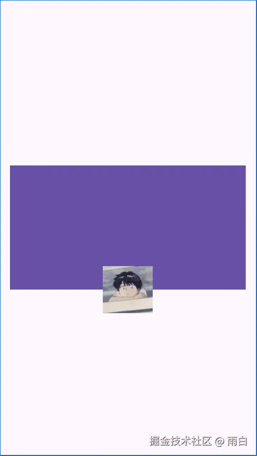
相对控件边缘居中
另一个复杂场景是"头像"相对于"背景图片"的底部居中:
这种效果使用相对布局很难实现。但在约束布局我们只需这样:
xml
<?xml version="1.0" encoding="utf-8"?>
<androidx.constraintlayout.widget.ConstraintLayout xmlns:android="http://schemas.android.com/apk/res/android"
    xmlns:app="http://schemas.android.com/apk/res-auto"
    android:layout_width="match_parent"
    android:layout_height="match_parent">

    <ImageView
        android:id="@+id/image_background"
        android:layout_width="0dp"
        android:layout_height="200dp"
        android:layout_margin="16dp"
        android:background="?attr/colorPrimary"
        app:layout_constraintBottom_toBottomOf="parent"
        app:layout_constraintEnd_toEndOf="parent"
        app:layout_constraintStart_toStartOf="parent"
        app:layout_constraintTop_toTopOf="parent" />

    <ImageView
        android:id="@+id/image_avatar_on_edge"
        android:layout_width="80dp"
        android:layout_height="80dp"
        android:src="@drawable/avatar"
        app:layout_constraintBottom_toBottomOf="@id/image_background"
        app:layout_constraintEnd_toEndOf="@id/image_background"
        app:layout_constraintStart_toStartOf="@id/image_background"
        app:layout_constraintTop_toBottomOf="@id/image_background" />

</androidx.constraintlayout.widget.ConstraintLayout>我们通过让头像的顶部和底部同时 约束到了背景图的底部,巧妙地实现这种半出界式的居中效果(头像的垂直中心点,与背景图的底部边缘对齐)。
实现权重布局
假如,我们要实现三个 View 水平三等分父容器宽度:
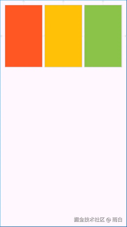
在线性布局中,我们可以通过 layout_weight 属性来实现。在约束布局中,我们也能实现,而且无需进行嵌套。
首先,需要将每个 View 的宽度都设为 0dp(充满约束空间)。然后,为这三个 View 创建一条水平约束链,也就是三个控件之间是互相约束的,并且两端约束到了父容器上。最后,我们只需添加 app:layout_constraintHorizontal_weight 属性即可。
xml
<?xml version="1.0" encoding="utf-8"?>
<androidx.constraintlayout.widget.ConstraintLayout xmlns:android="http://schemas.android.com/apk/res/android"
    xmlns:app="http://schemas.android.com/apk/res-auto"
    android:layout_width="match_parent"
    android:layout_height="match_parent"
    android:padding="16dp">

    <View
        android:id="@+id/view_1"
        android:layout_width="0dp"
        android:layout_height="200dp"
        android:background="#FF5722"
        app:layout_constraintEnd_toStartOf="@id/view_2"
        app:layout_constraintHorizontal_weight="1"
        app:layout_constraintStart_toStartOf="parent"
        app:layout_constraintTop_toTopOf="parent" />

    <View
        android:id="@+id/view_2"
        android:layout_width="0dp"
        android:layout_height="200dp"
        android:layout_marginStart="8dp"
        android:background="#FFC107"
        app:layout_constraintEnd_toStartOf="@+id/view_3"
        app:layout_constraintHorizontal_weight="1"
        app:layout_constraintStart_toEndOf="@+id/view_1"
        app:layout_constraintTop_toTopOf="parent" />

    <View
        android:id="@+id/view_3"
        android:layout_width="0dp"
        android:layout_height="200dp"
        android:layout_marginStart="8dp"
        android:background="#8BC34A"
        app:layout_constraintEnd_toEndOf="parent"
        app:layout_constraintHorizontal_weight="1"
        app:layout_constraintStart_toEndOf="@id/view_2"
        app:layout_constraintTop_toTopOf="parent" />

</androidx.constraintlayout.widget.ConstraintLayout>
注意:约束布局相对线性布局来说:可同时设置垂直、水平方向上的权重,而且权重设置只有在对应方向上的高/宽度值为
0dp时才会生效。
核心功能与辅助控件
了解了基础布局和核心优势后,我们来看看 ConstraintLayout 提供的、能轻松实现复杂布局的强大功能和辅助工具。
尺寸和比例控制
宽高比约束 (DimensionRatio)
如果我们需要让一个控件保持固定的宽高比(例如,一个 16:9 的视频播放器),可以使用 layout_constraintDimensionRatio 属性。要让这个属性生效,必须将控件的宽或高中的一个值设为 0dp,让系统根据另一边和比例来计算。
xml
<?xml version="1.0" encoding="utf-8"?>
<androidx.constraintlayout.widget.ConstraintLayout xmlns:android="http://schemas.android.com/apk/res/android"
    xmlns:app="http://schemas.android.com/apk/res-auto"
    android:layout_width="match_parent"
    android:layout_height="match_parent">

    <ImageView
        android:layout_width="200dp"
        android:layout_height="0dp"
        android:src="?attr/colorPrimary"
        app:layout_constraintBottom_toBottomOf="parent"
        app:layout_constraintDimensionRatio="16:9"
        app:layout_constraintEnd_toEndOf="parent"
        app:layout_constraintStart_toStartOf="parent"
        app:layout_constraintTop_toTopOf="parent" />

</androidx.constraintlayout.widget.ConstraintLayout>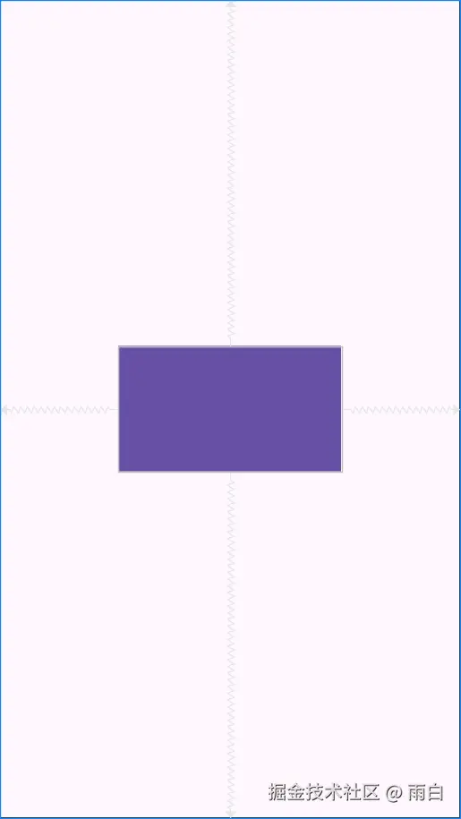
如果宽和高都设为了 0dp,那么控件会尝试填满所有约束。此时,我们需要使用前缀 W, 或 H, 来指定基于哪一条边计算比例。
例如,H,16:9 表示宽度填满约束,高度根据当前宽度和 16:9 的比例动态计算。
xml
<ImageView
    android:layout_width="0dp"
    android:layout_height="0dp"
    app:layout_constraintDimensionRatio="H,16:9"
    ... />
百分比尺寸 (Percent Dimensions)
我们也可以直接指定一个控件的宽度或高度为其父容器尺寸的百分比。同样地,对应方向上的尺寸必须设为 0dp。
xml
<?xml version="1.0" encoding="utf-8"?>
<androidx.constraintlayout.widget.ConstraintLayout xmlns:android="http://schemas.android.com/apk/res/android"
xmlns:app="http://schemas.android.com/apk/res-auto"
android:layout_width="match_parent"
android:layout_height="match_parent"
android:padding="16dp">
<View
android:layout_width="0dp"
android:layout_height="200dp"
android:background="?attr/colorPrimary"
app:layout_constraintStart_toStartOf="parent"
app:layout_constraintTop_toTopOf="parent"
app:layout_constraintWidth_percent="0.7" />
</androidx.constraintlayout.widget.ConstraintLayout>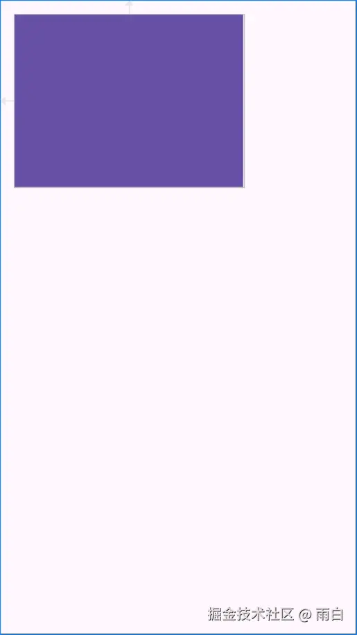 注意:虽然百分比布局可用于实现屏幕适配,但它会让控件尺寸与父容器强行绑定在一起,灵活性略差。在约束布局中,使用
 Guideline 来创建百分比网格,是一种更强大、更灵活的方式。
定位与分布
文字基线对齐 (Baseline Alignment)
当两个大小不同的 TextView 控件需要实现文字底部对齐时,就需要用到 layout_constraintBaseline_toBaselineOf 属性。
xml
<?xml version="1.0" encoding="utf-8"?>
<androidx.constraintlayout.widget.ConstraintLayout xmlns:android="http://schemas.android.com/apk/res/android"
    xmlns:app="http://schemas.android.com/apk/res-auto"
    android:layout_width="match_parent"
    android:layout_height="match_parent"
    android:padding="16dp">

    <TextView
        android:id="@+id/text_large"
        android:layout_width="wrap_content"
        android:layout_height="wrap_content"
        android:text="99"
        android:textSize="128sp"
        app:layout_constraintEnd_toStartOf="@id/text_small"
        app:layout_constraintHorizontal_chainStyle="packed"
        app:layout_constraintStart_toStartOf="parent"
        app:layout_constraintTop_toTopOf="parent" />

    <TextView
        android:id="@+id/text_small"
        android:layout_width="wrap_content"
        android:layout_height="wrap_content"
        android:text="%"
        android:textSize="24sp"
        app:layout_constraintBaseline_toBaselineOf="@id/text_large"
        app:layout_constraintEnd_toEndOf="parent"
        app:layout_constraintStart_toEndOf="@id/text_large" />

</androidx.constraintlayout.widget.ConstraintLayout>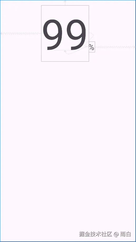
角度定位 (Circular Positioning)
ConstraintLayout 支持通过角度和距离来定位,它的定位只需指定圆心 、半径 和角度。
xml
<?xml version="1.0" encoding="utf-8"?>
<androidx.constraintlayout.widget.ConstraintLayout xmlns:android="http://schemas.android.com/apk/res/android"
    xmlns:app="http://schemas.android.com/apk/res-auto"
    xmlns:tools="http://schemas.android.com/tools"
    android:layout_width="match_parent"
    android:layout_height="match_parent">

    <View
        android:id="@+id/view_center"
        android:layout_width="50dp"
        android:layout_height="50dp"
        android:background="?attr/colorPrimary"
        app:layout_constraintBottom_toBottomOf="parent"
        app:layout_constraintEnd_toEndOf="parent"
        app:layout_constraintStart_toStartOf="parent"
        app:layout_constraintTop_toTopOf="parent" />

    <Button
        android:id="@+id/view_satellite"
        android:layout_width="wrap_content"
        android:layout_height="wrap_content"
        android:text="45°"
        app:layout_constraintCircle="@id/view_center"
        app:layout_constraintCircleAngle="45"
        app:layout_constraintCircleRadius="150dp"
        tools:ignore="MissingConstraints" />

</androidx.constraintlayout.widget.ConstraintLayout>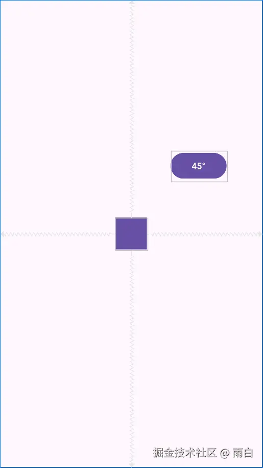
需要注意一点,角度是从正上方(0 度)开始顺时针计算的。
约束宽度和偏移 (Constrained Width & Bias)
一个常见的场景:一个 TextView 的宽度是 wrap_content,它可能会因为文字过长而超出边界。
xml
<?xml version="1.0" encoding="utf-8"?>
<androidx.constraintlayout.widget.ConstraintLayout xmlns:android="http://schemas.android.com/apk/res/android"
    xmlns:app="http://schemas.android.com/apk/res-auto"
    android:layout_width="match_parent"
    android:layout_height="match_parent"
    android:padding="16dp">

    <ImageView
        android:id="@+id/image_avatar"
        android:layout_width="wrap_content"
        android:layout_height="wrap_content"
        android:src="@mipmap/ic_launcher_round"
        app:layout_constraintStart_toStartOf="parent"
        app:layout_constraintTop_toTopOf="parent" />

    <TextView
        android:id="@+id/text_title"
        android:layout_width="wrap_content"
        android:layout_height="wrap_content"
        android:layout_marginStart="8dp"
        android:background="?attr/colorPrimary"
        android:text="这是一个非常非常长的标题,用于测试 constrainedWidth 的效果"
        android:textColor="@android:color/white"
        app:layout_constraintEnd_toEndOf="parent"
        app:layout_constraintStart_toEndOf="@id/image_avatar"
        app:layout_constraintTop_toTopOf="@id/image_avatar" />

</androidx.constraintlayout.widget.ConstraintLayout>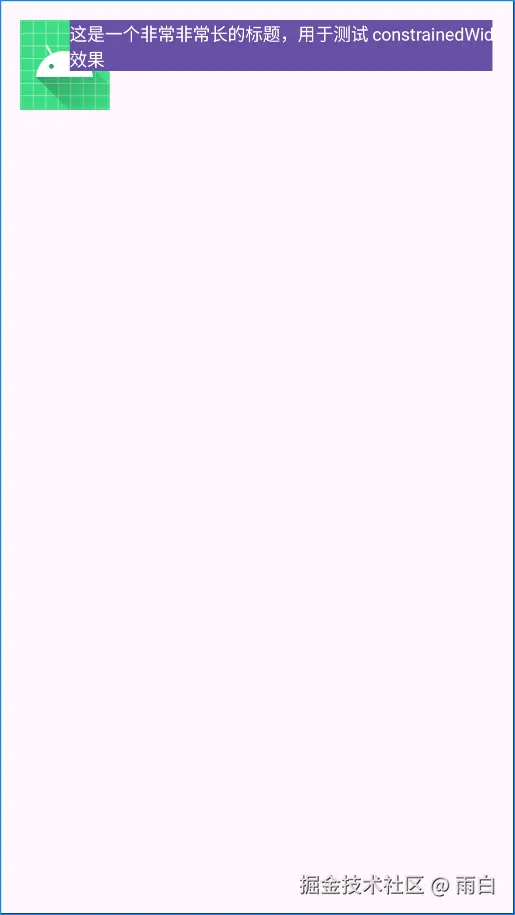
我们可以使用 app:layout_constrainedWidth="true" 来解决这个问题,使控件的宽度不会超过其宽度约束。
xml
<TextView
    android:id="@+id/text_title"
    ...
    app:layout_constrainedWidth="true" ... />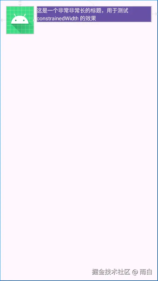
这确保了即使文本很长,它也会在这个约束空间内自动换行,不会超出范围。
但当文字过短时,它又会默认居中。
xml
<TextView
    android:id="@+id/text_title"
    ...
    android:text="短标题" ... />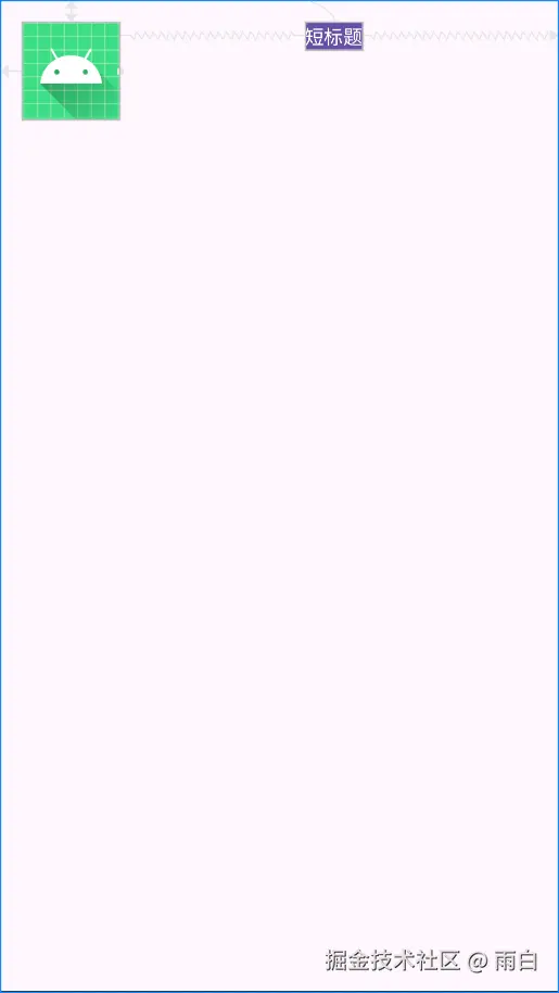
这时,我们可以使用 bias (偏移) 属性控制其位置。
xml
<TextView
    android:id="@+id/text_title"
    ...
    app:layout_constraintHorizontal_bias="0" ... />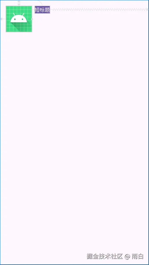
这确保了即使文本很短,会向左对齐,而不是在约束空间中居中。
bias属性的取值范围是 0 到 1,0 表示偏向约束范围的最左/上侧,1 表示偏向约束范围的最右/下侧,0.5 则表示居中,这也是默认值。
约束链的风格 (Chain Style)
当多个控件在同一方向上互相约束时,它们就会形成一条约束链。其实,我们可以通过 layout_constraintVertical_chainStyle 或 layout_constraintHorizontal_chainStyle 属性设置不同的风格,来控制约束链上元素的分布方式。
xml
<?xml version="1.0" encoding="utf-8"?>
<androidx.constraintlayout.widget.ConstraintLayout xmlns:android="http://schemas.android.com/apk/res/android"
    xmlns:app="http://schemas.android.com/apk/res-auto"
    android:layout_width="match_parent"
    android:layout_height="match_parent"
    android:padding="16dp">

    <!--默认风格为 spread 扩散-->
    <View
        android:id="@+id/view_1"
        android:layout_width="60dp"
        android:layout_height="60dp"
        android:background="#FF5722"
        app:layout_constraintEnd_toStartOf="@id/view_2"
        app:layout_constraintHorizontal_chainStyle="spread"
        app:layout_constraintStart_toStartOf="parent"
        app:layout_constraintTop_toTopOf="parent" />

    <View
        android:id="@+id/view_2"
        android:layout_width="60dp"
        android:layout_height="60dp"
        android:background="#FFC107"
        app:layout_constraintEnd_toStartOf="@+id/view_3"
        app:layout_constraintStart_toEndOf="@+id/view_1"
        app:layout_constraintTop_toTopOf="parent" />

    <View
        android:id="@+id/view_3"
        android:layout_width="60dp"
        android:layout_height="60dp"
        android:background="#8BC34A"
        app:layout_constraintEnd_toEndOf="parent"
        app:layout_constraintStart_toEndOf="@id/view_2"
        app:layout_constraintTop_toTopOf="parent" />
</androidx.constraintlayout.widget.ConstraintLayout>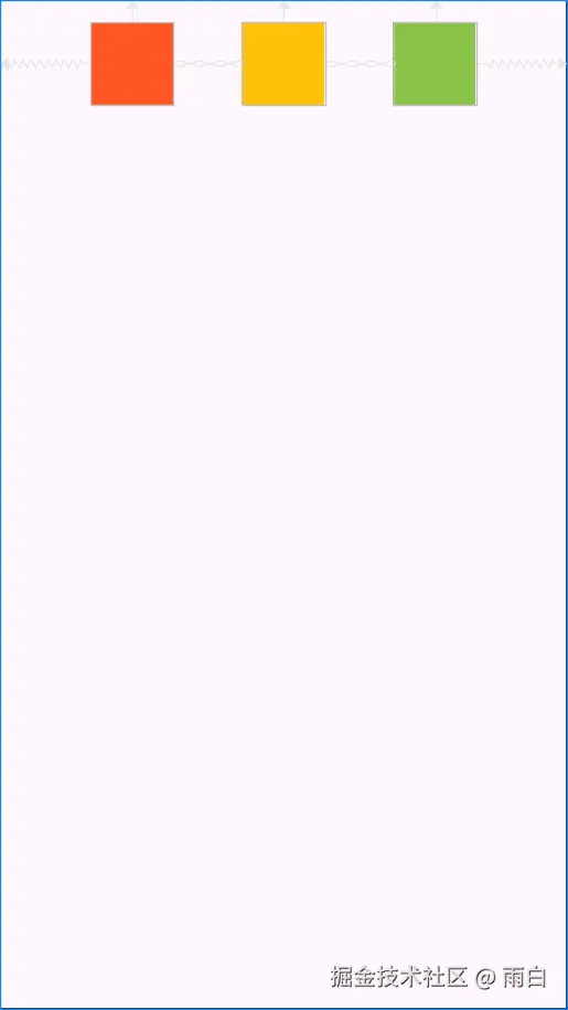
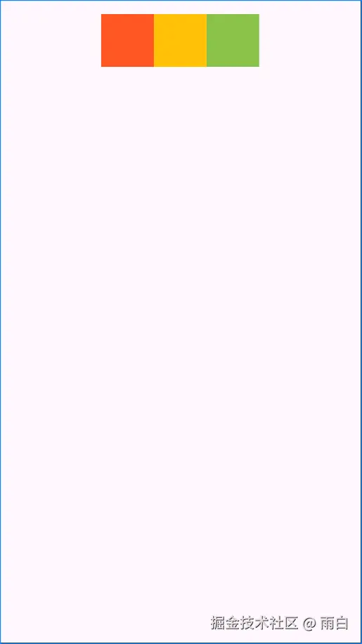
如果我们想让元素们作为一个整体居中,可以将约束链的风格设为 packed(打包)。
当约束链风格为
packed时,我们还可以为约束链的第一个控件指定bias属性(如app:layout_constraintVertical_bias="0.3"),来实现整体偏移,而不是完全居中。
xml
<View
    android:id="@+id/view_1"
    ...
    app:layout_constraintHorizontal_chainStyle="packed"
    ... />
如果想让两端的元素靠边,中间的元素平分剩余空间,可以使用 spread_inside (内部扩散)风格。
xml
<View
android:id="@+id/view_1"
...
app:layout_constraintHorizontal_chainStyle="spread_inside"
... />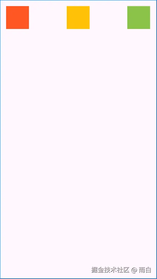 注意:约束链风格需要写在约束链的第一个控件上(链头)才会生效。
消失边距 (goneMargin)
当一个 View 的约束目标的 visibility (可见性)变为 gone 时,布局会发生变化。
xml
<?xml version="1.0" encoding="utf-8"?>
<androidx.constraintlayout.widget.ConstraintLayout xmlns:android="http://schemas.android.com/apk/res/android"
    xmlns:app="http://schemas.android.com/apk/res-auto"
    android:layout_width="match_parent"
    android:layout_height="match_parent">

    <TextView
        android:id="@+id/text_optional"
        android:layout_width="wrap_content"
        android:layout_height="wrap_content"
        android:background="?attr/colorPrimary"
        android:text="我是可隐藏文本"
        android:textColor="@android:color/white"
        android:textSize="20sp"
        android:visibility="visible"
        app:layout_constraintStart_toStartOf="parent"
        app:layout_constraintTop_toTopOf="parent" />

    <ImageView
        android:id="@+id/icon"
        android:layout_width="40dp"
        android:layout_height="40dp"
        android:src="@mipmap/ic_launcher_round"
        app:layout_constraintStart_toEndOf="@id/text_optional"
        app:layout_constraintTop_toTopOf="@id/text_optional" />

</androidx.constraintlayout.widget.ConstraintLayout>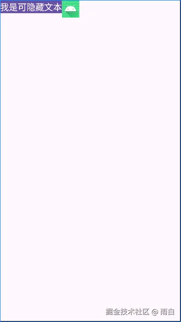
将 text_optional 隐藏(android:visibility="gone"),icon 会紧贴父布局的左侧。
而这种变化通常不是我们想要的,我们希望 text_optional 隐藏后,icon 能与父布局左侧有一个间距。为此,我们可以使用 layout_goneMarginStart 属性。
xml
<ImageView
    android:id="@+id/icon"
    ...
    app:layout_goneMarginStart="16dp" />
当然,ConstraintLayout 提供了一整套 goneMargin 属性,包括 layout_goneMarginStart、layout_goneMarginEnd、layout_goneMarginTop、layout_goneMarginBottom。
辅助工具
ConstraintLayout 提供了一系列本身不可见、不参与布局测量,能够简化复杂布局的辅助控件。在不增加布局嵌套层级的情况下,能够实现过去需要多层嵌套才能完成的效果。
Guideline:创建对齐辅助线
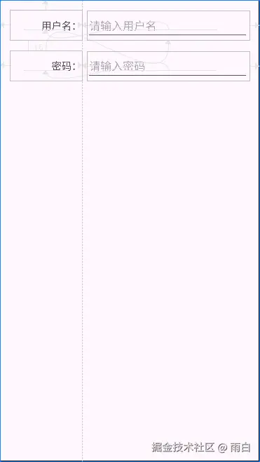
在开发中,我们经常需要让多个控件的边缘或中心线对齐,尤其是在构建类似表单的界面时。
例如,对于下面这个登录布局,我们要求"用户名"和"密码"这两个 TextView 的右侧需要严格对齐。
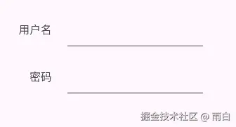
之前,你可能会使用一个线性布局包裹这两个控件,然后让里面的控件居右。但这也会多一层嵌套层级。在约束布局中,我们可以加上一个不可见的垂直 辅助线(Guideline)来完成。
Guideline 就像在布局中画了一条看不见的线,其它控件可以相对这条线进行约束。
xml
<?xml version="1.0" encoding="utf-8"?>
<androidx.constraintlayout.widget.ConstraintLayout xmlns:android="http://schemas.android.com/apk/res/android"
    xmlns:app="http://schemas.android.com/apk/res-auto"
    android:layout_width="match_parent"
    android:layout_height="match_parent"
    android:padding="16dp">

    <androidx.constraintlayout.widget.Guideline
        android:id="@+id/guideline_vertical"
        android:layout_width="wrap_content"
        android:layout_height="wrap_content"
        android:orientation="vertical"
        app:layout_constraintGuide_percent="0.3" />

    <TextView
        android:id="@+id/text_username_label"
        android:layout_width="0dp"
        android:layout_height="wrap_content"
        android:gravity="end|center_vertical"
        android:minHeight="48dp"
        android:text="用户名:"
        android:textSize="16sp"
        app:layout_constraintEnd_toStartOf="@id/guideline_vertical"
        app:layout_constraintStart_toStartOf="parent"
        app:layout_constraintTop_toTopOf="parent" />

    <EditText
        android:id="@+id/edit_username"
        android:layout_width="0dp"
        android:layout_height="wrap_content"
        android:layout_marginStart="8dp"
        android:hint="请输入用户名"
        app:layout_constraintBaseline_toBaselineOf="@id/text_username_label"
        app:layout_constraintEnd_toEndOf="parent"
        app:layout_constraintStart_toEndOf="@id/guideline_vertical" />

    <TextView
        android:id="@+id/text_password_label"
        android:layout_width="0dp"
        android:layout_height="wrap_content"
        android:layout_marginTop="16dp"
        android:gravity="end|center_vertical"
        android:minHeight="48dp"
        android:text="密码:"
        android:textSize="16sp"
        app:layout_constraintEnd_toStartOf="@id/guideline_vertical"
        app:layout_constraintStart_toStartOf="parent"
        app:layout_constraintTop_toBottomOf="@id/edit_username" />

    <EditText
        android:id="@+id/edit_password"
        android:layout_width="0dp"
        android:layout_height="wrap_content"
        android:layout_marginStart="8dp"
        android:hint="请输入密码"
        android:inputType="textPassword"
        app:layout_constraintBaseline_toBaselineOf="@id/text_password_label"
        app:layout_constraintEnd_toEndOf="parent"
        app:layout_constraintStart_toEndOf="@id/guideline_vertical" />

</androidx.constraintlayout.widget.ConstraintLayout>
我们将辅助线放在了父容器宽度 30% 的地方,然后让两个 TextView 的结束边都约束到这条线上,这就实现了对齐,我们并没有嵌套。
 当然辅助线的位置也可以通过
 layout_constraintGuide_begin 或 layout_constraintGuide_end 属性来设置距离父容器边缘的固定距离。
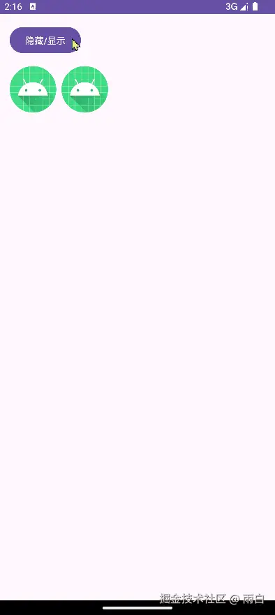
Group:统一管理控件可见性
如果我们需要同时显示或隐藏多个控件,之前我们可能会使用一个布局包裹这些控件,然后控制该布局的显隐即可。但这也会增加布局嵌套。
在约束布局中,所有控件都在一个层级中。那么我们需要找到每一个控件,然后逐个设置 visibility 吗?我们当然不会这么做,我们可以使用 Group 控件来完成。
Group 会引用一组控件的 id,然后代理它们的 visibility 属性。
xml
<?xml version="1.0" encoding="utf-8"?>
<androidx.constraintlayout.widget.ConstraintLayout xmlns:android="http://schemas.android.com/apk/res/android"
    xmlns:app="http://schemas.android.com/apk/res-auto"
    android:layout_width="match_parent"
    android:layout_height="match_parent"
    android:padding="16dp">

    <Button
        android:id="@+id/button_toggle"
        android:layout_width="wrap_content"
        android:layout_height="wrap_content"
        android:text="隐藏/显示"
        app:layout_constraintStart_toStartOf="parent"
        app:layout_constraintTop_toTopOf="parent" />

    <ImageView
        android:id="@+id/image_1"
        android:layout_width="wrap_content"
        android:layout_height="wrap_content"
        android:layout_marginTop="16dp"
        android:src="@mipmap/ic_launcher"
        app:layout_constraintStart_toStartOf="parent"
        app:layout_constraintTop_toBottomOf="@id/button_toggle" />

    <ImageView
        android:id="@+id/image_2"
        android:layout_width="wrap_content"
        android:layout_height="wrap_content"
        android:layout_marginStart="8dp"
        android:src="@mipmap/ic_launcher_round"
        app:layout_constraintStart_toEndOf="@id/image_1"
        app:layout_constraintTop_toTopOf="@id/image_1" />

    <androidx.constraintlayout.widget.Group
        android:id="@+id/group_images"
        android:layout_width="wrap_content"
        android:layout_height="wrap_content"
        android:visibility="visible"
        app:constraint_referenced_ids="image_1,image_2" />

</androidx.constraintlayout.widget.ConstraintLayout>
我们通过 app:constraint_referenced_ids 属性将两个 ImageView 交由 group 管理。现在,我们只需在代码中控制 group 的可见性即可:
java
// 在 onCreate() 方法中
Group group = findViewById(R.id.group);
findViewById(R.id.button_toggle).setOnClickListener(v ->
    if (group.getVisibility() == View.VISIBLE) {
        group.setVisibility(View.GONE);
    } else {
        group.setVisibility(View.VISIBLE);
    }
);
这样,只要点击按钮,就能让 group 引用的所有控件同时隐藏或显示。
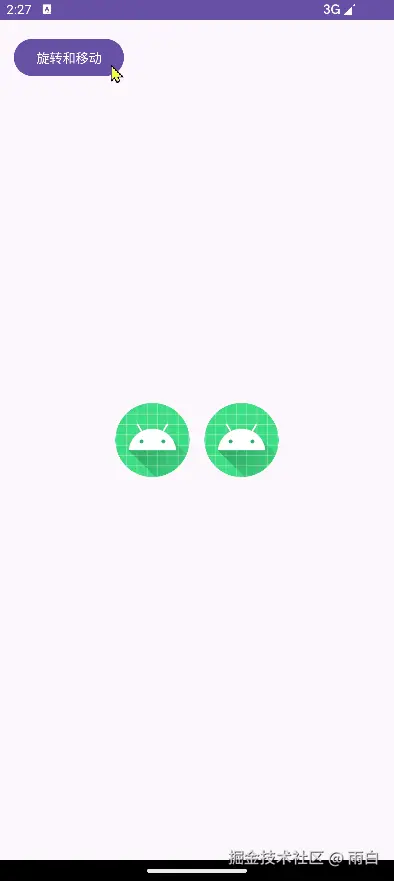
Layer:对控件组进行变换
Group 解决了统一控制显隐的问题,但如果我们想对一组控件进行整体的动画变换 (如旋转、平移、缩放),Group 就做不到了。之前我们引入一个父 ViewGroup,然后对这个父容器做动画,但这也会增加嵌套。
为此,我们可以使用 Layer(图层)。它和 Group 一样,也是通过 id 引用一组控件。这组控件像是被放在了一个透明图层上,我们可以对这个图层进行变换,从而影响到所有控件的渲染效果,但控件本身的布局属性不会改变。
xml
<?xml version="1.0" encoding="utf-8"?>
<androidx.constraintlayout.widget.ConstraintLayout xmlns:android="http://schemas.android.com/apk/res/android"
    xmlns:app="http://schemas.android.com/apk/res-auto"
    xmlns:tools="http://schemas.android.com/tools"
    android:layout_width="match_parent"
    android:layout_height="match_parent"
    android:padding="16dp">

    <Button
        android:id="@+id/button_animate"
        android:layout_width="wrap_content"
        android:layout_height="wrap_content"
        android:text="旋转和移动"
        app:layout_constraintStart_toStartOf="parent"
        app:layout_constraintTop_toTopOf="parent" />

    <ImageView
        android:id="@+id/image1"
        android:layout_width="80dp"
        android:layout_height="80dp"
        android:src="@mipmap/ic_launcher"
        app:layout_constraintBottom_toBottomOf="parent"
        app:layout_constraintEnd_toStartOf="@id/image2"
        app:layout_constraintStart_toStartOf="parent"
        app:layout_constraintTop_toTopOf="parent" />

    <ImageView
        android:id="@+id/image2"
        android:layout_width="80dp"
        android:layout_height="80dp"
        android:layout_marginStart="16dp"
        android:src="@mipmap/ic_launcher_round"
        app:layout_constraintEnd_toEndOf="parent"
        app:layout_constraintStart_toEndOf="@id/image1"
        app:layout_constraintTop_toTopOf="@id/image1" />

    <androidx.constraintlayout.helper.widget.Layer
        android:id="@+id/layer"
        android:layout_width="wrap_content"
        android:layout_height="wrap_content"
        app:constraint_referenced_ids="image1,image2"
        tools:ignore="MissingConstraints" />

</androidx.constraintlayout.widget.ConstraintLayout>
在代码中,获取 Layer 实例,并调用它的变换方法:
java
// MainActivity.kt
Layer layer = findViewById(R.id.layer);
Button button = findViewById(R.id.button_animate);

button.setOnClickListener(v -> {
    // 对 Layer 进行变换
    layer.setRotation(45f);
    layer.setTranslationX(160f);
    layer.setTranslationY(160f);
    layer.setScaleX(1.25f);
    layer.setScaleY(1.25f);
});点击按钮后,image1 和 image2 会作为一个整体,围绕它们的中心点进行旋转、缩放,并一起平移。
Barrier:创建响应式对齐边界
Guideline 创建的是固定位置的对齐线,但很多时候,我们需要"动态的"对齐线。例如,我们希望 ImageView 始终位于两个 TextView 中更宽的那个的右侧。
如果只是让 ImageView 简单约束到其中一个 TextView 的右侧,那么当另一个 TextView 更长时,会导致 ImageView 遮挡 TextView。
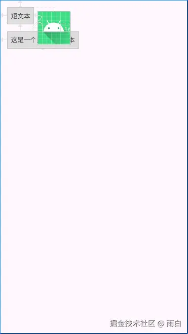
之前我们可能会使用线性布局包裹两个 TextView,将布局的宽度设为自适应,然后让 ImageView 约束到这个线性布局的右侧。可这也会增加嵌套,在约束布局中,我们可以使用 Barrier(屏障)来解决这个问题。
xml
<?xml version="1.0" encoding="utf-8"?>
<androidx.constraintlayout.widget.ConstraintLayout xmlns:android="http://schemas.android.com/apk/res/android"
    xmlns:app="http://schemas.android.com/apk/res-auto"
    android:layout_width="match_parent"
    android:layout_height="match_parent"
    android:padding="16dp">

    <TextView
        android:id="@+id/text_1"
        android:layout_width="wrap_content"
        android:layout_height="wrap_content"
        android:background="#ddd"
        android:padding="8dp"
        android:text="短文本"
        app:layout_constraintStart_toStartOf="parent"
        app:layout_constraintTop_toTopOf="parent" />

    <TextView
        android:id="@+id/text_2"
        android:layout_width="wrap_content"
        android:layout_height="wrap_content"
        android:layout_marginTop="16dp"
        android:background="#ddd"
        android:padding="8dp"
        android:text="这是一个比较长的文本"
        app:layout_constraintStart_toStartOf="parent"
        app:layout_constraintTop_toBottomOf="@id/text_1" />

    <androidx.constraintlayout.widget.Barrier
        android:id="@+id/barrier_end"
        android:layout_width="wrap_content"
        android:layout_height="wrap_content"
        app:barrierDirection="end"
        app:constraint_referenced_ids="text_1,text_2" />

    <ImageView
        android:id="@+id/image_icon"
        android:layout_width="wrap_content"
        android:layout_height="wrap_content"
        android:layout_marginStart="8dp"
        android:src="@mipmap/ic_launcher_round"
        app:layout_constraintBottom_toBottomOf="@id/text_2"
        app:layout_constraintStart_toEndOf="@id/barrier_end"
        app:layout_constraintTop_toTopOf="@id/text_1" />

    </androidx.constraintlayout.widget.ConstraintLayout>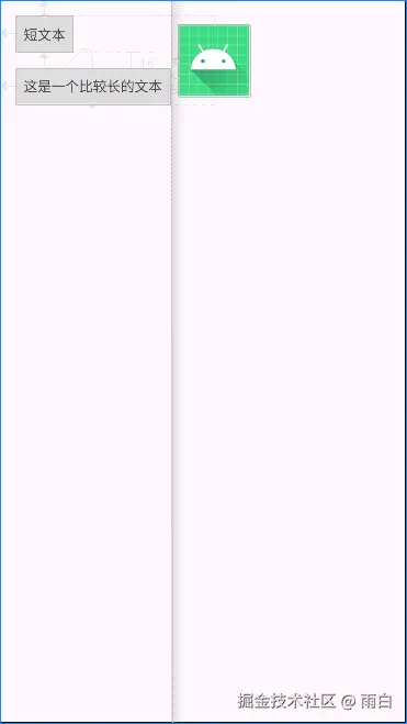
我们设置了 app:barrierDirection="end",这样 Barrier 会自动到它所引用的 text_1 和 text_2 的最右侧。这样,不管 TextView 的文字内容如何变化,Barrier 都会自动调整位置,ImageView 也会随之移动,保证永远不会重叠。
注意:如果使用了 ProGuard/R8 等代码混淆工具,
constraint_referenced_ids这种引用方式可能会因为资源 id 名称的改变而失效,所以要注意混淆规则的配置。
Placeholder:动态内容占位符
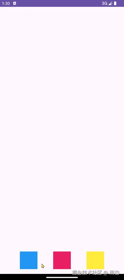
Placeholder(占位符)可创建一个"卡槽",在运行时,我们可以动态地将任意一个控件以动画的形式移动到这个"卡槽"的位置和大小。
xml
<?xml version="1.0" encoding="utf-8"?>
<androidx.constraintlayout.widget.ConstraintLayout xmlns:android="http://schemas.android.com/apk/res/android"
    xmlns:app="http://schemas.android.com/apk/res-auto"
    xmlns:tools="http://schemas.android.com/tools"
    android:layout_width="match_parent"
    android:layout_height="match_parent"
    android:padding="16dp">

    <androidx.constraintlayout.widget.Placeholder
        android:id="@+id/placeholder_top"
        android:layout_width="100dp"
        android:layout_height="100dp"
        app:layout_constraintEnd_toEndOf="parent"
        app:layout_constraintStart_toStartOf="parent"
        app:layout_constraintTop_toTopOf="parent" />

    <View
        android:id="@+id/view_blue"
        android:layout_width="60dp"
        android:layout_height="60dp"
        android:background="#2196F3"
        android:onClick="onColorBlockClicked"
        app:layout_constraintBottom_toBottomOf="parent"
        app:layout_constraintEnd_toStartOf="@+id/view_pink"
        app:layout_constraintStart_toStartOf="parent" />

    <View
        android:id="@+id/view_pink"
        android:layout_width="60dp"
        android:layout_height="60dp"
        android:background="#E91E63"
        android:onClick="onColorBlockClicked"
        app:layout_constraintBottom_toBottomOf="parent"
        app:layout_constraintEnd_toStartOf="@+id/view_yellow"
        app:layout_constraintStart_toEndOf="@+id/view_blue" />

    <View
        android:id="@+id/view_yellow"
        android:layout_width="60dp"
        android:layout_height="60dp"
        android:background="#FFEB3B"
        android:onClick="onColorBlockClicked"
        app:layout_constraintBottom_toBottomOf="parent"
        app:layout_constraintEnd_toEndOf="parent"
        app:layout_constraintStart_toEndOf="@+id/view_pink" />

</androidx.constraintlayout.widget.ConstraintLayout>
在 Activity 中,设置点击事件的处理方法:
java
public class MainActivity extends AppCompatActivity {

    private Placeholder placeholder;

    @Override
    protected void onCreate(Bundle savedInstanceState) {
        super.onCreate(savedInstanceState);
        setContentView(R.layout.activity_main);
        placeholder = findViewById(R.id.placeholder_top);
    }

    // 在 XML 文件中通过 android:onClick 属性指定的方法
    public void onColorBlockClicked(View view) {
        // 让动画更平滑
        TransitionManager.beginDelayedTransition((ViewGroup) view.getParent());

        // 让 Placeholder 的内容变为被点击的 View
        placeholder.setContentId(view.getId());
    }
}
点击任何一个方块,它都会平滑地移动到 Placeholder 的位置。
代码方式修改布局:ConstraintSet
有时候,我们需要在代码中动态改变一个控件的位置或尺寸。之前,我们通常需要获取控件的 LayoutParams,将其强转为 RelativeLayout.LayoutParams 或 LinearLayout.LayoutParams 等,然后修改其中的规则,这样很麻烦还容易出错。
在约束布局中,我们可以通过 ConstraintSet 工具类来完成。它是布局中所有约束的一份拷贝,我们可以创建或修改这份拷贝,然后再一次性应用到布局中。
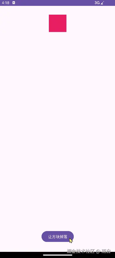
例如,我们来实现点击一个按钮,让顶部的方块掉到底部。
布局如下:
xml
<?xml version="1.0" encoding="utf-8"?>
<androidx.constraintlayout.widget.ConstraintLayout xmlns:android="http://schemas.android.com/apk/res/android"
    xmlns:app="http://schemas.android.com/apk/res-auto"
    xmlns:tools="http://schemas.android.com/tools"
    android:id="@+id/root_layout"
    android:layout_width="match_parent"
    android:layout_height="match_parent">

    <View
        android:id="@+id/view_target"
        android:layout_width="64dp"
        android:layout_height="64dp"
        android:layout_marginTop="32dp"
        android:background="#E91E63"
        app:layout_constraintEnd_toEndOf="parent"
        app:layout_constraintStart_toStartOf="parent"
        app:layout_constraintTop_toTopOf="parent" />

    <Button
        android:id="@+id/button_trigger"
        android:layout_width="wrap_content"
        android:layout_height="wrap_content"
        android:layout_marginBottom="32dp"
        android:text="让方块掉落"
        app:layout_constraintBottom_toBottomOf="parent"
        app:layout_constraintEnd_toEndOf="parent"
        app:layout_constraintStart_toStartOf="parent" />

</androidx.constraintlayout.widget.ConstraintLayout>
在 Activity 中,我们为按钮设置点击事件,并在其中通过 ConstraintSet 修改 view_target 的约束。
java
// MainActivity.java
public class MainActivity extends AppCompatActivity {
    @Override
    protected void onCreate(Bundle savedInstanceState) {
        super.onCreate(savedInstanceState);
        setContentView(R.layout.activity_main);

        ConstraintLayout rootLayout = findViewById(R.id.root_layout);
        View targetView = findViewById(R.id.view_target);
        Button triggerButton = findViewById(R.id.button_trigger);

        triggerButton.setOnClickListener(v -> {
            // 让动画更平滑
            TransitionManager.beginDelayedTransition(rootLayout);

            // 创建新的 ConstraintSet 对象
            ConstraintSet constraintSet = new ConstraintSet();

            // 复制当前布局的约束
            constraintSet.clone(rootLayout);

            // 修改约束规则
            // 清除顶部约束
            constraintSet.clear(targetView.getId(), ConstraintSet.TOP);
            // 将按钮的底部连接到父容器的底部
            constraintSet.connect(
                    targetView.getId(), // 要修改的控件 id
                    ConstraintSet.BOTTOM, // 要修改的边
                    ConstraintSet.PARENT_ID, // 目标控件id,PARENT_ID 表示父容器
                    ConstraintSet.BOTTOM, // 目标的边
                    16 // 边距(dp)
            );

            // 将修改后的约束应用回布局中
            constraintSet.applyTo(rootLayout);
        });
    }
}
Flow:实现虚拟流式布局
我们已经知道了如何通过代码来动态建立约束,因此我们也可以通过一个自定义的帮助类来对引用的 View 批量建立约束,从而影响布局,实现类似 LinearLayout 的效果。
首先,定义一个名为 Linear 的帮助类,继承自 ConstraintHelper。它会将它引用的所有控件,垂直排列起来。
java
public class Linear extends ConstraintHelper {
    public Linear(Context context, AttributeSet attrs) {
        super(context, attrs);
    }

    @Override
    public void updatePreLayout(ConstraintLayout container) {
        super.updatePreLayout(container);
        // updatePreLayout 方法会在系统执行约束计算之前调用,我们在这里修改约束

        int[] ids = getReferencedIds();
        if (ids.length <= 1) {
            return;
        }

        ConstraintSet constraintSet = new ConstraintSet();
        constraintSet.clone(container);

        // 将所有后续控件的顶部,约束到前一个控件的底部
        for (int i = 0; i < ids.length - 1; i++) {
            int currentId = ids[i + 1];
            int beforeId = ids[i];

            constraintSet.connect(currentId, ConstraintSet.TOP, beforeId, ConstraintSet.BOTTOM, 16); // 加上16dp的间距
        }

        // 将修改应用回去
        constraintSet.applyTo(container);
    }
}然后在布局中使用这个帮助类。注意,view_2 和 view_3 没有设置任何约束。
xml
<?xml version="1.0" encoding="utf-8"?>
<androidx.constraintlayout.widget.ConstraintLayout xmlns:android="http://schemas.android.com/apk/res/android"
    xmlns:app="http://schemas.android.com/apk/res-auto"
    xmlns:tools="http://schemas.android.com/tools"
    android:layout_width="match_parent"
    android:layout_height="match_parent"
    android:padding="16dp">

    <View
        android:id="@+id/view1"
        android:layout_width="60dp"
        android:layout_height="60dp"
        android:background="#2196F3"
        app:layout_constraintStart_toStartOf="parent"
        app:layout_constraintTop_toTopOf="parent" />

    <View
        android:id="@+id/view2"
        android:layout_width="60dp"
        android:layout_height="60dp"
        android:background="#E91E63"
        tools:ignore="MissingConstraints" />

    <View
        android:id="@+id/view3"
        android:layout_width="60dp"
        android:layout_height="60dp"
        android:background="#FFEB3B"
        tools:ignore="MissingConstraints" />

    <com.example.constrainlayouttest.Linear
        android:id="@+id/linear"
        android:layout_width="wrap_content"
        android:layout_height="wrap_content"
        app:constraint_referenced_ids="view1,view2,view3"
        tools:ignore="MissingConstraints" />

</androidx.constraintlayout.widget.ConstraintLayout>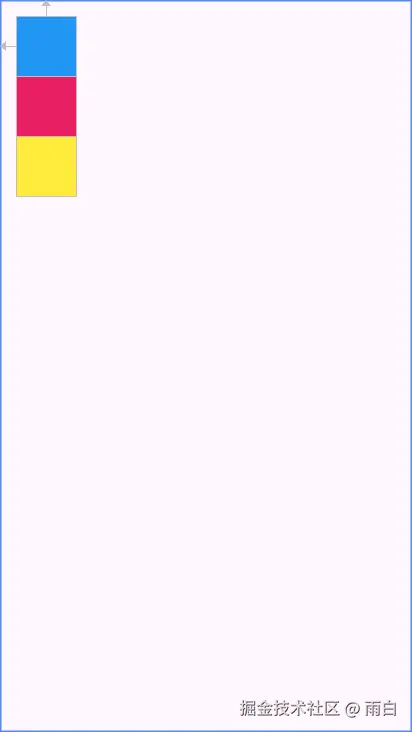
可以看出,即使 view2 和 view3 没有在 XML 中设置约束,也能通过 Linear 帮助类依次排列。这意味着,约束布局可以通过引用的方式来完成一组 View 布局的描述,而不需要通过 ViewGroup 进行嵌套。
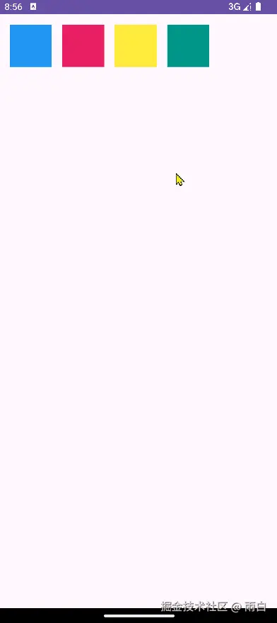
实际上,基于这种虚拟布局思想,官方提供了一个辅助控件 Flow。它能将它所引用的一组控件,在虚拟的画布上进行排列和打包,并轻松实现自动换行。
xml
<?xml version="1.0" encoding="utf-8"?>
<androidx.constraintlayout.widget.ConstraintLayout xmlns:android="http://schemas.android.com/apk/res/android"
    xmlns:app="http://schemas.android.com/apk/res-auto"
    android:layout_width="match_parent"
    android:layout_height="match_parent"
    android:padding="16dp">

    <androidx.constraintlayout.helper.widget.Flow
        android:id="@+id/flow"
        android:layout_width="0dp"
        android:layout_height="wrap_content"
        android:orientation="horizontal"
        app:constraint_referenced_ids="button1,button2,button3,button4,button5,button6"
        app:flow_wrapMode="none"
        app:layout_constraintEnd_toEndOf="parent"
        app:layout_constraintStart_toStartOf="parent"
        app:layout_constraintTop_toTopOf="parent" />

    <Button android:id="@+id/button1" android:layout_width="wrap_content" android:layout_height="wrap_content" android:text="KOTLIN" />
    <Button android:id="@+id/button2" android:layout_width="wrap_content" android:layout_height="wrap_content" android:text="ANDROID" />
    <Button android:id="@+id/button3" android:layout_width="wrap_content" android:layout_height="wrap_content" android:text="JETPACK" />
    <Button android:id="@+id/button4" android:layout_width="wrap_content" android:layout_height="wrap_content" android:text="COMPOSE" />
    <Button android:id="@+id/button5" android:layout_width="wrap_content" android:layout_height="wrap_content" android:text="ARCHITECTURE" />
    <Button android:id="@+id/button6" android:layout_width="wrap_content" android:layout_height="wrap_content" android:text="MVVM" />

</androidx.constraintlayout.widget.ConstraintLayout>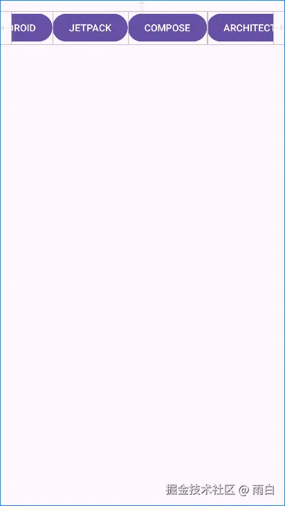
可以看到按钮超出屏幕范围了,这是因为我们将 flow_wrapMode 设为了 none。我们只需将其设为 chain,就可以实现自动换行。
xml
<androidx.constraintlayout.helper.widget.Flow
    android:id="@+id/flow"
    android:layout_width="0dp"
    android:layout_height="wrap_content"
    android:orientation="horizontal"
    app:constraint_referenced_ids="button1,button2,button3,button4,button5,button6"
    app:flow_wrapMode="chain"
    app:layout_constraintEnd_toEndOf="parent"
    app:layout_constraintStart_toStartOf="parent"
    app:layout_constraintTop_toTopOf="parent" />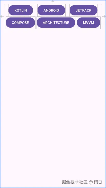
当前 chain 模式下是链式对齐,每一行内的元素像约束链一样,根据可用空间进行分布。我们可以将 flow_wrapMode 设为 aligned,以实现更为整齐的行列对齐。也就是与上一行对应位置的元素在起点对齐,形成网格效果。
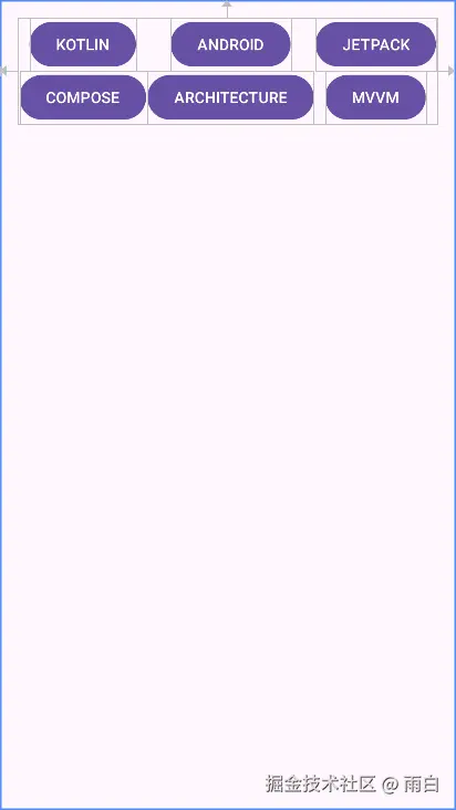
此外,我们还可以通过 flow_horizontalGap 和 flow_verticalGap 来轻松控制元素间的水平和垂直间距。
进阶技巧与动画
看完了各类功能和辅助工具后,我们来看看 ConstraintLayout 的可扩展性和强大的动画能力。
自定义 ConstraintHelper 实现复用动画
有时,我们需要在布局加载好后,对一组控件自动播放统一的入场动画,比如揭露、放大、渐入等效果。之前我们会在 Activity 或 Fragment 中编写动画代码,这不仅麻烦,还将动画逻辑与页面逻辑耦合在了一起。
而在约束布局中,我们可以通过继承 ConstraintHelper 类,创建可被 XML 直接引用的动画辅助器。
ConstraintHelper 是 Group、Layer 等辅助控件的父类。我们继承它,并重写其 updatePostLayout 方法即可。这个方法会在所有控件布局完成后(位置和尺寸都已确定)被调用,我们在这启动动画。
java
public class CircularRevealHelper extends ConstraintHelper {
    public CircularRevealHelper(Context context, AttributeSet attrs) {
        super(context, attrs);
    }

    @Override
    public void updatePostLayout(ConstraintLayout container) {
        super.updatePostLayout(container);

        int[] ids = getReferencedIds();
        if (ids == null) return;

        for (int id : ids) {
            View view = container.getViewById(id);
            if (view == null) continue;

            // 计算揭露动画的半径,确保能覆盖整个View
            int radius = (int) Math.hypot(view.getWidth(), view.getHeight());

            // 从视图中心开始揭露
            int centerX = view.getWidth() / 2;
            int centerY = view.getHeight() / 2;

            // 创建并启动圆形揭露动画
            Animator animator = ViewAnimationUtils.createCircularReveal(view, centerX, centerY, 0f, (float) radius);
            animator.setDuration(1500L);
            animator.start();
        }
    }
}
然后,在 XML 布局中直接声明它,并通过 app:constraint_referenced_ids 属性引用我们想应用动画的控件。
xml
<?xml version="1.0" encoding="utf-8"?>
<androidx.constraintlayout.widget.ConstraintLayout xmlns:android="http://schemas.android.com/apk/res/android"
    xmlns:app="http://schemas.android.com/apk/res-auto"
    xmlns:tools="http://schemas.android.com/tools"
    android:layout_width="match_parent"
    android:layout_height="match_parent">

    <ImageView
        android:id="@+id/image_view_1"
        android:layout_width="wrap_content"
        android:layout_height="wrap_content"
        android:layout_marginEnd="16dp"
        android:src="@mipmap/ic_launcher"
        app:layout_constraintBottom_toBottomOf="@+id/image_view_2"
        app:layout_constraintEnd_toStartOf="@+id/image_view_2"
        app:layout_constraintTop_toTopOf="@+id/image_view_2" />

    <ImageView
        android:id="@+id/image_view_2"
        android:layout_width="wrap_content"
        android:layout_height="wrap_content"
        android:src="@mipmap/ic_launcher"
        app:layout_constraintBottom_toBottomOf="parent"
        app:layout_constraintEnd_toEndOf="parent"
        app:layout_constraintStart_toStartOf="parent"
        app:layout_constraintTop_toTopOf="parent" />

    <ImageView
        android:id="@+id/image_view_3"
        android:layout_width="wrap_content"
        android:layout_height="wrap_content"
        android:layout_marginStart="16dp"
        android:src="@mipmap/ic_launcher"
        app:layout_constraintStart_toEndOf="@+id/image_view_2"
        app:layout_constraintTop_toTopOf="@+id/image_view_2" />

    <ImageView
        android:id="@+id/image_view_4"
        android:layout_width="wrap_content"
        android:layout_height="wrap_content"
        android:layout_marginTop="16dp"
        android:src="@mipmap/ic_launcher"
        app:layout_constraintEnd_toEndOf="@+id/image_view_2"
        app:layout_constraintStart_toStartOf="@+id/image_view_2"
        app:layout_constraintTop_toBottomOf="@+id/image_view_2" />

    <com.example.constrainlayouttest.CircularRevealHelper
        android:layout_width="wrap_content"
        android:layout_height="wrap_content"
        app:constraint_referenced_ids="image_view_1,image_view_2,image_view_3,image_view_4"
        tools:ignore="MissingConstraints" />

</androidx.constraintlayout.widget.ConstraintLayout>
可以看到,在布局加载完成后,动画会自动播放。我们并不需要在 Activity 或 Fragment 中编写任何动画启动代码,并且这个 CircularRevealHelper 可以在任何布局中被复用。
通过 ConstraintSet 实现布局动画
前面我们通过代码的方式动态修改了约束,但当需要修改约束的控件一多,这种方式还是非常麻烦。所以,我们更多会选择直接从一个准备好的 XML 布局文件中加载一整套约束,然后应用在当前布局中。
这也是实现平滑的布局动画的核心所在。
要实现这种效果,我们首先要定义两个布局文件,作为动画的起始和结束状态。
activity_constraint_start.xml
xml
<?xml version="1.0" encoding="utf-8"?>
<androidx.constraintlayout.widget.ConstraintLayout xmlns:android="http://schemas.android.com/apk/res/android"
    xmlns:app="http://schemas.android.com/apk/res-auto"
    android:id="@+id/root_layout"
    android:layout_width="match_parent"
    android:layout_height="match_parent"
    android:onClick="onClick">

    <View
        android:id="@+id/view_1"
        android:layout_width="64dp"
        android:layout_height="64dp"
        android:layout_marginStart="16dp"
        android:layout_marginTop="16dp"
        android:background="#2196F3"
        app:layout_constraintStart_toStartOf="parent"
        app:layout_constraintTop_toTopOf="parent" />

    <View
        android:id="@+id/view_2"
        android:layout_width="64dp"
        android:layout_height="64dp"
        android:layout_marginStart="16dp"
        android:background="#E91E63"
        app:layout_constraintStart_toEndOf="@+id/view_1"
        app:layout_constraintTop_toTopOf="@+id/view_1" />

    <View
        android:id="@+id/view_3"
        android:layout_width="64dp"
        android:layout_height="64dp"
        android:layout_marginStart="16dp"
        android:background="#FFEB3B"
        app:layout_constraintStart_toEndOf="@+id/view_2"
        app:layout_constraintTop_toTopOf="@+id/view_2" />

    <View
        android:id="@+id/view_4"
        android:layout_width="64dp"
        android:layout_height="64dp"
        android:layout_marginStart="16dp"
        android:background="#009688"
        app:layout_constraintStart_toEndOf="@+id/view_3"
        app:layout_constraintTop_toTopOf="@+id/view_3" />

</androidx.constraintlayout.widget.ConstraintLayout>
activity_constraint_end.xml
xml
<?xml version="1.0" encoding="utf-8"?>
<androidx.constraintlayout.widget.ConstraintLayout xmlns:android="http://schemas.android.com/apk/res/android"
    xmlns:app="http://schemas.android.com/apk/res-auto"
    android:layout_width="match_parent"
    android:layout_height="match_parent"
    android:onClick="onClick">

    <View
        android:id="@+id/view_1"
        android:layout_width="64dp"
        android:layout_height="64dp"
        android:layout_marginStart="16dp"
        android:layout_marginTop="16dp"
        android:background="#2196F3"
        app:layout_constraintStart_toStartOf="parent"
        app:layout_constraintTop_toTopOf="parent" />

    <View
        android:id="@+id/view_2"
        android:layout_width="64dp"
        android:layout_height="64dp"
        android:layout_marginStart="16dp"
        android:background="#E91E63"
        app:layout_constraintStart_toEndOf="@+id/view_1"
        app:layout_constraintTop_toTopOf="@+id/view_1" />

    <View
        android:id="@+id/view_3"
        android:layout_width="64dp"
        android:layout_height="64dp"
        android:layout_marginTop="16dp"
        android:background="#FFEB3B"
        app:layout_constraintStart_toStartOf="@+id/view_1"
        app:layout_constraintTop_toBottomOf="@+id/view_1" />

    <View
        android:id="@+id/view_4"
        android:layout_width="64dp"
        android:layout_height="64dp"
        android:layout_marginStart="16dp"
        android:background="#009688"
        app:layout_constraintStart_toEndOf="@+id/view_3"
        app:layout_constraintTop_toTopOf="@+id/view_3" />

</androidx.constraintlayout.widget.ConstraintLayout>
注意:两个布局文件中,控件的 id 必须保持一致。
然后,在代码中实现布局切换的逻辑。
java
// MainActivity.java
public class MainActivity extends AppCompatActivity {
    private boolean isEndState = false;

    @Override
    protected void onCreate(Bundle savedInstanceState) {
        super.onCreate(savedInstanceState);
        // 初始加载 start 布局
        setContentView(R.layout.activity_constraint_start);
    }


    public void onClick(View view) {
        ConstraintLayout constraintLayout = (ConstraintLayout) view;

        ConstraintSet constraintSet = new ConstraintSet();
        // 要切换的目标布局
        int destinationLayout = isEndState ? R.layout.activity_constraint_start : R.layout.activity_constraint_end;
        constraintSet.clone(this, destinationLayout);

        //在应用新约束之前,启动一个延迟过渡
        TransitionManager.beginDelayedTransition(constraintLayout);

        // 应用新的约束集,TransitionManager会自动捕捉变化并生成动画
        constraintSet.applyTo(constraintLayout);

        // 切换状态标志,以便下次点击时可以切换回来
        isEndState = !isEndState;
    }
}
运行效果:
可以看到布局在点击后平滑地进行了修改,这是因为我们应用新约束前调用了 TransitionManager.beginDelayedTransition(constraintLayout)。
总结
我们不难发现,ConstraintLayout 远不止一个更强大的相对布局那么简单。
它除了可以通过其扁平化的结构 减少布局嵌套、提升性能外,更是基于这种扁平化的思想,简化了过渡动画 的实现。避免了因布局嵌套导致的不同层级的控件互相引用困难的问题,也避免了复杂的属性动画代码的编写。我们只需定义好起始、结束状态,然后让 ConstraintLayout 与 TransitionManager 来完成即可。