Flutter中你从未见过的的InkWell组件使用示例
InkWell 是 Flutter 中最实用的组件之一. 它用于为原本不可交互的组件添加涟漪效果和交互处理功能.
InkWell 的关键特性
- 点击时生成 Material Design 风格的墨迹飞溅效果
- 支持多种手势操作(单击, 双击, 长按)
- 在 Material 组件中工作以显示正确的视觉反馈
- 可以自定义不同的溅射颜色和形状
使用 InkWell 的自定义组件
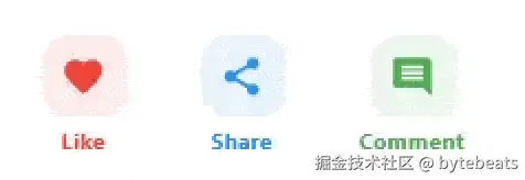
自定义按钮
具有独特设计且保持正确触摸反馈的自定义按钮.
less
class EngageButton extends StatelessWidget {
  final IconData icon;
  final String label;
  final Color color;
  final VoidCallback onTap;

  const EngageButton({
    super.key,
    required this.icon,
    required this.label,
    required this.color,
    required this.onTap,
  });

  @override
  Widget build(BuildContext context) {
    return Column(
      mainAxisSize: MainAxisSize.min,
      children: [
        Material(
          color: color.withValues(alpha: 0.1),
          borderRadius: BorderRadius.circular(16),
          child: InkWell(
            onTap: onTap,
            borderRadius: BorderRadius.circular(16),
            splashColor: color.withValues(alpha: 0.3),
            highlightColor: color.withValues(alpha: 0.1),
            child: Container(
              padding: const EdgeInsets.all(12),
              child: Icon(icon, color: color, size: 28),
            ),
          ),
        ),
        const SizedBox(height: 4),
        Text(
          label,
          style: TextStyle(color: color, fontWeight: FontWeight.bold),
        ),
      ],
    );
  }
} 从View中使用它们:
less
            Row(
              mainAxisAlignment: MainAxisAlignment.spaceEvenly,
              children: [
                EngageButton(
                  icon: Icons.favorite,
                  label: 'Like',
                  color: Colors.red,
                  onTap: () =>(){},
                ),
                EngageButton(
                  icon: Icons.share,
                  label: 'Share',
                  color: Colors.blue,
                  onTap: () => (){},
                ),
                EngageButton(
                  icon: Icons.comment,
                  label: 'Comment',
                  color: Colors.green,
                  onTap: () =>(){},
                ),
              ],
            ),
交互式卡片
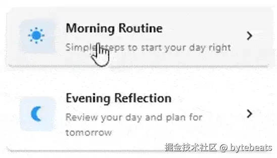
可点击的卡片组件, 带有视觉反馈
less
class InteractiveCard extends StatelessWidget {
  final String title;
  final String description;
  final IconData icon;
  final VoidCallback onTap;

  const InteractiveCard({
    super.key,
    required this.title,
    required this.description,
    required this.icon,
    required this.onTap,
  });

  @override
  Widget build(BuildContext context) {
    return Material(
      color: Colors.white,
      elevation: 2,
      borderRadius: BorderRadius.circular(8),
      child: InkWell(
        onTap: onTap,
        borderRadius: BorderRadius.circular(8),
        child: Padding(
          padding: const EdgeInsets.all(16.0),
          child: Row(
            children: [
              Container(
                padding: const EdgeInsets.all(12),
                decoration: BoxDecoration(
                  color: Colors.blue.withValues(alpha: 0.1),
                  borderRadius: BorderRadius.circular(8),
                ),
                child: Icon(icon, color: Colors.blue, size: 24),
              ),
              const SizedBox(width: 16),
              Expanded(
                child: Column(
                  crossAxisAlignment: CrossAxisAlignment.start,
                  children: [
                    Text(
                      title,
                      style: const TextStyle(
                        fontWeight: FontWeight.bold,
                        fontSize: 16,
                      ),
                    ),
                    const SizedBox(height: 4),
                    Text(
                      description,
                      style: TextStyle(
                        color: Colors.grey[600],
                        fontSize: 14,
                      ),
                    ),
                  ],
                ),
              ),
              const Icon(Icons.chevron_right),
            ],
          ),
        ),
      ),
    );
  }
}从View中使用:
less
           InteractiveCard(
              title: 'Morning Routine',
              description: 'Simple steps to start your day right',
              icon: Icons.wb_sunny,
              onTap: () =>(){},
            ),
            const SizedBox(height: 16),
            InteractiveCard(
              title: 'Evening Reflection',
              description: 'Review your day and plan for tomorrow',
              icon: Icons.nightlight_round,
              onTap: () => (){},
            ),
交互式列表项
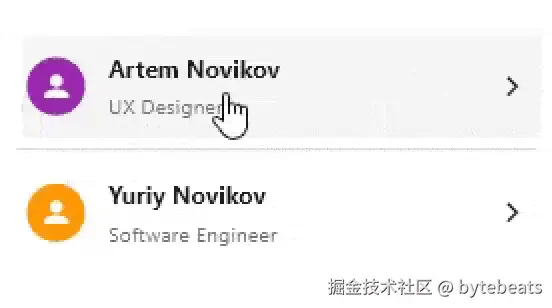
具有自定义布局但标准交互模式的列表.
php
class InteractiveListItem extends StatelessWidget {
  final Widget leading;
  final String title;
  final String subtitle;
  final Widget trailing;
  final VoidCallback onTap;

  const InteractiveListItem({
    super.key,
    required this.leading,
    required this.title,
    required this.subtitle,
    required this.trailing,
    required this.onTap,
  });

  @override
  Widget build(BuildContext context) {
    return Material(
      color: Colors.transparent,
      child: InkWell(
        onTap: onTap,
        child: Padding(
          padding: const EdgeInsets.symmetric(vertical: 12.0, horizontal: 8.0),
          child: Row(
            children: [
              leading,
              const SizedBox(width: 16),
              Expanded(
                child: Column(
                  crossAxisAlignment: CrossAxisAlignment.start,
                  children: [
                    Text(
                      title,
                      style: const TextStyle(
                        fontWeight: FontWeight.bold,
                        fontSize: 16,
                      ),
                    ),
                    const SizedBox(height: 4),
                    Text(
                      subtitle,
                      style: TextStyle(
                        color: Colors.grey[600],
                        fontSize: 14,
                      ),
                    ),
                  ],
                ),
              ),
              trailing,
            ],
          ),
        ),
      ),
    );
  }
}从View中使用:
less
InteractiveListItem(
leading: const CircleAvatar(
backgroundColor: Colors.purple,
child: Icon(Icons.person, color: Colors.white),
),
title: 'Artem Novikov',
subtitle: 'UX Designer',
trailing: const Icon(Icons.arrow_forward_ios, size: 16),
onTap: () =>(){},
),
const Divider(),
InteractiveListItem(
leading: const CircleAvatar(
backgroundColor: Colors.orange,
child: Icon(Icons.person, color: Colors.white),
),
title: 'Yuriy Novikov',
subtitle: 'Software Engineer',
trailing: const Icon(Icons.arrow_forward_ios, size: 16),
onTap: (){},
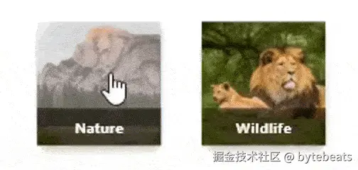
),ImageButton
具有涟漪效果和点击处理程序的图像.
less
class ImageButton extends StatelessWidget {
  final ImageProvider imageProvider;
  final String label;
  final VoidCallback onTap;

  const ImageButton({
    super.key,
    required this.imageProvider,
    required this.label,
    required this.onTap,
  });

  @override
  Widget build(BuildContext context) {
    return Column(
      mainAxisSize: MainAxisSize.min,
      children: [
        Material(
          elevation: 4,
          borderRadius: BorderRadius.circular(12),
          child: InkWell(
            onTap: onTap,
            borderRadius: BorderRadius.circular(12),
            child: Ink.image(
              image: imageProvider,
              width: 120,
              height: 120,
              fit: BoxFit.cover,
              child: Align(
                alignment: Alignment.bottomCenter,
                child: Container(
                  width: double.infinity,
                  color: Colors.black.withValues(alpha: 0.6),
                  padding: const EdgeInsets.symmetric(vertical: 8),
                  child: Text(
                    label,
                    textAlign: TextAlign.center,
                    style: const TextStyle(
                      color: Colors.white,
                      fontWeight: FontWeight.bold,
                    ),
                  ),
                ),
              ),
            ),
          ),
        ),
      ],
    );
  }
}从View中使用:
less
                ImageButton(
                  imageProvider: const NetworkImage(
                   'https://images.unsplash.com/photo-1472396961693-142e6e269027?w=400&auto=format&fit=crop&q=60&ixlib=rb-4.0.3&ixid=M3wxMjA3fDB8MHxzZWFyY2h8NXx8bmF0dXJlfGVufDB8fDB8fHwy'
                  ),
                  label: 'Nature',
                  onTap: (){},
                ),
                ImageButton(
                  imageProvider: const NetworkImage(
                   'https://images.unsplash.com/photo-1575550959106-5a7defe28b56?q=80&w=1470&auto=format&fit=crop&ixlib=rb-4.0.3&ixid=M3wxMjA3fDB8MHxwaG90by1wYWdlfHx8fGVufDB8fHx8fA%3D%3D'
                  ),
                  label: 'Wildlife',
                  onTap: (){},
                ),
IconButton 带 onDoubleTap 处理程序
用于播放音频的按钮, onTap以正常速度播放, onDoubleTap以快速速度播放, onLongPress以慢速播放.

less
class AudioIconButton extends StatelessWidget {
  final bool isPlaying;
  final VoidCallback onTap;
  final VoidCallback onDoubleTap;
  final VoidCallback onLongPress;
  final double size;
  final Color color;

  const AudioIconButton({
    super.key,
    required this.isPlaying,
    required this.onTap,
    required this.onDoubleTap,
    required this.onLongPress,
    this.size = 60.0,
    this.color = Colors.purple,
  });

  @override
  Widget build(BuildContext context) {
    return SizedBox(
      width: size,
      height: size,
      child: Material(
         borderRadius: BorderRadius.circular(16),
        color: color.withValues(alpha: 0.1),
        child: InkWell(
          onTap: onTap,
          onDoubleTap: onDoubleTap,
          onLongPress: onLongPress,
          borderRadius: BorderRadius.circular(16),
          splashColor: color.withValues(alpha: 0.3),
          highlightColor: color.withValues(alpha: 0.1),


          child: Container(
            padding: const EdgeInsets.all(12),
            child: Center(
              child: Icon(
                isPlaying ? Icons.pause : Icons.play_arrow,
                color: color,
                size: 28,
              ),
            ),
          ),
        ),
      ),
    );
  }
}View:
yaml
           GetBuilder<AudioController>(
              id: 'play',
              builder: (controller) {
                return AudioIconButton(
                    color: Colors.blue,
                    isPlaying: controller.isPlaying,
                    onTap: () {
                      controller.handleTap();
                    },
                    onDoubleTap: () {
                      controller.handleDoubleTap();
                    },
                    onLongPress: () {
                      controller.handleLongPress();
                    });
              }
), Controller:
ini
 bool isPlaying = false;

  void handleTap() {
    isPlaying = !isPlaying;
    var message = 'Playing is stopped';
    if (isPlaying) {
      message = 'Playing with normal speed';
    }
    Get.showSnackbar(GetSnackBar(
      message: message,
      duration: Duration(seconds: 1),
    ));

    update(['play']);
  }

  void handleDoubleTap() {
    isPlaying = !isPlaying;
    var message = 'Playing is stopped';
    if (isPlaying) {
      message = 'Playing fast';
    }
    Get.showSnackbar(GetSnackBar(
      message: message,
      duration: Duration(seconds: 1),
    ));
    update(['play']);
  }

  void handleLongPress() {
    isPlaying = !isPlaying;
    var message = 'Playing is stopped';
    if (isPlaying) {
      message = 'Playing slowly';
    }
    Get.showSnackbar(GetSnackBar(
      message: message,
      duration: Duration(seconds: 1),
    ));
    update(['play']);
  }
InkWell 与 InkResponse
InkWell 和 InkResponse 非常相似. 它们都实现了 InteractiveInkFeature 并位于 ink_well.dart 库中.
区别在于 InkResponse 允许对高亮形状的形式进行更多自定义, 而 InkWell 始终创建矩形高亮.
上述所有示例均可使用 InkResponse 重新实现.
InkWell 与 Ink
这两个类服务于完全不同的目的, 但经常被一起使用.
虽然 InkWell允许交互并以飞溅和高亮的形式提供视觉反馈, 但 Ink允许在底层 Material上绘制小部件, 而 InkWell提供的飞溅和高亮效果将在此可见.
我们已经使用 Ink 来实现我们的 ImageButton.
less
        Material(
          elevation: 4,
          borderRadius: BorderRadius.circular(12),
          child: Ink.image(
            image: imageProvider,
            width: 120,
            height: 120,
            fit: BoxFit.cover,
            child: InkWell(
好吧, 今天的内容就分享到这里啦!
一家之言, 欢迎拍砖!
Happy Coding! Stay GOLDEN!