
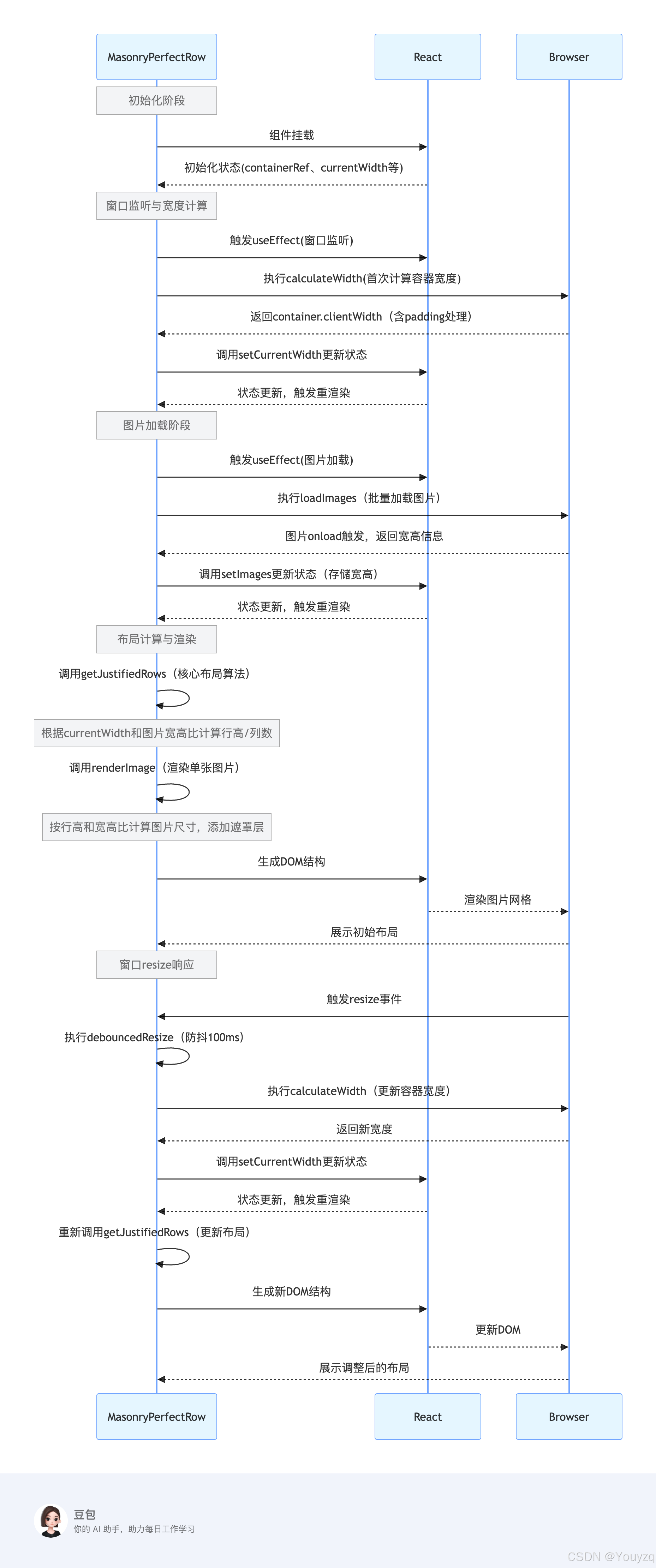
思路时序图
getJustifiedRows方法这个是核心
typescript
/**
 * 计算图片的合理布局(均匀分布到多行,每行高度一致)
 * 核心逻辑:根据图片宽高比和容器宽度,自动分配每行图片数量,使每行总宽度接近容器宽度
 * @param imgs 图片数组(包含宽高信息)
 * @param containerWidth 容器可用宽度(已减去padding等)
 * @param targetRowHeight 目标行高(默认200px,用于预估每行宽度)
 * @returns 行布局数组(每行包含图片列表和实际行高)
 */
const getJustifiedRows = (imgs: IImageItem[], containerWidth: number, targetRowHeight = 200): IRowItem[] => {
  // 边界条件:容器宽度无效或无图片时,返回空数组
  if (!containerWidth || containerWidth <= 0 || !imgs.length) return []

  // 存储最终的行布局
  const rows: IRowItem[] = []
  // 临时存储当前行的图片
  let currentRow: IImageItem[] = []
  // 当前行所有图片的宽高比总和(用于计算行宽)
  let totalAspectRatio = 0

  // 遍历所有图片,逐张分配到行中
  for (const img of imgs) {
    // 过滤无效图片(宽高为0或负数的情况)
    if (!img.width || !img.height || img.width <= 0 || img.height <= 0) continue

    // 计算当前图片的宽高比(宽度/高度)
    const aspectRatio = img.width / img.height
    // 累加当前行的宽高比总和
    totalAspectRatio += aspectRatio
    // 将图片添加到当前行
    currentRow.push(img)

    // 预估当前行的总宽度:宽高比总和 * 目标行高
    // (原理:宽高比=宽/高 → 宽=高*宽高比 → 行总宽=sum(宽)=行高*sum(宽高比))
    const estimatedRowWidth = totalAspectRatio * targetRowHeight

    // 换行条件:
    // 1. 预估行宽达到容器宽度的95%以上(接近容器宽度,避免过窄)
    // 2. 当前行图片数达到5张(避免单行图片过多导致变形)
    if (estimatedRowWidth >= containerWidth * 0.95 || currentRow.length >= 5) {
      // 计算当前行的实际行高:容器宽度 / 宽高比总和
      // (保证行总宽恰好等于容器宽度:行高 = 容器宽 / sum(宽高比))
      const rowHeight = containerWidth / totalAspectRatio
      // 限制行高在100-400px之间(避免行过高或过矮)
      const constrainedHeight = Math.min(Math.max(rowHeight, 100), 400)

      // 将当前行添加到结果数组
      rows.push({ images: [...currentRow], height: constrainedHeight })
      // 重置当前行(准备下一行)
      currentRow = []
      totalAspectRatio = 0
    }
  }

  // 处理最后一行(可能未达到换行条件的剩余图片)
  if (currentRow.length > 0) {
    // 计算最后一行的宽高比总和
    const totalRatio = currentRow.reduce((sum, img) => {
      if (img.width && img.height && img.height > 0) {
        return sum + img.width / img.height
      }
      return sum
    }, 0)

    // 计算最后一行的行高(默认用目标行高,若有有效宽高比则重新计算)
    let rowHeight = targetRowHeight
    if (totalRatio > 0) rowHeight = containerWidth / totalRatio

    // 同样限制行高范围
    const constrainedHeight = Math.min(Math.max(rowHeight, 100), 400)
    // 添加最后一行到结果
    rows.push({ images: currentRow, height: constrainedHeight })
  }

  return rows
}
核心逻辑总结:
- 宽高比计算:通过图片的宽高比(宽度 / 高度)来动态分配每行宽度,避免图片变形。
- 换行机制:当预估行宽接近容器宽度(95%)或单行图片达 5 张时自动换行,平衡布局。
- 行高调整:每行的实际行高由 "容器宽度 ÷ 该行宽高比总和" 计算得出,确保每行总宽恰好填满容器。
- 边界控制:限制行高在 100-400px,过滤无效图片,处理最后一行剩余图片,保证布局合理性。
代码块
组件MasonryGallery
index.tsx
typescript
import React, { FC, useEffect, useRef, useState } from 'react'
import styles from './index.module.scss'

// 定义图片数据类型接口
interface IImageItem {
  src: string
  width: number
  height: number
}

// 定义行数据类型接口
interface IRowItem {
  images: IImageItem[]
  height: number
}

interface IProps {
  imageList: string[]
}

const MasonryPerfectRow: FC<IProps> = ({ imageList }) => {
  // 容器ref
  const containerRef = useRef<HTMLDivElement>(null)
  // 加载后的图片列表(带宽高信息)
  const [images, setImages] = useState<IImageItem[]>([])
  // 容器当前宽度(初始值设为0,后续会通过ref获取)
  const [currentWidth, setCurrentWidth] = useState<number>(window.innerWidth - 120)
  // 加载状态
  const [isLoading, setIsLoading] = useState<boolean>(true)
  // 错误信息
  const [error, setError] = useState<string | null>(null)

  // 防抖函数
  const debounce = (func: (...args: any[]) => void, delay: number) => {
    let timeoutId: NodeJS.Timeout | null = null
    return (...args: any[]) => {
      if (timeoutId) clearTimeout(timeoutId)
      timeoutId = setTimeout(() => func.apply(this, args), delay)
    }
  }
  // 监听窗口大小变化,更新容器宽度(包括首次初始化)
  useEffect(() => {
    // 计算容器宽度的函数
    const calculateWidth = () => {
      if (containerRef.current) {
        // 减去左右padding后的实际可用宽度
        const newWidth = containerRef.current.clientWidth - 68
        if (newWidth > 0 && newWidth !== currentWidth) {
          setCurrentWidth(newWidth)
        }
      }
    }
    // 首次加载时计算宽度
    // 使用requestAnimationFrame确保DOM已渲染完成
    const frameId = requestAnimationFrame(calculateWidth)
    // 防抖处理窗口 resize 事件
    const debouncedResize = debounce(calculateWidth, 100)
    window.addEventListener('resize', debouncedResize)
    // 清理函数
    return () => {
      cancelAnimationFrame(frameId)
      window.removeEventListener('resize', debouncedResize)
    }
  }, [containerRef, currentWidth])

  // 加载图片并获取宽高信息
  useEffect(() => {
    const loadImages = async () => {
      try {
        setIsLoading(true)
        const loadedImages: IImageItem[] = await Promise.all(
          imageList.map(
            (src): Promise<IImageItem> =>
              new Promise((resolve, reject) => {
                const img = new Image()
                img.onload = () => {
                  resolve({ src, width: img.width, height: img.height })
                }
                img.onerror = () => {
                  reject(new Error(`Failed to load image: ${src}`))
                }
                img.src = src
              })
          )
        )
        setImages(loadedImages)
        setError(null)
      } catch (err) {
        console.error('Error loading images:', err)
        setError('Some images failed to load. Please try again later.')
      } finally {
        setIsLoading(false)
      }
    }
    loadImages()
  }, [imageList]) // 依赖项添加imageList,确保props变化时重新加载

  // 计算合理的行布局
  const getJustifiedRows = (imgs: IImageItem[], containerWidth: number, targetRowHeight = 200): IRowItem[] => {
    if (!containerWidth || containerWidth <= 0 || !imgs.length) return []

    const rows: IRowItem[] = []
    let currentRow: IImageItem[] = []
    let totalAspectRatio = 0

    for (const img of imgs) {
      // 过滤无效图片
      if (!img.width || !img.height || img.width <= 0 || img.height <= 0) continue

      const aspectRatio = img.width / img.height
      totalAspectRatio += aspectRatio
      currentRow.push(img)

      // 预估行宽
      const estimatedRowWidth = totalAspectRatio * targetRowHeight

      // 行宽接近容器宽度或达到最大列数时换行
      if (estimatedRowWidth >= containerWidth * 0.95 || currentRow.length >= 5) {
        const rowHeight = containerWidth / totalAspectRatio
        // 限制行高范围
        const constrainedHeight = Math.min(Math.max(rowHeight, 100), 400)
        rows.push({ images: [...currentRow], height: constrainedHeight })
        currentRow = []
        totalAspectRatio = 0
      }
    }

    // 处理最后一行
    if (currentRow.length > 0) {
      const totalRatio = currentRow.reduce((sum, img) => {
        if (img.width && img.height && img.height > 0) {
          return sum + img.width / img.height
        }
        return sum
      }, 0)

      let rowHeight = targetRowHeight
      if (totalRatio > 0) rowHeight = containerWidth / totalRatio

      const constrainedHeight = Math.min(Math.max(rowHeight, 100), 400)
      rows.push({ images: currentRow, height: constrainedHeight })
    }

    return rows
  }

  // 计算行布局(只有当currentWidth有效时才计算)
  const rows = currentWidth > 0 ? getJustifiedRows(images, currentWidth, 200) : []

  // 渲染单张图片
  // 渲染单张图片(带遮罩层效果)
  const renderImage = (img: IImageItem, row: IRowItem, index: number) => {
    const aspectRatio = img.width / img.height
    const width = row.height * aspectRatio

    return (
      <div
        key={index}
        className={styles.imgbox}
        style={{
          width,
          height: row.height,
          marginRight: index < row.images.length - 1 ? '8px' : 0,
          position: 'relative', // 关键:让遮罩层相对于容器定位
          overflow: 'hidden', // 防止遮罩层超出容器
        }}
      >
        <img
          src={img.src}
          alt={`Gallery image ${index}`}
          className={styles['gallery-image']}
          style={{
            width: '100%',
            height: '100%',
            objectFit: 'cover',
          }}
          loading='lazy'
        />
        {/* 遮罩层 */}
        <div className={styles.overlay}>
          {/* 可以在这里添加遮罩层内容,如图标、文字等 */}
          <div className={styles.overlayText}>立即下载</div>
          <div className={styles.overlayIcon}>
            <img className={styles.overlayIconImg} src='https://s1.ssl.qhres2.com/static/fdff157108749ba9.svg' alt='' />
            <div className={styles.overlayIconTxt}> 立即下载立即下载立即下载立即下载立即下载立即下载立即下载</div>
          </div>
        </div>
      </div>
    )
  }
  // 加载状态
  if (isLoading) {
    return (
      <div className={styles['loading-container']}>
        <div className={styles.loader}></div>
        <p className={styles['loading-text']}>Loading images...</p>
      </div>
    )
  }

  // 错误状态
  if (error) {
    return (
      <div className={styles['error-container']}>
        <p className={styles['error-message']}>{error}</p>
        <button onClick={() => window.location.reload()} className={styles['retry-button']}>
          Try Again
        </button>
      </div>
    )
  }

  // 主渲染
  return (
    <div ref={containerRef} className={styles.galleryContainer}>
      {rows.length === 0 ? (
        <div className={styles.emptyState}>No images to display</div>
      ) : (
        rows.map((row, rowIndex) => (
          <div key={rowIndex} className={styles.imageRow} style={{ height: row.height }}>
            {row.images.map((img, index) => renderImage(img, row, index))}
          </div>
        ))
      )}
    </div>
  )
}

export default MasonryPerfectRow
index.module.scss
css
// 画廊容器
.gallery-container {
  box-sizing: border-box;
  padding: 0 34px;
  width: 100%;
}

// 图片行容器
.image-row {
  display: flex;
  margin-bottom: 8px;
  transition: height 0.3s ease;
  width: 100%;
}

// 画廊图片样式
.gallery-image {
  min-width: 50px; // 防止图片过窄
  object-fit: cover;
  transition: width 0.3s ease, height 0.3s ease;
}

// 加载状态容器
.loading-container {
  padding: 20px;
  text-align: center;
}

// 加载动画
.loader {
  animation: spin 1s linear infinite;
  border: 4px solid #f3f3f3;
  border-radius: 50%;
  border-top: 4px solid #3498db;
  height: 40px;
  margin: 0 auto;
  width: 40px;
}

// 加载文本
.loading-text {
  margin-top: 16px;
}

// 错误状态容器
.error-container {
  padding: 20px;
  text-align: center;
}

// 错误消息
.error-message {
  color: #e74c3c;
}

// 重试按钮
.retry-button {
  background-color: #3498db;
  border: none;
  border-radius: 4px;
  color: white;
  cursor: pointer;
  margin-top: 10px;
  padding: 8px 16px;
  transition: background-color 0.3s ease;

  &:hover {
    background-color: #2980b9;
  }
}

// 空状态
.empty-state {
  padding: 20px;
  text-align: center;
}

// 旋转动画
@keyframes spin {
  0% {
    transform: rotate(0deg);
  }

  100% {
    transform: rotate(360deg);
  }
}

// 图片容器
.imgbox {
  cursor: pointer;
  overflow: hidden;
  position: relative;
  transition: transform 0.3s ease;
}

// 遮罩层样式
.overlay {
  align-items: center;
  background-color: rgb(0 0 0 / 30%);
  display: flex;
  height: 100%;
  justify-content: center;
  left: 0;
  opacity: 0;
  position: absolute;
  top: 0;
  transition: opacity 0.3s ease;
  width: 100%;

  // 鼠标悬停时显示遮罩层
  .imgbox:hover & {
    opacity: 1;
  }
}

.overlay-text {
  background-color: #00cba1;
  border-radius: 10px;
  color: white;
  font-size: 14px;
  height: 35px;
  line-height: 35px;
  opacity: 0;
  position: absolute;
  right: 10px;
  text-align: center;
  top: 12px;

  // 初始状态:向上偏移并隐藏
  transform: translateY(-20px);
  transition: transform 0.3s ease, opacity 0.3s ease;
  width: 100px;

  // 鼠标悬停时:滑入并显示
  .imgbox:hover & {
    opacity: 1;
    transform: translateY(0);
  }
}

.overlay-icon {
  align-items: center;
  bottom: 12px;
  display: flex;
  left: 10px;
  opacity: 0;
  position: absolute;
  text-align: center;

  // 初始状态:向下偏移并隐藏
  transform: translateY(20px);
  transition: transform 0.3s ease, opacity 0.3s ease;
  transition-delay: 0.1s; // 延迟一点动画,增加层次感
  width: calc(100% - 24px);

  // 鼠标悬停时:滑入并显示
  .imgbox:hover & {
    opacity: 1;
    transform: translateY(0);
  }

  &-txt {
    color: white;
    font-size: 12px;
    font-weight: 400;
    margin-left: 8px;
    overflow: hidden;
    text-overflow: ellipsis;
    white-space: nowrap;
  }

  &-img {
    height: 12.5px;
  }
}
使用
html
  const imageList = [
    'https://p4.ssl.qhimg.com/t110b9a9301785cda89aa2b042a.png',
    'https://p2.ssl.qhimg.com/t110b9a93013a53e1158ed9da2b.png',
    'https://p2.ssl.qhimg.com/t110b9a9301e083c368a2645f76.png',
    'https://p2.ssl.qhimg.com/t110b9a93013a53e1158ed9da2b.png',
    'https://p5.ssl.qhimg.com/t110b9a9301f2b55a5a1eb7f9da.png',
    'https://p5.ssl.qhimg.com/t110b9a930137bebbb5135c540f.png',
    'https://p5.ssl.qhimg.com/t110b9a930124a1f20cc8fd2943.png',
    'https://p5.ssl.qhimg.com/t110b9a930124a1f20cc8fd2943.png',
    'https://p2.ssl.qhimg.com/t110b9a9301d67ef27aecbf5b09.png',
    'https://p2.ssl.qhimg.com/t110b9a93015294d61d129d32e3.png',
    'https://p0.ssl.qhimg.com/t110b9a9301625724a16a504db8.png',
    'https://p1.ssl.qhimg.com/t110b9a93012f8a910f75bd1324.png',
    'https://p5.ssl.qhimg.com/t110b9a930124a1f20cc8fd2943.png',
    'https://p5.ssl.qhimg.com/t110b9a930124a1f20cc8fd2943.png',
    'https://p2.ssl.qhimg.com/t110b9a9301d67ef27aecbf5b09.png',
    'https://p2.ssl.qhimg.com/t110b9a93015294d61d129d32e3.png',
    'https://p0.ssl.qhimg.com/t110b9a9301625724a16a504db8.png',
    'https://p1.ssl.qhimg.com/t110b9a93012f8a910f75bd1324.png',
  ] //都是随机的图片
<MasonryGallery imageList={imageList} />