简介
StyleX 是由 Meta 开发的零运行时 CSS-in-JS 解决方案,在构建时将样式编译为静态 CSS,消除运行时开销。
核心特性
- 零运行时开销 -- 构建时编译为静态 CSS
- 类型安全 -- 完整的 TypeScript 支持
- 原子化 CSS -- 自动生成原子化类名,最小化包体积
- 开发体验 -- 热重载、错误提示、工具链集成
快速开始
安装
npm install @stylexjs/stylex
npm install -D @stylexjs/rollup-plugin
Vite 配置
// vite.config.js
import { defineConfig } from "vite";
import react from "@vitejs/plugin-react";
import stylexPlugin from "@stylexjs/rollup-plugin";

export default defineConfig({
  plugins: [
    stylexPlugin({
      dev: true,
      runtimeInjection: true,
      genConditionalClasses: true,
      fileName: "stylex.css",
      unstable_moduleResolution: {
        type: "commonJS",
        rootDir: process.cwd(),
      },
    }),
    react(),
  ],
});
基础用法
创建样式
import * as stylex from "@stylexjs/stylex";
// 简单的样式定义
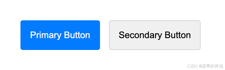
const styles = stylex.create({
button: {
padding: 16,
margin: 8,
borderRadius: 4,
borderWidth: 1,
borderStyle: "solid",
borderColor: "#ccc",
backgroundColor: "#f0f0f0",
cursor: "pointer",
fontSize: 16,
},
primary: {
backgroundColor: "#007bff",
borderColor: "#007bff",
color: "white",
},
});
function StyleXButton({ variant, children }) {
const buttonProps = stylex.props(
styles.button,
variant === "primary" && styles.primary
);
return <button {...buttonProps}>{children}</button>;
}
响应式设计
import * as stylex from "@stylexjs/stylex";

const responsiveStyles = stylex.create({
  container: {
    padding: 16,
    "@media (max-width: 768px)": {
      padding: 8,
    },
    "@media (min-width: 1024px)": {
      padding: 32,
    },
  },
});
主题系统
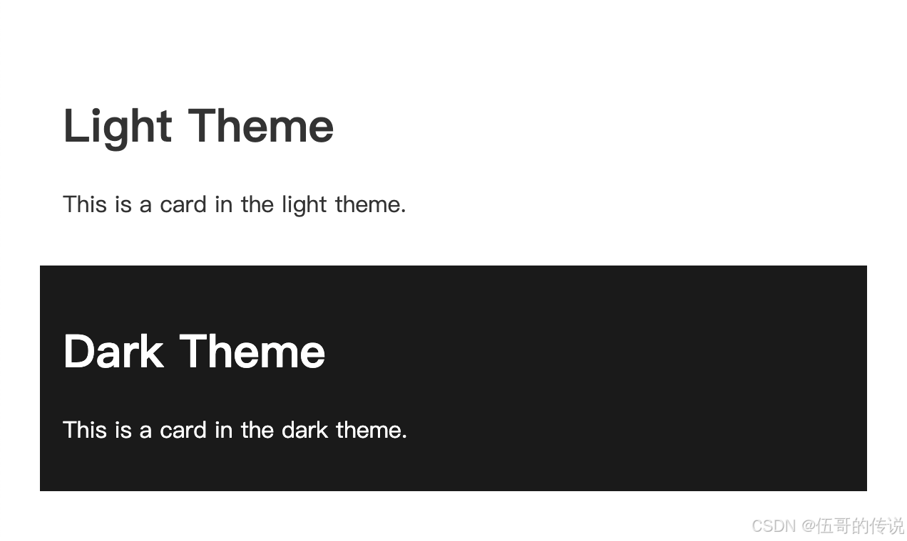
//tokens.stylex.js
import * as stylex from "@stylexjs/stylex";

// 定义主题变量
export const tokens = stylex.defineVars({
  primaryColor: "#007bff",
  backgroundColor: "#ffffff",
  textColor: "#333333",
  spacing: "16px",
});

// 暗色主题
export const darkTheme = stylex.createTheme(tokens, {
  primaryColor: "#0d6efd",
  backgroundColor: "#1a1a1a",
  textColor: "#ffffff",
  spacing: "16px",
});

import * as stylex from "@stylexjs/stylex";
import { tokens, darkTheme } from "./tokens.stylex.js";

// 使用主题
const themedStyles = stylex.create({
  card: {
    backgroundColor: tokens.backgroundColor,
    color: tokens.textColor,
    padding: tokens.spacing,
  },
});

function ThemedCard({ isDark, children }) {
  const themeProps = stylex.props(isDark && darkTheme);
  const cardProps = stylex.props(themedStyles.card);

  return (
    <div {...themeProps}>
      <div {...cardProps}>{children}</div>
    </div>
  );
}
实际应用示例
卡片组件
const cardStyles = stylex.create({
  card: {
    backgroundColor: "white",
    borderRadius: 8,
    boxShadow: "0 2px 8px rgba(0, 0, 0, 0.1)",
    overflow: "hidden",
    transition: "transform 0.2s ease",
    ":hover": {
      transform: "translateY(-2px)",
    },
  },
  header: {
    padding: 16,
    borderBottom: "1px solid #e9ecef",
  },
  content: {
    padding: 16,
  },
});

function Card({ title, children }) {
  const cardProps = stylex.props(cardStyles.card);
  const headerProps = stylex.props(cardStyles.header);
  const contentProps = stylex.props(cardStyles.content);

  return (
    <div {...cardProps}>
      {title && (
        <div {...headerProps}>
          <h3>{title}</h3>
        </div>
      )}
      <div {...contentProps}>{children}</div>
    </div>
  );
}
表单组件
const formStyles = stylex.create({
  input: {
    width: "100%",
    padding: "8px 12px",
    border: "1px solid #ddd",
    borderRadius: 4,
    ":focus": {
      outline: "none",
      borderColor: "#007bff",
      boxShadow: "0 0 0 2px rgba(0, 123, 255, 0.25)",
    },
  },
  error: {
    borderColor: "#dc3545",
  },
  button: {
    padding: "12px 24px",
    backgroundColor: "#007bff",
    color: "white",
    border: "none",
    borderRadius: 4,
    cursor: "pointer",
    ":hover": {
      backgroundColor: "#0056b3",
    },
  },
});
工具集成
高级 Vite 配置
// vite.config.js
import { defineConfig } from "vite";
import react from "@vitejs/plugin-react";
import stylexPlugin from "@stylexjs/rollup-plugin";

export default defineConfig({
  plugins: [
    react(),
    stylexPlugin({
      dev: process.env.NODE_ENV === "development",
      genConditionalClasses: true,
      fileName: "stylex.css",
      minify: process.env.NODE_ENV === "production",
      // 自定义类名生成
      classNamePrefix: "sx",
      // 启用样式去重
      unstable_moduleResolution: {
        type: "commonJS",
        rootDir: process.cwd(),
      },
    }),
  ],
  build: {
    // 确保 CSS 被正确提取
    cssCodeSplit: true,
    rollupOptions: {
      output: {
        assetFileNames: (assetInfo) => {
          if (assetInfo.name === "stylex.css") {
            return "assets/stylex.[hash].css";
          }
          return "assets/[name].[hash][extname]";
        },
      },
    },
  },
});
TypeScript 支持
// stylex.d.ts
declare module "@stylexjs/stylex" {
  export function create<T extends Record<string, any>>(
    styles: T
  ): { [K in keyof T]: string };
  export function defineVars<T extends Record<string, string | number>>(
    vars: T
  ): T;
  export function createTheme<T>(baseTheme: T, overrides: Partial<T>): string;
  export default function stylex(
    ...styles: (string | false | null | undefined)[]
  ): string;
}
最佳实践
样式组织
// tokens.js - 设计令牌
export const tokens = stylex.defineVars({
  colorPrimary: "#007bff",
  colorSecondary: "#6c757d",
  spacingS: "8px",
  spacingM: "16px",
  spacingL: "24px",
  fontSizeS: "12px",
  fontSizeM: "14px",
  borderRadius: "4px",
});

// Button.stylex.js - 组件样式
import { tokens } from "./tokens";

export const buttonStyles = stylex.create({
  base: {
    padding: `${tokens.spacingS} ${tokens.spacingM}`,
    fontSize: tokens.fontSizeM,
    borderRadius: tokens.borderRadius,
    border: "none",
    cursor: "pointer",
  },
  primary: {
    backgroundColor: tokens.colorPrimary,
    color: "white",
  },
  secondary: {
    backgroundColor: tokens.colorSecondary,
    color: "white",
  },
});
条件样式
const messageStyles = stylex.create({
  base: {
    padding: 16,
    borderRadius: 4,
    marginBottom: 16,
  },
  success: {
    backgroundColor: "#d4edda",
    color: "#155724",
  },
  error: {
    backgroundColor: "#f8d7da",
    color: "#721c24",
  },
});

function Message({ type, children }) {
  const messageProps = stylex.props(
    messageStyles.base,
    type === "success" && messageStyles.success,
    type === "error" && messageStyles.error
  );

  return <div {...messageProps}>{children}</div>;
}
常见问题
Q: StyleX 与其他 CSS-in-JS 库有什么区别?
A: StyleX 的主要优势是零运行时开销,在构建时编译为静态 CSS。
Q: 如何处理动态样式?
A: 使用 CSS 变量或函数参数传递动态值。
Q: 是否支持 SSR?
A: 完全支持,由于样式在构建时生成,无客户端和服务端不一致问题。
总结
StyleX 是一个强大的零运行时 CSS-in-JS 解决方案,特别适合:
- 大型 React 应用程序
- 性能要求严格的项目
- 需要类型安全的团队
- 追求最佳构建产物的项目
主要优势:零运行时开销、类型安全、原子化 CSS、优秀的开发体验。通过构建时编译,StyleX 既保持了 CSS-in-JS 的开发体验,又获得了静态 CSS 的性能优势。
StyleX:Meta推出的高性能零运行时CSS-in-JS解决方案 - 高质量源码分享平台-免费下载各类网站源码与模板及前沿技术分享