效果演示: 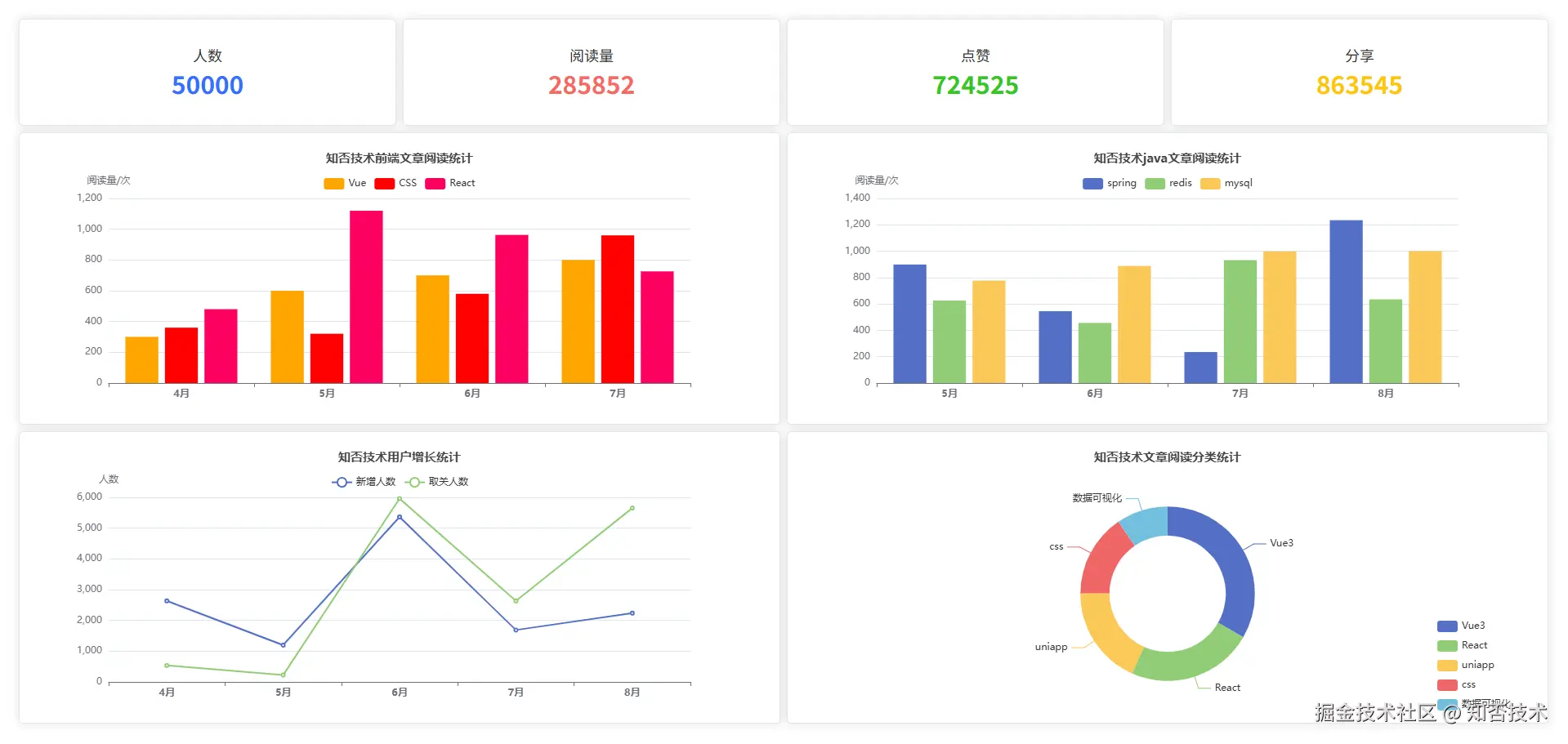

1.安装配置 vue-echarts
本篇文章使用的 vue-echarts 是一个数据可视化组件库,它对 echarts 进行了封装,更适合在 Vue 项目中使用。
1.安装
css
npm install echarts vue-echarts2.配置 main.js
js
import { createApp } from 'vue'
import App from './App.vue'
import ECharts from 'vue-echarts' // vue-echarts
import { use } from 'echarts/core' // echarts 核心
import { CanvasRenderer } from 'echarts/renderers'// 渲染器
import { BarChart, LineChart, PieChart } from 'echarts/charts' // 图表
import {
    GridComponent,
    TooltipComponent,
    LegendComponent,
    TitleComponent
} from 'echarts/components' // echarts 组件

// 按需注册
use([
    CanvasRenderer,
    BarChart,
    LineChart,
    PieChart,
    GridComponent,
    TooltipComponent,
    LegendComponent,
    TitleComponent
]);
const app = createApp(App)
app.component('v-chart', ECharts)
app.mount("#app")
2.创建图表
我们分别创建 4 个图表:两个柱状图,一个折线图,一个饼图。
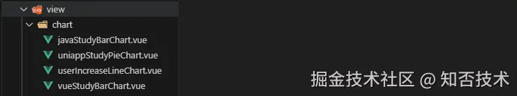
1.vueStudyBarChart.vue
java
<template>
  <div class="content">
    <v-chart autoresize :option="option"></v-chart>
  </div>
</template>

<script setup>
import { ref } from "vue";
const option = ref({
  title: {
    text: "知否技术前端文章阅读统计", // 标题文本
    left: "center", // 距离左边距离,跟 top 一样,这里为居中
    textStyle: {
      // 标题样式
      fontStyle: "normal", // 字体样式,默认是 normal ,也可以是斜体 'italic'
      fontWeight: "bolder", // 字体粗细,normal、bold、bolder、100、200
      fontSize: "15", // 字体样式
    },
  },
  tooltip: {
    trigger: "axis", // 触发类型,axis 表示在坐标轴触发,item 表示数据项图形触发,主要在散点图,饼图等无类目轴的图表中使用。
    axisPointer: {
      // 坐标轴指示器配置项。
      type: "cross", // line 直线指示器,shadow阴影指示器,cross十字准星指示器,none 无指示器
    },
  },
  legend: {
    top: "30", // 距离顶部距离
  },
  xAxis: {
    type: "category", // category 类目轴,适用于离散的类目数据。value数值轴,适用于连续数据。
    data: ["4月", "5月", "6月", "7月"], // 类目数据
    axisLabel: {
      // 坐标轴刻度标签的相关设置。
      fontWeight: "bold", // 类目文字加粗
    },
  },
  yAxis: {
    type: "value", // 默认 y轴 展示数值
    name: "阅读量/次", // 坐标轴名称
  },
  series: [
    {
      name: "Vue", // 系列名称,用于tooltip的显示,legend 的图例筛选,
      type: "bar", // bar 表示柱状图,pie 是饼图,line 是折线图
      data: [300, 600, 700, 800], // 数据
      itemStyle: {
        // 图形样式
        color: "orange", // 图形颜色
      },
    },
    {
      name: "CSS",
      type: "bar",
      data: [360, 320, 580, 960],
      itemStyle: {
        // 图形样式
        color: "red",
      },
    },
    {
      name: "React",
      type: "bar",
      data: [480, 1120, 963, 726],
      itemStyle: {
        // 图形样式
        color: "#fe0163",
      },
    },
  ],
});
</script>
2.javaStudyBarChart.vue
java
<template>
  <div class="content">
    <v-chart autoresize :option="option"></v-chart>
  </div>
</template>
<script setup>
import { ref } from "vue";
const option = ref({
  title: {
    text: "知否技术java文章阅读统计", // 标题文本
    left: "center", // 距离左边距离,跟 top 一样,这里为居中
    textStyle: {
      // 标题样式
      fontStyle: "normal", // 字体样式,默认是 normal ,也可以是斜体 'italic'
      fontWeight: "bolder", // 字体粗细,normal、bold、bolder、100、200
      fontSize: "15", // 字体样式
    },
  },
  tooltip: {
    trigger: "axis", // 触发类型,axis 表示在坐标轴触发,item 表示数据项图形触发,主要在散点图,饼图等无类目轴的图表中使用。
    axisPointer: {
      // 坐标轴指示器配置项。
      type: "cross", // line 直线指示器,shadow阴影指示器,cross十字准星指示器,none 无指示器
    },
  },
  legend: {
    top: "30", // 距离顶部距离
  },
  xAxis: {
    type: "category", // category 类目轴,适用于离散的类目数据。value数值轴,适用于连续数据。
    data: ["5月", "6月", "7月", "8月"], // 类目数据
    axisLabel: {
      // 坐标轴刻度标签的相关设置。
      fontWeight: "bold", // 类目文字加粗
    },
  },
  yAxis: {
    type: "value", // 默认 y轴 展示数值
    name: "阅读量/次", // 坐标轴名称
  },
  series: [
    {
      name: "spring", // 系列名称,用于tooltip的显示,legend 的图例筛选,
      type: "bar", // bar 表示柱状图,pie 是饼图,line 是折线图
      data: [899, 545, 235, 1235], // 数据
    },
    {
      name: "redis",
      type: "bar",
      data: [625, 456, 932, 635],
    },
    {
      name: "mysql",
      type: "bar",
      data: [777, 888, 999, 1001],
    },
  ],
});
</script>
3.userIncreaseLineChart.vue
java
<template>
  <div class="content">
    <v-chart autoresize :option="option"></v-chart>
  </div>
</template>

<script setup>
import { ref } from "vue";
const option = ref({
  title: {
    text: "知否技术用户增长统计", // 标题文本
    left: "center", // 距离左边距离,跟 top 一样,这里为居中
    textStyle: {
      // 标题样式
      fontStyle: "normal", // 字体样式,默认是 normal ,也可以是斜体 'italic'
      fontWeight: "bolder", // 字体粗细,normal、bold、bolder、100、200
      fontSize: "15", // 字体样式
    },
  },
  tooltip: {
    trigger: "axis", // 触发类型,axis 表示在坐标轴触发,item 表示数据项图形触发,主要在散点图,饼图等无类目轴的图表中使用。
    axisPointer: {
      // 坐标轴指示器配置项。
      type: "cross", // line 直线指示器,shadow阴影指示器,cross十字准星指示器,none 无指示器
    },
  },
  legend: {
    top: "30", // 距离顶部距离
  },
  xAxis: {
    type: "category", // category 类目轴,适用于离散的类目数据。value数值轴,适用于连续数据。
    data: ["4月", "5月", "6月", "7月", "8月"], // 类目数据
    axisLabel: {
      // 坐标轴刻度标签的相关设置。
      fontWeight: "bold", // 类目文字加粗
    },
  },
  yAxis: {
    type: "value", // 默认 y轴 展示数值
    name: "人数", // 坐标轴名称
  },
  series: [
    {
      name: "新增人数", // 系列名称,用于tooltip的显示,legend 的图例筛选,
      type: "line", // bar 表示柱状图,pie 是饼图,line 是折线图
      data: [2635, 1196, 5362, 1689, 2236], // 数据
    },
    {
      name: "取关人数", // 系列名称,用于tooltip的显示,legend 的图例筛选,
      type: "line", // bar 表示柱状图,pie 是饼图,line 是折线图
      data: [536, 226, 5963, 2635, 5652], // 数据
    },
  ],
});
</script>
4.uniappStudyPieChart.vue
java
<template>
  <div class="content">
    <v-chart autoresize :option="option"></v-chart>
  </div>
</template>

<script setup>
import { ref } from "vue";
const option = ref({
  title: {
    text: "知否技术文章阅读分类统计",
    left: "center", // 距离左边距离,跟 top 一样,这里为居中
    textStyle: {
      // 标题样式
      fontStyle: "normal", // 字体样式,默认是 normal ,也可以是斜体 'italic'
      fontWeight: "bolder", // 字体粗细,normal、bold、bolder、100、200
      fontSize: "15", // 字体样式
    },
  },
  tooltip: {
    trigger: "item",
  },
  legend: {
    right: "20",
    bottom: 30,
    orient: "vertical", //图例列表的布局朝向。默认ho    rizontal水平,vertical是垂直的。
  },
  series: [
    {
      name: "前端学习",
      type: "pie",
      radius: ["40%", "60%"],
      data: [
        { value: 1048, name: "Vue3" },
        { value: 735, name: "React" },
        { value: 580, name: "uniapp" },
        { value: 484, name: "css" },
        { value: 300, name: "数据可视化" },
      ],
    },
  ],
});
</script>
3. 首页布局
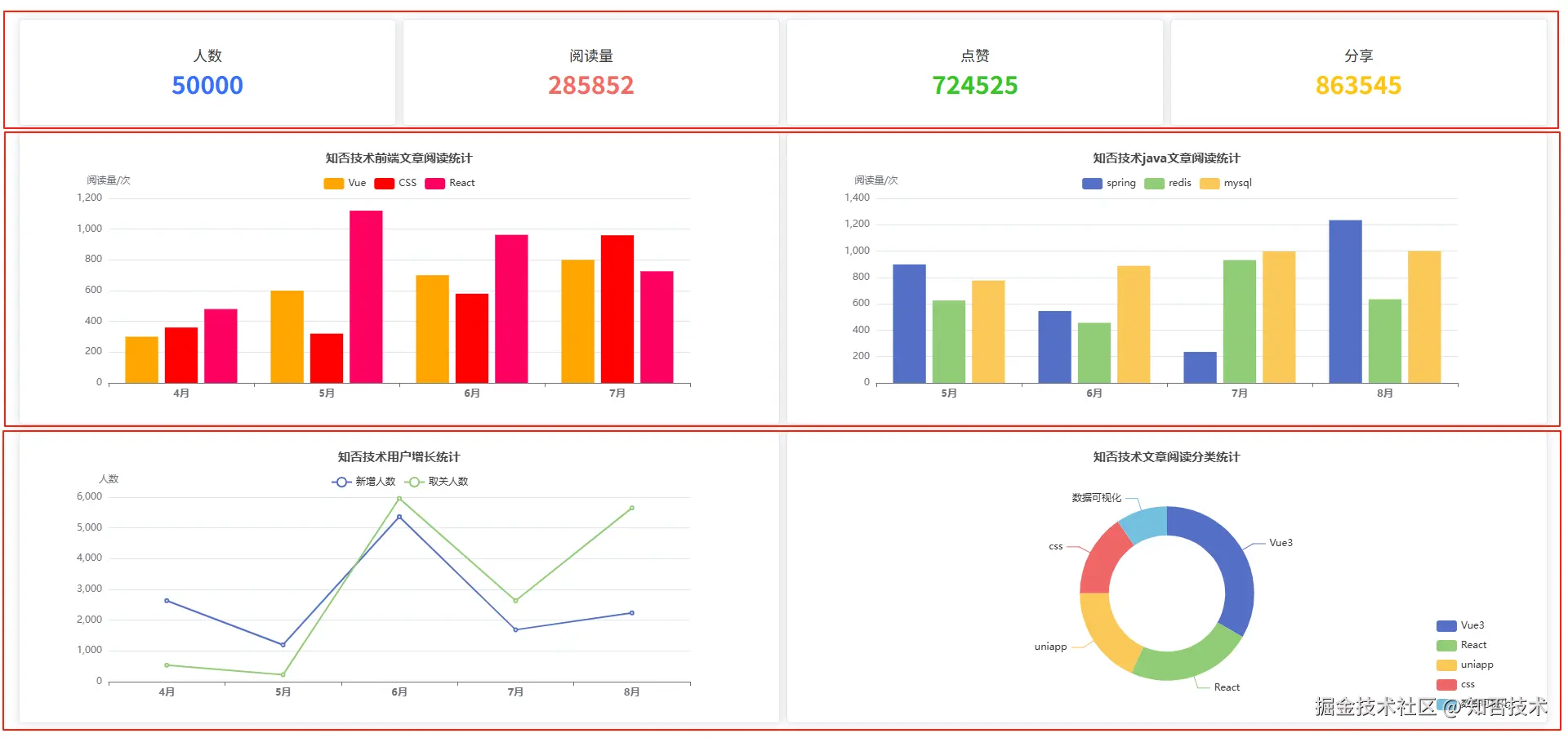
前端组件库用的 ElementPlus,所以这里主要使用 el-row、el-col 和 el-card 进行布局。
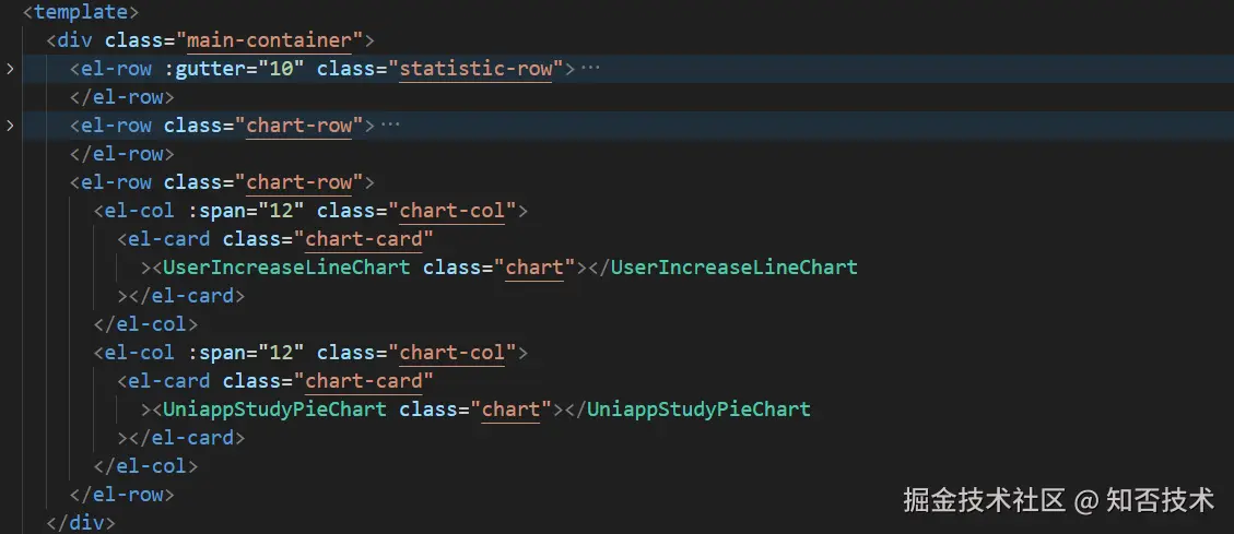
首先我们给首页最外层 div 设置 css 样式:
css
.main-container {
  width: calc(100vw - 20px);
  height: calc(100vh - 20px);
  padding: 10px;
  overflow: hidden; // 避免滚动条
  box-sizing: border-box; // 宽高计算方式:包含 padding 和 border
}
然后页面第一行数据统计占用 16% 高度,下面两行的图标层分别占用 42% 的高度。当然这里大家可以自由设置高度。
css
.statistic-row {
  height: 16%;
  padding: 5px;
}
.chart-row {
  height: 42%;
}
然后 el-col 设置为 100% 高度:
css
.chart-col {
  height: 100%;
  padding: 5px !important;
}
第一行数据统计行设置为 flex 布局,并分别设置子 div 的字体颜色。
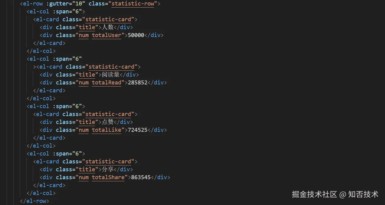
css
.statistic-card {
  height: 100%;
  width: 100%;
  border-radius: 5px;
  ::v-deep .el-card__body {
    height: 100%;
    padding: 0px;
    display: flex;
    flex-direction: column;
    justify-content: center;
    align-items: center;
  }
  .title {
    font-size: 18px;
  }
  .num {
    font-size: 30px;
    font-weight: bold;
  }
  .totalUser {
    color: #3370ff;
  }
  .totalRead {
    color: #f76964;
  }
  .totalLike {
    color: #34c724;
  }
  .totalShare {
    color: #ffc60a;
  }
}
图表行和图表设置宽高为 100%
css
.chart-card {
  height: 100%;
  width: 100%;
  border-radius: 5px;
  ::v-deep .el-card__body {
    height: 100%;
    padding: 20px;
  }
}
.chart {
  height: 100%;
  width: 100%;
}
注:因为 el-card 中的数据主要在 el-card__body 中展示,所以需要通过 v-deep 穿透样式去修改 el-card 的样式。
4. 注意事项
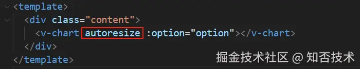
4.1 图表自适应
autoresize 参数可以实现随屏幕自动调整图表大小
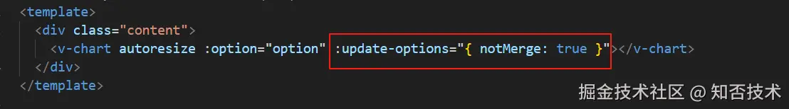
4.2 实时触发视图更新
有时候我们会遇到父组件向 echarts 图表组件传值不能实时更新的问题,可以通过以下配置解决:
ruby
:update-options="{notMerge:true}"