今日实现个登录框的动画效果,记录一下和大家分享😊~
希望对大家也有所帮助,共同成长进步💪~
如果大家喜欢,可以点赞或留言💕~~~~,谢谢大家⭐️⭐️⭐️~~~
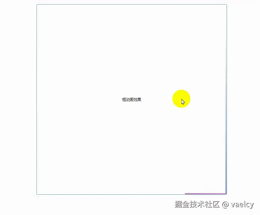
展示效果图
Html部分
html
    <div id="login_box">
      <div class="login-container">
        <span class="login-right-warp-one"></span>
        <span class="login-right-warp-two"></span>
        <span class="login-right-warp-main">框动画效果</span>
      </div>
    </div>
Css部分
css
    * {
        margin: 0;
        padding: 0;
        /* font-size: 16px; */
        font-size: 10px;
        /* background-color: rgb(189, 188, 188); */
      }
      html,
      body {
        width: 100%;
        height: 100%;
        /* background-color: pink; */
        margin: 0 auto;
      }
      :root {
        --el-color-primary: #4da197;
        --el-color-primary-light: #4da197;
        --el-color-white: #ffffff;
      }
      @keyframes loginLeft {
        0% {
          left: -100%;
        }
        50%,
        100% {
          left: 100%;
        }
      }
      @keyframes loginTop {
        0% {
          top: -100%;
        }
        50%,
        100% {
          top: 100%;
        }
      }
      @keyframes loginRight {
        0% {
          right: -100%;
        }
        50%,
        100% {
          right: 100%;
        }
      }
      @keyframes loginBottom {
        0% {
          bottom: -100%;
        }
        50%,
        100% {
          bottom: 100%;
        }
      }
      .login-container {
        width: 500px;
        height: 500px;
        border-radius: 3px;
        border: 1px solid var(--el-color-primary-light);
        position: relative;
        overflow: hidden;
        background-color: var(--el-color-white);
        margin: 0 auto;
      }
      .login-right-warp-one,
      .login-right-warp-two {
        position: absolute;
        display: block;
        width: inherit;
        height: inherit;
        &::before,
        &::after {
          content: "";
          position: absolute;
          z-index: 1;
        }
      }
      .login-right-warp-one {
        &::before {
          filter: hue-rotate(0deg);
          top: 0;
          left: 0;
          width: 100%;
          height: 3px;
          background: linear-gradient(
            90deg,
            transparent,
            var(--el-color-primary)
          );
          animation: loginLeft 3s linear infinite;
        }
        &::after {
          filter: hue-rotate(60deg);
          top: -100%;
          right: 0px;
          width: 3px;
          height: 100%;
          background: linear-gradient(
            180deg,
            transparent,
            var(--el-color-primary)
          );
          animation: loginTop 3s linear infinite;
          animation-delay: 0.7s;
        }
      }
      .login-right-warp-two {
        &::before {
          filter: hue-rotate(120deg);
          bottom: 0px;
          right: -100%;
          width: 100%;
          height: 3px;
          background: linear-gradient(
            270deg,
            transparent,
            var(--el-color-primary)
          );
          animation: loginRight 3s linear infinite;
          animation-delay: 1.4s;
        }
        &::after {
          filter: hue-rotate(300deg);
          bottom: -100%;
          left: 0px;
          width: 3px;
          height: 100%;
          background: linear-gradient(
            360deg,
            transparent,
            var(--el-color-primary)
          );
          animation: loginBottom 3s linear infinite;
          animation-delay: 2.1s;
        }
      }
      .login-right-warp-main {
        display: flex;
        flex-direction: column;
        height: 100%;
        justify-content: center;
        align-items: center;
      }
最后感谢大家阅读⭐️⭐️⭐️,如果文章对你有帮助,喜欢可以点赞或留言哟💕💕💕