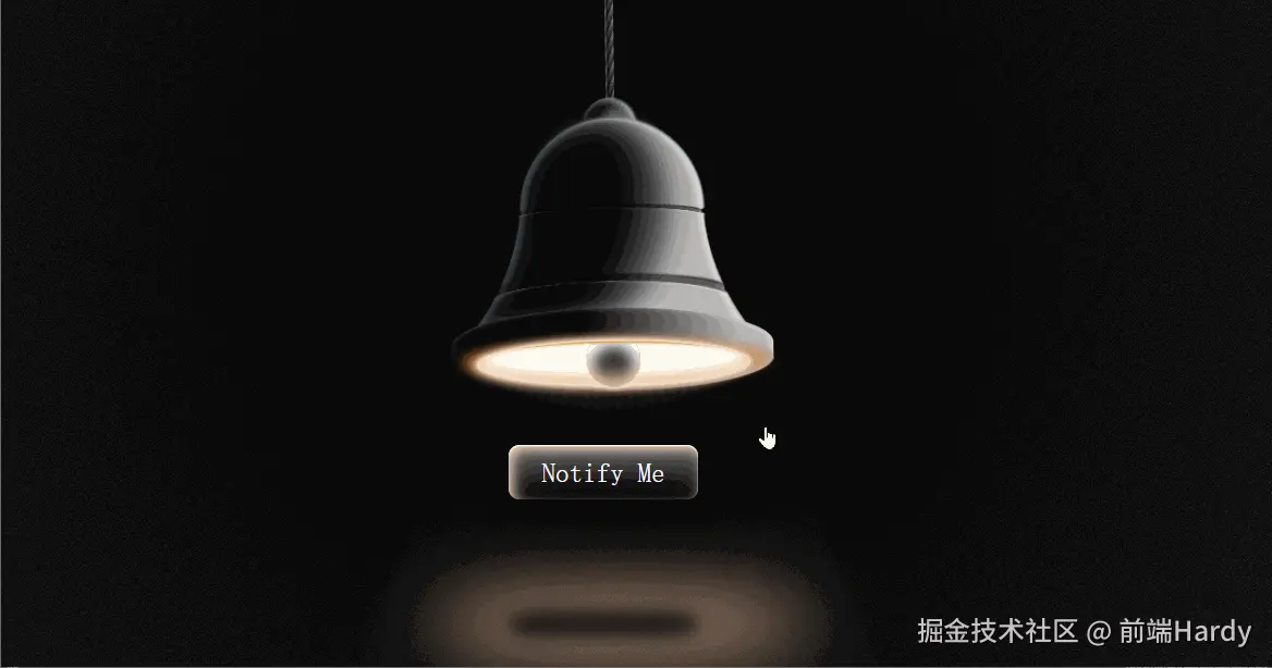
这个 HTML 文件实现了一个带有 3D 效果和动画的"小铃铛"页面,用户可以通过点击铃铛来触发动画效果。
大家复制代码时,可能会因格式转换出现错乱,导致样式失效。建议先少量复制代码进行测试,若未能解决问题,私信回复源码两字,我会发送完整的压缩包给你。
演示效果
HTML&CSS
html
<!DOCTYPE html>
<html lang="en">
<head>
<meta charset="UTF-8">
<meta name="viewport" content="width=device-width, initial-scale=1.0">
<title>小铃铛</title>
<style>
* {
box-sizing: border-box;
}
html,
body {
height: 100%;
overflow: hidden;
}
body {
display: flex;
flex-direction: row;
flex-wrap: wrap;
justify-content: center;
align-items: center;
margin: 0;
background: #000;
font-size: calc(var(--_size) * 0.01);
--_size: min(min(600px, 50vh), 50vw);
--base-clr: #b7b5b4;
--degofrot: 0.8;
}
.bell-container {
width: 80em;
height: 80em;
opacity: 1;
cursor: pointer;
transform-origin: 50% -50vh;
animation: 5s ease-in-out infinite bell;
}
@keyframes bell {
0% {
rotate: calc(1deg * var(--degofrot));
}
50% {
rotate: calc(-1deg * var(--degofrot));
}
100% {
rotate: calc(1deg * var(--degofrot));
}
}
* {
transition: filter 0.4s ease-in-out, box-shadow 0.4s ease-in-out,
opacity 0.4s ease-in-out, color 0.4s ease-in-out, background 0.4s ease-in-out,
text-shadow 0.4s ease-in-out;
&::before,
&::after {
transition: filter 0.4s ease-in-out, box-shadow 0.4s ease-in-out,
opacity 0.4s ease-in-out, color 0.4s ease-in-out, background 0.4s ease-in-out,
text-shadow 0.4s ease-in-out;
}
}
.bell-container,
.bell-container * {
position: absolute;
left: 0;
right: 0;
top: 0;
bottom: 0;
margin: auto;
}
.rope {
height: 50vh;
width: 2em;
translate: 0 -52%;
background: linear-gradient(90deg, #2d54744d 0%, #000b 30%, transparent 100%),
repeating-linear-gradient(-70deg, #252525, #888 2%, #3a3a3a 3%);
}
.bell-top {
width: 14%;
height: 14%;
border-radius: 50%;
translate: 0 -28em;
background: var(--base-clr);
box-shadow: inset -1em -0.5em 2em 0.5em #fff, inset 1em -1em 2em 3em #000,
0 -0.1em 0.4em 0.3em #c6eaffa8;
}
.bell-base {
width: 50%;
height: 50%;
border-radius: 50%;
translate: 0 -24%;
background: var(--base-clr);
box-shadow: 0 -0.1em 0.4em 0.2em #c6eaffa8;
}
.bell-base:before {
content: "";
background-image: radial-gradient(circle at -80% -12%,
transparent 50em,
var(--base-clr) 50em);
position: absolute;
translate: -18em 20em;
width: 100%;
height: 80%;
}
.bell-base:after {
content: "";
background-image: radial-gradient(circle at -80% -12%,
transparent 50.1em,
#cacaca 50.3em,
var(--base-clr) 50.5em);
position: absolute;
translate: 18em 20em;
width: 100%;
height: 80%;
transform: rotateY(180deg);
}
.bell-base:nth-child(2) {
filter: brightness(3) blur(1em);
scale: 0.74 0.84;
translate: 0em -11em;
}
.shadow-l1 {
width: 30em;
height: 42em;
border-radius: 50%;
rotate: 12deg;
translate: -3em -6em;
filter: blur(2em);
background: #797a80;
}
.shadow-l2 {
width: 130%;
height: 90%;
filter: blur(5em);
translate: -6em 9em;
}
.shadow-l2::before {
display: block;
content: "";
width: 68%;
height: 64%;
border-radius: 50%;
rotate: -54deg;
translate: -8em 2em;
scale: 1;
background: red;
background: #000000;
}
.glow {
width: 100%;
height: 100%;
filter: brightness(2) blur(2em);
}
.glow::before {
clip-path: polygon(9% 83%,
12% 79%,
15% 74%,
18% 68%,
20% 62%,
22% 56%,
23% 50%,
24% 43%,
25% 38%,
25% 34%,
26% 29%,
26% 26%,
27% 22%,
29% 19%,
30% 15%,
32% 13%,
34% 10%,
37% 7%,
41% 5%,
44% 4%,
47% 3%,
51% 3%,
55% 3%,
58% 5%,
62% 6%,
73% 29%,
72% 25%,
70% 20%,
67% 16%,
63% 12%,
60% 9%,
58% 8%,
55% 7%,
52% 6%,
48% 6%,
44% 8%,
41% 9%,
37% 12%,
36% 14%,
33% 16%,
31% 20%,
30% 23%,
29% 26%,
28% 31%,
27% 36%,
27% 39%,
26% 44%,
26% 48%,
26% 52%,
25% 56%,
23% 61%,
22% 65%,
21% 69%,
19% 72%,
17% 75%,
15% 78%,
13% 81%);
width: 100%;
height: 80%;
translate: 0 6em;
scale: 0.94 0.94;
background: #fff3;
display: block;
content: "";
}
.glow2 {
width: 100%;
height: 100%;
filter: brightness(1) blur(0.3em);
opacity: 0.1;
}
.glow2::before {
clip-path: polygon(9.21% 83%,
12.28% 79%,
15.35% 74%,
18.41% 68%,
20.46% 62%,
22.51% 56%,
23.53% 50%,
24.55% 43%,
25.58% 34%,
26.6% 29%,
27.62% 22%,
29.16% 18.5%,
30.95% 15.75%,
32.74% 13%,
34.78% 10%,
37.85% 7%,
41.94% 5%,
45.01% 4%,
48.08% 3%,
52.17% 3%,
56.27% 3%,
64.01% 6.36%,
55.75% 4.5%,
47.83% 4.75%,
42.84% 5.88%,
39.51% 7.88%,
36.45% 10.38%,
33.38% 14.88%,
30.69% 19%,
29.67% 22.5%,
28.8% 26.72%,
28.21% 31.36%,
26.92% 38.44%,
26.57% 43.67%,
25.51% 48.34%,
25% 54.34%,
23.4% 60.69%,
21.23% 65.38%,
18.41% 71.5%,
16.88% 74.75%,
12.28% 80.5%);
width: 100%;
height: 84%;
translate: -1em 8.4em;
scale: 1;
background: #fff3;
display: block;
content: "";
}
.left-glow {
--lgc: #5d819666;
width: 50%;
height: 50%;
border-radius: 50%;
translate: 0 -24%;
background: transparent;
box-shadow: inset 1em 0em 1em 0.2em var(--lgc);
clip-path: polygon(0 0, 100% 0, 100% 50%, 0 50%);
}
.left-glow2 {
--lgc2: #5d819666;
width: 49%;
height: 50%;
background-image: radial-gradient(circle at -80% -12%,
transparent 50em,
var(--lgc2) 50.3em,
transparent 52em);
position: absolute;
translate: -19em 10.35em;
clip-path: polygon(0 0, 100% 0, 100% 78%, 0 78%);
}
.r-glow {
--lgc: #fffaf680;
width: 50%;
height: 50%;
border-radius: 50%;
translate: 0 -24%;
background: transparent;
box-shadow: inset 1em 0em 1em 0.2em var(--lgc);
clip-path: polygon(0 0, 100% 0, 100% 50%, 0 50%);
transform: rotateY(180deg);
}
.r-glow2 {
--lgc2: #fffaf680;
width: 49%;
height: 50%;
background-image: radial-gradient(circle at -80% -12%,
transparent 50em,
var(--lgc2) 50.3em,
transparent 52em);
position: absolute;
translate: 18.2em 10.35em;
clip-path: polygon(0 0, 100% 0, 100% 78%, 0 78%);
transform: rotateY(180deg) rotateZ(-2deg);
}
.mid-ring.small {
translate: 0.04em -8em;
scale: 0.8 0.5;
}
.mid-ring {
width: 64%;
height: 10%;
border-radius: 50%;
translate: -0.1em 10em;
box-shadow: inset -0.3em 1.3em 0.4em -1em #fff5,
-0.2em -1.2em 0.4em -0.4em #505050, -0.1em -1.8em 0.4em -0.4em #fff5,
0 -2.5em 0.4em -1em #000000;
mix-blend-mode: hard-light;
filter: brightness(0.8);
}
.mid-ring::before,
.mid-ring::after {
content: "";
display: block;
background: #000;
width: 2em;
height: 2em;
top: 10%;
border-radius: 50%;
position: absolute;
}
.mid-ring::after {
right: -2%;
}
.mid-ring::before {
left: -2%;
}
.bell-buff-t {
background: #fff2;
width: 72%;
height: 12%;
border-radius: 50%;
translate: 0 16em;
filter: blur(1em);
}
.bell-buff {
background: linear-gradient(90deg, black 40%, var(--base-clr) 90%);
width: 88%;
height: 20%;
border-radius: 50% 50% 50% 50% / 50% 50% 30% 30%;
translate: 0 20em;
box-shadow: inset 1em 0 2em -1em #5d819666, inset -1em 0 2em -1em #fff;
}
.bell-btm {
width: 88%;
height: 18%;
border-radius: 50%;
translate: 0 23em;
background: linear-gradient(90deg, black 40%, var(--base-clr) 90%);
}
.bell-btm2 {
width: 74%;
height: 12%;
border-radius: 50%;
translate: 0 24em;
background: #fffff6;
box-shadow: 0 0 1em 0.6em #ffe9d4, -0.8em 0.2em 2em 1em #cca37f,
-5.4em -0.6em 3em -1em #ce6e1abb, 6em -0.6em 3em -1em #ce6e1abb,
inset 0em 30.3em 0.3em -30em #c7962d, inset 0 -2em 2em -2em #ffe9d4,
inset 0em -1em 2em 1em #ce6e1a66;
filter: brightness(1);
}
.off .bell-btm2 {
filter: brightness(0.02);
}
.bell-ring-container {
width: 74%;
height: 24%;
border-radius: 50% 50% 50% 50% / 25% 25% 0% 0%;
translate: 0 29.2em;
overflow: hidden;
}
.bell-ring {
width: 12em;
height: 12em;
background: #fff;
border-radius: 50%;
translate: 0 -6em;
box-shadow: 0 0.8em 1em -0.3em #f8e1d0, inset 0 -6em 4em -4em #e3b695,
inset 0 1em 3em 1em #fff4, inset 0 2em 3em 1em #fff,
inset 0 100em 0 100em #2c2c2c;
}
.off .bell-ring {
background: #000;
box-shadow: 0 0.8em 1em -0.3em #f8e1d000, inset 0 -6em 4em -4em #e3b69500,
inset 0 1em 3em 1em #fff0, inset 0 -2em 3em 1em #fff2,
inset 0 100em 0 100em #000;
}
.bell-rays {
mix-blend-mode: soft-light;
box-shadow: inset 0 -21em 4em -20em #000;
width: 100%;
height: 140%;
translate: 0 -4em;
border-radius: 50%;
}
.bell-rays::before {
content: "";
display: block;
width: 100em;
height: 100em;
transform-origin: 50% 50%;
position: absolute;
left: -21em;
top: -77em;
border-radius: 100%;
filter: blur(0.6em);
background: repeating-conic-gradient(at 50% 50%,
#fff2 0%,
transparent 0.6%,
#fff2 0.8%);
animation: radiate 1s linear infinite;
}
.off .bell-rays {
opacity: 0;
}
@keyframes radiate {
0% {
rotate: 0deg;
}
100% {
rotate: 6deg;
}
}
.volumetric {
width: 98%;
height: 224%;
translate: 0 124em;
opacity: 0.2;
.vl {
width: 100%;
height: 100%;
transform-origin: 50% 20em;
rotate: 22deg;
box-shadow: inset 40em 0 20em -20em #fff1;
}
.vr {
width: 100%;
height: 100%;
transform-origin: 50% 20em;
rotate: -22deg;
box-shadow: inset -40em 0 20em -20em #fff1;
}
}
.off .volumetric {
opacity: 0;
}
.grain {
z-index: 10;
position: absolute;
pointer-events: none;
width: 100%;
height: 100%;
top: 0;
bottom: 0;
margin: auto;
background: radial-gradient(circle at 50% 50%, #000, #0000),
url("data:image/svg+xml,%3Csvg viewBox='0 0 600 600' xmlns='http://www.w3.org/2000/svg'%3E%3Cfilter id='noiseFilter'%3E%3CfeTurbulence type='fractalNoise' baseFrequency='2' numOctaves='3' stitchTiles='stitch'/%3E%3C/filter%3E%3Crect width='100%25' height='100%25' filter='url(%23noiseFilter)'/%3E%3C/svg%3E");
filter: contrast(100%) brightness(200%) grayscale(1) opacity(0.168);
mix-blend-mode: screen;
}
.button {
position: relative;
font-size: 6em;
font-family: monospace;
background: #000;
top: 8em;
width: fit-content;
height: fit-content;
color: #fff;
cursor: pointer;
padding: 0.4em 1.2em;
border-radius: 0.4em;
text-shadow: 0 -1px 3px #fff0;
box-shadow: inset 0 0.04em 0.06em 0 #fff, inset 0 1em 1em 0 #fff5,
inset 0 0.2em 0.2em 0 #e3b695;
animation: 5s ease-in-out infinite lumenbtn;
&:hover {
color: #fff;
text-shadow: 0 -1px 3px #fff;
transition: all 0.16s ease-in-out;
}
&::before,
&::after {
content: "";
display: block;
width: 100%;
height: 54%;
position: absolute;
top: 6em;
left: 0;
right: 0;
}
&::before {
background: #e3b695;
scale: 2;
z-index: -2;
filter: blur(12px);
border-radius: 100%;
animation: 5s ease-in-out infinite lumen;
}
&::after {
background: #000c;
z-index: -1;
filter: blur(0.3em);
border-radius: 30%;
}
}
@keyframes lumenbtn {
0% {
box-shadow: inset 0 0.04em 0.06em 0 #fff,
inset calc(-0.2em * var(--degofrot)) 1em 1em 0 #fff5,
inset calc(-0.2em * var(--degofrot)) 0.2em 0.4em 0 #e3b695;
}
50% {
box-shadow: inset 0 0.04em 0.06em 0 #fff,
inset calc(0.2em * var(--degofrot)) 1em 1em 0 #fff5,
inset calc(0.2em * var(--degofrot)) 0.2em 0.4em 0 #e3b695;
}
100% {
box-shadow: inset 0 0.04em 0.06em 0 #fff,
inset calc(-0.2em * var(--degofrot)) 1em 1em 0 #fff5,
inset calc(-0.2em * var(--degofrot)) 0.2em 0.4em 0 #e3b695;
}
}
@keyframes lumen {
0% {
translate: calc(-0.8em * var(--degofrot));
}
50% {
translate: calc(0.8em * var(--degofrot));
}
100% {
translate: calc(-0.8em * var(--degofrot));
}
}
.off+.button {
opacity: 0;
pointer-events: none;
}
</style>
</head>
<body>
<div class="bell-container off" onclick="this.classList.toggle('off')">
<div class="rope"></div>
<div class="bell-top"></div>
<div class="bell-base"></div>
<div class="bell-base"></div>
<div class="shadow-l1"></div>
<div class="shadow-l2"></div>
<div class="left-glow"></div>
<div class="left-glow2"></div>
<div class="r-glow"></div>
<div class="r-glow2"></div>
<div class="mid-ring"></div>
<div class="mid-ring small"></div>
<div class="glow"></div>
<div class="glow2"></div>
<div class="bell-buff-t"></div>
<div class="bell-buff"></div>
<div class="bell-btm"></div>
<div class="bell-btm2"></div>
<div class="bell-ring-container">
<div class="bell-ring"></div>
<div class="bell-rays"></div>
</div>
<div class="volumetric">
<div class="vl"></div>
<div class="vr"></div>
</div>
</div>
<div class="button">Notify Me</div>
<div class="grain"></div>
</body>
</html>HTML
- bell-container off:铃铛容器,初始状态为关闭(off),点击时切换 off 类。
- 包含铃铛的各个部分,如绳子、铃铛顶部、底部、阴影、高光等。
- button:一个按钮,显示"Notify Me"。
- grain:一个覆盖整个页面的纹理层,用于增加视觉效果。
CSS
- bell-container off:铃铛的主容器,初始状态为关闭(off),点击时切换 off 类。
- rope:铃铛的绳子部分。
- bell-top:铃铛的顶部。
- bell-base:铃铛的底部,有两个相同的元素,一个用于显示,一个用于模糊效果。
- shadow-l1 和 shadow-l2:铃铛的阴影部分。
- left-glow 和 left-glow2:铃铛左侧的高光效果。
- r-glow 和 r-glow2:铃铛右侧的高光效果。
- mid-ring 和 mid-ring small:铃铛中间的环形部分。
- glow 和 glow2:铃铛的发光效果。
- bell-buff-t 和 bell-buff:铃铛的缓冲部分。
- bell-btm 和 bell-btm2:铃铛的底部部分。
- bell-ring-container:铃铛的铃铛部分,包含铃铛的主体和光线效果。
- bell-ring:铃铛的主体。
- bell-rays:铃铛的光线效果。
- volumetric:铃铛的体积效果,包含两个子元素用于创建立体感。
- vl 和 vr:用于创建立体感的左右部分。
各位互联网搭子,要是这篇文章成功引起了你的注意,别犹豫,关注、点赞、评论、分享走一波,让我们把这份默契延续下去,一起在知识的海洋里乘风破浪!