居中是前端面试的必考题之一。很多人只会写 flex,却不知道在不同场景下(文本、固定宽高、不固定宽高、现代布局)该如何选择方案。
本文将居中问题拆解为两个维度:
- 方向:水平 / 垂直 / 水平垂直
- 元素尺寸:固定宽高 / 不固定宽高
而 "如何实现元素居中" 关键在于 系统性地分析场景,选择合适的方案
一、文本类居中
1. 水平居中
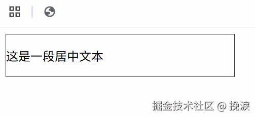
最常见的是 text-align: center;,适用于行内元素、inline-block 或文本。
xml
<div class="box text-center">
  <p>这是一段居中文本</p>
</div>
css
.box {
  width: 300px;
  border: 1px solid #333;
  text-align: center;
}
效果:文字在容器中水平居中。
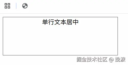
2. 单行垂直居中
利用 line-height 等于容器高度。
ini
<div class="box line-center">
  单行文本居中
</div>
css
.box {
  width: 300px;
  height: 100px;
  border: 1px solid #333;
  line-height: 100px;
  text-align: center;
}
效果:文本垂直居中,适合固定高度的按钮或导航。
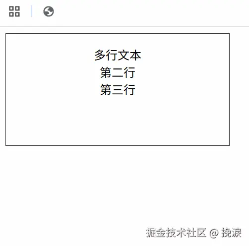
3. 多行垂直居中
多行文本不能用 line-height,一般用 padding。
javascript
<div class="box padding-center">
  <p>多行文本<br>第二行<br>第三行</p>
</div>
css
.box {
  width: 300px;
  height: 150px;
  border: 1px solid #333;
  padding: 40px 0; /* 通过内边距调整 */
  text-align: center;
}
效果:多行内容整体居中。
二、固定宽高块居中
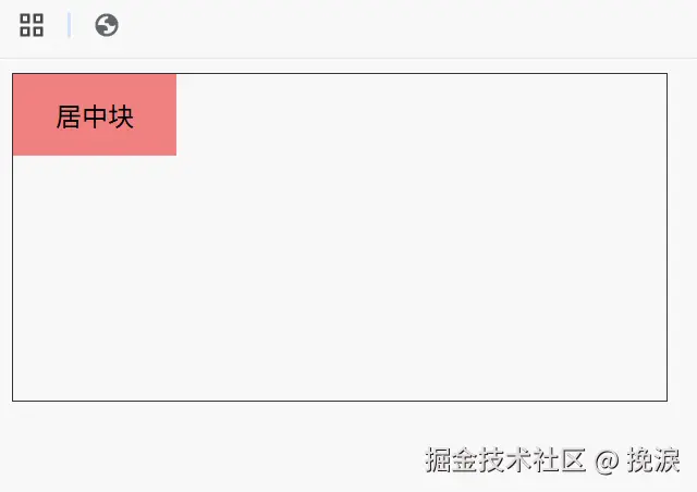
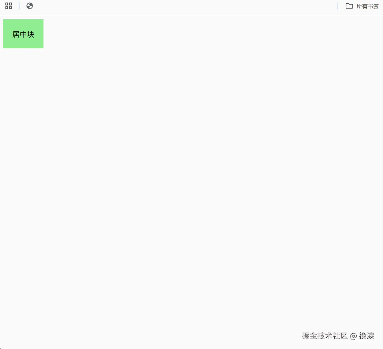
1. 绝对定位 + 负 margin
经典方案,兼容性最强。
ini
<div class="parent">
  <div class="child">居中块</div>
</div>
css
.parent {
  position: relative;
  width: 400px;
  height: 200px;
  border: 1px solid #333;
}

.child {
  position: absolute;
  top: 50%;
  left: 50%;
  width: 100px;
  height: 50px;
  margin-left: -50px;
  margin-top: -25px;
  background: lightcoral;
  text-align: center;
  line-height: 50px;
}
效果:子元素精确居中。
2. absolute + 四边 0 + margin:auto
写法更简洁。
css
.child {
  position: absolute;
  top: 0; bottom: 0; left: 0; right: 0;
  margin: auto;
  width: 100px;
  height: 50px;
  background: lightseagreen;
  text-align: center;
  line-height: 50px;
}
效果:同样在正中间。
三、不固定宽高块居中
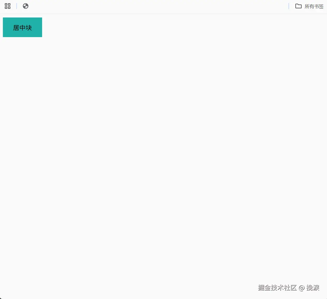
1. absolute + transform
最常用且简洁的方案。
css
.child {
  position: absolute;
  top: 50%;
  left: 50%;
  transform: translate(-50%, -50%);
  background: lightblue;
  padding: 20px;
}
效果:无论子元素多大,都能居中。
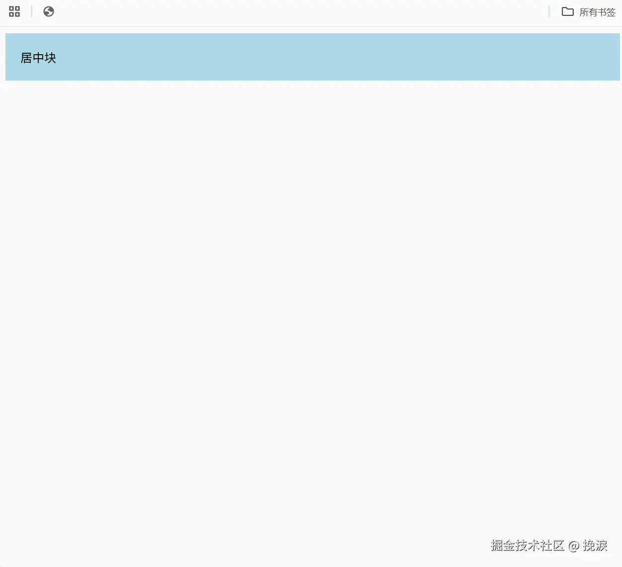
2. absolute + 四边 0 + margin:auto
要求子元素有宽高(可用 fit-content)。
css
.child {
  position: absolute;
  top: 0; bottom: 0; left: 0; right: 0;
  margin: auto;
  width: fit-content;
  height: fit-content;
  background: lightgreen;
  padding: 20px;
}
效果:自适应大小时依旧居中。
四、现代布局
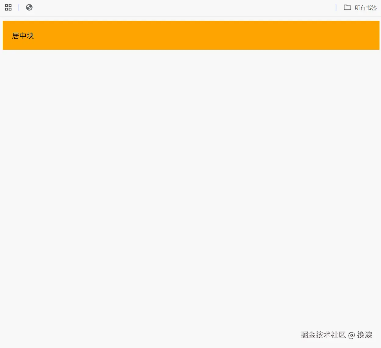
1. Flexbox
最推荐,简洁直观。
css
.parent {
  display: flex;
  justify-content: center;
  align-items: center;
  width: 400px;
  height: 200px;
  border: 1px solid #333;
}

.child {
  background: orange;
  padding: 20px;
}
效果:子元素始终完美居中,代码少。
2. Grid
语法更简洁,未来趋势。
css
.parent {
display: grid;
place-items: center;
width: 400px;
height: 200px;
border: 1px solid #333;
}
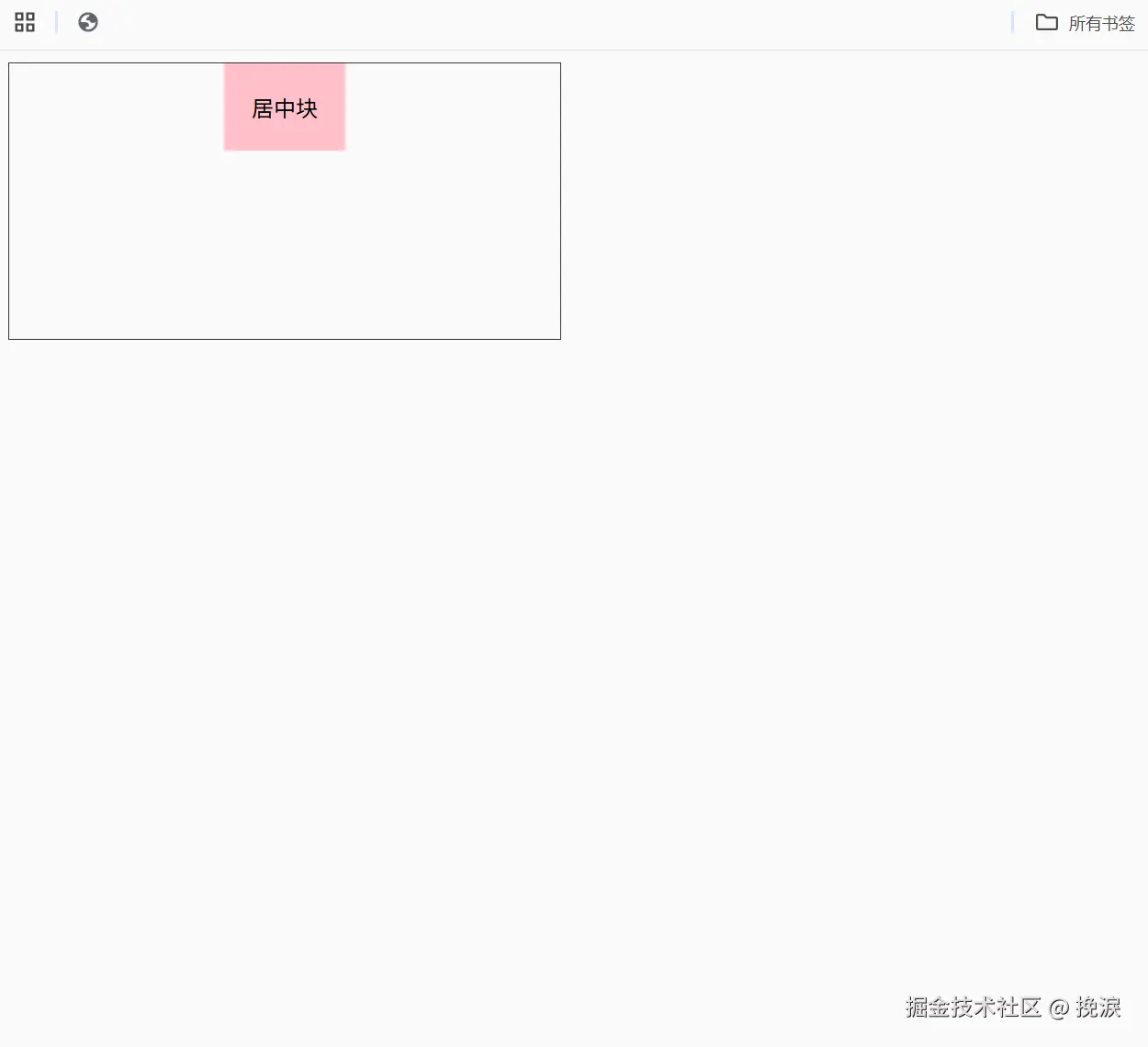
.child {
background: pink;
padding: 20px;
}效果:写一行就能居中,语义更强。
五、小结
在面试中,单纯写出代码还不够,更重要的是表达思路:
-
先问清楚:
- 居中的是文本还是块?
- 是否固定宽高?
- 对兼容性的要求?
-
再给出答案:
- 首选:Flex/Grid,代码简洁、可维护性好。
- 降级方案:absolute + transform,适合老项目。
- 文本类 :
text-align、line-height。
-
补充对比:
- 性能上差别不大,但现代布局更可维护。
table-cell、line-height多行等方案已过时,不推荐。