概念
什么是安全区域 getSafeAreaInsets()
安全区域是屏幕上不会被以下系统元素遮挡的区域:
- 状态栏 :显示时间、电量、信号等信息的顶部区域
- 导航栏 :底部的虚拟按键区域(Android)
- 刘海屏 :iPhone X 及以后机型的顶部刘海区域
- 圆角 :设备屏幕的圆角部分
- 胶囊按钮 :微信小程序右上角的胶囊按钮区域
插件参考
需要将navigationStyle设置为custom
新建hook文件
useNavigation.ts
ts
import { computed, ref } from 'vue'

/**
 * 导航栏相关信息的 Hook
 * 用于获取状态栏高度、胶囊按钮信息、导航栏高度等
 */
export function useNavigation() {
  // 状态栏高度(单位:px)
  const statusBarHeight = ref(0)
  // 胶囊按钮信息(仅微信小程序)
  const menuButtonInfo = ref<UniApp.GetMenuButtonBoundingClientRectRes | null>(null)
  // 系统信息
  const systemInfo = ref<UniApp.GetSystemInfoResult | null>(null)

  // 计算导航栏高度
  // 计算这个导航栏的高度有很多种方案
  const navigationBarHeight = computed(() => {
    if (!menuButtonInfo.value || !statusBarHeight.value) {
      // 默认导航栏高度(当无法获取胶囊信息时)
      return statusBarHeight.value + 44
    }

    const menuHeight = menuButtonInfo.value.height // 胶囊按钮的高度
    const menuTop = menuButtonInfo.value.top // 胶囊按钮距离顶部的距离
    const menuBottom = menuTop + menuHeight // 胶囊按钮底部距离

    // 导航栏高度 = 胶囊按钮底部距离 + 胶囊按钮距离导航栏底部的距离
    // 通常胶囊按钮距离导航栏底部的距离等于距离顶部的距离
    const paddingBottom = menuTop - statusBarHeight.value // 胶囊按钮距离导航栏底部的距离
    return menuBottom + paddingBottom
  })

  // 计算内容区域的顶部偏移量(状态栏 + 导航栏)
  const contentTop = computed(() => {
    return navigationBarHeight.value
  })

  // 初始化获取系统信息
  const initNavigation = () => {
    // 获取系统信息
    uni.getSystemInfo({
      success: (res) => {
        systemInfo.value = res
        statusBarHeight.value = res.statusBarHeight || 0
      },
      fail: () => {
        // 降级处理
        statusBarHeight.value = 20 // iOS 默认状态栏高度
      },
    })

    // 获取胶囊按钮信息(仅小程序环境)
    // #ifdef MP
    try {
      const menuButton = uni.getMenuButtonBoundingClientRect()
      if (menuButton && menuButton.width > 0) {
        menuButtonInfo.value = menuButton
      }
    }
    catch (error) {
      console.warn('获取胶囊按钮信息失败:', error)
    }
    // #endif
  }

  // 获取安全区域信息
  const getSafeAreaInsets = () => {
    if (!systemInfo.value)
      return null

    // #ifdef MP-WEIXIN
    const windowInfo = uni.getWindowInfo() // 获取窗口信息
    return windowInfo.safeArea
      ? {
          top: windowInfo.safeArea.top, // 顶部安全边距(避开状态栏、刘海等)
          right: windowInfo.windowWidth - windowInfo.safeArea.right, // 右侧安全边距(避开圆角等)
          bottom: windowInfo.windowHeight - windowInfo.safeArea.bottom, // 底部安全边距(避开导航栏、Home指示器等
          left: windowInfo.safeArea.left, // 左侧安全边距(避开圆角等)
        }
      : null
    // #endif

    // #ifndef MP-WEIXIN
    return systemInfo.value.safeAreaInsets
    // #endif
  }

  return {
    statusBarHeight,
    menuButtonInfo,
    systemInfo,
    navigationBarHeight,
    contentTop,
    initNavigation,
    getSafeAreaInsets,
  }
}

/**
 * 同步获取导航栏高度的工具函数
 * 适用于需要立即获取高度的场景
 */
export function getNavigationHeight() {
  let statusBarHeight = 0
  let navigationBarHeight = 44 // 默认导航栏高度

  try {
    // 获取系统信息
    const systemInfo = uni.getSystemInfoSync()
    statusBarHeight = systemInfo.statusBarHeight || 0

    // #ifdef MP-WEIXIN
    // 获取胶囊按钮信息
    const menuButton = uni.getMenuButtonBoundingClientRect()
    if (menuButton && menuButton.width > 0) {
      const menuHeight = menuButton.height
      const menuTop = menuButton.top
      const menuBottom = menuTop + menuHeight
      const paddingBottom = menuTop - statusBarHeight
      navigationBarHeight = menuBottom + paddingBottom
    }
    else {
      navigationBarHeight = statusBarHeight + 44
    }
    // #endif

    // #ifndef MP-WEIXIN
    navigationBarHeight = statusBarHeight + 44
    // #endif
  }
  catch (error) {
    console.warn('获取导航栏高度失败:', error)
    statusBarHeight = 20
    navigationBarHeight = 64
  }

  return {
    statusBarHeight,
    navigationBarHeight,
    contentTop: navigationBarHeight,
  }
}
图片标注
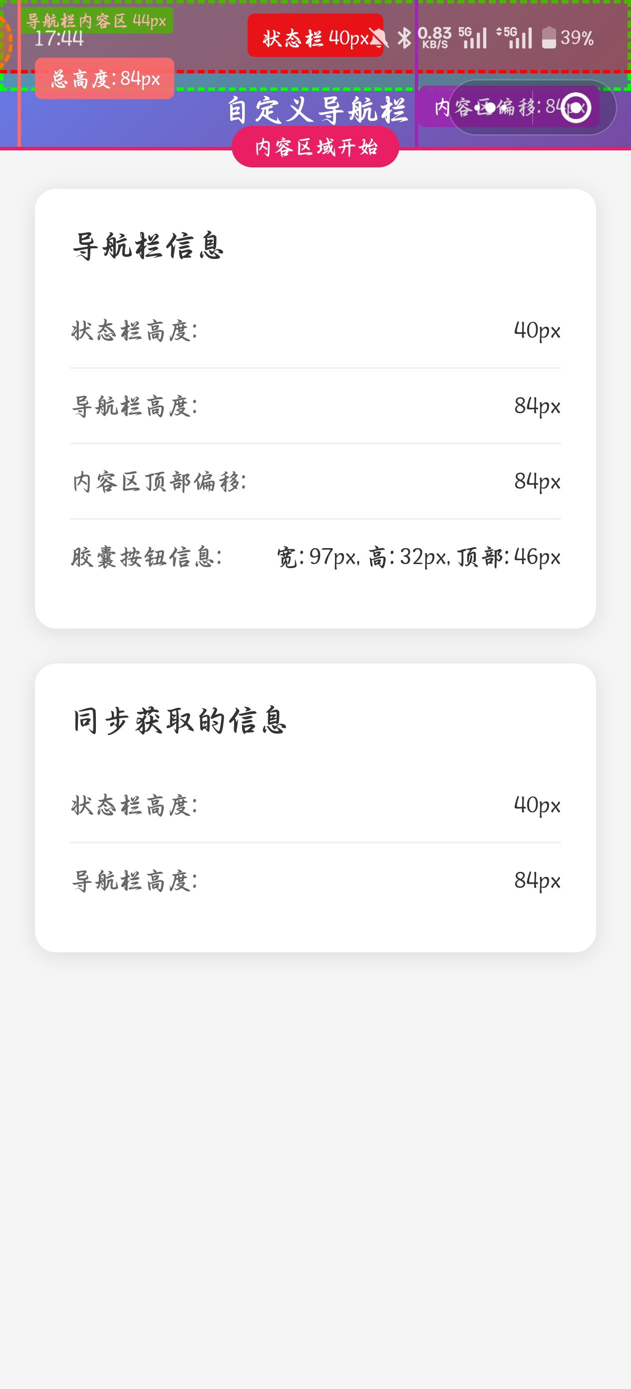
演示
如果使用的是unibest这个架子去开发的可以直接使用下面的代码拷贝进页面进行演示查看,也就是上面图片展示的数据,可以在微信开发者工具中切换不同的机型去查看数据,做一个更好的理解
html
<route lang="jsonc" type="page">
{
  "style": {
    "navigationStyle": "custom",
    "navigationBarTitleText": "导航栏高度示例"
  }
}
</route>

<script setup lang="ts">
import { getNavigationHeight, useNavigation } from '@/hooks'

// 使用 Hook 方式(响应式)
const {
  statusBarHeight,
  menuButtonInfo,
  navigationBarHeight,
  contentTop,
  initNavigation,
  getSafeAreaInsets,
} = useNavigation()

// 使用同步方式(立即获取)
const syncHeights = getNavigationHeight()

// 组件挂载时初始化
onMounted(() => {
  initNavigation()

  console.log('同步获取的高度信息:', syncHeights)
})

// 监听高度变化
watch([statusBarHeight, navigationBarHeight], ([newStatusHeight, newNavHeight]) => {
  console.log('状态栏高度:', newStatusHeight)
  console.log('导航栏高度:', newNavHeight)
  console.log('内容区顶部偏移:', contentTop.value)
})
</script>

<template>
  <view class="demo-page">
    <!-- 状态栏标注区域 -->
    <view
      class="status-bar-annotation"
      :style="{
        height: `${statusBarHeight}px`,
      }"
    >
      <view class="annotation-label">
        <text class="annotation-text">
          状态栏 {{ statusBarHeight }}px
        </text>
      </view>
    </view>

    <!-- 自定义导航栏 -->
    <view
      class="custom-navbar box-border"
      :style="{
        height: `${navigationBarHeight}px`,
        paddingTop: `${statusBarHeight}px`,
      }"
    >
      <!-- 导航栏内容区域标注 -->
      <view class="navbar-content-annotation">
        <text class="navbar-annotation-text">
          导航栏内容区 44px
        </text>
      </view>

      <view class="navbar-content">
        <text class="navbar-title">
          自定义导航栏
        </text>
      </view>

      <!-- 胶囊按钮标注(仅微信小程序) -->
      <view
        v-if="menuButtonInfo"
        class="capsule-annotation"
        :style="{
          width: `${menuButtonInfo.width}px`,
          height: `${menuButtonInfo.height}px`,
          top: `${menuButtonInfo.top - statusBarHeight}px`,
          right: `${menuButtonInfo.right}px`,
        }"
      >
        <view class="capsule-label">
          <text class="capsule-text">
            胶囊按钮<br>
            {{ menuButtonInfo.width }}×{{ menuButtonInfo.height }}px<br>
            距顶: {{ menuButtonInfo.top }}px
          </text>
        </view>
      </view>
    </view>

    <!-- 导航栏总高度标注 -->
    <view class="navbar-height-annotation">
      <view class="height-indicator">
        <view class="height-line" />
        <text class="height-text">
          总高度: {{ navigationBarHeight }}px
        </text>
      </view>
    </view>

    <!-- 内容区域偏移标注 -->
    <view class="content-offset-annotation">
      <view class="offset-indicator">
        <view class="offset-line" />
        <text class="offset-text">
          内容区偏移: {{ contentTop }}px
        </text>
      </view>
    </view>

    <!-- 内容区域分割线 -->
    <view
      class="content-divider"
      :style="{
        top: `${contentTop}px`,
      }"
    >
      <text class="divider-text">
        内容区域开始
      </text>
    </view>

    <!-- 内容区域 -->
    <view
      class="content"
      :style="{
        paddingTop: `${contentTop + 24}px`,
      }"
    >
      <view class="info-card">
        <text class="card-title">
          导航栏信息
        </text>

        <view class="info-item">
          <text class="label">
            状态栏高度:
          </text>
          <text class="value">
            {{ statusBarHeight }}px
          </text>
        </view>

        <view class="info-item">
          <text class="label">
            导航栏高度:
          </text>
          <text class="value">
            {{ navigationBarHeight }}px
          </text>
        </view>

        <view class="info-item">
          <text class="label">
            内容区顶部偏移:
          </text>
          <text class="value">
            {{ contentTop }}px
          </text>
        </view>

        <view v-if="menuButtonInfo" class="info-item">
          <text class="label">
            胶囊按钮信息:
          </text>
          <text class="value">
            宽: {{ menuButtonInfo.width }}px,
            高: {{ menuButtonInfo.height }}px,
            顶部: {{ menuButtonInfo.top }}px
          </text>
        </view>
      </view>

      <view class="info-card">
        <text class="card-title">
          同步获取的信息
        </text>

        <view class="info-item">
          <text class="label">
            状态栏高度:
          </text>
          <text class="value">
            {{ syncHeights.statusBarHeight }}px
          </text>
        </view>

        <view class="info-item">
          <text class="label">
            导航栏高度:
          </text>
          <text class="value">
            {{ syncHeights.navigationBarHeight }}px
          </text>
        </view>
      </view>
    </view>
  </view>
</template>

<style lang="scss" scoped>
.demo-page {
  min-height: 100vh;
  background-color: #f5f5f5;
}

// 状态栏标注样式
.status-bar-annotation {
  position: fixed;
  top: 0;
  left: 0;
  right: 0;
  background: rgba(255, 0, 0, 0.3);
  border-bottom: 2px dashed #ff0000;
  z-index: 1001;
  display: flex;
  align-items: center;
  justify-content: center;

  .annotation-label {
    background: rgba(255, 0, 0, 0.8);
    padding: 2px 8px;
    border-radius: 4px;

    .annotation-text {
      color: white;
      font-size: 12px;
      font-weight: 600;
    }
  }
}

.custom-navbar {
  position: fixed;
  top: 0;
  left: 0;
  right: 0;
  background: linear-gradient(135deg, #667eea 0%, #764ba2 100%);
  z-index: 1000;

  // 导航栏内容区域标注
  .navbar-content-annotation {
    position: absolute;
    top: 0;
    left: 0;
    right: 0;
    height: 44px;
    background: rgba(0, 255, 0, 0.2);
    border: 2px dashed #00ff00;
    display: flex;
    align-items: flex-start;
    justify-content: flex-start;
    padding: 2px 8px;

    .navbar-annotation-text {
      background: rgba(0, 255, 0, 0.8);
      color: white;
      font-size: 10px;
      font-weight: 600;
      padding: 1px 4px;
      border-radius: 2px;
    }
  }

  .navbar-content {
    display: flex;
    align-items: center;
    justify-content: center;
    height: 44px;
    position: relative;
    z-index: 2;

    .navbar-title {
      color: white;
      font-size: 18px;
      font-weight: 600;
    }
  }

  // 胶囊按钮标注
  .capsule-annotation {
    position: absolute;
    background: rgba(255, 165, 0, 0.3);
    border: 2px dashed #ffa500;
    border-radius: 16px;
    display: flex;
    align-items: center;
    justify-content: center;

    .capsule-label {
      position: absolute;
      top: -60px;
      right: 0;
      background: rgba(255, 165, 0, 0.9);
      padding: 4px 8px;
      border-radius: 4px;
      white-space: nowrap;

      .capsule-text {
        color: white;
        font-size: 10px;
        font-weight: 600;
        line-height: 1.2;
      }
    }
  }
}

// 导航栏总高度标注
.navbar-height-annotation {
  position: fixed;
  left: 10px;
  top: 0;
  z-index: 1002;
  height: v-bind('`${navigationBarHeight}px`');

  .height-indicator {
    display: flex;
    align-items: flex-start;
    height: 100%;

    .height-line {
      width: 2px;
      height: 100%;
      background: #ff6b6b;
      margin-right: 8px;
    }

    .height-text {
      background: rgba(255, 107, 107, 0.9);
      color: white;
      font-size: 12px;
      font-weight: 600;
      padding: 4px 8px;
      border-radius: 4px;
      white-space: nowrap;
      margin-top: 50%;
      transform: translateY(-50%);
    }
  }
}

// 内容区域偏移标注
.content-offset-annotation {
  position: fixed;
  right: 10px;
  top: 0;
  z-index: 1002;
  height: v-bind('`${contentTop}px`');

  .offset-indicator {
    display: flex;
    align-items: flex-start;
    height: 100%;

    .offset-line {
      width: 2px;
      height: 100%;
      background: #9c27b0;
      margin-left: 8px;
    }

    .offset-text {
      background: rgba(156, 39, 176, 0.9);
      color: white;
      font-size: 12px;
      font-weight: 600;
      padding: 4px 8px;
      border-radius: 4px;
      white-space: nowrap;
      margin-top: 50%;
      transform: translateY(-50%);
      margin-right: 8px;
    }
  }
}

// 内容区域分割线
.content-divider {
  position: fixed;
  left: 0;
  right: 0;
  height: 2px;
  background: #e91e63;
  z-index: 1001;
  display: flex;
  align-items: center;
  justify-content: center;

  .divider-text {
    background: #e91e63;
    color: white;
    font-size: 12px;
    font-weight: 600;
    padding: 4px 12px;
    border-radius: 12px;
    position: absolute;
    top: -12px;
  }
}

.content {
  padding: 20px;

  .info-card {
    background: white;
    border-radius: 12px;
    padding: 20px;
    margin-bottom: 20px;
    box-shadow: 0 2px 12px rgba(0, 0, 0, 0.1);

    .card-title {
      font-size: 18px;
      font-weight: 600;
      color: #333;
      margin-bottom: 16px;
      display: block;
    }

    .info-item {
      display: flex;
      justify-content: space-between;
      align-items: center;
      padding: 12px 0;
      border-bottom: 1px solid #f0f0f0;

      &:last-child {
        border-bottom: none;
      }

      .label {
        color: #666;
        font-size: 14px;
      }

      .value {
        color: #333;
        font-size: 14px;
        font-weight: 500;
      }
    }
  }
}
</style>
以上代码有大模型生成,做了部分的更改跟注释,不得不说大模型强大的很,很多uniapp 的 api 并不是很了解,但是 ai 了解,我们只需要提需求,然后让他给出方案即可,强大的很!!!!