一 类和接口
1.1 类的创建与使用
ets
class 类名 {
	属性
	方法
}

// entry\src\main\ets\models\Product.ets
class Product {
  // 属性
  num: number
  name: string
  price: number

  // 构造方法  不能重载
  constructor(num: number, name: string, price: number) {
    this.num = num
    this.name = name
    this.price = price
  }

  // 方法
  show() {
    console.log("show", this.num, this.name, this.price)
  }
}

export default Product // 外部需要调用 这个是必要的


// entry\src\main\ets\pages\Index.ets
import Product from '../models/Product' // 调用者使用
1.2接口和类的区别
类:对象的集合
接口:表示的是一种能力
ets
interface 接口名 {
	属性
	方法
}

// 门,防盗门,防火门

interface FFire{}
interface FWater{}

// class Door implements FFire {
//
// }
class Door implements FFire,FWater {
}
二、ArkTs声明式UI开发
2.1 基本结构
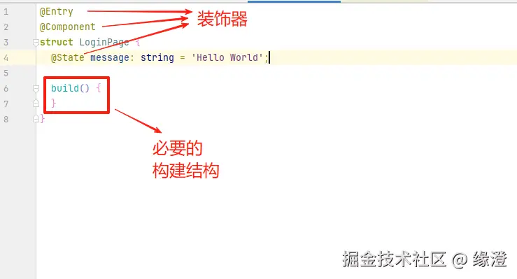
ets
@Entry
@Component
struct LoginPage {
  @State message: string = 'Hello World';

  /**
   * 用一些组件放置到界面,用来搭建界面的结构
   * **/
  build() {
    Column() {

    }
  }
}
2.2 ArkUI常见布局
2.2.1 行布局Row
布局结构从左至右
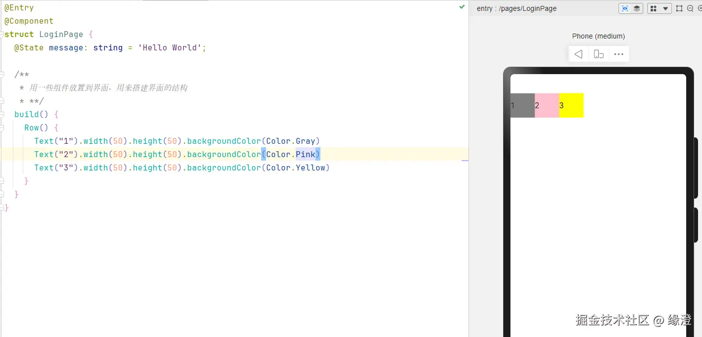
ets
@Entry
@Component
struct LoginPage {
@State message: string = 'Hello World';
/**
* 用一些组件放置到界面,用来搭建界面的结构
* **/
build() {
Row() {
Text("1").width(50).height(50).backgroundColor(Color.Gray)
Text("2").width(50).height(50).backgroundColor(Color.Pink)
Text("3").width(50).height(50).backgroundColor(Color.Yellow)
}
}
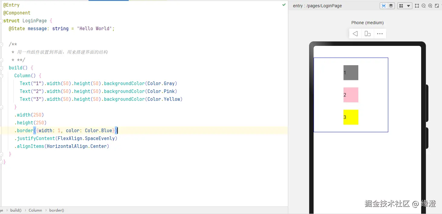
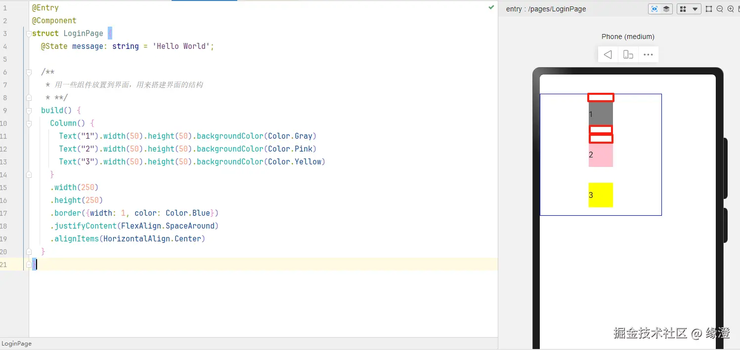
}2.2.2 列布局Column
- 自上而下的布局方式
- 默认是主轴居中
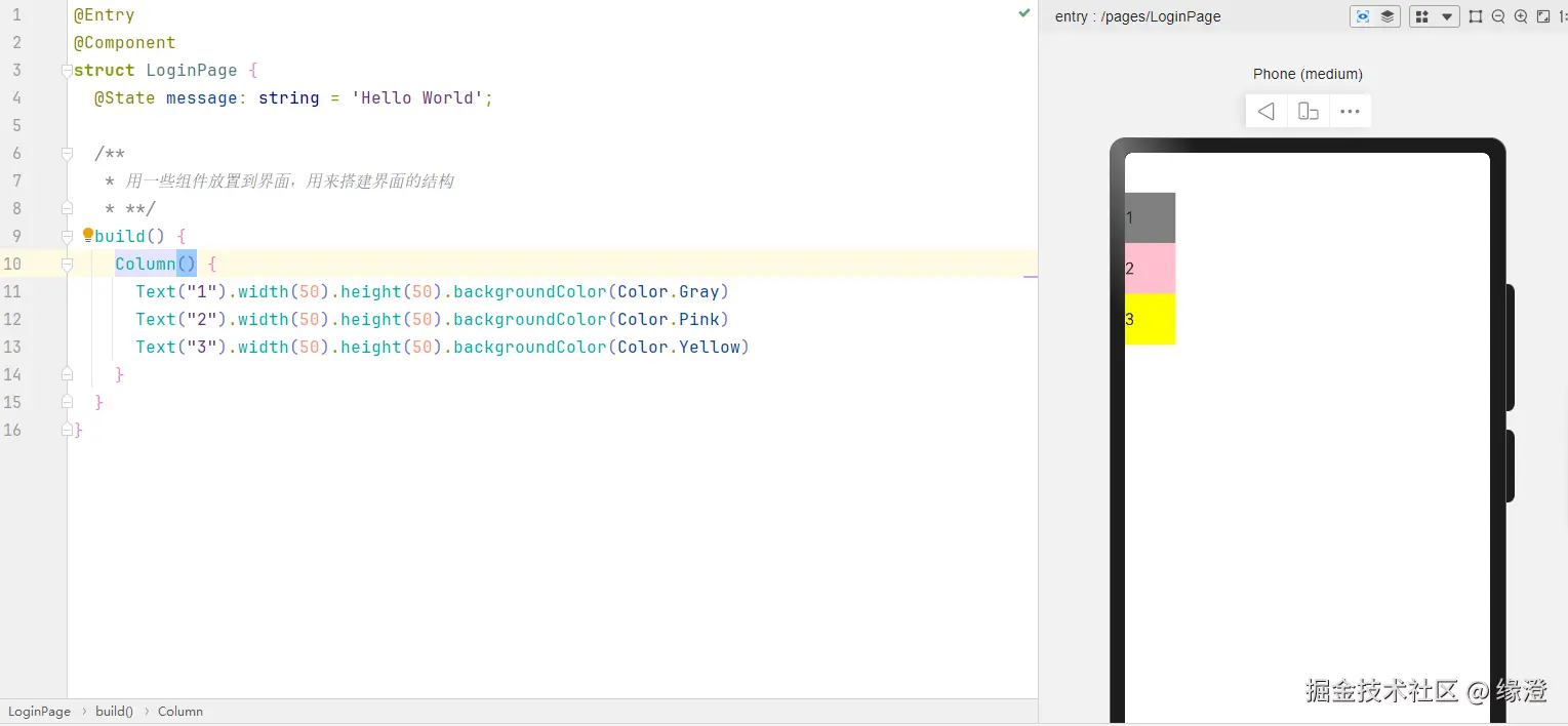
- 效果:子元素在主轴的起始位置对齐。
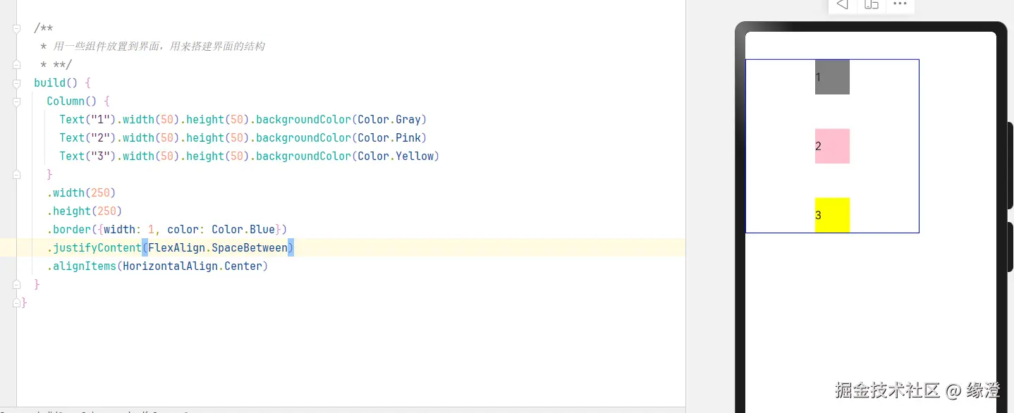
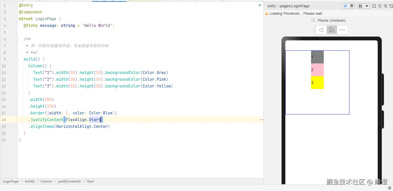
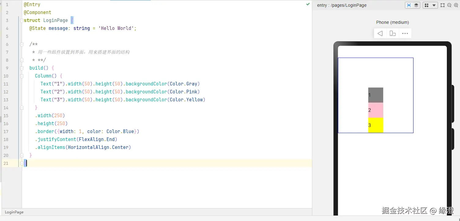
1. justifyContent 主轴布局
-
FlexAlign.SpaceBetween:以起止点为范围,均分
-
FlexAlign.Start: 主轴起始点对齐,默认值
-
FlexAlign.End:主轴结尾对齐
-
FlexAlign.SpaceEvenly:均分空白范围
-
FlexAlign.SpaceAround:每个元素周围的空白范围一致
2.2.3 弹性布局Flex
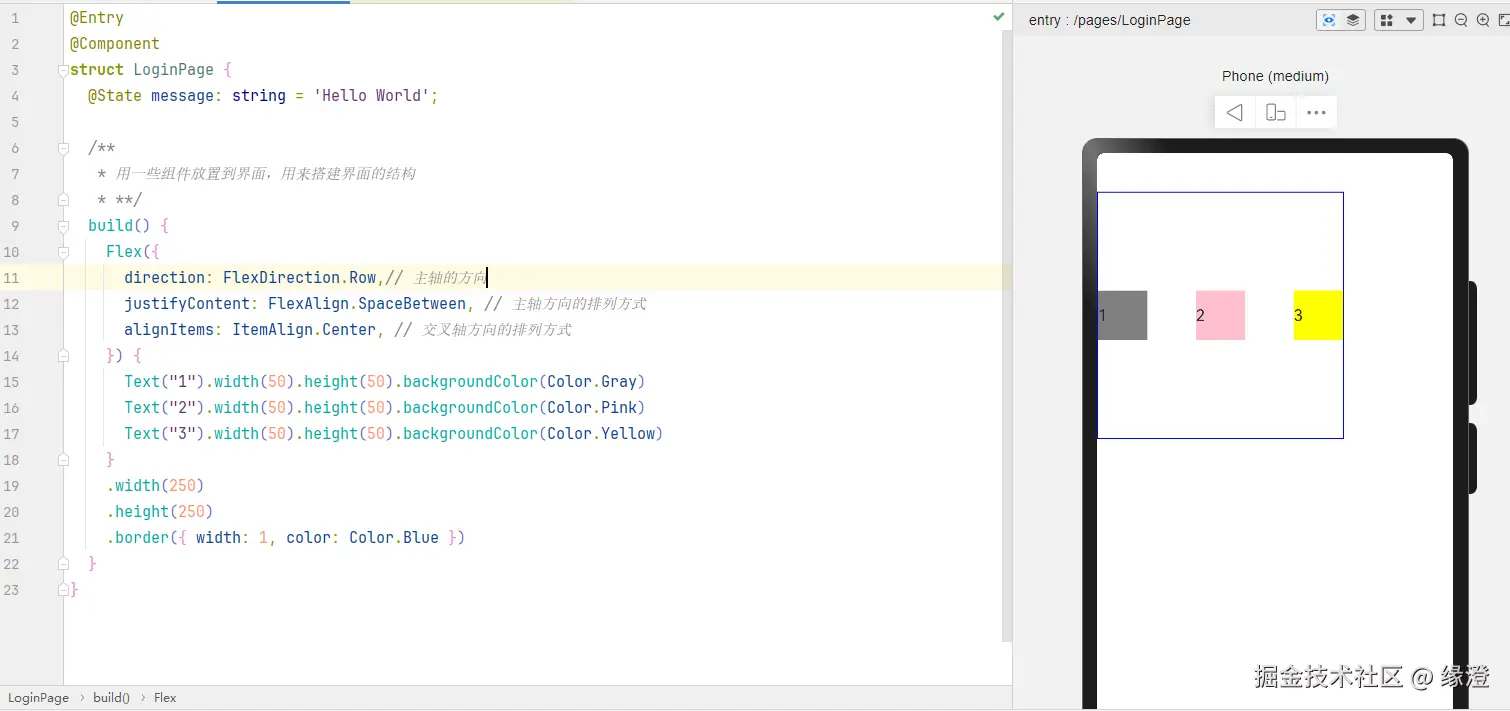
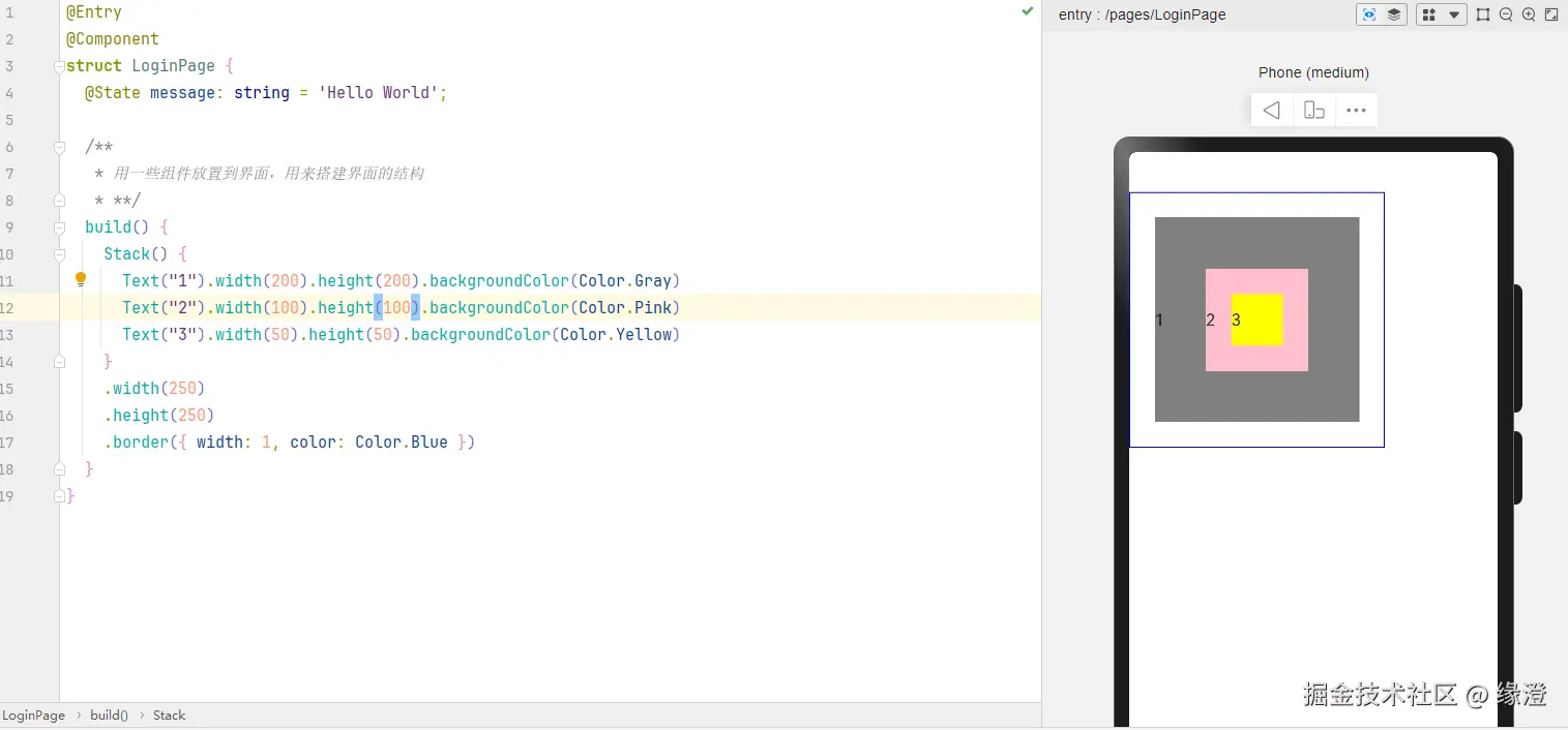
ets
@Entry
@Component
struct LoginPage {
  @State message: string = 'Hello World';

  /**
   * 用一些组件放置到界面,用来搭建界面的结构
   * **/
  build() {
    Flex({
      direction: FlexDirection.Row,// 主轴的方向
      justifyContent: FlexAlign.SpaceBetween, // 主轴方向的排列方式
      alignItems: ItemAlign.Center, // 交叉轴方向的排列方式
    }) {
      Text("1").width(50).height(50).backgroundColor(Color.Gray)
      Text("2").width(50).height(50).backgroundColor(Color.Pink)
      Text("3").width(50).height(50).backgroundColor(Color.Yellow)
    }
    .width(250)
    .height(250)
    .border({ width: 1, color: Color.Blue })
  }
}当数量过多时会出现以下的情况,元素被压缩但是始终不会换行,所以需要设置属性wrap
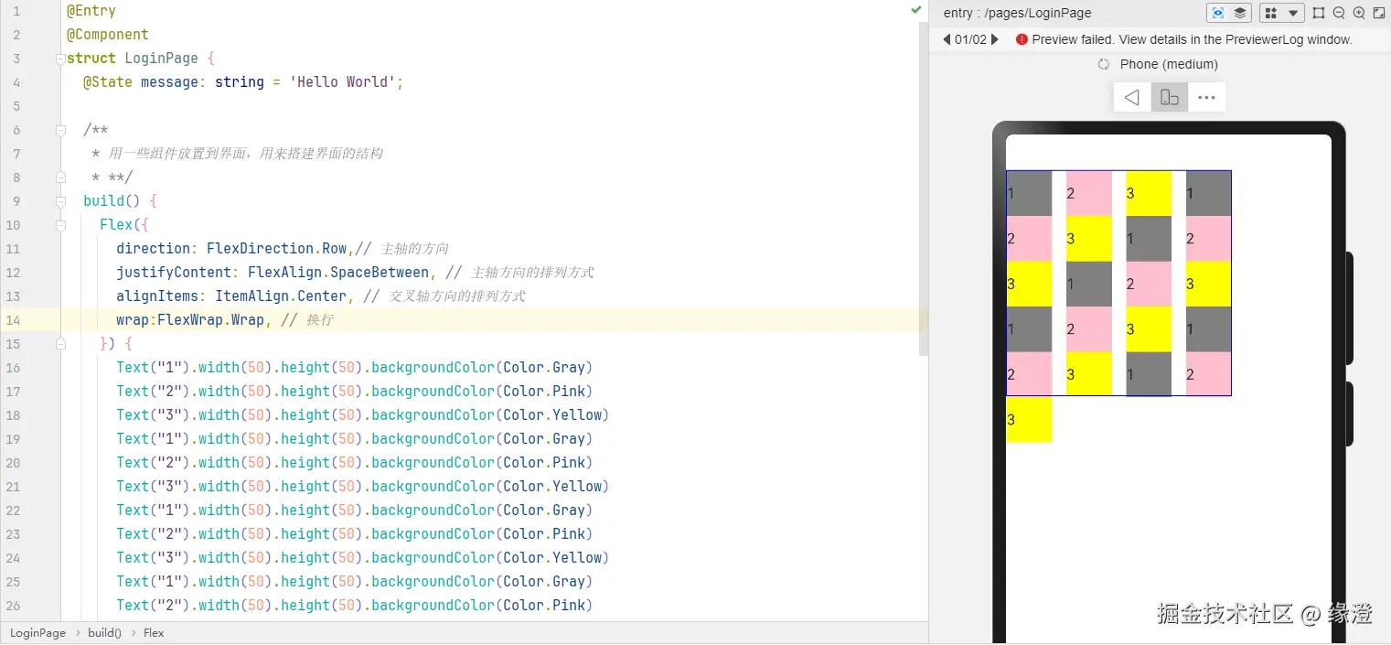
ets
@Entry
@Component
struct LoginPage {
@State message: string = 'Hello World';
/**
* 用一些组件放置到界面,用来搭建界面的结构
* **/
build() {
Flex({
direction: FlexDirection.Row,// 主轴的方向
justifyContent: FlexAlign.SpaceBetween, // 主轴方向的排列方式
alignItems: ItemAlign.Center, // 交叉轴方向的排列方式
wrap:FlexWrap.Wrap, // 换行
}) {
Text("1").width(50).height(50).backgroundColor(Color.Gray)
Text("2").width(50).height(50).backgroundColor(Color.Pink)
Text("3").width(50).height(50).backgroundColor(Color.Yellow)
Text("1").width(50).height(50).backgroundColor(Color.Gray)
Text("2").width(50).height(50).backgroundColor(Color.Pink)
Text("3").width(50).height(50).backgroundColor(Color.Yellow)
Text("1").width(50).height(50).backgroundColor(Color.Gray)
Text("2").width(50).height(50).backgroundColor(Color.Pink)
Text("3").width(50).height(50).backgroundColor(Color.Yellow)
Text("1").width(50).height(50).backgroundColor(Color.Gray)
Text("2").width(50).height(50).backgroundColor(Color.Pink)
Text("3").width(50).height(50).backgroundColor(Color.Yellow)
Text("1").width(50).height(50).backgroundColor(Color.Gray)
Text("2").width(50).height(50).backgroundColor(Color.Pink)
Text("3").width(50).height(50).backgroundColor(Color.Yellow)
Text("1").width(50).height(50).backgroundColor(Color.Gray)
Text("2").width(50).height(50).backgroundColor(Color.Pink)
Text("3").width(50).height(50).backgroundColor(Color.Yellow)
Text("1").width(50).height(50).backgroundColor(Color.Gray)
Text("2").width(50).height(50).backgroundColor(Color.Pink)
Text("3").width(50).height(50).backgroundColor(Color.Yellow)
}
.width(250)
.height(250)
.border({ width: 1, color: Color.Blue })
}
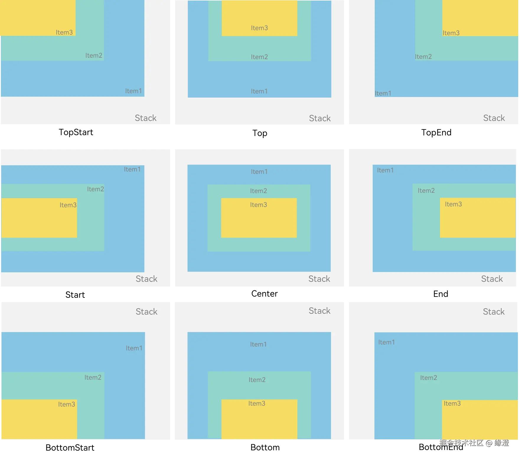
}2.2.4 堆叠布局Stack
类似于前端的绝对定位
默认是居中对齐的