一、List
列表组件
结构:
ets
@Entry
@Component
struct ListPage {

  build() {
    List() {
      ListItem() {
        Text("子组件")
      }
      ListItem()
      ListItem()
      ListItem()
    }
    .height('100%')
    .width('100%')
  }
}- 列表中的内容一般是相似的,因此我们可以利用
ForEach来进行渲染,减少代码量 - 当数据量过大时,我们就需要需要使用
LazyForEach来提升效率,增加用户体验
ForEach(数据源, 组件生成函数, 键值生成函数) 键值生成函数是一个回调函数,用于生成唯一的key;若不写,系统会帮我们生成独一无二的key,这个参数,宁可不给也不要随意添加,不恰当会影响运行效率
ets
interface testListData {
name: string
age: number
}
@Entry
@Component
struct ListPage {
@State data: testListData[] = [
{ name: "a", age: 12 },
{ name: "b", age: 13 },
{ name: "c", age: 14 },
{ name: "d", age: 15 },
{ name: "e", age: 16 },
]
build() {
List({ space: 5 }) {
ForEach(this.data, (item: testListData, idx: number) => {
ListItem() {
Column() {
Row() {
Text(item.name).fontSize(30)
Blank()
Text(item.age + "").fontSize(30)
}
.width('100%')
Divider().strokeWidth(2)
}
.width('100%')
}
}, (item: testListData, idx) => idx + "")
}
.height('100%')
.width('100%')
}
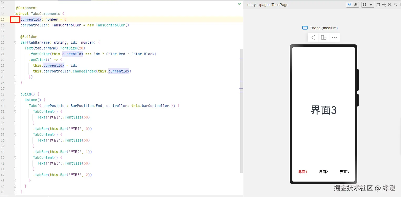
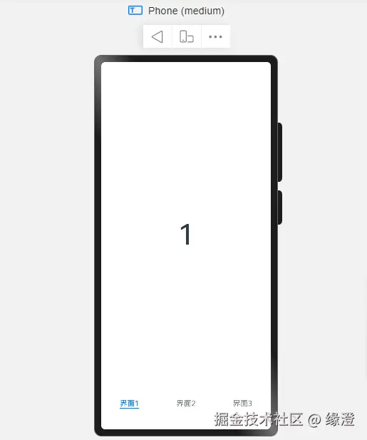
}二、Tabs
类似于微信底部的切换栏
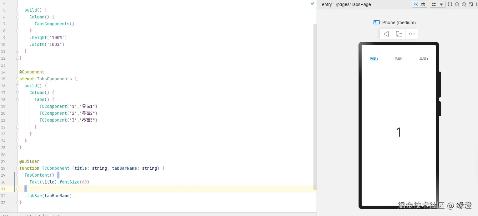
切换栏 默认是在顶部的,可以通过Tabs({barPosition: BarPosition.End})设置栏的位置为底部
通过设置controller: this.barController给tabs设置控制器,方便后续的手动设置操作
.barMode(BarMode.Scrollable)// 滚动
ets
@Entry
@Component
struct TabsPage {
  build() {
    Column() {
      TabsComponents()
    }
    .height('100%')
    .width('100%')
  }
}

@Component
struct TabsComponents {
  @State currentIdx: number = 0
  barController: TabsController = new TabsController()

  @Builder
  Bar(tabBarName: string, idx: number) {
    Text(tabBarName).fontSize(20)
      .fontColor(this.currentIdx === idx ? Color.Red : Color.Black)
      .onClick(() => {
        this.currentIdx = idx
        this.barController.changeIndex(this.currentIdx)
      })
  }

  build() {
    Column() {
      Tabs({ barPosition: BarPosition.End, controller: this.barController }) {
        TabContent() {
          Text("界面1").fontSize(60)
        }
        .tabBar(this.Bar("界面1", 0))
        TabContent() {
          Text("界面2").fontSize(60)
        }
        .tabBar(this.Bar("界面2", 1))
        TabContent() {
          Text("界面3").fontSize(60)
        }
        .tabBar(this.Bar("界面3", 2))
      }
    }
  }
}- 绑定的目标页数一定要绑定
@State装饰器,否则只切换无效果@State currentIdx: number = 0

- 缺失
@State