首先,既然可以拖拽,那就与鼠标、或者触屏滑动等事件有关系了。
那么直接就先搞个左右分布的,再来个复杂的左右加上下的。话不多说。我先起个高大上的名字。
1.页面拖拽分隔布局实现方案
实现思路
-
使用flex布局创建基础结构
-
通过JavaScript监听鼠标事件实现拖拽功能
-
使用CSS过渡效果提升用户体验
-
添加响应式设计确保布局适应性
下面是完整的实现代码:
xml
<!DOCTYPE html>
<html lang="zh-CN">
<head>
<meta charset="UTF-8">
<meta name="viewport" content="width=device-width, initial-scale=1.0">
<title>页面拖拽分隔布局</title>
<style>
* {
margin: 0;
padding: 0;
box-sizing: border-box;
}
body {
font-family: 'Segoe UI', Tahoma, Geneva, Verdana, sans-serif;
background: linear-gradient(135deg, #f5f7fa 0%, #c3cfe2 100%);
color: #333;
line-height: 1.6;
min-height: 100vh;
padding: 20px;
}
.container {
max-width: 1200px;
margin: 0 auto;
background: white;
border-radius: 12px;
box-shadow: 0 10px 30px rgba(0, 0, 0, 0.1);
overflow: hidden;
}
header {
text-align: center;
padding: 25px;
background: #4a6bdf;
color: white;
}
h1 {
font-size: 2.2rem;
margin-bottom: 10px;
}
.description {
font-size: 1.1rem;
opacity: 0.9;
max-width: 800px;
margin: 0 auto;
}
.layout-container {
display: flex;
min-height: 500px;
position: relative;
}
.panel {
overflow: auto;
padding: 20px;
transition: all 0.3s ease;
}
.left-panel {
background: #eef2f7;
flex: 0 0 30%;
}
.right-panel {
background: #f8f9fa;
flex: 1;
}
.divider {
width: 10px;
background: #4a6bdf;
cursor: col-resize;
display: flex;
align-items: center;
justify-content: center;
position: relative;
transition: background 0.3s ease;
}
.divider:hover {
background: #3a5bce;
}
.divider-handle {
width: 6px;
height: 50px;
background: white;
border-radius: 3px;
}
.panel-content {
height: 100%;
}
.panel-title {
font-size: 1.3rem;
margin-bottom: 15px;
color: #2c3e50;
padding-bottom: 10px;
border-bottom: 2px solid #4a6bdf;
}
pre {
background: #2d3a4b;
color: #9feaf9;
padding: 15px;
border-radius: 6px;
overflow: auto;
font-family: 'Fira Code', monospace;
font-size: 0.9rem;
}
.code-example {
margin-top: 20px;
}
.panel-content p {
margin-bottom: 15px;
}
footer {
text-align: center;
padding: 20px;
background: #4a6bdf;
color: white;
font-size: 0.9rem;
}
.instructions {
background: #f1f8ff;
padding: 15px;
border-radius: 8px;
margin-top: 20px;
border-left: 4px solid #4a6bdf;
}
@media (max-width: 768px) {
.layout-container {
flex-direction: column;
}
.left-panel, .right-panel {
flex: none;
width: 100%;
}
.divider {
width: 100%;
height: 10px;
cursor: row-resize;
}
.divider-handle {
width: 50px;
height: 6px;
}
}
</style>
</head>
<body>
<div class="container">
<header>
<h1>页面拖拽分隔布局</h1>
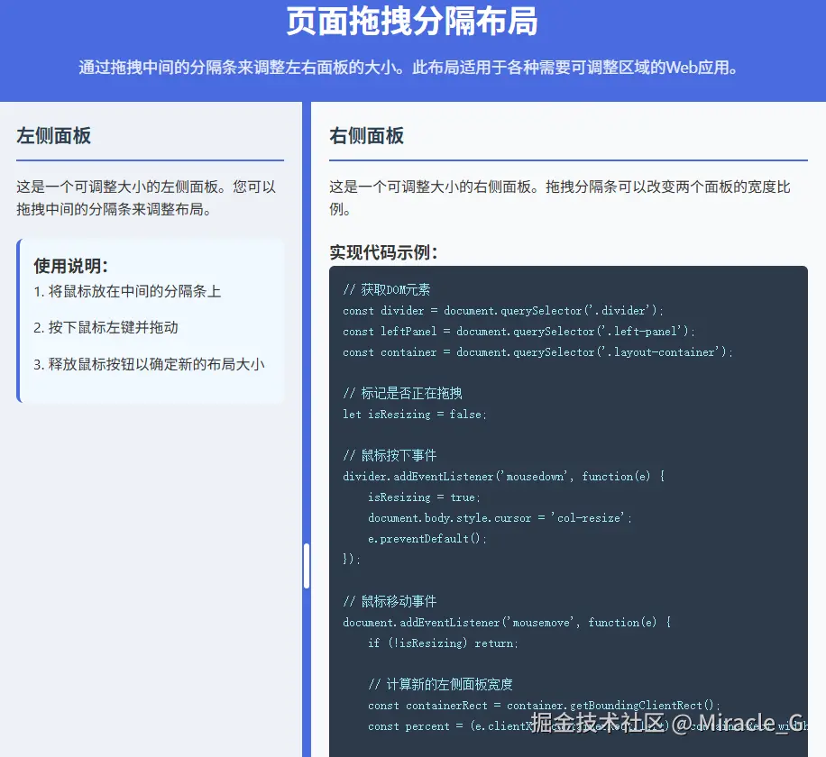
<p class="description">通过拖拽中间的分隔条来调整左右面板的大小。此布局适用于各种需要可调整区域的Web应用。</p>
</header>
<div class="layout-container">
<div class="panel left-panel">
<div class="panel-content">
<h2 class="panel-title">左侧面板</h2>
<p>这是一个可调整大小的左侧面板。您可以拖拽中间的分隔条来调整布局。</p>
<div class="instructions">
<h3>使用说明:</h3>
<p>1. 将鼠标放在中间的分隔条上</p>
<p>2. 按下鼠标左键并拖动</p>
<p>3. 释放鼠标按钮以确定新的布局大小</p>
</div>
</div>
</div>
<div class="divider">
<div class="divider-handle"></div>
</div>
<div class="panel right-panel">
<div class="panel-content">
<h2 class="panel-title">右侧面板</h2>
<p>这是一个可调整大小的右侧面板。拖拽分隔条可以改变两个面板的宽度比例。</p>
<div class="code-example">
<h3>实现代码示例:</h3>
<pre><code>// 获取DOM元素
const divider = document.querySelector('.divider');
const leftPanel = document.querySelector('.left-panel');
const container = document.querySelector('.layout-container');
// 标记是否正在拖拽
let isResizing = false;
// 鼠标按下事件
divider.addEventListener('mousedown', function(e) {
isResizing = true;
document.body.style.cursor = 'col-resize';
e.preventDefault();
});
// 鼠标移动事件
document.addEventListener('mousemove', function(e) {
if (!isResizing) return;
// 计算新的左侧面板宽度
const containerRect = container.getBoundingClientRect();
const percent = (e.clientX - containerRect.left) / containerRect.width * 100;
// 设置最小宽度限制
const newWidth = Math.max(20, Math.min(80, percent));
leftPanel.style.flex = `0 0 ${newWidth}%`;
});
// 鼠标释放事件
document.addEventListener('mouseup', function(e) {
isResizing = false;
document.body.style.cursor = 'default';
});</code></pre>
</div>
</div>
</div>
</div>
<footer>
<p>页面拖拽分隔布局实现方案 © 2025</p>
</footer>
</div>
<script>
document.addEventListener('DOMContentLoaded', function() {
const divider = document.querySelector('.divider');
const leftPanel = document.querySelector('.left-panel');
const container = document.querySelector('.layout-container');
let isResizing = false;
divider.addEventListener('mousedown', function(e) {
isResizing = true;
document.body.style.cursor = 'col-resize';
leftPanel.style.userSelect = 'none';
leftPanel.style.pointerEvents = 'none';
e.preventDefault();
});
document.addEventListener('mousemove', function(e) {
if (!isResizing) return;
const containerRect = container.getBoundingClientRect();
const percent = (e.clientX - containerRect.left) / containerRect.width * 100;
// 设置最小和最大宽度限制
const newWidth = Math.max(20, Math.min(80, percent));
leftPanel.style.flex = `0 0 ${newWidth}%`;
});
document.addEventListener('mouseup', function() {
isResizing = false;
document.body.style.cursor = 'default';
leftPanel.style.userSelect = 'auto';
leftPanel.style.pointerEvents = 'auto';
});
// 触摸设备支持
divider.addEventListener('touchstart', function(e) {
isResizing = true;
e.preventDefault();
});
document.addEventListener('touchmove', function(e) {
if (!isResizing) return;
const touch = e.touches[0];
const containerRect = container.getBoundingClientRect();
const percent = (touch.clientX - containerRect.left) / containerRect.width * 100;
const newWidth = Math.max(20, Math.min(80, percent));
leftPanel.style.flex = `0 0 ${newWidth}%`;
});
document.addEventListener('touchend', function() {
isResizing = false;
});
});
</script>
</body>
</html>代码运行效果如下:
总结一下哈,基本上拖拽分隔有如下的功能特点。
功能特点
-
直观的拖拽界面:中间的分隔条清晰可见,带有视觉反馈
-
响应式设计:在移动设备上自动转换为垂直分隔布局
-
边界限制:防止面板变得过小或过大(限制在20%-80%之间)
-
跨设备支持:同时支持鼠标和触摸交互
-
视觉反馈:拖拽时改变光标样式,提升用户体验
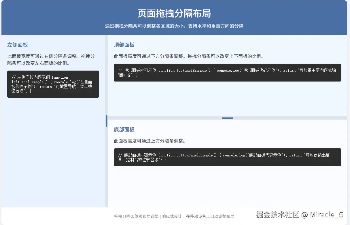
下面再来一种这样的布局,如下图:
代码如下:
xml
<!DOCTYPE html>
<html lang="zh-CN">
<head>
    <meta charset="UTF-8">
    <meta name="viewport" content="width=device-width, initial-scale=1.0">
    <title>可拖拽分隔布局</title>
    <style>
        * {
            margin: 0;
            padding: 0;
            box-sizing: border-box;
        }

        body {
            font-family: 'Segoe UI', Tahoma, Geneva, Verdana, sans-serif;
            color: #333;
            background-color: #f5f7fa;
            padding: 20px;
            min-height: 100vh;
        }

        .container {
            max-width: 1200px;
            margin: 0 auto;
            background: white;
            border-radius: 10px;
            box-shadow: 0 5px 15px rgba(0, 0, 0, 0.08);
            overflow: hidden;
        }

        header {
            background: #4a6fa5;
            color: white;
            padding: 20px;
            text-align: center;
        }

        h1 {
            font-weight: 500;
            margin-bottom: 10px;
        }

        .description {
            font-size: 16px;
            opacity: 0.9;
            max-width: 600px;
            margin: 0 auto;
        }

        .layout-container {
            display: flex;
            flex-direction: column;
            height: 70vh;
            min-height: 500px;
        }

        .horizontal-panels {
            display: flex;
            flex: 1;
            overflow: hidden;
        }

        .panel {
            padding: 20px;
            overflow: auto;
            background: #fff;
        }

        .left-panel {
            flex: 0 0 30%;
            background-color: #e9f2ff;
            border-right: 1px solid #dde4ee;
        }

        .right-panel {
            flex: 1;
            display: flex;
            flex-direction: column;
        }

        .top-panel {
            flex: 0 0 60%;
            background-color: #f0f7ff;
            border-bottom: 1px solid #dde4ee;
            overflow: auto;
        }

        .bottom-panel {
            flex: 1;
            background-color: #f9fbff;
            overflow: auto;
        }

        /* 分隔条样式 */
        .divider {
            background-color: #dde4ee;
            position: relative;
            z-index: 10;
            transition: all 0.2s ease;
        }

        .divider:hover {
            background-color: #4a6fa5;
        }

        .divider.horizontal {
            height: 10px;
            cursor: row-resize;
        }

        .divider.vertical {
            width: 10px;
            cursor: col-resize;
        }

        .divider-handle {
            position: absolute;
            background: #4a6fa5;
            border-radius: 3px;
        }

        .divider.horizontal .divider-handle {
            width: 40px;
            height: 5px;
            left: 50%;
            top: 50%;
            transform: translate(-50%, -50%);
        }

        .divider.vertical .divider-handle {
            width: 5px;
            height: 40px;
            left: 50%;
            top: 50%;
            transform: translate(-50%, -50%);
        }

        .panel-content {
            height: 100%;
        }

        .panel-title {
            font-size: 18px;
            margin-bottom: 15px;
            color: #4a6fa5;
            font-weight: 500;
        }

        .code-block {
            background: #2d2d2d;
            color: #f8f8f2;
            padding: 15px;
            border-radius: 5px;
            font-family: 'Fira Code', monospace;
            font-size: 14px;
            overflow: auto;
            margin-top: 15px;
        }

        footer {
            text-align: center;
            padding: 20px;
            color: #7a7a7a;
            font-size: 14px;
        }

        @media (max-width: 768px) {
            .horizontal-panels {
                flex-direction: column;
            }

            .left-panel {
                flex: 0 0 200px;
                border-right: none;
                border-bottom: 1px solid #dde4ee;
            }

            .divider.vertical {
                width: 100%;
                height: 10px;
                cursor: row-resize;
            }

            .divider.vertical .divider-handle {
                width: 40px;
                height: 5px;
                left: 50%;
                top: 50%;
                transform: translate(-50%, -50%);
            }
        }
    </style>
</head>
<body>
    <div class="container">
        <header>
            <h1>页面拖拽分隔布局</h1>
            <p class="description">通过拖拽分隔条可以调整各区域的大小,支持水平和垂直方向的分隔</p>
        </header>

        <div class="layout-container">
            <div class="horizontal-panels">
                <div class="panel left-panel">
                    <div class="panel-content">
                        <h3 class="panel-title">左侧面板</h3>
                        <p>此面板宽度可通过右侧分隔条调整。拖拽分隔条可以改变左右面板的比例。</p>
                        <div class="code-block">
// 左侧面板内容示例
function leftPanelExample() {
    console.log("左侧面板代码示例");
    return "可放置导航、菜单或设置项";
}
                        </div>
                    </div>
                </div>

                <div class="divider vertical" id="vertical-divider">
                    <div class="divider-handle"></div>
                </div>

                <div class="right-panel">
                    <div class="panel top-panel">
                        <div class="panel-content">
                            <h3 class="panel-title">顶部面板</h3>
                            <p>此面板高度可通过下方分隔条调整。拖拽分隔条可以改变上下面板的比例。</p>
                            <div class="code-block">
// 顶部面板内容示例
function topPanelExample() {
    console.log("顶部面板代码示例");
    return "可放置主要内容或编辑区域";
}
                            </div>
                        </div>
                    </div>

                    <div class="divider horizontal" id="horizontal-divider">
                        <div class="divider-handle"></div>
                    </div>

                    <div class="panel bottom-panel">
                        <div class="panel-content">
                            <h3 class="panel-title">底部面板</h3>
                            <p>此面板高度可通过上方分隔条调整。</p>
                            <div class="code-block">
// 底部面板内容示例
function bottomPanelExample() {
    console.log("底部面板代码示例");
    return "可放置输出结果、控制台或注释区域";
}
                            </div>
                        </div>
                    </div>
                </div>
            </div>
        </div>

        <footer>
            <p>拖拽分隔条体验布局调整 | 响应式设计,在移动设备上自动调整布局</p>
        </footer>
    </div>

    <script>
        document.addEventListener('DOMContentLoaded', function() {
            // 获取元素
            const verticalDivider = document.getElementById('vertical-divider');
            const horizontalDivider = document.getElementById('horizontal-divider');
            const leftPanel = document.querySelector('.left-panel');
            const topPanel = document.querySelector('.top-panel');
            const bottomPanel = document.querySelector('.bottom-panel');

            // 垂直分隔条事件
            verticalDivider.addEventListener('mousedown', function(e) {
                e.preventDefault();

                document.addEventListener('mousemove', resizeVertical);
                document.addEventListener('mouseup', stopResize);

                function resizeVertical(e) {
                    const containerRect = document.querySelector('.horizontal-panels').getBoundingClientRect();
                    const percent = (e.clientX - containerRect.left) / containerRect.width * 100;

                    // 设置最小和最大宽度限制
                    if (percent > 20 && percent < 60) {
                        leftPanel.style.flex = `0 0 ${percent}%`;
                    }
                }

                function stopResize() {
                    document.removeEventListener('mousemove', resizeVertical);
                    document.removeEventListener('mouseup', stopResize);
                }
            });

            // 水平分隔条事件
            horizontalDivider.addEventListener('mousedown', function(e) {
                e.preventDefault();

                document.addEventListener('mousemove', resizeHorizontal);
                document.addEventListener('mouseup', stopResize);

                function resizeHorizontal(e) {
                    const containerRect = document.querySelector('.right-panel').getBoundingClientRect();
                    const percent = (e.clientY - containerRect.top) / containerRect.height * 100;

                    // 设置最小和最大高度限制
                    if (percent > 30 && percent < 80) {
                        topPanel.style.flex = `0 0 ${percent}%`;
                    }
                }

                function stopResize() {
                    document.removeEventListener('mousemove', resizeHorizontal);
                    document.removeEventListener('mouseup', stopResize);
                }
            });

            // 响应式设计:在移动设备上调整分隔条功能
            function handleResponsive() {
                if (window.innerWidth <= 768) {
                    verticalDivider.removeEventListener('mousedown', verticalDivider._originalListener);

                    verticalDivider.addEventListener('mousedown', function(e) {
                        e.preventDefault();

                        document.addEventListener('mousemove', resizeVerticalMobile);
                        document.addEventListener('mouseup', stopResize);

                        function resizeVerticalMobile(e) {
                            const containerRect = document.querySelector('.layout-container').getBoundingClientRect();
                            const percent = (e.clientY - containerRect.top) / containerRect.height * 100;

                            if (percent > 20 && percent < 50) {
                                leftPanel.style.flex = `0 0 ${percent}%`;
                            }
                        }

                        function stopResize() {
                            document.removeEventListener('mousemove', resizeVerticalMobile);
                            document.removeEventListener('mouseup', stopResize);
                        }
                    });

                    verticalDivider._originalListener = true;
                }
            }

            // 初始调用和监听窗口变化
            handleResponsive();
            window.addEventListener('resize', handleResponsive);
        });
    </script>
</body>
</html>
以上这些只是基础的展示效果,如果要在生产中,我们要考虑性能,易用性,拖拽的结果是否持久化保存等等问题。
一般性能,可能就是节流或者requestAnimationFrame等。
持久化一般用localStorage或者indexedDB等
**加油 ** 一起探索更美好的未来。。。