🎨 Vue 2 背景颜色渐变实现方式汇总
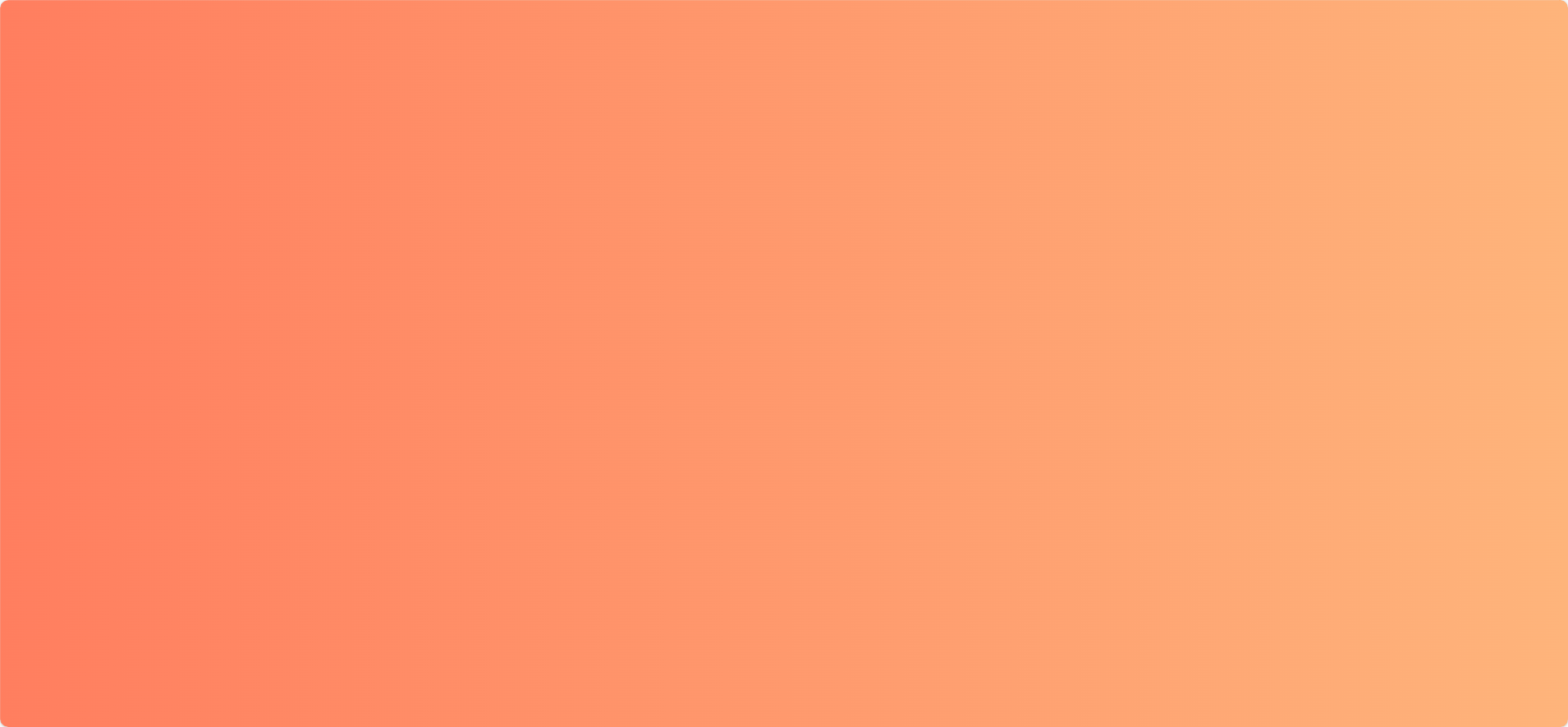
1️⃣ 线性渐变(Linear Gradient)
<template>
  <div class="linear-bg">
    <h1>线性渐变背景</h1>
  </div>
</template>

<style scoped>
.linear-bg {
  height: 100vh;
  background: linear-gradient(to right, #ff7e5f, #feb47b);
}
</style>
📌 可选方向:
-
to bottom -
to top right -
45deg(角度)
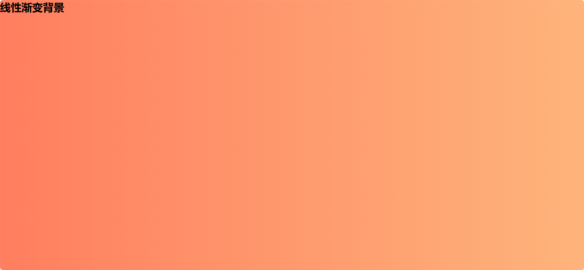
2️⃣ 径向渐变(Radial Gradient)
<template>
  <div class="radial-bg">
    <h1>径向渐变背景</h1>
  </div>
</template>

<style scoped>
.radial-bg {
  height: 100vh;
  background: radial-gradient(circle, #ffefba, #ffffff);
}
</style>
📌 可选形状:
-
circle -
ellipse
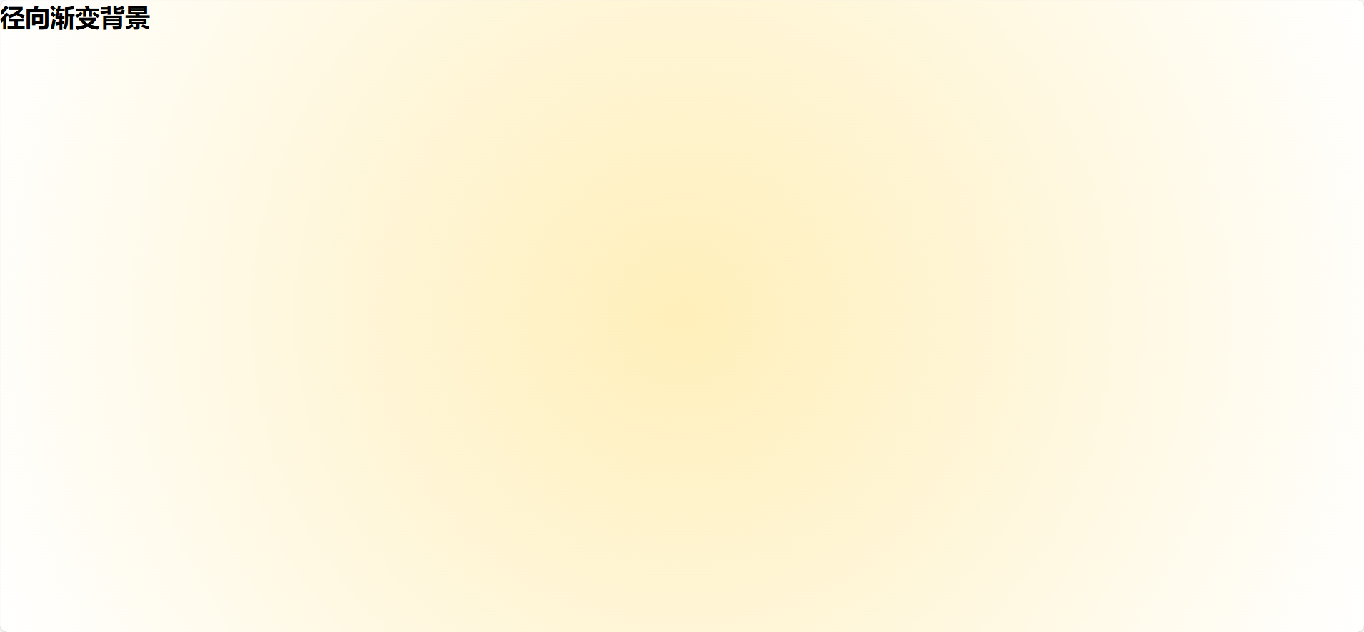
3️⃣ 多色渐变(Multi-color Gradient)
<template>
  <div class="multi-bg">
    <h1>多色渐变背景</h1>
  </div>
</template>

<style scoped>
.multi-bg {
  height: 100vh;
  background: linear-gradient(to right, red, orange, yellow, green, blue, indigo, violet);
}
</style>
📌 用于炫彩背景、节日氛围等场景。
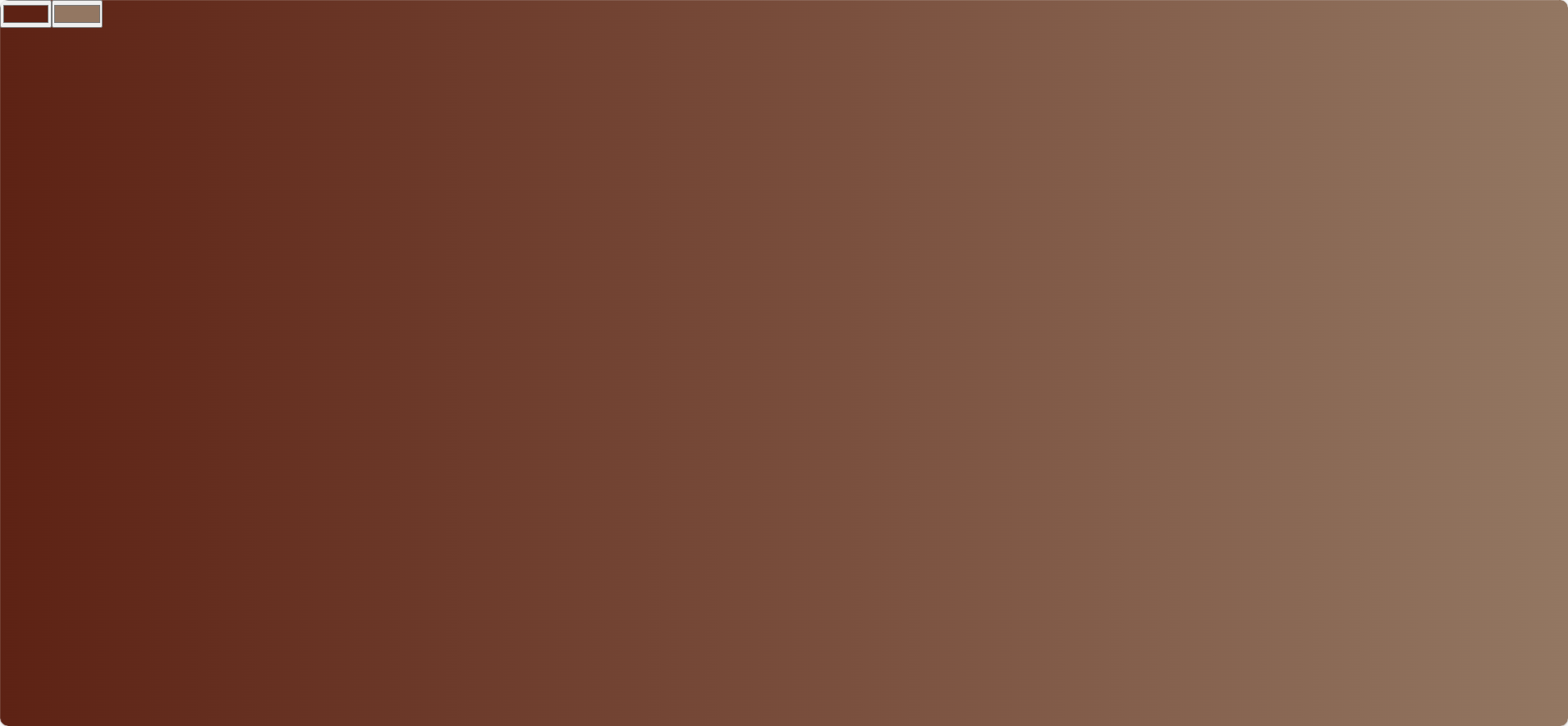
4️⃣ 动态渐变(通过 data 或 computed 控制)
<template>
  <div :style="gradientStyle">
    <input type="color" v-model="colorStart" />
    <input type="color" v-model="colorEnd" />
  </div>
</template>

<script>
export default {
  data() {
    return {
      colorStart: '#ff7e5f',
      colorEnd: '#feb47b'
    };
  },
  computed: {
    gradientStyle() {
      return {
        height: '100vh',
        background: `linear-gradient(to right, ${this.colorStart}, ${this.colorEnd})`
      };
    }
  }
};
</script>
📌 用户可实时调整颜色,适合主题切换或个性化设置。
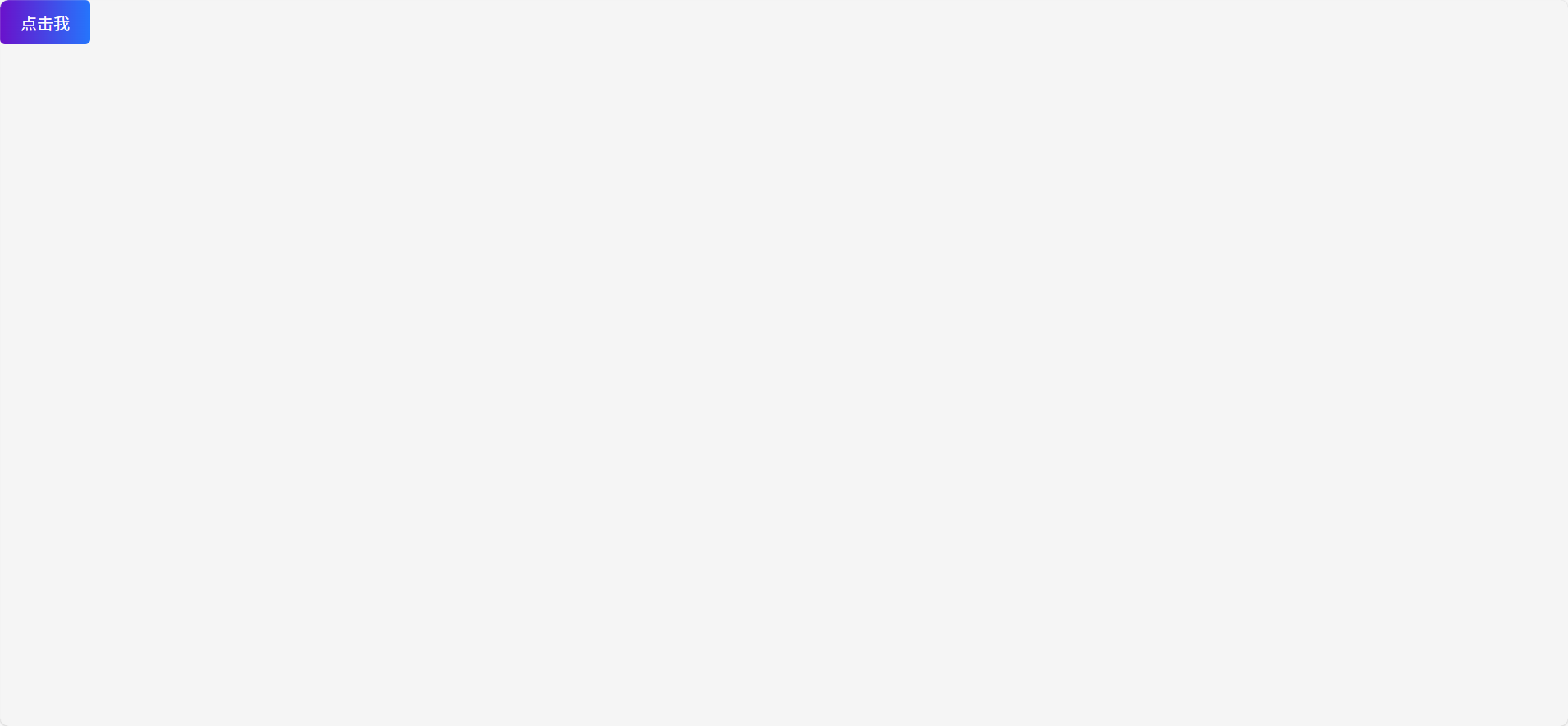
5️⃣ 渐变按钮或导航栏
<template>
  <button class="gradient-btn">点击我</button>
</template>

<style scoped>
.gradient-btn {
  padding: 10px 20px;
  border: none;
  border-radius: 5px;
  background: linear-gradient(to right, #6a11cb, #2575fc);
  color: white;
  font-size: 16px;
  cursor: pointer;
}
</style>
📌 渐变可用于按钮、卡片、导航栏等局部组件。
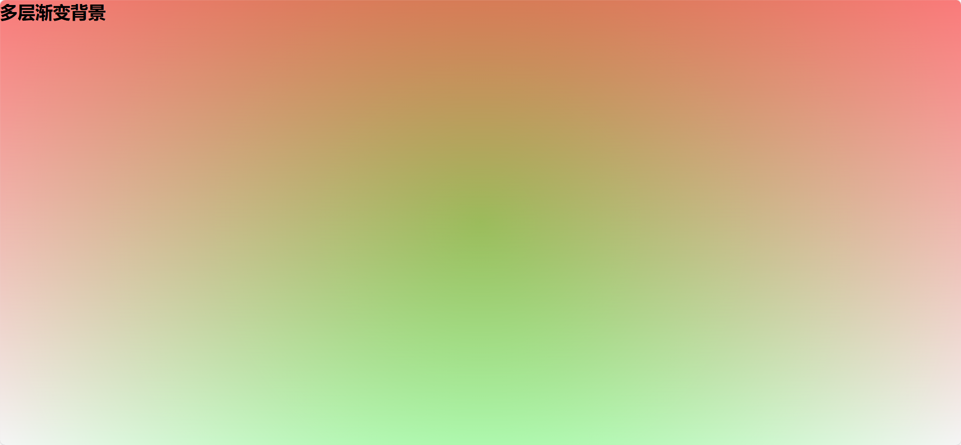
6️⃣ 多层渐变叠加(高级效果)
<template>
  <div class="layered-bg">
    <h1>多层渐变背景</h1>
  </div>
</template>

<style scoped>
.layered-bg {
  height: 100vh;
  background:
    linear-gradient(to bottom, rgba(255,0,0,0.5), rgba(255,0,0,0)),
    radial-gradient(circle, rgba(0,255,0,0.5), rgba(0,255,0,0));
}
</style>
📌 可用于玻璃拟态、模糊背景等视觉增强。
7️⃣ 渐变动画(背景颜色动态变化)
<template>
  <div class="animated-bg">
    <h1>渐变动画背景</h1>
  </div>
</template>

<style scoped>
.animated-bg {
  height: 100vh;
  animation: gradientShift 5s infinite alternate;
  background: linear-gradient(270deg, #ff6ec4, #7873f5);
  background-size: 400% 400%;
}

@keyframes gradientShift {
  0% {
    background-position: 0% 50%;
  }
  100% {
    background-position: 100% 50%;
  }
}
</style>
📌 适合炫酷首页或加载页。
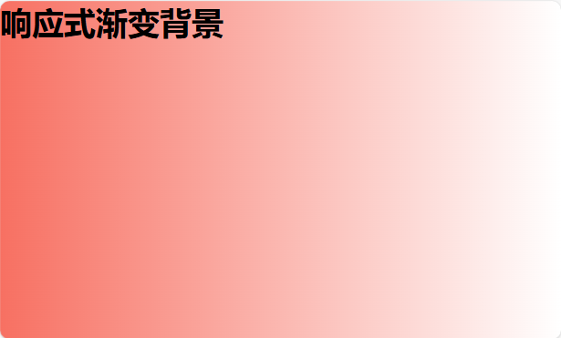
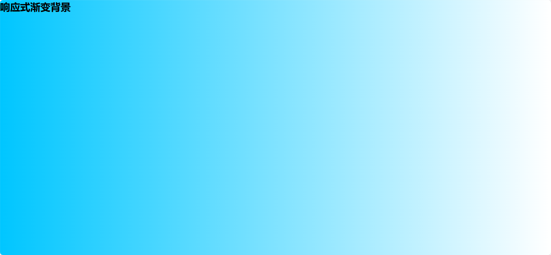
8️⃣ 响应式渐变(根据窗口大小或状态变化)
<template>
  <div :style="responsiveGradient">
    <h1>响应式渐变背景</h1>
  </div>
</template>

<script>
export default {
  data() {
    return {
      width: window.innerWidth
    };
  },
  computed: {
    responsiveGradient() {
      const color = this.width > 768 ? '#00c6ff' : '#f77062';
      return {
        height: '100vh',
        background: `linear-gradient(to right, ${color}, #ffffff)`
      };
    }
  },
  mounted() {
    window.addEventListener('resize', () => {
      this.width = window.innerWidth;
    });
  }
};
</script>
📌 可用于移动端适配或暗/亮模式切换。
9️⃣ SVG 渐变背景(更复杂的图形渐变)
<template>
  <div class="svg-bg">
    <svg width="100%" height="100%">
      <defs>
        <linearGradient id="grad1" x1="0%" y1="0%" x2="100%" y2="0%">
          <stop offset="0%" style="stop-color:#ff7e5f;stop-opacity:1" />
          <stop offset="100%" style="stop-color:#feb47b;stop-opacity:1" />
        </linearGradient>
      </defs>
      <rect width="100%" height="100%" fill="url(#grad1)" />
    </svg>
  </div>
</template>

<style scoped>
.svg-bg {
  height: 100vh;
  overflow: hidden;
}
</style>
📌 适合需要精细控制渐变路径的场景。