背景
在上半年接触flutter时,遇到了一个比较有意思的组件Hero,它可以实现页面之间的元素动画过渡,比如点击一个图片,跳转到详情页,详情页的图片会有一个动画过渡到详情页的图片。
效果可见这篇文章:Flutter 中的 Hero 动画
我一直想尝试在Vue中实现这样的效果,但是在Vue中并没有这样的组件,在社区上也很少看到有人去实现这样的效果。
直到前段时间看到了这个视频:【Anthony Fu】起飞!跨路由 Vue 组件动画实验,这个视频给了我极大的启发,让我决定动手用自己的方式实现。
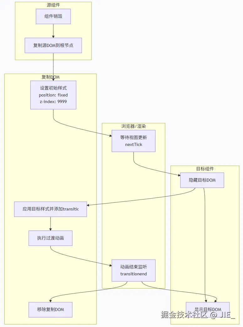
实现思路
视频中的思路
Anthony Fu的思路是在两个不同的页面中使用代理组件 进行占位,实际元素渲染在根节点 ,然后通过代理组件将状态共享 给目标组件来实现过渡。
我的思路
受到视频的启发,但我想做一种更轻量级的实现:在不影响原有组件结构,只需添加简单属性可实现过渡。
我的思路是:
- 组件销毁 时,复制源DOM到根节点
- 视图更新后,先隐藏目标DOM
- 将目标DOM 样式赋给克隆DOM,添加过渡动画
- 动画结束后移除克隆DOM,显示目标DOM
实现
自定义指令
为避免使用全局组件,所以我决定使用自定义指令来实现。
我们需要在指令中接收一个参数,参数为需要过渡组件 的 id。以及动画的配置项。
typescript
export interface HeroAnimationProps {
  heroId: string;
  duration?: `${number}s` | `${number}ms`;
  timingFunction?: 'ease' | 'linear' | 'ease-in' | 'ease-out' | 'ease-in-out' | string;
  delay?: `${number}s` | `${number}ms`;
}
接下来编写指令:
首先,我们需要在DOM上绑定一个属性,属性为需要过渡组件 的id。
typescript
const heroAnimationDirective: Directive<HTMLElement, HeroAnimationProps> = {
  mounted(el: HTMLElement, { value }: { value: HeroAnimationProps }) {
    el.dataset.heroId = value.heroId;
  }
};
可能会遇到这些情况来触发动画:
- 路由切换
- 组件内元素销毁
v-if
路由切换和v-if都属于组件销毁 的情况,在指令的beforeUnmount中触发动画即可。
⚠️
v-show的情况暂时没想好怎么处理,v-show切换时只能通过beforeUpdate和updated来触发动画,但是在这两个钩子中,并不好判断是v-show的值变化还是别的响应式值变化。希望有大佬能够提供思路。
typescript
const heroAnimationDirective: Directive<HTMLElement, HeroAnimationProps> = {
  mounted(el, { value }) {
    el.dataset.heroId = value.heroId;
  },
  beforeUnmount(el, { value }) {
    heroAnimation(el, value);
  }
};
动画实现
现在我们再根据最开始的思路来实现动画。
typescript
async function heroAnimation(el: HTMLElement, props: HeroAnimationProps) {
  const {
    duration = '1s',
    timingFunction = 'ease',
    delay = '0s'
  } = props;

  const containerEl = document.body;
  // 视图更新前获取源DOM位置 并 克隆源DOM
  const rect = el.getBoundingClientRect();
  const clone = el.cloneNode(true) as HTMLElement;
  await nextTick();
  const heroId = el.dataset.heroId;

  const newEl = document.querySelector(
    `[data-hero-id="${heroId}"]:not([data-clone]):not([style*="display: none"])`
  ) as HTMLElement;

  if (!newEl) return;
  // 视图更新后获取目标DOM位置
  const newRect = newEl.getBoundingClientRect();
  // 先赋值源DOM的位置和大小
  clone.style.position = 'fixed';
  clone.style.zIndex = '9999';
  clone.style.left = `${rect.left}px`;
  clone.style.top = `${rect.top}px`;
  clone.style.width = `${rect.width}px`;
  clone.style.height = `${rect.height}px`;
  clone.dataset.clone = 'true';
  // 隐藏目标DOM
  newEl.style.visibility = 'hidden';

  containerEl.appendChild(clone);
  // 在下一帧中赋值目标DOM的位置和大小 达到过渡效果
  requestAnimationFrame(() => {
    clone.style.visibility = 'visible';
    clone.style.transition = `all ${duration} ${timingFunction} ${delay}`;
    copyStyles(newEl, clone);
    clone.style.left = `${newRect.left}px`;
    clone.style.top = `${newRect.top}px`;
    clone.style.width = `${newRect.width}px`;
    clone.style.height = `${newRect.height}px`;
    // 动画结束后移除克隆DOM 显示目标DOM
    clone.addEventListener('transitionend', () => {
      newEl.style.visibility = 'visible';
      containerEl.removeChild(clone);
    }, { once: true });
  });
};我们再来实现一下copyStyles方法,我们需要排除一下我们已经显式定义的属性和可能会影响过渡的属性。
typescript
function copyStyles(source: HTMLElement, target: HTMLElement) {
  const computedStyle = window.getComputedStyle(source);
  const props = Array.from(computedStyle);

  const excludes = [
    'transition',
    'visibility',
    'position',
    'z-index',
    'left',
    'top',
    'right',
    'bottom',
    'width',
    'height',
    'inset'
  ];

  for (const prop of props) {
    if (excludes.some(item => prop.includes(item))) continue;
    target.style.setProperty(prop, computedStyle.getPropertyValue(prop));
  }
};
测试页面
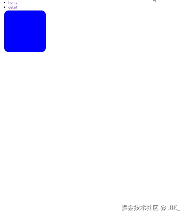
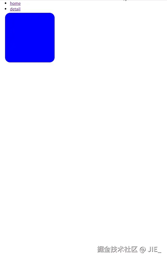
我们简单写两个页面来测试一下效果。
App.vue:
vue
<template>
  <div style="position: relative; width: 100vw; height: 100vh;">
    <ul>
      <li>
        <router-link to="/">home</router-link>
      </li>
      <li>
        <router-link to="/detail">detail</router-link>
      </li>
    </ul>
    <router-view></router-view>
  </div>
</template>
页面1:
vue
<template>
  <div>
    <div
      class="box1"
      v-hero="{
        heroId: 'box'
      }"
    />
  </div>
</template>

<style scoped>
.box1 {
  position: absolute;
  top: 500px;
  left: 300px;
  width: 100px;
  height: 100px;
  background-color: red;
}
</style>
页面2:
vue
<template>
  <div>
    <div
      class="box2"
      v-hero="{
        heroId: 'box'
      }"
    />
  </div>
</template>

<style scoped>
.box2 {
  position: absolute;
  top: 50px;
  left: 20px;
  width: 200px;
  height: 200px;
  background-color: blue;
  border-radius: 20px;
}
</style>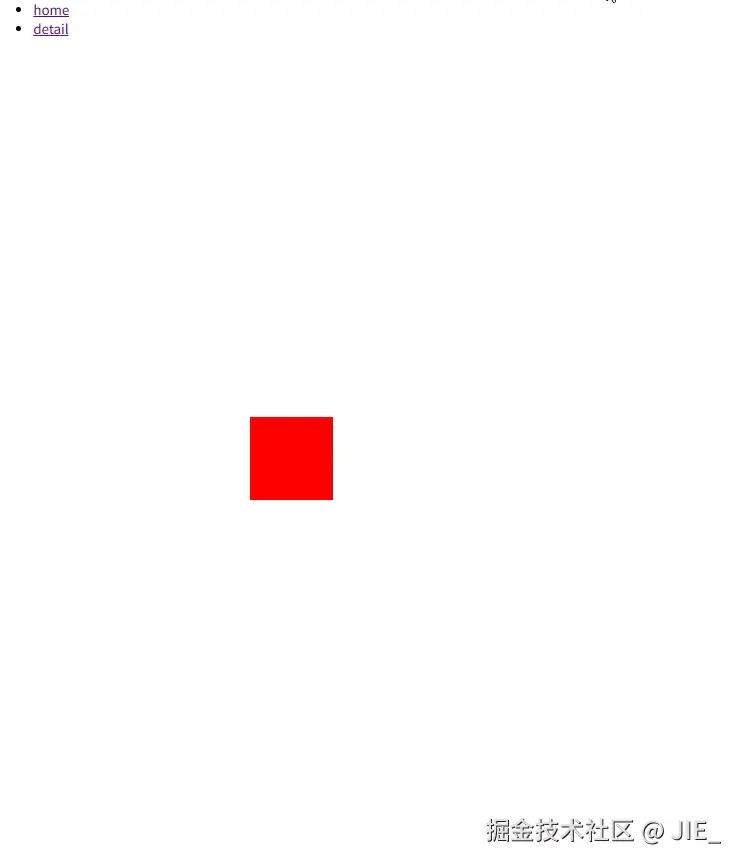
目前效果看起来还不错🤔,但是如果过渡元素的样式中有transform属性,那么过渡的过程就会出现问题。
问题分析与解决
我们在页面1的box1元素上添加transform属性:
css
.box1 {
  ...保留其他样式
  transform: rotate(45deg);
}
再次看下效果:
可以看到在动画结束后,元素抖动了一下,然后才回到了原来的位置。
我们先注释掉containerEl.removeChild(clone),发现克隆出来的DOM在动画结束后的宽高和目标元素对不上。
- 动画结束后
克隆DOM的宽高:width: 141.412px; height: 141.412px; - 实际目标元素的宽高是:
width: 100px; height: 100px;
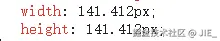
getBoundingClientRect计算的是元素经过所有CSS变换(包括transform)后的最终渲染边界框。这意味着:
- 旋转(rotate)会影响元素的边界框尺寸
- 缩放(scale)会改变元素的实际显示大小
- 平移(translate)会调整元素的位置坐标
这些变换都会反映在返回的DOMRect对象中。
解决方案:既然问题出在transform属性上,那么我们就在getBoundingClientRect之前暂时去除 transform属性,之后再赋值回来。
typescript
function getRect(el: HTMLElement) {
  // 保存原始transform和transition属性
  const originalTransform = el.style.transform;
  const originalTransition = el.style.transition;
  el.style.transform = 'none';
  el.style.transition = 'none';
  const rect = el.getBoundingClientRect();
  el.style.transform = originalTransform;
  // 在下一帧中赋值transition属性 避免恢复transform时发生过渡动画 拿到的rect信息还是会存在问题
  requestAnimationFrame(() => {
    el.style.transition = originalTransition;
  });
  return rect;
};

async function heroAnimation(el: HTMLElement, props: HeroAnimationProps) {
  ...
  const rect = getRect(el);
  ...
  const newRect = getRect(newEl);
  ...
}
再来看下效果:
这下就没有抖动了😀。
一些优化
当前用于过渡的组件是添加到根节点 下的,z-index是定死的,但实际使用中还会有些情况:
- 动画可能是需要在某个容器执行
- 动画元素可能会被别的元素遮盖来完成一些特殊的效果
那我们需要在props中再添加如下属性:
typescript
export interface HeroAnimationProps {
  ...
  position?: 'absolute' | 'fixed';
  zIndex?: number;
  container?: string | Ref<HTMLElement>
}现在就可以指定过渡元素所在的容器了,我们再在heroAnimation方法进行如下改造:
- 指定容器
- 动态
z-index - 在指定容器的情况下,坐标要改为相对坐标
typescript
async function heroAnimation(el: HTMLElement, props: HeroAnimationProps) {
  const {
    duration = '1s',
    timingFunction = 'ease',
    delay = '0s',
    position = 'fixed',
    zIndex = 9999,
    container = document.body
  } = props;

  const containerEl: HTMLElement = isRef(container)
    ? container.value ?? document.body
    : typeof container === 'string'
      ? document.querySelector(container) ?? document.body
      : container;

  ...

  const containerRect = getRect(containerEl);
  const pos = getPosition(rect, containerRect, position);
  clone.style.left = `${pos.left}px`;
  clone.style.top = `${pos.top}px`;

  ...

  requestAnimationFrame(() => {
    ...
    const newPos = getPosition(newRect, containerRect, position);
    clone.style.left = `${newPos.left}px`;
    clone.style.top = `${newPos.top}px`;
    ...
  });
};由于当前动画元素的定位可能是相对定位 ,所以我们得计算出元素的相对坐标 ,只需要通过元素坐标 - 容器坐标就可以计算出当前元素的相对坐标:
typescript
function getPosition (rect: DOMRect, containerRect: DOMRect, position: HeroAnimationProps['position']) {
  return {
    left: position === 'absolute' ? rect.left - containerRect.left : rect.left,
    top: position === 'absolute' ? rect.top - containerRect.top : rect.top,
  };
};我们再改造一下App.vue,在router-view外再包一层容器,并在两个页面中指定动画容器,再看看效果:
App.vue
vue
<template>
  <div style="position: relative; width: 100vw; height: 100vh;">
    ...
    <div id="container" class="container">
      <router-view></router-view>
    </div>
  </div>
</template>

<style scoped>
.container {
  position: relative;
  margin-inline: 20px;
  width: 500px;
  height: 500px;
  border: solid 2px #000;
  border-radius: 20px;
  overflow: hidden;
}
</style>
页面1:
vue
<template>
  <div>
    <div
      class="box1"
      v-hero="{
        heroId: 'box',
        position: 'absolute',
        container: '#container'
      }"
    />
  </div>
</template>

<style scoped>
.box1 {
  position: absolute;
  bottom: -50px;
  right: -50px;
  width: 100px;
  height: 100px;
  background-color: red;
  transform: rotate(45deg);
}
</style>
页面2:
vue
<template>
  <div>
    <div
      class="box2"
      v-hero="{
        heroId: 'box',
        position: 'absolute',
        container: '#container'
      }"
    />
  </div>
</template>

<style scoped>
.box2 {
  position: absolute;
  top: -100px;
  left: -100px;
  width: 200px;
  height: 200px;
  background-color: blue;
  border-radius: 20px;
}
</style>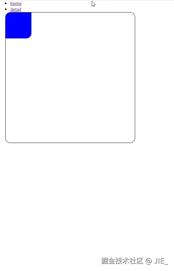
效果还是不错的😁。
在线预览
总结
目前实现
- 实现跨路由的动画效果,支持容器定位(position)和层级(z-index)控制
- 解决
transform属性导致的边界框计算问题 - 支持指定动画元素的容器
一些限制/不足
v-show隐藏控制
- 目前还不支持
v-show隐藏来触发动画
- 图片内容过渡
- 源/目标图片不一致时会出现闪烁(建议使用同源图片)