了解如何使用 Material API 配置排版,包括使用可下载字体和可变字体。
1. Text Typograph block and Text parameters
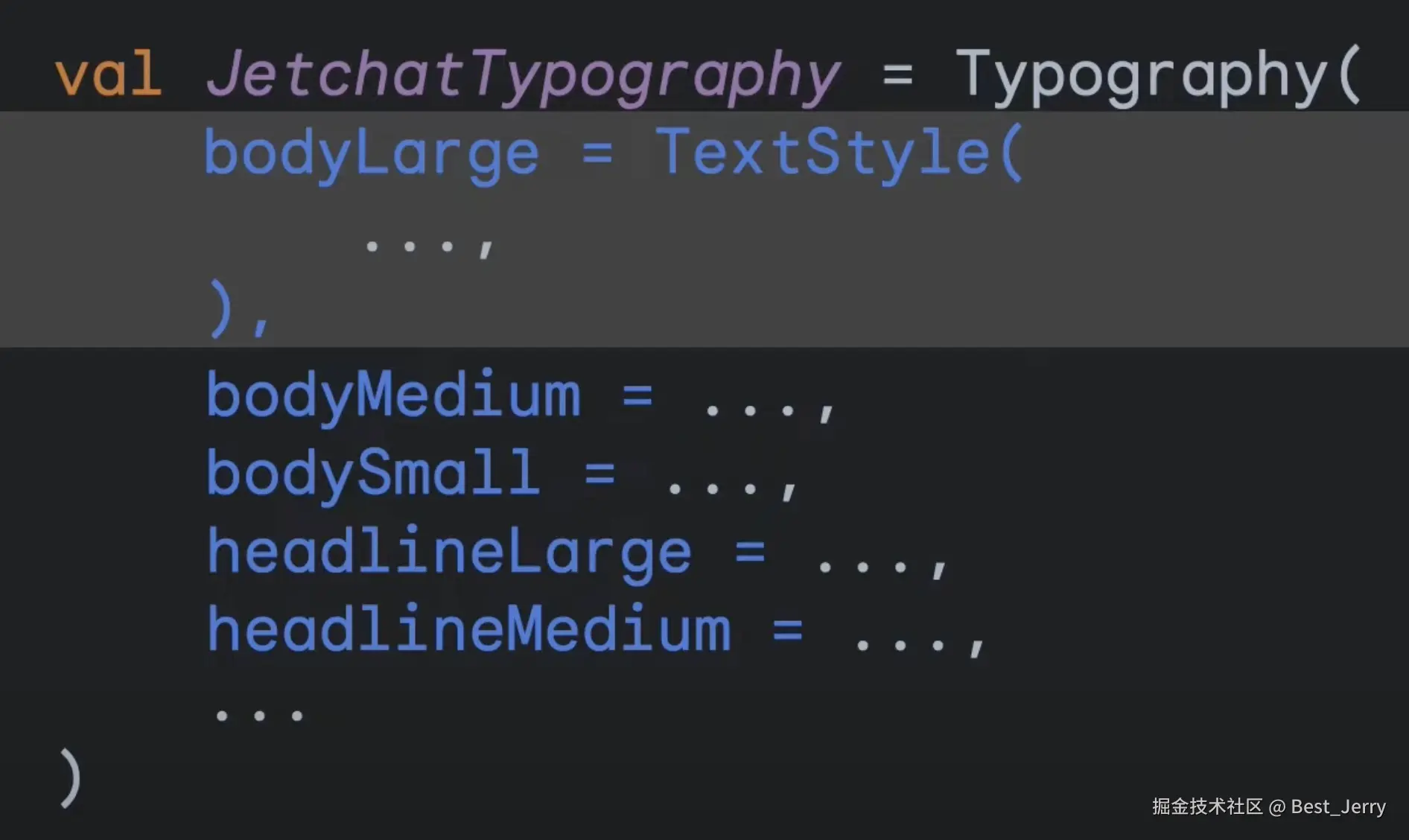
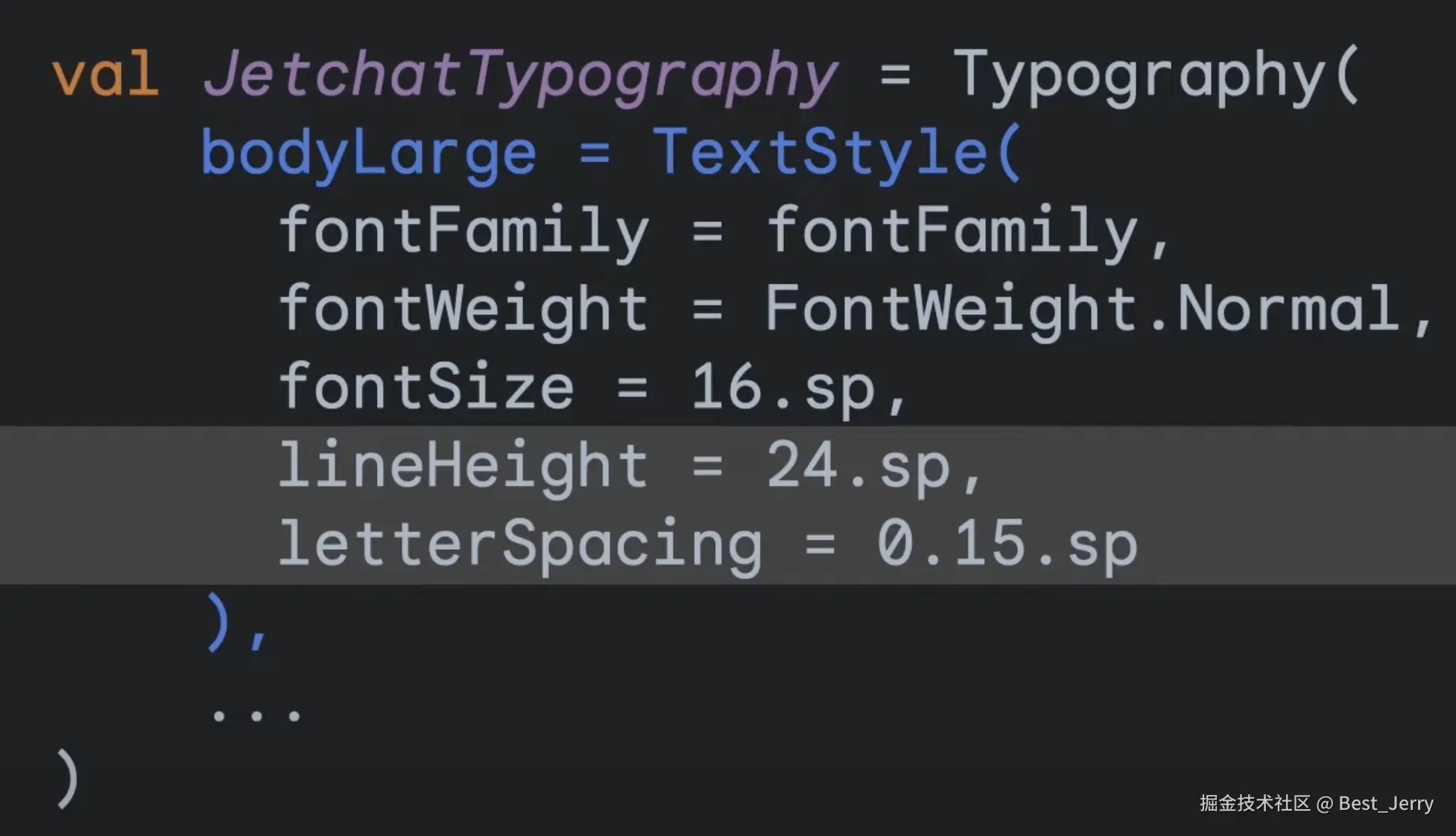
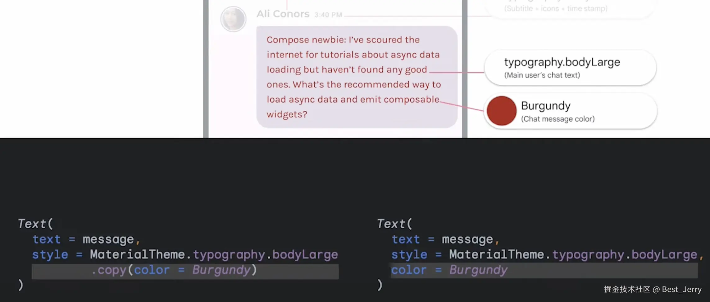
可以使用 TextStyle.copy() 方法自定义 TextStyle。
直接在组合函数中提供参数会覆盖 TextStyle 中定义的样式,比如 Text() 中的 color 参数。
2. Material implementation
为什么 Button 里面的 Text 会自己设置成 Button 的样式展示?
kotlin
Button(onClick = {
    ...
}) {
    Text(text = "Send")
}
因为在 Button() 组合函数中,在 ProvideContentColorTextStyle() 组合函数中设置了 textStyle = MaterialTheme.typography.labelLarge
kotlin
@Composable
fun Button(
    onClick: () -> Unit,
    modifier: Modifier = Modifier,
    enabled: Boolean = true,
    shape: Shape = ButtonDefaults.shape,
    colors: ButtonColors = ButtonDefaults.buttonColors(),
    elevation: ButtonElevation? = ButtonDefaults.buttonElevation(),
    border: BorderStroke? = null,
    contentPadding: PaddingValues = ButtonDefaults.ContentPadding,
    interactionSource: MutableInteractionSource? = null,
    content: @Composable RowScope.() -> Unit
) {
        ...
        ProvideContentColorTextStyle(
            contentColor = contentColor,
            textStyle = MaterialTheme.typography.labelLarge
        ) {
            ...
        }
    }
}
在 ProvideContentColorTextStyle() 组合函数的实现中,将 LocalTextStyle 设置成 MaterialTheme.typography.labelLarge。
kotlin
@Composable
internal fun ProvideContentColorTextStyle(
    contentColor: Color,
    textStyle: TextStyle,
    content: @Composable () -> Unit
) {
    val mergedStyle = LocalTextStyle.current.merge(textStyle)
    CompositionLocalProvider(
        LocalContentColor provides contentColor,
        LocalTextStyle provides mergedStyle,
        content = content
    )
}
Text() 组合函数中的 style 参数默认就是 LocalTextStyle.current。类似的,Text 的颜色有 LocalContentColor.current 决定。
kotlin
@Composable
fun Text(
    text: String,
    modifier: Modifier = Modifier,
    color: Color = Color.Unspecified,
    fontSize: TextUnit = TextUnit.Unspecified,
    fontStyle: FontStyle? = null,
    fontWeight: FontWeight? = null,
    fontFamily: FontFamily? = null,
    letterSpacing: TextUnit = TextUnit.Unspecified,
    textDecoration: TextDecoration? = null,
    textAlign: TextAlign? = null,
    lineHeight: TextUnit = TextUnit.Unspecified,
    overflow: TextOverflow = TextOverflow.Clip,
    softWrap: Boolean = true,
    maxLines: Int = Int.MAX_VALUE,
    minLines: Int = 1,
    onTextLayout: ((TextLayoutResult) -> Unit)? = null,
    style: TextStyle = LocalTextStyle.current
) {
    val textColor = color.takeOrElse { style.color.takeOrElse { LocalContentColor.current } }
    ...
}
3. onTextLayout() API
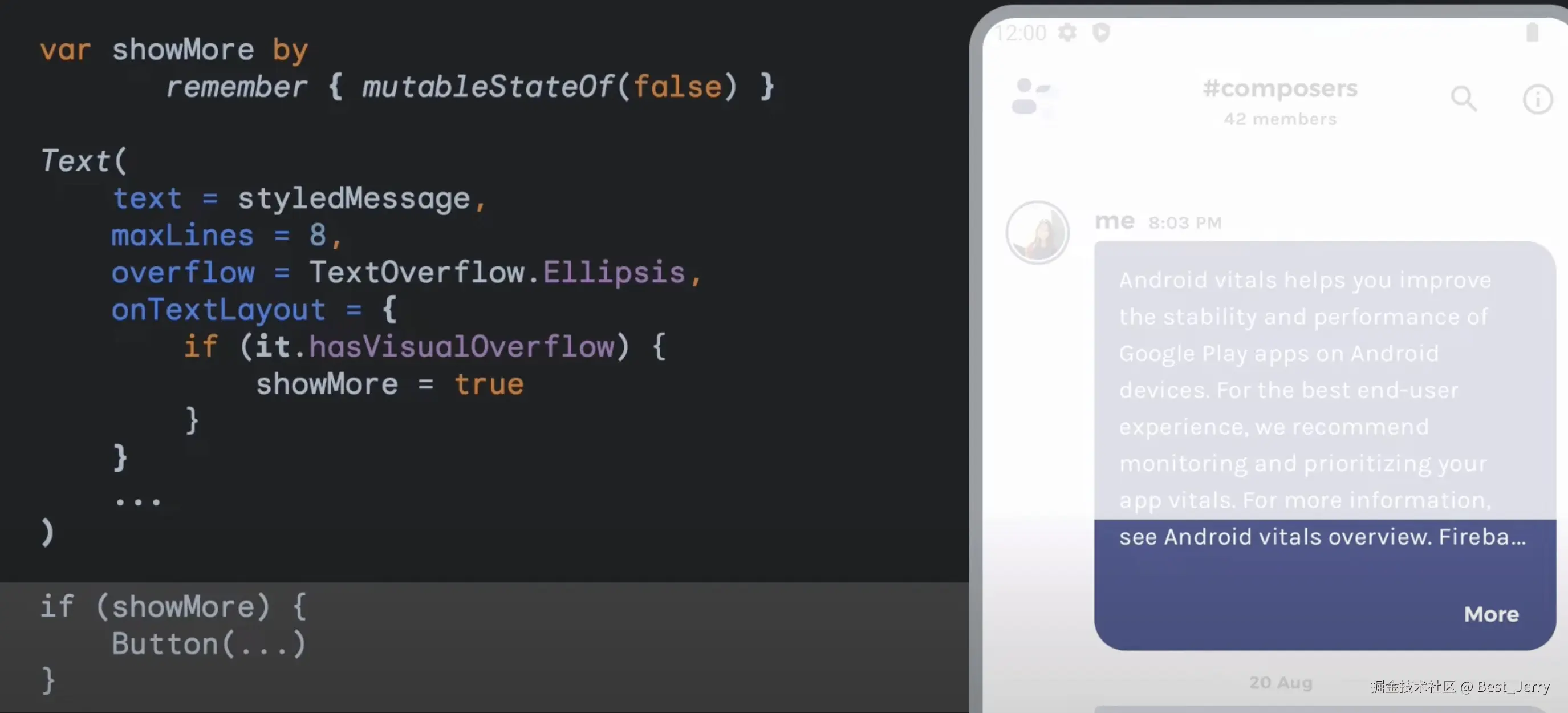
如何为 Text 设置最大行数,超出部分显示省略号?
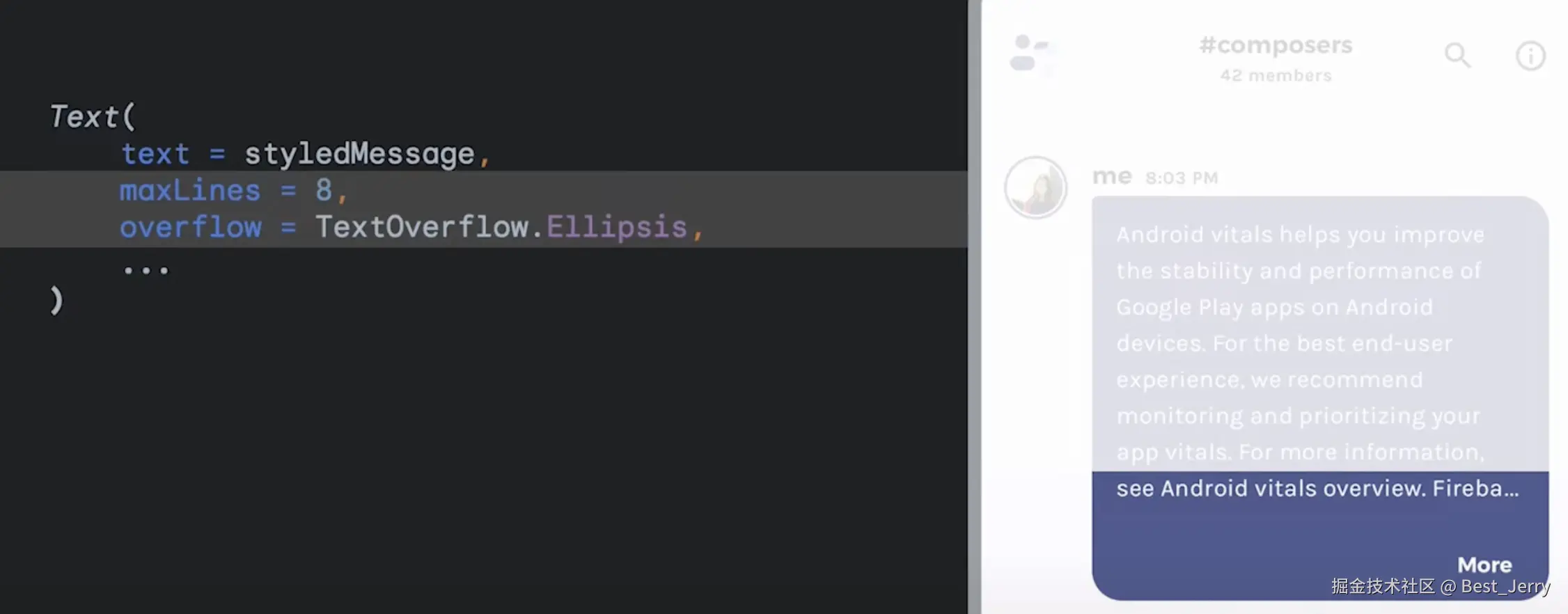
点击 More 按钮,隐藏 More 按钮,展示所有 Text 的内容。
可以使用 onTextLayout lambda。onTextLayout lambda 内部不允许存在 UI,因为此调用不是组合的一部分。可以改变触发重组的状态变量达到更新的目的。
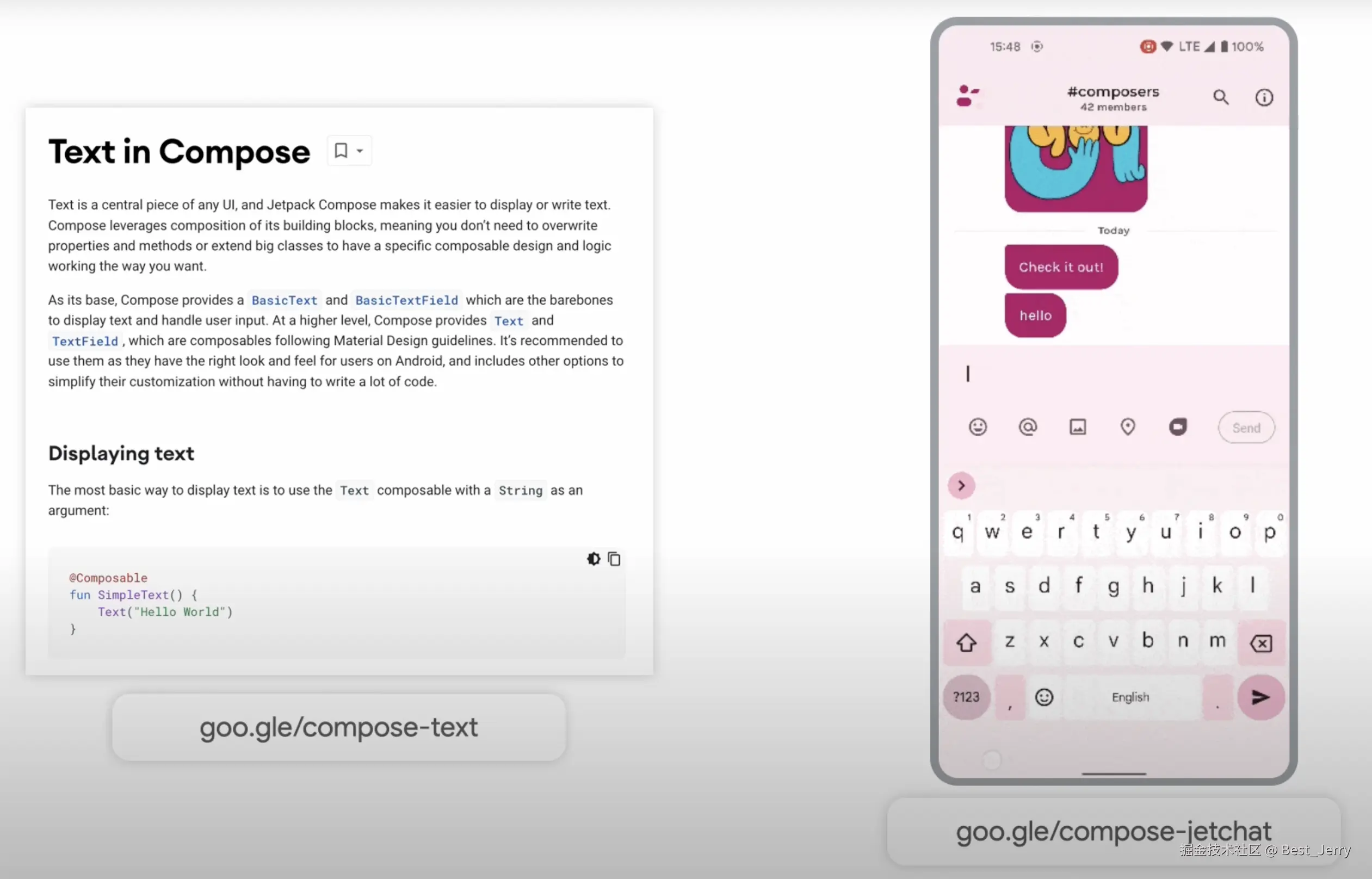
4. Downloadable fonts
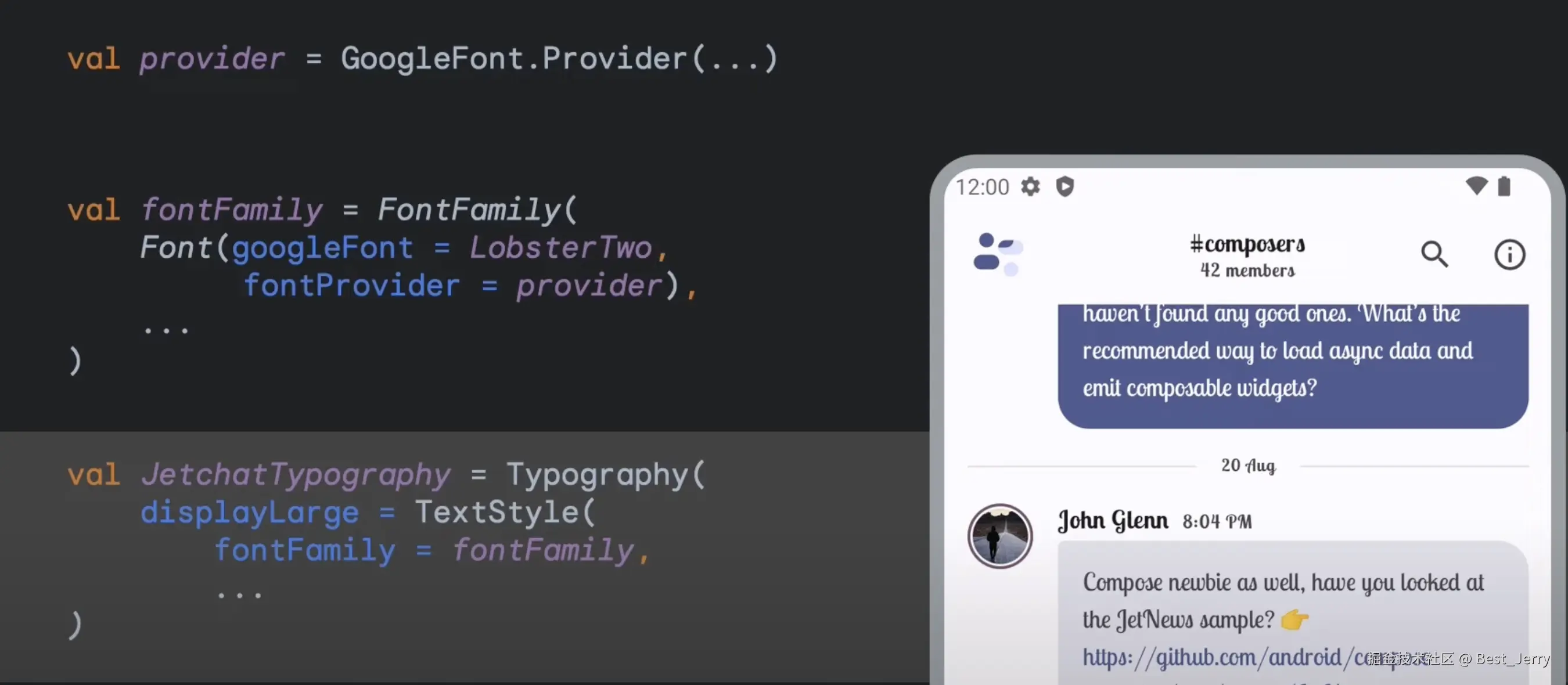
如何下载并使用字体?
- 导入 ui-text-google-fonts 库
gradle
implementation 'androidx.compose.ui:ui-text-google-fonts:1.9.0'- 配置 Google 字体提供商
kotlin
val provider = GoogleFont.Provider(...)- 选择 Google 字体
kotlin
val fontFamily = FontFamily(
    Font(
        googleFont = LobsterTwo,
        fontProvider = provider
    )
)- 在排版中添加这个字体
kotlin
val typography = Typography(
    displayLarge = TextStyle(
        fontFamily = fontFamily
    )
)- 当使用到这个字体的时候它会自动下载并应用,不需要任何回调
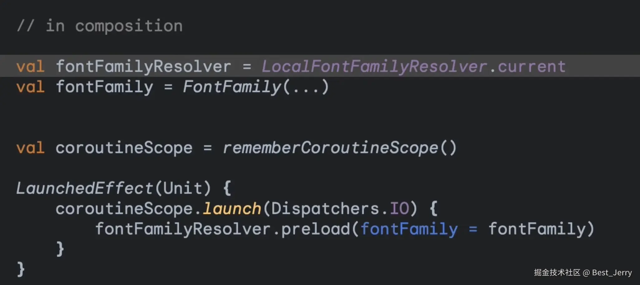
预加载字体
如何预加载字体?
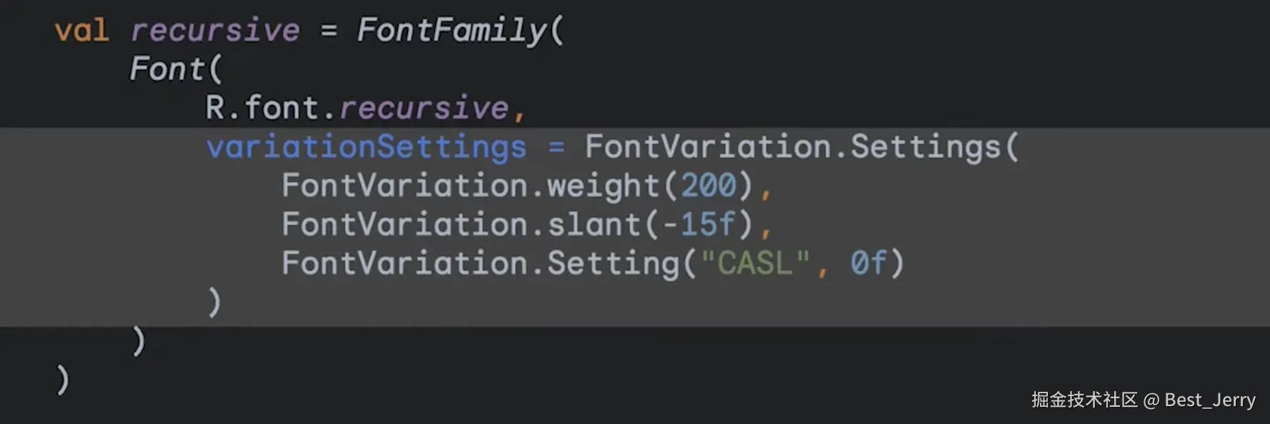
5. Variable fonts
如何配置可变字体?
-
下载字体
-
使用 FontVariation API 改变字体
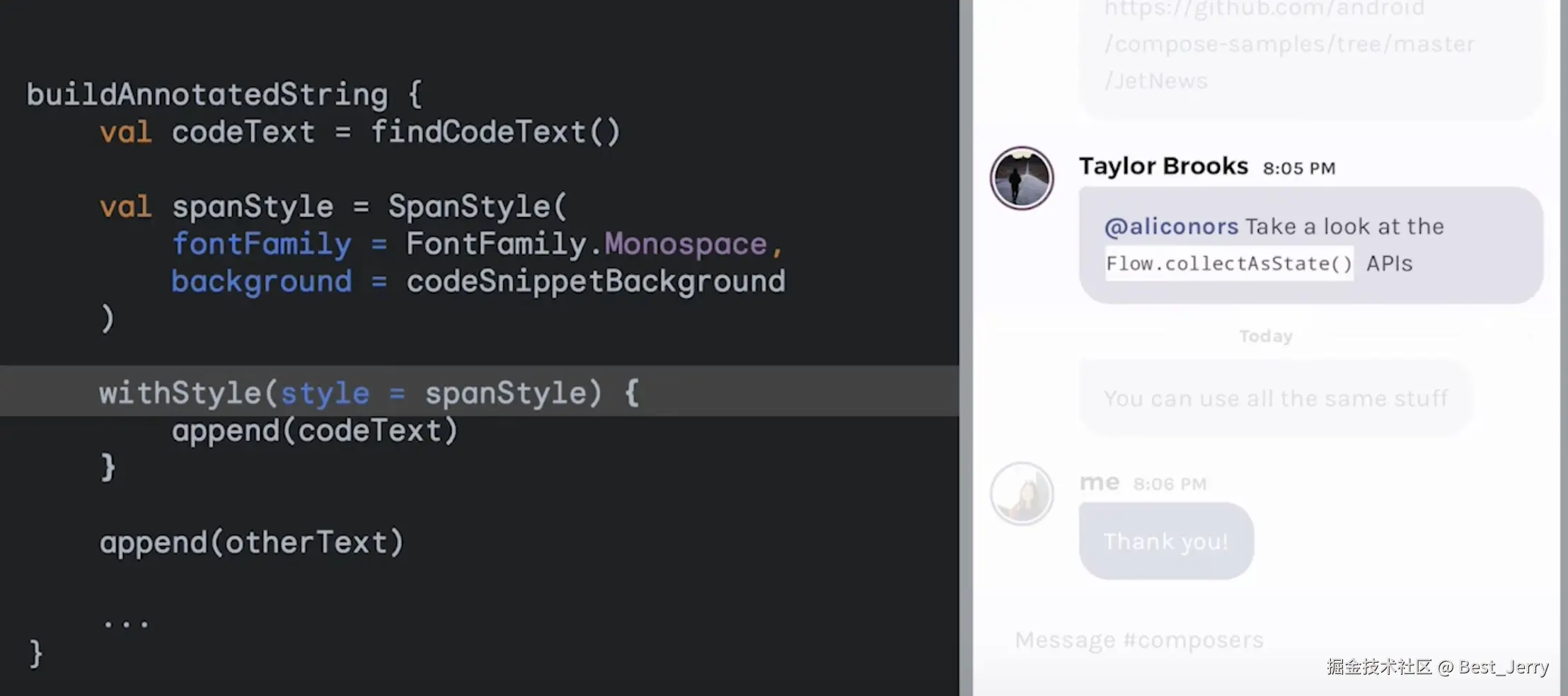
6. AnnotatedString
如何对 Text 中的部分文字进行样式设置?
AnnotatedString 允许我们设置文本或段落的部分样式,使用 buildAnnotatedString{}、SpanStyle()、withStyle()。
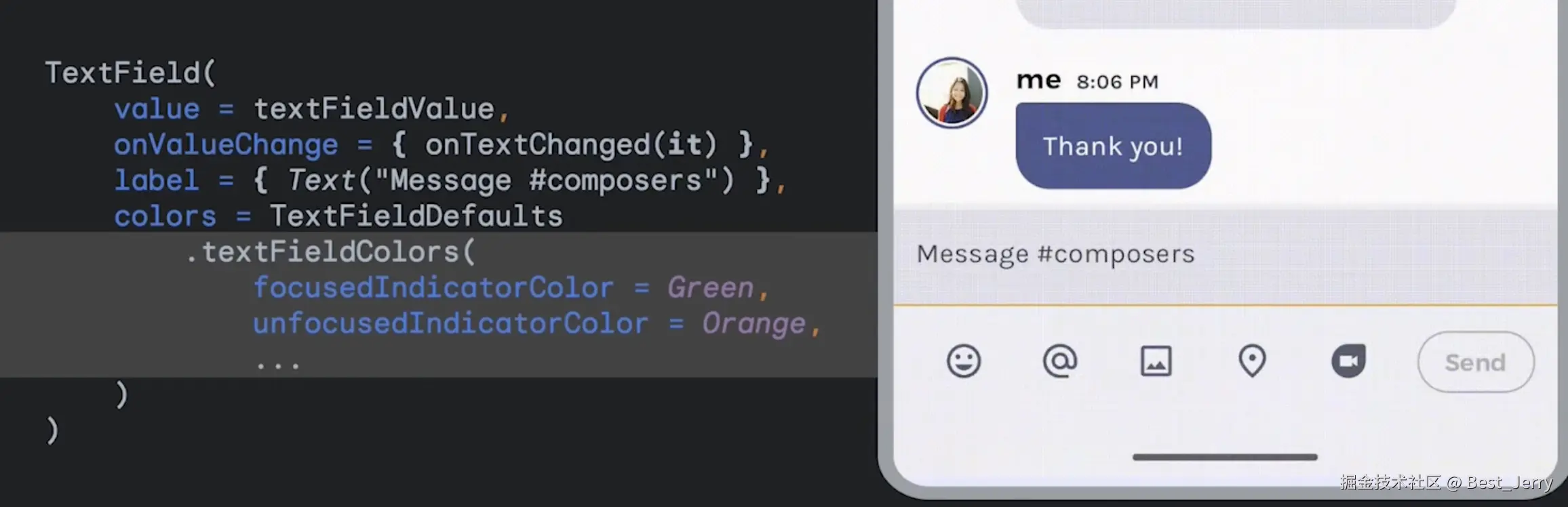
7. Styling TextField
如何自定义 TextField?
自定义 TextField 组件的颜色
kotlin
TextField(
    colors = TextFieldDefaults.colors(
        focusedIndicatorColor = Color.Green,
        unfocusedIndicatorColor = Color.Yellow
    )
)
自定义 TextField 边框的颜色
kotlin
TextField(
    colors = OutlinedTextFieldDefaults.colors(
        focusedBorderColor = Color.Green,
        unfocusedBorderColor = Color.Yellow
    )
)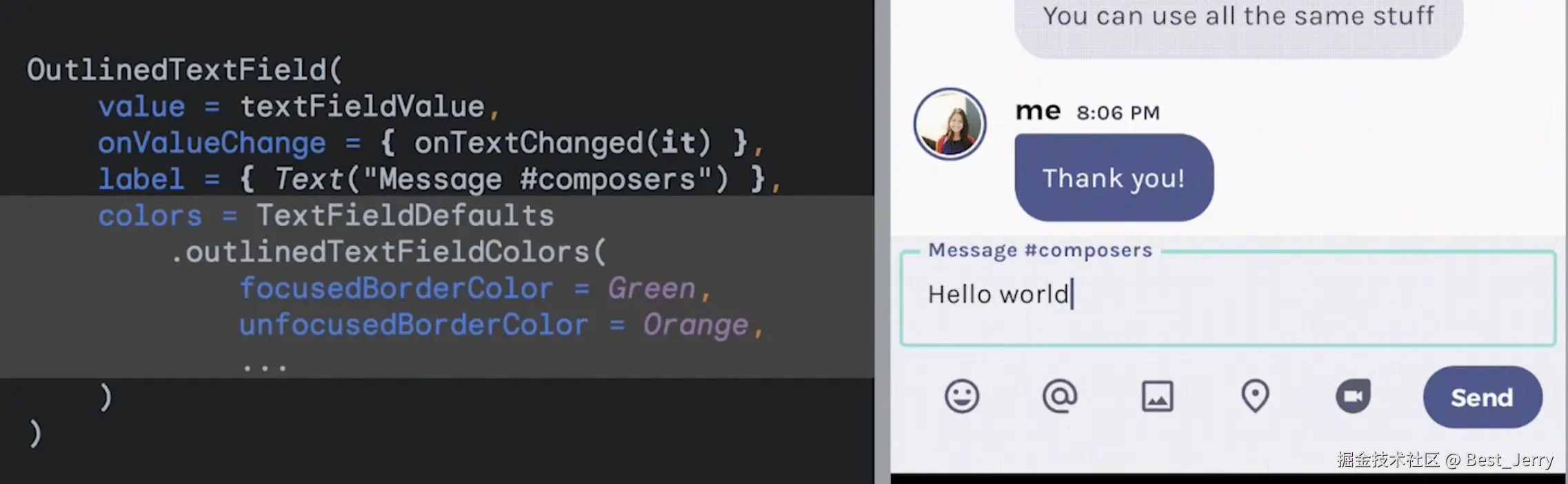
如果希望进一步自定义边框,可以使用 Modifier 进行设置。
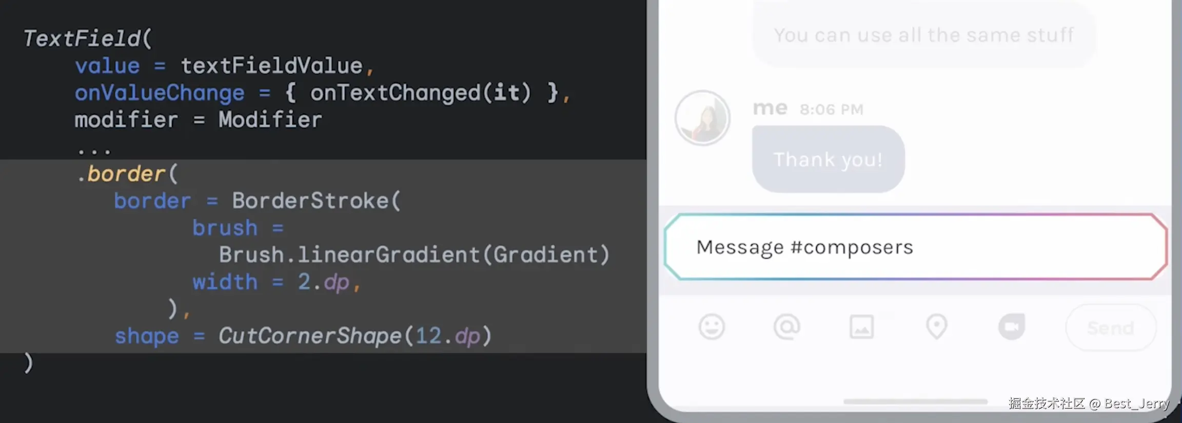
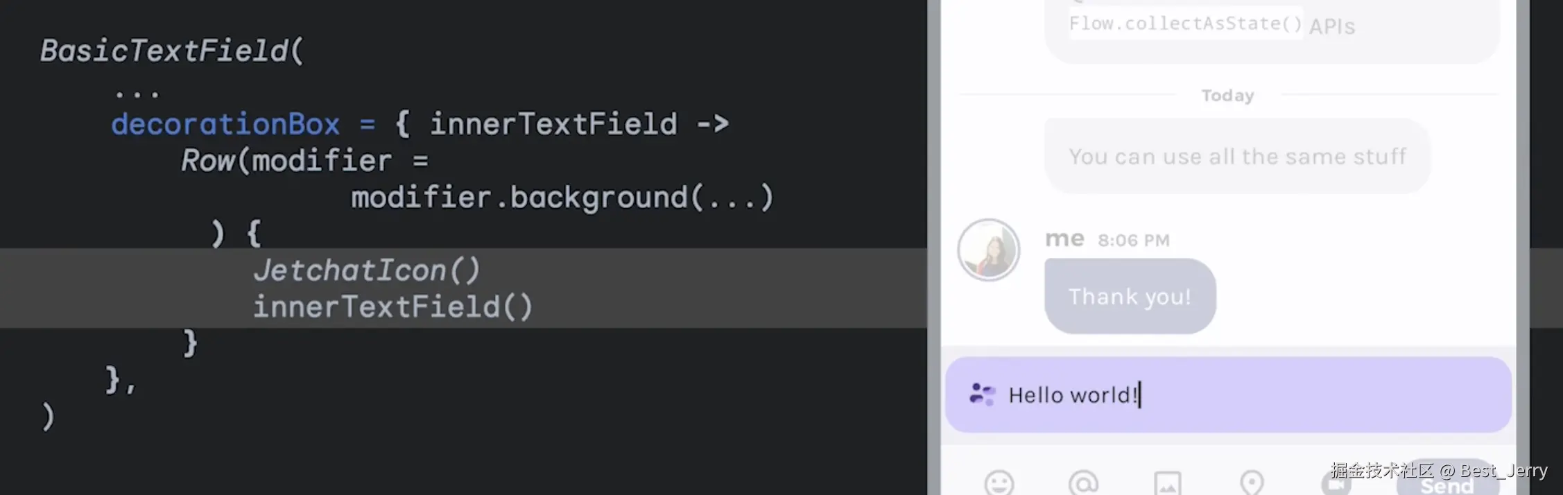
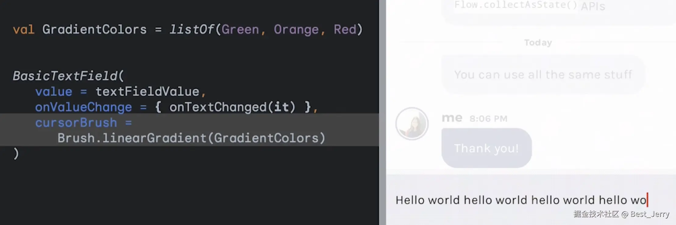
8. Styling BasicTextField
如何完全自定义 TextField?
使用 BasicTextField 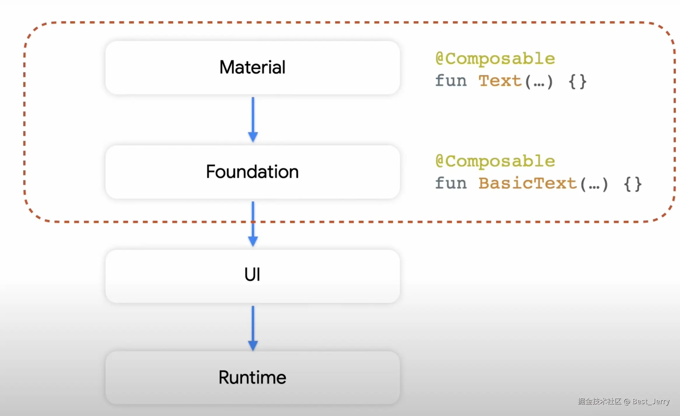
随着输入字数越来越接近字符限制,光标的颜色渐变。
设置自定义背景和前导图标。