CSS不仅仅是用来美化页面的工具,它还能实现许多令人惊叹的交互效果,而无需一行JavaScript代码!今天我将带你探索几种实用的纯CSS交互技巧。
悬停效果:
最简单的交互效果就是鼠标悬停响应。看这个例子:
html
<!DOCTYPE html>
<html>
<head>
    <style>
        .hover-button {
            background-color: #4CAF50;
            color: white;
            padding: 15px 32px;
            text-align: center;
            text-decoration: none;
            display: inline-block;
            font-size: 16px;
            margin: 4px 2px;
            cursor: pointer;
            transition: all 0.3s ease;
            border-radius: 4px;
        }

        .hover-button:hover {
            background-color: #45a049;
            transform: scale(1.05);
            box-shadow: 0 4px 8px rgba(0,0,0,0.2);
        }
    </style>
</head>
<body>
    <button class="hover-button">悬停看我变身</button>
</body>
</html>这里使用了:hover伪类和transition属性,创建了平滑的动画效果。当鼠标悬停在按钮上时,按钮会轻微放大并改变阴影。
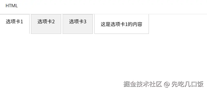
纯CSS实现选项卡
选项卡是网站常见组件,通常需要JavaScript,但其实CSS也能实现:
html
<!DOCTYPE html>
<html>
<head>
    <style>
        .tabs {
            display: flex;
        }

        .tab-label {
            padding: 10px 20px;
            background: #f1f1f1;
            cursor: pointer;
            border: 1px solid #ccc;
            margin-right: 5px;
        }

        .tab-content {
            display: none;
            padding: 20px;
            border: 1px solid #ccc;
            border-top: none;
        }

        input[type="radio"] {
            display: none;
        }

        input[type="radio"]:checked + .tab-label {
            background: #fff;
            border-bottom: 1px solid #fff;
        }

        #tab1:checked ~ #content1,
        #tab2:checked ~ #content2,
        #tab3:checked ~ #content3 {
            display: block;
        }
    </style>
</head>
<body>
    <div class="tabs">
        <input type="radio" id="tab1" name="tabs" checked>
        <label for="tab1" class="tab-label">选项卡1</label>

        <input type="radio" id="tab2" name="tabs">
        <label for="tab2" class="tab-label">选项卡2</label>

        <input type="radio" id="tab3" name="tabs">
        <label for="tab3" class="tab-label">选项卡3</label>

        <div id="content1" class="tab-content">这是选项卡1的内容</div>
        <div id="content2" class="tab-content">这是选项卡2的内容</div>
        <div id="content3" class="tab-content">这是选项卡3的内容</div>
    </div>
</body>
</html>这个实现的秘诀在于使用隐藏的单选按钮和:checked伪类选择器。当选择不同的选项卡时,对应的内容区域就会显示。
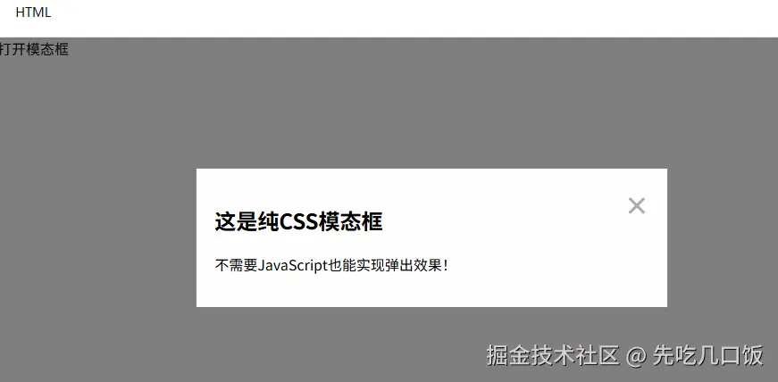
模态框(Modal)效果
模态框(弹出窗口)也可以只用CSS实现:
html
<!DOCTYPE html>
<html>
<head>
<style>
.modal {
display: none;
position: fixed;
top: 0;
left: 0;
width: 100%;
height: 100%;
background-color: rgba(0,0,0,0.5);
}
.modal-content {
background-color: #fefefe;
margin: 15% auto;
padding: 20px;
border: 1px solid #888;
width: 50%;
position: relative;
}
.close {
color: #aaa;
float: right;
font-size: 28px;
font-weight: bold;
cursor: pointer;
}
.modal-toggle {
display: none;
}
.modal-toggle:checked + .modal {
display: block;
}
</style>
</head>
<body>
<label for="modal-toggle" class="button">打开模态框</label>
<input type="checkbox" id="modal-toggle" class="modal-toggle">
<div class="modal">
<div class="modal-content">
<label for="modal-toggle" class="close">×</label>
<h2>这是纯CSS模态框</h2>
<p>不需要JavaScript也能实现弹出效果!</p>
</div>
</div>
</body>
</html>这个实现同样利用了复选框和:checked伪类。点击"打开模态框"标签会选中隐藏的复选框,然后通过CSS选择器显示模态框。
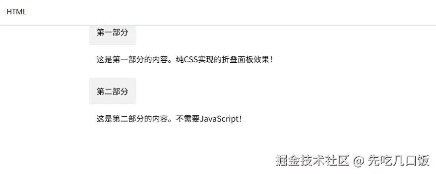
折叠面板(Accordion)
折叠面板是另一种常见UI组件,也可以纯CSS实现:
html
<!DOCTYPE html>
<html>
<head>
    <style>
        .accordion {
            width: 100%;
            max-width: 600px;
            margin: 0 auto;
        }

        .accordion-item {
            margin-bottom: 10px;
        }

        .accordion-header {
            background: #f1f1f1;
            padding: 15px;
            cursor: pointer;
            position: relative;
        }

        .accordion-content {
            padding: 0 15px;
            max-height: 0;
            overflow: hidden;
            transition: max-height 0.3s ease;
        }

        .accordion-toggle {
            display: none;
        }

        .accordion-toggle:checked + .accordion-header + .accordion-content {
            max-height: 200px;
            padding: 15px;
        }

        .accordion-header::after {
            content: "+";
            position: absolute;
            right: 15px;
            top: 50%;
            transform: translateY(-50%);
        }

        .accordion-toggle:checked + .accordion-header::after {
            content: "-";
        }
    </style>
</head>
<body>
    <div class="accordion">
        <div class="accordion-item">
            <input type="checkbox" id="section1" class="accordion-toggle">
            <label for="section1" class="accordion-header">第一部分</label>
            <div class="accordion-content">
                <p>这是第一部分的内容。纯CSS实现的折叠面板效果!</p>
            </div>
        </div>

        <div class="accordion-item">
            <input type="checkbox" id="section2" class="accordion-toggle">
            <label for="section2" class="accordion-header">第二部分</label>
            <div class="accordion-content">
                <p>这是第二部分的内容。不需要JavaScript!</p>
            </div>
        </div>
    </div>
</body>
</html>这里使用了max-height属性和过渡效果来创建平滑的展开/折叠动画。
最后的总结
就是现在其实市面上的这种封装好的组件很多很多,只要引入然后应用就行,谁还会使用纯原生css写,对吧。但是这是我们的基础技能,没事了不还得练练吗?
当然,纯CSS现在解决方案也有局限性,比如状态管理能力有限,交互逻辑相对简单。但对于许多基本交互需求,CSS也提供了轻量级且高效的解决方案。