自定义 `Utable.vue` 组件
html
<script>
import { mapState } from 'vuex'
import { Table } from 'ant-design-vue'
export default {
  name: 'UTable',
  props: {
    dataSource: {
      type: Array,
      default: () => []
    },
    columns: {
      type: Array,
      default: () => []
    },
    onClearSelected: {
      type: Function,
      default: () => null
    },
    positionBottom:{
      type: Boolean,
      default: false
    }
  },
  computed: {
    ...mapState({
      primaryColor: state => state.app.color,
    }),
  },
  methods: {
    handleTableChange(e){
      this.$emit('change', e);
    },
    getBottomClass(){
      return ['u-table-selected-info', this.positionBottom?'u-table-selected-info-container-position':'u-table-selected-info-container']
    }
  },
  render() {
    const on={
      ...this.$listeners
    }
    const props = {...this.$attrs,...this.$props}

    const slots = Object.keys(this.$slots).map(slot => {
      return (<template slot={slot}>{this.$slots[slot]}</template>)
    })
    // columns={columns} dataSource={dataSource}
    const table=(<Table bordered props={props}  scopedSlots={this.$scopedSlots} on={on}>
      {slots}
    </Table>)

    const { rowSelection } = this.$attrs
    // 我的版本不支持用这种语法
    // const selectRoeKeys = (rowSelection?.selectedRowKeys || []).length
    const selectRoeKeys = (rowSelection ? (rowSelection.selectedRowKeys || []) : []).length

    const that = this;
    const onClearSelected = function(arg){
      return that.$props.onClearSelected ? that.$props.onClearSelected(arguments): null;
    }

    return (<div>
      { table }
      <div class={this.getBottomClass()}>
      <a-icon type="info-circle" theme="filled" style={{ color: this.primaryColor }} /> 已选择
      <a style="font-weight: 600">{selectRoeKeys}</a>项
      <a style="margin-left: 24px" onClick={onClearSelected}>清空</a>
  </div>
    </div>)
  }
}
</script>


<style scoped>
.u-table-selected-info-container{
  line-height:24px;
  margin-top: -40px;
}
.u-table-selected-info-container-position{
  position: absolute;bottom: 40px;height: 24px;line-height:24px;
}
</style>
使用
html
<template>
<div>
<div>
</div>
<u-table :columns="columns"
:loading="loading"
:data-source="dataSource"
:ipagination="ipagination"
:rowSelection="{ selectedRowKeys: selectedRowKeys, onChange: onSelectChange }"
:onClearSelected="onClearSelected"
@change="handleChange">
<span slot="gender" slot-scope="text, record">
<i>{{text=='1' ? '男':'女'}}</i>
</span>
<template slot="action" slot-scope="text, record">
<a >编辑</a>
<a-divider type="vertical" />
<a >详情</a>
</template>
</u-table>
</div>
</template>
<script>
import UTable from '@/components/UTable/UTable'
export default {
name: "Alteration",
components: {
UTable
},
data() {
return {
columns: [
{
title: '#',
dataIndex: '',
key: 'rowIndex',
width: 60,
align: 'center',
customRender: function (t, r, index) {
return parseInt(index) + 1;
}
},
{
title: '姓名',
dataIndex: 'name',
width: 120,
},
{
title: '性别',
dataIndex: 'gender',
width: 120,
scopedSlots: { customRender: 'gender' },
},
{
title: '年龄',
dataIndex: 'age',
width: 120,
},
{
title: '操作',
dataIndex: 'action',
align: 'center',
width: 120,
scopedSlots: {
customRender: 'action'
}
}
],
loading: false,
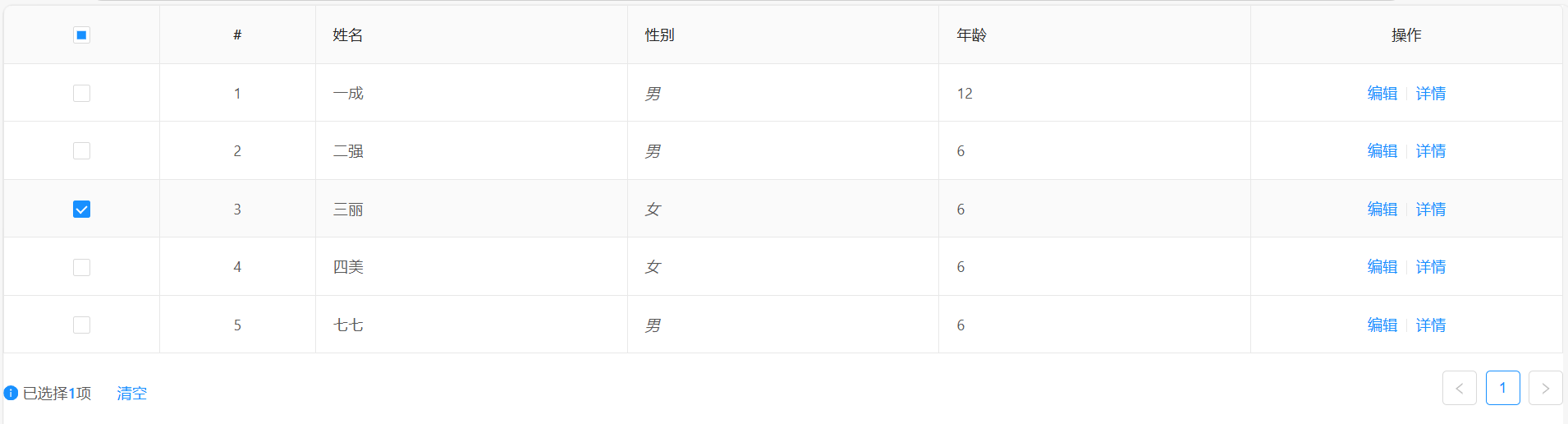
dataSource: [
{name: "一成", gender: "1", age: 12},
{name: "二强", gender: "1", age: 6},
{name: "三丽", gender: "2", age: 6},
{name: "四美", gender: "2", age: 6},
{name: "七七", gender: "1", age: 6},
],
/* 分页参数 */
ipagination: {
current: 1,
pageSize: 5,
pageSizeOptions: ['5', '10', '50'],
showTotal: (total, range) => {
return range[0] + '-' + range[1] + ' 共' + total + '条'
},
showQuickJumper: true,
showSizeChanger: true,
total: 0
},
selectedRowKeys: [],
selectionRows: []
}
},
mounted() {
},
methods: {
onSelectChange(selectedRowKeys, selectionRows){
this.selectedRowKeys = selectedRowKeys;
this.selectionRows = selectionRows;
},
onClearSelected(){
// 目前还无法清空,但是执行了这个函数。等我找找原因
console.log("清空函数",this.selectedRowKeys)
this.selectedRowKeys.length = 0;
this.selectionRows.length = 0;
},
handleChange(){}
}
}
</script>
<style lang="less" scoped>
.steps {
max-width: 750px;
margin: 16px auto;
}
</style>效果图
操作列、性别列是自定义的slot