在前端做动画一般有两种思路,一种是CSS来实现,一种是JS来实现,CSS实现动画比较简单而且效率高,但是不灵活,比如一些交互非常强的动画CSS就很难实现,但是用JS去实现的话,官方没有提供相应的API,我们得自己写或者使用第三方库,自己写比较麻烦,使用第三方库又导致要引入更多的JS文件,在效率上也不合适,问题在于JS没有一个很好的原生的动画API,但是现在已经解决了,官方提供了一套API叫做Web Animation API,简称WAAPI,这一套API可以让我们在JS比较简单的实现动画而且效率和CSS的一样高。我们用一个案例去使用一下这个API。
1.初始化案例场景
我们想要实现的效果是,一个小球显示在屏幕上,鼠标点击哪里,这个小球就滑动到哪里。
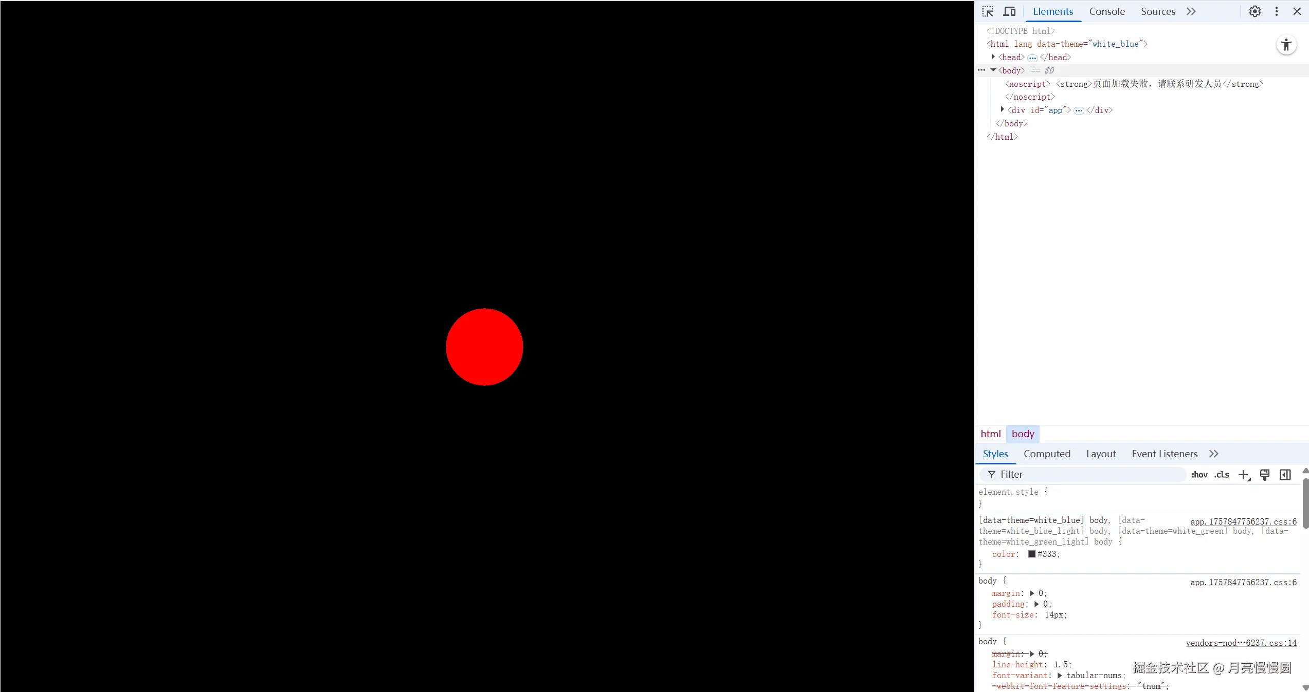
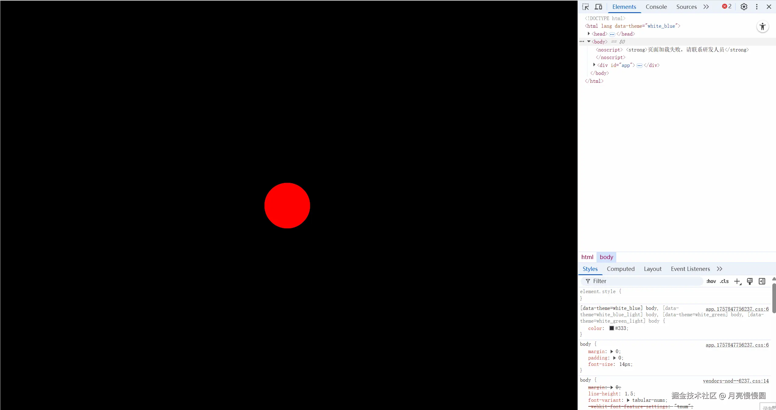
我们先搭建一个场景出来,初始化一个小球,让其出现在屏幕中间位置,然后做了一个鼠标点击的动画。
html
<template>
    <div class="screen-view">
        <div class="ball"></div>
    </div>
</template>
<script>
export default {
    name: 'WebAnimationAPI',
    data() {
        return {

        }
    },
    mounted() {
        // 让页面点击时出现一个扩散的圆圈
        window.addEventListener('click', (e) => {
            const pointer = document.createElement('div');
            pointer.classList.add('pointer')
            pointer.style.left = e.clientX + 'px';
            pointer.style.top = e.clientY + 'px';
            document.body.appendChild(pointer);
            pointer.addEventListener('animationend', () => {
                pointer.remove();
            })
        })

        // 初始化小球位置在屏幕中心
        // 不要在css里用定位的方式让小球位置在屏幕中心,因为这样的话小球在根据鼠标位置移动的时候会出现错误,因为此时小球中心是屏幕中心,而鼠标位置是根据左上角计算的
        // 所以一开始小球的中心一定要和屏幕的左上角重合
        // 然后后期我们初始化的时候用transform让小球移动到屏幕中心
        const centerX = window.innerWidth / 2;
        const centerY = window.innerHeight / 2;
        ball.style.transform = `translate(${centerX}px, ${centerY}px)`;
    },

}
</script>
<style lang='scss'>
// 不要加scoped,因为pointer是动态创建的,加了scoped样式就会失效,因为scoped是通过属性选择器来实现的,动态创建的元素没有这个属性选择器。
.screen-view {
    box-sizing: border-box;
    height: 100%;
    background-color: #000;
    overflow: hidden;

    .ball {
        width: 100px;
        height: 100px;
        background-color: red;
        border-radius: 50%;
        margin-top: -50px;
        margin-left: -50px;
        // 这里是为了让小球的中心点和屏幕的左上角重合,用margin,不要用transform,因为会出现些许偏差
    }
}

// 点击时出现的扩散圆圈
.pointer {
    width: 20px;
    height: 20px;
    border: 1px solid #fff;
    border-radius: 50%;
    position: fixed;
    transform: translate(-50%, -50%);
    animation: pointerAnim 0.6s ease-out forwards;  // forwards 保持最后一帧的状态 ease-out 先快后慢
    z-index: 9999;
    pointer-events: none; // 让指针不阻止点击事件
}

// 扩散动画
@keyframes pointerAnim {
    0% {
        opacity: 1;  // 初始状态不透明
        transform: translate(-50%, -50%) scale(1);  // 初始状态大小为1
    }

    100% {
        opacity: 0;  // 最终状态透明
        transform: translate(-50%, -50%) scale(5);  // 最终状态放大5倍
    }
}
</style>
2.让小球移动到鼠标位置
接下来就很简单了,获取到小球的这个元素,然后使用Web Animation API,让小球从原来位置移动到鼠标点击位置就好了,Web Animation API使用起来也比较简单,就是像下面这样调用animal函数,传递两个参数。
js
element.animal(keyframes,options)第一个参数keyframes是关键帧,第二个参数是动画配置。keyframes就类似于在CSS里面写的这种关键帧,像下面这样。
css
@keyframes pointerAnim {
    0% {
        opacity: 1; // 初始状态不透明
        transform: translate(-50%, -50%) scale(1); // 初始状态大小为1
    }

    100% {
        opacity: 0; // 最终状态透明
        transform: translate(-50%, -50%) scale(5); // 最终状态放大5倍
    }
}你看0%,100%这两项数据,到js里面不就是一个数组吗,所以keyframes是一个数组,数组的每一项就是一个关键帧,然后CSS里面每一个关键帧里面写的是样式属性,所以keyframes数组里面的每一项都是一个对象,对象里面就是样式属性,比如下面这样。
js
function move(x, y) {
    ball.animate([{ transform: `translate(0,0)` }, { transform: `translate(${x}px, ${y}px)` }], options)
}这时候会发现,好像和CSS里面的关键帧不太一样,少了0%,100%这样的进度百分比,在JS里面默认不用带百分比,默认情况下会去平均分配,所以上面的代码加上注释。
js
function move(x, y) {
    ball.animate([{ transform: `translate(0,0)` }, { transform: `translate(${x}px, ${y}px)` }], options)
    // 刚开始是transform: `translate(0,0)` 位置出现在屏幕左上角,在整个动画时间内变成transform: `translate(${x}px, ${y}px)` 移动到鼠标点击位置
}至于options动画配置这个参数有两种写法,第一种是直接写一个数字表示动画时间,单位是毫秒;第二种是写一个对象,可以配置更多信息,比如duration属性就是动画时间。
js
function move(x, y) {
    ball.animate([
        { transform: `translate(0,0)` },  // 位置出现在屏幕左上角
        { transform: `translate(${x}px, ${y}px)` }  // 移动到鼠标点击位置
    ], {
        duration: 1000,  // 动画持续时间
        easing: 'ease-out'  // 先快后慢
    });
}
此时代码为:
html
<template>
    <div class="screen-view">
        <div class="ball"></div>
    </div>
</template>
<script>
export default {
    name: 'WebAnimationAPI',
    data() {
        return {
        }
    },
    mounted() {
        // 让页面点击时出现一个扩散的圆圈
        window.addEventListener('click', (e) => {
            const pointer = document.createElement('div');
            pointer.classList.add('pointer')
            pointer.style.left = e.clientX + 'px';
            pointer.style.top = e.clientY + 'px';
            document.body.appendChild(pointer);
            pointer.addEventListener('animationend', () => {
                pointer.remove();
            })
        })

        // 获取小球
        const ball = document.querySelector('.ball');

        // 初始化小球位置在屏幕中心
        // 不要在css里用定位的方式让小球位置在屏幕中心,因为这样的话小球在根据鼠标位置移动的时候会出现错误,因为此时小球中心是屏幕中心,而鼠标位置是根据左上角计算的
        // 所以一开始小球的中心一定要和屏幕的左上角重合
        // 然后后期我们初始化的时候用transform让小球移动到屏幕中心
        const centerX = window.innerWidth / 2;
        const centerY = window.innerHeight / 2;
        ball.style.transform = `translate(${centerX}px, ${centerY}px)`;

        // 监听点击事件,让小球移动到点击位置
        window.addEventListener('click', (e) => {
            // 获取点击位置
            const x = e.clientX;
            const y = e.clientY;

            // 调用函数move 让小球移动到点击位置
            move(x, y);
        })

        // 定义函数move
        function move(x, y) {
            ball.animate([
                { transform: `translate(0,0)` },  // 位置出现在屏幕左上角
                { transform: `translate(${x}px, ${y}px)` }  // 移动到鼠标点击位置
            ], {
                duration: 1000,  // 动画持续时间
                easing: 'ease-out'  // 先快后慢
            });
        }
    },

}
</script>
<style lang='scss'>
// 不要加scoped,因为pointer是动态创建的,加了scoped样式就会失效,因为scoped是通过属性选择器来实现的,动态创建的元素没有这个属性选择器。
.screen-view {
    box-sizing: border-box;
    height: 100%;
    background-color: #000;
    overflow: hidden;

    .ball {
        width: 100px;
        height: 100px;
        background-color: red;
        border-radius: 50%;
        margin-top: -50px;
        margin-left: -50px;
        // 这里是为了让小球的中心点和屏幕的左上角重合,用margin,不要用transform,因为会出现些许偏差
    }
}

// 点击时出现的扩散圆圈
.pointer {
    width: 20px;
    height: 20px;
    border: 1px solid #fff;
    border-radius: 50%;
    position: fixed;
    transform: translate(-50%, -50%);
    animation: pointerAnim 0.6s ease-out forwards; // forwards 保持最后一帧的状态 ease-out 先快后慢
    z-index: 9999;
    pointer-events: none; // 让指针不阻止点击事件
}

// 扩散动画
@keyframes pointerAnim {
    0% {
        opacity: 1; // 初始状态不透明
        transform: translate(-50%, -50%) scale(1); // 初始状态大小为1
    }

    100% {
        opacity: 0; // 最终状态透明
        transform: translate(-50%, -50%) scale(5); // 最终状态放大5倍
    }
}
</style>
让我们来看看效果如何。
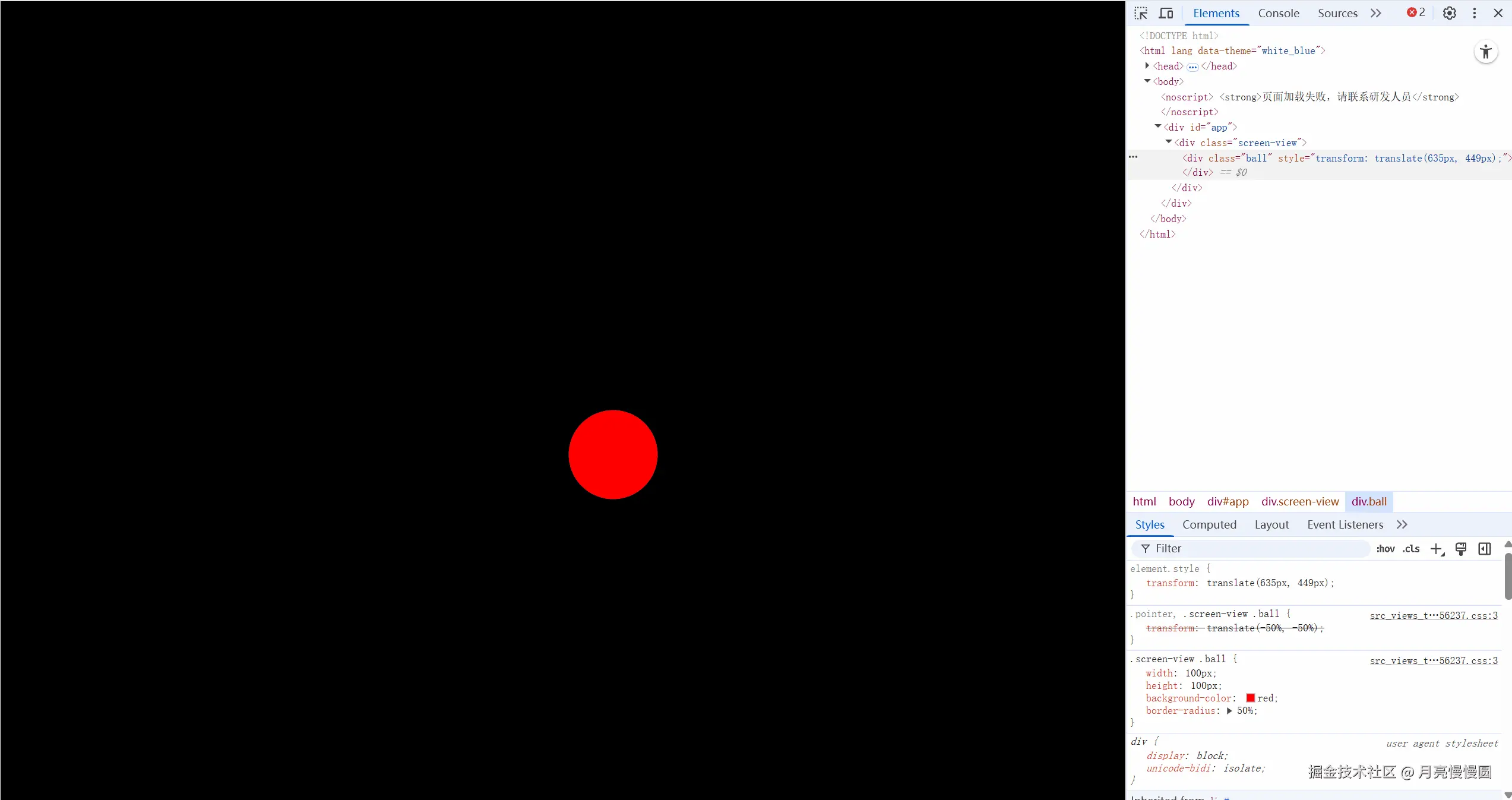
可以看到点击以后小球先会出现在屏幕左上角,然后移动到鼠标点击位置,动画结束后再回到最初的中间位置(又回到最初的位置是因为没有设置让动画保留最后一帧,后面会设置)。
3.Web Animation API效率高的原因
这套API之所以效率高,是因为它不会去改变元素的样式,CSS在运行动画的时候样式也是不会变,这一点Web Animation API和CSS是一样的,如果我们用一些第三方的动画库,是必须要去改变元素的style样式的,这样子一定会导致主线程的重新渲染,所以效率不高。
4.让小球移动后停留在当前位置
如果我们想小球移动以后就停在当前的位置,这一点我们在CSS的时候是怎么做的呢,我们在应用动画的时候有一个forwards,这个东西全称叫做animal-fill-mode,然后设置为forwards,这个东西我们在设置鼠标点击动画的时候用了,只不过是直接写在animation里面的。
css
// 点击时出现的扩散圆圈
.pointer {
    width: 20px;
    height: 20px;
    border: 1px solid #fff;
    border-radius: 50%;
    position: fixed;
    transform: translate(-50%, -50%);
    animation: pointerAnim 0.6s ease-out forwards; // forwards 保持最后一帧的状态 ease-out 先快后慢
    z-index: 9999;
    pointer-events: none; // 让指针不阻止点击事件
}在JS里,我们可以在options里配置,通过fill属性,值设置为forwards。
js
// 定义函数move
function move(x, y) {
    ball.animate([
        { transform: `translate(0,0)` },
        { transform: `translate(${x}px, ${y}px)` }
    ], {
        duration: 1000,  // 动画持续时间
        fill: 'forwards', // 保持最后一帧的状态
        easing: 'ease-out'  // 先快后慢
    });
}
5.设置小球移动时的起始位置
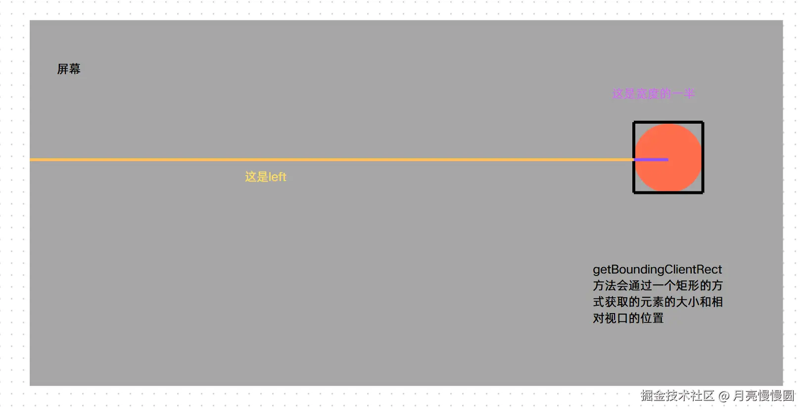
现在还有一个问题就是,小球的起始位置,我们刚才设置的起始位置一直是屏幕的左上角,那我们现在要以小球的当前位置为移动的起始位置该怎么做呢。其实也很简单,我们可以通过getBoundingClientRect方法获取元素的大小以及相对视口的位置,然后根据相对视口的位置加上自身的高宽的一半就是元素的中心的x和y坐标了。
js
// 定义函数move
function move(x, y) {
    // 计算小球当前位置
    // getBoundingClientRect方法获取元素的大小及其相对于视口的位置
    const rect = ball.getBoundingClientRect();
    // x坐标是left加上宽度的一半,y坐标是top加上高度的一半
    // 这里left和top是相对于视口的 相当于定位的left和top
    const currentX = rect.left + rect.width / 2; // 小球中心点的X坐标
    const currentY = rect.top + rect.height / 2; // 小球中心点的y坐标
    ball.animate([
        { transform: `translate(${currentX}px, ${currentY}px)` },
        { transform: `translate(${x}px, ${y}px)` }
    ], {
        duration: 1000,  // 动画持续时间
        fill: 'forwards', // 保持最后一帧的状态
        easing: 'ease-out'  // 先快后慢
    });
}
效果如下:
6.优化
现在功能已经实现了,但是还要考虑一个效率的问题,就是我们每次点击都会去开启一个新的动画,而过去的动画是不会消失的,他会把过去的动画的对象配置全部保留,我们可以通过getAnimations方法去获取所有的动画。
js
// 定义函数move
function move(x, y) {
    // 计算小球当前位置
    // getBoundingClientRect方法获取元素的大小及其相对于视口的位置
    const rect = ball.getBoundingClientRect();
    // x坐标是left加上宽度的一半,y坐标是top加上高度的一半
    // 这里left和top是相对于视口的 相当于定位的left和top
    const currentX = rect.left + rect.width / 2; // 小球中心点的X坐标
    const currentY = rect.top + rect.height / 2; // 小球中心点的y坐标
    ball.animate([
        { transform: `translate(${currentX}px, ${currentY}px)` },
        { transform: `translate(${x}px, ${y}px)` }
    ], {
        duration: 1000,  // 动画持续时间
        fill: 'forwards', // 保持最后一帧的状态
        easing: 'ease-out'  // 先快后慢

    // 获取元素上所有的动画
    const animations = ball.getAnimations();
    console.log(animations);
}
会发现数组里面的项越来越多,所以说当我们开启一个新的动画的时候,如果过去的不需要了,我们可以手动把它清除掉。因为是个数组嘛,所以我们可以循环每一项,然后使用cancel方法去清除每一个动画。
js
// 定义函数move
function move(x, y) {
    // 计算小球当前位置
    // getBoundingClientRect方法获取元素的大小及其相对于视口的位置
    const rect = ball.getBoundingClientRect();
    // x坐标是left加上宽度的一半,y坐标是top加上高度的一半
    // 这里left和top是相对于视口的 相当于定位的left和top
    const currentX = rect.left + rect.width / 2; // 小球中心点的X坐标
    const currentY = rect.top + rect.height / 2; // 小球中心点的y坐标

    // 调用新动画之前,先取消之前的动画
    ball.getAnimations().forEach(anim => anim.can

    ball.animate([
        { transform: `translate(${currentX}px, ${currentY}px)` },
        { transform: `translate(${x}px, ${y}px)` }
    ], {
        duration: 1000,  // 动画持续时间
        fill: 'forwards', // 保持最后一帧的状态
        easing: 'ease-out'  // 先快后慢

    // 获取元素上所有的动画
    const animations = ball.getAnimations();
    console.log(animations);
}
可以看到这样的话之前的动画全部都清除掉了,这一点很重要。
7.拉长小球以后再移动
现在功能是实现了,如果我们想让这个小球先按照移动方向拉长以后再移动,该怎么做呢。
这样的话小球的移动就要再加上一个关键帧了,让小球拉长,这个小球拉长我们可以使用scaleX去放大小球的宽度。
js
// 定义函数move
function move(x, y) {
    // 计算小球当前位置
    // getBoundingClientRect方法获取元素的大小及其相对于视口的位置
    const rect = ball.getBoundingClientRect();
    // x坐标是left加上宽度的一半,y坐标是top加上高度的一半
    // 这里left和top是相对于视口的 相当于定位的left和top
    const currentX = rect.left + rect.width / 2; // 小球中心点的X坐标
    const currentY = rect.top + rect.height / 2; // 小球
    // 调用新动画之前,先取消之前的动画
    ball.getAnimations().forEach(anim => anim.can
    ball.animate([
        { transform: `translate(${currentX}px, ${currentY}px)` },  // 当前位置
        { transform: `translate(${currentX}px, ${currentY}px) scaleX(1.5)` },  // 中间位置,放大X轴
        { transform: `translate(${x}px, ${y}px)` }  // 目标位置
    ], {
        duration: 1000,  // 动画持续时间
        fill: 'forwards', // 保持最后一帧的状态
        easing: 'ease-out'  // 先快后慢

    // 获取元素上所有的动画
    const animations = ball.getAnimations();
    console.log(animations);
}
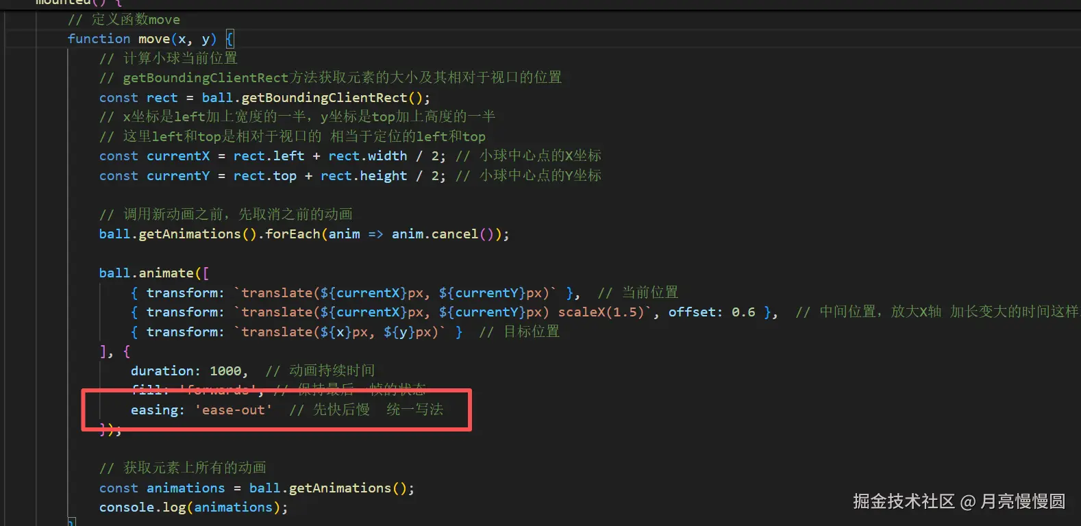
但是我们是想先拉长以后再移动,这样的话更自然,所以我们可以控制小球拉长的时间,也就是控制关键帧的时间,我们到目前为止关键帧的时间都是平均分配的,怎么实现和CSS里面的关键帧一样,设置0%,100%这样的进度百分比呢。这里我们在JS里的每一帧上用offset属性去控制进度,不过不是0%,100%这样的写法,它的取值范围是0~1,我们给变宽的关键帧的进度控制在0.6,让变宽的时间占大部分,这样就实现了先拉长后移动的效果。
js
// 定义函数move
function move(x, y) {
    // 计算小球当前位置
    // getBoundingClientRect方法获取元素的大小及其相对于视口的位置
    const rect = ball.getBoundingClientRect();
    // x坐标是left加上宽度的一半,y坐标是top加上高度的一半
    // 这里left和top是相对于视口的 相当于定位的left和top
    const currentX = rect.left + rect.width / 2; // 小球中心点的X坐标
    const currentY = rect.top + rect.height / 2; // 小球
    // 调用新动画之前,先取消之前的动画
    ball.getAnimations().forEach(anim => anim.can
    ball.animate([
        { transform: `translate(${currentX}px, ${currentY}px)` },  // 当前位置
        { transform: `translate(${currentX}px, ${currentY}px) scaleX(1.5)`, offset: 0.6 },  // 中间位置,放大X轴 加长变大的时间这样就实现先拉长后移动的效果
        { transform: `translate(${x}px, ${y}px)` }  // 目标位置
    ], {
        duration: 1000,  // 动画持续时间
        fill: 'forwards', // 保持最后一帧的状态
        easing: 'ease-out'  // 先快后慢

    // 获取元素上所有的动画
    const animations = ball.getAnimations();
    console.log(animations);
}
还有就是我们可以写时间函数,就是animation-timing-function控制是先快后慢还是先满后快还是匀速,在CSS里面我们可以统一在动画应用animation里写,也可以写在每一个关键帧里面。
css
// 点击时出现的扩散圆圈
.pointer {
    width: 20px;
    height: 20px;
    border: 1px solid #fff;
    border-radius: 50%;
    position: fixed;
    transform: translate(-50%, -50%);
    animation: pointerAnim 0.6s ease-out forwards; // forwards 保持最后一帧的状态, ease-out 先快后慢 这是统一写法
    z-index: 9999;
    pointer-events: none; // 让指针不阻止点击事件
}

// 扩散动画
@keyframes pointerAnim {
    0% {
        opacity: 1; // 初始状态不透明
        transform: translate(-50%, -50%) scale(1); // 初始状态大小为1
    }

    100% {
        opacity: 0; // 最终状态透明
        transform: translate(-50%, -50%) scale(5); // 最终状态放大5倍
        animation-timing-function: ease-out; // 先快后慢  这是写在每一帧的写法
    }
}当然我们在JS里也可以写,其实我们之前也写了,在options里面,在这里写就是统一写法。
当然我们也可以写在每一个关键帧里:
js
// 定义函数move
function move(x, y) {
    // 计算小球当前位置
    // getBoundingClientRect方法获取元素的大小及其相对于视口的位置
    const rect = ball.getBoundingClientRect();
    // x坐标是left加上宽度的一半,y坐标是top加上高度的一半
    // 这里left和top是相对于视口的 相当于定位的left和top
    const currentX = rect.left + rect.width / 2; // 小球中心点的X坐标
    const currentY = rect.top + rect.height / 2; // 小球中心点的Y坐标
    // 调用新动画之前,先取消之前的动画
    ball.getAnimations().forEach(anim => anim.can
    ball.animate([
        { transform: `translate(${currentX}px, ${currentY}px)`, easing: 'ease-out' },  // 当前位置 ease-out 先快后慢
        { transform: `translate(${currentX}px, ${currentY}px) scaleX(1.5)`, offset: 0.6, easing: 'ease-in' },  // 中间位置,放大X轴 加长变大的时间这样就实现先拉长后移动的效果 ease-in 先慢后快
        { transform: `translate(${x}px, ${y}px)` }  // 目标位置
    ], {
        duration: 1000,  // 动画持续时间
        fill: 'forwards', // 保持最后一帧的状态

    // 获取元素上所有的动画
    const animations = ball.getAnimations();
    console.log(animations);
}
为了更丝滑我们再多加点关键帧。
js
// 定义函数move
function move(x, y) {
    // 计算小球当前位置
    // getBoundingClientRect方法获取元素的大小及其相对于视口的位置
    const rect = ball.getBoundingClientRect();
    // x坐标是left加上宽度的一半,y坐标是top加上高度的一半
    // 这里left和top是相对于视口的 相当于定位的left和top
    const currentX = rect.left + rect.width / 2; // 小球中心点的X坐标
    const currentY = rect.top + rect.height / 2; // 小球中心点的Y坐标
    // 调用新动画之前,先取消之前的动画
    ball.getAnimations().forEach(anim => anim.can
    ball.animate([
        { transform: `translate(${currentX}px, ${currentY}px)`, easing: 'ease-out' },  // 当前位置 ease-out 先快后慢
        { transform: `translate(${currentX}px, ${currentY}px) scaleX(1.5)`, offset: 0.6, easing: 'ease-in' },  // 中间位置,放大X轴 加长变大的时间这样就实现先拉长后移动的效果 ease-in 先慢后快
        { transform: `translate(${currentX}px, ${currentY}px) scaleX(1.5)`, offset: 0.7, easing: 'ease-out' },
        { transform: `translate(${x}px, ${y}px)` }  // 目标位置
    ], {
        duration: 1000,  // 动画持续时间
        fill: 'forwards', // 保持最后一帧的状态

    // 获取元素上所有的动画
    const animations = ball.getAnimations();
    console.log(animations);
}
这样看起来就会丝滑很多。

但是还有一个问题,就是不能一直横向拉伸啊,应该根据鼠标点击位置去拉伸,那该怎么做呢,其实也简单,旋转呗,原本横向拉伸的,我们旋转的角度就是了,现在就是来计算我们要旋转多少角度的事情了。
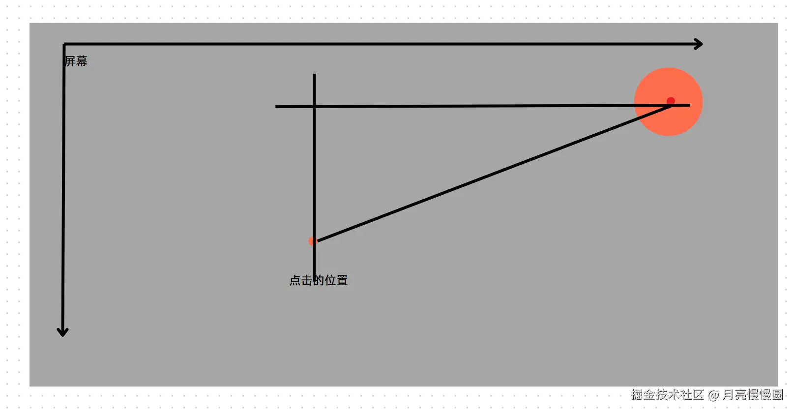
这下运用几何知识都会算吧。
js
// 计算旋转的角度
const deltaX = x - currentX;  // x是点击位置的x坐标 currentX是小球当前位置的x坐标
const deltaY = y - currentY;  // y是点击位置的y坐标 currentY是小球当前位置的y坐标
// 计算角度 使用反正切函数atan2(y, x) 返回值
const angle = Math.atan2(deltaY, deltaX) * (180 / Math.PI); // 计算角度并转换为度数然后把角度通过rotate都加到变宽的关键帧和第一个关键帧里面去(不一定都是圆形所以第一个关键帧也要加)。
js
// 定义函数move
function move(x, y) {
// 计算小球当前位置
// getBoundingClientRect方法获取元素的大小及其相对于视口的位置
const rect = ball.getBoundingClientRect();
// x坐标是left加上宽度的一半,y坐标是top加上高度的一半
// 这里left和top是相对于视口的 相当于定位的left和top
const currentX = rect.left + rect.width / 2; // 小球中心点的X坐标
const currentY = rect.top + rect.height / 2; // 小球中心点的Y坐标
// 计算旋转的角度
const deltaX = x - currentX; // x是点击位置的x坐标 currentX是小球当前位置的x坐标
const deltaY = y - currentY; // y是点击位置的y坐标 currentY是小球当前位置的y坐标
// 计算角度 使用反正切函数atan2(y, x) 返回值
const angle = Math.atan2(deltaY, deltaX) * (180 / Math.PI); // 计算角度并转换为度数
ball.style.transform = `translate(${currentX}px, ${currentY}px) rotate(${angle
// 调用新动画之前,先取消之前的动画
ball.getAnimations().forEach(anim => anim.can
ball.animate([
{ transform: `translate(${currentX}px, ${currentY}px) rotate(${angle}deg) `, easing: 'ease-out' }, // 当前位置 ease-out 先快后慢
{ transform: `translate(${currentX}px, ${currentY}px) rotate(${angle}deg) scaleX(1.5)`, offset: 0.6, easing: 'ease-in' }, // 中间位置,放大X轴 加长变大的时间这样就实现先拉长后移动的效果 ease-in 先慢后快
{ transform: `translate(${currentX}px, ${currentY}px) rotate(${angle}deg) scaleX(1.5)`, offset: 0.7, easing: 'ease-out' }, // 中间位置,放大X轴 加长变大的时间这样就实现先拉长后移动的效果 ease-in 先慢后快
{ transform: `translate(${x}px, ${y}px)` } // 目标位置
], {
duration: 1000, // 动画持续时间
fill: 'forwards', // 保持最后一帧的状态
// 获取元素上所有的动画
const animations = ball.getAnimations();
console.log(animations);
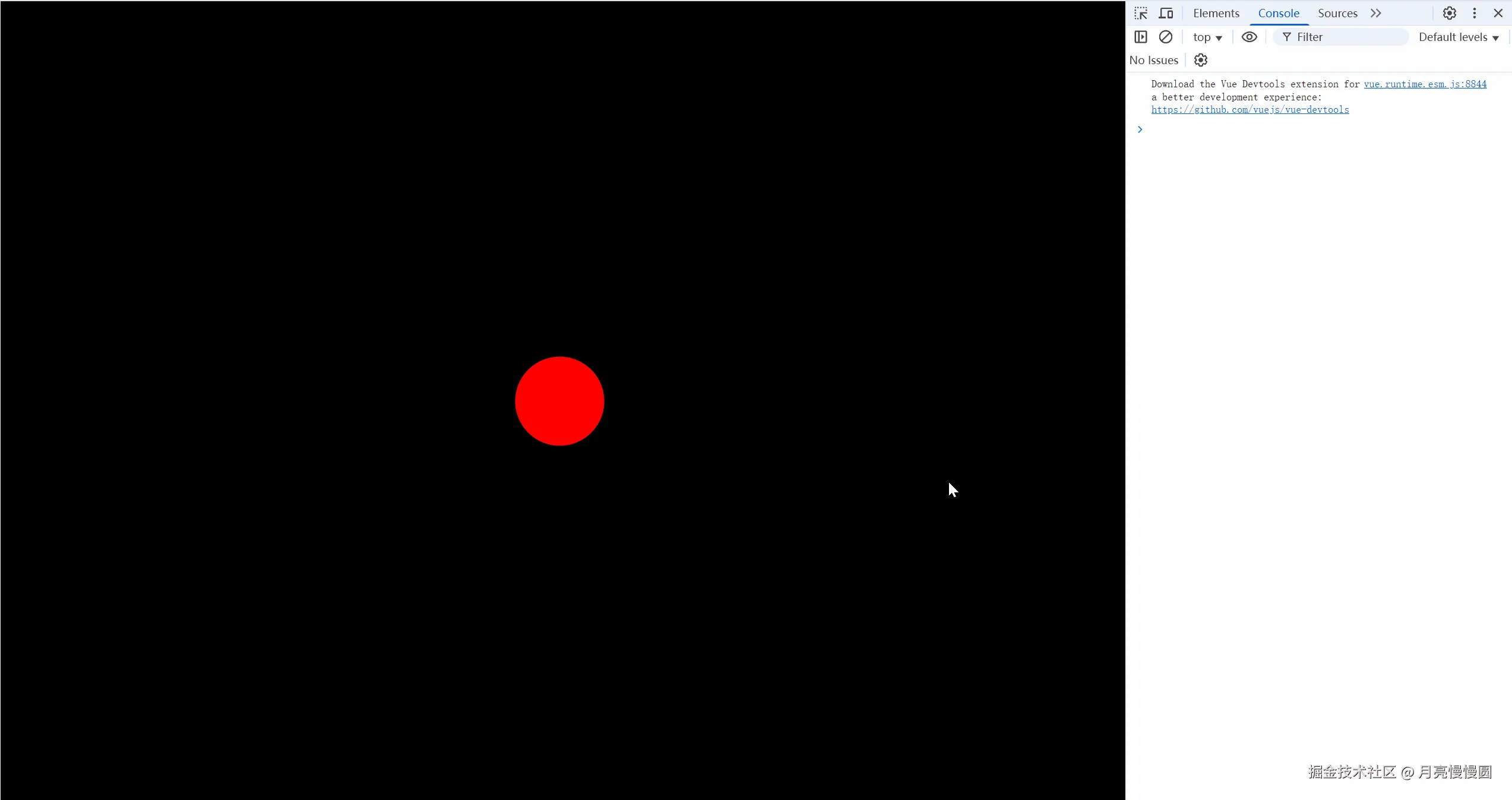
}我们来看一下效果。
8.完整代码
html
<template>
    <div class="screen-view">
        <div class="ball"></div>
    </div>
</template>
<script>
export default {
    name: 'WebAnimationAPI',
    data() {
        return {
        }
    },
    mounted() {
        // 让页面点击时出现一个扩散的圆圈
        window.addEventListener('click', (e) => {
            const pointer = document.createElement('div');
            pointer.classList.add('pointer')
            pointer.style.left = e.clientX + 'px';
            pointer.style.top = e.clientY + 'px';
            document.body.appendChild(pointer);
            pointer.addEventListener('animationend', () => {
                pointer.remove();
            })
        })

        // 获取小球
        const ball = document.querySelector('.ball');

        // 初始化小球位置在屏幕中心
        // 不要在css里用定位的方式让小球位置在屏幕中心,因为这样的话小球在根据鼠标位置移动的时候会出现错误,因为此时小球中心是屏幕中心,而鼠标位置是根据左上角计算的
        // 所以一开始小球的中心一定要和屏幕的左上角重合
        // 然后后期我们初始化的时候用transform让小球移动到屏幕中心
        const centerX = window.innerWidth / 2;
        const centerY = window.innerHeight / 2;
        ball.style.transform = `translate(${centerX}px, ${centerY}px)`;

        // 监听点击事件,让小球移动到点击位置
        window.addEventListener('click', (e) => {
            // 获取点击位置
            const x = e.clientX;
            const y = e.clientY;

            // 调用函数move 让小球移动到点击位置
            move(x, y);
        })

        // 定义函数move
        function move(x, y) {
            // 计算小球当前位置
            // getBoundingClientRect方法获取元素的大小及其相对于视口的位置
            const rect = ball.getBoundingClientRect();
            // x坐标是left加上宽度的一半,y坐标是top加上高度的一半
            // 这里left和top是相对于视口的 相当于定位的left和top
            const currentX = rect.left + rect.width / 2; // 小球中心点的X坐标
            const currentY = rect.top + rect.height / 2; // 小球中心点的Y坐标

            // 计算旋转的角度
            const deltaX = x - currentX;  // x是点击位置的x坐标 currentX是小球当前位置的x坐标
            const deltaY = y - currentY;  // y是点击位置的y坐标 currentY是小球当前位置的y坐标
            // 计算角度 使用反正切函数atan2(y, x) 返回值
            const angle = Math.atan2(deltaY, deltaX) * (180 / Math.PI); // 计算角度并转换为度数
            ball.style.transform = `translate(${currentX}px, ${currentY}px) rotate(${angle}deg)`;

            // 调用新动画之前,先取消之前的动画
            ball.getAnimations().forEach(anim => anim.cancel());

            ball.animate([
                { transform: `translate(${currentX}px, ${currentY}px) rotate(${angle}deg) `, easing: 'ease-out' },  // 当前位置 ease-out 先快后慢
                { transform: `translate(${currentX}px, ${currentY}px) rotate(${angle}deg) scaleX(1.5)`, offset: 0.6, easing: 'ease-in' },  // 中间位置,放大X轴 加长变大的时间这样就实现先拉长后移动的效果 ease-in 先慢后快
                { transform: `translate(${currentX}px, ${currentY}px) rotate(${angle}deg) scaleX(1.5)`, offset: 0.7, easing: 'ease-out' },  // 中间位置,放大X轴 加长变大的时间这样就实现先拉长后移动的效果 ease-in 先慢后快
                { transform: `translate(${x}px, ${y}px)` }  // 目标位置
            ], {
                duration: 1000,  // 动画持续时间
                fill: 'forwards', // 保持最后一帧的状态
            });

            // 获取元素上所有的动画
            const animations = ball.getAnimations();
            console.log(animations);
        }
    },

}
</script>
<style lang='scss'>
// 不要加scoped,因为pointer是动态创建的,加了scoped样式就会失效,为什么会失效呢?因为scoped是通过属性选择器来实现的,动态创建的元素没有这个属性选择器。
.screen-view {
    box-sizing: border-box;
    height: 100%;
    background-color: #000;
    overflow: hidden;

    .ball {
        width: 100px;
        height: 100px;
        background-color: red;
        border-radius: 50%;
        margin-top: -50px;
        margin-left: -50px;
        // 这里是为了让小球的中心点和屏幕的左上角重合,用margin,不要用transform,因为会出现些许偏差
    }
}

// 点击时出现的扩散圆圈
.pointer {
    width: 20px;
    height: 20px;
    border: 1px solid #fff;
    border-radius: 50%;
    position: fixed;
    transform: translate(-50%, -50%);
    animation: pointerAnim 0.6s ease-out forwards; // forwards 保持最后一帧的状态, ease-out 先快后慢 这是统一写法
    z-index: 9999;
    pointer-events: none; // 让指针不阻止点击事件
}

// 扩散动画
@keyframes pointerAnim {
    0% {
        opacity: 1; // 初始状态不透明
        transform: translate(-50%, -50%) scale(1); // 初始状态大小为1
    }

    100% {
        opacity: 0; // 最终状态透明
        transform: translate(-50%, -50%) scale(5); // 最终状态放大5倍
    }
}
</style>